Imagine being able to sit down with an elite athlete, absorbing firsthand how they overcome obstacles, refine their techniques, and elevate performance. Now, translate that scenario into your organization’s efforts to harness complex technology and innovation.
Today’s fast-paced technological landscape demands faster, more targeted responses—not just generalized knowledge from endless manuals, excel thought leaders, or tutorials. By adopting personalized one-on-one sessions with expert consultants, your business can significantly accelerate adoption, reduce costly implementation errors, and maximize the returns on technology investments.
This isn’t theory; it’s strategic reality: the shortest path between confusion and clarity is a focused, personalized consulting interaction. But what’s the real value of adopting a one-on-one expert model, and how can it directly propel your organization’s growth in data, analytics, and innovation? Let’s explore how expert-level consulting sessions are transforming the way forward-looking organizations meet adoption challenges.
The widespread availability of data, analytics, and innovative technology solutions has undeniably driven organizations across every sector into new realms of efficiency and insight. But simply deploying new tools is only part of the equation. Real adoption happens when users fully embrace technology, understanding not just how to use it, but also why to use it. Generic training sessions and one-size-fits-all instructions often overlook the complexity unique to each organization’s infrastructure, talent pool, and operational structure.
This is where personalized expert sessions clearly demonstrate superior value. A dedicated consulting professional with domain-specific expertise dives directly into the details relevant to your organization, reducing time wasted on irrelevant information and generic advice. As we’ve explored in “Why Hourly Software Consulting is the Future of Adaptive, Scalable Innovation“, personalized consulting scales according to each business’s specific demands, providing flexibility and effectiveness unmatched by traditional training methods.
One-on-one sessions create focused environments where employees feel comfortable asking direct questions and getting immediate, strategically sound answers. Consultants identify individual or departmental knowledge gaps early, clarify misconceptions, and set clear expectations. The payoff? Users gain deeper, actionable insights and more confidence rapidly, facilitating higher engagement with complex data projects, DevOps toolchains, and digital transformations. Ultimately, the right consulting partner empowers your team to not only understand complex systems but to champion them throughout the organization.
The Critical Role of Tailored Learning in Complex Environments
When dealing with advanced technologies such as data engineering, analytics platforms, or DevOps automation, standard seminars and pre-recorded webinars often lead to frustration. They frequently present generalized use-cases, glossing over specific details critical to your unique infrastructure and workflows. This oversight results in knowledge gaps and unused technology investments. High-level expertise doesn’t manifest simply through broad strokes—it thrives on specificity, customization, and depth of understanding relevant to your actual environment.
By arranging one-on-one sessions with experts from a specialized data engineering consulting firm, such as outlined in Data Engineering Consulting Services in Austin Texas, organizations ensure learning remains personalized, practical, and applicable. Tailored learning sessions facilitate pinpoint accuracy in resolving specific problems rapidly, speeding up adoption significantly.
Furthermore, tailored consulting sessions continuously adjust in real-time. As consultants probe deeper into your organization’s unique business context, technological challenges, and strategic objectives, solutions become more accurate and directly actionable. Each resolved challenge presents cumulative knowledge, forming the foundation of a more resilient and educated team, empowered to leverage increasingly complex innovation opportunities confidently.
Streamlining Problem Resolution with Expert Guidance
One-on-one expert guidance quickly pinpoints and resolves bottlenecks that traditional group training methods often miss. Consultants work closely with your team, meticulously analyzing specific scenarios and troubleshooting directly, saving valuable hours or even days spent on self-guided trial-and-error. Instead of endlessly browsing support forums, your team accesses authoritative expertise immediately, considerably shortening problem resolution timeframes.
Take DevOps and automation as examples of constantly evolving technologies frequently needing expert-level explanation. Our piece “Introduction to DevOps and the Role of Automation” emphasizes the complexity behind successful tool implementations. Engaging in regular one-on-one sessions bridges your team’s skills gaps faster and fosters a deeper understanding of the capabilities newly introduced tools offer.
Immediate consultant assistance in a personalized session means quicker diagnosis, clearer comprehension, and more efficient enhancements to operational productivity and problem-solving processes. As consultants demonstrate best practices broadcasted directly from their experiences and client-specific knowledge bases, your organization naturally begins to develop those problem-resolution behaviors internally. This empowers teams not merely to resolve single issues but grow their ability to tackle future complexities effectively, consistently, and independently.
Facilitating Innovative Thinking and Strategic Insights
Personal sessions with recognized subject matter experts do more than just accelerate technology adoption or solve individual problems—they catalyze innovation. As your team absorbs deep insights from specialists with profound practical knowledge, new perspectives naturally emerge. Discussing current technologies, acknowledging previous hurdles, and exploring upcoming innovation directions transform routine troubleshooting into strategic dialogues. These interactions nurture promising ideas, solution-driven attitudes, and higher user confidence levels.
Expert consultants facilitate states of productive curiosity, guiding your team into exploring innovative applications for existing technologies or introducing entirely new approaches tailored to your strategic ambitions. Leaders find reassurance in knowing their teams approach technical complexity not only with confidence but also with creativity, continually seeking improvement in pursuit of organizational excellence. Such mentorship naturally broadens horizons, fosters outside-the-box thinking, refines decision-making skills, and positions your organization ahead of your competition.
Moreover, a trusted consultant relationship ensures your technology platforms continually align with strategic visions. Effective experts interpret complicated technological discussions in a way that resonates deeply with decision-makers, refining their understanding of what’s possible—and strategic. Consequently, technology investments start driving strategy rather than merely supporting it, positioning your organization as both innovative adopters and visionary leaders.
Scaling Learning and User Adoption Effectively
It’s natural to question the scalability of one-on-one expert-driven learning: “Can we really sustain individualized consulting sessions with numerous employees?” Surprisingly, when implemented smartly, yes. Dedicated consultant sessions prove strikingly effective if strategically distributed and leveraged.
Organizations can train influential internal champions and technical leads within one-on-one consultancy contexts, who then effectively disseminate best practices internally. Moreover, access to consulting expertise can be strategically targeted toward critical areas or pivotal innovations, ensuring optimized spending in areas of most significant impact.
With continued advancements in remote technology and online communication tools, conducting expert sessions flexibly and remotely facilitates seamless scalability. Consultants can target key individuals or smaller, high-impact teams granularly, tailoring their approach precisely to identified learning and adoption gaps. This systematic scalability ensures real benefits derived from expert guidance rapidly expand throughout your organization over time.
By embracing scalable, targeted expert-driven sessions, organizations not only increase adoption of data innovation tools but also embed deep institutional knowledge, streamline operations, and foster agility in response to changes or emerging opportunities. Effective scalability of personalized learning ultimately positions organizations as proactive rather than reactive, future-proofing their technology adoption strategies.
Conclusion: One on One Expert Sessions – The Smart Investment
Maximizing technology adoption, particularly in complex domains like analytics, data engineering, and automation, hinges on accessing and leveraging true expertise. One-on-one consulting sessions represent more than just quick technical interventions—they re-chart your organization’s course, enabling empowered teams to transform obstacles into opportunities.
Investing in personalized executive consulting accelerates challenges resolution, expands in-depth knowledge, inspires innovation, and ensures scalable technology adoption success. Don’t limit your organization’s potential with generalized approaches. Step confidently into the future by proactively investing in personalized consulting relationships today.
In today’s competitive landscape, organizations are constantly searching for ways to sharpen their edge and improve profitability. One powerful yet often misunderstood strategy is adopting a data-driven culture. But what exactly does that mean, and why is it so crucial for long-term success?
At its core, a data-driven culture means decisions are grounded in data insights rather than intuition, assumptions, or outdated practices. This mindset transforms how businesses operate, innovate, and scale, leading to stronger profitability, more effective strategies, and a sharper competitive advantage.
The Core Principles of a Data-Driven Culture
A data-driven culture goes beyond just collecting data — it requires a fundamental shift in how decisions are made and information is valued across the organization.
First, it emphasizes data accessibility. Insights shouldn’t be confined to specialized teams; instead, decision-makers at all levels should have the tools and literacy to understand data’s impact. This openness leads to better collaboration and transparency across departments.
Second, a successful data-driven organization focuses on objective decision-making. Rather than relying on gut instincts, leadership empowers teams with dashboards, reports, and real-time analytics to inform strategies.
Finally, continuous improvement is central. Data-driven companies prioritize feedback loops, using insights from past performance to refine processes, products, and services continually. Similar to the agile method.
By embedding these principles, businesses can make smarter, faster decisions that directly impact profitability and performance.
How a Data-Driven Culture Transforms Profitability
Shifting to a data-driven approach isn’t just a theoretical improvement — it drives measurable financial results. Here’s how:
1. Smarter Resource Allocation: Data insights reveal which projects, products, and markets deliver the highest returns. This clarity helps businesses invest in areas with the most impact, reducing waste, stop fraud before it happens, and improving operational efficiency.
2. Enhanced Customer Experience: Understanding customer behavior through data analytics allows businesses to personalize experiences, predict preferences, and address pain points proactively. This not only boosts customer satisfaction but also drives loyalty and repeat revenue.
3. Risk Management and Agility: Predictive analytics and historical data help businesses identify risks early. Whether it’s market volatility, supply chain disruptions, or shifting consumer trends, data-driven companies can respond faster and more strategically, protecting their bottom line.
4. Measurable Performance Insights: Data provides clarity on performance metrics, ensuring businesses can set realistic KPIs, track progress, and make adjustments in real time. Clear visibility into operational performance fosters accountability and sustained growth.
The bottom line? Organizations embracing data-driven decision-making tend to outperform their competitors in profitability, efficiency, and innovation.
Overcoming Barriers to Building a Data-Driven Culture
While the benefits are clear, transitioning to a data-driven culture requires overcoming several challenges. Resistance to change, lack of data literacy, and inadequate tools can all slow progress.
Leadership Buy-In is Essential: Cultural shifts start at the top. Executives and decision-makers must not only endorse but actively model data-driven behaviors. This includes basing strategic decisions on data insights and fostering a culture where questioning assumptions is encouraged.
Invest in Data Literacy: A data-driven organization empowers its workforce with the skills to interpret and apply insights effectively. This doesn’t mean everyone needs to be a data scientist, but ensuring all employees understand basic metrics, trends, when they’re painting themself into the corner of a spreadsheet, and analysis tools is key.
Break Down Data Silos: Data trapped within isolated departments limits its impact. Integrated data platforms and open access to analytics help ensure the entire organization benefits from shared insights, fostering collaboration and more cohesive strategies.
The Competitive Edge of a Data-Driven Culture
In a rapidly evolving market, companies that harness data effectively gain a significant advantage. They can anticipate market shifts, identify growth opportunities, and adapt faster than competitors relying on outdated decision-making models, like juggling spreadsheets.
Industries like retail, healthcare, finance, construction, and technology have already seen transformative results. For example, leading e-commerce platforms use real-time data to adjust pricing dynamically, while healthcare providers leverage predictive analytics for more effective patient care strategies.
Embracing a data-driven culture isn’t just about keeping pace — it’s about setting the pace.
Companies that fail to adapt risk falling behind, while those who commit to leveraging data gain the tools to innovate, grow, and lead their industry.
Conclusion: Why Your Business Can’t Afford to Ignore Data
A data-driven culture isn’t a passing trend — it’s a foundational shift in how businesses operate and thrive. By prioritizing data-informed decision-making, companies unlock profitability, stronger customer relationships, and long-term resilience in a dynamic market.
If you’re serious about driving growth, reducing risk, avoid fraud, and making smarter investments, building a data-driven culture should be a top priority. It’s not just about data; it’s about transforming the way your organization thinks, acts, and succeeds.
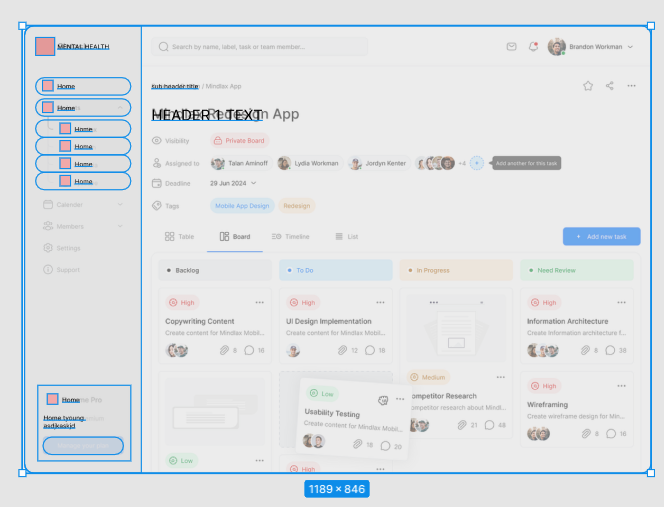
Building dashboards in PowerBI quickly is important because decision makers are eager to start using these rocket ships we are creating. However, if you’re new to PowerBI that may be asking a lot! Tracing is helpful because it empowers us to quickly create a solution and design from scratch.
What is tracing? Drawing over lines on a superimposed piece of transparent paper, and with figma, you will be able to do this digitally speaking. Allowing you to trace over any designs to abstract your own.
Tracing dashboards is a good way to recreate something net new and offers a fast path for getting people talking about your dashboard designs.
In this article, you will learn to become a master of making powerful designs from scratch, and this will empower you to Create dashboards in PowerBI quickly. Here’s a lot of screenshots to show you what you’re going to be building and potentially a template you can copy and paste into your next PowerBI Design.
Create visual documentation for PowerBI Design
Here at DEV3LOPCOM, LLC, we passionately believe visual documentation improves project deadlines. Plus, allows for fast data product creation and we want to show you how we would create a dashboard from scratch without any direction on the style or design.
Figma works, but any app that allows tracing over an image will work, and in this blog we will show you how to create this template.
We show the steps to tracing the design, and adding it to PowerBI. This can help you operationalize your templates and improve your dashboarding speed across any dashboarding product.
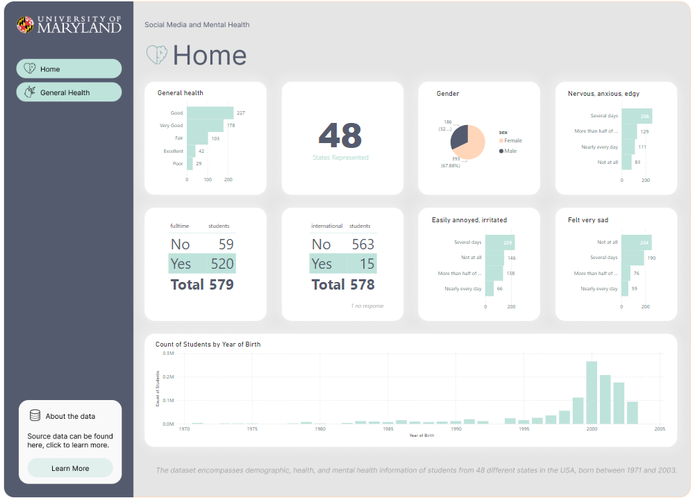
About this PowerBI dashboard Data and our Goals
First, lets learn about the data and establish goals about our workload to keep us focused on an objective.
All data should have a brief description, otherwise it’s hard for others to collaborate with your data sources.
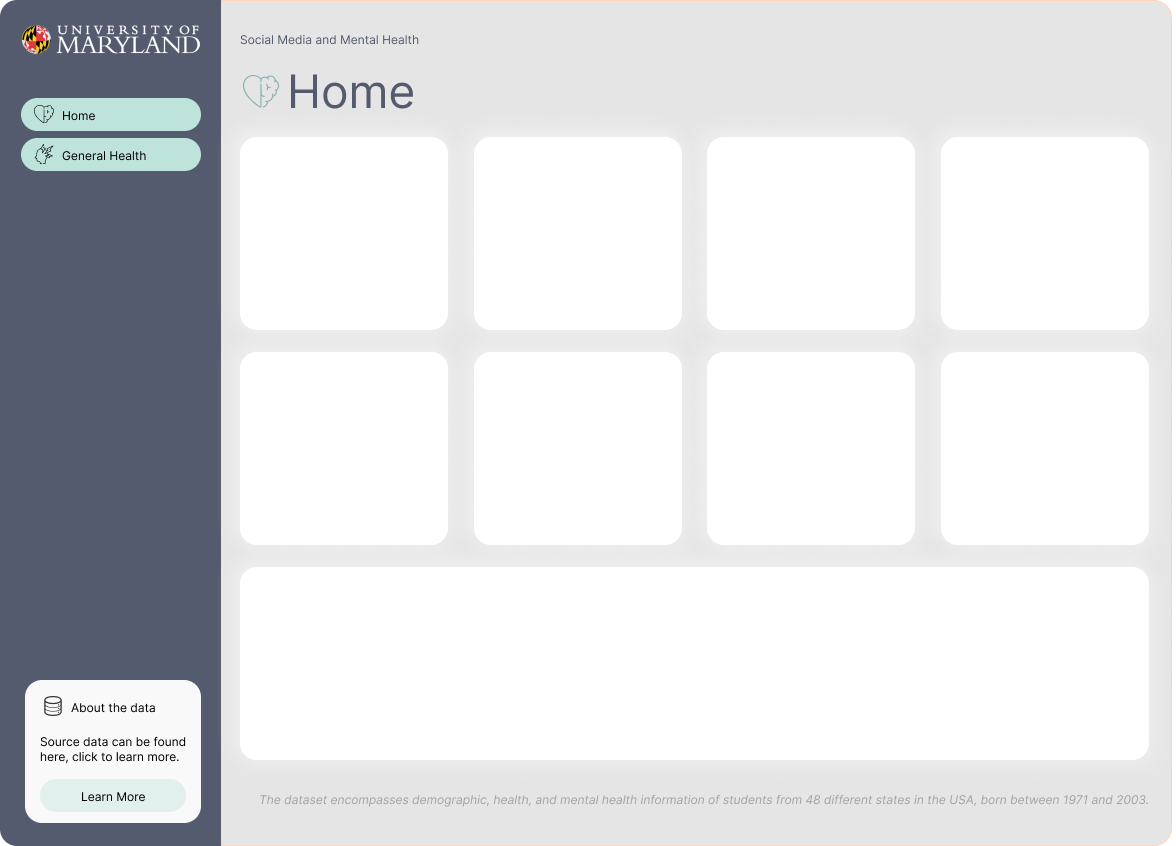
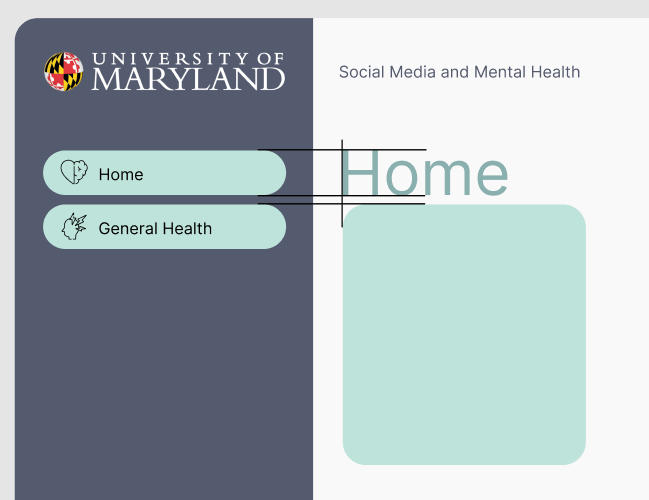
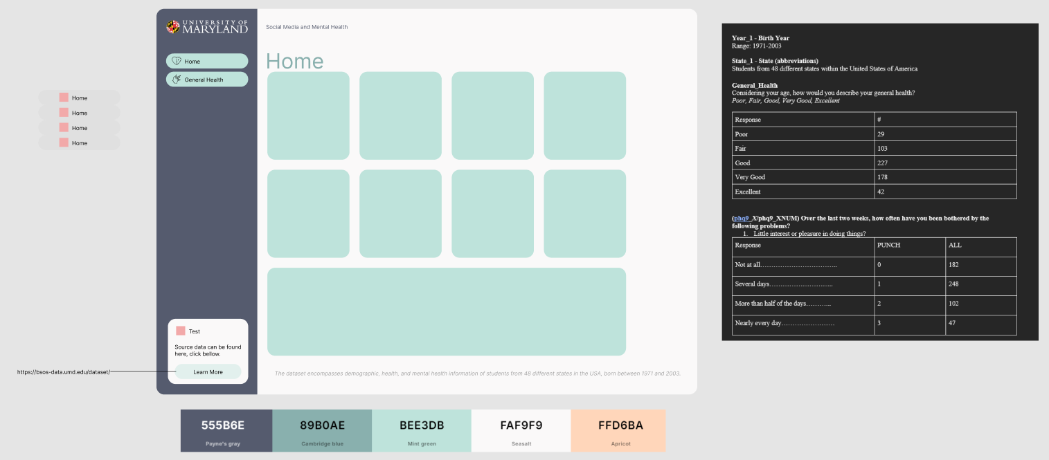
Using the following data about Social Media and Mental Health, was recently released by University of Maryland in July 2024.
Our goal is to quickly generate a dashboard to help others learn PowerBI. However we have thin requirements, it’s fun to pretend this is a real world software consulting engagement, and similar to a real world use case in a busy business environment, perhaps people are too busy to give us insights.We must research and learn on our own.
About data: The dataset encompasses demographic, health, and mental health information of students from 48 different states in the USA, born between 1971 and 2003.
How do I get my CSV Data into PowerBI?
Open your PowerBI software. You don’t need to buy anything, just go grab the software and get started with me.
In the Home tab, click Get Data. Then select Text/CSV.
Once we have our CSV data open, you may notice we have weird Column headers that aren’t sensible to anyone on the dashboarding end.
This is typical in a lot of APIs, Data Warehouses, and Data Engineering in general is ripe of columns not being named correctly for each team. Luckily for us, PowerBI can change column names with great ease.
Finding Artwork to Trace Your Dashboard
First, we need to start with learning about “artwork.” When learning to draw, an art teach will ask you to trace something 100 times, and then by the 100th time you’ll be drawing it better.
Same with the internet, we often are reverse engineering each others design to improve our design. In this process we will find some artists we enjoy, choose one, and trace our dashboard on this design.
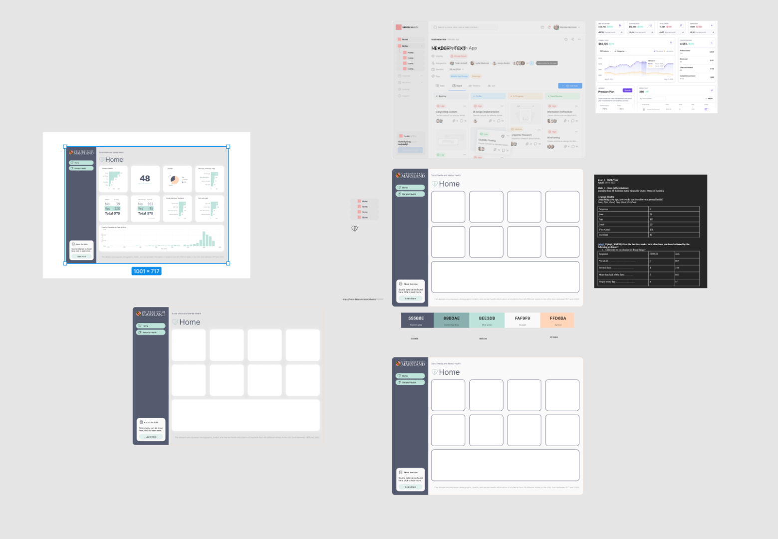
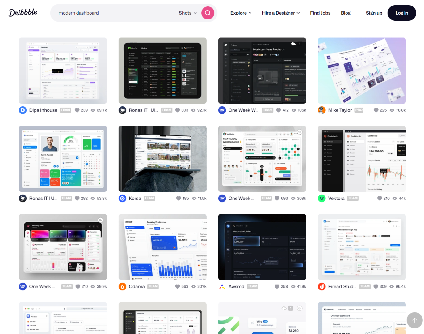
I like using Dribbble to find ideas and learn about modern approaches. It has a lot of really stylish content, and it’s easy to start here as a dashboarding guru.
I search for ‘modern dashboard style…
If working with a client, I will find 3 designs and then ask them to choose one. Then I’ll build everything around this template. I like using figma because it’s easy enough for people to dig into the weeds, and see they can access the design elements.
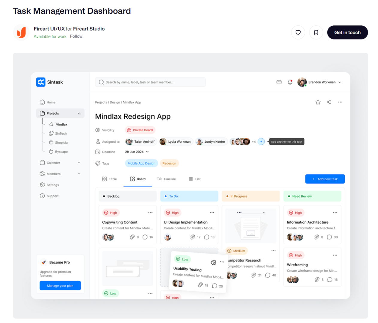
Pretend our client suggest the following design.
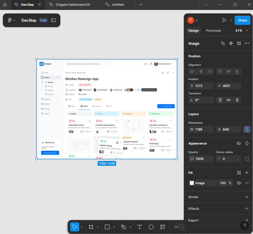
Okay, paste the dashboard we are asked to mimic into figma and lets start tracing.
You’ll notice as you do this you’ll start to create your own unique design to your dashboarding solution.
Start tracing design for PowerBI Dashboard
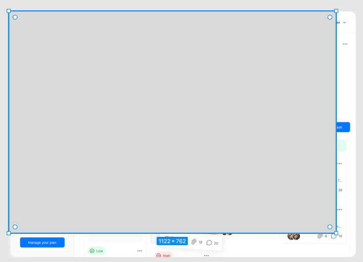
Cover the surface with a square.
Once hidden completely, lets edit transparency hitting 5 on keyboard. This should adjust the transparency.
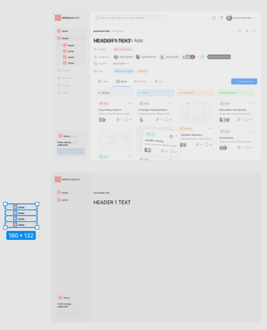
Okay, keep flowing. Next same thing for side menu. Trace it. But before we go, adjust the edges to be rounded.
Easy enough in figma, grab little white ball and pull it down until it hits the line we are tracing. adjusting one side adjust all 4 sides.
Okay, hit the side menu.
Next, TEXT overlays. And button overlay with squares.
I prefer starting with a highlighted button so i know the sizing, then replicate that size across. Alt drag and drop for similar copy paste of previous object.
Working through buttons should be easy, let the software guide you to make it perfect too. Notice this has a 7 pixel gap.
Skipping ahead…
Now that we have this style, lets see what it looks like in PowerBI.
Adding your Figma design to PowerBI is simple. It’s a file.
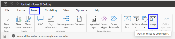
Export the file to your computer.
Add image to PowerBI.
Resize dashboard so it fits cleanly.
Remove padding, this is my least favorite thing to have to do in Tableau and PowerBI. These apps automatically pad everything for some reason, haha.
Making decisions about our new Figma Style for PowerBI
In the beginning stages it’s about speed and repeatability. In more advanced dashboard development Figma saves a lot of time.
Next, lets duplicate our work area, and move the sub button navigation for today to the right side.
This is good enough for PowerBI. But before we leave just yet, lets dive into how we can improve the color pallet. I’m using coolors for an easy one.
Now, start to style your dashboard so that it’s appealing. Don’t spend too much time here because chances are the design will change, and you’re just trying to make it look decent. Use corporate colors so you’re following the “designers” pattern. They can send your a pdf file with the correct style guide, which improves this process, but today we are tracing and coming up with our own style guide.
As you’re applying color, start to focus on subtle details…
Improving PowerBI Dashboard with Logos, Style, and Strategy
Logos make dashboards pop. You know you can easily grab one, so grab the most recent logo. Don’t edit peoples logos, use what they supply online.
I’m choosing the source data logo, to help represent the source information because putting my logo here would not be a factual representation of the effort.
Now, notice what happens when I size it next to the buttons, depending on your screenshot and size of dashboard to be traced, in Figma, it’s subtle… Notice my sizing is subtly off and I can’t seem to make it exact, I generate black guide bars… aim to sync up for “perfect”… people will use your dashboard more often if it’s synced up.
In this example/screenshot I’m demonstrating how lining up this logo is a little more tedious than allowing figma to define things by snapping edges, I created black guide lines to help me follow a consistent flow from top to bottom. This is a kind of “hawk eye” or “pixel perfect” strategy I need you to deploy to create powerful dashboards in any reporting software or designed front-end!
Before we part, a few more subtle wins to consider as you perfect your traced design for PowerBI.
This will give a very nice clean view. In figma, click the red square, paste the image. Very easy process if you created the space for the icon. As you do this selection of icons, realize nothing is perfect, we are prototyping, get something in there because that’s the key, fast/repetitive!
Notice how we made some decisions that moved us away from the original design, this is called “making it your own.”
One more layer of decisions to clean it up.
The strategy here is making things clean and lined up, using LINES to guide ourselves. Delete these guide lines once you’ve mastered this technique and keep duplicating to avoid having to do this process again…
Here’s my work station, notice I’m starting to document what goes inside of buttons, and the documentation is in the same screen. This helps with identifying where our hard work belongs.
The header looks a little close to the first square, however a good starting point, we can optimize that later. The point of using guides/lines is the important part of this training.
Choosing cool icons for PowerBI Navigation
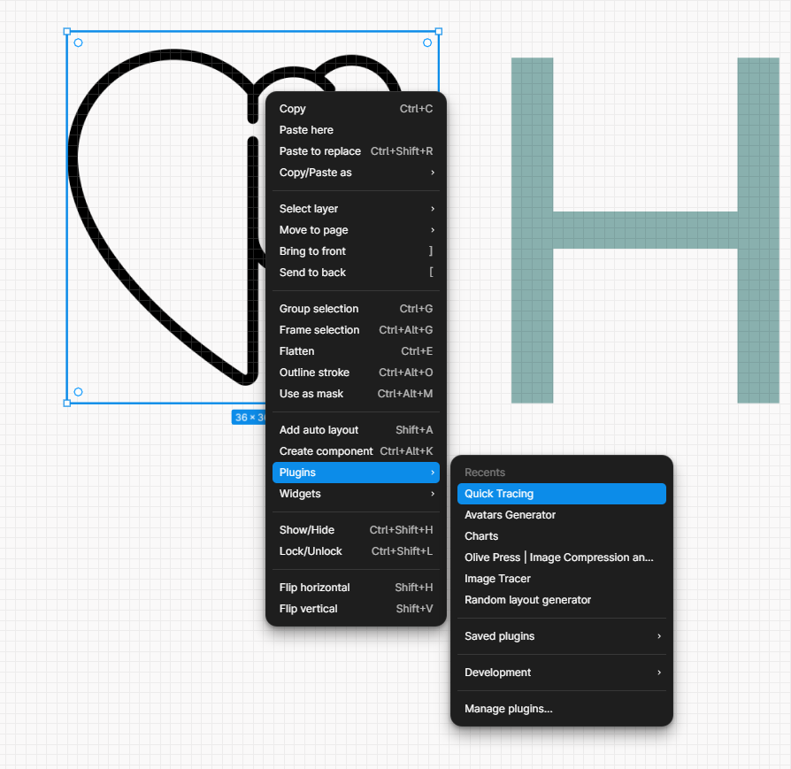
Since we are prototyping and not rushing to production, we need a simply PNG file for icons. Google search will bring up a lot of options you can trace, “black icon mental health heart.”
Simply click a square in figma, and ctrl+v paste.
This is why we created that square in tracing section, it outlines my sizing requirements.
Now, we have two buttons, logo. Things are cooking. Plus, custom icons. Always tell people it’s easy to change icons, this is just a prototype.
Many tracing apps can be found in the figma community. Great for icon tracing. This creates a vector trace of the heart/brain icon.
Once you trace the svg, you can color the file and it’s a vector rendering. I like changing the color to match the pallete.
Now, to finalize the visual. I use more guides but in the shape of a square this time. Find what works best for you.
Insert image into PowerBI
Woot, you’re here! You’re doing you’re own design based on a tracing.
I hope you’re proud of your drawing. If not, simply grab more ideas and trace until you’re satisfied.
Open Insert Tab, then click image. Navigate to the image you created in Figma. Group it and export it.
Start to play with dashboard sizing based on your image size.
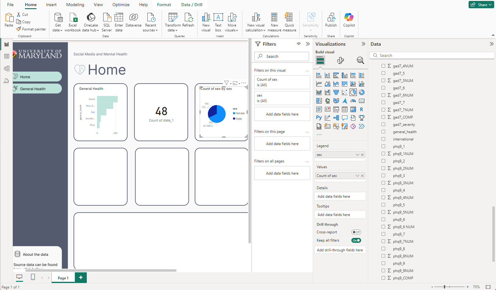
Adding your first charts on new style in PowerBI
Okay, so you’re adding your new traced design to PowerBI as an image. You fixed the canvas.
And you’re beginning to add charts.
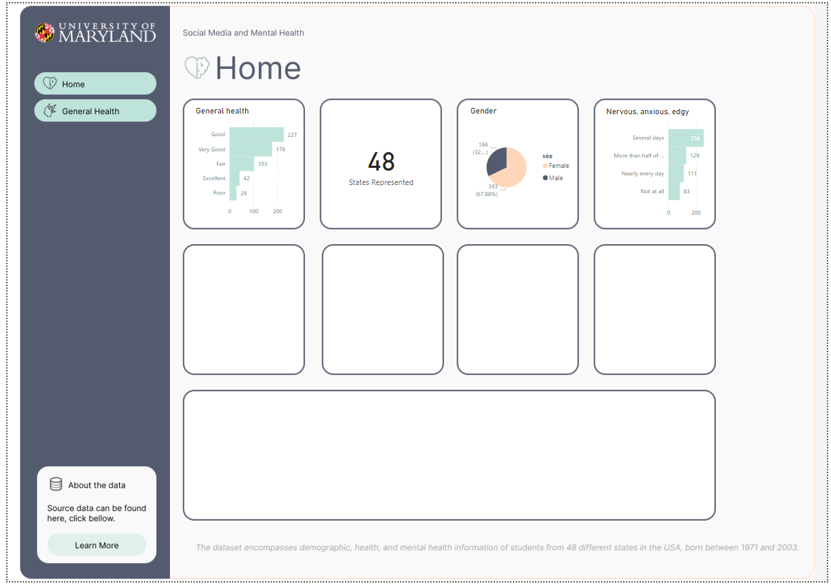
I’ve started with the easier charts, that feel very global. Like the amounts of states accounted for in the overall survey. The differences between gender, and the general health column popped to mind considering our button says General Health too. Even though it’s a place holder, perhaps we can go into detail about general health as a button too. Also, I like making actionable KPI to flow with buttons, so end users know if they click that bar chart, perhaps they will learn more about General health, and also the button General health will take them there too.
Scaling up on your new Traced PowerBI Design Template
Okay, people are going to ask you to change your PowerBI Design, for example pixels aren’t perfect, maybe 2 pixel boarder around charts isn’t great.
This is why I love having my dashboard design in Figma. Easy to edit. Copy and paste and start new styles.
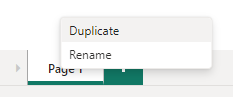
In powerbi, similar process, right click dashboard tab, and click duplicate to duplicate your dashboard.
Now, delete the background image, and add a new image. Should look like this if you’re still adding charts. As long as you don’t move boxes, you’re safe to simply add back the new image and it will fit perfectly.
This is a good sign, you’re not depending on a reporting platform to manage your design elements. You can slap this background into any reporting software.
Now, you have a duplicate tab in PowerBI, I went with nuerophism, a cool design technique that makes it feel like it’s popping off the screen because of the light and dark shadows. Do you notice the differences in the shadows?
Conclusion to Tracing designs with with Figma for PowerBI Desktop
While working with designers, often we are given screenshots of artwork, and tracing allows us to gain what we need to be successful.
I hope you enjoyed this tutorial on creating quick PowerBI products using Figma to trace.
Keep perfecting your craft and let us know if you need help with any dashboard designing services!
We will add more training like this in our articles here on dev3lop, stay tuned.
Although, we started as a Tableau Consulting Company, we have been navigating into more and more PowerBI the past few years.
Ready to break into the data industry? Use our comprehensive guide!
“Success is not final, failure is not fatal: It is the courage to continue that count.” – Winston Churchill.
If you don’t mind failure as a form of learning, you will love the data industry.
In today’s data-driven world, the demand for skilled professionals in the data industry is skyrocketing. Whether you’re a recent graduate or considering a career change, breaking into this field can open up exciting opportunities for growth and success. But where do you start? How do you navigate through the vast landscape of big data?
This blog post will guide you through the essential steps to enter the data industry and discover your path to success. We’ll explore different roles and responsibilities within this dynamic field, providing insights into what it takes to thrive in each role. By leveraging your skills and knowledge, you can position yourself as a valuable asset in an industry that offers endless possibilities.
So, if you’re ready to embark on an exhilarating journey into the data industry, buckle up and get ready for an insightful exploration of how you can break into this thriving field.
Critical Requirements for Success in Data Science
To break into the data industry and become a successful data scientist, there are several essential requirements that you should consider. These requirements will help you develop the necessary skills and knowledge to thrive in this exciting field.
Strong Analytical Skills
One of the most essential requirements for data science success is solid analytical skills. This means being able to interpret and analyze complex datasets effectively. As a data scientist, you will be working with large volumes of data, and it’s crucial to have the ability to identify patterns, trends, and insights within that data. This requires a keen eye for detail and the ability to think.
What is data science? Data science involves extracting, analyzing, researching, and interpreting meaningful insights from large and complex sets of structured and unstructured data. It encompasses various techniques, tools, and methodologies to gain valuable insights and inform decision-making processes, including statistics, machine learning, data visualization, and more.
Another essential requirement for aspiring data scientists is proficiency in programming languages like Python or R. These languages are used in the data science community for tasks such as data manipulation, analysis, and visualization. Being comfortable with programming allows you to work efficiently with large datasets and automate repetitive tasks.
Solid Foundation in Statistics and Mathematics
A solid foundation in statistics and mathematics provides a strong base for your work as a data scientist. Understanding statistical concepts such as probability distributions, hypothesis testing, and regression analysis is crucial for drawing meaningful conclusions from your data. A good grasp of mathematical analysis helps you develop algorithms and models to extract valuable insights from complex datasets.
Familiarity with Machine Learning Algorithms
Machine learning plays a significant role in modern-day data science. Familiarity with different machine learning algorithms is essential to excel in this field. Machine learning algorithms enable you to build predictive models to make accurate predictions based on historical patterns found within your dataset. By leveraging these algorithms, you can make more informed decisions based on data-driven insights.
It’s worth mentioning that while these requirements are crucial for success in data science, they are not set in stone. The beauty of this industry lies in its ever-evolving nature, with new tools, techniques, and technologies emerging. As a data scientist, you must be adaptable and willing to continuously learn and upskill yourself to stay ahead of the curve.
Developing Soft Skills and Learning Technical Skills
Developing a combination of soft and technical skills is essential and the fastest way to earn more money in the data industry. These two aspects work hand in hand to make you a successful data professional. Let’s explore how each skill plays a crucial role in your journey.
Communication Skills
Communication skills are vital for conveying insights from complex data analysis to non-technical stakeholders. As a data scientist, you’ll often find yourself working with teams from various departments who may not have a strong background in data analysis. Explaining your findings in plain language is critical to ensuring everyone understands and can act upon the information.
Improving communication skills involves distilling complex concepts into simple terms, using visual aids like charts or graphs, and listening to others’ perspectives. By honing these skills, you’ll become an effective communicator who can bridge the gap between technical jargon and practical applications.
Problem-Solving Abilities
Data scientists need problem-solving and solid abilities to tackle real-world challenges using innovative approaches. In data science, problems are straightforward and often require creative thinking to find solutions. A solid foundation in mathematics and statistics is essential for analyzing complex datasets and identifying patterns or trends.
Practice thinking about different scenarios and brainstorming multiple solutions to enhance your problem-solving abilities. Embrace challenges as opportunities for growth rather than obstacles, and don’t be afraid to experiment with new techniques or algorithms. The more you practice problem-solving, the better equipped you’ll be when faced with real-world data challenges.
Continuous Learning of Technical Skills
Data science evolves with emerging technologies such as artificial intelligence (AI) and machine learning (ML). Learning new technical skills is crucial to stay relevant in this rapidly changing industry.
Continuous learning involves staying up-to-date with the latest advancements in computer science, programming languages, and data analysis techniques. This can be achieved through courses, workshops, or conferences, reading industry publications, and participating in coding challenges or hackathons.
By embracing a lifelong learning mindset, you’ll expand your knowledge and demonstrate your commitment to staying current in the field.
Collaboration Skills
Data scientists work alone. They are often part of multidisciplinary teams that include individuals from different backgrounds, such as business, design, and engineering. Collaborating effectively with others is essential for bringing together diverse perspectives and expertise to solve complex problems.
Developing collaboration skills involves being open-minded, respectful of others’ opinions, and able to communicate within a team setting. Understanding each team member’s role and how their contributions fit the larger project goals is essential. By fostering a collaborative environment, you’ll create synergies that lead to more impactful data-driven solutions.
Joining Data Science Bootcamps and Online Courses
Enrolling in data science boot camps or online courses is a fantastic way to break into the data industry. These programs provide structured learning opportunities for aspiring data professionals like you. Let’s dive into why joining these boot camps and courses can benefit your career.
Structured Learning Opportunities
Data science boot camps and online courses offer a structured curriculum that guides you through the fundamentals of data analysis, machine learning, and programming languages such as Python and R. These programs break down complex concepts into bite-sized lessons, making it easier for beginners to grasp the material.
By following a structured learning path, you can build a strong foundation in data science without feeling overwhelmed. The courses are designed to gradually take you from beginner to advanced levels, ensuring you understand each concept before moving on to the next one.
Hands-On Experience with Real-World Datasets
One of the key advantages of joining data science boot camps or online courses is the opportunity to work with real-world datasets. These programs often provide hands-on projects where you can apply your newly acquired skills to analyze and interpret actual data.
Working on real-world datasets allows you to gain practical experience and develop problem-solving skills valued in the industry. You’ll learn to clean messy data, perform exploratory analysis, build predictive models, and communicate your findings effectively.
Networking Opportunities within Communities
Bootcamps and online courses create communities of like-minded individuals who share a passion for data science. By joining these communities through discussion forums or dedicated LinkedIn groups, you open yourself to valuable networking opportunities. The art of networking is essential and you must study it in the wild!
Networking within these communities can lead to connections with professionals already working in the field. They may offer guidance, mentorship, or job referrals when suitable positions become available. Building relationships with others who share your interests can inspire collaboration on future projects or research opportunities.
Career Support Services
Many data science boot camps provide additional career support services to help you transition into the industry. These services may include resume building, interview preparation, and job placement assistance. The boot camp’s instructors and career advisors can offer valuable insights and guidance tailored to the data industry.
By taking advantage of these resources, you can enhance your chances of landing a job in the data field. They can help you highlight your skills on your resume, prepare for technical interviews, and confidently navigate the job search process.
Roadmap to Breaking Into Data Analytics
Foundational Understanding of Databases, SQL, and Excel
Before diving into more advanced analytics techniques, gaining a foundational understanding of databases, SQL, and Excel is crucial. These skills form the backbone of data analytics and provide a solid base for further exploration.
Databases: Familiarize yourself with the basics of databases, which are structured systems for storing and organizing data. Understand concepts like tables, rows, and columns. This knowledge will help you navigate through datasets.
SQL: Learn Structured Query Language (SQL), a programming language for managing and manipulating data in relational databases. Proficiency in SQL allows you to extract valuable insights from large datasets by querying specific information.
Excel: Mastering Excel is essential as it is used for data analysis tasks. Learn how to organize data using spreadsheets, perform calculations, create charts and graphs, and apply functions to manipulate data.
Knowledge of Statistical Concepts
Acquiring statistical concepts is vital to making informed decisions based on data insights. Statistics provides the tools necessary to analyze and interpret data.
Descriptive Statistics: Understand statistics such as mean, median, mode, standard deviation, and variance. These measures summarize the essential characteristics of a dataset.
Probability Theory: Grasp the fundamentals of probability theory to understand the likelihood of certain events occurring. Probability theory plays a crucial role in making predictions based on available data.
Hypothesis Testing: Learn how to test hypotheses using statistical methods. Hypothesis testing helps determine whether observed differences or relationships between variables are statistically significant or due to chance.
Regression Analysis: Understand regression analysis techniques that allow you to explore relationships between variables and make predictions based on those relationships.
Programming Languages: Python or R
Learning programming languages like Python or R opens up opportunities for efficiently handling large datasets through automation. These languages are widely used in data analytics and offer potent libraries and tools for data analysis.
Python: Python is a versatile language known for its simplicity and readability. It has numerous libraries, such as Pandas and NumPy, that facilitate data manipulation, analysis, and visualization. Python’s popularity makes it an excellent choice for aspiring data analysts.
R: R is a programming language for statistical computing and graphics. It provides a wide range of packages tailored to data analysis tasks. R’s extensive library ecosystem makes it a preferred choice for statisticians and researchers.
Expertise in Data Visualization Tools
Effectively communicating insights to stakeholders is crucial in the field of data analytics. Developing expertise in data visualization tools helps convey complex information visually appealingly.
Tableau: Tableau is a popular data visualization tool that allows users to create interactive dashboards, charts, maps, and reports. With its drag-and-drop interface, Tableau simplifies the process of visualizing complex datasets.
Power BI: Power BI is another tool that enables users to transform raw data into interactive visualizations and business intelligence dashboards. Its integration with other Microsoft products suits organizations already using Microsoft technologies.
D3.js: D3.js (Data-Driven Documents) is a JavaScript library that provides advanced capabilities for creating custom visualizations on the web. It offers flexibility and control over every aspect of the visualization design.
By following this roadmap, you can break into the exciting world of data analytics. Gaining foundational knowledge of databases, SQL, Excel, and statistical concepts, learning programming languages like Python or R, and developing expertise in data visualization tools will equip you with the essential skills needed to excel as a data analyst.
Building a Strong Portfolio of Data Science Projects
In the competitive field of data science, having a solid portfolio of projects is essential to break into the industry. It showcases your skills and expertise and demonstrates your ability to apply data science techniques to real-world problems. Here are some key points to consider when building your data science project portfolio:
Creating a Diverse Portfolio of Data Science Projects
It’s important to include diverse projects that highlight different aspects of your skills and knowledge. This diversity can demonstrate your versatility as a data scientist and make you stand out from other candidates. Consider including projects that involve various domains such as finance, healthcare, or marketing.
Demonstrating Problem-Solving Abilities and Real-World Applications
To make your portfolio more impactful, focus on projects that showcase your problem-solving abilities and have practical applications in the real world. Employers are often interested in how you can use data science techniques to solve complex problems and drive meaningful insights. For example, you could develop a predictive model for customer churn in an e-commerce company or analyze social media sentiment for brand reputation management.
Sharing Projects on Platforms like GitHub or Kaggle
Once you have completed your projects, sharing them on platforms like GitHub or Kaggle is crucial. These platforms not only provide a space for showcasing your work but also allow for peer feedback and recognition within the data science community. By sharing your code and project documentation, you can receive valuable input from experienced data scientists and improve your work.
Continuous Updating and Expansion of Your Portfolio
Building a solid foundation is just the beginning; continuously updating and expanding your portfolio is essential. As you gain more experience and learn new techniques, consider adding new projects that reflect your growth in the field. This shows potential employers that you are committed to staying up-to-date with advancements in data science.
Leveraging Python for Data Science Projects
Python is a popular programming language in data science due to its versatility and extensive libraries. It offers a wide range of tools and frameworks that can be utilized for various data science projects. By showcasing your proficiency in Python, you demonstrate your ability to work with large datasets, perform statistical analysis, and develop machine learning models.
Researching Project Options and Exploring Different Domains
Take the time to research different options and explore various domains. This allows you to gain exposure to other data types and problem spaces. For example, you could work on a project related to image recognition using deep learning techniques or analyze financial data to predict stock market trends. The more diverse your project selection, the more your portfolio will be more well-rounded.
Mastering Data Visualization Tools for Success
Data visualization is a crucial skill in the data industry. It involves presenting complex information in a visual, understandable, and interpretable format. To break into the data industry, it is essential to master data visualization tools like Tableau or Power BI. These tools enable effective communication of complex insights through visual representations.
Proficiency in Data Visualization Tools
Becoming proficient in data visualization tools opens up possibilities for analyzing and presenting data. With these tools, you can create visually appealing charts, graphs, and interactive dashboards that bring your data to life. You can convey your findings and insights to stakeholders by mastering these tools.
Enhancing Clarity and Impact
Understanding design principles and best practices is critical to creating impactful visualizations. By applying design principles such as color theory, font selection, and layout optimization, you can enhance the clarity and impact of your visualizations. For example, using contrasting colors helps highlight important information, while choosing appropriate fonts ensures readability.
Interactive Dashboards for Engagement
One of the significant advantages of using data visualization tools like Tableau or Power BI is the ability to create interactive dashboards. These dashboards allow stakeholders to explore the data, fostering engagement and understanding. Users can filter, sort, and interact with different elements within the dashboard to gain deeper insights from the data.
Identifying Actionable Insights
Visualizing trends, patterns, and outliers is an excellent way to identify actionable insights from large datasets. By representing data visually, you can easily spot trends over time or identify patterns that might not be apparent when looking at raw numbers alone. For example, a line chart showing sales performance over time may reveal seasonal fluctuations or growth trends that inform business decisions.
Effective Communication of Insights
Data visualization tools provide an efficient means of communicating complex insights with various stakeholders. Visual representations make it easier for non-technical audiences to understand and digest information. Presenting data visually allows you to effectively communicate your findings and recommendations, leading to informed decision-making.
Bridging the Gap Between Data Analysis and Decision-Making
Data visualization tools bridge the gap between data analysis and decision-making. They allow analysts to transform raw data into meaningful visualizations that tell a story. These visualizations enable stakeholders to make informed decisions based on data-driven insights. Youu can become a valuable asset in any organization’s decision-making process.
Achieving Success in the Data Industry
Staying updated with industry trends, emerging technologies, and best practices is essential. By continuously expanding your knowledge and skills, you can position yourself for long-term success. Here are some strategies to help you on your journey:
Stay Updated with Industry Trends
The data science industry is ever-evolving, regularly introducing new tools, techniques, and methodologies. To stay ahead of the curve, make it a priority to keep up with the latest trends in the field. Follow reputable blogs and websites that provide insights into data science advancements. Engage in online communities, forums, or social media groups where professionals share their experiences and discuss emerging technologies.
Actively Participate in Knowledge Sharing
Active participation in online communities allows you to learn from others and provides networking opportunities. Engage in discussions about different aspects of data science and share your own experiences and knowledge. You can establish yourself as a respected community member by contributing valuable insights and solutions to common challenges data scientists face.
Continuous Professional Development
Attending conferences or workshops focused on data science is an excellent way to expand your skill set and stay updated on the latest advancements in the field. These events often feature presentations by industry experts who share their insights and practical applications of cutting-edge technologies. Networking at these events can open doors to job opportunities or collaborations with like-minded professionals.
Build Your Brand
Building a personal brand within the data science industry can enhance your career prospects. Consider starting a blog where you share your expertise on various topics related to data science. Writing articles that provide valuable insights or tutorials can establish you as an authority figure within the community.
Another way to build your brand is through speaking engagements at conferences or webinars. Sharing your knowledge with others helps solidify your expertise and increases your visibility among potential employers or clients.
Embrace Lifelong Learning
The journey to success in the data industry is an ongoing process of learning and growth. As technology continues to advance, it’s crucial to embrace lifelong learning. Seek out online courses or certifications that can enhance your skills in specific areas of data science. Expanding your knowledge and staying updated with the latest tools and techniques can make you a valuable asset to companies seeking skilled data scientists.
Critical Requirements for Success in the Data Industry
To break into the data industry and thrive, there are several vital requirements aspiring professionals should focus on. These requirements will help build a strong foundation and equip individuals with the necessary skills to excel in this high-demand field. Let’s explore these requirements in more detail.
Strong Foundation in Mathematics, Statistics, Computer Science, or Related Fields
A solid understanding of mathematics, statistics, computer science, or related fields is crucial for success in the data industry. These subjects form the backbone of data analysis and interpretation. Professionals with a strong foundation in these areas can effectively analyze complex datasets and draw meaningful insights from them.
Professionals with a background in mathematics can apply mathematical concepts such as calculus, linear algebra, and probability theory to solve real-world problems. Statistics provides the necessary tools and techniques for data analysis and hypothesis testing. Computer science skills enable individuals to handle large datasets using programming languages.
Proficiency in Programming Languages such as Python or R
Proficiency in programming languages like Python or R is essential for handling large datasets and building analytical models. These languages offer potent libraries and frameworks specifically designed for data analysis and machine learning.
Python is used due to its simplicity and versatility. It offers numerous libraries, such as Pandas and NumPy, that simplify data manipulation tasks. Python has gained popularity in machine learning due to libraries like Scikit-learn and TensorFlow.
R is another popular language among data professionals due to its extensive statistical capabilities. It provides various packages like dplyr and ggplot2 that facilitate data manipulation, visualization, and statistical modeling.
By mastering these programming languages, professionals can clean messy datasets, perform advanced analytics tasks, develop predictive models, and derive valuable insights from raw data.
Effective Communication Skills
In addition to technical expertise, practical communication skills are vital for success in the data industry. Professionals must clearly articulate complex findings to non-technical stakeholders within an organization. This involves translating technical jargon into simple and understandable terms.
Communicating effectively allows data professionals to bridge the gap between technical analysis and business decision-making. By compellingly presenting their findings, they can influence key stakeholders and drive data-driven strategies.
Adaptability to Evolving Technologies
The data field constantly evolves, with new technologies, tools, and techniques emerging regularly. To succeed in this dynamic industry, professionals must be adaptable and willing to keep up with these changes.
Adaptability ensures that professionals can stay ahead of the curve and leverage the latest advancements in data analytics. It involves continuously learning new skills, exploring emerging technologies, and embracing innovative approaches to problem-solving.
By staying adaptable, professionals can remain relevant and competitive in an ever-changing job market. They can also demonstrate their commitment to professional growth and development.
Networking and Industry Events for Career Advancement
Attending industry conferences, meetups, and networking events can be a game-changer. These opportunities provide a platform to connect with professionals already established in the field.
Building relationships with mentors or experienced data practitioners can offer valuable guidance and career advice. These seasoned professionals have been through the ups and downs of the industry and can provide insights that books or online courses cannot match. They can share their experiences, help you navigate challenges, and even introduce you to potential job opportunities.
Engaging in online communities or forums is another great way to expand your network and gain knowledge in the data industry. Platforms like LinkedIn groups or specialized data science forums allow for knowledge sharing, collaboration, and discussions on industry trends. By actively participating in these communities, you not only showcase your expertise but also have access to a vast pool of professionals who could potentially connect you with job openings or refer you to companies.
Participating in hackathons or data science competitions is an excellent way to demonstrate your skills to potential employers while expanding your professional network. These events often attract top talent from companies looking for skilled individuals who can solve real-world problems using data analysis techniques. By showcasing your abilities during these competitions, you gain recognition and catch the attention of recruiters scouting for new talent.
Networking at industry events may initially seem intimidating, especially if you’re starting or considering a career change. However, it’s important to remember that everyone attending these events shares a common interest: they are passionate about data! This shared passion creates an environment where people are generally open to meeting new faces, exchanging ideas, and helping each other grow professionally.
While attending networking events is crucial for making connections within the industry, it’s equally important to approach them with an open mind and genuine curiosity. Don’t just focus on finding job opportunities or promoting yourself; take the time to learn from others, ask questions, and listen actively. Youu can build meaningful relationships that may prove invaluable in your career journey.
To make the most out of networking events and industry conferences, it’s essential to come prepared. Research the event beforehand, familiarize yourself with the speakers or panelists, and identify individuals you want to connect with. Prepare thoughtful questions or talking points that can help initiate conversations and leave a lasting impression.
Background and Degrees for Success in the Data Industry
A solid educational background is crucial to break into the data industry. Employers often seek candidates with expertise in mathematics, statistics, computer science, engineering, or related fields. Let’s explore why earning a degree and pursuing advanced education can pave the way to success in this industry.
A foundation for entry-level positions
A bachelor’s degree provides the foundational knowledge necessary to secure entry-level positions in the data industry. This degree equips you with essential skills such as data analysis, programming languages, statistical modeling, and database management. With a solid understanding of these concepts, you’ll be well-prepared to tackle real-world challenges.
Enhanced career prospects with advanced degrees
While a bachelor’s degree can open doors to entry-level roles, pursuing advanced degrees like a master’s or Ph.D. can significantly enhance your career prospects. These higher levels of education offer specialized coursework that dives deeper into machine learning, data mining, predictive analytics, and big data processing. Youu demonstrate your commitment to continuous learning and professional growth. It also distinguishes you from other candidates by showcasing your expertise in specific data science or analytics areas.
Certifications validate expertise
In addition to formal degrees, certifications specific to data science or analytics are highly valued by employers. These certifications prove your specialized knowledge and skills within the field. They demonstrate your commitment to staying up-to-date with industry trends and technologies.
Certifications like Certified Data Scientist (CDS), SAS Certified Big Data Professional (SAS BDSP), or Google Cloud Certified – Professional Data Engineer validate your expertise and increase your marketability as a job candidate. They provide tangible evidence that you have acquired the skills and knowledge required for various roles within the data industry.
The pros of obtaining relevant degrees:
Increased job opportunities: A degree in mathematics, statistics, computer science, engineering, or a related field significantly expands your job prospects in the data industry.
Higher earning potential: With advanced degrees and certifications, you can command higher salaries due to your specialized skills and expertise.
Specialization opportunities: Advanced degrees allow you to specialize in niche areas within data science or analytics, making you an attractive candidate for highly sought-after positions.
The cons of obtaining relevant degrees:
Time commitment: Pursuing a degree requires significant time and effort. It may take several years to complete a bachelor’s degree and even longer for advanced degrees like master’s or Ph.D.
Financial investment: Obtaining a degree can be costly. Tuition fees, textbooks, and other expenses must be considered when pursuing higher education.
Conclusion: Achieving Success in the Data Industry
Congratulations on completing this comprehensive guide to breaking into the data industry!
By now, you should have a clear understanding of the critical requirements for success in data science, including developing both technical and soft skills, joining boot camps or online courses, building a solid portfolio, mastering data visualization tools, networking at industry events, and having the right background and degrees.
Now that you have armed yourself with this knowledge, it’s time to take action. Start by identifying which areas you must focus on most and create a roadmap for your journey into the data industry. Remember that success in this field is not just about qualifications; it’s about continuously learning and adapting to new technologies and trends. Embrace challenges as opportunities for growth, and never stop expanding your skill set.
FAQs
How long does it take to break into the data industry?
Breaking into the data industry can vary depending on your background and dedication. While some individuals may be able to transition within a few months through intensive programs like boot camps, others may take several years if they are pursuing traditional education routes or starting from scratch. It ultimately depends on your commitment level and how quickly you can acquire the necessary skills.
Do I need a degree in computer science or mathematics?
While a computer science or mathematics degree can be beneficial when breaking into the data industry, it is not always mandatory. Many successful professionals in this field come from diverse educational backgrounds. What matters most is acquiring relevant skills through self-study, online courses, boot camps, or practical experience.
How important is networking in the data industry?
Networking is crucial in advancing one’s career in the data industry. Building connections with professionals already in the field can open doors to job opportunities and provide valuable insights into industry trends. Attend conferences, join online communities, and actively engage with others in the data science community to expand your network.
What are some popular data visualization tools?
Some popular data visualization tools used in the industry include Tableau, Power BI, D3.js, and Python libraries such as Matplotlib and Seaborn. These tools allow you to create visually appealing and interactive representations of data, making it easier to communicate insights effectively.
How can I showcase my data science projects in a portfolio?
When showcasing your data science projects in a portfolio, highlight the problem you solved, the techniques you used, and the impact of your work. Include visualizations, code snippets, and explanations demonstrating your ability to analyze and derive insights from complex datasets. Ensure your portfolio is well-organized and visually appealing to make a strong impression on potential employers or clients.
Remember that breaking into the data industry requires continuous learning, perseverance, and adaptability. Stay curious, keep expanding your knowledge base, and embrace new challenges. Good luck on your journey!
Today, we would like to highlight the functionality of Date Buckets, which is how we like to think of it mentally, and others call it Period-over-Period Analysis within Tableau Desktop. Both periods are buckets of dates and work great with min(1) kpi dashboards and often used in our Tableau Consulting engagements.
This blog delves into a method for date calculations to be used as trailing periods of time, to gain access to quick change between two periods in Tableau. In other words; We are focusing on identifying the last two periods in your data source, and the end user supplies a value to increase those buckets based on a date part you pick.
This approach enhances the efficiency and clarity of your analytical processes with Tableau and is easy to re-use. There are many ways to write this calculation and this is one way to write the calculation.
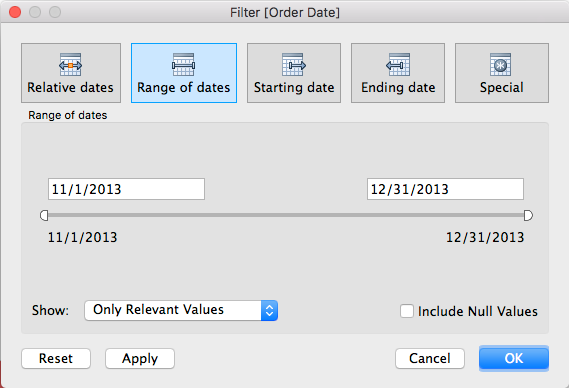
between dates filter
In Tableau this between date filter will create two calendar inputs, most executives don’t want to click anything.
It only takes 3 steps to build self generating, automated (not static set filters), date buckets in tableau desktop that trail with your max date in the date column [w].
lol, type this stuff or paste the code coming from this tutorial.
Below please find my quick win tutorial as a means of quickly winning… on any Tableau workbook with a date and a parameter.
We will be using the SuperStore Subset of data.
Which comes with every license of Tableau Desktop. In your data, you probably have a date. Use that date and follow along with these next two steps.
To begin, you need a date, and a parameter.
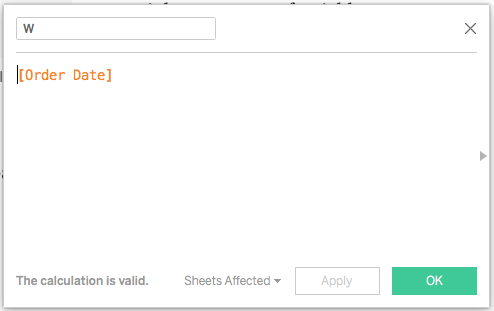
Step 1, make a date variable named W.
Create a new calculated field in tableau desktop, call it W.
make a simple variable W in place of your date. your date goes in this calculated field.
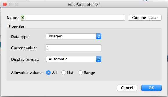
Now make the parameter.
Step 2, make a parameter variable named X. It’s an integer.
This will be the number of ‘X’ per period of analysis.
make a simple variable X in place of your parameter.
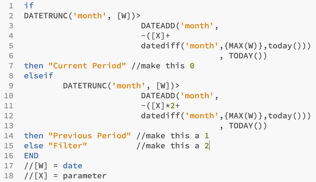
Paste the calculation below in any workbook with a Date and Parameter.
Above, if you followed along, you will not need to make any major changes to the calculation.
if
DATETRUNC('month', [W])>
                        DATEADD('month',
                        -([X]+
                        datediff('month',{MAX([W])},today()))
                                        , TODAY())
then "Current Period" //make this 0
elseif
  DATETRUNC('month', [W])>
                        DATEADD('month',
                        -([X]*2+
                        datediff('month',{MAX([W])},today()))
                                        , TODAY())
then "Previous Period" //make this a 1
else "Filter"          //make this a 2
END
//[W] = date
//[X] = parameter
Drag drop this on to the view, right click filter, filter filter…
Now, only two buckets of time are available. You’re welcome!
Automated period over period analysis in Tableau
You’ve just implemented automated date buckets in Tableau, allowing end-users to control visualizations using the bucket generator. Personally, I find the tool most effective when using it in a daily context rather than a monthly one. However, the monthly option provides a convenient way to encapsulate dates within distinct periods, while the daily granularity offers a simpler and more immediate view.
Having a rapid date divider or bucket automation at your disposal is highly advantageous. It empowers you to visually highlight disparities between two date periods or employ the calculations for logical flagging, subtracting values, and determining differences, all without relying on the software to construct these operations through window calculations.
Optimization date buckets or period over period in Tableau
Optimization #1: remove LOD calculations
Nothing against LOD calcs, except they are slow and built to help users who don’t know SQL.
{max(W)} seeks to find the max date, you can find it easier using a subquery in your select statement. If you don’t know what that means, ask your data architect supporting your environment to add the max(date) as a column, and have it be repeated per row too. They will know what to do or you need a new data architect.
Optimization #2: stop using % difference or difference table calculations
Nothing against table calculations, except they are slow and built to help users who don’t know SQL.
Optimization #3: change strings to integers.
Nothing against strings, except they are slow.
It’s likely not your fault that you’re using strings in 2018 with if statements, it’s probably because someone taught you who also did not know how to write optimized Tableau calculations.
Optimization #4: ‘month’ date part… add a swapper.
The Datetrunc is used to round the dates to the nearest relative date part, that’s just how I explain it easily.
Date part can be a parameter.
DATEPART(date_part, date, [start_of_week])
NO I Don’t mean the Function Datepart.
DATETRUNC(date_part, date, [start_of_week])
YES I Mean Date_part, which is scattered in the calculation and easy enough to replace with a parameter full of date_parts. Now end user can play a bit more.
Optimization #5: remove max(date), add an end date parameter…
Remove {max(date)} or the subquery of max(date) explained above because you can give your end user the opportunity to change the end date using parameter.