{/* Content imported from WordPress - review and enhance */}
Building dashboards in PowerBI quickly is important because decision makers are eager to start using these rocket ships we are creating. However, if you’re new to PowerBI that may be asking a lot! Tracing is helpful because it empowers us to quickly create a solution and design from scratch.
What is tracing? Drawing over lines on a superimposed piece of transparent paper, and with figma, you will be able to do this digitally speaking. Allowing you to trace over any designs to abstract your own.
Tracing dashboards is a good way to recreate something net new and offers a fast path for getting people talking about your dashboard designs.
In this article, you will learn to become a master of making powerful designs from scratch, and this will empower you to Create dashboards in PowerBI quickly. Here’s a lot of screenshots to show you what you’re going to be building and potentially a template you can copy and paste into your next PowerBI Design.
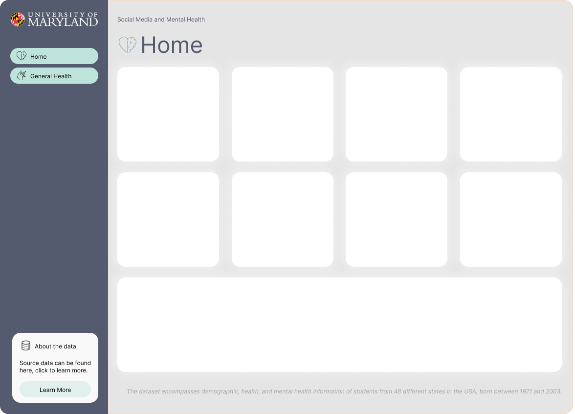
Create visual documentation for PowerBI Design
Here at DEV3LOPCOM, LLC, we passionately believe visual documentation improves project deadlines. Plus, allows for fast data product creation and we want to show you how we would create a dashboard from scratch without any direction on the style or design.
Figma works, but any app that allows tracing over an image will work, and in this blog we will show you how to create this template.
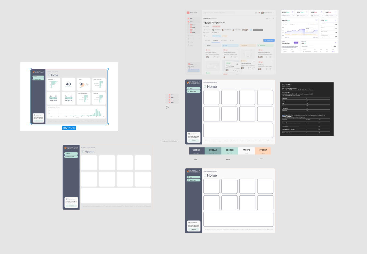
We show the steps to tracing the design, and adding it to PowerBI. This can help you operationalize your templates and improve your dashboarding speed across any dashboarding product.
About this PowerBI dashboard Data and our Goals
First, lets learn about the data and establish goals about our workload to keep us focused on an objective.
All data should have a brief description, otherwise it’s hard for others to collaborate with your data sources.
Using the following data about Social Media and Mental Health, was recently released by University of Maryland in July 2024.
Our goal is to quickly generate a dashboard to help others learn PowerBI. However we have thin requirements, it’s fun to pretend this is a real world software consulting engagement, and similar to a real world use case in a busy business environment, perhaps people are too busy to give us insights. We must research and learn on our own.
About data: The dataset encompasses demographic, health, and mental health information of students from 48 different states in the USA, born between 1971 and 2003.
How do I get my CSV Data into PowerBI?
Open your PowerBI software. You don’t need to buy anything, just go grab the software and get started with me.
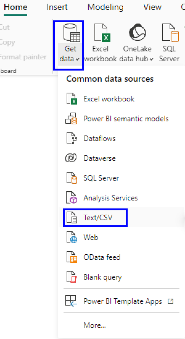
In the Home tab, click Get Data. Then select Text/CSV.
Once we have our CSV data open, you may notice we have weird Column headers that aren’t sensible to anyone on the dashboarding end.
This is typical in a lot of APIs, Data Warehouses, and Data Engineering in general is ripe of columns not being named correctly for each team. Luckily for us, PowerBI can change column names with great ease.
Finding Artwork to Trace Your Dashboard
First, we need to start with learning about “artwork.” When learning to draw, an art teach will ask you to trace something 100 times, and then by the 100th time you’ll be drawing it better.
Same with the internet, we often are reverse engineering each others design to improve our design. In this process we will find some artists we enjoy, choose one, and trace our dashboard on this design.
I like using Dribbble to find ideas and learn about modern approaches. It has a lot of really stylish content, and it’s easy to start here as a dashboarding guru.

I search for ‘modern dashboard style…
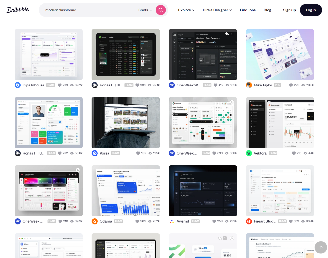
If working with a client, I will find 3 designs and then ask them to choose one. Then I’ll build everything around this template. I like using figma because it’s easy enough for people to dig into the weeds, and see they can access the design elements.
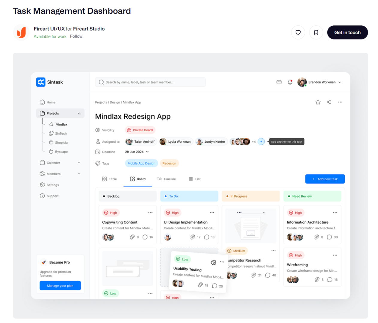
Pretend our client suggest the following design.
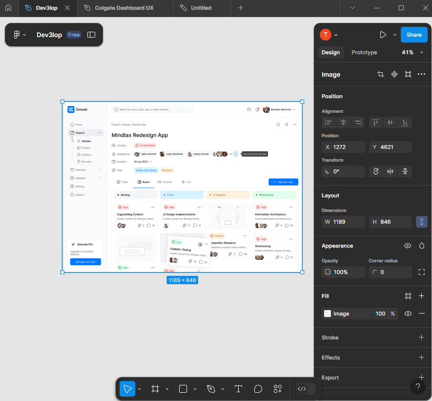
Okay, paste the dashboard we are asked to mimic into figma and lets start tracing.
You’ll notice as you do this you’ll start to create your own unique design to your dashboarding solution.
Start tracing design for PowerBI Dashboard
Cover the surface with a square.
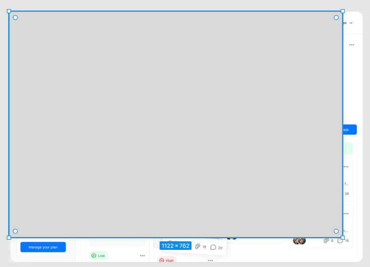
Once hidden completely, lets edit transparency hitting 5 on keyboard. This should adjust the transparency.
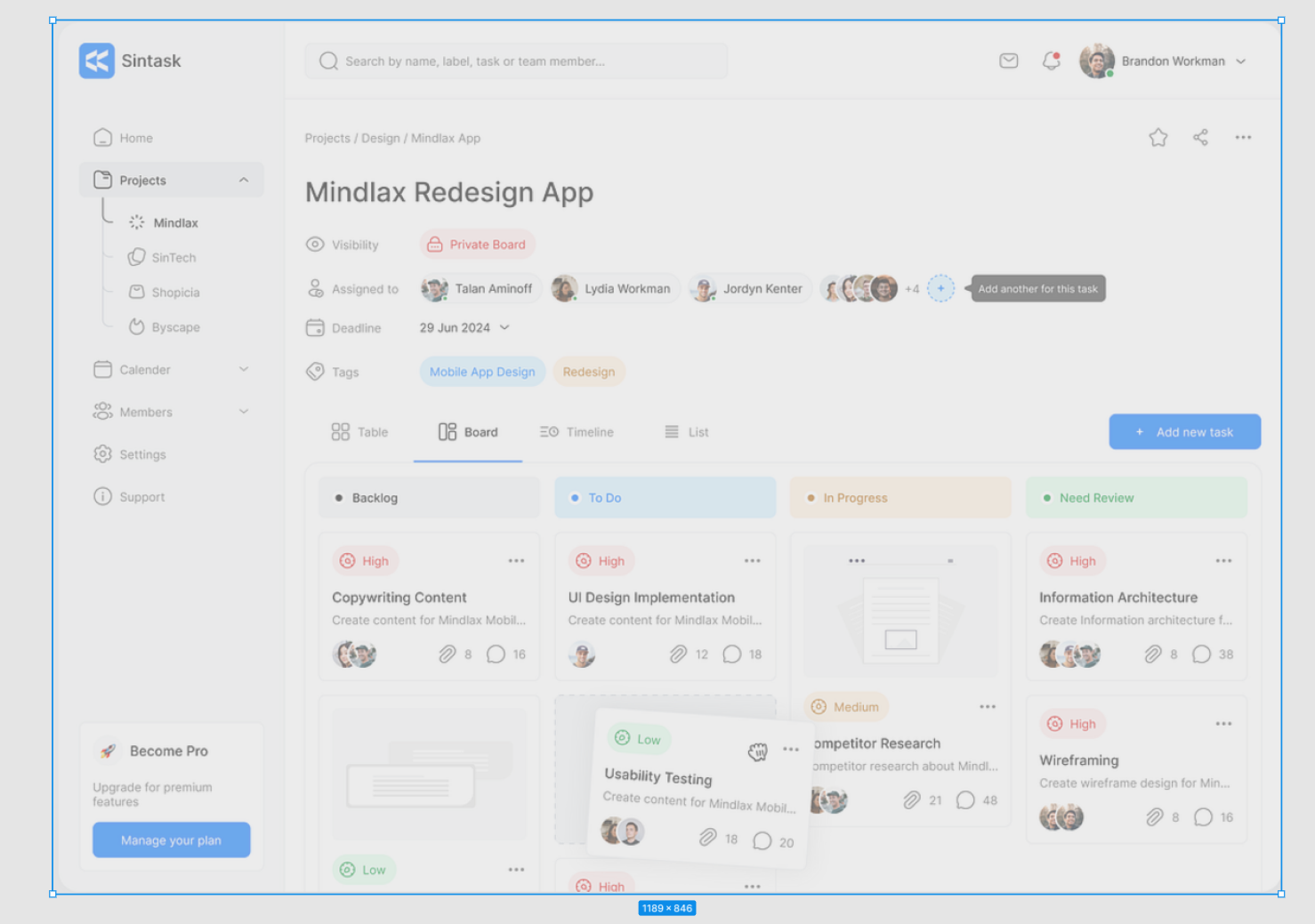
Okay, keep flowing. Next same thing for side menu. Trace it. But before we go, adjust the edges to be rounded.
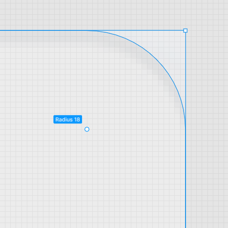
Easy enough in figma, grab little white ball and pull it down until it hits the line we are tracing. adjusting one side adjust all 4 sides.
Okay, hit the side menu.
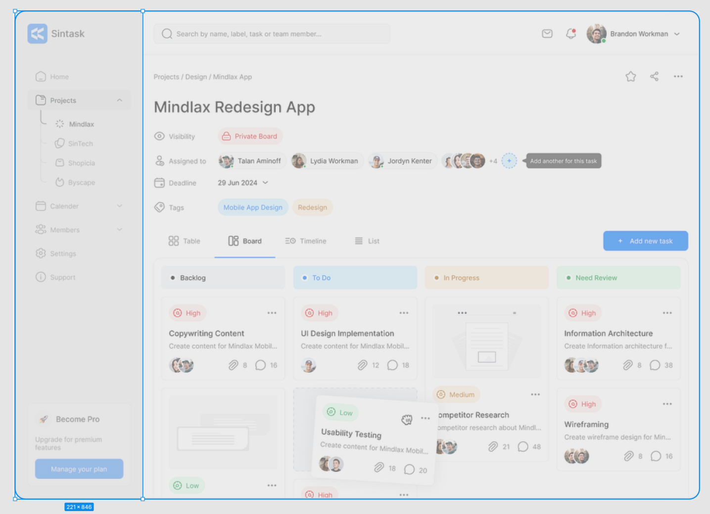
Next, TEXT overlays. And button overlay with squares.
I prefer starting with a highlighted button so i know the sizing, then replicate that size across. Alt drag and drop for similar copy paste of previous object.
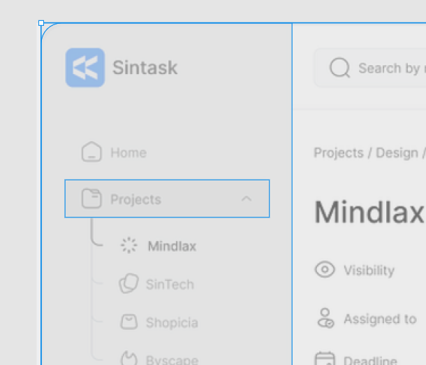
Working through buttons should be easy, let the software guide you to make it perfect too. Notice this has a 7 pixel gap.
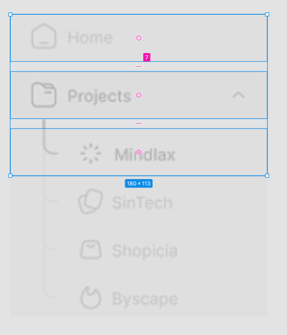
Skipping ahead…
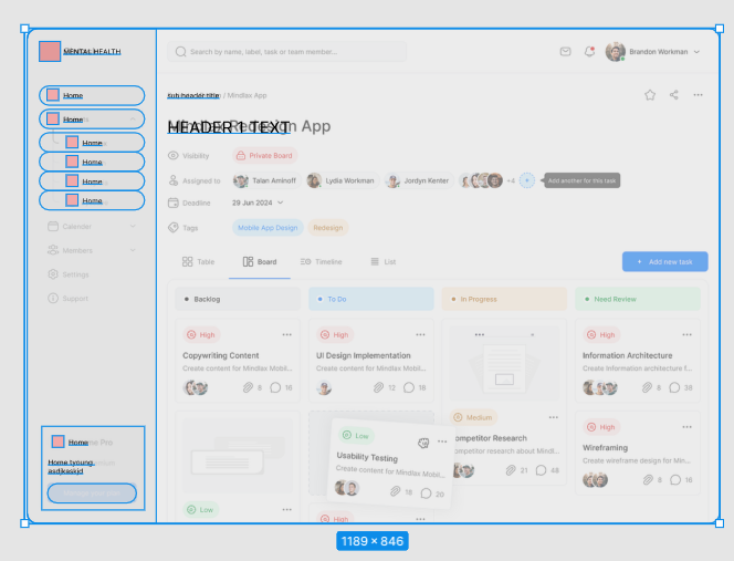
Now that we have this style, lets see what it looks like in PowerBI.
Adding your Figma design to PowerBI is simple. It’s a file.
Export the file to your computer.
Add image to PowerBI.
Resize dashboard so it fits cleanly.
Remove padding, this is my least favorite thing to have to do in Tableau and PowerBI. These apps automatically pad everything for some reason, haha.
Making decisions about our new Figma Style for PowerBI
In the beginning stages it’s about speed and repeatability. In more advanced dashboard development Figma saves a lot of time.
Next, lets duplicate our work area, and move the sub button navigation for today to the right side.
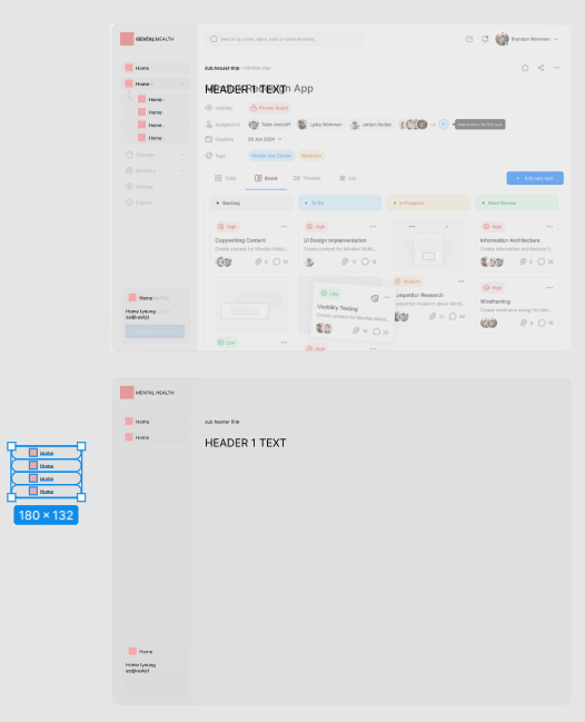
This is good enough for PowerBI. But before we leave just yet, lets dive into how we can improve the color pallet. I’m using coolors for an easy one.

Now, start to style your dashboard so that it’s appealing. Don’t spend too much time here because chances are the design will change, and you’re just trying to make it look decent. Use corporate colors so you’re following the “designers” pattern. They can send your a pdf file with the correct style guide, which improves this process, but today we are tracing and coming up with our own style guide.
As you’re applying color, start to focus on subtle details…
Improving PowerBI Dashboard with Logos, Style, and Strategy
Logos make dashboards pop. You know you can easily grab one, so grab the most recent logo. Don’t edit peoples logos, use what they supply online.
I’m choosing the source data logo, to help represent the source information because putting my logo here would not be a factual representation of the effort.
Now, notice what happens when I size it next to the buttons, depending on your screenshot and size of dashboard to be traced, in Figma, it’s subtle… Notice my sizing is subtly off and I can’t seem to make it exact, I generate black guide bars… aim to sync up for “perfect”… people will use your dashboard more often if it’s synced up.

In this example/screenshot I’m demonstrating how lining up this logo is a little more tedious than allowing figma to define things by snapping edges, I created black guide lines to help me follow a consistent flow from top to bottom. This is a kind of “hawk eye” or “pixel perfect” strategy I need you to deploy to create powerful dashboards in any reporting software or designed front-end!
Before we part, a few more subtle wins to consider as you perfect your traced design for PowerBI.
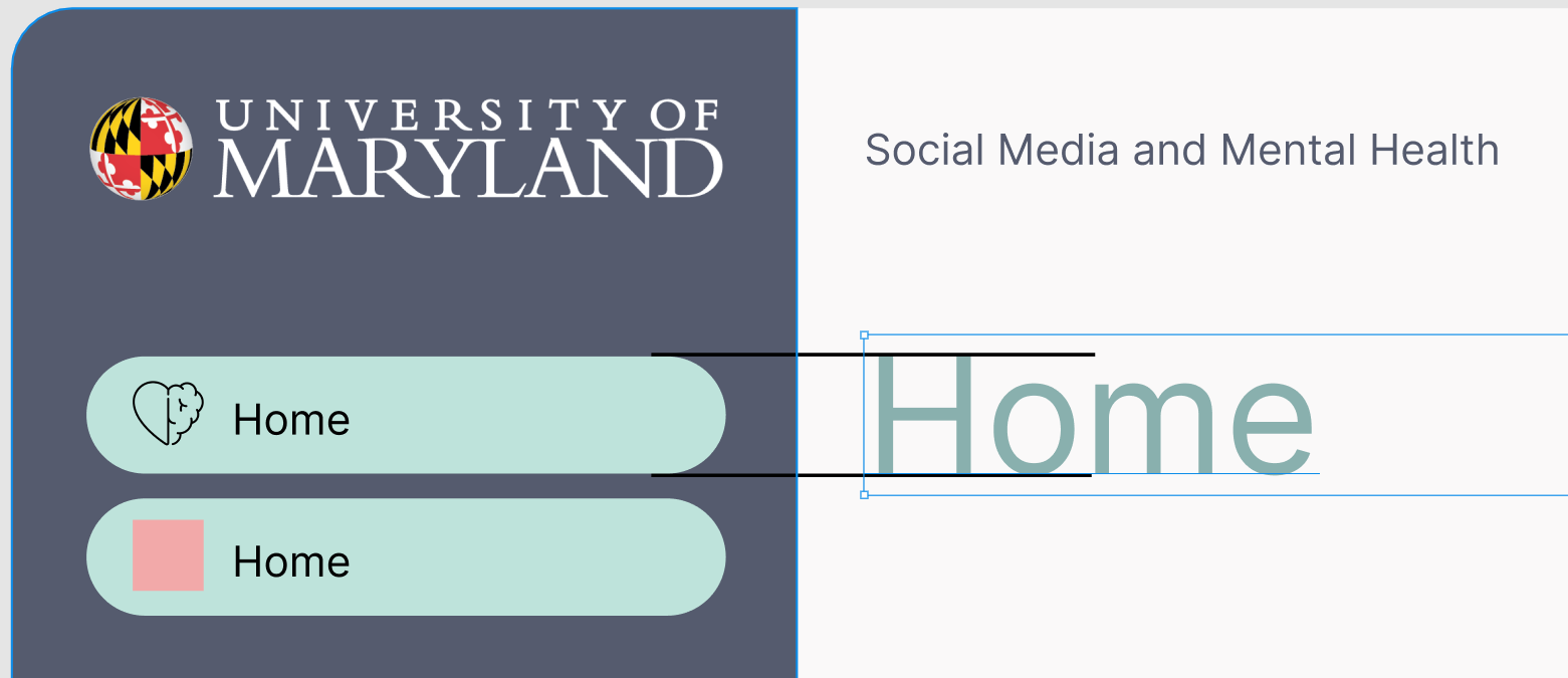
This will give a very nice clean view. In figma, click the red square, paste the image. Very easy process if you created the space for the icon. As you do this selection of icons, realize nothing is perfect, we are prototyping, get something in there because that’s the key, fast/repetitive!
Notice how we made some decisions that moved us away from the original design, this is called “making it your own.”
One more layer of decisions to clean it up.
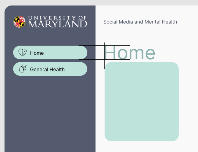
The strategy here is making things clean and lined up, using LINES to guide ourselves. Delete these guide lines once you’ve mastered this technique and keep duplicating to avoid having to do this process again…
Here’s my work station, notice I’m starting to document what goes inside of buttons, and the documentation is in the same screen. This helps with identifying where our hard work belongs.
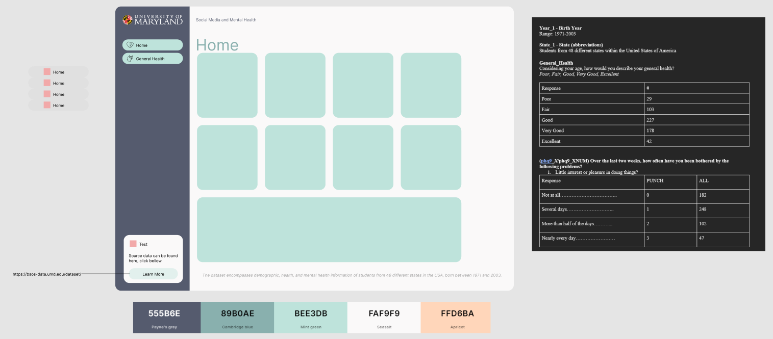
The header looks a little close to the first square, however a good starting point, we can optimize that later. The point of using guides/lines is the important part of this training.
Choosing cool icons for PowerBI Navigation
Since we are prototyping and not rushing to production, we need a simply PNG file for icons. Google search will bring up a lot of options you can trace, “black icon mental health heart.”

Simply click a square in figma, and ctrl+v paste.

This is why we created that square in tracing section, it outlines my sizing requirements.
Now, we have two buttons, logo. Things are cooking. Plus, custom icons. Always tell people it’s easy to change icons, this is just a prototype.
Many tracing apps can be found in the figma community. Great for icon tracing. This creates a vector trace of the heart/brain icon.
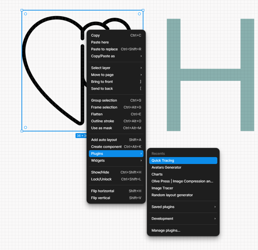
Once you trace the svg, you can color the file and it’s a vector rendering. I like changing the color to match the pallete.
Now, to finalize the visual. I use more guides but in the shape of a square this time. Find what works best for you.

Insert image into PowerBI
Woot, you’re here! You’re doing you’re own design based on a tracing.
I hope you’re proud of your drawing. If not, simply grab more ideas and trace until you’re satisfied.
Open Insert Tab, then click image. Navigate to the image you created in Figma. Group it and export it.

Start to play with dashboard sizing based on your image size.
Adding your first charts on new style in PowerBI
Okay, so you’re adding your new traced design to PowerBI as an image. You fixed the canvas.
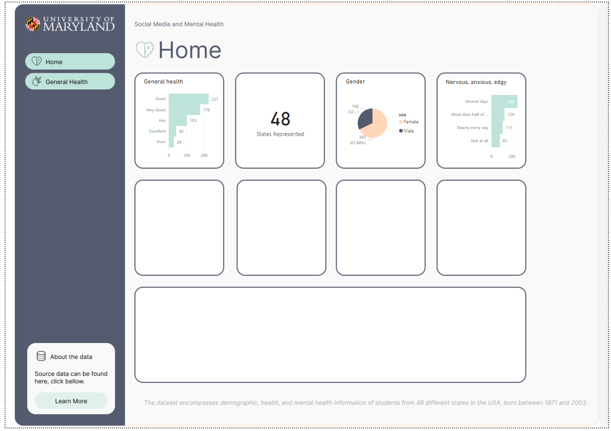
And you’re beginning to add charts.
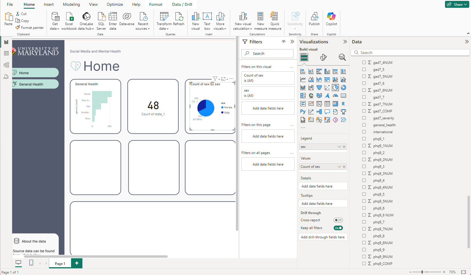
I’ve started with the easier charts, that feel very global. Like the amounts of states accounted for in the overall survey. The differences between gender, and the general health column popped to mind considering our button says General Health too. Even though it’s a place holder, perhaps we can go into detail about general health as a button too. Also, I like making actionable KPI to flow with buttons, so end users know if they click that bar chart, perhaps they will learn more about General health, and also the button General health will take them there too.
Scaling up on your new Traced PowerBI Design Template
Okay, people are going to ask you to change your PowerBI Design, for example pixels aren’t perfect, maybe 2 pixel boarder around charts isn’t great.
This is why I love having my dashboard design in Figma. Easy to edit. Copy and paste and start new styles.
In powerbi, similar process, right click dashboard tab, and click duplicate to duplicate your dashboard.

Now, delete the background image, and add a new image. Should look like this if you’re still adding charts. As long as you don’t move boxes, you’re safe to simply add back the new image and it will fit perfectly.
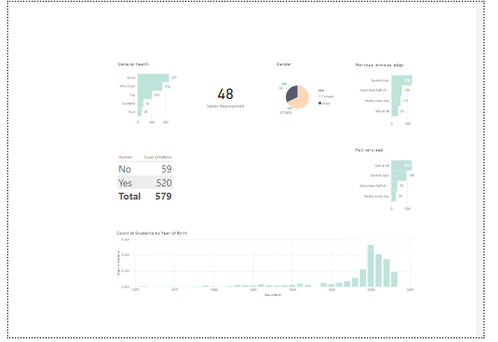
This is a good sign, you’re not depending on a reporting platform to manage your design elements. You can slap this background into any reporting software.
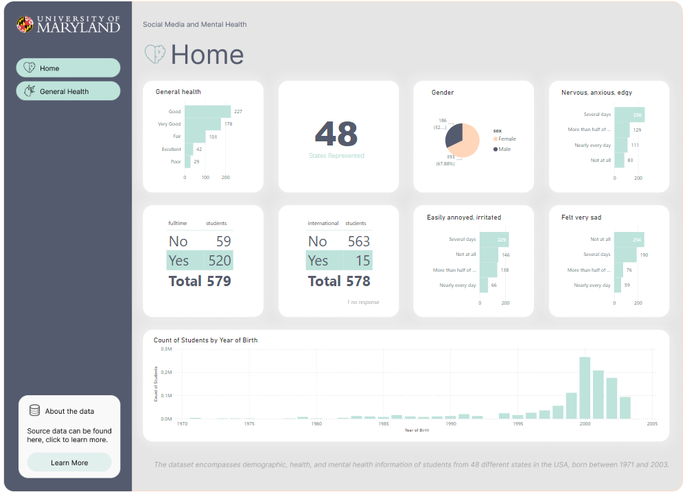
Now, you have a duplicate tab in PowerBI, I went with nuerophism, a cool design technique that makes it feel like it’s popping off the screen because of the light and dark shadows. Do you notice the differences in the shadows?
Conclusion to Tracing designs with with Figma for PowerBI Desktop
While working with designers, often we are given screenshots of artwork, and tracing allows us to gain what we need to be successful.
I hope you enjoyed this tutorial on creating quick PowerBI products using Figma to trace.
Keep perfecting your craft and let us know if you need help with any dashboard designing services!
We will add more training like this in our articles here on dev3lop, stay tuned.
Although, we started as a Tableau Consulting Company, we have been navigating into more and more PowerBI the past few years.