{/* Content imported from WordPress - review and enhance */}
Today’s blog is about the min(1) paradigm for KPI charting in Tableau desktop and how to make advanced KPI charts without needing slow table calculations to do the computations for you. Instead, we will show you how to utilize Tableau features to generate a better KPI solution. Welcome to learning how to create a min(1) KPI dashboard. And if you’re breaking into the data industry, this is a good tutorial for you and advanced gurus.
At times, developers think they need to generate many visualizations to move forward and float them in a specific way to create a dashboard; however, as data sizes increase, enterprises find these dashboards inefficient. To begin unlocking the power of data, we first must master the software!
What’s happening with KPI Dashboards in Tableau?
Making a lot of visualizations to generate a KPI chart is not the correct answer because it will slow down your Tableau Workbook! Instead, we have discovered decreasing the amount of visualization is the best path to optimization and easier cycles of support or additional features. The lack of visualizations means you can do more within the same workspace and keep track of less because it is consolidated into one chart.
A lot of charts means making a lot of data extract requests, a lot of live data requests, a lot of file data requests, a lot of tooltips, and a lot of filters,… Filters do a lot of performance degradation, also known as damaging the user experience due to generating technology inefficiently.
If you have ever been where end users need a faster dashboard, and the KPI dashboard is moving slowly, you have found a great wiki on building KPI charts in Tableau.
Learning how to make optimized Tableau KPI Dashboards is a path to building an operationalized Tableau solution you can utilize with any data source in the future; when you’re done building this one time, you can easily copy and paste this Tableau win into more workbooks.
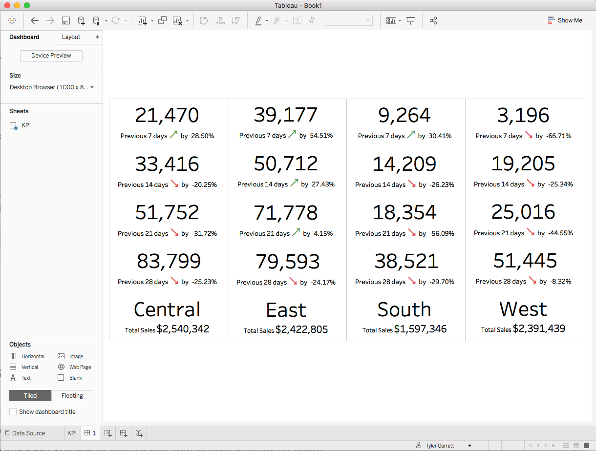 This is a screenshot of many KPI charts on one visualization; pause here to see how this is possible.
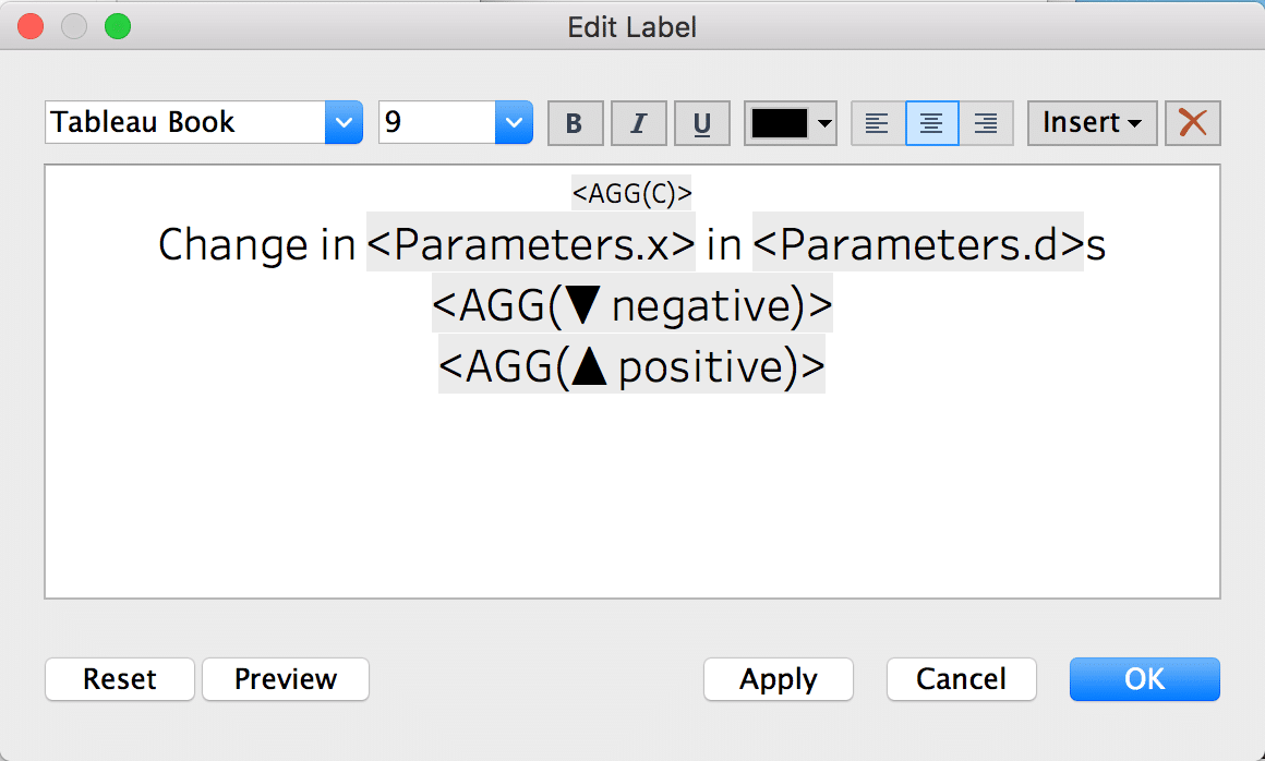
What is the minimum value of 1? (min(1))
What is the minimum value of 1? What is X when computing min(1)=x?
One.
Finding the minimum of 1 isn’t rocket science. However, we must understand this logic to maximize the product’s functionality. Also, did you know min(1) is faster than max(1) or attr(1)?
You can “fix” a value behind the scenes to a static value, which keeps the axis from moving, giving you a conditional background to edit with the color marks card. The text marks card is now available to build conditional text or colors on text or text images.
The number Of Records or the value of 1 in a calculation will handle the generation of your KPI chart.
By the end of the Tableau min1 kpi charts article…
You will know how to make a KPI chart without creating multiple visualizations per user request.
You will know how to keep it simple and easy to support
You will understand what we are doing, why it works, and how to build it
You will have code to copy and paste and screenshots to follow along
Developing a good understanding of how to keep Tableau simple will eliminate the unnecessary bloat and server strain. By removing unoptimized development, you’re removing a wait time per interaction on your development. Most environments will not be happy with less than split second or second response times; it’s intuitive to understand how to improve the speeds of your workbooks without having to rearchitect the data.
“I recommend as data grows, you begin adding relational theory to your data pipeline, ask your data engineers to work through the atomic pieces of your data, bring the data to a 1nf, 2nf, or 3nf state until the data moves faster or vastly decreases in data sizes. It’s not unusual to aggregate second data into monthly data if your end users only need monthly data.”
Tyler Garret, Founder of Dev3lopcom, llc
Please keep it simple when crafting your tableau dashboards; the more simple the development, the easier it will be to maintain solutions in the future.
Using Min(1) offers an easy way to learn the product. However, you need to know the product!
Learning the min(1) solution from end to end will change how you solve problems.
“I gravitated to the min(1) solution because it offers a simple playing field for edits, support isn’t a nightmare, and it’s easy to conditionally color. Mostly, I enjoy that my complexities turn into calculations, the calculations I can either duplicate or copy paste back into the workbook, understanding the difference between these two or whether they nest into each other based on these single click is a large difference when generating calculations that need to be connected or not connected. Before getting too far in this tutorial, I recommend you understand the differences between duplicating the calculations and copying the calculations, and also understand the product has two spaces this becomes a negative development path or positive development path. The two places are calculations and dashboards/visualizations. Test the right click copy and duplicate as you evolve because it will define your speeds in the product for a long time.”
Tyler Garrett, Founder of Dev3lopcom, llc
Begin building your first min1 KPI bar chart.
Thanks for taking the time to start this min1 kpi bar chart tutorial. If you have any questions or get lost in the tutorial, please contact us or leave a comment. Happy to help.
To begin, start your tableau product!
Open a new visualization and build a min(1) bar chart.
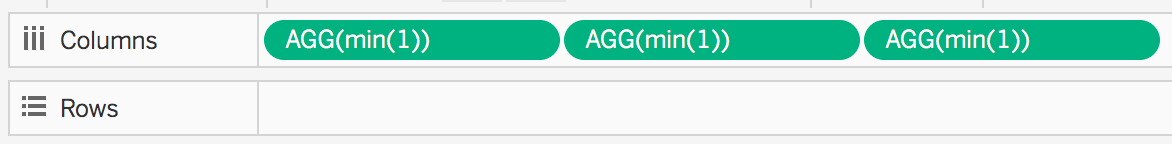
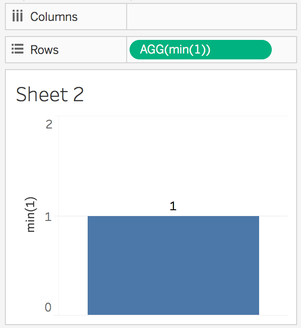 a simple bar chart, min1 generates an axis length of 1
Okay, min(1), always 1. Build it.
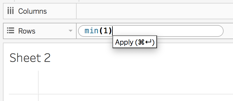
Start typing min(1) - hit ENTER!
 min(1) on sheet2
Not sure how I’m typing in this area? Double-click in the rows or columns below your marks card. First, double-click, and then you will see an input appear. If you want to harden these and not have them become “viz only static calls,” you can drag them into the workbook. I like this method because it’s all upfront, it names the calculations the name of the code, and it makes life relatively fast compared to not understanding this functionality and always building calculations, which leads to always needing to find those calculations, open those calculations, and edit those calculations. Also, when you need to delete the calculation, it takes longer because you have to see it in the workbook, and it’s not sitting in the rows bucket because you made a calculation. Based on this paragraph, you should better understand options and even the best path for you; it depends on what’s fast for you.
In short, let’s walk through these features.
**Pro TIP: **Tableau desktop offers a quick and easy user experience when adding content to the visualization or SHEET.
In a couple of places, you can double-click and type—rows, Columns, and here… on the bottom of the marks card.
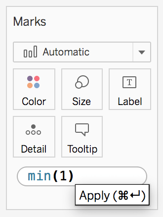 Marks card is free to double-click below the squares. Then, you move it to the mark square of your preference.
Making a KPI Chart in Tableau using Min(1)
You have your min(1) bar established.
Make 3, hold ctrl+mouse1, and drag and drop to duplicate min1 across columns three times. Command+mouse1 click drag and drop for macOS.
Open up the axis on each and change the Fixed end to 1. Zero to One will be the end goal.
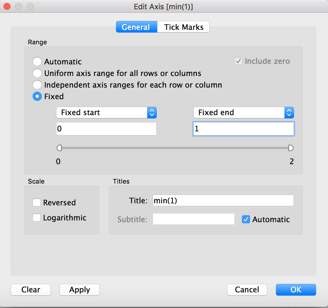
Click okay, and your simple min(1) mark will cover the entire pane.
Complete the following two similarly. You’re changing the value of the axis so that you can build a background on your KPI. This background is now easy to color conditionally. If you do a dual axis and make it a shape, now you have a background that can be conditionally colored and a shape that can be conditionally colored or changed. Welcome to a world of “smart KPI building” and the removal of all the strange multi-chart dashboards created due to not knowing these solutions.
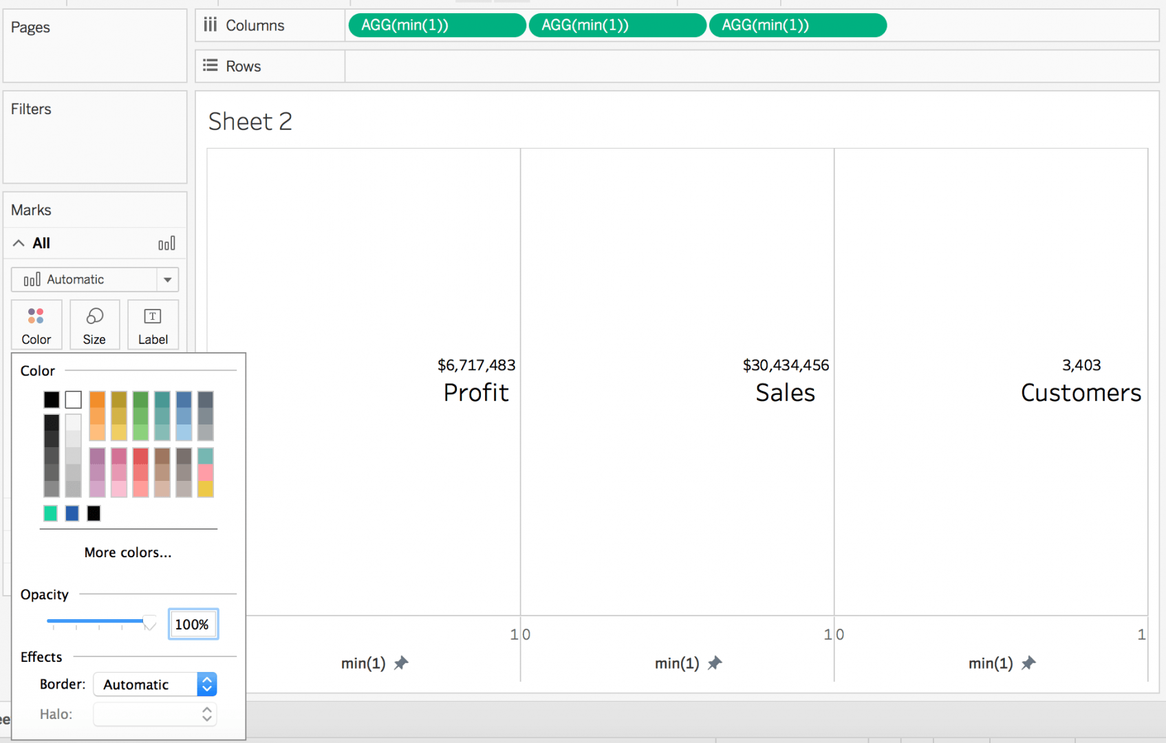
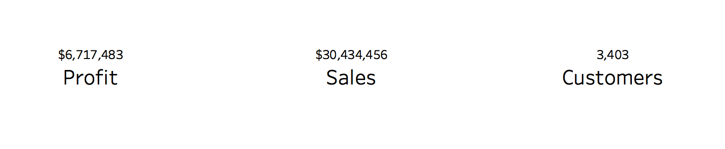
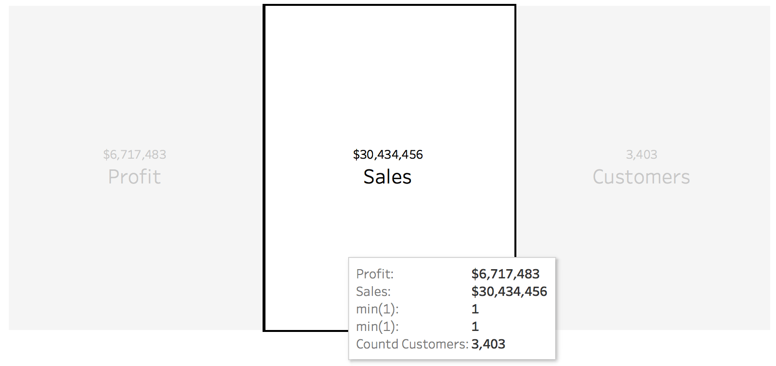
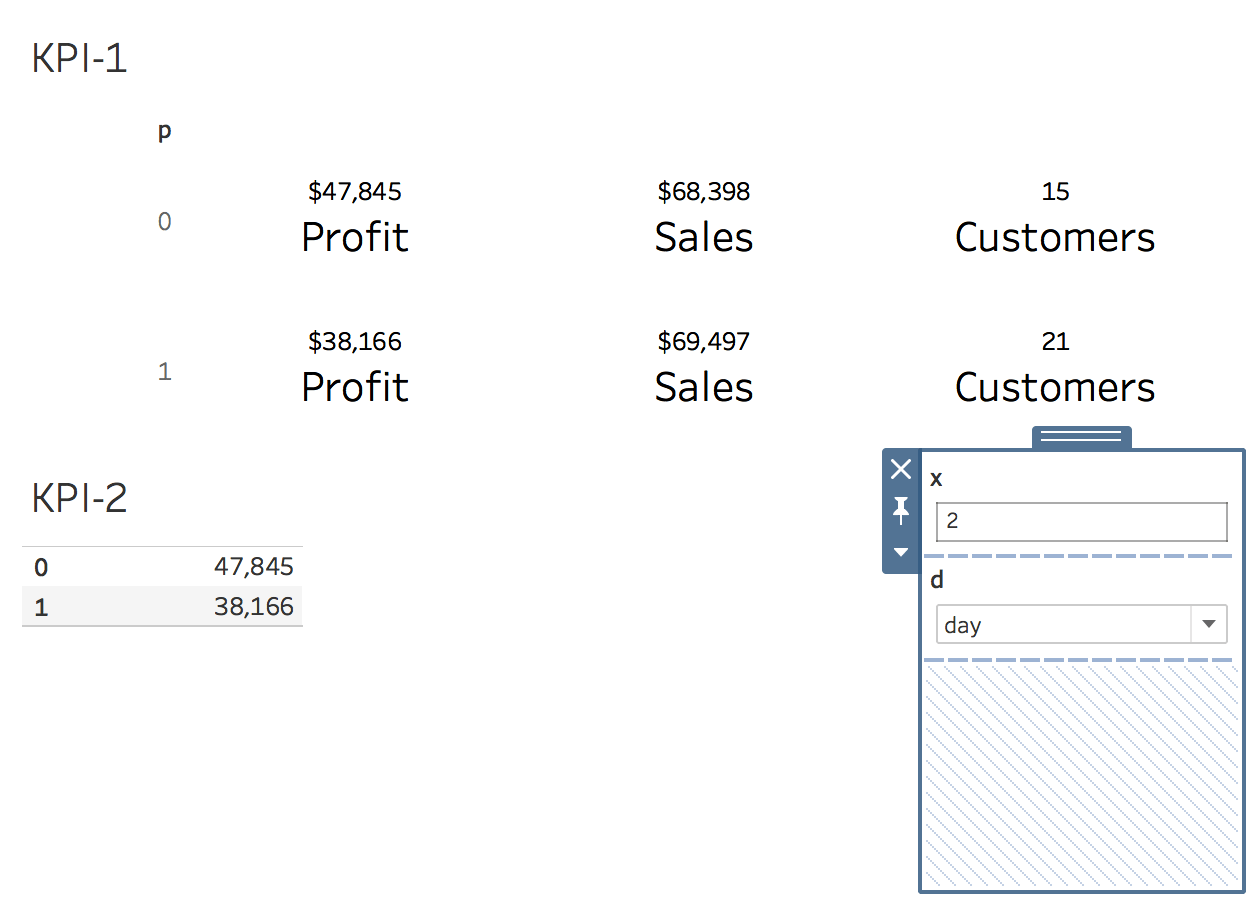
Once completed, let’s add profit, sales, and a count of customers on the last KPI Chart.
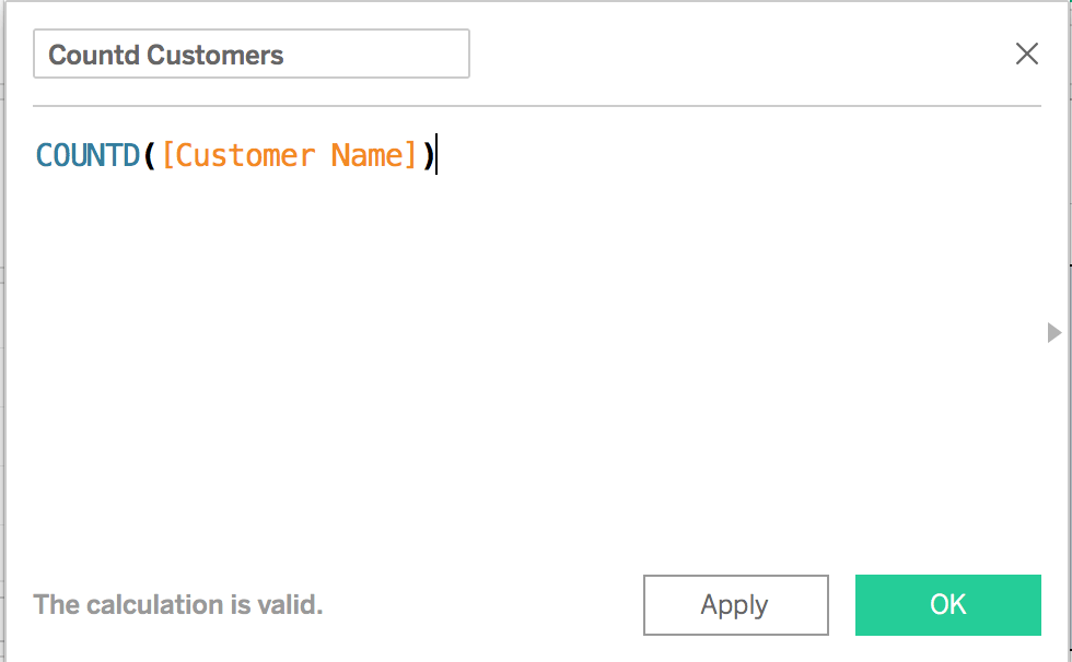
Drag profit on your first minute (1) and sales on your second minute (1), and generate a calculated field for the final customer name count. I want to see the distinct count of customer names to understand the count of customers doing X.
Once you have these measure values on your KPI charts, you should start to see everything forming, and you can see we have some formatting ahead of us now.
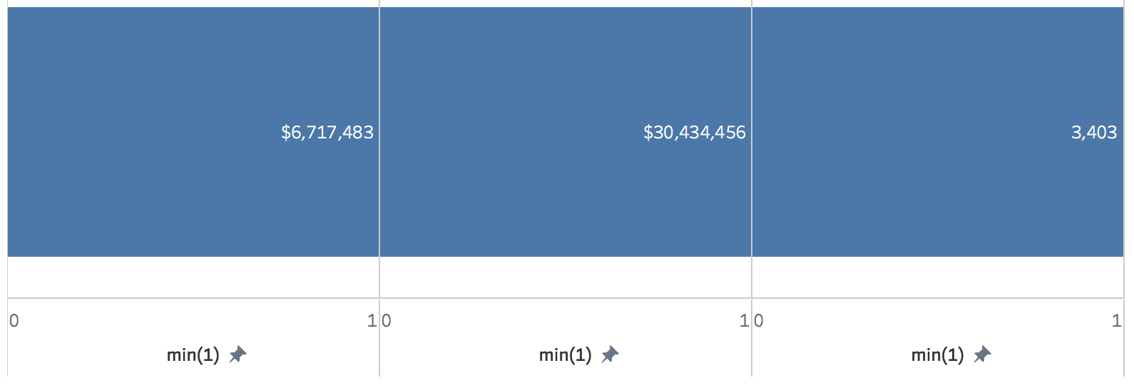
Of course, profit is on the far left, and sales are in the middle, but when you open this solution again, you will not understand what we are offering the end users. To provide this solution to the end users, we need to make it sensible.
I am making the KPI Chart sensible.
Often, KPI charts come with an explanation, so don’t forget to explain what the number or chart means.
Also, pretend your end users are not super technical and can’t read minds.
Please do your best to help people make quick decisions; let’s fill in the blanks with sensible labels!
Click on any of the three to open the correct mark card.
The following steps are self-explanatory: filling in the rest of the labels, making the font subtly bigger, or a **bold **KPI chart will work for some people.
Think SMART in these steps. Don’t spend 5 hours making a KPI chart look a certain way. Don’t spend 10 hours making tooltips look cool. Ask end users for feedback before wasting time.
Open the ALL marks card and change the color to white.
Cleaning up your KPI charts
Cleaning up the KPI chart is about “simple clicks,” not “hard clicks.”
Hiding headers may hide a label, so let’s discuss.
Hiding headers may help remove the axis, but it may also release your axis’s title.
Some charts work great with the axis as the label; other times, it’s more complex. Feel free to play with different labeling methods.
I prefer labeling in the text pad editor, per marks card because it offers an endless amount of options. I enjoy formatting each marks card globally with the sheet formatting tools OR twiddle around with the mark level edits. Depends on what the end goals, which I enjoy designing on paper or whiteboard before I begin. Drawing pictures and steps is my method of visually seeing the algorithm.
by tyler garrett
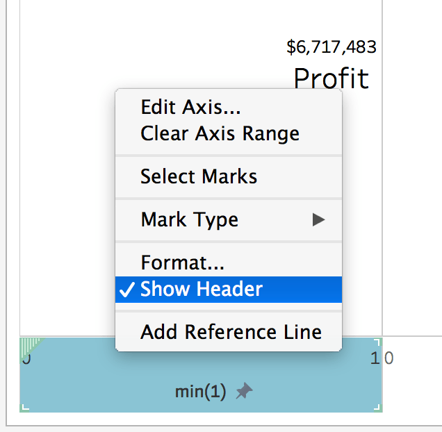
Hide headers with a right click on the axis, and uncheck the show header.
Center the text on the “all marks” card because it will update across all marks cards! Work cleverly, not hard!
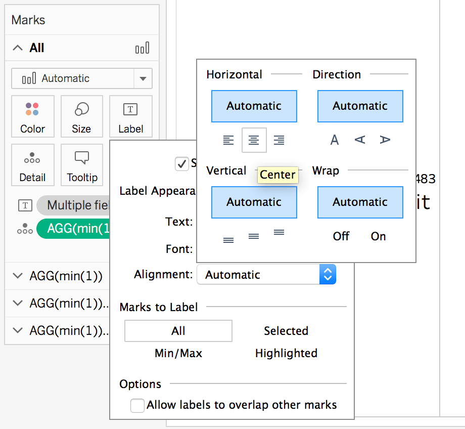
With text aligning in the middle, our KPI chart is starting to form.
These are personal preference changes; let your end users decide.
The key to utilizing the min(1) is the ability to augment Tableau to a style that fits your formatting needs. KPI charts have many variations; this particular one gives you complete flexibility to a text editor, which provides you with as much flexibility as you can write a calculation. The text can be conditionally colored based on logic, as can the box or min(1) bar in the background.
I prefer the min(1) bar versus a “square mark” sized large because a min(1) bar is predictable and fixable within editing the axis. As you need two marks colored in 1 mark card space, you can use a dual axis or conditionally color the text.
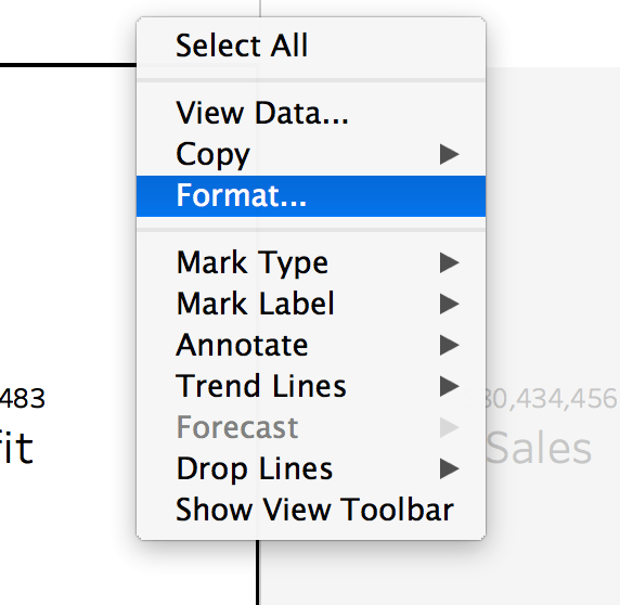
Right-click what you want to format in Tableau Desktop.
Right-click what you want to format is what I ask people to repeat when I teach them Tableau desktop, “right-click what you want to format.”
Today, we right-click the chart. Because… “we right-click what we want to format in Tableau!”
We drive to the “lines” because those are pesky, and someone in a meeting will likely ask you to remove the borders!
Boarders, dividers, tomatoes, potatoes, try and HIDE these and see if it’s the right path. It’s easy to get frustrated finding the right edit; I’m not saying I haven’t gone mad and turned everything off only to find the bar chart had borders turned on.
Sometimes, digging around these formatting menus is more accessible than telling someone the right buttons to hit because no one will memorize all these clicks. You will get better as you use Tableau more; keep clicking!
Open these, click none. Yay!
Notice we almost have it complete. We are still showing the zero line. Boo!

Removing the zero line seems like it gets most of it
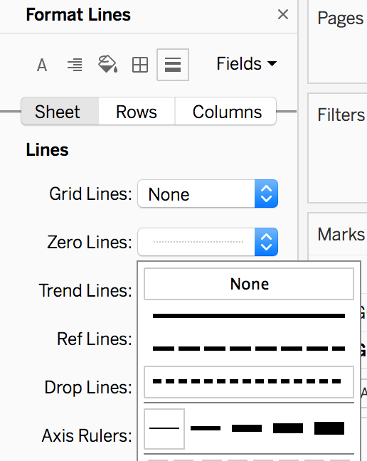
Instead of wasting your time, double-check a few more things… zero line, axis ruler, maybe your min(1) has a border around the bar?
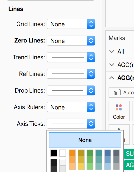
Axis ticks, zero lines, and grid lines.
Tired of clicking yet?!
Luckily, in the end, you’re developing your way into a tool that allows anyone to filter this sheet and give them blimp view aggregates! You might as well never build this again; you can swap out measures easily or make a three by 3 with a simple duplication of your sheet.
 Omg, KPI charts without borders.
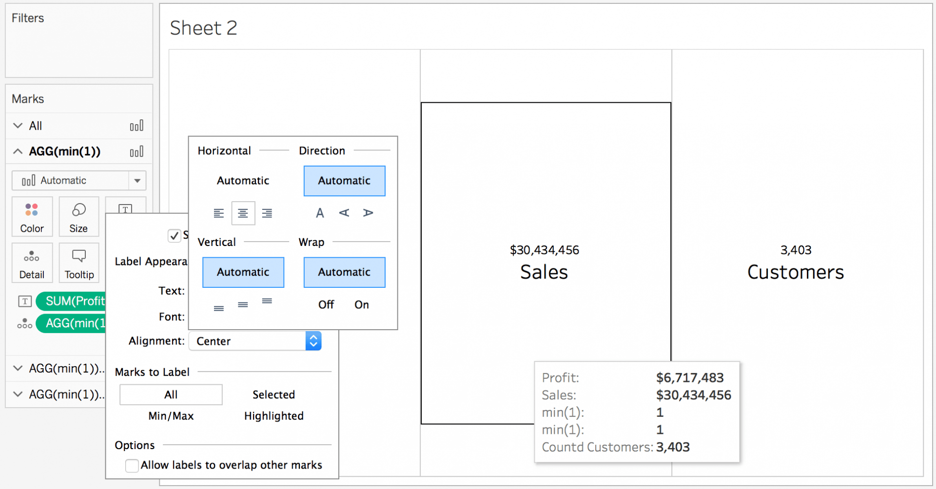
You now have three aggregated measures and a bar to color + tooltips conditionally.
Okay, we have simple KPI charts down. Let’s look at more advanced functionality and how to do it with copy-paste calculations!
Dynamic KPI charting in Tableau, building an on/off flag using dates and parameters.
Duplicate your sheet, and let’s begin our Dynamic KPI charting in Tableau! If you don’t already know, we are using the super store sample set of data that comes default with every installation of Tableau.
Building these dynamic charts or KPI charts is easy if you understand the min(1) steps we explained above and are excited about making on/off flags.
Also, if you’re learning, be willing to start thinking outside of the bucket! We will use that code to deep dive here and make our KPI chart more flexible and user-friendly.
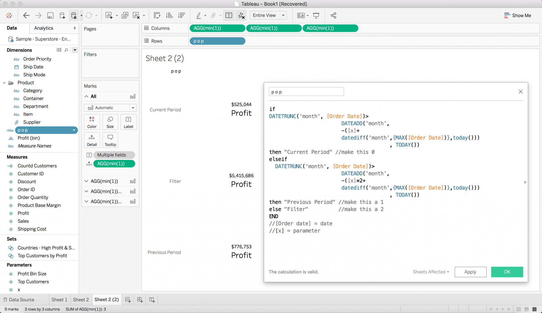
We steal the code from our data buckets to generate three different buckets of data.
if DATETRUNC(‘month’, )> DATEADD(‘month’, -(+ datediff(‘month’,{MAX()},today())) , TODAY()) then “Current Period” //make this 0 elseif
DATETRUNC(‘month’, )> DATEADD(‘month’, -(*2+ datediff(‘month’,{MAX()},today())) , TODAY()) then “Previous Period” //make this a 1 else “Filter” //make this a 2 END // = date // = parameter For supplemental reading, check out the period-over-period in Tableau.
With this new code implemented, you will only need one parameter to begin seeing period-over-period data.
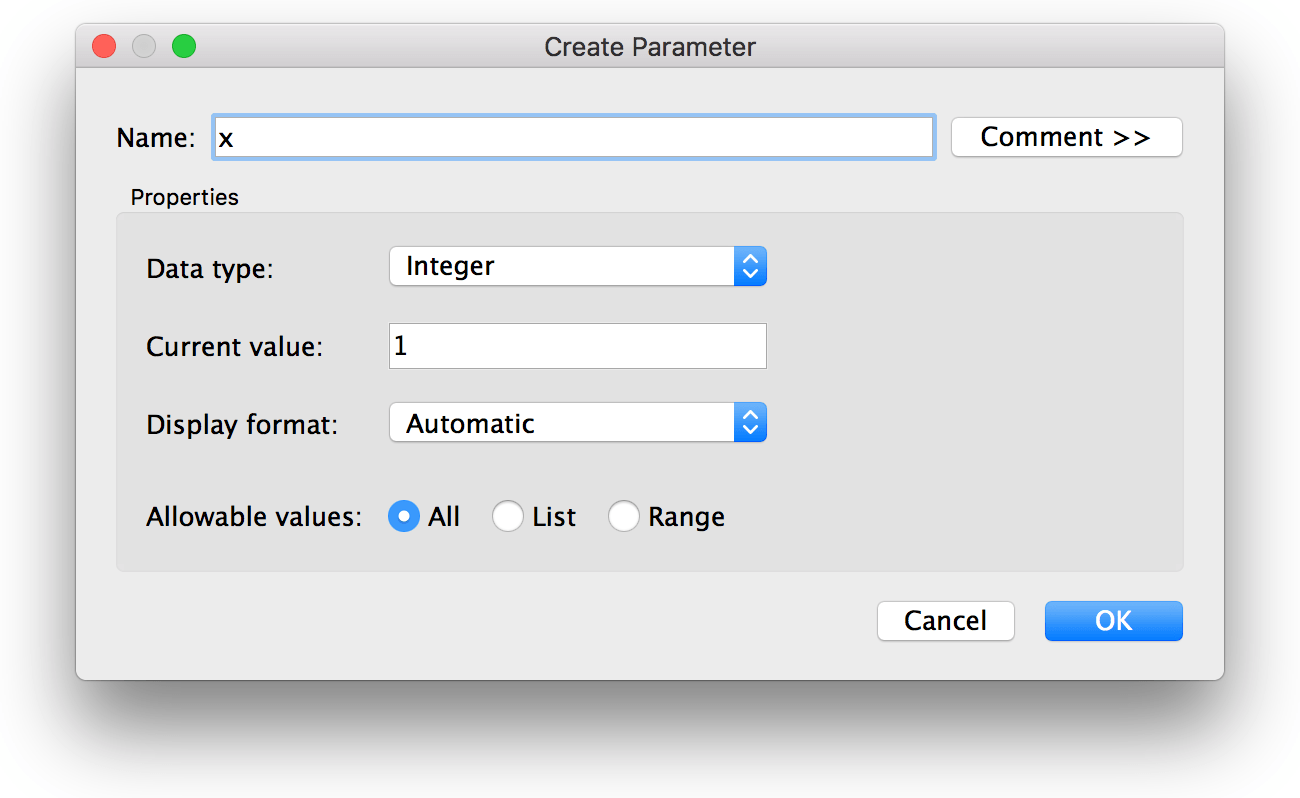
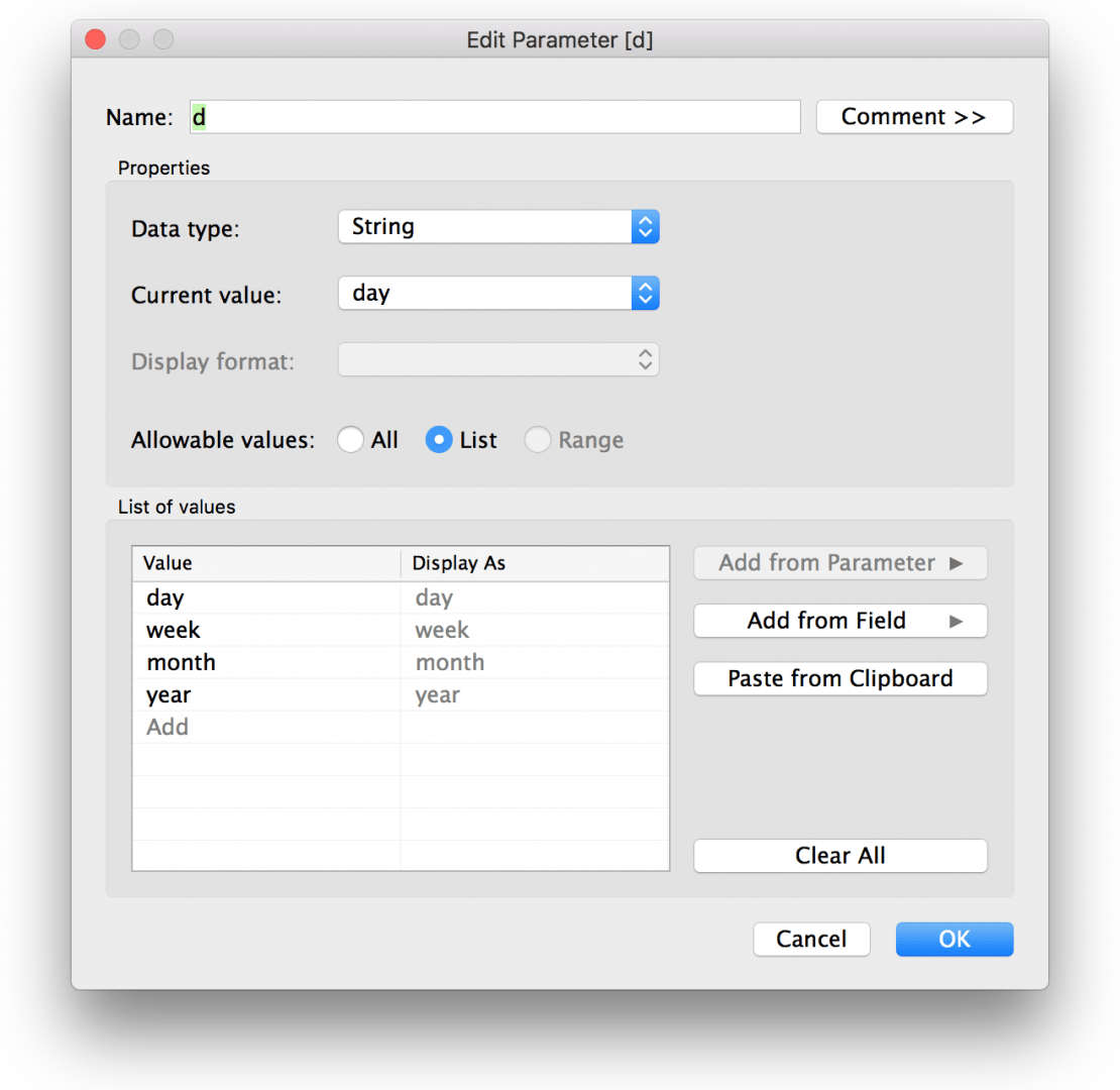
Build a parameter.
call it x
data type integer
current value 1
OKAY
Drag and drop your new period-over-period calculation on the visualization. Exclude Filter.
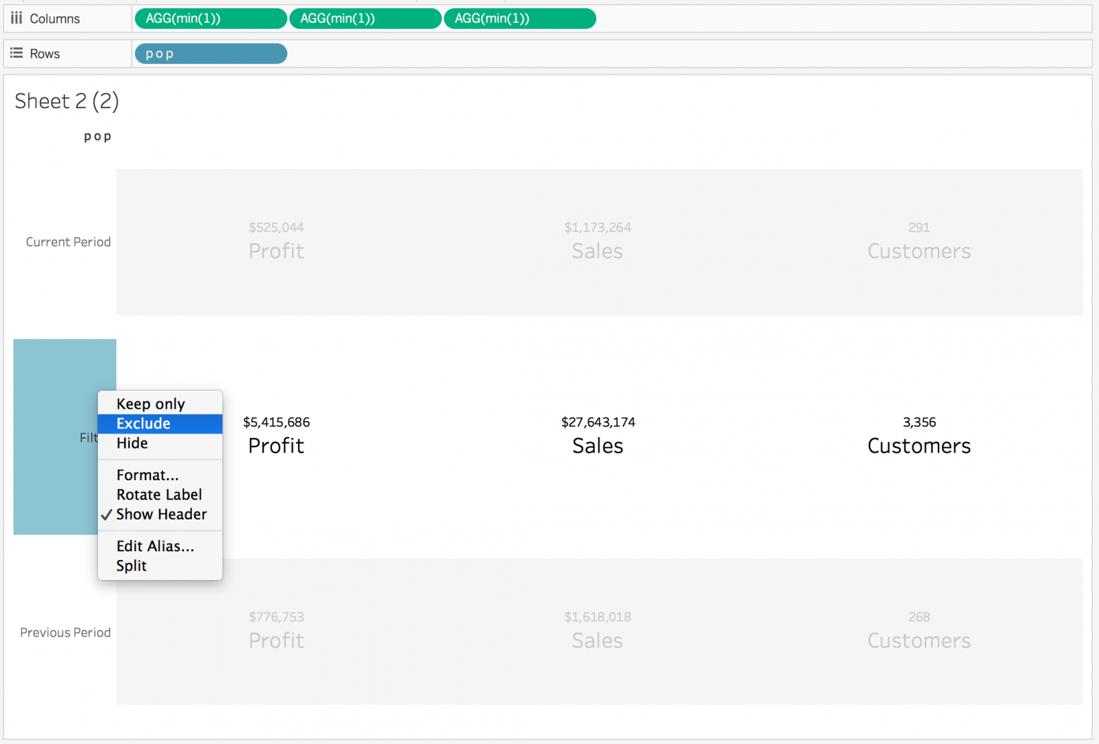
After you exclude the filter, you’re left with two distinct periods, which is now set by your parameter.
Show parameter control by right-clicking the parameter.
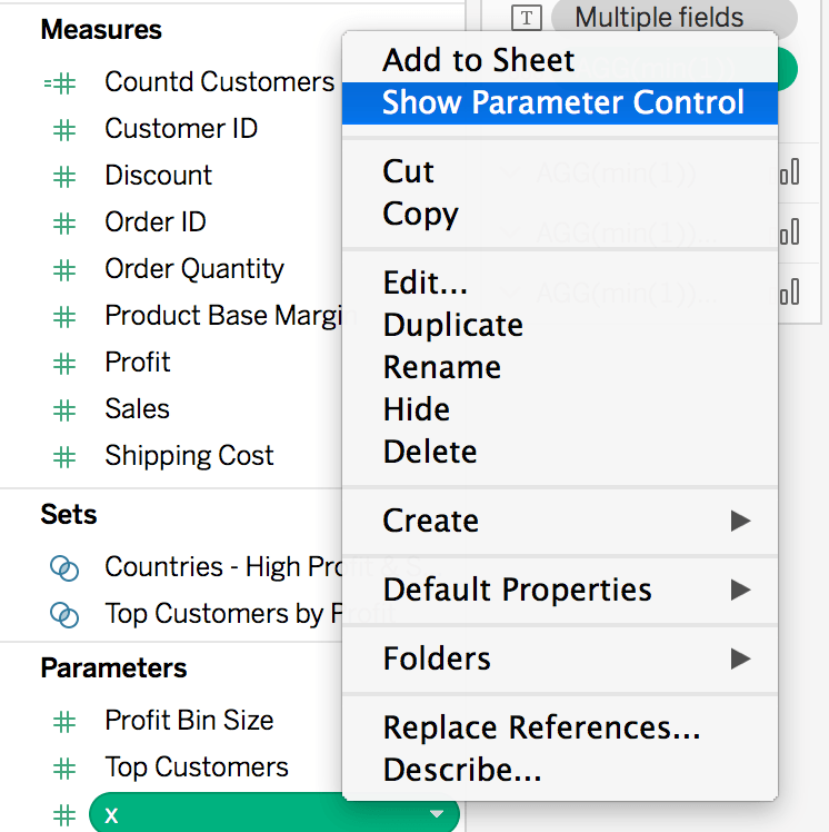 Show the parameter on the sheet.
The parameter is input into your period-over-period algorithm, which takes the number of parameters inputted as months.
When you add more numbers to the input, you’re increasing the number of months. Because we don’t love static solutions, let’s optimize the date bucket solution, too!
Let’s dive back into the period-over-period calculation and make it better for end users. Start with generating another parameter!
Show the parameter and open your calculation.
Update “month” with your new parameter d, the date part.
Notice we change the notes on the bottom of the calculation; leaving comments at the bottom or top is a great way to tell others what you did.
We can simplify our life by removing the “logical-looking text values” and cutting them back to only an integer! Rename your calc to a single letter to facilitate your future development.
At this point, your calculation is relatively efficient and utilizes many parameters. When you save calc or hit OKAY, the settings on the filter will change; check out the following popup.
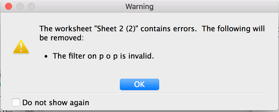
We expect an error because the previous filter on the “p o p” calculation or period over period calc - was only filtering on a condition. This condition is no longer possible.
The previous condition excluded the “Filter bucket” from our period-over-period solution.
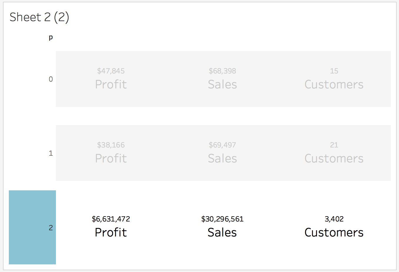 Filter 2.
Filter 2! We are now showing 0, as current and 1 as previous.
This will save a lot of time when generating calculations like;
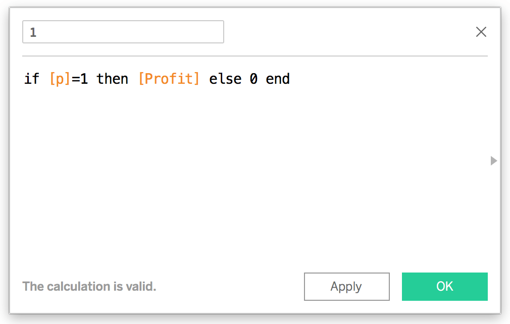
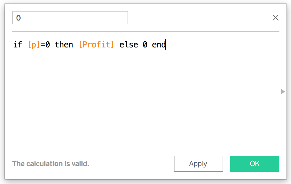
(if p=0 then (profit) else 0 end) - (if p=1 then (profit) else 0 end)
VS calculations like…
(if =“Current period” then else 0 end) - (if =“Previous period” then else 0 end)
And understanding how slow Tableau works with “strings” is also key to making this calculation fast.
Rename your sheet, call it “KPI-1” and begin discussing how to use this pop calculation to show dynamic coloring.
Finding the difference or change without Table Calculations
Table calculations are powerful for ad-hoc analytics but often can be outsmarted with basic logic or SQL. Outsmarting the need to use Table calculations means your workbook will be faster. Everything below shows you how to generate the difference or change variation for color variations, including an in-depth look at how to develop the solution yourself.
Having two sets of numbers and two sets of dates generates a difference or change in the data. A trend because we have an archive of data; archive* data* is like saying “past data or historical.”
Whether you’re hunting for a percentage difference or a subtraction difference, finding these are relatively easy with dates.
Next steps:
Write two quick calculations.
These calculations offer two simple drag-and-drop values that represent X amount of days!
Now, we can quickly see how these will start to be utilized.
0 = current period
1= previous period
If the current period is greater than the previous period, is that a negative or a positive? Logically, we use an algorithm to show a HOT or COLD coloring, aka GOOD or BAD.
Sometimes, measured values are not all black and white.
It may seem obvious that more money is a positive or GREEN, but realistically, an uptick or downtick may be green or red.
It’s always best to ask what end users first.
For the sake of this demo/blog, let’s begin using the concept that the current profit is higher than the previous period, which is green. We should celebrate our successes and use green to share this win across our dashboard, but without generating a Table calculation, we need to create a difference between the two values.
Check your work!
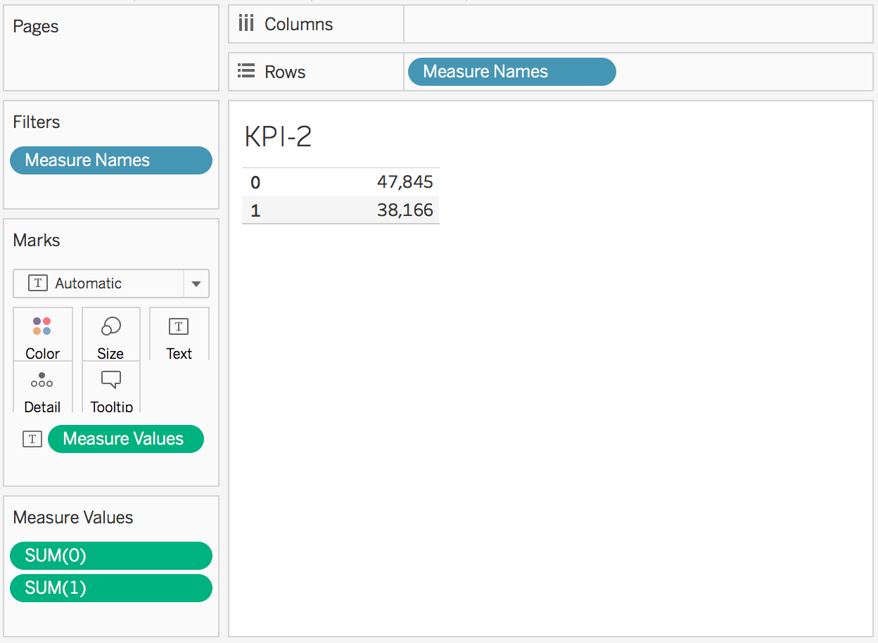
 using the dashboard to verify calculations work.
In the final steps, make a calculation for sum()-sum().
We need to understand what value is positive or negative.
Build another min(1) chart!
Use the parameters and your new difference calculation to build the KPI values!
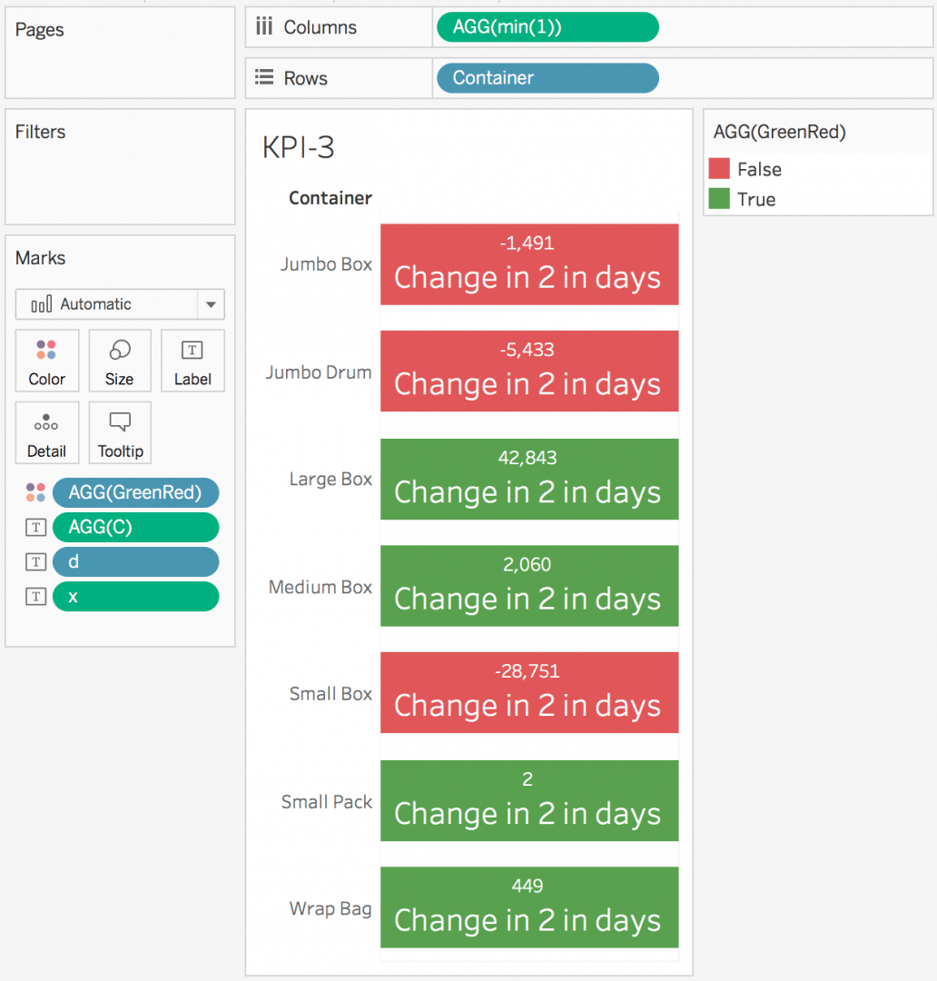
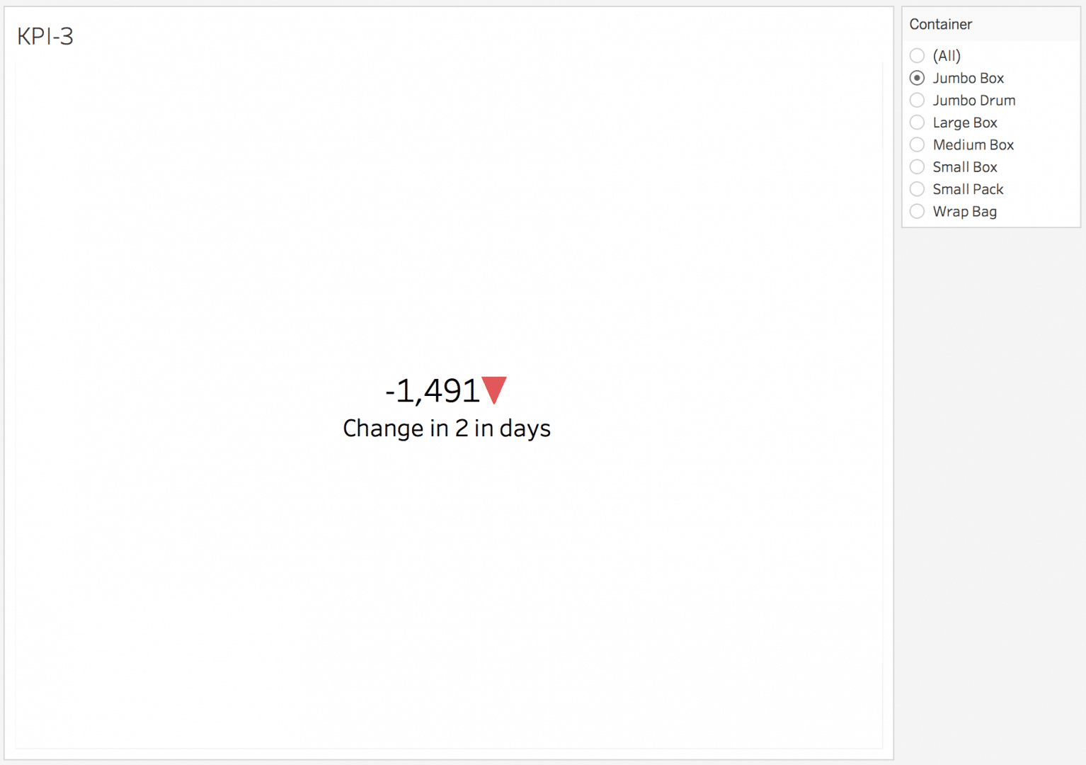
Bonus points if you generate this KPI-3!
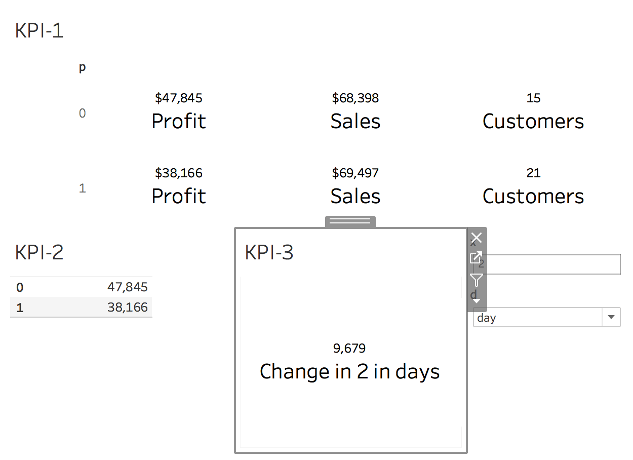 showing an increase of 9,679…
We will simulate a user experience by dragging and dropping to see shipping container options onto the visualization.
Notice in our chart, we don’t have any colors showing Green or Red. However, we have logic.
If the Profit value is less than zero dollars, the value is negative. If it’s greater than zero dollars, the value is positive.
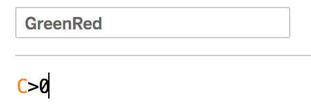
Let’s rename our calculation to save us the pain in future calculations. Rename it to “C” for change.
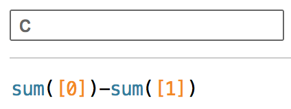
Now, if C>0, then positive else negative! We don’t want to pretend writing an if statement here is wise; study about Boolean calculations as alternatives.
Generate one final calculation.
You can add this to your visualization and quickly visualize the difference between periods.
Add GreenRed to your Color Marks card
you’ll see it populate your visualization
change the colors to green & red
Maybe you’re familiar with this kind of color, well here’s why I enjoy this kind of KPI charting! With the calculations we have, and logic developed, we can build an advanced color chart within 1 single KPI mark card, without having to do a dual axis.
Using text editor for conditional coloring using simple logic
Using a text editor, you are given a lot of flexibility in a user-friendly space. Trying to explain the dual axis to give an up/down arrow can be more confusing and complex to support for new users.
▲ up arrow
▼ down arrow
By generating two more calculations, you can offer two different things to color in your text editor.
Remove the “containers” dimension and drag it to the filters. Convert to a single value list, aka radio buttons.
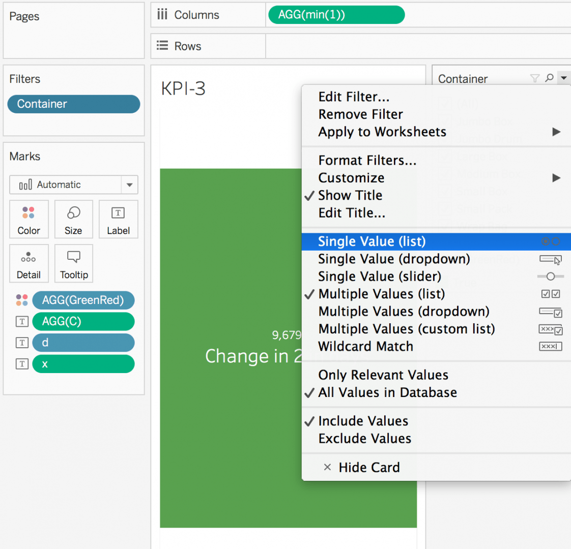 omg green
Radio buttons help us simulate a typical KPI experience. Our end-user has a couple of filters, and charts are likely below; filtering this way in the visualization gives us the ability to debug immediately.
Swap to Jumbo Box. Notice the negative background. What if our end user says, “We don’t want a red background.” Or maybe the end user wants 3 conditional coloring variables, and Tableau can only do a dual axis to show two.
omg red
Remove the color GreenRed from the visualization. Drag our two new positive and negative calculations with the text arrows. Put those on the Text mark card.
notice the positive arrow is missing…
Where is the positive arrow?
The positive arrow missing can be a complex few steps to figure out, you need to find each arrow, color it, and the end user will see green or red.
That’s why I rather enjoy this method. Also, using the container filter gives us the ability to see both positive and negative.
This process avoids needing to figure out where the green arrow is located. For what it’s worth if you’re not familiar with this step, I encourage you to try and build the arrows without these steps.
 awesome
If you’re experienced, you may enjoy the fact that you’re not having to edit the color marks card, and you can rest assured your workbook will not break as easily as before.
Re-arrange everything according to your “design requirements.”
lovely
Okay, now you’re on the way to understanding how you can
effectively design advanced KPI charts
without developing slow tableau workbooks
and without table calculations
Below are a few final remarks about making your min(1) KPI charts easy to maintain in the future. Not advanced, but rather more for easy support.
 outstanding
Ending notes about the min1 solution
Eventually, min(1) has a max, and it becomes harder to support; there are a lot of calculations to maintain, and you have to learn tricks to make it work better. Once you get there, copy-pasting things and duplicating things as needed becomes a priority, and edits become easier as you scale, but it is also a lot to maintain. Consider the amount of work/effort before committing to big asks. There’s always something easier; keep updated on Tableau Community too.
Tips about min(1) KPI for new users
I try to explain to new Tableau users in Training during a Tableau consulting engagement, “Don’t let this become the hammer” Often, Tableau has easier ways to solve the problem, but when things get custom, I always use this solution here.”
Eventually, using the same hammer over and over, it feels like, “This shoe doesn’t fit, and dashboards are slow.” Remember, at times, it’s okay to swap to a visualization, and that’s better because it’s less work for you and Tableau (most of the time).
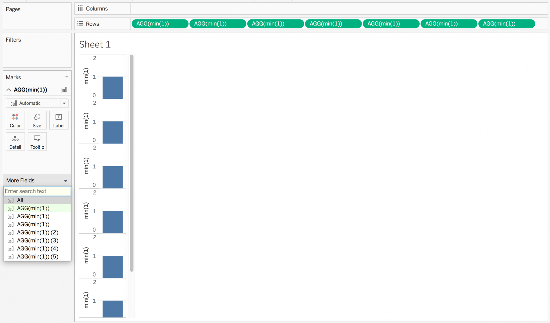 lots of min(1) which is what though?
Pro tips about Min(1) kpis
Above in the screenshot, notice the layering of “more fields”… does it ever look like this when you’re developing your KPIs/dashboards? This happens, and here’s a fix.
Let’s chat about what’s happening in the Tableau world.
And, before we begin, let’s swap the axis.
min(1)
When we double click on columns or rows, and type min(1), we can see we are typing a calculation, that calculation is a SHEET level only calculation. It doesn’t live anywhere else in the workbook, but it does live in the workbook; from an optimization perspective, don’t bother stressing yourself out or testing what’s best; just consider what’s easiest to support and build faster, and harden later.
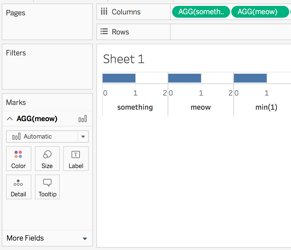
Type //something on your min(1) calc…
You type //TheNameYouWantToSee (hold shift, then hit enter), it drops you to a new line, and then you can type min(1)… Or you can open your typed calcs by double clicking, and start from the front of the calc.
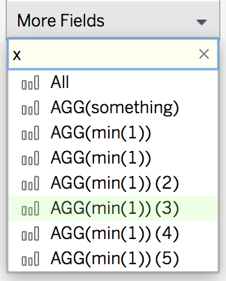
End goal, we want our field to show up right ‘meow’ (now).
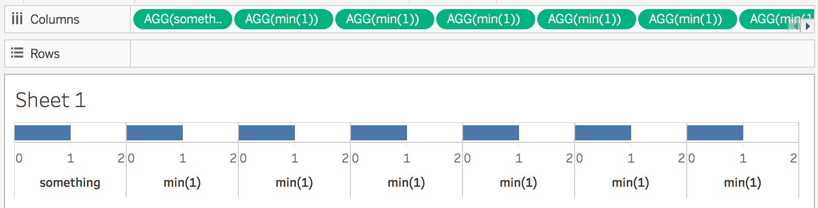
 making the new line is all it takes
By adding the //comment, and a new line, you can leave a in a comment… a note to help you dig through your min(1)‘s.
A nice trick to avoid “more fields” becoming Min(1) over and over.
Never fun to support min(1) over and over in heavy KPI charts!
Min 1 is tricky, but not a trick!
When I first learned this, it was called a “trick.” But the more I use it, the more I realize it’s a native feature and should be utilized because it helps make very complicated visualizations easily, unlike the 10 MB Google Sheet Error, which inevitably leads to much engineering.
We use this solution often because it helps avoid a need to edit colors in the colors marks editing screens, which can be difficult and usually generates the need to force the data to show specific values before you can tell Tableau when to change the color of an object. Eventually, meeting people become excited about improving KPI visualizations, which is challenging to do with marks alone. Doing it with text has become a fast approach to generating complex KPIs with a simple min(1).