Real-time presence indicators is a cool feature request coming to your backlog. If you need to improve your companies software, DEV3LOP is here to discuss real-time presence indicators!
I spent many nights creating a new software Vugam, but now I need to make my software better. What do I do? Real-time presence indicators could be the next step in the equation.
However if you’re like me, you’re calling this multiplayer, or tracking cursors. Perhaps it’s the ability to see someone is typing in slack, or that there’s a green icon in zoom if you’re online. Some people are never online, and it’s really obvious via zoom icon indicator.
Does your software need multiplayer?
Do you want multiple users working together in a collaborative environment?
Are users working together on similar problems?
Are users using single player software that is built to collaborate with other people?
My first time seeing real-time indicators was while using GoogleSheets and GoogleDocs in college, however no cursor indicators and limited capabilities had me wondering, what’s next… But not being in the software engineering path, being focused on information system, I felt a little disconnected from the technology.
This blog discusses improving user experience with collaboration, the differences between what to stream real-time and what to store in storage, and the balancing act of how to manage real-time data flows.
I need to create a user experience that allows end users to come together.
But once that software is done, how do I improve? Perhaps, real-time presence indicators… Using websockets.
Hi, I’m Tyler, I’m interested in adding real-time presence indicators into new projects and in our future software releases. One in particular is creating a multiplayer analytics software, however how the heck do I make a software multiplayer? Friends have told me this is a stretch and a lot of work…
I’m naive, I didn’t believe them. Created websockets/multiplayer in a day, and created a bit of a problem. I wasn’t thinking about what should be persistent between sessions VS streaming. This caused a lot of bugs. But lets take these lemons and create a drink.
Javascript VS HTML (legacy) in this screenshot.
Why a Server and a Database Are Essential (and Why the Cursor COULD stay Ephemeral)
When building real-time web applications, one of the biggest decisions is how and where to store data. Not knowing how to do this yourself is a cool maze of learning that I’d like to explain to you, for business users, and technical people who are interested in transitioning into a more technical space!
Some might assume that a websocket alone can handle everything, but this misses a crucial point: you need a server and database layer to keep important data secure, consistent, and reliable. Some may even start learning “acid compliance” to further explore the rules of a database.
Following down a path of creating a websocket software that didn’t consider what should be persistent in a file or database, VS streaming in websockets is where I have fallen a victim, but in the mistake I found this is likely not common sense to business users who desire this request…
Real-Time Presence Indicators: The server acts as the backbone, ensuring everything runs smoothly and logically
Again, the server acts as the backbone, you’ll need a server to use websockets and the backbone is used to ensure everything runs smoothly and logically!
The database (or perhaps document storage) preserves what actually matters—data that should last beyond a single session or connection. But not everything belongs in the database. Take the cursor: it’s a dynamic, real-time element. It doesn’t need to be saved, tracked, or tied to a user’s identity. Let it stay ephemeral, moving freely through the websocket.
This approach doesn’t just streamline the system; it respects user privacy. By not storing or analyzing every cursor movement, users can trust they aren’t being monitored at this granular level. It’s a small but meaningful way to give control back to the user.
Why real-time cursor trackingHas Stuck with Me
My goal is to make real-time cursor tracking and communication a cornerstone of the web applications I build in the future. It’s a tool I’ve come to value deeply, largely because of the success I’ve seen with platforms like Figma.
Real-time collaboration is more than just a feature; it’s a way of thinking. Working with it teaches lessons about system design that stick with you—lessons that make you better at building solutions, even if you’re not the one writing the code.
The nice thing about creating a real time cursor tracking software yourself is that you run into the troubles of not knowing better, and this is the best teacher. Whether to use express or websockets, an exciting time.
There’s also a balancing act here that matters: Real-Time System Management
Real-time systems shouldn’t come at the expense of user privacy.
Knowing when to store data and when to let it flow naturally is key—not just for performance, but for creating systems that people can trust. Perhaps that system is one that doesn’t LEARN on your users and create a product within the gray area.
For me, this isn’t just a technical challenge—it’s an opportunity to build better, smarter, and more thoughtful applications. Want to learn more, simple, contact us now.
Building dashboards in PowerBI quickly is important because decision makers are eager to start using these rocket ships we are creating. However, if you’re new to PowerBI that may be asking a lot! Tracing is helpful because it empowers us to quickly create a solution and design from scratch.
What is tracing? Drawing over lines on a superimposed piece of transparent paper, and with figma, you will be able to do this digitally speaking. Allowing you to trace over any designs to abstract your own.
Tracing dashboards is a good way to recreate something net new and offers a fast path for getting people talking about your dashboard designs.
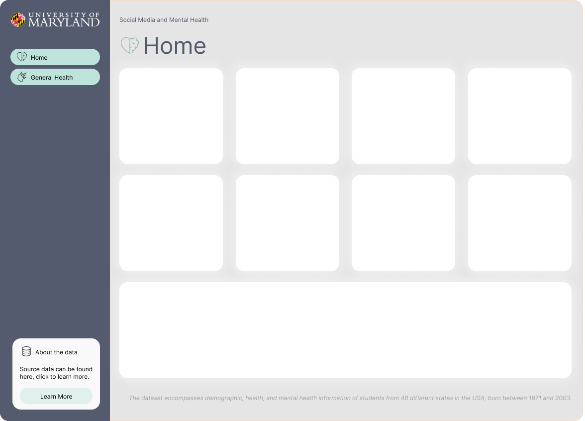
In this article, you will learn to become a master of making powerful designs from scratch, and this will empower you to Create dashboards in PowerBI quickly. Here’s a lot of screenshots to show you what you’re going to be building and potentially a template you can copy and paste into your next PowerBI Design.
Create visual documentation for PowerBI Design
Here at DEV3LOPCOM, LLC, we passionately believe visual documentation improves project deadlines. Plus, allows for fast data product creation and we want to show you how we would create a dashboard from scratch without any direction on the style or design.
Figma works, but any app that allows tracing over an image will work, and in this blog we will show you how to create this template.
We show the steps to tracing the design, and adding it to PowerBI. This can help you operationalize your templates and improve your dashboarding speed across any dashboarding product.
About this PowerBI dashboard Data and our Goals
First, lets learn about the data and establish goals about our workload to keep us focused on an objective.
All data should have a brief description, otherwise it’s hard for others to collaborate with your data sources.
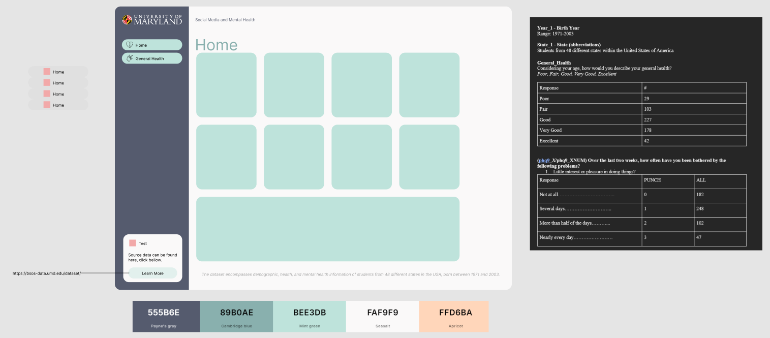
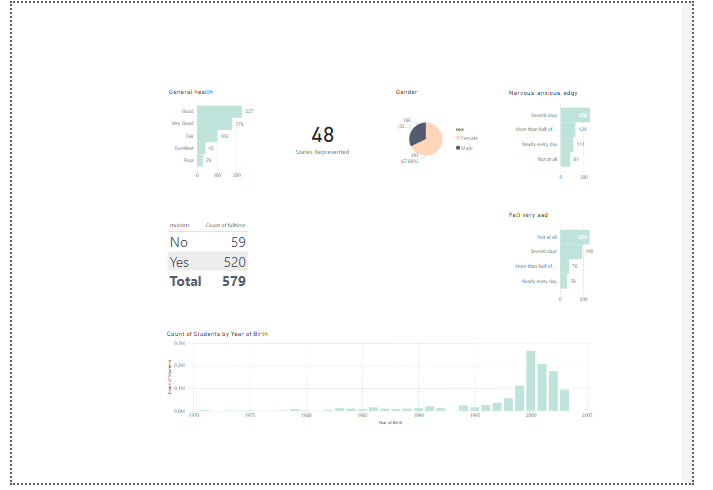
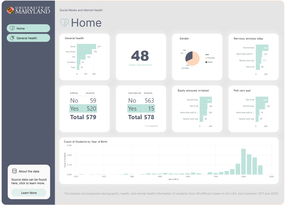
Using the following data about Social Media and Mental Health, was recently released by University of Maryland in July 2024.
Our goal is to quickly generate a dashboard to help others learn PowerBI. However we have thin requirements, it’s fun to pretend this is a real world software consulting engagement, and similar to a real world use case in a busy business environment, perhaps people are too busy to give us insights.We must research and learn on our own.
About data: The dataset encompasses demographic, health, and mental health information of students from 48 different states in the USA, born between 1971 and 2003.
How do I get my CSV Data into PowerBI?
Open your PowerBI software. You don’t need to buy anything, just go grab the software and get started with me.
In the Home tab, click Get Data. Then select Text/CSV.
Once we have our CSV data open, you may notice we have weird Column headers that aren’t sensible to anyone on the dashboarding end.
This is typical in a lot of APIs, Data Warehouses, and Data Engineering in general is ripe of columns not being named correctly for each team. Luckily for us, PowerBI can change column names with great ease.
Finding Artwork to Trace Your Dashboard
First, we need to start with learning about “artwork.” When learning to draw, an art teach will ask you to trace something 100 times, and then by the 100th time you’ll be drawing it better.
Same with the internet, we often are reverse engineering each others design to improve our design. In this process we will find some artists we enjoy, choose one, and trace our dashboard on this design.
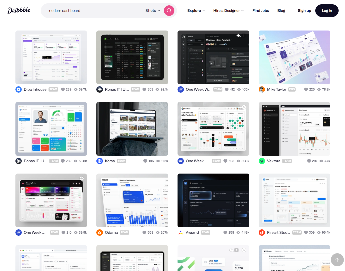
I like using Dribbble to find ideas and learn about modern approaches. It has a lot of really stylish content, and it’s easy to start here as a dashboarding guru.
I search for ‘modern dashboard style…
If working with a client, I will find 3 designs and then ask them to choose one. Then I’ll build everything around this template. I like using figma because it’s easy enough for people to dig into the weeds, and see they can access the design elements.
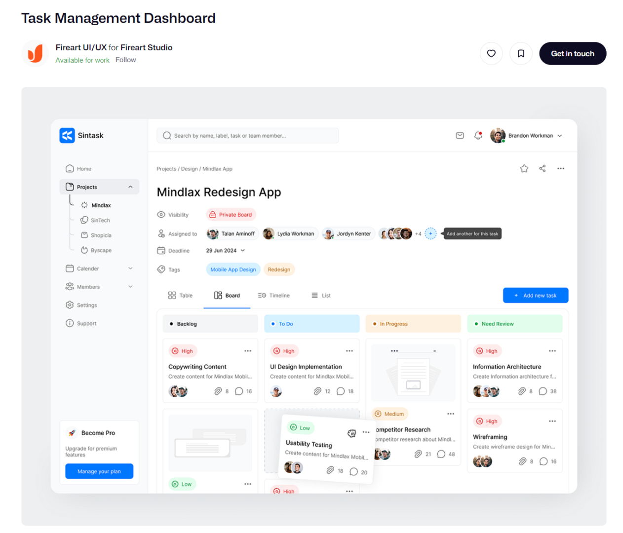
Pretend our client suggest the following design.
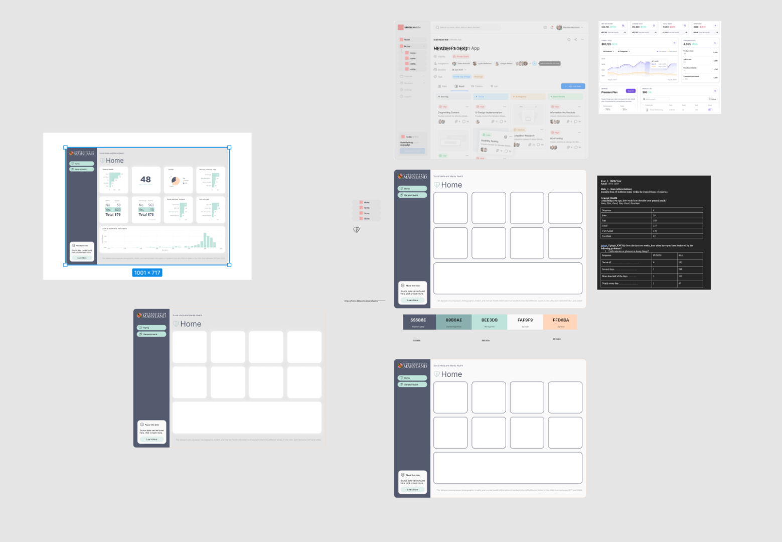
Okay, paste the dashboard we are asked to mimic into figma and lets start tracing.
You’ll notice as you do this you’ll start to create your own unique design to your dashboarding solution.
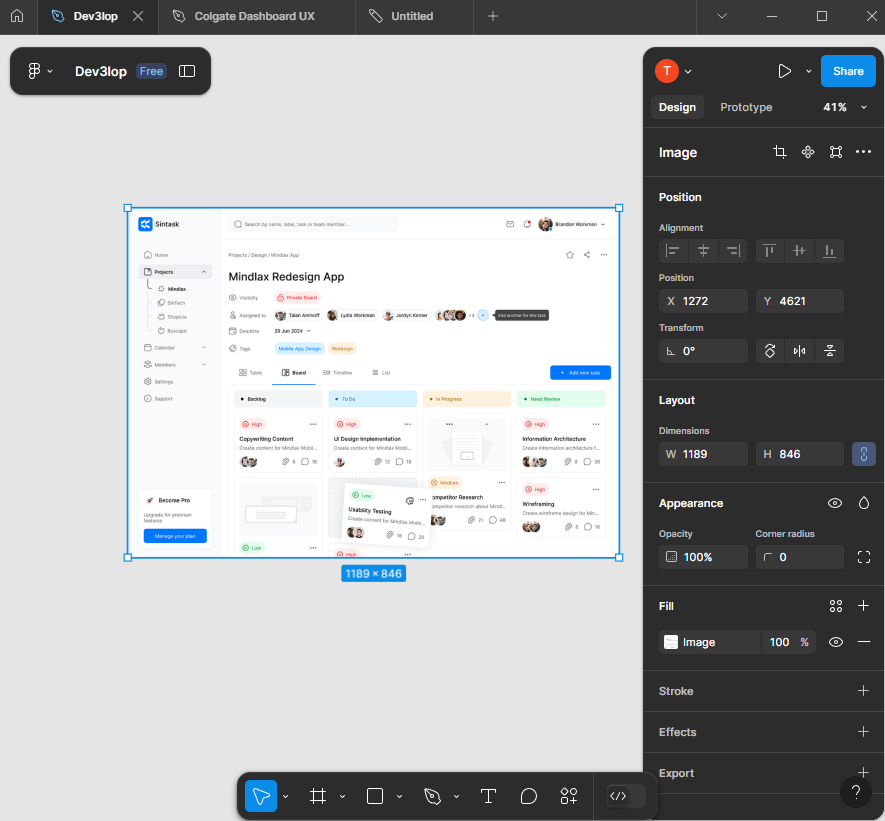
Start tracing design for PowerBI Dashboard
Cover the surface with a square.
Once hidden completely, lets edit transparency hitting 5 on keyboard. This should adjust the transparency.
Okay, keep flowing. Next same thing for side menu. Trace it. But before we go, adjust the edges to be rounded.
Easy enough in figma, grab little white ball and pull it down until it hits the line we are tracing. adjusting one side adjust all 4 sides.
Okay, hit the side menu.
Next, TEXT overlays. And button overlay with squares.
I prefer starting with a highlighted button so i know the sizing, then replicate that size across. Alt drag and drop for similar copy paste of previous object.
Working through buttons should be easy, let the software guide you to make it perfect too. Notice this has a 7 pixel gap.
Skipping ahead…
Now that we have this style, lets see what it looks like in PowerBI.
Adding your Figma design to PowerBI is simple. It’s a file.
Export the file to your computer.
Add image to PowerBI.
Resize dashboard so it fits cleanly.
Remove padding, this is my least favorite thing to have to do in Tableau and PowerBI. These apps automatically pad everything for some reason, haha.
Making decisions about our new Figma Style for PowerBI
In the beginning stages it’s about speed and repeatability. In more advanced dashboard development Figma saves a lot of time.
Next, lets duplicate our work area, and move the sub button navigation for today to the right side.
This is good enough for PowerBI. But before we leave just yet, lets dive into how we can improve the color pallet. I’m using coolors for an easy one.
Now, start to style your dashboard so that it’s appealing. Don’t spend too much time here because chances are the design will change, and you’re just trying to make it look decent. Use corporate colors so you’re following the “designers” pattern. They can send your a pdf file with the correct style guide, which improves this process, but today we are tracing and coming up with our own style guide.
As you’re applying color, start to focus on subtle details…
Improving PowerBI Dashboard with Logos, Style, and Strategy
Logos make dashboards pop. You know you can easily grab one, so grab the most recent logo. Don’t edit peoples logos, use what they supply online.
I’m choosing the source data logo, to help represent the source information because putting my logo here would not be a factual representation of the effort.
Now, notice what happens when I size it next to the buttons, depending on your screenshot and size of dashboard to be traced, in Figma, it’s subtle… Notice my sizing is subtly off and I can’t seem to make it exact, I generate black guide bars… aim to sync up for “perfect”… people will use your dashboard more often if it’s synced up.
In this example/screenshot I’m demonstrating how lining up this logo is a little more tedious than allowing figma to define things by snapping edges, I created black guide lines to help me follow a consistent flow from top to bottom. This is a kind of “hawk eye” or “pixel perfect” strategy I need you to deploy to create powerful dashboards in any reporting software or designed front-end!
Before we part, a few more subtle wins to consider as you perfect your traced design for PowerBI.
This will give a very nice clean view. In figma, click the red square, paste the image. Very easy process if you created the space for the icon. As you do this selection of icons, realize nothing is perfect, we are prototyping, get something in there because that’s the key, fast/repetitive!
Notice how we made some decisions that moved us away from the original design, this is called “making it your own.”
One more layer of decisions to clean it up.
The strategy here is making things clean and lined up, using LINES to guide ourselves. Delete these guide lines once you’ve mastered this technique and keep duplicating to avoid having to do this process again…
Here’s my work station, notice I’m starting to document what goes inside of buttons, and the documentation is in the same screen. This helps with identifying where our hard work belongs.
The header looks a little close to the first square, however a good starting point, we can optimize that later. The point of using guides/lines is the important part of this training.
Choosing cool icons for PowerBI Navigation
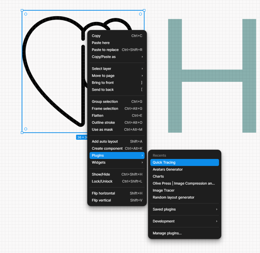
Since we are prototyping and not rushing to production, we need a simply PNG file for icons. Google search will bring up a lot of options you can trace, “black icon mental health heart.”
Simply click a square in figma, and ctrl+v paste.
This is why we created that square in tracing section, it outlines my sizing requirements.
Now, we have two buttons, logo. Things are cooking. Plus, custom icons. Always tell people it’s easy to change icons, this is just a prototype.
Many tracing apps can be found in the figma community. Great for icon tracing. This creates a vector trace of the heart/brain icon.
Once you trace the svg, you can color the file and it’s a vector rendering. I like changing the color to match the pallete.
Now, to finalize the visual. I use more guides but in the shape of a square this time. Find what works best for you.
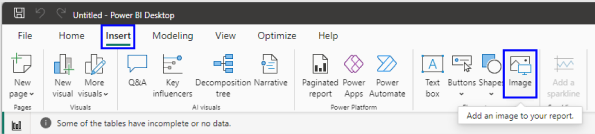
Insert image into PowerBI
Woot, you’re here! You’re doing you’re own design based on a tracing.
I hope you’re proud of your drawing. If not, simply grab more ideas and trace until you’re satisfied.
Open Insert Tab, then click image. Navigate to the image you created in Figma. Group it and export it.
Start to play with dashboard sizing based on your image size.
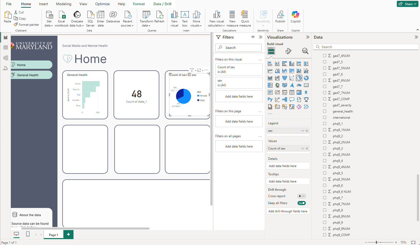
Adding your first charts on new style in PowerBI
Okay, so you’re adding your new traced design to PowerBI as an image. You fixed the canvas.
And you’re beginning to add charts.
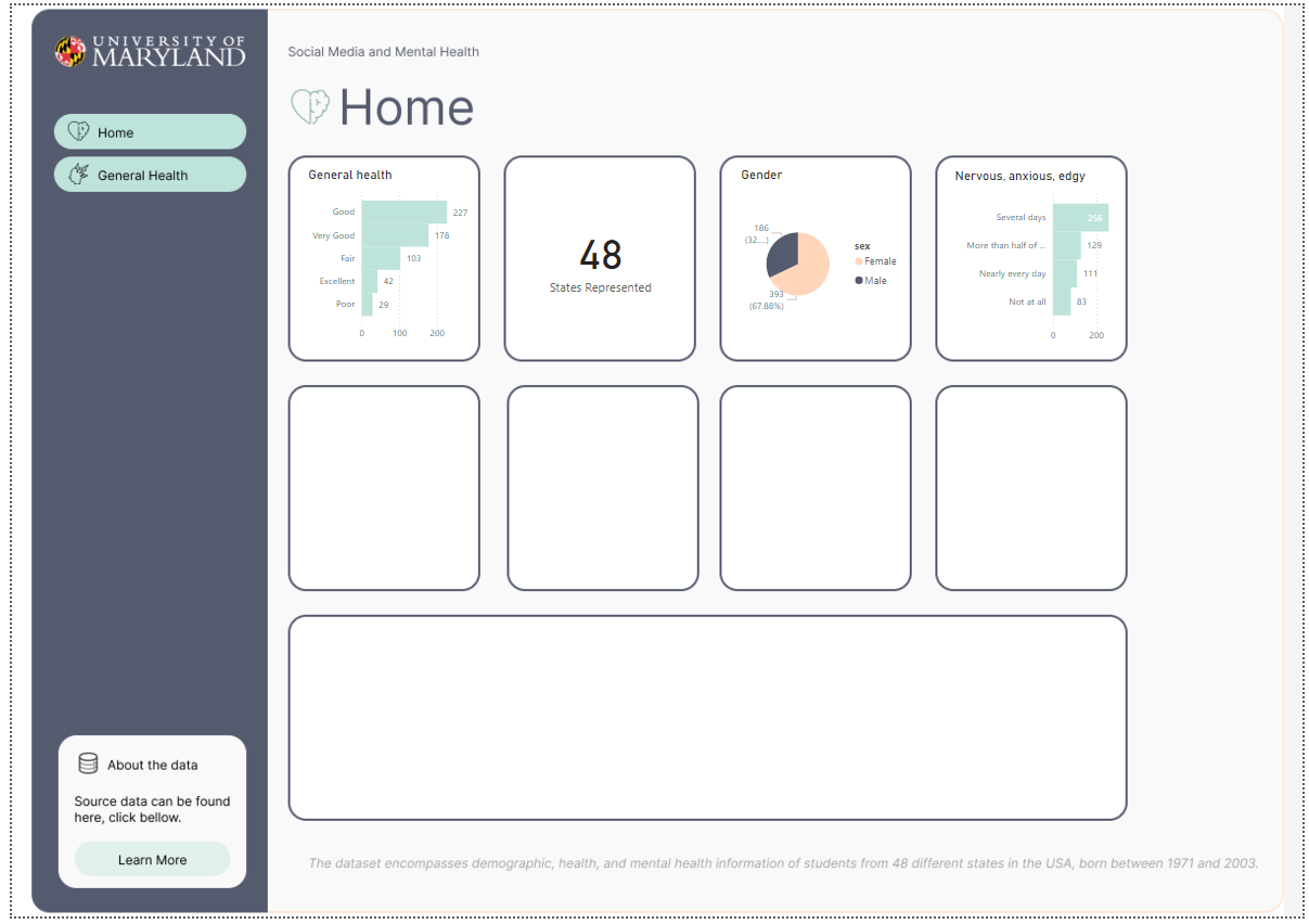
I’ve started with the easier charts, that feel very global. Like the amounts of states accounted for in the overall survey. The differences between gender, and the general health column popped to mind considering our button says General Health too. Even though it’s a place holder, perhaps we can go into detail about general health as a button too. Also, I like making actionable KPI to flow with buttons, so end users know if they click that bar chart, perhaps they will learn more about General health, and also the button General health will take them there too.
Scaling up on your new Traced PowerBI Design Template
Okay, people are going to ask you to change your PowerBI Design, for example pixels aren’t perfect, maybe 2 pixel boarder around charts isn’t great.
This is why I love having my dashboard design in Figma. Easy to edit. Copy and paste and start new styles.
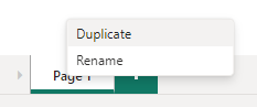
In powerbi, similar process, right click dashboard tab, and click duplicate to duplicate your dashboard.
Now, delete the background image, and add a new image. Should look like this if you’re still adding charts. As long as you don’t move boxes, you’re safe to simply add back the new image and it will fit perfectly.
This is a good sign, you’re not depending on a reporting platform to manage your design elements. You can slap this background into any reporting software.
Now, you have a duplicate tab in PowerBI, I went with nuerophism, a cool design technique that makes it feel like it’s popping off the screen because of the light and dark shadows. Do you notice the differences in the shadows?
Conclusion to Tracing designs with with Figma for PowerBI Desktop
While working with designers, often we are given screenshots of artwork, and tracing allows us to gain what we need to be successful.
I hope you enjoyed this tutorial on creating quick PowerBI products using Figma to trace.
Keep perfecting your craft and let us know if you need help with any dashboard designing services!
We will add more training like this in our articles here on dev3lop, stay tuned.
Although, we started as a Tableau Consulting Company, we have been navigating into more and more PowerBI the past few years.
Ensuring that even the next data expert won’t find it too daunting.
To excel in quick calculations, it’s essential to identify and address slower ones.
#1 Problem with Slow Tableau Workbooks
Solving slow Tableau workbooks is often a calculation optimization game.
Then the migration of transformations, Boolean style calculations for example are easily pushed to SQL because SQL does Boolean logic with ease, so why make Tableau do this for you? This is a subtle win and as you continue you’ll find bigger wins in our blog below.
Think of Tableau as a tool you don’t need to over complicate. You can protype, transform, build a data product, and then stress about the “improvements” we discuss below in the near future.
Stressing these tiny details now will slow down your project, and stress out business users. Do it when no one is looking or when someone asks “why is this slow?”
During Tableau Consulting engagements, we see it’s easy to move your slow moving calculations into your database after the prototyping phase, and consider pushing heavily updated calculations to your SQL end the hardening phase that you do at the end. Anything being changed often is best to keep in your Tableau Workbook until everyone has completed their apples to apples.
Optimizing Calculations in Tableau Desktop for Better Performance
When it comes to Tableau Desktop, writing fast and efficient calculations isn’t just a nice-to-have—it’s a must for performance and scalability. A calculation that works is great, but one that works fast is better, especially as data grows. Let’s break down why certain choices in your calculations can have a massive impact on performance, focusing on the example provided.
The Problem: Slow String-Based Calculations
Here’s the first example:
if month(date) >= 5 then "blue"
else "orange"
end
Why is this slow? Strings.
Strings Are Heavy: Every time Tableau processes this, it’s comparing strings instead of lighter, numeric values. Strings take up more space and are slower to process than integers.
The else Isn’t Necessary: If your logic doesn’t need an else, don’t add one just to fill in. else assigns a default value—if that value isn’t relevant, you’re doing extra work.
The Improvement: Simplifying the Logic
Here’s a slightly improved version:
if month(date) >= 5 then "blue"
end
This avoids unnecessary processing by dropping the else. If the condition isn’t met, Tableau will simply return NULL. However, this still relies on strings, which slows things down.
The Better Option: Switch to Numbers
if month(date) >= 5 then 1 // blue
elseif month(date) <= 4 then 2 // orange
else 0 // filter out
end
This is a solid step forward. Why?
Databases Love Numbers: Integer-based logic is much faster because databases and Tableau’s data engine process integers far more efficiently than strings.
Strings have thousands of possible values.
Integers have only 10 basic values (0-9) in a single digit, making calculations simpler and faster.
Future-Proof Logic: By using integers, you’re not just optimizing today; you’re setting yourself (and your team) up for easier scaling and maintenance tomorrow. Want to add another category? It’s just another number.
Ease of Filtering: Returning 0 for filtering out irrelevant data reduces additional logic elsewhere, streamlining workflows.
Why Does This Matter?
When you write calculations that rely on strings, Tableau (and the underlying database) has to:
Compare values character by character.
Manage much larger datasets because strings require more storage.
Perform extra lookups if you’re working with case-sensitive text.
Switching to numeric logic tells Tableau to focus on lightweight, easy-to-process values. Over time, this can lead to noticeable performance improvements, especially with large datasets or frequent dashboard updates.
Pro Tip: Comment for Clarity
This isn’t just about optimizing calculations; it’s about teaching better practices. Add comments like this:
if month(date) >= 5 then 1 // blue
elseif month(date) <= 4 then 2 // orange
else 0 // filter out irrelevant months
end
By documenting your choices:
You make your logic easier for others to understand.
You reduce the need for future troubleshooting.
You create a shared knowledge base, improving team productivity.
The Bottom Line: Calcs need to be faster!
When building calculations in Tableau, think beyond “does this work?” to “how efficiently does this work?” Opt for integer-based logic over strings whenever possible. It’s a small change with a big payoff, especially as your dashboards grow more complex. Less work for Tableau = faster insights for you.
Got other optimization tips? Let me know in the comments!
A Faster Tableau Calculation
The simplest and fastest approach? Stick with numbers and Booleans:
if month(date) >= 5 then 1 // blue
else 0 // orange
end
Why It Works: You’re just typing numbers. The comments explain the logic for human readers without bogging down Tableau with unnecessary strings.
Scalable: This approach is ideal for larger datasets and complex workbooks. As your project grows, you’ll appreciate the simplicity and speed of integer-based logic.
For an even lighter touch:
month(date) >= 5
Boolean Flag: This returns TRUE or FALSE directly, which is incredibly efficient. Boolean logic is the leanest and fastest calculation type Tableau can process.
Why Writing Fast Tableau Calculations Matters
Writing fast calculations isn’t just a power move for your own dashboards—it’s a cornerstone for building a thriving Tableau community. Here’s why it matters:
User Adoption: Fast calculations mean responsive dashboards. That translates to better user experiences and higher adoption rates for your work.
Community Growth: When you optimize your calculations, you share best practices that help others master Tableau’s native features.
Future-Proofing: Hundreds of slow calculations will drag your workbook down over time. Optimized logic ensures your dashboards remain scalable and maintainable.
Let’s keep the momentum going: Write fast Tableau calculations, build amazing dashboards, and grow the community together. Pretty dang fast, right? 🚀
Everyone needs software, and they need it now! If project success defines your situation, I’d like to introduce to you a concept that may change your perspective on solving problems. This is where a tedious project maybe completed in minutes VS months, thanks to artificial intelligence.
Micro opp apps or micro ops apps, in our mind, are similar to micro opportunities and are usually operational in nature. Little wins or low hanging fruit that is accessible to win in a short period of time.
Micro is the size of the code, the length of the engagement, the requirements given are thin, and that’s what you need to complete this micro software.
We specialize in micro and macro application development (we are dev3lop) and have over a decade of experience implementing these applications into hardened rocket ships at enterprise, government, and commercial companies.
Micro Opp apps
Have you ever wanted to craft software but never had the time to invest into the education or fundamentals? Great! AI is in a place where you can ask it to write an entire prototype and within a few minutes you have proper software that solves a business problem!
The open-source world and closed-source LLM revolution are meeting eye to eye from a code perspective, and it’s a great time to dive into this realm of AI-infused development.
Companies are constantly seeking ways to streamline operations without the burden of overly complex software. Micro Operational Applications are emerging as the perfect solution—tailored tools that address specific business needs without the unnecessary bulk of traditional SaaS products.
Why Traditional SaaS Products Fall Short
While SaaS products offer robust features, they often come with limitations that make them less than ideal for certain business requirements. Their one-size-fits-all approach can lead to tedious workflows and inefficiencies. Customizing these platforms to fit specific needs can be time-consuming and costly, involving multiple software engineers, database administrators, designers, and executive approvals.
The Rise of Micro Operational Applications
Micro Operational Applications are changing the game by providing targeted solutions that can be developed in a single working session. Thanks to advancements in AI and development tools like ChatGPT and Claude, non technically savvy individuals can now transform text prompts into working prototypes swiftly.
Prompt: “Create a single html file using cdn <insert javascript framework>: <type what you want the software to do, how you want it to look, and any features you can think of>”
This prompt is how you can begin creating html files that can be a solution to a problem, it’s easy to share with others via chat software, and may start get peoples wheels turning!
Benefits of Micro Operational Applications:
Speed of Development: Quickly create applications without the lengthy timelines of traditional software projects.
Cost-Effective: Reduce the need for large development teams and extensive resources.
Customization: Tailor applications precisely to meet specific business needs.
Agility: Adapt and iterate applications rapidly in response to changing requirements.
AI Assistance Accelerates Development
AI-infused development tools are democratizing the creation of software. They enable individuals who are “technical enough” to develop functional prototypes without deep expertise in coding. This shift not only speeds up the development process but also reduces the dependency on large teams and extensive planning.
A Glimpse Into the Future
Given the rapid advancements in AI-assisted development, it’s foreseeable that Micro Operational Applications will become mainstream in the next few months or years. They represent a significant shift towards more efficient, agile, and customized business solutions.
Embrace the future of business operations with Micro Operational Applications—where efficiency meets innovation.
Authors perspective on micro apps in production environments.
Some projects are easy to complete but require a lot of social skills to understand full requirements. Micro apps win here because it gets the brain moving without much input. Also, micro apps are great when you have all the requirements, this allows for instant prototyping, and instant value proposition.
Micro Operational Applications are used to solve problems that don’t require a SaaS product because the SaaS product is too robust and has limitations that simply make business requirements tedious.
They are software you can create in a single working session, and they are prototypes for what could become a more hardened software in your wheel house. Think of “excel” today, it’s easy to stand up, get moving, and most people know the software. Micro apps are moving this way quickly. You don’t have to be a hero of tech to move it forward.
Micro Operation Applications are becoming easier to develop due to AI assistance.
Tools like Claude and Chatgpt are opening the door for ‘technical’ enough gurus to move the torch from text prompt to working prototype.
These micro apps are helpful because they offer a door into not needing three software engineers, your DBA, your designer, and executives involved in the creation. They can happen faster than any software project has happened.
To make it truly important there’s more engineering required, however given AI infused development is picking up in speed, I can foresee Micro Operational Software becoming main stream soon enough.
The next phase is going to be AI connecting it to backends. Without a lot of work. Until then you’re going to need data engineering to help you make the leap.
So as far as we know, AI will help you thread your current data systems, however if this is more lifting than expected, that’s where you’ll need focused Data Engineering Consulting Services!
Contact us to get a working session scheduled, we will show you how we use AI to solve problems.
You know, with everyone saying “big data this” and “big data that,” I’m starting to wonder if we have any idea of what big data is all about. From our experience, we see big and small data daily, and how we manage them is typically very similar. Let’s make this fit since we love node.js for any data size.
This comprehensive overview will highlight nodejs data pipelines, and explain why people are moving this direction.
Businesses need to process and analyze vast amounts of data efficiently. Nodejs is just the right tool; combined with Express and Knex, you have yourself a powerful data engineering stack of tools.
What is a data pipeline? Data pipelines are essential for seamless data flow from one system to another, enabling real-time analytics, data warehousing, and machine learning. We use data pipeline as a buzzword that explains how we may be processing data in a full stack. It’s easier than saying processing, fetching, and other terms in the engineering realm.
With its non-blocking I/O and event-driven architecture, Node is an excellent choice for building efficient and scalable data pipelines. We regularly re-use our internal data engineering nodejs product for data warehousing engagements because it allows us to continually advance our data product offering in the competitive advanced analytics consulting world. This guide explores how Node.js can be leveraged to streamline data pipelines, offering practical insights and examples.
Why Choose Node.js for Data Pipelines?
We choose nodejs for data pipelines because it’s efficient, fast, easy to scale, and easy to grow. It’s also within the javascript language, which means it’s extendable. If you haven’t already clearly stated why Nodejs is essential to your ecosystem, it’s good to begin. If you need some help, we have listed a few reasons below.
Node.js uses an asynchronous, non-blocking I/O model, which means it can handle multiple operations simultaneously without waiting for any single one to complete. This is particularly advantageous for data pipelines, where I/O operations, such as reading from a database or writing to a file, are common. Non-blocking I/O ensures the data pipeline remains responsive and can handle high throughput with minimal latency.
Event-Driven Architecture
Node.js operates on an event-driven architecture, making it well-suited for handling real-time data streams. Events trigger specific actions, allowing the system to process data as it arrives. This model is ideal for data pipelines that require real-time processing, such as log aggregation, monitoring, and analytics.
Single Language Across the Stack
Using JavaScript both on the client and server sides simplifies the development process and enhances productivity. Developers can share code between the front and back end, reducing redundancy and maintenance efforts.
Building Blocks of a Node.js Data Pipeline
1. Data Ingestion
Data ingestion is the first step in a data pipeline, involving collecting raw data from various sources. In Node.js, you can use libraries like Axios for HTTP requests or node-fetch to gather data from APIs and fs For reading data from files.
Once data is ingested, it must be processed, including transformations, filtering, and aggregations. Node.js streams are a powerful feature for handling large datasets efficiently.
An example of subtle chunking, a process often used to lower the stress on databases and offers an easy scale-up per pipeline:
Processed data must often be stored in a database or a data warehouse. Node.js supports various databases, including MongoDB, PostgreSQL (our preference, with KNEX), and Redis. Libraries like Mongoose for MongoDB and pg for PostgreSQL make it straightforward to interact with databases.
Tools like Grafana can be integrated to monitor and visualize the data pipeline in real-time. Node.js can send data to monitoring tools directly via APIs or client libraries.
Node.js runs on a single thread, but you can leverage clustering to exploit multi-core systems. The cluster The module allows you to create child processes with the same server port.
Message queues like RabbitMQ or Apache Kafka can be used to decouple and scale different stages of the pipeline. Node.js libraries, such as amqplib for RabbitMQ and kafkajs For Kafka provides easy integration.
Conclusion regarding Streamlining Data Pipelines with Nodejs
With its non-blocking I/O and event-driven architecture, the fact that so many people are using Node, plus Node.js, is a powerful tool for building efficient and scalable data pipelines. Its ecosystem of libraries and frameworks, coupled with its ability to handle real-time data processing, makes it an ideal choice for modern data workflows. By leveraging Node.js for data ingestion, processing, storage, and visualization, developers can create robust and high-performance data pipelines that meet the demands of today’s data-driven world.