Imagine running a business where every product hits the shelves at precisely the right moment, seamlessly meeting customer demand without excess storage or shortages. Picture your decisions guided by insightful visualizations, based not merely on intuition but transformed by innovative analytics into proactive supply chain intelligence. Achieving this ideal state requires more than gut feelings and static numbers; it’s about implementing advanced inventory optimization strategies powered by cutting-edge analytical methodologies. With fierce market competition and intricate supply chains, businesses today need agile and dynamic visualization tools capable of streamlining their decision-making processes, enhancing responsiveness, and creating lasting competitive advantages. Let’s dive into how organizations leverage inventory optimization visualizations to effectively balance supply and demand and, ultimately, transform their logistical operations.
The Critical Role of Inventory Optimization Visualization in Modern Supply Chains
In today’s competitive marketplace, inventory optimization visualization has evolved into a cornerstone strategy for efficient supply chain management. Organizations must be equipped to adapt instantaneously to shifting customer demands while minimizing excessive holding costs and leveling out inventory peaks. Visualization proves invaluable as decision-makers gain clarity through data, translating abstract figures into actionable insights. By integrating various streams of data—from real-time sales figures to purchasing patterns—these visualizations empower firms to pinpoint areas that demand immediate attention, predict bottlenecks, and streamline warehouse operations. Leveraging real-time dashboards built using platforms such as Tableau—expertly tuned with advanced Tableau consulting and data visualization services—helps leaders quickly assess critical inventory data, enabling decisive action to balance supply levels against dynamic demand. When refined correctly, inventory visualization tools convert a traditionally static and complex data environment into a strategic, intuitive, and interactive resource for enhancing organizational agility.
Furthermore, inventory optimization visualization becomes a cornerstone for collaboration, facilitating seamless cross-functional communication between procurement, sales, logistics, and financial teams. This interdepartmental synergy fosters informed, prompt, and synchronized decisions. Today’s market leaders recognize that developing sophisticated visual dashboards backed by robust analytics isn’t just desirable—it’s essential. Becoming proactive versus reactive has become mandatory, enabling companies to reduce inventory overhead, minimize waste, and maximize customer satisfaction outcomes.
Understanding Demand Forecasting through Advanced Visualization Techniques
Accurately forecasting future demand has long held the status of an essential pillar in inventory optimization. It’s not just about having the right inventory—it’s about maintaining optimal inventory aligned precisely with predicted consumer behaviors. Advanced visualization techniques have revolutionized demand forecasting by integrating complex predictions with easily digestible dashboards. Machine learning models and historical analytics come alive in these visualizations, allowing rapid identification of trends, seasonal fluctuations, and anomalies. With clearer visibility, decision-makers can better prepare for predicted demand spikes and anticipate potential shortfalls long before they cause disruptions. This proactive stance inherently reduces costs while significantly enhancing customer satisfaction.
Leveraging visualization technology particularly shines when integrated with emerging practices like semantic type recognition for automated data processing, powering more finely tuned forecasting models. With technologies like semantic understanding and automated data categorization, decision-makers can explore highly granular analyses, dramatically elevating the accuracy of demand projections. By enhancing visualization solutions with state-of-the-art predictive analytics, organizations can seamlessly align their supply chains with dynamic consumer demands, preventing costly inventory over-orders or understock situations, both critical pitfalls in supply management.
Managing Inventory Visibility & Security through Attribute-Based Access Controls (ABAC)
Security and governance are integral components often overlooked when considering inventory visualization solutions. Proper access levels, governed by attribute-based access control (ABAC), ensure that data remains secure and available solely to appropriate stakeholders. With supply chains becoming one of the most strategic business aspects, safeguarding visibility with ABAC serves two purposes: protecting sensitive operational data and enhancing clarity among authorized teams. ABAC creates customizable access levels where specific segments of your supply chain data visualization remain exclusively available to users requiring that information to perform their roles effectively.
This enhanced security empowers businesses to securely streamline inventory decision-making, particularly when handling sensitive or confidential data. Integrating ABAC into industry-leading visualization platforms ensures improved regulatory compliance while reinforcing internal security protocols. Coupled with advanced strategies like employing robust test data management for sensitive information, organizations can further mitigate risks associated with unauthorized access or data breaches, thereby solidifying inventory optimization visualization security practices.
Leveraging Data Pipelines for Enhanced Inventory Decisions
Smooth inventory optimization visualization hinges significantly on the seamless flow of accurately governed data through robust data pipelines. Implementing efficient data pipelines ensures reliable, real-time, and actionable visualization outputs. Achieving this picture-perfect alignment demands adopting effective cross-departmental practices, like well-structured cross-pipeline data sharing exchange patterns and formats, further enhancing the synchronization of organizational groups involved in the supply chain.
Additionally, the evolving landscape brings innovative methodologies such as the data lakehouse implementation, integrating structured warehouse precision with unstructured data lake flexibility. Data lakehouses provide powerful federated analysis capabilities, ensuring visualization tools can access and display diverse data sources in real-time. By adopting these cutting-edge strategies to establish well-structured data pipelines, organizations enable granular inventory visualizations and real-time analytics, transforming data into actionable intelligence effectively.
Ensuring Quality and Reliability with Data Observability and Quality Testing
Optimizing supply and demand visualization strategies fully relies upon the quality of underlying data. Visualizations built upon inaccurate or incomplete data would result in misguided decisions, costly inventory shortfalls, or excessive stockpiles. Comprehensive data quality measures, such as deploying data quality testing frameworks, ensure that the integrity of inventory visualization—from source data to decision-making outputs—is continuously maintained. Data observability mesh practices, another innovative approach discussed in depth in this exploration of building holistic data monitoring systems, enable businesses to track data actively for anomalies, promptly identifying and diagnosing accuracy problems.
Leveraging observability and rigorous quality testing enables the creation of reliable inventory forecasts and strategic visualization dashboards. Decision-makers can confidently rely upon these visual analyses to perform responsive and accurate adjustments aligned with evolving market dynamics and changing consumer behaviors. Ultimately, visualization solutions driven by high-quality, constantly monitored data instill confidence, supporting robust methods for inventory optimization and creating competitive supply chain advantages.
Visual Insights for Future-Ready Inventory Optimization
As organizations innovate and evolve, inventory optimization visualization remains poised to play an increasingly pivotal role in strategic decision-making. The ability to effectively leverage visualization technology for real-time strategic decisions equips companies to maintain inventory agility and quickly respond to fluctuating market conditions, customer expectations, and unforeseen disruptions.
Furthermore, embracing adaptive data pipeline design patterns, implementing attribute-based access controls, and continuously developing forecast improvement through semantic recognition and automated data processing ensures businesses remain at the forefront of inventory optimization. By uniting innovation strategies with clear, impactful visualization and robust security management best practices, forward-thinking leaders can optimize supply chain efficiency, reduce costs, and deliver customer experiences unmatched by competitors—ultimately positioning themselves firmly ahead of the curve.
To thrive in a highly competitive marketplace, decision-makers must harness these visualization advances for balancing supply and demand in ways never before feasible. Inventory optimization visualization, combined with innovative technological strategies and proven analytics techniques, provides not merely intelligence but true resilience—allowing businesses to stay several steps ahead in supply chain planning and optimization.
The restaurant and food service industry is evolving rapidly, driven by growing consumer expectations, increased competition, and the quest to maximize profitability in an uncertain economy. To stay competitive, savvy restaurateurs and hospitality managers are increasingly relying on sophisticated digital tools, especially restaurant analytics dashboards. These dashboards consolidate complex data sets into interactive visuals that empower decision-makers to quickly uncover critical insights, optimize operations, and enhance customer experiences. By leveraging analytics tools designed to deliver strong ROI, managers can make informed, data-driven choices that directly impact revenues and operational efficiency. In this blog, we explore the strategic value of implementing restaurant analytics dashboards—from inventory and staffing optimization to advanced sales analytics like market basket analysis—helping stakeholders understand how innovative software and analytics techniques ensure sustained success and competitive advantage.
Understanding Restaurant Analytics Dashboards
At their core, restaurant analytics dashboards are centralized platforms that harmonize data collected from multiple restaurant function areas. From automated point-of-sale systems and inventory management applications to customer loyalty and reservation apps, these dashboards integrate diverse data flows into a coherent visual interface. Visualization is the critical component facilitating swift decision-making since it quickly conveys actionable information to non-technical stakeholders. The most effective dashboards commonly incorporate charts, graphs, dynamic filtering, and drill-down capabilities to allow business managers to navigate from high-level KPIs down to detailed transactional data effortlessly.
Implementing an effective dashboard solution requires strategic mastery over various components, including data ingestion, processing, and visualization. Employing techniques like advanced ETL (Extract, Transform, Load) consulting services ensures data pipelines are robust and optimized, guaranteeing consistency, accuracy, and compliance at every step of the analysis process. Combining powerful backend data processing technologies with seamless front-end visualization makes it easy for restaurant leaders to spot trends, manage inventory proactively, reduce costs, and enhance guest satisfaction.
A well-developed restaurant dashboard not only simplifies complex datasets but also creates intuitive pathways for actionable business insights that can be quickly applied to operational strategy and planning. Through innovative data narrative methods like scrollytelling visualization, executives and management teams can clearly communicate critical KPI storylines, enabling teams to easily understand complex scenarios and act decisively.
Key Insights Delivered by Restaurant Dashboards
The value of restaurant analytics dashboards lies primarily in their ability to uncover a wide array of insights crucial for operational optimization. For example, sales data can provide insights into best-performing dishes, emerging customer preferences, and even loss-leaders. Inventory data tightly integrated into dashboards enables proactive monitoring, preventing stock-outs, spoilage, and waste––significantly impacting margins. Labor and staffing analytics dashboards, meanwhile, can pinpoint optimal staffing levels, leading to more efficient shift scheduling and reduced labor costs.
Restaurant dashboards can harness advanced analytical techniques to provide deeper clarity into business performance. By incorporating predictive analytics and market-basket-analysis methods, dashboards reveal critical relationships and hidden insights among menu items. Utilizing specialized analytics techniques such as market basket analysis to identify complementary product pairings, restaurant owners can strategically upsell and refine menus to maximize average transaction totals.
Moreover, dashboards equipped with custom analytical models and algorithms can forecast future sales, detect seasonal patterns, and predict shifts in customer behavior, enabling managers to prepare effectively for different market conditions. Using these advanced forecasting mechanisms and visualization techniques, restaurant executives proactively minimize operational risks and improve sustainability in their day-to-day operations.
Best Practices for Dashboard Implementation in Restaurants
The effective implementation of restaurant analytics dashboards requires a strategic, multi-tiered approach. From data collection to final deployment, rigor and attention to detail significantly increase analytics effectiveness. Data quality and governance are foundational, necessitating clear rules, standards, and guidelines throughout the analytics life cycle. Implementing role-based data permissions and access controls ensures restaurant data remains secure and within regulatory compliance. Leveraging proven methodologies like carefully configuring database privileges, as explained comprehensively in our related guide on granting privileges and permissions in SQL, considerably reduces risks to data security while promoting efficient data-sharing practices within your organization.
When integrating disparate data sources, businesses must choose between centralized data storage or adopting innovative data architecture patterns for microservices. Microservices-driven data architectures enable agile decision-making by decentralizing data management, providing maximum flexibility for evolving operational requirements. Dashboards leveraging these optimization techniques frequently outperform conventional solutions, providing enhanced scalability, rapid deployment timelines, and reduced operational complexities.
Adopting complete data transparency is essential to dashboard success. Ensuring stakeholders understand the underlying metrics, clarity of visualization methods, and appropriate use of analytics fosters trust. Incorporating powerful and intuitive dashboards using tested methods such as precise SQL filtering techniques and visual layout optimizations arms decision-makers with effective insights, reducing confusion and increasing analytics utilization significantly.
Innovative Visualization Techniques that Drive Decision Making
To fully leverage dashboard capabilities, restaurant operators and executives must select visualization techniques with strategic intent—favoring clarity, simplicity, and storytelling potential. For hierarchical data sets, strategic use of treemap visualizations optimized for hierarchical representation present a clear hierarchy of menu popularity, order frequency, and product performance, enabling instant identification of top or underperforming menu items at a glance.
For networks and relationship mapping, employing powerful visualization methods like force-directed graphs for network data analytics uncovers subtle interdependencies and interactions, allowing restaurateurs to pinpoint high-value combinations, optimal recipes, or supplier dependencies. These relationships are traditionally hidden in numerical data sets but, through advanced visualizations, become immediately evident—leading to far superior strategic outcomes.
Further innovative techniques such as interactive dashboards incorporating intuitive drill-down capacities, visual forecasting charts, and KPI indicators allow users to adapt and interact dynamically with data. Smart targeting of data visualizations to specific user roles (e.g. operational management versus financial executives) ensures dashboards remain actionable, insightful, and highly relevant across your entire organizational hierarchy.
Selecting the Right Analytics Solution to Avoid Hype
Not all restaurant analytics dashboards are created equal—performance varies tremendously between solutions. Thus, restaurant executives should maintain a strong focus on practical functionality, scalability, ease-of-use, integration capability, and proven return on investment. Independently verifying and evaluating organized solutions and guidelines helps restaurant businesses avoid pitfalls associated with overhyped software. Investors and decision-makers can gain meaningful insights into overrated data engineering tools, allowing them to avoid expensive mistakes and choose effective analytics platforms that directly contribute to restaurant profitability and optimization goals.
Restaurants that choose mature dashboards incorporating proven analytics, visualization, and data engineering methodologies inevitably experience improved decision-making, reduced waste, increased revenue, and enhanced customer satisfaction. Strategic partnership with an experienced data analytics consulting service guarantees your dashboard investments fully support operational objectives and financial targets. A partnership approach ensures your restaurant always maintains technological leadership, optimizes costs, and continually learns and adapts from business insights generated.
Conclusion: Drive Restaurant Success through Analytics Dashboards
As restaurateurs increasingly rely on swift, analytical decision-making to achieve greater returns and optimize food service operations, restaurant analytics dashboards become vital enablers of success. Integrating rigorous data governance principles, innovative visualization methods, and advanced analytical capabilities positions restaurants to optimize workloads, reduce operating costs, and maintain unrivaled efficiency across their businesses. Ultimately, analytics dashboards help hospitality executives transform restaurant data into tangible operational improvements, fueling sustainable growth and long-term competitive advantage in today’s challenging industry landscape.
Organizations today swim through oceans of data, attempting to translate vast amounts of information into actionable insight. But every meaningful data-driven decision begins with effective data governance, starting specifically with how we manage and catalog our critical enterprise data elements. Attribute registry design serves as a cornerstone of successful data strategy, equipping organizations with the clarity necessary to leverage analytics, foster innovation, and drive strategic advantage. In this comprehensive guide, we’ll explore the nuances of designing a robust attribute registry, sharing insights from our experiences as experts specializing in data, analytics, and innovation, to ensure your enterprise can maximize value from its data assets.
What is an Attribute Registry and Why Does it Matter?
An attribute registry is essentially a structured catalog of metadata about your key business data—the attributes that describe, qualify, and give meaning to the datasets your enterprise manages daily. Think of it as an inventory or index of your data elements, clearly defining what your data represents, how it’s formatted, and how it interrelates across business processes. Without this comprehensive metadata layer, an organization may find itself struggling with unreliable analytics, delayed reporting, and continuous complexities in understanding their own databases and data streams.
Effective attribute registries make interoperability possible, establishing a standardized definition for data across diverse business units and technological ecosystems. By clearly identifying, defining, and documenting data attributes, your registry becomes the single source of truth responsible for consistency and accuracy in enterprise-level analytics. Implemented strategically, attribute registries support a greater degree of self-service analytics, inspire confidence in decision-makers, significantly reduce misunderstanding, and vastly accelerate speed-to-insight.
An attribute registry helps organizations address critical operational concerns like compliance, regulatory reporting standards, and cybersecurity. Well-crafted registries ensure organizational readiness for audits and help adhere to data privacy frameworks such as GDPR or CCPA. Additionally, robust metadata management serves as a foundational component to successful projects within cloud-based infrastructure transformations. Our AWS consulting services regularly demonstrate to clients how effectively designed attribute registries greatly simplify complex cloud migrations while protecting data governance standards.
Core Principles for Effective Attribute Registry Design
Clarity and Consistency in Definitions
The key to a successful data attribute registry lies in establishing definitive clarity and consistency. Attributes need to be unambiguously defined, so all stakeholders—business analysts, data scientists, developers, and executives—interpret them in the same manner. Naming conventions and attribute definitions must follow best practices from inception to ensure simplicity and functionalities.
To facilitate clarity, use standardized naming conventions, clear and non-technical language, and precise definitions. Avoid industry jargon or ambiguous descriptions whenever possible. Collaborate cross-functionally and document examples, discussing openly how each data element aligns or applies across various internal use-cases and verticals within your enterprise.
It is imperative that the registry includes examples, guidelines, and explanations accessible to different stakeholder types. A powerful and clear attribute registry, thus, helps eliminate duplicated interpretations, achieving greater efficiency and consistency in data-driven operations across your enterprise.
Flexibility for Future Scalability and Changes
In today’s rapidly evolving technology landscape, rigidity in design hampers a solution’s lifecycle and usefulness. Your attribute registry must be adaptable to incorporate expanding datasets and evolving technological standards. Thus, building flexibility into your attribute registry from the start ensures that it provides lasting infrastructure benefits. Establishing scalable structures enables easier integration with emerging database paradigms, such as deciding clearly between SQL and NoSQL databases, simplifying transitions and minimizing disruptions.
A flexible registry design substantially reduces complexity in real-time data application scenarios and unlocks innovative analytic capabilities, such as real-time data processing with Node.js. This future-driven approach also supports iterative innovation, enabling teams to rapidly adapt services to changing requirements without repeatedly overhauling foundational data governance standards.
Key Steps in Building an Attribute Registry
Identifying Critical Data Elements and Use Cases
Successful attribute registry design starts by rigorously identifying your critical enterprise data elements or CDEs, linking each CDE explicitly to clear, business-specific use cases. This requires deep collaboration across business domains and technology divisions, evaluating both current analytical applications and potential future needs. Early investment in this identification phase helps prioritize your resources, ensuring maximum impact from your registry efforts. Leveraging techniques like market basket analysis (an effective approach to identifying complementary products) can even help uncover novel insights around underutilized or hidden data attributes.
Focus first on the most strategically valuable areas, such as operational efficiency, customer insights, and regulatory compliance demands, targeting highest-value attributes first. Organizations leveraging their registry around defined use-cases invariably achieve quicker returns and higher team adoption, which helps engrain the registry deeply into your data culture.
Defining and Documenting Metadata
Once you identify the list of critical elements, thoroughly document and organize metadata clearly defining every attribute. Metadata definitions should typically include information like the business definition, data type, allowed values, constraints, sensitivities, data lineage, transformation rules, and relationships between data attributes. Clear visualizations and responsive documentation dimensions—similar to those recommended in our guidance on responsive visualization design for multi-device analytics—enable intuitive user interactions whether users access metadata through desktops, tablets, or mobile devices.
Ensure metadata documentation isn’t static but dynamic and maintained continuously, employing automated tools or frameworks, accompanied by defined accountability processes. As digital transformation accelerates real-time analytic demands, maintaining accurate and evolving registry metadata complements data pipeline optimization described in our detailed guide on streamlining data pipelines with Node.js, significantly reducing system fragility and complexity.
Ensuring Attribute Registry Usability and Integration
Seamless Integration into the Data Ecosystem
Your attribute registry should be deeply integrated with your existing data ecosystem—not stand alone as a disconnected reference manual. Its incorporation should be such that analysts and developers automatically adopt and access registry definitions through embedded services, APIs, pipeline processes, and even data visualization tools, minimizing friction and enhancing usability.
Deep integration empowers developers and analytics teams to leverage registry reliably, even for sophisticated data analytics scenarios and complex implementations like those described in our insights on stream table join implementation patterns. Enterprises could further improve solution usability by ensuring comprehensive interoperability between their registries and specialized data governance tools, metadata repositories, and enterprise-collaboration platforms.
User Self-Service Capabilities and Accessibility
An effective attribute registry shouldn’t make technical teams gatekeepers. Instead, incorporate accessible exploration and self-service capabilities so stakeholders across various expertise levels can quickly find, interpret, and use data attributes independently. Clear user experiences and intuitive self-service functionalities help democratize data access and streamline operational workflows.
In improving usability and accessibility (as demonstrated by our recommendations in the role of data analytics in improving public services), organizations encourage wide adoption and position the registry as an indispensable asset—powering consistent analysis, reporting, and decision-making initiative without unnecessary dependencies or delays.
Continuous Improvement and Management of the Attribute Registry
Like many complex technical investments, success relies on continuous feedback, innovation, and optimization. Regular audits, stakeholder reviews, and iterative enhancements are crucial for continually improving your attribute registry. Proactive management will allow quickly addressing identified issues similar to the methodologies explored in our post on efficient systems for addressing high-priority issues, maintaining trust and reliability in data-driven decision-making.
Tracking registry usage patterns, user feedback, and analytics adoption metrics helps uncover pain points early. Routinely monitor and document registry issues, iterate on user experience, and regularly communicate changes across business units. This streamlined approach enhances your operations considerably and keeps at bay the pitfalls we’ve identified in our article about fixing a failing dashboard strategy.
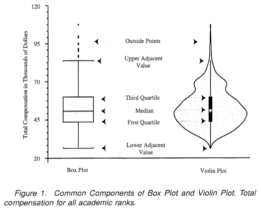
In an age where data visualizations speak louder than reports, choosing the right plot becomes imperative.
Decision-makers crave clear and insightful graphics, ensuring data-driven decisions are based on realities rather than intuitive guesswork. Violin plots and box plots are two visualization champions helping analytical leaders identify hidden patterns and drive innovation. But the question remains: when do you leverage violin plots, and when do box plots take precedence?
As your strategic partner in navigating the complex landscape of data analytics and innovative perspectives, we’re here to guide you through the subtle complexities of these visualization tools, ensuring your data stories resonate powerfully with stakeholders.
Understanding the Difference: Violin Plot vs. Box Plot
At first glance, violin plots and box plots seem similar—both visualizations provide insights about data distribution. Yet, beneath the surface, significant differences distinguish their applicability to various analytical contexts.
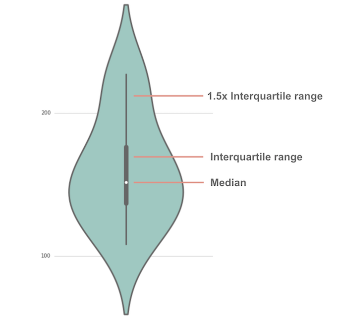
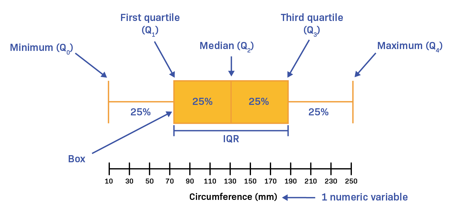
A box plot offers a simple yet powerful representation of essential statistical insights like median, interquartile range, minimum and maximum outliers within the data. Its simplicity fosters quick comprehension and easy communication of data spread, particularly beneficial when stakeholders require immediate clarity.
In contrast, a violin plot extends this capability further by combining box plot fundamentals with a kernel density estimation (KDE).
This approach provides a deeper, more nuanced visualization, showcasing the probability density distribution and illuminating the full spectrum of data distribution, including multimodality and density variations. These sophisticated visuals allow decision-makers to understand distributions at a granular level, uncovering hidden trends or patterns that could considerably impact strategic decisions.
This data-centric differentiation makes violin plots powerful in scenarios demanding comprehensive data analysis and deeper interpretive insights. On the other hand, box plots clearly suffice in scenarios focused on rapid interpretation and concise summaries essential for executive presentations. Choosing the right visualization hinges on knowing your data—what insights you need, and how granular stakeholders wish to see the information.
Violin Plots: Best Scenarios for Deeper Distribution Insights
Uncover Hidden Patterns and Multimodal Data Features
Businesses generating substantial amounts of data benefit immensely from visualization techniques that pinpoint subtle variations and hidden insights. Violin plots shine precisely in these contexts by capturing data patterns that box plots might overlook. Kerne density estimation provides additional distribution insights by illuminating multiple peaks or modes within a dataset—a necessity when dealing with multimodal datasets indicating mixed populations or varied behaviors among different subgroups.
Such granularity serves as a necessary precursor before implementing complex analytics strategies like those we outlined in holographic data modeling for multi-perspective analytics. By first understanding nuanced complexities, your predictive and analytical data models become more robust. Imagine a scenario where user behavior exhibits multimodality; a violin plot clarifies user segments more explicitly, adapting strategy and aligning offerings accordingly.
Comprehensive Exploration During Initial Phases of Data Analysis
When performing comprehensive exploratory data analysis (EDA), analysts seek extensive, detailed visualization that fully embraces variability and data diversity. Violin plots enable analysts to see beyond simplistic summaries provided by box plots. Their rich visualizations inform proactive investigation during the early stages of analysis, guiding decisions for subsequent analytical modeling and optimization efforts. Particularly relevant in finely-tuned predictive modeling scenarios, stakeholders appreciate this depth when exploring supply chain variability through approaches detailed in our guidelines on leveraging predictive analytics for enhanced supply chain management. Precise insights into demand volatility and supplier diversity empower decision-makers to anticipate events, foresee roadblocks, and streamline operational strategies.
Box Plots: Optimal for Quick Understanding & Efficient Communication
Simplified Visuals for Executive-Level Reporting
In many organizations, simplified visualizations drive quick, confident executive decision-making. Box plots summarize critical statistical metrics concisely, allowing executives and non-technical stakeholders to grasp fundamental data characteristics fast. Utilizing an easily comprehensible visual ensures adoption and effectiveness in communication across teams and executive leadership.
If you have stakeholders who comment something along lines of “no one looks at your reports,” it could highlight challenges in communication clarity or complexity. Box plots effectively address this issue, providing a visual summary that’s digestible, impactful, and capable of quickly bringing clarity to discussions. Rather than burying leaders in detail-heavy visualizations, the accessible nature of box plots ensures swift insights, supporting prompt strategic action.
Ideal for Quickly Spotting Outliers and Comparing Groups
Another significant benefit of box plots aligns with scenarios demanding quick glance visibility to outliers or performance differences across comparable groups or categories. For instance, segment performance metrics in marketing campaigns, manager KPIs in organizational reviews, or sales results across multiple product categories become immediately identifiable through this simplistic approach.
This straightforward functionality enables quick identification of deviations warranting immediate action. Note that this speed in decision-making can enhance organizational agility, another core benefit when incorporating sophisticated analytics aimed at operational efficiency, similar to innovations discussed in our guide to semantic type recognition for automated data processing. You initiate faster response times, expedited troubleshooting, and strategic pivots, maximizing opportunities and minimizing inefficiencies.
Synergizing Violin and Box Plots for Strategic Advantages
Smart technical strategists also understand the advantages inherent to utilizing violin plots and box plots in tandem, leveraging each visualization to complement the other. For example, analysts venture into violin plots initially when exploring data properties comprehensively, then transition later to box plots when communicating summarized insights to broader audiences.
This approach mirrors methodologies we’ve employed successfully in engagements providing advanced Tableau consulting services, where analytics dashboards balance comprehensive analysis (with violin plots) and easy-to-digest summaries (using box plots).
Carefully choosing visualization strategies based on purpose and audience cultivates deeper appreciation of analytics capabilities throughout an organization. Consider using the combined strength of these plots for situations like performance tuning, predictive analytics refinement, and even advanced data retrieval strategies such as those noted in our insight into enhancing data retrieval with indexing in SQL.
A Visualization Strategy Aligned to Your Data Objectives
Ultimately, the violin plot vs. box plot debate finds merit only in understanding your unique strategic priorities and organizational needs.
For rapid communication, executive dashboards, and immediate insights—box plots remain unbeatable. However, when exploratory investigation and meticulous distribution insights become paramount, violin plots provide robust clarity and deeper analytical footing.
At every visualization journey step, an informed approach steers optimal strategic outcomes. Effective visualization is not merely a formula but a strategy developed through careful contemplation into data complexities, stakeholder requirements, and intended objectives.
Ready to enhance your strategic decision-making through visualization clarity? Consider also the benefits of structured, semantic data integration efforts, aligning perfectly towards your strategic aim—like we’ve outlined in our work with ontology-driven data integration and our strategy of creating clarity via enhancing user experience through clearer policies.
Final Thoughts: Plotting the Road Ahead
Understanding the contextual benefits and differences between violin and box plots ensures your visualization strategy sets your team in the right analytical direction. Choosing the right visualization aligns directly with impactful storytelling, powerful insights, and insightful data discovery—each vital in navigating today’s competitive, data-driven marketplace. As your strategic partner in technology, analytics, and innovation, we’re here to help guide your analytics journey forward toward data excellence and strategic clarity.
Need support integrating these visualizations into your data ecosystem? Let’s connect—your data innovation journey starts here.
In an era where data fuels strategic decision-making, delivering timely, relevant, and accessible insights to stakeholders is critical. However, relevant analytics are only as good as their accessibility—and user experience matters deeply. With business leaders, executives, and team members accessing critical information via smartphones, tablets, laptops, or large monitor walls, responsive visualization design becomes a non-negotiable imperative. As data strategists and leading-edge software consultants, we’ve seen firsthand how responsive visual design dramatically improves analytics adoption and intuitive decision-making. Building dashboards and interactive analytical visualizations isn’t merely about aesthetics or functionality in silos—it’s about creating unified, cross-device experiences that seamlessly enable insight-driven action. This is the essence of enabling genuinely responsive analytics—designing visual interfaces that tell powerful stories clearly, succinctly, and consistently, regardless of the viewing device.
Understanding the Importance of Responsive Visualization
Organizations today operate in dynamic, fast-moving environments. Executives do not have the luxury of waiting until they’re in front of a desktop monitor to make critical decisions based on analytics—nor do frontline field workers always have the convenience of secure office networks to check essential operational data. Responsive visualization design inherently acknowledges this reality by constraining and molding data-driven insights into meaningful visual outputs that fit perfectly across all types of screens and devices, ensuring accessibility and clarity anywhere.
Our experience with the tech-driven construction industry exemplifies the demand for responsive dashboards. For instance, integrating analytics with platforms through Procore API consulting services proved valuable in enabling field workers on construction sites to swiftly consume analytics through mobile interfaces. Bringing real-time data visualizations to on-the-ground teams requires dashboards optimized for smartphones or tablets, empowering rapid, well-informed decisions without reliance on desktop setups.
Incorporating responsive designs greatly supports adoption by minimizing barriers to insight consumption. As emphasized in our blog post discussing creating executive dashboards for meaningful decisions, a key success factor includes dashboards that instantly adapt to different contexts, workflows, and roles. Responsive visualizations allow executives and employees to instantly understand complex data insights, whether they’re checking a quick report on their mobile phones or analyzing performance metrics at their office desks.
Principles and Best Practices for Responsive Data Visualization
Simplicity in Data Representation
One of the fundamental principles of responsive visualization design is simplicity. Mobile devices inherently have smaller screens, requiring visual elements that communicate clearly and swiftly. Overly complex visualizations may deliver remarkable details on large desktop monitors, but quickly lose readability and usability when viewed on a smartphone device. Therefore, prioritize minimalism and simplicity to ensure the essential information is instantly recognizable and actionable.
Strategically employing visual hierarchy—highlighting critical metrics clearly, placing crucial KPIs at the forefront, and limiting excessive metrics—facilitates quick comprehension. Utilizing best practices such as progressive disclosure, straightforward bar and line charts, and a conservative color palette ensures visualizations remain impactful, ensure clarity, and offer actionable insights, even in constrained spaces.
Adaptive Content and Modular Design
Adapting for mobile devices isn’t merely about shrinking visual elements—it’s about fundamentally re-thinking content from a modular standpoint. Responsive analytics visualizations should break complex dashboards into modular tiles that can reshape flexibly, permitting enhancing content adaptability to various devices and screen orientations. Layers of interaction and data hierarchy emerge intuitively as device size and real-estate increases from smartphone to desktop.
As we’ve outlined previously in our exploration of privacy-preserving analytics with synthetic data, flexibility in viewing data at varying levels of granularity supports both comprehension and secure data handling. Responsive visualization development should similarly allow stakeholders to easily toggle between simple overviews and detailed drill-down scenarios without cognitive overload on smaller screens.
Responsive Visualization Technologies and Tools
Modern visualization tools and platforms now integrate responsiveness inherently, enabling designers and developers to create responsive dashboards efficiently. Solutions such as Tableau, Power BI, and D3.js have robust features facilitating adaptive visualizations without extensive additional coding. Beyond dashboards, building robust APIs and modern data pipelines further ensures analytical data continuously feeds responsive visualizations with accurate and up-to-date information.
Moreover, leveraging responsive visual analytics that integrate with real-time data streaming delivers significant value for rapid business decisions. As discussed in our post highlighting the importance of data streaming in fraud prevention and detection, the fusion of real-time streamed data with responsive visual interface design broadens accessibility to critical insights, eliminating latency in decision making across all devices.
Additionally, advanced monitoring solutions tailored to pipeline drift detection benefit greatly from responsive capabilities, ensuring analytics remain promptly actionable regardless of location or device. Implementing responsive visualization through innovative tooling ensures critical insights get properly presented to decision-makers wherever needed.
Overcoming Responsive Design Challenges
One inherent challenge to responsive visualization and analytics delivery is managing performance while preserving data fidelity across various devices. Smaller devices typically have less processing power, demanding optimized code and streamlined data payloads. Applying best practices like caching, intelligent data sampling, and efficient rendering significantly enhances responsive analytical performance without comprising insight accuracy.
Another critical challenge involves designing information architectures flexible enough for multiple screens while rigorous enough to convey powerful insights without confusion. As noted in our exploration of using causal inference frameworks in business decision support, structured and carefully organized information architectures contribute significantly to robust and insightful analytical experiences. Correctly applying responsive layout grids, dynamic resizing constraints, and employing iterative user testing sessions ensures analytics visuals retain meaning and efficient interaction patterns regardless of the individual end-user’s device.
We also encourage decision-makers and technical strategists adopting responsive designs to proactively learn from user feedback loops. Collaborative sessions conducted in ways similar to our post about 1-on-1 expertise sessions to improve tool adoption offer invaluable insights into user behaviors and unexpected pain points, streamlining iteration and significantly boosting visualization adoption across multiple devices.
Using Responsive Analytics to Impactful Industry-Specific Outcomes
Responsive visualization design becomes particularly impactful in addressing specific industry needs. For instance, cities currently adopting responsive analytics as part of digitally enabled sustainability strategies leverage visualization across multiple connected device categories—from public informational kiosks to smartphone reporting apps and sophisticated command centers. Our collaboration and exploration of improving Austin’s urban sustainability through analytics showcases vividly how responsive data visualization optimizes public policy implementation and community engagement significantly.
Similarly, the healthcare industry strongly benefits from responsive visualizations that accurately and clearly communicate real-time patient monitoring information and health data inputs across medical practitioners’ handheld and desktop devices. The capacity to review data fluidly from wearable devices, tablets, and desktop applications drastically improves responsiveness to medical crises or patient care adjustments.
The critical factor across these varied industries remains straightforward—increase stakeholder access and lower complexity to maximize analytics’ value proposition. Responsive visualization, when executed correctly, becomes a competitive differentiator and a facilitator for innovative analytical breakthroughs across digital transformation journeys.
Conclusion: Building Adaptable, Powerful Analytics Experiences
Responsive visualization design isn’t merely a supplementary feature to modern analytics—it’s a conversation-starting requirement. Effective analytics today demands intelligent responsiveness as stakeholders universally shift toward mobile and multi-device engagements. Organizations harnessing this responsiveness ensure deeper analytic adoption, clearer communication, improved knowledge retention, and ultimately, stronger and more informed decision-making.
At Dev3lop, our expert strategists offer not only technical expertise but also strategic roadmap support for transitioning analytics environments to wholly responsive platforms. Our commitment centers around effectively bridging the gap between data insight and real-world decision-making by enhancing data visualization accessibility, intuitiveness, and actionable outcomes across any device stakeholders leverage.
Through thoughtful, responsive analytics design, your stakeholders effectively engage and intelligently utilize data, laying the foundation for the next tier of digital innovation success.