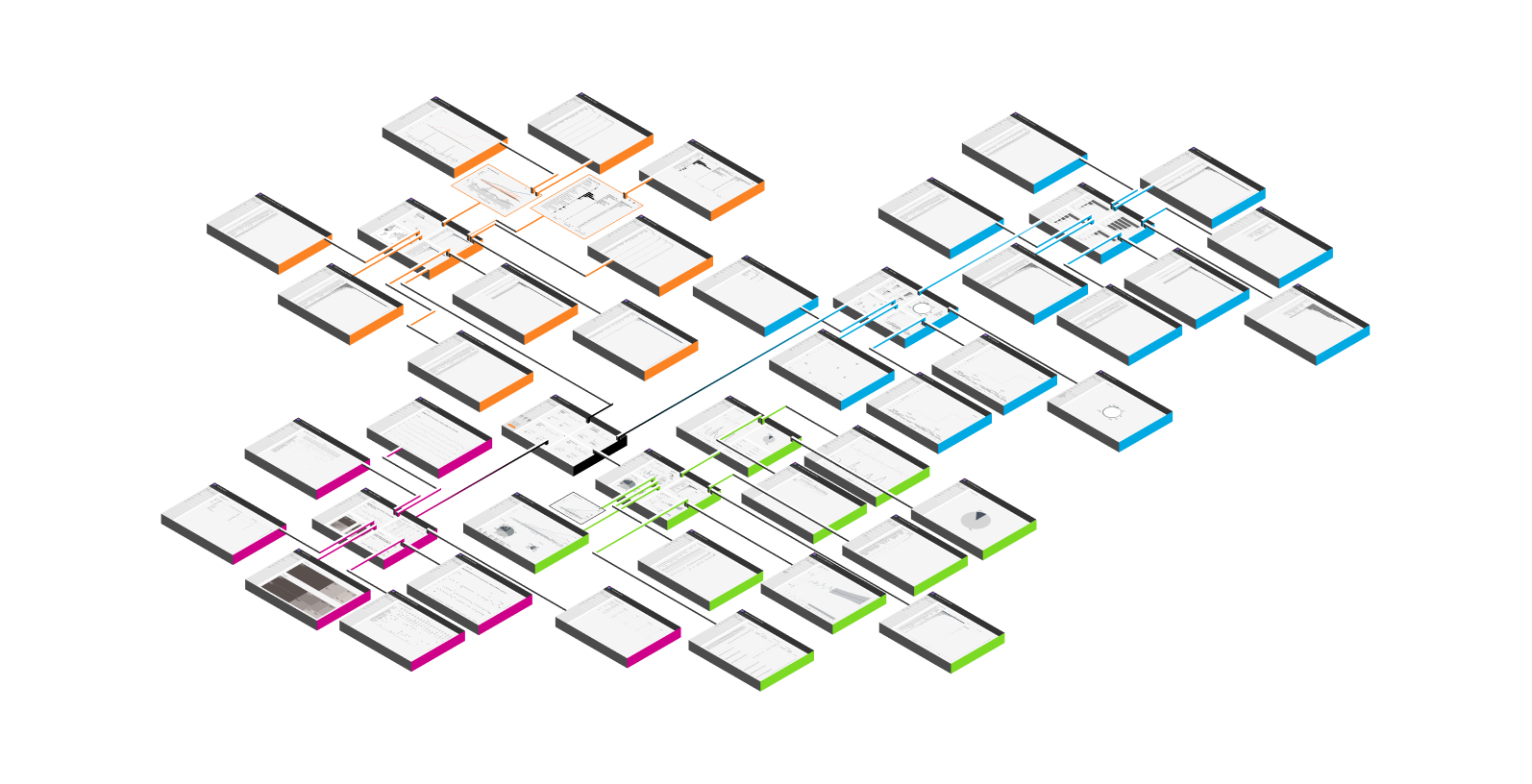
Tableau Dashboard development and end user usage dictates meta data creation or lack thereof. We have a template for you. It helps you formulate a large amount of navigation from a single landing page. A large journey that increases views per visit. This is helpful because it shows how actions like looking at data or increasing the size of charts, will show you the journey people are taking without interviewing them. Pretend if you have thousands of users, and wanted to know if they think one chart or another is more important. This dashboard will teach you the value of adding PowerBI style expand buttons inside of your dashboards and much more.
How you optimize Tableau desktop has a lot to do with how much meta data you can collect
If you know where people travel on your dashboard, you can add features here, make updates, delete content, upgrade content, and whatever you can think about.
Over fixating on creating dashboards that answer everything means you don’t see who views these extra views, it also becomes a slow dashboard compared to a dashboard with less, and often Tableau data products suffer because lack of understanding of what Tableau server (your infrastructure) or Tableau online (sales force infrastructure) tracks about your end users and doesn’t track.
Luckily we have a website user tracking Google analytics dashboards to share with you.
When you’re in a Tableau Training, they don’t mention the importance of “meta data creation,” that’s an advance Tableau Consulting topic, rather they show you features that consolidate user experiences. These features often generate more work and lower the amount of traffic you could be building down an A or B path.
If product managers or directors overseeing the build of a Tableau data product have little to no experience seeing a Tableau dashboard in Production or post development, your data product may be suffering. Similar to Tableau developers with no experience building websites for clients and increasing the conversion from one page to the next are not going to be as good as a web developer who understands they want to track the usage of these dashboards so that they can understand the conversion.
The end game of a Tableau data product completed means your team now has access to meta data for further discovery.

A Tableau Meta data usage strategy..
A piece of your data governance strategy is to discuss how the product usage data will be used.
If your team has no experience using Tableau beyond building charts and fun dashboards, there’s a good chance you will not know about what data is being tracked from an end user perspective because they have never been in a project where this is relevant.
Knowing about meta data captured gives you bonus points when building dashboards in Tableau. When creating data products for large audiences you will want to be sure to capture as much data as humanely possible.
Conclusively…
If you don’t know what data is tracked, you don’t know what data is not tracked.
Not understanding this information or fundamentals of Tableau will limit your dashboards optimization possibilities.
Opportunities to Optimize the User Experience
There are always numerous opportunities to optimize the user experience and many navigations will show you this quickly in Tableau. These optimizations can significantly impact user satisfaction, engagement, and overall success. Here are some key areas to consider when seeking to optimize the user experience:
a) User-Centered Design: Begin with a deep understanding of your target audience, their needs, and preferences. User research, surveys, and usability testing can help in this regard. By placing the user at the center of the design process, you can tailor the experience to meet their expectations.
b) Responsive Design: With the proliferation of devices and screen sizes, ensuring a seamless experience across various platforms is crucial. Responsive design techniques can adapt the user interface to different screen sizes, making content and functionality accessible to a broader audience.
c) Performance Optimization: Users expect speedy and responsive applications. Minimizing load times, reducing latency, and optimizing code can significantly enhance the user experience. This includes implementing techniques like content delivery networks (CDNs), browser caching, and code minification.
d) Personalization: Tailoring the user experience based on individual preferences and behaviors can lead to higher user satisfaction. Implementing personalization features, such as recommendations, customized content, and user-specific settings, can make the user feel more valued and engaged.
e) Accessibility: Accessibility improvements are essential to ensure that all users, including those with disabilities, can access and use your product. Implementing features like alternative text for images, keyboard navigation, and screen reader compatibility is essential for creating an inclusive user experience.
Improving the Most Used User Experience
When improving the most used user experience within a product or service, it’s important to focus on areas that have the greatest impact on your users. Here’s a step-by-step approach:
a) Identify Key Use Cases: Start by analyzing data and user feedback to pinpoint the most frequently used features or aspects of your product. These are the areas where you should concentrate your efforts.
b) User Feedback: Solicit feedback from users who are regular users of these key features. Understand their pain points, challenges, and suggestions for improvement.
c) Streamline Workflows: Simplify and optimize the workflows related to the most used features. Reduce unnecessary steps, automate repetitive tasks, and make the process more intuitive.
d) Performance Enhancements: Ensure that these features are as fast and responsive as possible. Users will appreciate a speedy experience, especially when using core functionalities.
e) User Interface Design: Evaluate the user interface and design to make it more user-friendly. Implement user-centric design principles and consider A/B testing to find the most effective design changes.
f) Testing and Iteration: Continuously test the improvements with real users and gather feedback to make iterative adjustments. A data-driven approach is essential for ongoing refinement.
The Opportunity to Architect a Product That Works Without Manual Intervention
Creating a product that operates without manual intervention is a goal often associated with automation, AI, and smart systems. Here are some key considerations for achieving this:
a) Data-Driven Decision Making: Implement data analytics and machine learning algorithms to enable the product to analyze data and make decisions autonomously. For example, a predictive maintenance system in manufacturing can use sensor data to schedule repairs before equipment fails.
b) Intelligent Automation: Incorporate automation into routine tasks and processes. This can range from chatbots handling customer support inquiries to software that automatically categorizes and sorts incoming emails.
c) Scalable Infrastructure: Ensure that the underlying infrastructure can scale automatically to handle increased demand. This may involve cloud-based services and elastic computing resources.
d) Self-Healing Systems: Build in mechanisms for the product to detect and resolve issues on its own. For instance, a web application can automatically restart failed services or redirect traffic in the event of a server failure.
e) Security and Compliance: Develop robust security and compliance measures to protect the product and its data, especially when it operates without manual intervention. This may include continuous monitoring, intrusion detection, and data encryption.
f) Monitoring and Reporting: Implement comprehensive monitoring and reporting tools that allow you to track the product’s performance and intervene if necessary. This ensures that, even in an automated system, there’s oversight and control.
By architecting a product that can operate autonomously, you can reduce the need for manual intervention, increase efficiency, and provide a more seamless experience for users while maintaining control over critical aspects of the system.
Not knowing what meta data is being tracked about end users will lead to a good data product suffering unnecessarily.
Once you understand what Tableau is tracking and not tracking your dashboards will start to look very different. We have found that clients will stop consolidating dashboards once they understand that consolidation isn’t always the best use case for every visualization or dashboard.
Is your Tableau data product suffering?
We found teams will face these six problems while creating Tableau data products.
- Complex Dashboard Design: The Tableau dashboards are overly complex and not designed intuitively. This complexity can make it difficult for users to comprehend the information presented. Improving dashboard design and data visualization techniques can enhance user understanding.
- Limited User Insights: While you can track whether users are viewing a dashboard or not through Tableau Server metadata, it doesn’t provide deeper insights into what users find valuable or the specific aspects of the data they care about. To address this, you need to implement more comprehensive analytics and gather user feedback to understand their preferences.
- Data Discovery Ambiguity: Users appreciate data discovery within the dashboards, but you lack a clear understanding of their preferences. Implementing user behavior tracking, click-through analysis, and surveys can help you identify what content and features are most relevant to your audience.
- Assumption of User Satisfaction: Assuming user satisfaction without direct feedback is risky. Instead, proactively seek user input through surveys or user interviews to gauge their opinions and preferences. This will help you refine your data product to better match user needs and expectations.
- Limited User Interaction: Users might only engage when something is wrong with the data product. To promote more regular interaction, consider implementing features that encourage user engagement, such as notifications, personalized content, and features like data alerts to notify users of relevant changes.
- Long Remediation Time: Dealing with issues and bug fixes can be time-consuming. To address this, consider implementing better monitoring and alerting systems to detect issues early and resolve them promptly. Investing in continuous integration and deployment (CI/CD) can also help in reducing downtime and improving the agility of your data product maintenance.
In summary, addressing these challenges requires a multifaceted approach that involves redesigning dashboards for better comprehension and this can be accessed by connecting to more end user meta data. Actively seeking user feedback, and implementing user tracking and analytics. Additionally, focusing on improving the support and remediation processes can help ensure that issues are resolved in a timely manner, enhancing the overall user experience with your Tableau data products.
If everything is consolidated, how do you improve?
One quick way to generating a healthy data product is considering the user data. Once you get into that meta data it will teach you more about what to build in the future.
If your team consolidated everything into one view, how does your team know what’s being used most? What if ten of the options on the dashboard are never used but generate a lot of work for the team to support?
Interviewing end users and your Tableau developers is important to creating great data products, however what if there’s hundreds of thousands of end users, and ten thousand of them are non-developers? Using Tableau meta data is important and views on each dashboard offers instant access into what’s being used most.
User experience tip; By tracking what user “learn more” you can study their user journey. Learning more or “navigation drilling” offers a window into understanding what’s important to your end users.
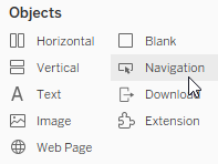
A navigation button in Tableau and moving the end users from one dashboard to another will teach you what users care about.
Use navigation buttons to learn more about measure values, dimensions, and ultimately discover the questions they are asking from the data.
Then it’s up to your team to capitalize on that knowledge to make that data or knowledge easier to access.

Features in Tableau Dashboards used Incorrectly.
If Tableau dashboarding features are used incorrectly, everything will be more difficult to support or easier. The future of support will depend how you use the features and your ability to build content that is easy to reuse; copy and paste.
Over using features in Tableau is a negative and there’s a large hurdle to jump each time you need to edit or make a simple fix.
Now, the simple fix, is not a simple fix. The simple fix requires everyone to fix the feature you implemented everywhere..
Understand the user experience.
Take this website for example, how do we know people are making it to the bottom of the page without a feature that allows them to jump to another page and then tracking that page?
In web tech things are different, in Tableau server you’re fixed to their platform tracking system.
Unless you embed the Tableau environment, however this will start to get technical very fast.
If you’re trying to implement technology that isn’t native, like implementing heatmaps, then we would know if users make it to the bottom of the page. However this feature slows down the speed of the entire website and may not fit for your Tableau Server environment.
Report consolidation and migration.
We know there’s a lot of demand for consolidating reporting and migrating to different SaaS products. We found once that ‘phase’ of business intelligence ends, companies start to see the reason consolidation is a negative or positive.
Consolidating dashboards using features is a big selling point because Tableau trainers choose to show these features in training and a lot of Tableau developers choose to build dashboards with features to help consolidated, however this is not a good usage of developer time if you’re unable to uncover meta data from the usage of the data products.
Consolidating user experiences in Tableau when building a data product limits your ability to understand what a user is using the most and forces interactions with end users beyond your data product.
This dashboard can work for profit, sales, and everything that can aggregate can be a fun dashboard to build, and insightful for many, however what if people are only using the profit pie chart of the dashboard? Building a user experience to uncover these questions from the end user will help you improve your tableau product development beyond report consolidation and migration phases.
A solution, using Colibri Tableau Dashboards
Our founder Tyler crafted Colibri after 10 years of building Tableau data products. Tyler, founder of dev3lop, worked at Tableau Software as a Full time employee before leaving to create Dev3lop | Consulting Services.
In Tyler’s words;
I added what I feel is an important aspect to generating meta data that will help you understand what is important to your end users who use the product, and it will tell you what data structures are being accessed the most. Drilling into a chart, better screenshots of the chart, and drilling into the data of a chart is the KEY of the entire solution. This amount of navigation gives you a huge foundation of clicks completed. Colibri can be your “template” and it doesn’t need to be tailored to Google analytics.


