Have you ever faced difficulty visualizing your data clearly because multiple data points overlap, obscuring important insights? When datasets become dense, traditional graphical representations often conceal the full story, leaving business leaders and analysts unable to drive clear decisions. The solution is jitter—a simple yet powerful technique that intelligently shifts data points slightly from their original positions, increasing visibility and interpretability. Implementing jitter empowers data analysts and decision-makers alike, enhancing the clarity of your visual storytelling. As a software consulting firm deeply committed to data, analytics, and innovation, we understand how critical precise data visualization can be in unlocking actionable insights. In this blog, we dive deeply into jitter implementation, exploring its importance, best practices, and strategic integration within your analytical workflows.
Understanding the Overlapping Data Challenge
In the world of data analytics, clarity is synonymous with actionable information. However, overlapping data points are commonplace, particularly in densely populated visualizations. Clustering hinders readability, significantly diminishing the value of an otherwise insightful visual analysis. Overlapping data obscures density, distribution, and distinct data clusters that decision-makers frequently depend on for strategic choices. To tackle this challenge, analytical teams must adopt smart visualization strategies that differentiate points clearly enough to reveal hidden trends and patterns.
Think about databases like Amazon Redshift that efficiently store and manage massive quantities of data. Proper visualization that demonstrates clear distinctions within overlapping points becomes critical for extracting full value from powerful services. Organizations leveraging platforms like Redshift benefit immensely from insightful visualizations that complement robust data storage solutions. For those unfamiliar with advanced database management, check out how our Amazon Redshift consulting services elevate analytical capacities strategically.
Resolving overlapping points through jittering means analysts no longer infer incorrectly or miss critical details concealed within clusters. For large-scale visualizations, it translates directly to improved data-driven decision making, empowering stakeholders with visual confidence.
Introducing Jitter: A Simple Yet Powerful Visualization Strategy
Jitter represents a simple, elegant, and highly effective visualization strategy to overcome the overlap issue. It works by adding small, random variations in the positioning of overlapping data points. As a result, jitter subtly disperses visually stacked points to reveal hidden density, trends, and distributions, all while maintaining the general correctness of your graph. Such strategic adjustments enhance accuracy in interpreting data visuals, making jitter an essential technique toolchest for data-driven organizations.
This controlled randomization helps analysts discern important nuances that would otherwise remain hidden. At a fundamental level, jitter offers an intuitive mechanism to observe variation, ensuring graphical presentations of data remain informative, engaging, and valuable to business stakeholders. Strategically integrating jitter within your visualizations offers a pivotal step toward enabling data-driven decision-making by presenting information clearer and concisely.
Jittering supports visual clarity without introducing bias. Rather, it enriches transparency by ensuring data points remain auditable and traceable to exact origins. Analysts trust jittered data because small positional variations do not significantly distort analytical outcomes; instead, jitter presents the intended picture accurately while eliminating misleading graphical congestion.
Best Practices for Jitter Implementation
Implementing jitter requires careful consideration of parameters. When embedding jitter into visualizations, randomness must be subtle yet sufficient, retaining accurate interpretation. Too much jitter introduces misleading visual dispersion; too little fails to effectively resolve overlaps. Adopting industry-proven best practices can help ensure jitter enhances rather than detracts visual accuracy.
When choosing jitter magnitude, consider your data scale and the density distribution of data points. Smaller increments typically maintain data integrity and readability. Avoid overly aggressive jitter to prevent misinterpretations. Strategic jittering often involves slight vertical or horizontal adjustment, depending on your visualization type (scatter plots, box plots, categorical plots). Each visualization option necessitates specific considerations for optimal usage of jittering.
Additionally, complement jitter with proper visualization considerations like color choices and schema selection. Learn more about how purposeful color selection makes jitter even more impactful in our article: the role of color in data visualization. Pairing jitter with thoughtful visual decisions ensures maximum clarity and effectiveness across analytical dashboards.
Applications of Jitter Across Industries and Analytical Methods
Jitter has widespread applications across countless industries and analytical scenarios. For instance, financial firms employ jitter visualization in scatterplot distributions of market analytics to reveal hidden correlations and outliers. Healthcare organizations adopt jitter in patient data visualizations to identify sensitive and otherwise hidden variations among patient population groups. Marketing analytics teams leverage jitter to identify subtle patterns in demographic data or sentiment analysis results, enhancing insights from advanced analytical methods.
Data teams increasingly integrate jitter into their toolkits alongside other analytical advancements. For example, combining jitter visualizations alongside sentiment analysis powered by Python and NLTK enables more precise digital media marketing strategies. Likewise, leveraging jitter helps visualize complex relationships and informs data-driven decision-making around customer engagement, user behavior, or complex transactional data.
Integrating jitter is also beneficial in enhancing clarity when visualizing data transformations in dynamic pipelines or analyzing complex logical SQL operator analytics—as detailed extensively in our guide on harnessing the power of logical operators in SQL. Robust visual clarity enabled by jitter supports transparency and accuracy across agile analytical workflows, empowering technical strategists as more reliable decision-makers.
Incorporating Jitter into Advanced Data Solution Architectures
As organizations embrace advanced feature store architectures or implement complex machine learning (ML) operations, jitter plays a role within broader analytical frameworks. Feature stores and ML pipelines must guarantee interpretability and transparency of data representations, making jitter an essential consideration. As discussed in our recent article on feature store architectures, jitter helps present features visibly and comparatively, enhancing the explainability of high-dimensional datasets in ML research and product deployments.
Jitter facilitates better comprehension in analytical frameworks where bidirectional data synchronization patterns emerge across different data systems. When dealing with synchronized data feeds coming from multiple emerging data platforms (like MongoDB Atlas explained in our recent guide MongoDB Atlas Signup), jitter visualizations further inform data synchronization analyses and integrations effectively. Visual clarity enabled by jitter aids engineers and decision-makers, proactively revealing subtler patterns in distributed systems.
Moreover, increasingly popular dynamic scheduling frameworks such as our proprietary scheduling software Canopys—see our announcement around this innovative technology here: software Canopys task scheduler—benefit significantly from jitter implementation, facilitating clarity in visual analytics generated by scheduled repeatable jobs and dynamic workflows. Organizational agility paired with visual accuracy and communicative clarity creates exceptional competitive advantage.
Conclusion and Strategic Next Steps: Optimizing Your Jitter Visualization Strategy
Far beyond a mere graphical adjustment, jitter redefines the way analysts visualize overlapping datasets by dramatically improving clarity, readability, and ultimately, decision accuracy. Successful implementation of jitter involves understanding best practices around jitter magnitude, positional variance, and interaction with other visualization considerations.
Enabling your organization with jitter augmentation positions you strategically to improve your data-driven decision-making capabilities. Leveraging jitter alongside other analytical best practices ensures cleaner, more insightful visualizations across your analytical infrastructure—from databases to cloud tools, and from pipelines to visual frontends.
If you’re ready to heighten the effectiveness and accuracy of your visual analytics, our team at Dev3lop offers comprehensive support to implement jitter across projects, from visualization best practices to advanced dynamic pipeline generation strategies. With jitter enhancing clarity, your organization can fully harness data-driven decision-making potential and lead innovation in analytical excellence.
Tags: Jitter Visualization, Data Visualization Techniques, Analytics Strategy, Data Clarity, Data-Driven Decisions, Visualization Best Practices
Picture this scenario: your organization recently implemented significant operational changes, launched a new web redesign, or introduced advanced AI capabilities. How do you confidently articulate the resulting improvements and justify continued investments in progress? Strategic before-and-after visual comparisons play a vital role for decision-makers in clearly demonstrating value from transformations, innovations, and performance enhancements. Embracing these visual techniques enables your team to make empirically-founded decisions, communicate effectively across stakeholders, and continuously refine your strategy using informed insights. In this post, we’ll unpack powerful visualization techniques highlighting their strategic implications—positioning you as a technical strategist who transforms raw data into insightful storytelling.
The Crucial Role of Visual Comparisons in Data-Driven Decisions
In today’s hyperconnected landscape, understanding the tangible impact of business decisions through analytics is more critical than ever before. While intricate datasets and advanced analytics tools provide decision-makers access to tremendous volumes of data, the real challenge lies in conveying the crux of this information concisely. This is where visual comparisons become invaluable. They offer clarity, context, and simplicity, which help accelerate understanding of complex findings. Effective visual comparison removes ambiguity by simplifying data into visual stories stakeholders easily interpret.
Leveraging visual comparisons is central to fostering a culture ready for innovation. Whether your goal is measuring brand sentiment across digital channels, highlighting your success in optimizing data processing speed through relational theory and normalization strategies, or communicating multidimensional data via density contour visualization techniques, visual comparisons streamline your analytics pathways. They provide a tangible, evidence-driven basis for dialogue and decisions, emphasizing significant trends and highlighting evolving situations in business contexts.
A strategic way to leverage visual comparisons is to demonstrate the impacts of new software deployment, process improvements, or recent changes strategically. Visualizing “before” and “after” conditions reduces cognitive load, making it an essential tool for reporting to stakeholders who allocate budgets, facilitate project support, and drive strategic transformations.
Comparing Temporal Data with Time-Series Visualizations
Perhaps no visual analytics format conveys progress over time as effectively as a powerful temporal data visualization. The inherent nature of business-oriented analytics typically involves measuring progress or performance variance over key periods. “Before-and-after” visual analysis using time-series visualizations allows stakeholders to swiftly grasp positive or negative trends occurring after significant business decisions or market interventions.
Line charts or area charts are traditional examples, often utilized due to their intuitive readability. However, innovative, visually rich options like streamgraphs for temporal flow visualization elevate how organizations consume data storytelling by efficiently visualizing multiple categories concurrently, even within large datasets. Diverging bar or column charts, illustrating the percentage change over time intervals, reinforce clarity, allowing decision-makers to quickly discern patterns or anomalies.
The functionality of these visualizations is magnified when integrated with technologies such as automated workflows, machine learning automation, and AI agent technology. With innovative approaches, such as employing advanced tools with expert guidance through AI agent consulting services, organizations can create dynamic, responsive analytics solutions that automatically update temporal visualizations, leading to quicker recognition and adaptive responses that precisely match the demands of a fast-paced competitive landscape.
Business activities often manifest geographically, from sales performance analytics and resource allocation to user adoption metrics for digital products. Geospatial visual comparison techniques illuminate differences across geographical regions swiftly and confidently. For instance, heatmaps depicting infrastructure upgrade impacts or market penetration before and after new strategic investments enable granular understanding of how different geographical locations have responded to corporate initiatives.
Advanced spatial analytics and GIS platforms empower visual comparisons by automatically capturing spatial data transformations. You can quickly pinpoint distributional shifts, spot untapped market opportunities, or identify geographical anomalies requiring deeper investigation using these intuitive geographic visuals. Pairing these techniques with analytics innovations, such as modeling consumer spatial behavior or spatial regression analysis, fosters a robust spatial analytics platform, ensuring strategic insights remain localized and actionable.
Whether managing client products, infrastructure performance enhancement, or analyzing user experience metrics spatially, geographical visualizations support stakeholders’ decisions in highly targeted and actionable ways. This clarity enables more confident resource deployments, timely responses, and precise interventions influenced directly by clear spatial insights.
The Power of Side-by-Side Data Dashboards
While individual charts provide clear evidence points, strategic visual comparison gains significant strength when harnessed within interactive data dashboards. Side-by-side dashboards quickly display “before” scenarios alongside the “after” conditions, offering a more immediate cognitive recognition of success factors leading transformations. Dashboards also provide flexibility by enabling stakeholders to toggle specific data subsets, allowing personalized exploration of variations observed before and after periods.
Visualization in dashboards is especially powerful when integrating temporal, spatial, and categorical data points simultaneously. For example, organizations that visualize the performance of newly adopted software platforms or AI-integrated solutions often benefit greatly from customizable business dashboards. Technical practices such as SQL pattern matching enable sleek data interactions, allowing teams to segment data quickly and thoughtfully to display precise before-and-after insights. Moreover, proactive management of dashboard performance by strategically optimizing and maintaining analytical software through best practice configurations, such as disabling unnecessary Windows services like Usosvc, ensures your visual comparisons remain rapid, responsive, and relevant.
Advanced Comparisons with Multivariate Distribution Visualizations
Going beyond basic two-dimensional elements, visual comparison techniques for complex multivariate data reveal nuanced changes through rich visualizations, such as density contours or violin plots. For example, density contour visualizations illustrate multidimensional relationships and make it practical to uncover subtle yet impactful distribution changes in the before-and-after scenarios.
When interpreting complex market research data, customer segmentations, or financial risk assessments, multivariate comparison visualizations significantly enhance your organization’s capacity to discern strategic patterns and shifts. Overlaying distributions using intelligent data summaries and contour density visualizations enables nuanced interpretation and helps differentiate between user or customer cohorts effectively.
Further, these visualizations output significant insights to support strategic investment decisions in new technology, staffing, marketing initiatives, and more. Importantly, evolving insights from multivariate visualizations demand evolving strategic roles. As described in our recent investigation into the evolving role of data scientists, these visualizations necessitate analytical talent prepared to merge statistical robustness with powerful graphic storytelling techniques.
Driving Future Outcomes with AI-Powered Visual Analysis
Artificial Intelligence further enriches “before-versus-after” visual analysis by surfacing insights hidden within large datasets and enabling dynamic, predictive insights to inform the next steps. AI-driven analytics, combined with visual comparisons, moves beyond historical knowledge and proactively identifies opportunity spaces or risks before they materialize.
Partnering with AI strategies such as AI agent consulting services establishes strategic analytics capabilities, actively leveraging predictive visual scenarios. The skills garnered from expert guidance in AI can reveal predictive comparative visualizations dynamically, transforming data-driven decisions into forward-looking strategies rather than simply retrospective reviews. Such advancements mean stakeholders predict scenarios with confident visualizations anticipating strategy shifts, optimal resource allocation, and robust market positioning.
Embracing AI-powered comparative visualization techniques doesn’t only uphold your analytics maturity but significantly enhances competitive positioning through proactive decision-making. This synthesis of artificial intelligence, expert strategic guidance, and compelling visualization further establishes organizations at the forefront of innovation.
Transforming Insights into Action with Visual Comparisons
Ultimately, adopting increased sophistication within visual comparison techniques fuels smarter business decisions and innovation-driven organizational cultures. These visual mechanisms are not merely tools of analysis; they’re powerful strategic instruments shaping executives’ ability to understand results, communicate progress, and chart future trajectories.
For executives and technology decision-makers, skillfully leveraging visual comparisons transforms raw analytics into actionable insights—clearly illustrating successes or uncovering critical gaps requiring immediate action. With each visualization, your organization secures sharper insights, deeper analytical competencies, and agile strategic capabilities.
Unlocking this potential starts by investing in best-in-class visual analytic strategies. Ready to elevate your analytics capabilities and unlock visual storytelling? Consider exploring advanced analytics strategies, visual storytelling excellence, and collaborative, innovative solutions today.
In the data-centric world of scientific visualization, clarity isn’t just important—it can mean the difference between impactful discoveries and misleading conclusions. Colors guide the eye and mind inherently, making perception-based color mapping an indispensable tool for analysts, scientists, and researchers who need precise interpretation of complex data. If you’ve ever found yourself wondering why certain visualizations immediately resonate and others fall flat, the principles of color perception are likely at play. Let’s explore how adopting a strategic, scientifically-grounded approach to color mapping can transform your data visualizations into powerful storytelling devices that lead directly to better decision-making.
Understanding Human Perception and Its Role in Color Mapping
At the core of perception-based color mapping is an understanding of how human beings interpret colors. When we view visualizations, our eyes distinguish varying intensities and hues, triggering cognitive reactions that direct focus, influence interpretation, and impact our understanding. For instance, specific hues are instinctively associated with natural elements—such as blue with water or coolness, red with heat or urgency—while intensity gradients dictate perceived data magnitude, clarity, and hierarchy of information. Misalignment between these perceptual cues and your intended message can cause confusion or misleading impressions.
Employing perception-based mapping means intentionally leveraging cognitive science to ensure accuracy and clarity in data visualization design. By using color schemes that align closely with natural human heuristics, we enhance readability, comprehension, and decision-making ability. Recognizing these fundamentals lays a robust foundation for analysts, scientists, and corporate executives who depend heavily on efficient decision-making tools for accuracy and speed.
Additionally, adopting perception-based principles complements broader visualization best practices. As detailed in our article on the importance of data visualization in data science, carefully crafted visualizations not only streamline analysis but also significantly enhance the communication and practical usability of your datasets, which ultimately leads to stronger business outcomes.
Choosing the Right Color Mapping Strategy
Designing effective color maps is a strategic exercise that hinges on multiple key factors. Begin by determining your specific visualization objective clearly: Are you mapping discrete categories, continuous data ranges, or diverging patterns? Understanding these objectives helps you select from sequential, diverging, or categorical color schemes accordingly.
Sequential schemes, consisting of gradual tonal shifts between two endpoints, are best suited for data with natural ordering or magnitude relationships (e.g., population density, temperature). In contrast, categorical color mappings highlight distinct and unrelated groups and must employ colors deemed sufficiently different to minimize confusion. Lastly, diverging color maps illustrate deviation around a midpoint and are valuable for data sets characterized by critical neutral or baseline values, like profit analysis or performance monitoring relative to benchmarks.
Like choosing between open-source and commercial ETL tools—explained thoroughly in our article comparing open-source and commercial ETL solutions—the right color mapping approach depends heavily upon aligning your visualizations closely to your business context and objectives. Thoughtful selection ensures accuracy, clear interpretation, and actionable insights for stakeholders, dramatically improving the quality and effectiveness of business communication.
Avoiding Common Pitfalls in Color Mapping
Even with well-defined objectives, pitfalls commonly emerge in designing perception-based color mappings. Too frequently, data visualizations fail due to improper color usage—such as inconsistent palettes, confusing schemes, overly vibrant colors causing visual fatigue, or inadequately distinguishable colors obscuring critical differences.
Additionally, excessive decoration or clutter in visual designs severely hampers effectiveness and readability. We strongly recommend reviewing our guidelines to avoid unnecessary chart elements and decorations. When selecting colors and constructing your palettes, simplicity and consistency enhance the clarity and immediate comprehensibility of your data storytelling.
An equally important pitfall to avoid concerns accessibility. Color choices should consider colorblind users and be perceivable universally, accounting for variability in color vision among your audience. Test your color mappings with various accessibility tools and ensure visualizations deliver meaningful insights to everyone equally, reflecting professionalism and inclusivity in your communication strategy.
Integrating Perception-Based Color Mapping in Data Visualization Tools
Effectively implementing these perception-based principles requires strategic tool usage and integration within your organization’s data visualization workflow. Leading analytics platforms like Power BI, Tableau, and Python-based visualization tools such as Matplotlib offer nuanced controls over color scale selections, customizable gradients, and accessibility-focused options designed specifically to implement perception-based mapping best practices.
For example, leveraging Power BI’s robust capabilities—highlighted in our comprehensive guide comparing import vs. direct query Power BI connections—can elevate your visual analytics substantially. Utilizing color decisions powered by psychological and cognitive research considerations brings visualization accuracy, clarity, and interpretability to new heights and directly supports informed decision-making.
Integrating color mapping through advanced analytical tools also requires careful management of access controls and data security measures. Ensuring appropriate data governance strategies like privilege management become crucial as visualizations become more detailed and widely shared. Our article focused on managing access control in SQL reinforces the importance of strict yet flexible control mechanisms for visualization security within data tools.
The Strategic Value of Perception-Based Color Mapping for Decision-Makers
When implemented strategically at the organizational level, perception-based color mapping transcends mere data presentation; it becomes a powerful decision-making asset. Clearly visualized data significantly reduces the cognitive load required to interpret complex analytics, accelerating insight extraction and enhancing informed judgment calls.
Perception-driven colors eliminate ambiguity and enhance decision accuracy by intuitively guiding viewer attention to underlying patterns, anomalies, or emerging trends communicated clearly through visualization. Thus, executives and decision-makers can interpret complex scenarios swiftly, understand business metrics effectively, and react promptly to evolving market conditions or internal performance indicators.
Moreover, training internal teams on effective color mapping techniques can strengthen intra-organizational communication, increase analytical literacy, and foster better collaborative data exploration methodologies. This proactive capacity building is particularly critical in clearly understanding workforce roles, which our article examining differences between data engineers and data analysts emphasizes as central to optimized analytics workflows in organizations.
Expert Support in Realizing Your Data Visualization Vision
Building robust scientific data visualizations with intentional color deployment is crucial in modern analytics-driven markets. Yet, not all internal teams are equally positioned to leverage these practices fully without guidance. Collaborating with experienced experts, especially through specialized support like our team at Dev3lop, provides organizations access to deep expertise in data analytics innovation, visualization best practices, and perception-based color mapping principles.
Our specialized team offering PostgreSQL consulting services fully integrates strategic visualization principles into broader analytics technology infrastructure planning. Leveraging professional consulting empowers your team’s ability to transform raw data into intuitively presented analytics insights, significantly enhancing both your organization’s internal analytics culture and stakeholder-facing competitive advantage.
With strategic consulting from Dev3lop LLC, you ensure your visualization strategy aligns better with cutting-edge cognitive psychological insights and powerful analytical technologies available today. Ultimately, perception-based color mapping can lead your organization’s storytelling from ordinary graphs to extraordinary insights crucial for shaping industry leadership.
Ready to elevate your approach? Let’s visualize your data effectively—together.
Navigating geographical data visualization successfully requires more than just an eye-catching map. Selecting the appropriate geographic coordinate system forms the backbone that supports accurate representation of spatial relationships, efficient data interaction, and clear analytic insights. Businesses relying on geospatial analyses for making critical decisions must ensure that their visualizations not only display geographic information accurately but also facilitate seamless integration with other analytical capabilities like modern data analytics tools and technologies. Taking an informed approach to coordinate system selection can mean the difference between insightful, actionable visualizations and misleading representations that drive suboptimal decisions. In this article, we’ll dive deeply into guiding principles, practical considerations, and strategic insights on selecting geographic coordinate systems for impactful map visualizations, empowering decision-makers and analytics teams to optimize their spatial data capabilities confidently.
Understanding Geographic Coordinate Systems and Projections
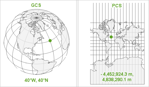
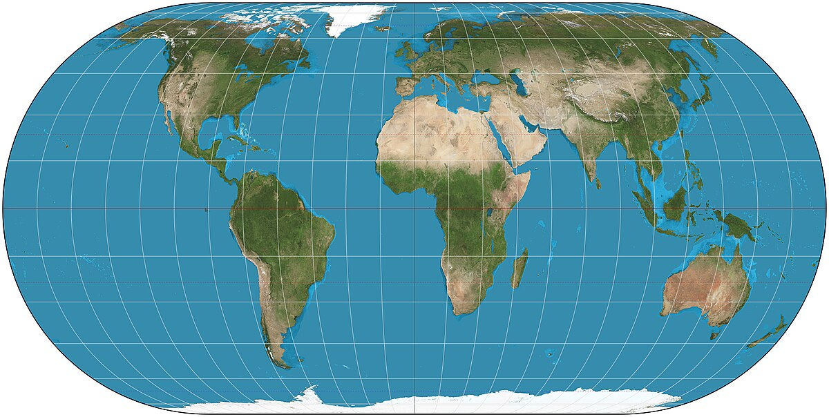
At their most basic, geographic coordinate systems (GCS) define locations by latitude and longitude, enabling location pinpointing anywhere on Earth. Yet, raw latitude and longitude numbers don’t directly translate well into two-dimensional maps suitable for human consumption. Hence, we introduce map projections, which convert the earth’s spherical coordinates into planar coordinates. Selecting an unsuitable projection can distort distances, directions, areas, and shapes, ultimately risking the accuracy of your analysis and its conclusions.
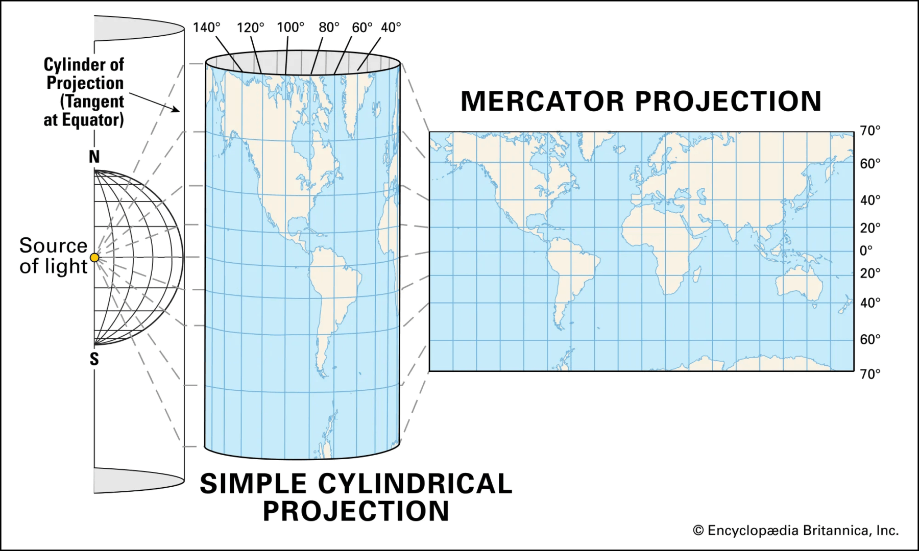
For example, the Mercator projection, often employed in many web-based visualization tools, significantly enlarges objects closer to the poles and misrepresents true sizes and distances. While suitable for navigation, it can incorrectly inform decisions where accurate representation of size and proportion is critical. Conversely, choosing equal-area projections like Mollweide ensures faithfully represented surface areas but distorts shapes, demanding thoughtful consideration when visuals impact business analyses and decisions.
Understanding how these coordinate systems and projections work at a fundamental level empowers your analytics teams, ensuring accuracy in map-based assessments and enabling stakeholders to make better-informed decisions. Whether visualizing sales performance, market penetration, or logistics supply chains, understanding these foundational elements contributes significantly towards precision and strategic effectiveness.
Factors Influencing Geographic Coordinate System Selection
When deciding on a coordinate system or projection, several key factors warrant serious consideration to maximize your visualization’s effectiveness and accuracy. Primarily, analytics teams should evaluate their visualization objectives first: is your primary aim navigational accuracy, shape accuracy, or accurate depiction of area? Each objective leads you towards selecting a different coordinate system.
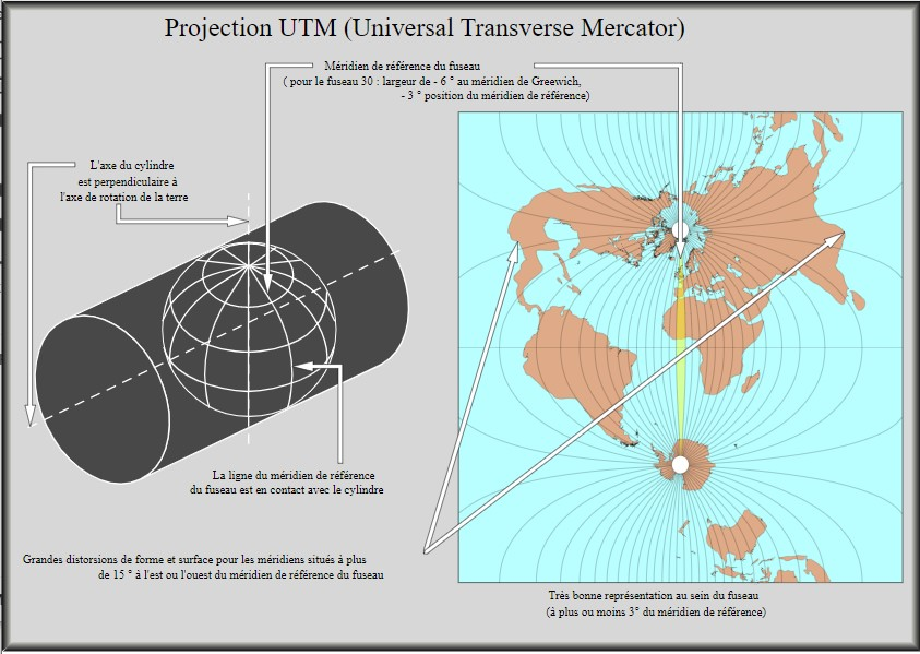
Next, consider geographic extent: is your visual focused on a local region, national scale, global scope, or perhaps spanning multiple continents? Local analyses benefit from localized projections, such as State Plane or UTM (Universal Transverse Mercator), preserving distance and local accuracy with minimal distortion. Conversely, global or multi-country visualizations require broader projections, potentially leveraging equal-area options to represent large geographic areas clearly and uniformly.
Performance and interactivity are also critical. Organizations serious about visual analytics often focus on optimizing loading times and responsiveness, as discussed in our guide on Performance Tuning for Data Visualization Dashboards. Your coordinate system’s complexity and alignment with visualization tools can significantly influence the scale and speed of data processing required. Thus, consider leveraging established data warehousing solutions, as detailed in our data warehousing consulting services, to better manage and streamline spatial data interaction.
By carefully weighing your specific objectives, geographic context, and technical usability, your selections will become more strategic and impactful, delivering meaningful insights to stakeholders quickly.
Impacts of Coordinate System Selection on Data Visualization Quality
Choosing a geographic coordinate system directly impacts visualization effectiveness and trustworthiness. An incorrect projection or unsuitable coordinate system can distort relative values, spatial relationships, and shapes. Inaccurate representation directly impacts interpretations, analyses, strategic decisions, and business outcomes. Eliminating unnecessary confusion caused by distorted views aids live analytics and executive teams alike, enabling straightforward interpretation, collaboration, and quicker actions.
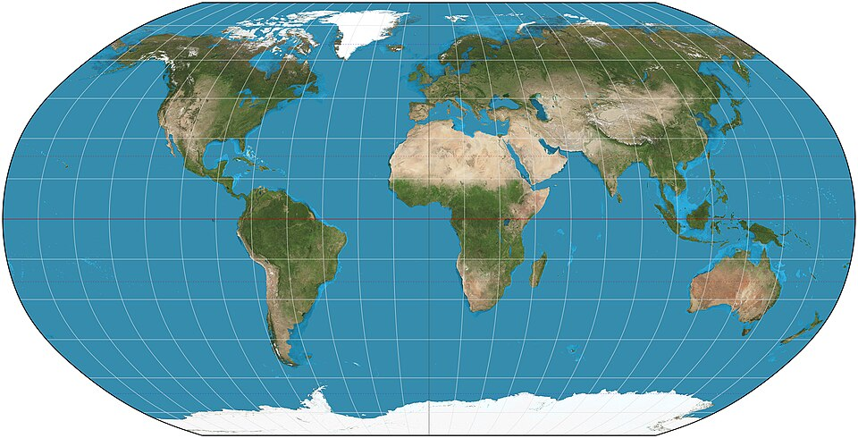
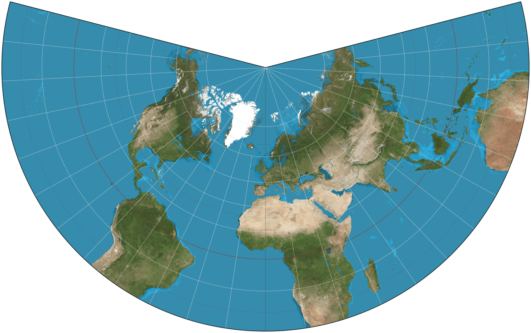
Robinson
For example, in visualizing international markets or global distributions, choosing projections like equal-area Robinson or Eckert IV greatly reduces the perceived distortion. Conversely, national analytics focusing heavily on logistics and routes benefit substantially from conformal projections (such as Lambert Conformal Conic), as these correctly preserve angles and shapes necessary to accurately trace routes and understand spatial logistics efficiently.
Eckert IV
Correctly viewing spatial data also supports advanced analytical opportunities—from effective clustering insights to deeper data science modeling usage. Real-time analytics and machine learning model accuracy depend heavily on feeding models high-quality, accurately represented geospatial data—making coordinate system selection foundational for advanced analytics, accurate predictive modeling, and consistent decision-making.
By aligning your visual analysis tools properly with the optimum coordinate system, organizations reduce ambiguity, improve data-driven efficiencies, and confidently support strategic and operational decisions with strong, convincing visualizations.
Practical Examples of Choosing the Right Coordinate System
Understanding these theoretical principles becomes stronger when contextualized within real-world applications. Suppose you’re leading data analysis in logistics, measuring delivery routes across Texas. Leveraging local scale projections such as State Plane Texas Central will ensure minimal distortion in distances and measurements, supporting exact geographic data interpretation, regulatory compliance, and precise route optimization.
Alternatively, businesses analyzing climate-impacting activities globally will benefit significantly from employing equal-area map projections, such as Peters or Mollweide, helping accurately visualize environmental impact data, distribute resources fairly, and make informed global strategic decisions.
Meanwhile, organizations prioritizing navigation-like use-cases, such as real-time fleet tracking visualizations or drone delivery routing, generally prefer conformal projections like Mercator or Lambert Conformal Conic. These systems preserve angles and allow for accurate representation of bearings, significantly increasing the precision of operational capabilities and the accuracy of real-time decision-making activities across analytics teams.
Lambert Conformal Conic
Effective practicality mandates adequate knowledge sharing, team alignment, and clear understanding of use-cases and tool capabilities. For organizations aiming to establish lasting consistency in spatial visualizations, employing data-contract-driven development frameworks enhances team alignment and communication about coordinate selection rationale, increasing strategic confidence across stakeholders.
Advanced Considerations: Integration and Data Pipelines
Today’s data-driven environments demand not just insightful map visualizations but seamless integration into broader data ecosystems. Coordinate systems and geospatial data should integrate easily within ETL pipelines, data warehousing solutions, and BI visualization tools. Observing the right golden signals for data pipelines is vital to maintaining the quality, efficiency, and accuracy of geographic data.
In advanced pipeline scenarios, such as integrating spatial data into automated machine learning models, the role of clearly defined and consistently applied geospatial standards becomes especially crucial. Modeling complexity and subtle predictive nuances become more manageable when consistent coordinate system choices underpin all combined data sets. As data products evolve—be it predictive delivery time models, regionally optimized marketing strategies, or market segmentation tools—coordination between spatial visualization requirements and predictive modeling necessities must be clearly defined.
In complex analytics operations, specialized consultants can greatly improve company capabilities. Organizations can benefit from engaging with expert partners who understand the intricate intersection between grassroots or enterprise-style consultancies, geospatial analytics best practices, and broader strategic analytics. By selecting experienced consultants, organizations enhance their opportunities for success, improve geospatial visualization capabilities, and ensure optimal alignment with broader organizational data strategies.
The Future of Geographic Coordinate Systems in Visualization
Looking forward, businesses face evolving demands and technological innovations—ranging from spatial analysis on real-time streaming data to advances in natural language querying of spatial data, such as explored in Natural Language Processing (NLP) applications. The future promises increasingly dynamic interactions with spatial data and map visualization capabilities.
Emerging trends point toward increased personalization, real-time responsiveness, and widespread machine learning integration—all of which depend heavily on the foundational accuracy and performance of geographic coordinate systems. Analytics platforms capable of dynamically adjusting coordinate systems based on query complexity, geographic context, or analytical objectives will grow in importance. Thus, staying informed about these developments and ensuring that your organization’s spatial visualization infrastructure remains flexible and adaptable strategically positions your analytics capabilities for future competitiveness and success.
By building strong expertise and aligning teams around deliberate geographic coordinate system selection, organizations enable robust spatial analytics, agile responsiveness to business requirements, and a solid framework for innovation readiness moving forward.