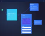
The realm of data analytics is an ever-evolving landscape where bold strategies, innovative tools, and visionary implementations converge to transform raw, complex datasets into visually compelling narratives. Today’s decision-makers wrestle with unprecedented data volumes, diverse metrics, and interconnected variables, each critical to understanding an organization’s operational health. To tame this vast and growing complexity, composite pattern visualization emerges as a powerful framework capable of integrating disparate metrics into cohesive, easily interpretable visual formats. By creating a structured yet flexible representation of multiple performance measures in a comprehensive unit, composite visualizations empower analysts to identify interdependencies, measure impacts across metrics, and ultimately drive intelligent strategic decisions. In the following sections, we will explore the composite pattern visualization approach, highlight its benefits in multi-metric analysis, dive into technical best practices, and provide practical advice on integrating this strategy seamlessly into your analytics infrastructure.
Understanding the Composite Pattern in Visualization
At its core, the composite pattern stems from software engineering principles, allowing users to treat individual objects and compositions of multiple objects uniformly. This principle, widely adopted in software architecture for years, finds unique applicability in visualization scenarios. Composite pattern visualization leverages this idea by structuring complex metric data points and diverse data flows into intuitive, nested visual graphics. By encapsulating multiple metrics within hierarchical, layered designs, organizations find clearer insight pathways and simplified analytical reasoning.
Composite visualizations effectively combine simple visuals, from basic charts to sophisticated heat maps or multi-dimensional geospatial tensors, into united “building blocks.” Each block is manageable individually or collectively to reveal multidimensional relationships, trends, and outliers. For instance, a business might leverage composite visualizations to simultaneously monitor customer satisfaction metrics alongside operational efficiency numbers, financial projections, or geographical demographic insights. The result is a comprehensive yet streamlined view of otherwise siloed metrics, empowering stakeholders with heightened clarity.
This approach drastically improves cognitive efficiency through structured visual hierarchies, allowing data teams to decompose high-level objectives into granular, actionable insights seamlessly. By applying nested visualization components, even extensive datasets become understandable and relevant without excessive cognitive load, driving efficiency improvements similar to optimizing data through relational normalization principles.
Benefits of Implementing Composite Pattern Visualization for Decision-Making
Organizations face significant challenges in timely decision-making due to fragmented views and an inability to correlate cross-domain metrics. Composite pattern visualization elegantly solves this issue, creating a cohesive representation of multiple analytic dimensions. Decision makers who adopt composite visual insights significantly reduce interpretation time, paving a path towards more confident, informed choices.
One notable benefit is the ability to correlate operational impacts across departments. Consider segmenting customer data by regional performance, financial indicators, and operational efficiency metrics. Rather than reviewing isolated visualizations or segment-wise reports, composite pattern visualization instantly intersects these distinct yet interrelated datasets. This practice enhances not only strategic decisions but rapidly identifies operational bottlenecks, growth opportunities, or hidden threats throughout organizational hierarchies.
Moreover, integrations become intuitive and cohesive, reducing technical complexity thanks to visualization standardization practices. Instead of disparate dashboards, fragmented tools, or overly specialized interfaces, unified composite visualizations simplify analytics workflows. Furthermore, data governance teams manage fewer assets to ensure security, quality, and consistency across the analytics stack. Such structured integrations naturally complement offerings such as cloud-based analytics services, further enabling scalability and simplicity in your analytics infrastructure.
Visualization Types and Best Practices in Composite Patterns
Effectively integrating composite pattern visualization requires familiarity with various visualization types applicable to multiple metric analyses. Depending on whether the data is temporal, spatial, categorical, or statistic-driven, distinct visualization types offer optimal clarity. Utilizing appropriately chosen individual visualization units—including scatterplots, heat maps, funnel charts, or map-based visual elements—ensures clear and impactful composite graphics.
A common yet powerful example of integrating spatial and categorical data is geospatial tensor analytics. By applying multi-dimensional geospatial data visually, analysts uncover powerful locational insights, optimize regional strategies, or enhance demographic analysis capabilities—topics deeply explored in our geospatial tensor analysis article. Conversely, for statistical time-series data, structured composite visuals relying on nested line charts, stacked bar graphs, and trend analyses often prove most effective.
Adhering to visualization best practices is critical to effectiveness. Composite pattern visualization success hinges on the principles of consistency, clarity, scalability, and interactivity. Consistency means uniform visual styles, color schemes, typography, and interactive behavior across visualization elements. Scalability involves the capacity to handle large volumes of metrics while maintaining visual clarity. Lastly, interactivity and usability should remain integral, enhancing user exploration and interpretation rather than hindering insights.
Integrating Composite Visualization into Your Analytical Infrastructure
Introducing composite visualization requires thoughtful integration within an existing data and analytics stack. Implementation typically involves iterative development and proactive algorithm application to ensure optimal processing speeds, often utilizing techniques such as dataset sampling optimization. While organizations frequently depend on legacy batch processes, it’s apparent that real-time analytical demands are growing. The composite pattern approach aligns seamlessly with organizations increasingly transitioning from slower batch processes towards more efficient real-time streaming analytics covered in our article: batch versus stream analytics.
A comprehensive pipeline architecture combined with robust version control and release management strategies deeply discussed in our guide, “Pipeline Version Control and Release Management,” provides enhanced reliability and maintainability. Composite visualizations gain stability when developed and deployed within well-managed pipeline architectures, keeping your analytics timely, accurate, and dependable.
Additionally, language-agnostic architectures offer flexibility for curious and innovative analytics teams. Python, a leading analytics language due to its versatility, supports composite pattern visualization implementation extremely well. Exploratory implementations can begin rapidly, leveraging readily accessible Python libraries for data ingestion, parsing, and part-of-speech tagging using strategies we’ve detailed here: “Python for Part-of-Speech Tagging.”
Tackling Common Challenges with Composite Visualizations
Despite clear advantages, organizations can face challenges transitioning towards composite visualization patterns. Common roadblocks include complexity in dataset integration, potential performance bottlenecks, and accurately handling time-sensitive updates to underlying metrics. Composite visualization solutions must often manage frequent updates and data modifications efficiently; challenges we commonly see organizations confronting, deeply explored in our resource “Updating Existing Table Data.”
Additionally, organizations regularly grapple with legacy systems and infrastructure inadequacies—the infamous technical debt. Such legacy environments, often associated with poorly maintained data lakes, draw attention away from analytics efficiency and insight realization. Our earlier warnings in “Fixing Data Lakes in Reporting Software is Bad” underscore explicitly why strong foundational frameworks, along with robust composite visualizations, reduce technical debt impacts.
Understanding these common challenges, paired with targeted strategies and iterative processes, ensures organizations successfully implement and sustain effective composite visualization implementations long-term.
Looking Ahead: Composite Visualization’s Role in Analytics Innovation
Analytics innovation never rests—organizations constantly seek fresh perspectives, improved methodologies, and faster decision cycles. Composite pattern visualization is poised as a critical future pillar, enabling seamless transition from metrics exploration to operationalization of insights. This evolving method continues to adjust dynamically to emerging needs, competencies, technical innovations, and analytic demands.
Organizations leveraging diverse composite visualization methodologies access faster growth and competitive advantage by unlocking hidden customer insights, demonstrating a process we addressed profoundly in “Unlocking Growth Opportunities through Customer Data Segmentation.”
Adopting composite visualization strategies equips organizations to future-proof analytical capabilities, synthesize complex data readily, and empower stakeholders at every organizational level towards informed and innovative strategies ahead.
Thank you for your support, follow DEV3LOPCOM, LLC on LinkedIn and YouTube.


