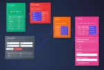
In today’s analytics environment, executives are overwhelmed with data but underwhelmed with insight. Dashboards are everywhere—but true decision-making power is not. A well-designed executive dashboard should be more than a digital bulletin board. It should be a strategic tool that cuts through noise, drives clarity, and enables quick, informed decisions at the highest levels of your organization.
Dashboards Aren’t Just for Reporting Anymore
For many organizations, dashboards are still treated as passive reporting tools. They look nice, they summarize KPIs, but they don’t do much. The reality? A powerful executive dashboard needs to tell a story—and more importantly, provide the right level of interactivity and depth to move the conversation forward.
That means surfacing why metrics are shifting, not just what the current status is. It means giving executives the ability to drill into anomalies and trends without relying on a separate team to pull ad-hoc reports. This shift from static visualization to dynamic decision-support is a core outcome of our data visualization consulting services, where every visual has purpose, and every purpose leads to action.
The Foundation: Clean, Connected, and Contextual Data
Before a single chart is created, your dashboard’s strength is determined by the foundation beneath it: your data pipeline. Executive dashboards demand more than a surface-level view—they need curated, timely, and trusted data from across the business. That often means solving for broken or siloed systems, messy Excel exports, or a graveyard of legacy SQL scripts.
This is where data engineering consulting services come into play. By modernizing data pipelines, integrating cloud data warehouses, and applying scalable transformation logic, we ensure your executive team sees one version of the truth, not six different numbers for the same metric.
Prioritize the Metrics That Actually Move the Needle
Not all KPIs belong on an executive dashboard. The temptation is to showcase everything—conversion rates, bounce rates, NPS, churn, EBITDA—but less is more. The best dashboards stay hyper-focused on the five to seven key metrics that truly influence strategic direction.
Work directly with stakeholders to define those north star metrics. Then, create contextual framing through comparisons, trend lines, and thresholds. Leverage calculated fields and scenario models to project how certain initiatives may influence outcomes over time.
Platforms like Tableau and Power BI can do this exceptionally well—when implemented properly. That’s why we often recommend partnering with experienced Tableau consulting services or Power BI professionals who know how to balance design with logic, scalability with interactivity.
Avoid the Trap of “One-Size-Fits-All” Dashboards
Too many dashboards fail because they try to serve too many audiences. A dashboard designed for a sales VP will look wildly different than one tailored for a COO. The needs, questions, and expectations are not the same.
Rather than building a Frankenstein interface, create role-based views that are tailored to the executive’s decision-making style. For example, a financial dashboard may highlight margins and revenue per region, while a product dashboard emphasizes velocity, feature adoption, and roadmap blockers.
By building these differentiated experiences from a shared data model, you reduce overhead without sacrificing flexibility—a strategy we often implement in our advanced analytics consulting services.
Real-Time Isn’t Always the Goal
There’s a common misconception that executive dashboards must be real-time. In reality, most executive decisions aren’t made minute-by-minute. They’re made based on trends, projections, and strategic goals. So while latency matters, context and trust matter more.
Instead of chasing real-time for the sake of it, evaluate the cadence of decisions. Weekly, daily, or even monthly refreshed dashboards—if deeply accurate and consistent—often outperform their flashy, fast-moving counterparts.
Building Buy-In Through Usability and Trust
Even the most technically perfect dashboard fails if executives don’t use it. Adoption comes from usability: clean layouts, fast load times, no broken filters. But more importantly, it comes from trust. If the numbers aren’t matching what’s expected—even if they’re technically correct—confidence erodes.
One way to combat this is by creating guided data experiences, with embedded tooltips, explanations, and “why this matters” annotations. Bring in stakeholders early. Show iterations. Validate KPIs with the teams responsible for delivering them. And continuously improve the dashboard based on real feedback loops.
Executive Dashboards Are Not a Final Product
A dashboard is not a launch-and-leave effort—it’s a living asset. As business needs shift, so must your dashboard. Metrics will evolve. Data sources will change. New initiatives will demand visibility. And so, your dashboard must be agile.
With the right foundation—strong data engineering, strategic analytics, and thoughtful visualization—executive dashboards transform from vanity projects into operational assets that drive the business forward.
Want help turning your executive dashboards into decision-making engines? Explore how our data visualization, data engineering, and advanced analytics services can bring clarity, context, and confidence to your leadership team.