In the streaming media industry, understanding viewer behavior through data-driven analytics isn’t just advantageous; it’s essential to sustain competitive advantage. Faced with unprecedented growth and fiercely competitive markets, companies must leverage advanced visualization techniques to analyze content consumption patterns effectively. These actionable insights offer a powerful strategic edge by uncovering precisely what engages audiences, how viewing habits evolve, and informing decisions ranging from content investments to marketing initiatives. In this intricate dance of data, analytics, and visualization, each component plays a critical role, aligning business intelligence with user experiences to unlock unparalleled strategic value.
The Power of Analytics Visualization for Streaming Media
With providers competing heavily for subscribers’ limited attention spans, streaming media companies benefit enormously from harnessing data analytics visualization. Visualizing content consumption patterns enables media strategists, business analysts, and decision-makers to identify emerging trends quickly, optimize viewer engagement strategies, and strategically allocate resources in a highly competitive marketplace. Leveraging sophisticated data visualization and analytics tools effectively transforms complex user behavioral data into digestible insights, significantly streamlining the decision-making process and enhancing operational efficiencies.
Effective analytics visualization helps content providers detect hidden patterns in audience interactions—revealing viewer preference segments and behavior trends over time. Integrating data-driven visualization into your analytical workflows enables multiple stakeholders to quickly assess content performance metrics and user engagement indicators. By centralizing streaming media analytics into visual-centric platforms, business leadership can rapidly identify trends such as drop-off points, average viewing habits, and content affinity groups, thus maximizing engagement and subscriber retention.
Key Visualization Patterns in Streaming Media Analytics
Organizations focused on delivering streaming media content need powerful visualization solutions that meaningfully represent complex viewer consumption information. Let’s explore several critical visualization patterns particularly suited to analyzing streaming media analytics data effectively.
User Behavior Flow Charts
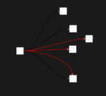
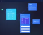
Behavior flow charts offer crucial insights into content consumption by visually capturing user interactions, session durations, and sequential behaviors. Stakeholders can quickly spot common user paths, bottlenecks, or drop-offs, fueling informed content investment and strategizing decisions. Utilizing visualization to map these pathways directly reveals actionable analytics, enabling organizations to optimize content curation and recommendation strategies precisely, enhancing user retention and identifying additional monetization opportunities. Leveraging advanced visualization solutions allows a deeper exploratory view into streaming platforms, revealing highly granular behavior patterns that standard dashboards often miss. This approach exemplifies capabilities discussed further in our analysis on visual decision support systems beyond standard dashboards.
Heatmap Visualization Patterns
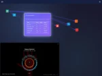
Heatmap visualizations adeptly highlight viewing intensity for specific content items, defined times of day, or demographic preferences, presenting stakeholders with intuitive representations of massive datasets at-a-glance. With real-time heatmaps, media strategists pinpoint precisely when viewers are most actively engaging and with what type of content, optimizing programming schedules for highest viewer retention and satisfaction. Accurate interpretation of heatmap outputs is significantly enhanced with integration of advanced predictive models—an approach demonstrated in our impact of AI on data engineering workflows article. Data visualization solutions enriched with predictive analytics effectively forecast future content performance trends, enabling streaming media companies to boost competitive capabilities.
Cohort Analysis Charts
Cohort analyses group viewers into distinct segments based on shared attributes or interaction timelines, clearly visualizing engagement and retention patterns among specific viewership cohorts. Such visualizations equip decision-makers with the insights required to craft personalized campaigns effectively, enhancing viewer experiences through targeted content recommendations, fostering more personalized interactions, and ultimately driving consumer loyalty and sustained growth. Robust data visualization solutions combined with advanced analytics further accentuate the accuracy and relevance of cohort-centric insights, providing decision-makers with clarity about targeted audience segments and associated performance drivers.
Implementing Streaming Media Visualization Patterns
Effectively applying these visualization patterns to real-world scenarios in streaming media analytics requires both technical savvy and strategic foresight. To build and maintain advanced visualization capabilities, it’s often necessary to establish comprehensive, automated data ingestion pipelines supported by robust software architectures and custom analytics algorithms.
One effective approach includes deploying efficient pipeline orchestration tools, such as those highlighted in our pipeline orchestration comparison of Airflow, Prefect, and Dagster. Selecting a suitable orchestration platform enhances data pipeline efficiency and reliability, significantly improving data quality for advanced streaming visualization applications.
Meanwhile, understanding dimension alignment represents another crucial aspect. Our detailed exploration on dimension conformity enforcement in data integration highlights the significance and techniques of managing consistent data definitions effectively to deliver quality analytics visualizations that accurately reflect viewer behaviors.
Safeguarding Viewer Privacy in Visualization Analytics
Comprehensive data visualization greatly enriches decision-making capabilities; however, it also elevates concerns around viewer privacy and data protection. Maintaining compliance with stringent privacy regulations demands thoughtful implementation of privacy-preserving tools and methodologies in your analytics framework. Implementing advanced analytics frameworks integrated with privacy considerations, such as privacy-preserving record linkage techniques, ensures viewer anonymity while deriving valuable content engagement insights.
Furthermore, incorporating responsible dataset sampling techniques into visualization workflows optimizes processing efficiency and enhances viewer privacy. Our strategic overview on dataset sampling techniques for processing optimization provides insights into balancing analytics robustness with user privacy imperatives, allowing visualization analysts to protect sensitive viewer data while delivering insightful results.
Future-Proofing Streaming Analytics Visualization Pipelines
As viewer habits evolve and content delivery models advance rapidly, analytics visualization pipelines must stay agile and future-proofed. Ensuring a consistent, structured framework backed by continuous integration (CI/CD) practices facilitates agility when deploying new visualization logic or applying data transformations swiftly and reliably. Learn how to strategically streamline content analytics visualization pipelines by exploring our authoritative guide on building your CI/CD pipeline.
Moreover, adopting continuous integration more comprehensively within your analytics workflow also ensures consistent deployment of transformation logic. Our detailed article on continuous integration for data transformation logic introduces essential best practices and insights that help mitigate risks in data visualization projects, significantly enhancing visualization agility and responsiveness to rapidly changing viewer trends.
Lastly, incorporating artificial intelligence (AI) and machine learning (ML) techniques into visualization capabilities can greatly amplify analytical insights. Techniques such as named entity recognition (NER)—thoroughly explained in our guide on using Python for NER, an NLP subtask—can assist visualization analysts in labeling and categorizing diverse viewer engagement content accurately and rapidly, boosting analytics efficiency and content classification accuracy.
Partnering with Experts for Visualization Success
Implementing effective streaming media visualization strategies demands a deep understanding of modern analytics methodologies and sharp technical expertise. Collaborating with experienced technical strategists specialized in data engineering, high-performance analytics pipelines, visualization techniques, and modern web technologies like Node.js greatly enhances your ability to achieve actionable visualization results. At Dev3lop, our specialized expertise and customized services support your end-to-end analytics needs, from Node.js consulting services to large-scale analytics architecture. Our rich experience includes handling large-scale data challenges—detailed in our insightful data engineering case study scaling to handle 1 billion events daily.
By leveraging our extensive strategy-driven approach and comprehensive technical solutions, Dev3lop positions your streaming media analytics for sustained competitive advantage. We help you unlock powerful visualization-driven insights, accelerating data-driven decisions that elevate viewer experiences.
Effective visualization analytics translates streaming viewer habits and preferences into actionable intelligence. Integrating smart visualization practices strengthens your organization’s decision-making and sets a platform for future innovation, growth, and competitive success.
Tags: Streaming Analytics, Visualization Patterns, Media Analytics, Data Visualization, Viewer Behavior Analytics, Content Consumption Analytics
Thank you for your support, follow DEV3LOPCOM, LLC on LinkedIn and YouTube.


