The Split node lets ET1 user split one or more column into multiple columns.
This particular node is great for the times you have multiple rows of data with consistent delimiters.
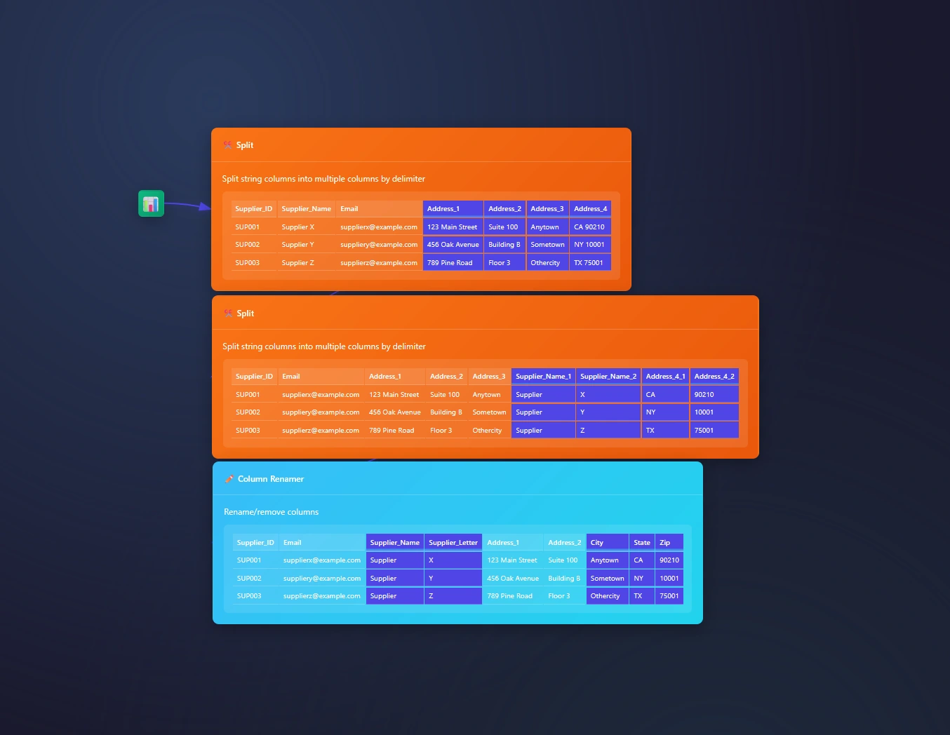
The data we are splitting
Here is the CSV you need to follow the overview.
We will pass this data through the CSV Input Node!
Supplier_ID,Supplier_Name,Address,Email
SUP001,Supplier X,123 Main Street|Suite 100|Anytown|CA 90210,supplierx@example.com
SUP002,Supplier Y,456 Oak Avenue|Building B|Sometown|NY 10001,suppliery@example.com
SUP003,Supplier Z,789 Pine Road|Floor 3|Othercity|TX 75001,supplierz@example.com
Splitting One Column
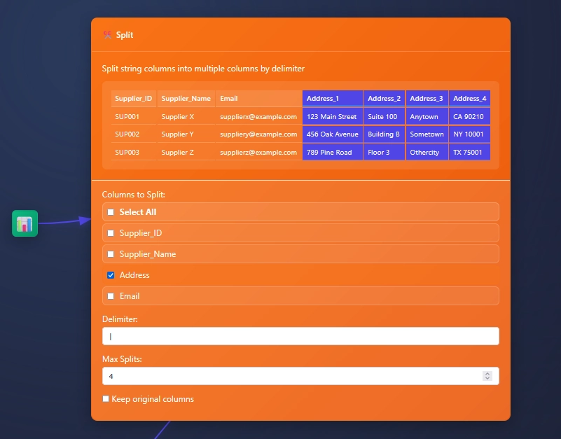
Splitting one column, like address in this example, can be by clicking one column, adding a delimiter, and setting the max amount of slits (or columns). Then choosing to keep original columns or not.
Splitting Multiple Columns
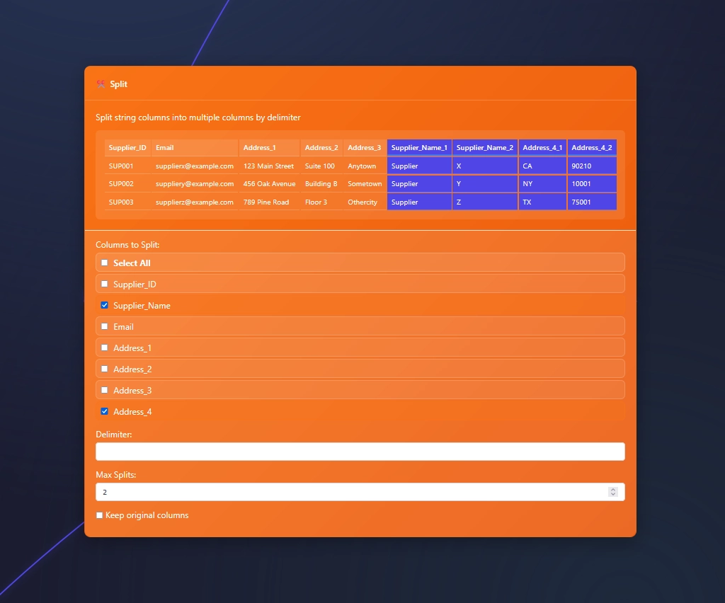
At times, while splitting data, you find a need to split more than one column with the same delimiter.
Splitting many columns to many columns is typical for parsing
In this example we need to split more than 1 column with a space and needing two splits.
Check more than one box and set your delimiter in the Split Node.
If a web-cam is available ET1’s code will try to automatically sync and if you can wave and point, this radial menu is a fun way to augment your ETL development.
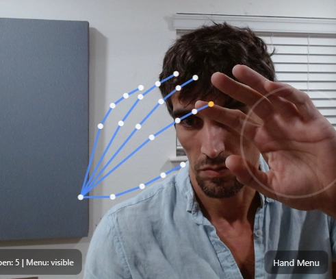
Using computer vision (explained in depth below) we map a skeleton over your hands and able to create a radial menu we are calling Navigator, which is overlayed on your hand.
The skeleton helps us build a menu on your hand, like an augmented environment to solve problems, and change the audience’s perception on the way problems are solved.
Notice the pointer finger has a yellow dot? This dot is used to click buttons.
We are utilizing Google AI Edge MediaPipe, more tech spec and links listed at the bottom of the article. No installs or license is required to use Google AI Edge API. In the Screenshot above we are demonstrating the skeleton we are using to build a menu around your hand.
What is the radial menu in ET1?
The radial menu is a user-friendly way to interact with ET1. If a webcam is available the end user can use their left or right hand to access multiple menus which have sub menus and interact together.
How does the radial menu work?
The video needs to see a hand aiming up right. Fingers above the wrist is the best posture. Like you’re waving hello to a friend, and aim your pointer finger to press a button.
The menu tracks your palm and depending on the distance from your hand and the web cam, you’re able to start clicking on buttons.
Using your pointer finger, point at a button. Either the left hand or right hand pointer finger is the finger that pushes buttons.
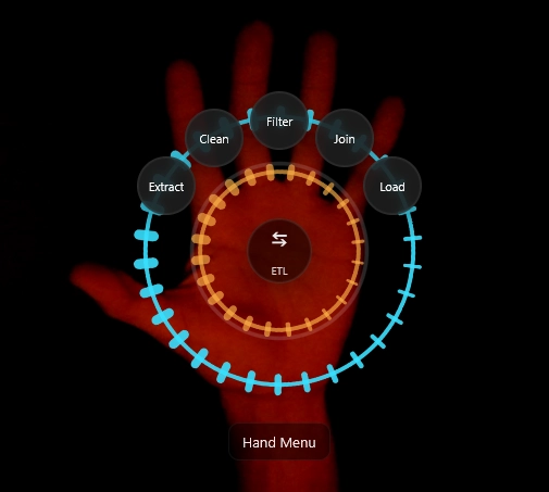
The Node Creation Menu
The node creation menu is comprised of 5 different buttons in the top ring. Each of these buttons requires a ‘charging’ effect to avoid accidental usage.
Extract Nodes
Clean Nodes
Filter Nodes
Join Nodes
Load Nodes
Inside of each click is another sub menu that has various nodes to build your data pipelines.
In the palm, notice “ETL” button and swap arrow. A subtle tap on your palm will jump between Canvas Controls and Node Creation menu, which are the primary two menus.
Pro tip: hand menu can be clicked by a mouse, which means you can more than one person working on the computer at a time, making this a two player solving software.
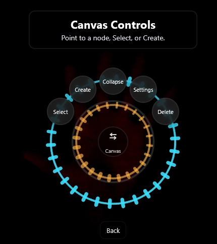
The Canvas Controls Menu
The Canvas Controls offers 5 different options.
Select Node
Create Node
Collapse Node
Settings Node
Delete Node
Inside Select Node button is a sub menu allowing you to swap between different nodes without having to use a mouse!
Inside Create Node button is the Node Creation Menu and connects nodes if you have a node selected.
Notice this is a low light capture. In this screenshot above, the palm button allows you to swap back to the node creation menu.
While Creating a New Node, The Hand Menu Works
Without a hand menu, ET1 works perfectly fine with the mouse and keyboard, however if you’re presenting and creating new nodes, the hand menu will sync up with your mouse interactions.
In the process of creating a new node the hand menu will sync up and allow you to create your node in the hand menu OR the mouse/keyboard will work in this quick menu feature. This opens the door for a different way of explaining the solution as you’re creating it for your audience.
Selecting a node
If you Select a node, you can collapse/open to reduce space, open/close settings, create new connected nodes down stream, delete the node,
Clicking a node selects a node. Selected nodes have a white box around the node. Canvas control menu allows you to select nodes. Canvas control menu lets you swap between selected nodes.
Selected nodes come to the front of the page, allowing you to quickly see what was behind another node.
De-selecting a node is important if you need the menu to create an ad-hoc node without it connecting. To de-select, click in the blank space in your workflow canvas!
Charging to click buttons in the radial menu.
Some buttons require a charge. Some buttons charge faster than others due to how often you’d want to use those buttons. In some circumstances the speed of the button is related to the likely hood that an end user would need to click that button more than once.
The charge up timers are important because some menus you might not want to accidentally click, and some menus you may be in a “thinking mode” so the radial menu allows you to think before immediately selecting most buttons.
In the Select Node sub menu you will notice buttons charge faster due to how often you may want to move faster in this menu.
Will the radial menu work at night?
Yes, the light from your monitor is enough to initiate the menu.
Low light settings seem to work better.
You will need to be closer to the computer if it’s completely dark in your room. The light from the computer may help.
ET1 uses Google AI Edge Implementation
We are not creating this solution from scratch and instead building on Google’s tooling.
What is Google’s AI Edge?
Google created tasks-vision (among other great tools), in their Google AI Edge product line. Google AI Edge? Allows people to deploy AI across mobile, web, and embedded applications.
Performantly run JAX, Keras, PyTorch, and TensorFlow models on Android, iOS, web, and embedded devices, optimized for traditional ML and generative AI.
This is a ‘low-code’ solution for common AI related tasks.
How are we using Google AI Edge?
In our instance, we are using tasks-vision because it allows us to create radial hand menus.
Using Google AI Edge API we enhance the user experience using MediaPipe.
From Google; MediaPipe Solutions provides a suite of libraries and tools for you to quickly apply artificial intelligence (AI) and machine learning (ML) techniques in your applications. You can plug these solutions into your applications immediately, customize them to your needs, and use them across multiple development platforms. MediaPipe Solutions is part of the MediaPipe open source project, so you can further customize the solutions code to meet your application needs.
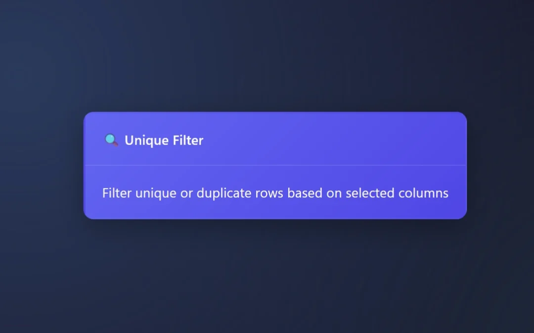
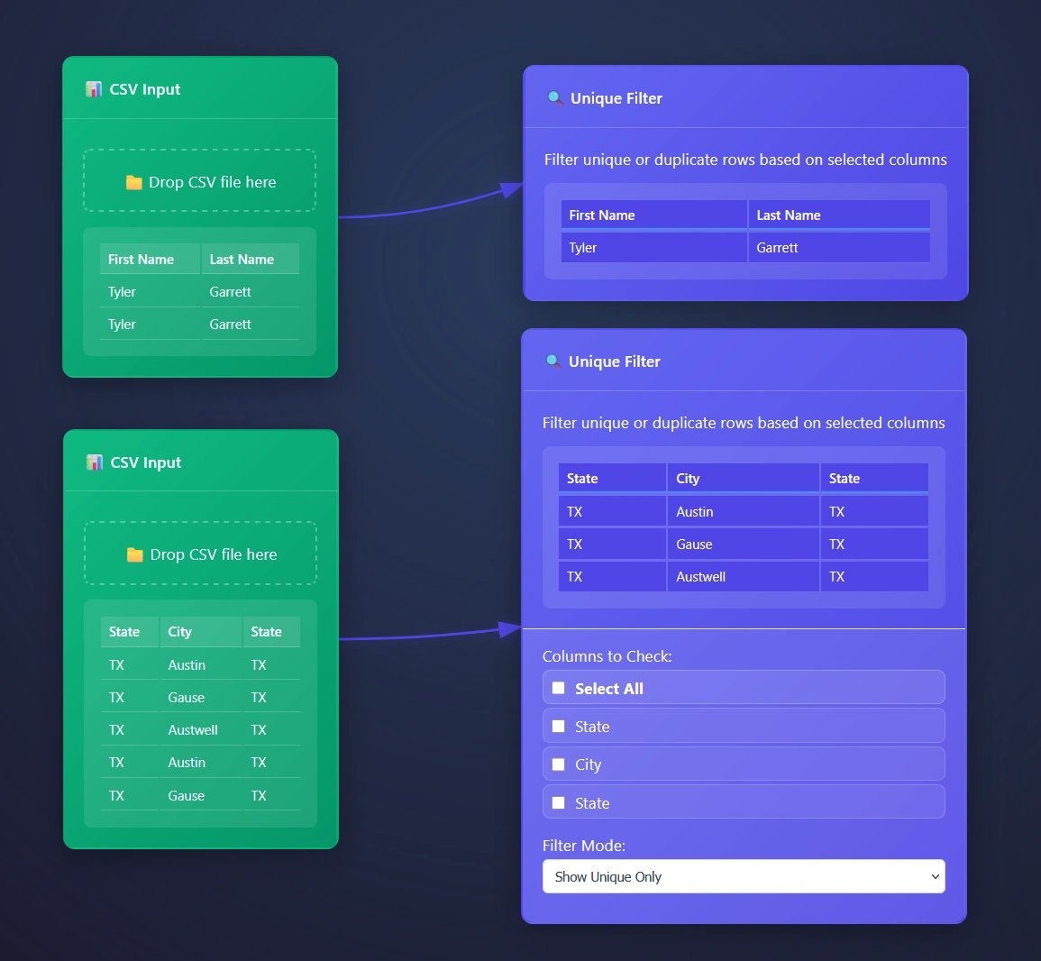
The Unique Filter Node or Unique Tool finds unique values per row in your data pipelines, or allows people to quickly review duplicates only.
Plus, you can select what column(s) to find unique values within. This enables people to easily understand what is inside of a column.
Duplicate rows happen, The Unique Filter node manages these rows for you automatically.
Whether you’re eager to only look at unique rows or drilling into the duplicates, ET1’s Unique Filter Node is the data engineering tool for your unique or duplicated needs.
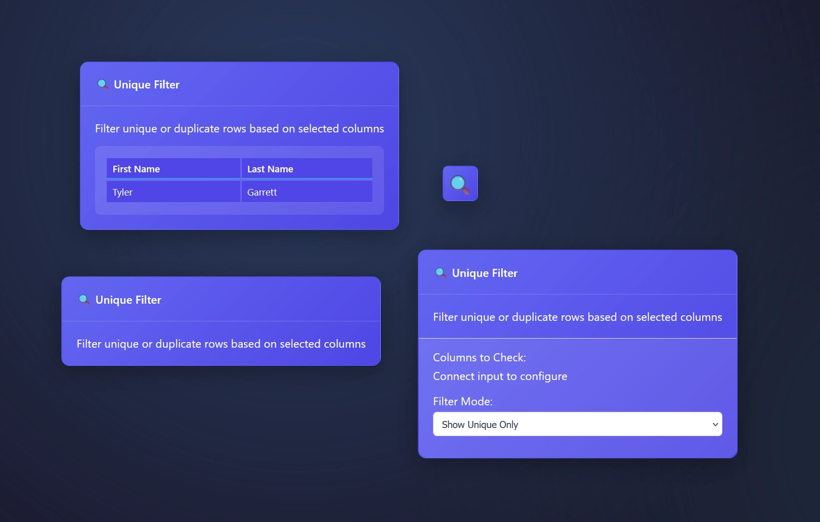
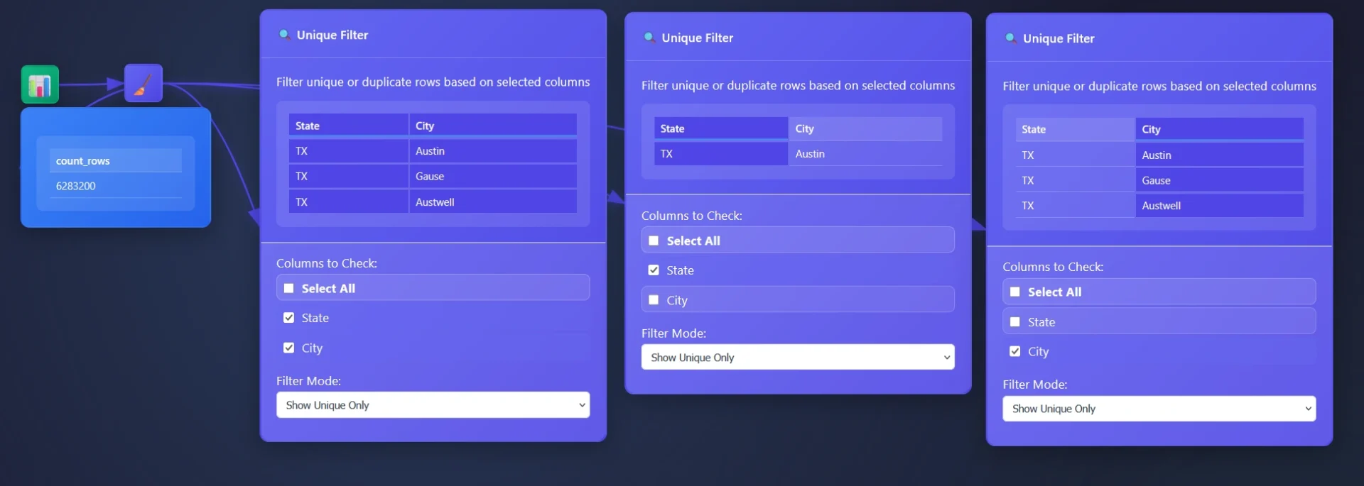
Unique Filter Node: Filter mode explained
The Unique Tool or Unique Filter Node
Show unique only – this setting means you will stream only the unique values through the pipeline
You may want to run this across all pipelines as a way to verify
This is an easy way to create look up tables
Build a tool to understand what is inside of a column
Show duplicate only – will stream duplicates only and remove the unique values found
Drill into duplicates only, great for deep dives and researchers
Helpful for auditing pipelines, does your pipeline have duplicates?
Using the Unique Filter Node in ET1
Drag and drop your data pipeline arrow connection to the input of the Unique Filter to begin immediately reporting on unique rows only.
Open the settings for more granular options.
ET1’s Unique Filter Node automatically removes duplicate rows based on selected columns, however we automatically infer you are eager to use all columns and start there. Opening the settings for more options will offer a cool way to group data.
Creating look up tables with Unique Filter Node
Auditing your column? How about the values inside of each column? This is a great tool for understanding what is possible in your data pipeline.
In this example, a dataset comprising 6 million transactions is provided through an email you never wish you looked at, and the objective is to identify the originating cities. While an aggregation tool could be utilized (where you are able to use group by) the Unique Tool offers another approach.
The Unique Tool facilitates a comprehensive understanding of individual column content. A common strategy involves removing unnecessary columns and employing the Unique Filter Node to extract the distinct values within the remaining table, thereby enabling the surfacing of valuable insights.
ET1 is designed to facilitate straightforward data filtering and transformation processes. It is helpful to consider data analysis as a communicative exchange with the dataset.
Technical specs on the Unique Tool’s Data Processing
JavaScript that filters data rows for uniqueness or duplication based on specified columns.
It processes tabular data in a browser-based ETL pipeline, determining which rows are unique or duplicate by constructing composite keys from selected column values. The behavior depends on the filterMode configuration: when set to 'unique', it retains only the first occurrence of each key; when set to 'duplicates', it excludes first occurrences and keeps only subsequent repeats.
Composite keys use a rare delimiter ('␟'): The character U+241F (Symbol for Unit Separator) is used to join column values into a single key string. This prevents collisions that could occur with common delimiters like commas or pipes, especially when column values themselves contain such characters.
Robust handling of missing or invalid configurations: If node.columns is not an array or contains invalid column names, the function defaults to using all available headers, ensuring that filtering still occurs meaningfully instead of failing silently or throwing errors.
Two-pass algorithm ensures correctness: The first pass counts all key occurrences, which could be used for analytics (though currently unused); the second pass performs the actual filtering. This structure allows future enhancements, such as filtering by occurrence count thresholds.
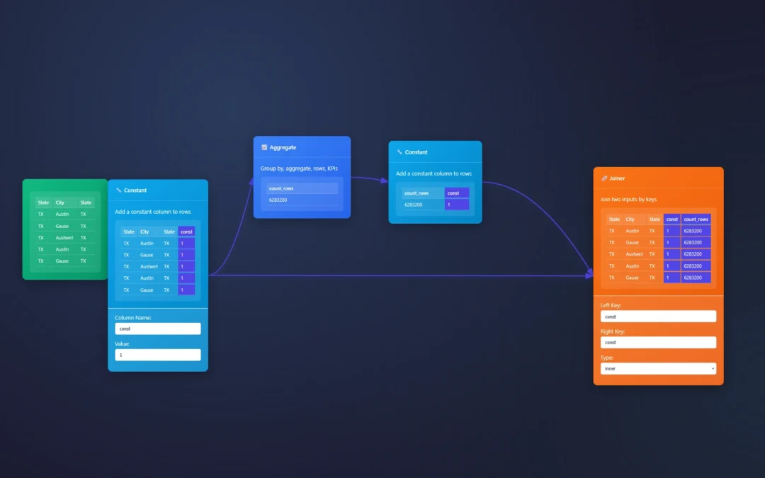
Seeking to append fields like the Alteryx Desktop software? The Joiner Node and Aggregate node is here to help. You will also need a constant to join on across both data streams.
We will show you how in this example below where we are sent 6million records in a CSV and asked to append the row count at a row level per row.
Assuming this will help them understand how bananas this csv file feels.
ET1 is able to append fields using the Joiner node!
Before the join node, we simply utilize an aggregate column to count rows. You could also swap this to aggregate any measure in the data pipeline.
Joiner automatically infers the join using similar column headers and matches the default header column ‘const’ applied in the constant node.
Creating the append field solution in ET1
Using the join to merge the data across rows, and then the constant to create a joinable column. Here’s the exact settings.
Append field is all about knowing how to join to a table.
Joiner has the ability to inner join, left join, and assume the left/right side of the join based on what you plug into the node first. Joins can be used as a filter, a labeler, a way to append fields, merge tables, and join at a row level with primary key to foreign key.
With ET1 we make this entire process of appending data at a row level easy to do, so that you’re able to complete the same solution as Alteryx’s Append Tool.
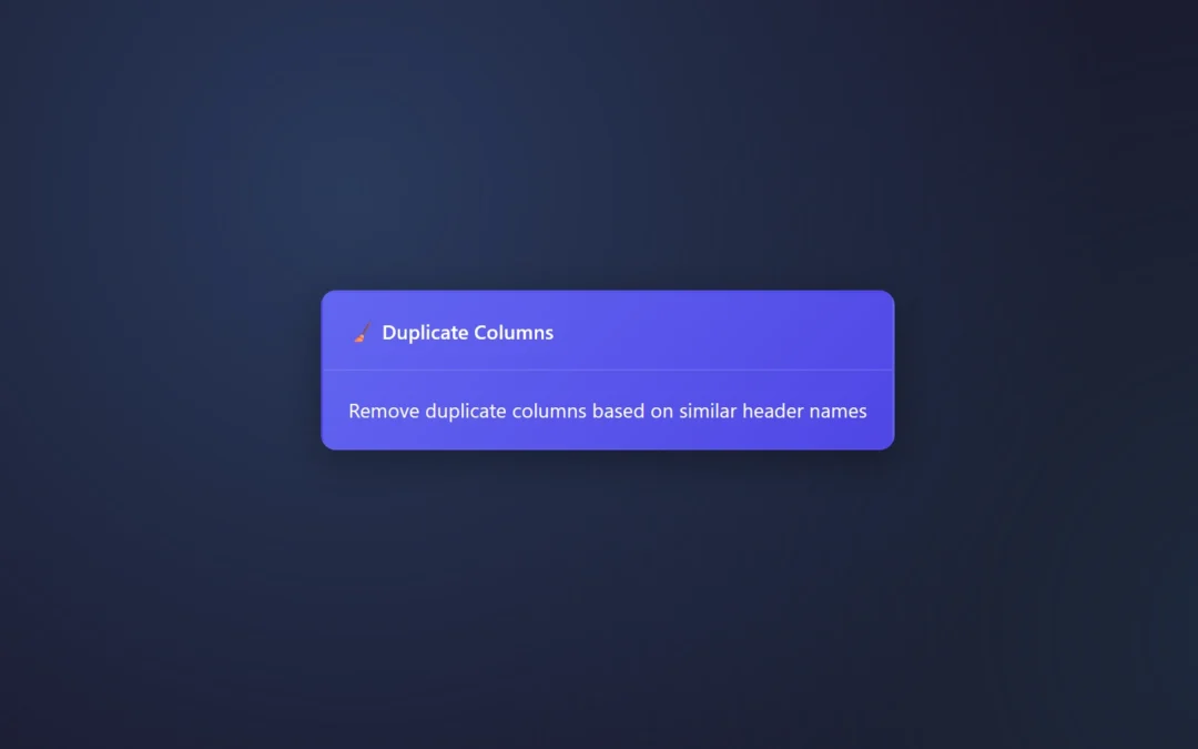
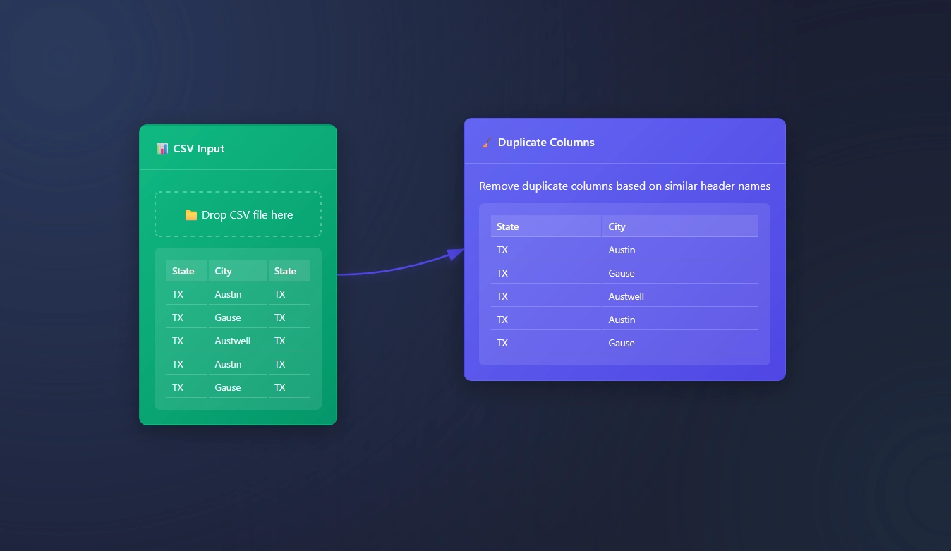
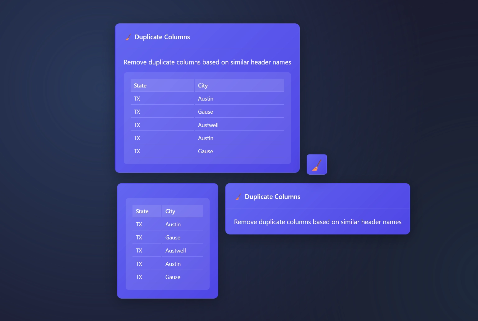
Dealing with duplicate columns? This particular node is designed to remove similarly named column headers.
If “State”=”State” then we remove the last column and only keep the first column.
“Remove duplicate columns based on similar header names”
Currently there are no settings for this tool because today Duplicate Columns Node solves problems without requiring a settings configuration.
The Duplicate Columns Node is built to automatically remove any duplicate headers.
The hardest part is connecting the dots. This is a node that automatically works, without any effort!
Here’s the various ways you will see The Duplicate Columns node in ET1.
A Use case Duplicate Columns Node
Crazy scenario; someone is sending you tables of data with duplicate columns, and now it’s your job to clean the table. This is a great tool, which simply removes Duplicate Columns.