Are you seeking to learn more about the Importance of Data Visualization in Data Science? Explained by advanced analytics consultants who spend their time in Big Data Technology and have a rich history in Data Mining for enterprise companies?
You’re in luck; we are a data visualization consulting services business that prides itself on our upbringing focused primarily on tableau consulting services; we find ourselves working directly with experts on a weekly to monthly basis and have a lot of valuable insights that we can share from our experiences, research, and time in production environments.
Line and bar charts are commonly used to visualize data in this field. Using visualization tools to present complex data in visual formats effectively enhances our understanding and interpretation of information. These presentation techniques, such as exploratory graphics and Tableau, allow us to better grasp the data’s meaning. We can identify patterns, trends, and outliers more efficiently through experimental graphics such as histograms, charts, and graphs than with raw data alone.
Many graphics, such as those created using Tableau, can significantly enhance our understanding of the data and enable us to apply machine-learning techniques more effectively. This allows us to make informed decisions based on data insights using visualization tools in our reports, like Google Charts (for developers) and Tableau (for non-developers).
There are two types of data visualizations. One that is easy to create and support, and one that requires a full-stack engineer to build and a very technical analyst to support. Many DEV3LOP clients opt for easy-to-build data visualization because it’s easy for their analysts to adopt.
Data visualization is a powerful tool for enhancing communication and storytelling with data. It helps us improve our understanding of data, engage our audience, and share information more effectively. Using graphics and charts, we can create visually appealing presentations that clearly and compellingly convey our findings. Effective data visualization is essential for anyone looking to tell a data-driven story and make an impact with their conclusions.
By embracing the importance of graphics and data visualization in data science, we unlock new possibilities for understanding complex information, making informed decisions, and communicating insights effectively through data visualization.
Definition and Examples of Data Visualization
Data visualization is about presenting information or data in a graphical form using graphics and plots. It transforms raw data into visual formats such as charts, graphs, maps, infographics, dashboards, and other visualization tools. This makes it easier to understand complex data by visually representing it through graphics and plots.
When discussing data visualization, we refer to various graphics and plot visual representations that help us make sense of the information. Here are some examples:
Bar charts, line charts, pie charts, and scatter plots are commonly used graphics to display numerical data visually. Data visualization processes allow us to generate presentations with a graph or more to tell a data story and easily compare different categories or trends in data analysis. With the help of data visualization tools, we can effectively visualize and analyze big data, making it easier to understand and draw insights from.
Data visualization methods such as a network graph, heat map, and tree diagram are helpful when showing relationships between entities or hierarchical structures. These tools are essential in data science visualization, allowing for clear and concise representation of complex information. Graphics play a crucial role in conveying the data effectively. Graphics and plots help us understand connections and dependencies within a dataset.
Geographic maps are powerful tools for displaying location-based data, especially regarding graphics and plots. Data science visualization can show population density, weather patterns, or even the spread of diseases across regions through graphics and plots, creating a compelling data story.
Infographics, a form of data science visualization or exploratory graphics, combine text and visuals to concisely and engagingly convey complex information. In data science visualization, graphics are often used to enhance understanding. They often use icons, illustrations, and color schemes to enhance understanding.
Dashboards are essential for data science visualization, testing a data visualization tool, creating a data story, and helping data graphs as they offer a real-time overview of key metrics or performance indicators. They bring together multiple graphics on a single screen for quick analysis.
The Importance of Data Visualization
Now that we have explored some examples of data visualization let’s discuss why graphics are essential in data science.
Visual representations, such as graphics, let you plot comprehension by simplifying complex datasets and presenting them in a more digestible format. Instead of sifting through rows, stressing about the data process, and digging through columns of numbers, we can quickly grasp patterns and trends, use a visualization tool, and share outliers at a glance with data science visualization and graphics.
Efficient Analysis: With large volumes of graphics data becoming increasingly common today, analyzing raw numbers alone can be overwhelming and time-consuming. Data visualization allows analysts to explore and gain insights from vast datasets more efficiently using graphics.
Enhanced Decision Making: When graphics present data visually, it becomes easier to identify correlations, spot anomalies, and draw meaningful conclusions. This empowers decision-makers to make informed choices based on a comprehensive understanding of the graphics data.
Improved Communication: Data science visualization graphics have a universal language that transcends barriers and lets us tell a data story through a presentation layer, software. Using data visualization software, we can effectively communicate complex ideas or findings to diverse audiences, regardless of their technical expertise. Graphics play a crucial role in conveying information visually.
Data visualization enables us to tell compelling stories with our graphics and also helps us work on our data process. Storytelling with data is a powerful way to engage, plot value, and communicate information effectively. By carefully selecting suitable graphics and arranging them logically, we can guide our audience through a narrative highlighting key insights and takeaways.
Collaboration and Sharing: Graphics foster collaboration among team members by providing a common framework for discussing and analyzing data visualizations. They also facilitate sharing graphic findings with stakeholders who may not be directly involved in the analysis process.
Identifying Patterns and Trends: Visual representations in a visualization tool, such as graphics, help us identify patterns, trends, and relationships that might go unnoticed in raw data. These insights can then be used to predict or inform future graphics strategies.
Real-Time Monitoring: Dashboards with live graphics allow organizations to monitor metrics in real-time. This helps them stay agile and respond promptly to graphics changes or anomalies as they occur.
Benefits of Data Visualization in Data Science
Data visualization is crucial in data science projects, offering several benefits in understanding complex concepts and findings through graphics. Explore some key advantages of incorporating graphics and data visualization into data science workflows.
Simplifying Complex Concepts and Findings
Data science involves working with vast amounts of information and analyzing it to extract meaningful insights, including graphics. However, raw data can be overwhelming and challenging to comprehend without graphics. This is where data visualization comes in handy. Presenting data visually through graphics, such as charts, graphs, and other visual representations, simplifies complex concepts and makes them more accessible to everyone.
Identifying Correlations, Causations, and Relationships
One of the primary goals of data analysis is to identify relationships between variables or factors while using our emerging technology data visualization tool. Data visualization, with the help of graphics, allows us to quickly identify correlations, causations, and patterns within datasets. Visualizing these graphics relationships makes it easier for data scientists to draw conclusions and make informed decisions based on their findings.
What is Correlation?
Correlation refers to the statistical relationship between two variables. It measures how closely one variable changes when another variable changes. In other words, correlation measures the strength and direction of the linear relationship between two variables. There are several types of correlations: positive, negative, and no. A positive correlation means that the other variable also tends to increase as one variable increases. A negative correlation means that the other variable decreases as one variable increases. No correlation means that there is no linear relationship between the two variables.
What is Causation?
Causation refers to the cause-and-effect relationship between two or more variables. It states that one variable (the cause) can influence another variable (the effect). In other words, causation describes how one variable affects another variable. There are several types of causation, including direct and indirect causation. Direct causation means that the cause directly influences the effect. Indirect causation means the cause indirectly controls the impact through a third variable or factor.
What is a Relationship?
Relationships, like SQL Joins, refer to the connection between two or more variables. It can be either correlative, causal, or both. A correlative relationship means a statistical relationship between two variables, like the Pearson Correlation. A causal relationship implies that one variable causes another variable. Correlative and causal relationships are essential in data analysis because they help us understand how variables interact.
In any dataset, anomalies or errors in graphics may need to be identified and addressed when hunting through our data visualization tool. These graphics outliers can significantly impact the accuracy of the analysis if not detected early on. Data visualization enables us to visualize the distribution of data points effectively, which is highly beneficial when you dive into machine learning, making it easier to spot anomalies or inconsistencies within the dataset. Graphics play a crucial role in this process.
Imagine learning machine learning without the ability to spot an anomaly yourself. It often takes many graphics to plot the correct line and stories; however, it’s a variable game of checking, testing, fixing, and continuously supporting over time.
Data scientists often must present their findings to stakeholders or non-experts who may not have a technical background and the data sets they know because they are often SMEs (subject matter experts). To effectively communicate their results, data scientists can utilize graphics to represent complex information visually, and usually, many graphics are required to turn heads.
In such cases, compelling graphics become essential for conveying complex information clearly and concisely, like showing the distribution between two vertical bars, which may be needed for a big data visualization solution in the future!
Graphics are visual representations that make it easier for others to understand the insights from the analysis without getting overwhelmed by numbers, technical jargon, or the many graphics that do not make sense.
To summarize:
Data visualization simplifies complex concepts and data science project findings using graphics.
Graphics facilitate the identification of correlations, causations, and relationships within datasets, and they provide visual representations that make it easier to analyze and understand data.
Graphics, or visual representations, help identify anomalies or errors in the collected data.
Effective graphics aid in presenting results to stakeholders or non-experts.
Importance of Data Visualization Software in Business Analytics
Data visualization plays a vital role in business analytics by providing actionable insights for decision-making processes. Graphics are essential in effectively communicating complex data to stakeholders. Businesses can easily interpret and understand complex data by transforming it into visual representations like graphics. Let’s explore why data visualization, mainly graphics reports, is essential in business analytics.
Visualizing business metrics for monitoring performance
One of the key benefits of data visualization software in business analytics is its ability to help monitor performance against key objectives, especially when it comes to graphics. Instead of relying on raw numbers and spreadsheets, visualizations allow businesses to track their progress visually using graphics. With clear and intuitive graphics, graphs, charts, and dashboards, it becomes easier to identify trends, patterns, and anomalies within the data.
For example, suppose a retail company wants to analyze its sales performance across different regions using graphics. By visualizing this data using graphics such as a map or a bar chart, they can quickly identify which areas are performing well and which need improvement. This enables them to make informed decisions about resource allocation, marketing strategies, and graphics.
Real-time tracking with interactive dashboards
Interactive dashboards are another powerful tool provided by graphics in business analytics. These dashboards allow businesses to track Key Performance Indicators (KPIs) in real-time. Users can drill down into specific metrics with just a few clicks or taps and gain deeper insights into their performance.
Imagine you’re managing an e-commerce website and want to monitor your website traffic. An interactive dashboard could display real-time metrics such as page views, bounce, and conversion rates. We created Colibri Google Analytics Tableau Dashboard to help us view multiple domains. By dynamizing this information, you can identify sudden changes or issues requiring immediate attention.
Effective communication of business strategies
Clear visualizations also play a vital role in communicating business strategies across teams within an organization. When presenting complex ideas or plans during meetings or presentations, visuals help convey information more effectively than lengthy reports or verbal explanations alone.
For instance, if you’re introducing a new marketing campaign to your team, a visually appealing infographic or chart can simplify the message and make it more memorable. Visuals help everyone understand the campaign’s goals, target audience, and expected outcomes.
Enhanced decision-making with data visualization
Data visualization empowers businesses to make informed decisions by visually representing complex data sets. Instead of relying on intuition or guesswork, decision-makers can analyze trends and patterns within the data to identify opportunities or potential risks.
Let’s say you’re a business owner trying to decide whether to expand into a new market. By visualizing relevant data such as population demographics, consumer behavior, and competitor analysis, you can gain insights into the market’s potential profitability and make an informed decision.
Significance of Data Visualization in Big Data Analytics
Data visualization plays a crucial role in the field of big data analytics. Effective visualization strategies are essential to handle large volumes of information. Let’s explore why data visualization is so significant in big data analytics.
Simplifying Analysis and Interpretation
Visual representations provide a simplified way to analyze and interpret information when dealing with massive datasets. Instead of sifting through endless rows and columns of raw data, visualizations present the data in a graphical format that is easy to understand. This allows analysts to identify dataset trends, patterns, and outliers quickly.
Interactive Visualizations for Easy Exploration
One of the key benefits of data visualization in big data analytics is its interactivity. Interactive visualizations allow users to quickly drill down into specific subsets or details within large datasets. Analysts can explore different dimensions and variables by interacting with the visualizations, gaining deeper insights into the underlying data. This level of exploration would be challenging without visual representations.
Uncovering Hidden Trends and Patterns
Data visualization enables businesses to uncover trends or patterns that may have otherwise been hidden within complex datasets. Visually representing the data makes it easier to spot correlations, anomalies, or emerging patterns that might not be apparent when looking at raw numbers alone. These insights can help organizations make informed decisions and exploit new opportunities.
Communicating Insights Effectively
In addition to simplifying analysis and interpretation for analysts, data visualization facilitates effective communication of insights across teams or stakeholders. Visual representations make it easier for non-technical individuals to grasp complex concepts by presenting information visually appealingly. This ensures everyone can understand and act upon the insights derived from big data analytics.
Enhancing Decision-Making Processes
By providing explicit visual representations of complex datasets, data visualization empowers decision-makers to make well-informed choices based on accurate information. When faced with large volumes of data, it can be challenging to identify the most relevant information or trends. Visualizations help decision-makers focus on the key insights and make data-driven decisions quickly and confidently.
Improving Data Quality and Accuracy
Data visualization also plays a role in improving data quality and accuracy within big data analytics. When visualizing data, inconsistencies or errors in the dataset become more apparent, allowing analysts to identify and rectify them promptly. Organizations can have confidence in their analytics results by ensuring the underlying data is accurate and reliable.
Enhancing Collaboration and Knowledge Sharing
Data visualization promotes collaboration and knowledge sharing among teams working on big data analytics projects. Visual representations make it easier for team members to share insights, discuss findings, and collaborate on problem-solving. This collaborative approach helps harness the collective intelligence, leading to more comprehensive analyses and better outcomes.
Role of Data Science Visualization: Tools and Techniques
Data science visualization plays a crucial role in analyzing and interpreting data. It involves using various tools and techniques to create meaningful visual representations that help us understand complex information more easily. Let’s explore the different tools, techniques, and benefits of data science visualization.
Data Visualization Tools
In data science, several powerful tools are available for creating visualizations. Some popular ones include Tableau, Power BI, and Python libraries such as Matplotlib and Seaborn. These tools provide a user-friendly interface with drag-and-drop functionality, making it easier for data scientists to create interactive dashboards and visualizations.
Data Visualization Techniques
Different types of data require other visualization techniques. Heatmaps represent patterns or correlations in large datasets, while scatter plots help visualize relationships between variables. Histograms help understand the distribution of numerical data, and network diagrams display relationships between entities.
Exploring Data and Identifying Outliers
Data scientists use data visualizations to explore datasets thoroughly. By creating visual representations of the data, they can identify patterns, trends, outliers, and anomalies that may not be apparent from raw numbers alone. For example, a scatter plot might reveal a strong positive or negative correlation between two variables, providing valuable insights into their relationship.
Validating Models
Visualization also plays a vital role in validating models in data science. Data scientists can effectively assess their models’ accuracy by comparing predicted outcomes with actual results through visualizations. This helps them identify any discrepancies or areas for improvement in their algorithms or methodologies.
Effective Communication with Stakeholders
One significant advantage of data visualization is its ability to present findings and insights to stakeholders effectively. Visual representations make complex information more accessible and understandable for non-technical audiences. Instead of giving them tables full of numbers or lengthy reports filled with jargon, visualizations clearly and concisely convey information.
Enhancing Data Analysis
Visualization tools enable data scientists to perform in-depth analysis of large datasets. With the ability to interact with visualizations, they can drill down into specific data points, apply filters, and uncover hidden insights. This interactivity allows for a more comprehensive understanding of the underlying data and helps identify trends, patterns, or anomalies that may have otherwise gone unnoticed.
Improving Decision-Making
Data visualization empowers organizations to make informed decisions based on data-driven insights. By presenting complex information visually, decision-makers can quickly grasp the essential findings and implications. Visualizations provide a holistic data view, enabling stakeholders to identify trends, outliers, and potential risks or opportunities that may influence strategic decisions.
Exploring Different Types of Data Visualization
Data visualization is a crucial aspect of data science. It helps us understand and interpret complex datasets by presenting them visually.
Bar Charts
Bar charts are one of the most common types of data visualizations. They use vertical bars to represent different categories or groups and their corresponding values. Bar charts are excellent for comparing quantities across various categories or tracking changes over time.
Line Graphs
Line graphs are ideal for showing trends and patterns over time. They use lines to connect data points, allowing us to visualize how variables change about one another. Line graphs are often used in analyzing stock market trends, weather patterns, and population growth.
Pie Charts
Pie charts display data as slices of a circle, with each slice representing a proportion or percentage of the whole. They help illustrate parts-to-whole relationships or compare relative sizes of different categories within a dataset.
Scatter Plots
Scatter plots are excellent for exploring relationships between two numerical variables. Each point on the plot represents an observation, with one variable plotted on the x-axis and the other on the y-axis. By examining the distribution of points, we can identify correlations or clusters within the dataset.
Treemaps
Treemaps provide a hierarchical view of data by dividing rectangles into smaller rectangles based on their proportions. Each rectangle represents a category or subgroup, with larger rectangles indicating higher values or frequencies. Treemaps help us analyze complex datasets that have multiple levels of categorization.
Heat Maps
Heat maps use colors to represent values within a matrix or grid-like structure. They are handy for visualizing large amounts of data and identifying patterns or anomalies quickly. Heat maps are commonly used in genetics, finance, and geographic information systems (GIS) fields.
When choosing the right visualization type, it’s essential to consider the purpose and characteristics of the dataset. Different visualizations offer unique perspectives on the same data, allowing us to uncover insights that may not be apparent through other methods.
For example, a bar chart would be an excellent choice to compare sales figures across different product categories. On the other hand, if we want to examine how two variables are related, a scatter plot would provide a more in-depth analysis.
The choice of colors is also crucial in data visualization. Colors can highlight specific patterns or draw attention to particular data points. However, it’s important not to overload the visualization with too many colors, as this can make it difficult for viewers to interpret the information accurately.
In addition to selecting the appropriate visualization type and color scheme, it’s essential to ensure that the visual representation is clear and easy to understand. Labels and titles should be used effectively to provide context and guide viewers through the information presented.
Data visualization is vital in data science by helping us explore and analyze complex datasets effectively. Using different types of visualizations, such as bar charts, line graphs, pie charts, scatter plots, treemaps, and heat maps, we can gain valuable insights into our data and communicate those findings clearly to others.
The Growing Importance of Data Visualization
Effective visualization becomes crucial for understanding trends and patterns as data grows exponentially. In today’s digital age, we generate massive amounts of data every second. From social media posts to online transactions, a constant influx of information needs to be analyzed and interpreted. This is where data visualization makes sense of the vast sea of numbers and figures.
Organizations increasingly rely on visualizations to gain a competitive edge in their industries. Raw data can often be overwhelming and challenging to comprehend. However, when presented visually, it becomes much easier to identify patterns, correlations, and outliers. Visualizations help us see the bigger picture and extract valuable insights from complex datasets.
With advancements in technology and tools, creating interactive visualizations has become more accessible. Gone are the days when only experts could create visually appealing graphs or charts. With user-friendly software like Google Charts and Tableau, anyone can transform raw data into captivating visuals without extensive coding knowledge.
Data visualization plays a massive role in storytelling with data. It allows us to present our findings in a compelling way that engages the audience and conveys information effectively. Using various graphic elements such as color coding, bar charts, heat maps, or line graphs, we can tell a story behind the numbers and communicate complex ideas.
The importance of data visualization cannot be overstated when dealing with big data. Visual representations provide clarity and facilitate decision-making processes when working with huge volumes of information that may seem incomprehensible at first glance. By condensing large datasets into easily digestible graphics or infographics, we can quickly identify trends or anomalies that might have gone unnoticed.
Visualizations also enable us to explore multiple dimensions simultaneously by representing different variables on a single graph or chart. This helps us uncover hidden relationships between variables that may not be apparent through traditional statistical analysis alone.
In addition to its practical applications, data visualization also has aesthetic value. Well-designed visualizations can be visually appealing and captivating, making it easier for the audience to engage with the presented information. By using colors, shapes, and other design elements effectively, we can create visually stunning representations that enhance understanding and retention of information.
The demand for professionals skilled in data visualization is rising across various sectors. Companies recognize the need for individuals who can analyze and present data visually compellingly. From marketing departments looking to understand consumer behavior to healthcare organizations seeking insights from patient records, there is a growing need for data visualization experts who can transform complex data into meaningful visuals.
Exploring Jupyter Notebook and Recommended Books on Data Visualization
Jupyter Notebook is an open-source web application that allows you to create interactive notebooks with code snippets and visualizations. It’s a powerful tool for data scientists and analysts to explore, analyze, and communicate their findings effectively.
Jupyter Notebook: A Versatile Tool for Data Scientists
Jupyter Notebook provides a flexible environment for working with data using various programming languages such as Python, R, Julia, and more. Its intuitive interface seamlessly combines code execution with text explanations, equations, images, and visualizations in a single document.
One of the critical benefits of the Jupyter Notebook is its ability to display visualizations directly within the notebook itself. By leveraging popular Python libraries like Matplotlib, Seaborn, Plotly, or Bokeh, you can create stunning charts, graphs, maps, and other visual representations of your data. This interactive nature allows you to explore your datasets dynamically and gain deeper insights.
Another advantage of using Jupyter Notebook is its collaborative features. Multiple users can simultaneously work on the same notebook by sharing it through platforms like GitHub or Google Colaboratory. This fosters teamwork and enables seamless knowledge sharing among data science teams.
Overlapping Use Cases and Types of Data Visualization
Data visualization plays a crucial role in uncovering insights and making informed decisions. Let’s explore some everyday use cases where data visualization comes into play and the different types of visualizations that are commonly used.
Sales Analysis
One critical use case for data visualization is sales analysis. Companies often need to analyze their sales performance across different regions or products. This is where bar charts come in handy. Bar charts provide a simple and effective way to compare sales performance visually. By representing each region or product as a separate bar, it becomes easy to identify trends, spot anomalies, and make data-driven decisions.
Customer Segmentation
Understanding customer behavior is essential for businesses to tailor their marketing strategies effectively. Heatmaps are a powerful tool for visualizing customer behavior patterns over time. Using color gradients to represent varying levels of engagement or activity, heatmaps allow businesses to identify hotspots or areas that require attention. This information can be invaluable.
Financial Forecasting
Financial forecasting involves predicting future economic outcomes based on historical data and market trends. Data visualization is crucial in providing an intuitive understanding of complex financial information. Line graphs commonly visualize historical trends, allowing analysts to identify patterns and accurately predict future financial performance.
Supply Chain Optimization
Efficient supply chain management is vital for businesses operating in various industries. Network diagrams are an excellent tool for understanding the intricate relationships within a supply chain network. These diagrams help visualize how different entities, such as suppliers, manufacturers, distributors, and retailers, are connected and interact. Businesses can optimize their supply chain operations and improve overall efficiency by identifying bottlenecks or inefficiencies within the network.
It’s essential to consider the nature of your data and the insights you want to uncover. Different types of visualizations excel in different scenarios, so let’s take a closer look at some commonly used ones.
Bar Charts
Bar charts are versatile and widely used for comparing categorical data. They are instrumental when comparing values across different categories or groups. For example, if you want to compare the sales performance of other product lines, a bar chart can provide a clear visual representation of how each product line is performing.
Heatmaps
Heatmaps are excellent for displaying large amounts of data in a compact and visually appealing format. They use color gradients to represent varying levels of intensity or value. Heatmaps are commonly used in various fields, such as customer analytics, website user behavior analysis, and risk assessment.
Network Diagrams
Network diagrams help visualize complex relationships within a network by representing entities as nodes and connections as edges. These diagrams are often used in social network analysis, supply chain management, and cybersecurity to understand connectivity patterns and identify key influencers or vulnerabilities within a network.
Everyday Use Cases for Data Visualization
Data visualization plays a crucial role in various fields, helping us make sense of complex information and uncover valuable insights. Let’s explore some everyday use cases where data visualization is widely used.
Data Exploration
One of the primary uses of data visualization is to explore and understand large datasets. Data scientists can quickly identify patterns, trends, and relationships within the data by creating visual representations such as charts, graphs, and maps. For example, we have a dataset containing information about customer purchases in an online store. Visualizing this data using line charts or scatter plots allows us to easily spot popular products, peak buying times, or correlations between price and customer satisfaction.
Trend Analysis
Another important application of data visualization is trend analysis. Visualizing historical data over time allows us to identify long-term patterns or changes in various metrics. This can be especially useful for businesses looking to analyze sales performance or track market trends. For instance, marketing teams can use line charts to visualize website traffic over several months to determine if their marketing campaigns drive more visitors.
Anomaly Detection
Data visualization also helps in detecting anomalies or outliers within datasets. Anomalies are observations that deviate significantly from the expected behavior or pattern. By visualizing the data using techniques like box plots or heatmaps, analysts can quickly spot these anomalies that may indicate errors in the dataset or highlight unusual events worthy of further investigation. For example, healthcare professionals can use visualizations to monitor patient vital signs and detect abnormal readings that may require immediate attention.
Example of detection in politics: In democratic societies, it’s essential that elections are fair and everyone’s vote counts the same. Elections are like extensive experiments where people vote based on what they want. We can see if any cheating is happening by looking at the results in a certain way. We found that the results differ from ordinary elections where there might be cheating. For example, we looked at Russian elections and found evidence of cheating with fake ballots. We made a model to measure how much cheating is happening. We also made a test to check for these cheating patterns in election results. The cool thing is that this method works well no matter how detailed the data is, so we can compare different countries.
Forecasting
Forecasting future trends and making predictions is another area where data visualization proves invaluable. Organizations can create visualizations that provide insights into future outcomes by analyzing historical data patterns and using statistical models. These forecasts help businesses make informed decisions regarding resource allocation, budget planning, inventory management, etc.
Now let’s explore some real-world examples of how data visualization is used in different industries:
Healthcare: Visualizations are widely used in healthcare to monitor patient data, identify disease patterns, and track the spread of epidemics. For instance, visualizing geographic data on a map can help identify areas with high infection rates during a disease outbreak.
Marketing: Marketing teams utilize data visualization to analyze campaign performance and customer behavior. By visualizing metrics like click-through rates, conversion rates, or customer segmentation, marketers can gain valuable insights into the effectiveness of their marketing strategies.
Government: Government agencies employ data visualization with their machine learning and a bar chart, line chart, or heat map to understand demographic trends, user analysis, plot trends, create a data story, and make informed policy decisions. Visualizations can help policymakers identify areas with high crime rates or visualize population growth patterns to plan infrastructure development accordingly.
Conclusion: The Importance of Data Visualization in Data Science
In conclusion, data visualization is a crucial component of data science that cannot be overlooked. It goes beyond just presenting information in a visually appealing manner; it allows us to understand complex datasets and extract meaningful insights. By representing data through charts, graphs, and interactive visuals, we can uncover patterns, trends, and correlations that might otherwise remain hidden.
Data visualization not only aids in better decision-making but also enhances communication and storytelling. It enables us to convey our findings effectively to technical and non-technical audiences, making it an essential skill for any data scientist or analyst. So whether you’re exploring business analytics or diving into big data analytics, mastering the art of data visualization will undoubtedly elevate your work.
Now that you understand the importance of data visualization in data science, it’s time to put your knowledge into practice. Start exploring different tools and techniques available for creating impactful visualizations. Don’t shy away from experimenting with various types of visual representations to find the most suitable ones for your specific use cases. Remember, the true power of data lies not just in its collection but in how we transform it into actionable insights through compelling visual narratives.
FAQs
Why is data visualization important?
Data visualization is important because it helps us make sense of complex datasets by representing them visually. It allows us to identify patterns, trends, and relationships that may not be apparent when looking at raw numbers or text-based information.
What are some benefits of using data visualization?
Using data visualization provides several benefits, such as improved understanding of information, enhanced decision-making capabilities, effective communication of insights to stakeholders, identification of outliers or anomalies in datasets, and the ability to spot trends or patterns quickly.
What tools can I use for data visualization?
Depending on your requirements and expertise level, numerous tools are available for data visualization. Some popular options include Tableau, Power BI, Python libraries like Matplotlib and Seaborn, R packages like ggplot2, and online platforms such as Google Data Studio.
Are there different types of data visualization?
Yes, various types of data visualization techniques can be used depending on the nature of the data and the insights you want to convey. Examples include bar charts, line graphs, scatter plots, heat maps, treemaps, and network diagrams.
How can I improve my data visualization skills?
To improve your data visualization skills, practice regularly by working with different datasets and experimenting with various visualization techniques. Study examples of compelling visualizations in books or online resources and seek feedback from peers or experts. Stay updated with new tools and techniques emerging in the data visualization domain.
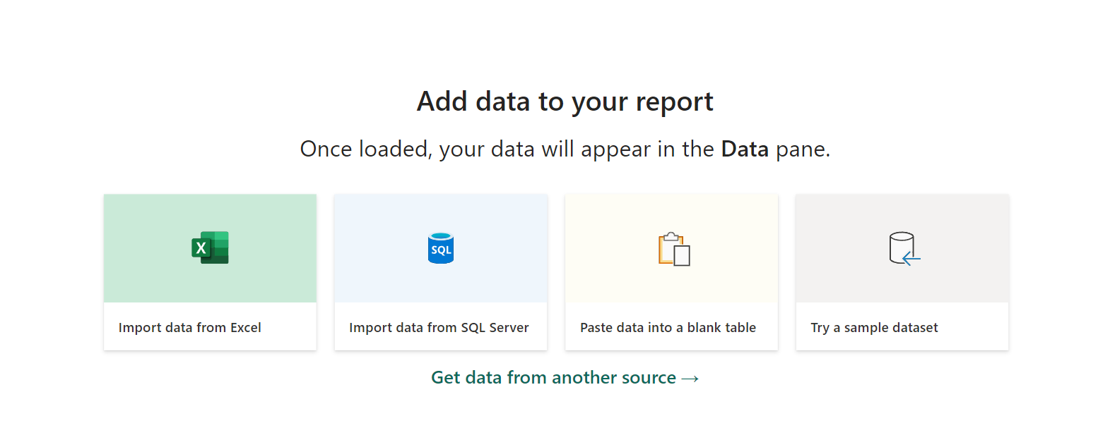
As you start working with Power BI, you’ll encounter an important decision: How do I connect to data in my reports, and what is the difference between Import vs Direct Query Power BI? Then you google for insights and find a few “technical consultant” focused blogs, that discuss significant differences thing sentences, and we wanted to make a comprehensive article for more audience members.
Your chosen connection method will depend on the source database and your analytics needs. Once connected, you can visualize and analyze the data in your reports using Power BI’s interactive dashboard. That’s where “Import” and “Direct Query” come into play. But what does Import vs Direct Query Power BI mean?
Both allow you to uncover hidden opportunities using data. Data governance for PowerBI is essential for operationalizing how data is refreshed in analytics projects. This ensures that the dashboard meets the organization’s analytics needs and takes advantage of the benefits of data governance. This means you’re not guessing between the directory method (aka live) or Import (aka extract) between each report because it’s an established offering for analytics projects. It’s advantageous for your analytics needs. Teams often set a few data freshness and time analytics options and then apply those limitations to all incoming reports. This ensures the data access credentials are up-to-date, providing a snapshot of the most recent information.
Introduction to Connecting to Data in Powerbi
You may also encounter this situation when you realize that the DirectQuery feature doesn’t work with your underlying data source or that the Import feature doesn’t update fast enough. You may wonder if you need to rebuild your data models.
The decision to use analytics extends beyond databases and includes various data sources such as online services, spreadsheets, APIs, and more.
In Power BI, users can choose the direct query method for their analytics needs. This choice becomes noticeable as they set up data connections and build their dashboards in Power BI.
You are choosing between Import Vs. Direct Query in Power BI, at first, is easy to skip without considering its long-term impact or the implications it may have as your prototype dashboard goes from DEV to PROD. When working with Direct Query to utilize data sets effectively, it is essential to understand the data connectivity and the underlying data source.
The first time you see the comparison between “Import Vs. Direct Query”
The first time, in Power BI, is while connecting to data.
Suppose you’re using a relational database like Microsoft SQL Server. In that case, you can import data into Power BI using Import Mode or connect directly to the database using Direct Query Mode for analytics.
As we researched, we found many technical blogs written to help people explain the tech technical aspects and insights using Power BI Service and Power BI Desktop. Still, we didn’t find direct content that explained it in a way we could easily share with business, sales, marketing teams, or executives using Power BI service and Power BI desktop. Ideally, this comprehensive guide will help explain to technical and non-technical users, as both should know about the process from multiple perspectives because it presents the overall availability of the data with both ups and downsides.
Consider Import and Direct Query as two different roads or paths leading to the same destination.
Insights in the Power BI service. Each road or path, including direct query, has advantages and considerations; we’ll help you navigate them. Whether you’re just starting your Power BI journey or looking to make more informed choices about data connections, this direct query may become your friendly companion.
Import Mode in Power BI is like bringing all your data into Power BI using DirectQuery. It’s fast, flexible, and lets you create powerful visualizations. With a direct query, you can work on your data even when offline, just like playing with building blocks.
On the other hand, Direct Query Mode is more like having a direct line to your data source with direct query. DirectQuery is a real-time feature in Power BI that doesn’t store your data inside the platform. It’s as if you’re looking at a live feed.
Selecting between Import or Direct Query involves critical decisions, like choosing between different game modes.
What is Import Data Mode?
The Import Data Mode in Power BI is like bringing all your data into Power BI’s playground using DirectQuery. Here’s a closer look:
The most common method used in Power BI is the DirectQuery Import Data Mode. In this direct query mode, you directly pull data from various sources—such as databases, spreadsheets, online services, and more—into Power BI.
This is extract in Tableau Desktop.
Power BI’s internal engine copies and stores the data using a direct query. Think of it as filling your toy box with all your favorite toys, including direct queries, making them readily available whenever you want to play.
This approach offers several key benefits:
Benefits of Import Data Mode
Speed: Since the data is stored within Power BI’s direct query functionality, it can be processed and analyzed quickly. With DirectQuery, your reports and visualizations using DirectQuery respond almost instantly, providing a smooth user experience.
Offline Access: With DirectQuery, you can work on your reports in Import Mode without an internet connection. It’s like having direct toys wherever you go without accessing the original data source.
Data Transformation and Modeling: In Import Mode, direct query gives you complete control over your data. To build a coherent and insightful dataset, you can shape, clean, and create relationships between tables with direct queries. This natural flexibility is like being the master of your toy kingdom, arranging everything just how you want.
How to Import Data in Power BI
Importing data into Power BI is straightforward:
Data Source Selection: First, you choose the direct data source you want to import from. This could be an SQL database, an Excel spreadsheet, a cloud service like Azure or Google Analytics, or many others that support direct queries.
Data Transformation: You can perform data transformations using Power Query, a powerful tool built into Power BI. This step allows you to clean, reshape, and prepare your data for analysis.
Data Modeling: In this phase, you create relationships between tables, define measures, and design your data model. It’s like assembling your toys in a way that they interact and tell a meaningful story.
Loading Data: Finally, you load the transformed and modeled data into Power BI. This data is ready to build reports, dashboards, and visualizations.
Data Transformation and Modeling
Data transformation and modeling are critical steps in Import Mode:
Data Transformation: Power Query allows you to perform various transformations on your data. You can filter out unnecessary information, merge data from multiple sources, handle missing values, and more. This is like customizing your toys to fit perfectly in your playtime scenario.
Data Modeling: In Power BI’s Data View, you define relationships between tables. These relationships enable you to create meaningful visuals. It’s similar to connecting different parts of your toys to create an exciting and cohesive storyline.
Performance Considerations
While Import Mode offers many advantages, it’s essential to consider performance factors:
Data Refresh: As your data evolves, you must regularly refresh it to keep your reports current. The frequency and duration of data refresh can impact the overall performance of your Power BI solution.
Data Volume: Large datasets can consume a significant amount of memory. Monitoring and optimizing your data model is essential to ensure it doesn’t become unwieldy.
Data Source Connectivity: The performance of data import depends on the speed and reliability of your data source. Slow data sources can lead to delays in report generation.
Data Compression: Power BI uses compression techniques to reduce the size of imported data. Understanding how this compression works can help you manage performance effectively.
What is Direct Query Mode?
Direct Query Mode in Power BI is like allowing an executive to see data when it’s in the database. They are running a query on that database when they start the report. This is great for dashboards that only have a few users or if the database is optimized for traffic, you can increase the traffic. However, as a rule of thumb, it’s best to keep direct queries for those who need to access data immediately and try to use Import for everything else.
This usual question of “when was this refreshed?” will have the exciting answer of “when you opened the report.”
This is called “Live” in Tableau Desktop.
In Direct Query Mode, you establish a direct connection from Power BI to your data source, such as a database, an online service, or other data repositories. Instead of importing and storing the data within Power BI, it remains where it is. Imagine it as if you’re watching your favorite TV show as it’s being broadcast without recording it. This means you’re always viewing the most up-to-date information, which can be crucial for scenarios where real-time data is essential.
Benefits of Direct Query Mode
Real-time or Near-real-time Data: Direct Query provides access to the latest data in your source system. This is invaluable when monitoring rapidly changing information, such as stock prices, customer interactions, or sensor data.
Data Source Consistency: Data isn’t duplicated in Power BI; maintain consistency with the source system. Any changes in the source data are reflected in your reports, eliminating the risk of using outdated information.
Resource Efficiency: Direct Query Mode doesn’t consume as much memory as Import Mode since it doesn’t store data internally. This can be advantageous when dealing with large datasets or resource-constrained environments.
Supported Data Sources
Power BI’s Direct Query Mode supports a variety of data sources, including:
Relational Databases: This includes popular databases like Microsoft SQL Server, Oracle, MySQL, and PostgreSQL, among others.
Online Services: You can connect to cloud-based services like Azure SQL Database, Google BigQuery, and Amazon Redshift.
On-premises Data: Direct Query can also access data stored on your organization’s servers, provided a network connection.
Custom Data Connectors: Power BI offers custom connectors that allow you to connect to various data sources, even those not natively supported.
Creating a Direct Query Connection
Setting up a Direct Query connection involves a few steps:
Data Source Configuration: Start by defining the connection details to your data source, such as server address, credentials, and database information.
Query Building: Once connected, you can create queries using Power BI’s query editor to specify which data you want to retrieve. Think of this as choosing the TV channel you want to watch.
Modeling and Visualization: As with Import Mode, you’ll need to design your data model and create visualizations in Power BI, but with Direct Query, the data stays in its original location.
Performance Considerations
While Direct Query offers real-time data access, there are some performance considerations to keep in mind:
Data Source Performance: The speed of your Direct Query connection depends on the performance of your data source. (Your dashboard calculations and complexity are equally crucial for performance, but this is the distance between data source and the dashboards). Slow or poorly optimized databases can delay retrieving data, but that’s dashboard-level performance and not data source performance. Both are significant, and both are different.
Query Optimization: Efficiently written queries can significantly improve performance. Power BI’s query editor provides tools to help you optimize your queries.
Data Volume: Large datasets may still impact performance, especially when complex calculations are involved. Efficient data modeling is essential to mitigate this.
Data Source Compatibility: Not all data sources are compatible with Direct Query. Ensure your data source supports this mode before attempting to create a connection.
Direct Query Mode is a powerful tool when you need real-time access to your data, but understanding its benefits, limitations, and how to optimize its performance is crucial for a successful implementation in your Power BI projects.
When to Use Import vs. Direct Query
Regarding Power BI, how you access and interact with your data is not one-size-fits-all. It depends on your specific needs and the nature of your data. In this section, we’ll explore the scenarios that favor two fundamental data access modes: Import Mode and Direct Query Mode. Additionally, we’ll delve into the concept of Hybrid Models, where you can blend the strengths of both modes to create a tailored solution that best fits your data analysis requirements. Whether you seek real-time insights, optimized performance, or a careful balance between data freshness and resource efficiency, this section will guide you toward making the right choice for your unique scenarios.
Scenarios Favoring Import Mode
Data Exploration and Transformation:Import Mode shines when you clean, shape, and transform your data before creating reports. It allows you to consolidate data from multiple sources, perform calculations, and create a unified data model within Power BI. This is especially valuable when dealing with disparate data sources that require harmonization.
Offline Accessibility: Importing data into Power BI provides the advantage of working offline. Once you’ve imported the data, you can create, modify, and view reports without needing a live connection to the source. This is crucial for situations where consistent access to data is required, even when the internet connection is unreliable or unavailable.
Complex Calculations: Import Mode allows you to perform complex calculations, aggregations, and modeling within Power BI. This is advantageous when you need to create advanced KPIs, custom measures, or calculated columns that rely on data from various sources.
Performance Optimization: You can optimize performance by importing data into Power BI. Since the data resides within Power BI’s internal engine, queries and visualizations respond quickly, providing a smooth user experience, even with large datasets.
Data Security and Compliance: Import Mode is often favored when data security and compliance are paramount. By controlling access to the imported data, you can protect sensitive information, making it suitable for industries with strict regulatory requirements.
Scenarios Favoring Direct Query Mode
Real-time Data Analysis: Direct Query Mode is essential when you require up-to-the-minute data insights. It’s perfect for monitoring stock prices, tracking website traffic, or analyzing real-time sensor data. With Direct Query, you see changes as they happen.
Large and Evolving Datasets: When working with massive datasets that are frequently updated, importing all the data can be impractical or resource-intensive. Direct Query ensures you always work with the most current information without worrying about data refresh schedules or storage limitations.
Data Source Consistency: In situations where maintaining data source consistency is critical, such as financial reporting or compliance monitoring, Direct Query ensures that your reports reflect the exact state of the source data, avoiding any discrepancies or data staleness.
Resource Efficiency: Direct Query is resource-efficient since it doesn’t store data internally. This makes it suitable for scenarios where memory or storage constraints are a concern, especially in large enterprises or organizations with limited IT resources.
Hybrid Models: Combining Import and Direct Query
In some cases, the best approach involves combining both Import and Direct Query modes in what is known as a “Hybrid Model.” Here’s when and why you might choose this approach:
A blend of Historical and Real-time Data: Hybrid models are beneficial when you need a combination of historical data (imported for analysis) and real-time data (accessed through Direct Query). For example, you might import historical sales data while using Direct Query to monitor real-time sales.
Data Volume Management: You can use Import Mode for the most critical or frequently accessed data and Direct Query for less frequently accessed or rapidly changing data. This way, you strike a balance between performance and data freshness.
Combining Data Sources: Sometimes, you may need to combine data from sources best suited for different modes. For example, you might import financial data from a spreadsheet (Import Mode) and connect to an external API for real-time market data (Direct Query).
Optimizing Performance: By strategically choosing where to use Import and Direct Query, you can optimize the overall performance of your Power BI solution. For instance, you can alleviate resource constraints by using Direct Query for the most resource-intensive data sources while leveraging Import Mode for the rest.
Hybrid models provide flexibility and allow you to tailor your Power BI solution to meet your organization’s specific needs, combining the strengths of both Import and Direct Query modes to maximize efficiency and data freshness.
A Comprehensive Overview of Data Refreshes when choosing between Important VS Direct Query.
To navigate this landscape effectively, one must understand the nuances of data access modes. In this section of the “Power BI Comprehensive Guide,” we delve into two pivotal aspects: “Scheduled Refresh in Import Mode” and “Real-time Data in Direct Query Mode.” These elements are the gears that keep your data engine running smoothly, offering distinct advantages for different scenarios.
Scheduled Refresh in Import Mode automates keeping your data up-to-date, ensuring your reports and dashboards reflect the latest information. We’ll explore its benefits, such as automated data updates and historical analysis while considering factors like data source availability and performance impact.
Real-time Data in Direct Query Mode opens a window into the world of instantaneous insights. Discover how this mode allows you to access data as it happens, perfect for scenarios like stock market analysis, web analytics, and IoT data monitoring. However, we’ll also delve into the critical considerations, such as data source performance and query optimization.
Lastly, we’ll examine the critical topic of Data Source Limitations, where not all data sources are created equal. Understanding the compatibility and capabilities of your data sources, especially in the context of Direct Query Mode, is vital for a successful Power BI implementation.
As we navigate these aspects, you’ll gain a deeper understanding of the mechanics that drive data access in Power BI, empowering you to make informed decisions about which mode suits your unique data analysis needs. So, let’s dive into the world of data access modes and uncover the tools you need for data-driven success.
Scheduled Refresh in Import Mode
Scheduled Refresh is critical to working with Import Mode in Power BI. This feature lets you keep your reports and dashboards up-to-date with the latest data from your source systems. Here’s a more detailed explanation:
Scheduled Refresh allows you to define a refresh frequency for your imported data. For example, you can set it to refresh daily, hourly, or even more frequently, depending on the requirements of your reports and the frequency of data updates in your source systems. Power BI will re-query the data sources during each scheduled refresh, retrieve the latest information, and update your datasets.
Scheduled Refresh is beneficial in several scenarios:
Automated Data Updates: It automates the data retrieval and refresh process, reducing manual efforts. This is particularly useful for large datasets or multiple data sources.
Timely Insights: Scheduled Refresh ensures that your reports and dashboards always reflect the most current data available. This is essential for data-driven decision-making.
Historical Analysis: It allows you to maintain a historical record of your data, enabling you to analyze trends, track changes over time, and make informed historical comparisons.
However, it’s essential to consider some key factors when setting up Scheduled Refresh:
Data Source Availability: Your data sources must be accessible and available during the scheduled refresh times. If the data source becomes unavailable, the refresh process may fail.
Performance Impact: Frequently scheduled refreshes can strain your data source, so balancing data freshness and performance is essential.
Data Volume: The size of your dataset and the complexity of data transformations can affect the duration of the refresh process. Optimizing your data model and query performance is crucial.
Real-time Data in Direct Query Mode
In Direct Query Mode, real-time data access is one of its defining features. Here’s a more detailed explanation:
Direct Query Mode lets you connect to data sources in real-time or near-real time. This means that when new data is added or updated in the source system, it becomes immediately available for analysis in your Power BI reports. It’s like having a live feed of your data, and it’s precious in scenarios where timeliness is critical.
Some use cases for real-time data in Direct Query Mode include:
Stock Market Analysis: Traders and investors rely on up-to-the-second stock price data to make informed decisions.
Web Analytics: Businesses need real-time insights into website traffic, click-through rates, and user behavior to optimize their online presence.
IoT Data Monitoring: Industries like manufacturing and healthcare depend on real-time data from IoT sensors to ensure smooth operations and patient safety.
Real-time data in Direct Query Mode comes with considerations
Data Source Performance: The performance of your data source becomes crucial, as any delays or downtimes in the source system will directly impact the real-time data feed.
Query Optimization: Queries in Direct Query Mode should be optimized to minimize latency and ensure fast response times.
Data Source Limitations
While Power BI supports a wide range of data sources, it’s essential to be aware of potential limitations, especially in Direct Query Mode. Here’s an overview:
Data Source Compatibility: Not all data sources are compatible with Direct Query Mode. Some sources might not support real-time access or have limited capabilities when used in this mode. It’s essential to check the documentation and compatibility of your data source with Power BI.
Complex Transformations: In Direct Query Mode, some complex data transformations possible in Import Mode may not be supported. This can impact your ability to create calculated columns or measures directly within Power BI.
Performance Considerations: Direct Query Mode’s performance depends heavily on your data source’s performance. Slow or resource-intensive queries on the source side can lead to slower response times in Power BI.
Understanding the limitations and capabilities of your data sources is crucial for making informed decisions when choosing between Import Mode and Direct Query Mode in your Power BI projects.
Performance Considerations Using Import vs Direct Query Power BI
Factors Affecting Import Mode Performance
In import mode, performance considerations are essential for efficient data analysis. The primary factor influencing import mode performance is the size and complexity of your dataset. When dealing with larger datasets, loading data into the local or in-memory cache can become resource-intensive and time-consuming. As the dataset grows, memory usage increases, potentially leading to performance bottlenecks. Additionally, the complexity of data transformations and calculations within the data model can slow down import mode. To mitigate this, data model optimization becomes crucial, ensuring that the model is streamlined and calculations are as efficient as possible. Another factor affecting performance is the hardware resources available. Adequate RAM and CPU power are necessary to support large datasets and complex calculations. Lastly, the frequency of data refreshes should be carefully considered. Frequent refreshes can strain system resources and impact the user experience, so finding the right balance between data freshness and performance is essential.
Factors Affecting Direct Query Mode Performance
Direct Query mode, on the other hand, introduces a different set of performance considerations. This mode connects to the data source in real time, eliminating the need to load data into a local cache. However, the speed and reliability of the data source connection become critical factors. A slow or unreliable connection can lead to delays in query execution, impacting the user experience. Additionally, the complexity of queries plays a significant role in Direct Query mode. Complex queries involving multiple data sources or intricate calculations can result in slower
performance. It’s imperative to optimize your queries to ensure they run efficiently. Furthermore, the performance of Direct Query mode relies heavily on optimizing the data source itself. Proper indexing and tuning of the data source are essential for fast query execution. Lastly, managing concurrency is vital in this mode, as multiple users accessing the same data source concurrently can lead to performance challenges. Therefore, implementing effective concurrency management is necessary to maintain a smooth user experience.
Optimization Tips for Import vs Direct Query Power BI
Several optimization strategies can be employed to enhance the performance of both import and Direct Query modes. First and foremost, data cleansing should be a priority. Cleaning and preprocessing the data before importing or connecting in Direct Query mode can significantly reduce unnecessary data, improving performance. Data compression techniques should also be utilized to reduce data size and optimize memory usage, especially in import mode. Implementing appropriate indexing strategies is crucial in both modes. In Direct Query mode, this ensures that tables in the data source are well-indexed for faster query execution, while in import mode, it helps with data retrieval efficiency. Aggregations can be employed in import mode to precompute summarized data, substantially boosting query performance. Partitioning large datasets is another valuable technique for import mode, as it helps distribute the load and improves data refresh times. Regular performance monitoring is essential to identify and address bottlenecks, ensuring data analysis and reporting remain efficient over time.
Security and Data Sensitivity when Using Import vs Direct Query Power BI
Data Security in Import Mode
Regarding data security in import mode, protecting the data stored in the local cache is paramount. Access control measures should be implemented to restrict data access based on user roles and permissions. This ensures that only authorized individuals can view and interact with sensitive data. Encryption is another critical aspect of data security at rest and in transit. Encrypting the data protects it from unauthorized access or interception during transmission. Furthermore, maintaining audit logs is essential for tracking data access and changes made to the data model. This auditing capability enhances security and aids in compliance and accountability efforts.
Data Security in Direct Query Mode
In Direct Query mode, data security focuses on securing data at the source. Secure authentication methods should be implemented to ensure that only authorized users can access the data source. Proper authorization mechanisms must be in place to control access at the source level, ensuring that users can only retrieve the data they are entitled to view. Additionally, data masking techniques can be employed to restrict the exposure of sensitive information in query results. By implementing data masking, you protect sensitive data from being inadvertently exposed to unauthorized users, maintaining high data security and privacy. Overall, in both import and Direct Query modes, a robust data security strategy is vital to safeguard sensitive information and maintain the trust of users and stakeholders.
Compliance and Privacy Considerations: Import vs Direct Query Power BI
Compliance and privacy considerations are paramount in data analysis and reporting using import or Direct Query modes. Ensuring compliance with regulations such as GDPR and HIPAA is a top priority. This involves controlling data access, implementing encryption measures, and defining data retention policies that align with legal requirements. Data residency is another critical aspect to consider. Determining where your data is stored and transmitted is essential to ensure compliance with regional data residency regulations and restrictions. Data anonymization or pseudonymization should also be part of your compliance strategy to protect individual privacy while still allowing for meaningful analysis. Furthermore, consent management mechanisms should be in place, enabling users to provide explicit consent for data processing and sharing. These considerations collectively form a robust compliance and privacy framework that ensures your data analysis practices adhere to legal and ethical standards.
Data Modeling and Transformation
Data modeling in import mode involves structuring your data to optimize the efficiency of data analysis. One of the critical principles often applied in this mode is the use of a star schema. Data is organized into fact tables and dimension tables in a star schema. Fact tables contain the core business metrics and are surrounded by dimension tables that provide context and attributes related to those metrics. This schema design simplifies query performance, allowing for more straightforward navigation and data aggregation.
Calculated columns play a crucial role in import mode data modeling. By creating calculated columns for frequently used calculations, you can improve query speed. These calculated columns can encompass various calculations, such as aggregations, custom calculations, or even derived dimensions, which simplify and expedite generating insights from your data. Furthermore, defining relationships between tables is essential in import mode to ensure data can be accurately and efficiently navigated. Properly defined relationships enable users to create meaningful reports and visualizations.
Data Modeling in Direct Query Mode
In Direct Query mode, data modeling focuses on optimizing query performance rather than designing data structures in the local cache. Crafting efficient SQL queries is paramount in this mode. Ensuring your queries are well-structured and utilizing database-specific optimizations can significantly impact query response times. Query optimization techniques, such as query folding, are valuable for pushing data transformations back to the data source, reducing the amount of data transferred and processed by the reporting tool.
Additionally, proper indexing of tables in the data source is critical. A well-indexed data source can dramatically improve query execution speed. Indexes enable the database to quickly locate the necessary data, reducing the time it takes to retrieve and process results. Data modeling in Direct Query mode is closely tied to the performance optimization of the underlying data source. Ensuring the data source is well-tuned for query performance is essential for delivering fast and responsive reports.
Differences and Limitations Visualization and Reporting
Building Reports in Import Mode
Building reports in import mode offers several advantages, primarily regarding the complexity and richness of visualizations and dashboards that can be created. Since data is stored locally in a cache, it is readily available for immediate manipulation and visualization. This means you can make interactive and visually appealing reports with various visual elements, including charts, graphs, and complex calculated fields. However, there are limitations to consider. Reports in import mode may suffer from slower refresh times, especially when dealing with large datasets. Additionally, real-time data updates often require scheduled refreshes, resulting in data lag between updates and the availability of new information in reports.
Building Reports in Direct Query Mode
Building reports in Direct Query mode offers real-time data access without the need for data duplication. This model is well-suited for scenarios where up-to-the-minute data is critical. However, the level of complexity in visualizations may be limited compared to import mode. Due to the need for real-time querying and potential performance constraints, some complex visualizations may not be feasible. High-concurrency scenarios can also impact query responsiveness, as multiple users accessing the same data source concurrently may experience delays in query execution.
Deployment and Sharing
Publishing Reports in Import Mode
Publishing reports in import mode is relatively straightforward, as the reports are self-contained with data stored in the local cache. These reports can be published on various platforms and accessed by users without directly connecting to the original data source. Users can interact with these reports offline, which can be advantageous when internet connectivity is limited. However, managing data refresh schedules effectively is essential to ensure that the data in the reports remains up-to-date.
Publishing Reports in Direct Query Mode
Publishing reports in Direct Query mode requires a different approach. These reports are connected to live data sources, and as such, they require access to the data source to provide interactivity. Users must have access to the data source to interact with the reports effectively. This mode’s dependency on data source availability and performance should be considered when publishing reports. Ensuring the data source is maintained correctly and optimized to support the reporting workload is essential.
Sharing Options and Limitations
Sharing options differ between import and Direct Query modes due to their distinct characteristics. Import mode reports are more portable, containing the data within the report file. Users can share these reports independently of the data source, simplifying distribution. In contrast, Direct Query reports have more stringent requirements since they rely on a live connection to the data source. This means that sharing Direct Query reports may involve granting access to the data source or hosting the reports on a platform that provides the necessary data connectivity. These considerations should be factored into your sharing and distribution strategy.
Best Practices: Import vs. Direct Query Power BI
Like most SaaS products that are packed full of optimal or suboptimal decisions that will meet expectations during testing time, and we recommend you begin testing as soon as possible to ensure your system can handle Direct Query or the Import Mode, which has a limit of 8 total schedule windows unless you decide to utilize the PowerBI REST API, we will save that for another blog, and know it’s a good step for batch style refreshes that can be accessed via standard programming languages or data engineering services.
Best Practices for Import Mode
To optimize performance in import mode, several best practices should be followed. First, data models should be optimized for speed and efficiency. This includes using star schemas, calculated columns, and well-defined relationships between tables. Data compression and aggregation techniques should be employed to reduce data size and enhance memory usage. Scheduled data refreshes should be during off-peak hours to minimize user disruption. Monitoring and managing memory usage is essential to prevent performance degradation over time, as large datasets can consume substantial system resources.
Best Practices for Direct Query Mode
In Direct Query mode, query optimization is critical. Craft efficient SQL queries that fully utilize the database’s capabilities and optimizations. Ensure that tables in the data source are appropriately indexed to facilitate fast query execution. Monitoring data source performance is crucial, as it directly impacts the responsiveness of Direct Query reports. Educating users on query performance considerations and best practices can also help mitigate potential issues and ensure a smooth user experience.
Common Pitfalls to Avoid
Common pitfalls must be avoided in Import and Direct Query modes to ensure a successful data analysis and reporting process. Overloading import mode with massive datasets can lead to performance issues, so it’s essential to balance the size of the dataset with available system resources. In Direct Query mode, neglecting to optimize data source indexes can result in slow query performance, harming the user experience. Implementing proper data security and compliance measures in both modes can expose sensitive data and lead to legal and ethical issues. Finally, neglecting performance monitoring and optimization in either mode can result in degraded performance and user dissatisfaction.
Use Cases and Examples
Industry-specific Examples
Data analysis and reporting are critical in decision-making and operations in various industries. For instance, in the retail industry, businesses use data analysis to track sales performance, optimize inventory management, and make data-driven pricing decisions. Data analysis helps monitor patient outcomes, assess treatment efficacy, and improve healthcare delivery. The finance sector relies on data analysis for tracking financial transactions, detecting fraud, and making investment decisions. Each industry has unique challenges and opportunities where data analysis can drive improvements and efficiencies.
Real-world Use Cases
Real-world use cases for data analysis and reporting are diverse and encompass many applications. Sales analytics is an everyday use case involving analyzing sales data by region, product, and time to identify trends and opportunities. Customer engagement analysis helps businesses measure customer satisfaction, engagement, and loyalty, providing insights to enhance the customer experience. Operational efficiency analysis identifies bottlenecks, streamlines processes, and optimizes organization resource allocation. These use cases illustrate how data analysis and reporting can be applied across various domains to improve decision-making and drive positive outcomes.
Conclusion
In conclusion, choosing between import mode and Direct Query mode depends on your specific data analysis and reporting needs and your data environment’s capabilities: performance, security, and compliance considerations.
Here is an excellent place to start inviting others to the conversation and ensure others understand what is happening without extra engineering. Like executives getting LIVE reports versus EXTRACTS, maybe this is where we talk about STREAMING?
All modes offer unique advantages and limitations, and a well-informed decision should align with your organization’s goals and requirements. Staying updated on emerging trends and developments in data analysis tools is essential to adapt to evolving needs and technologies. Practical data analysis and reporting are critical for informed decision-making and success in today’s data-driven world.
The ability to network with data science professionals is a valuable skill that can open doors to exciting opportunities and foster your personal and professional growth. It would be best if you created long-lasting connections while networking. Long-lasting relationships that will get you ahead in life, and similar to attending school, these are people who you can depend on for your entire lifetime.
Whether you are an Excel guru, analyst, engineer, intern, office admin, executive, or just someone interested in data science, building a solid network of data professionals can provide insights, mentorship, collaboration opportunities, and potential job prospects.
This article will guide you through the essential steps to effectively network with data professionals.
The more you practice, the more you can recall these successful attempts and your confidence will grow.
Being a technical person, it’s easy to rabbit-hole unnecessarily about strange topics related to what you love! Learning social cues before you start messaging people or meeting new people is good. Every new person will help you learn. Document everything in a spreadsheet and create a dashboard to share your success over some time.
How Can I Tell If I’m Being Annoying?
It can be challenging to understand whether or not you’re coming across as being annoying, and we think it’s best to be yourself, honest, and truthful. However, what if being yourself isn’t working? Perhaps we can pick up some new strategies before we begin. Often, looking back on previous convos can be an excellent way to realize what strategies are working and what’s not working. This is why many organizations are moving to NLP solutions built into their phone call systems; this allows them to hear what is working and what is not working with immediate feedback.
It’s essential to be aware of social cues to determine if you might be annoying someone during a conversation. Here are some signs that may indicate the other person is getting annoyed:
Body Language: Watch for signs of discomfort in their body language. These may be signs of irritation or discomfort if they fidget, cross their arms, or avoid eye contact.
Short Responses: If the person begins responding with quick, curt answers or seems disinterested in continuing the conversation, it’s a sign that they may not be enjoying the interaction.
Repetitive Topics: If you keep bringing up the same topic or steering the conversation back to yourself, the other person may find it annoying. It’s crucial to balance talking about yourself with showing genuine interest in their thoughts and experiences.
Overwhelming Questions: If you’re bombarding the person with too many questions or questions that are too personal, they may feel overwhelmed or uncomfortable.
Lack of Engagement: If the other person stops asking you questions or stops actively participating in the conversation, it could be a sign that they’re not enjoying the interaction.
Interrupting: Constantly interrupting or not allowing others to speak can be annoying. It’s important to let them express themselves and actively listen.
Unwanted Advice: Offering unsolicited advice or opinions on sensitive topics can be irritating. It’s generally best to offer advice or opinions when asked.
Negative Tone: If you sense a change in the person’s tone, such as becoming more curt or sarcastic, it may indicate annoyance.
Physical Distancing: If the person physically moves away from you during the conversation, it’s a clear sign that they may be uncomfortable.
Excessive Texting or Distraction: If the person starts checking their phone frequently or appears distracted, it could indicate that they are no longer engaged in the conversation.
It’s essential to be sensitive to these cues and adjust your behavior accordingly.
While working in customer service jobs before college, I spoke to hundreds of people per day, and had an opportunity to see what’s working for me and what’s not. Then while working at Tableau Software, I attended many sales conferences, and used my years of customer service experience and applied it to my interpersonal communication skills.
by tyler garrett, founder of dev3lop
Interpersonal communication is an exchange of information between two or more people. It is also an area of research that seeks to understand how humans use verbal and nonverbal cues to accomplish a number of personal and relational goals.
from wiki
If you suspect you may be annoying someone, it’s a good idea to politely ask if everything is okay or if they’re still interested in the conversation.
Here are ten ideas you can ask someone during the convo to check to see if you’re being annoying. I enjoy #1. Hopefully, these spark ideas on how to communicate comfortably with others.
“I hope I’m not talking too much about myself. How’s the conversation been for you?”
“Is there anything you’d like to discuss or any more interesting topic?”
“Am I being too intense or enthusiastic about this topic?”
“Are there any specific things I’ve said or done that bother you?”
“Is there anything I can do to make our conversation more enjoyable?”
“I’ve noticed I’ve been asking a lot of questions. Is there anything else you’d like to share or discuss?”
“Is there a specific way you prefer to have conversations I should be aware of?”
“Do you have any feedback or suggestions on how I can improve our interaction?”
“Is there a topic or subject you’re passionate about that we can discuss instead?”
“I want to ensure you’re comfortable in our conversation. If there’s anything I should change, please let me know.”
Respect their response and be prepared to exit the conversation if needed gracefully. Remember that not everyone will find the same annoying, so it’s also essential to be yourself and know the other person’s comfort level.
Managing Toxic Users in Online Communities
Dealing with Toxic Online Communities and Users: 6 Strategies for Safeguarding Your Well-Being
While meeting data science gurus, you’ll quickly learn not every community is the same and not all data gurus are the same. Encountering toxic behavior or a toxic online community/user can be distressing, and it’s inevitable. Here are six strategies to help you navigate and protect your well-being in such situations:
Limit Interaction: The first and most effective step is to limit your interaction with toxic individuals or communities. Avoid engaging in arguments or responding to negative comments. If possible, mute, block, or unfollow toxic users to minimize exposure to their content.
Seek Support: Reach out to friends, family, or trusted online friends for emotional support. Discussing your experiences with those you trust can provide a sense of validation and help you process your feelings about the situation.
Report and Document: If the toxicity crosses a line into harassment or abuse, use the platform’s reporting mechanisms to alert moderators or administrators. Document any offensive or harmful content, which can help build a case if needed.
Maintain Boundaries: Set clear boundaries for what you’re willing to tolerate. Don’t be afraid to assert yourself and express your discomfort when necessary. Remember that it’s okay to disengage from any community or individual who consistently exhibits toxic behavior.
Importance of Blocking: Blocking toxic individuals is crucial in protecting your online well-being. Blocking prevents further interaction and provides peace of mind, allowing you to curate a safer and more positive online environment.
Self-Care: Prioritize self-care. Engage in activities that bring you joy, relaxation, and peace. This may include stepping away from online interactions, pursuing hobbies, or practicing mindfulness. Taking care of your mental and emotional well-being is essential in the face of toxicity.
Dealing with toxicity online can be challenging, but employing these strategies, including the importance of blocking, can help you safeguard your well-being and maintain a positive online experience.
Attend Conferences and Meetups
Now that you’re ready to leave the nest check out a local meetup. It’s time to leave the toxic people behind!
Let’s think hard: where can we meet tech people? You can hear about new companies, companies hiring, people pitching their new products, and even sitting at a local coffee shop.
However, once you’re all done with coffee, you could head to data science conferences and meetups, as they are the cornerstone of building a robust network within the data professional community. Often, it’s one big party from sun up until sun down; most of the time, everyone is having a great time, and it’s always an easy way to meet someone with an interest equal to yours.
Here’s an in-depth exploration of why these events are so effective for networking:
1. Networking Opportunities: Data science conferences and meetups attract professionals from various backgrounds and expertise levels. This diversity provides an ideal setting for expanding your network. Whether you’re a seasoned data scientist or just starting out, you’ll have the chance to connect with like-minded individuals who share your passion for data.
2. Knowledge Sharing: These events are hubs of knowledge sharing. Not only do you get to attend presentations and workshops led by experts, but you can also engage in discussions with fellow attendees. The exchange of ideas, experiences, and insights can be precious, enhancing your understanding of the field.
3. Exposure to the Latest Trends: Data science is rapidly evolving. Conferences and meetups often feature talks on cutting-edge technologies, methodologies, and tools. By staying informed about the latest trends and developments, you can position yourself as an informed and forward-thinking professional, which can be attractive to potential collaborators or employers.
4. Access to Experts: These events frequently bring in prominent figures in the data science world as speakers. Meeting and interacting with these experts can be invaluable for your career. You can gain insights, seek advice, and even establish mentor-mentee relationships with individuals who have succeeded.
5. Potential Mentorship: Conferences and meetups are excellent places to find mentors or advisors who can guide your data science journey. Many experienced professionals are open to offering guidance, sharing their experiences, and helping newcomers navigate the intricacies of the field.
6. Serendipitous Encounters: Sometimes, the most fruitful connections happen by chance. You might meet someone who shares a common interest, has complementary skills, or works on a project that aligns with your goals. These serendipitous encounters can lead to productive collaborations, research projects, or job opportunities.
7. Building Your Reputation: Active participation in conferences and meetups can help you establish your reputation in the data science community. You can showcase your expertise and gain recognition as a knowledgeable and engaged professional by asking insightful questions during sessions, giving presentations, or contributing to panel discussions.
8. Friendships and Support: Beyond professional benefits, attending conferences and meetups can lead to personal connections and friendships. Having a network of supportive peers can be instrumental in overcoming challenges and celebrating successes.
In conclusion, attending data science conferences and meetups is more than just a way to acquire knowledge. It’s a strategic approach to building a network of professionals who can offer guidance, collaboration, mentorship, and even potential job opportunities. By actively participating in these events and seizing networking opportunities, you can enrich your career and make lasting connections in the data science world.
Utilize LinkedIn
LinkedIn is a large website where you can host your resume and have headhunters reach out to you about jobs. There’s more to it but if you’re networking, you’re also probably on the market to get a job. Having a LinkedIn is a best practice.
Why use LinkedIn? LinkedIn is a powerful tool for networking with data professionals.
Once you’ve created a well-structured LinkedIn profile highlighting your skills, achievements, and interests in the data field. You can begin to join data science groups and engage in discussions, connect with professionals, and reach out for informational interviews or collaborations.
You’re now a content creator; you need to regularly share relevant content and insights to establish your credibility within the data community. It’s not mandatory, but it’s a great way to meet others and tell the algorithm you’re essential, giving you more visibility on your posts.
Utilize LinkedIn for Effective Networking with Data Professionals
LinkedIn has emerged as an indispensable tool for networking and career development in today’s digital age. When it comes to the data science field, here’s how you can harness the power of LinkedIn for networking with data professionals:
1. Optimize Your Profile: Your LinkedIn profile is your digital identity in the professional world. To make the most of it, ensure your profile is complete, accurate, and engaging. Highlight your skills, education, and relevant experience. Use a professional photo and write a compelling summary that encapsulates your passion for data and career goals.
2. Join Data Science Groups: LinkedIn offers various groups and communities tailored to diverse professional interests. Look for data science groups, such as “Data Science Central,” “Data Science and Machine Learning,” or specific groups related to your niche within data science. Joining these groups is an excellent way to connect with like-minded individuals who share your interests and are actively involved in the field.
3. Engage in Discussions: Once you’re a member of these groups, actively engage in discussions. Share your insights, ask questions, and participate in conversations related to data science topics. By contributing meaningfully to these discussions, you demonstrate your knowledge and passion for the field, and you’ll start to gain visibility among your peers.
4. Connect with Professionals: Leverage LinkedIn’s networking capabilities by connecting with data professionals whose work or interests align with yours. When sending connection requests, personalize your messages, indicating your desire to connect and potentially collaborate or learn from each other. A personalized message is more likely to be well-received than a generic one.
5. Informational Interviews: LinkedIn is a valuable platform for contacting data professionals for informational interviews. If you’re interested in a specific career path or seeking advice, don’t hesitate to request a brief conversation. Many professionals are open to sharing their insights and experiences, making informational interviews a potent networking tool.
6. Showcase Your Knowledge: Establish your credibility within the data community by regularly sharing relevant content, such as articles, research papers, or your own insights on data science trends. Sharing valuable content keeps you engaged with your network and positions you as an informed and influential professional.
7. Personal Branding: Use LinkedIn to build your brand in data science. This involves consistently sharing your experiences, achievements, and the projects you’ve worked on. When others see your accomplishments, they’re more likely to respect and connect with you as a professional.
8. Recommendations and Endorsements: Ask for recommendations and endorsements from colleagues, mentors, or supervisors who can vouch for your skills and expertise. These endorsements add credibility to your profile and make you more attractive to potential employers or collaborators.
9. Stay Updated: LinkedIn is a dynamic platform, and the more active you are, the more likely you are to stay on the radar of your connections. Regularly update your profile with new skills, experiences, and accomplishments. Share industry news and engage with your connections’ content to stay in the loop with the latest developments in data science.
In summary, LinkedIn is a powerful networking tool for data professionals. By creating a strong and engaging profile, actively participating in data science groups, connecting with professionals, sharing insights, and using the platform to seek advice or collaborations, you can expand your network, enhance your credibility, and open doors to a wealth of opportunities within the data science community.
Online Forums and Communities
Participating in online data science forums and communities like Stack Overflow, Kaggle, or Reddit’s r/datascience can help you connect with professionals and enthusiasts. Each community has its ups and downs; consider them an ocean of possibility and take everything with a grain of salt.
Ensure you actively contribute to discussions, seek advice, and offer assistance to others.
These communities often provide a supportive environment for learning and networking.
Leveraging Online Forums and Communities for Networking in Data Science
In the digital age, online forums and communities have become invaluable hubs for knowledge sharing, networking, and collaboration within the data science field. Here’s how you can make the most of these online platforms:
1. Active Participation: Engaging with online data science communities requires active participation. Whether you choose platforms like Stack Overflow, Kaggle, or Reddit’s r/datascience, actively contribute to discussions, respond to questions, and join conversations on topics that interest you. Participating regularly demonstrates your passion for the field and makes yourself more visible to others in the community.
2. Seek Advice and Share Knowledge: Online forums provide an excellent platform to seek advice when facing challenges or uncertainties in your work or studies. Don’t hesitate to ask questions; you’ll often find experienced professionals willing to provide guidance. Conversely, offer assistance and share your knowledge if you have expertise in a particular area. This reciprocal exchange of information is a powerful networking tool.
3. Showcase Your Skills: These platforms allow you to showcase your skills and expertise. You establish yourself as a knowledgeable and helpful professional when you help others by providing thoughtful and insightful responses. This can lead to others reaching out to connect or collaborate with you.
4. Collaboration Opportunities: Online communities are teeming with individuals working on data-related projects. By actively participating in these communities, you increase the likelihood of finding potential collaborators. Whether you’re looking for partners on a research project, a coding challenge, or a data competition, these platforms are fertile ground for forming connections with like-minded professionals.
5. Learning and Skill Development: Online forums are not just about networking but also about continuous learning. You’ll gain valuable insights and learn new skills by participating in discussions and seeking answers to your questions. This helps you advance in your data science journey and gives you more to bring to the table when networking with others.
6. Building Your Reputation: A strong presence in online data science communities can help you build your reputation in the field. You become a respected figure in the community when you consistently provide high-quality responses, engage in thoughtful discussions, and showcase your skills. Others will likely contact you for collaborations, advice, or job opportunities.
7. Supportive Environment: Many data science forums and communities have a culture of support and encouragement. The sense of camaraderie and shared passion for data science creates a welcoming environment for networking. You’ll often find individuals who are eager to help and share their experiences.
8. Networking Beyond Borders: Online communities are not bound by geographical constraints. You can connect with data professionals worldwide, gaining a diverse perspective and expanding your network far beyond your local area.
9. Staying Informed: Many online platforms feature discussions on the latest trends, tools, and technologies in the data science field. Staying active in these communities keeps you updated about industry developments and enables you to discuss emerging trends.
In conclusion, participating in online data science forums and communities is an effective way to connect with professionals and enthusiasts, learn, share your expertise, and find collaboration opportunities. The supportive environment of these platforms makes them ideal for networking, and active involvement can help you build a strong network while enhancing your knowledge and skills in the field.
Collaborate on Projects
Collaborative projects are an excellent way to network with data professionals. Join data-related projects on platforms like GitHub or Kaggle and contribute your skills and expertise. Working together on real-world projects builds your experience and allows you to connect with people who share similar interests.
Harnessing the Power of Collaborative Projects for Networking in Data Science
Collaboration on data-related projects is a dynamic and practical approach to network with data professionals while simultaneously honing your skills and gaining hands-on experience. Here’s an in-depth look at the benefits and strategies of collaborating on data projects:
1. Real-World Experience: Collaborative projects allow you to apply your data science skills to real-world problems. By actively participating in these projects, you gain practical experience and enhance your problem-solving abilities. This hands-on experience is highly regarded by employers and collaborators alike.
2. Skill Development: Working on collaborative projects exposes you to diverse challenges, data sets, and problem domains. This exposure helps you expand your skill set, allowing you to become a more versatile and knowledgeable data professional.
3. Networking with Peers: Collaborative platforms such as GitHub, Kaggle, and GitLab often attract a community of data enthusiasts and professionals. By contributing to open-source projects or joining data challenges, you connect with like-minded individuals who share your passion for data science. These peers can become valuable connections for future collaborations or career opportunities.
4. Exposure to Diverse Perspectives: Collaborative projects often involve individuals from various backgrounds, each offering a unique perspective and set of skills. This diversity can lead to innovative solutions and foster creative thinking. Engaging with people from different professional and cultural backgrounds broadens your horizons and enriches your problem-solving capabilities.
5. Building a Portfolio: The projects you collaborate on are a testament to your skills and expertise. A portfolio showcasing your contributions to meaningful data projects can be a powerful tool for attracting potential collaborators, mentors, and employers.
6. Open Source Contributions: Open-source projects are a great way to give back to the data science community while expanding your network. Many data professionals appreciate contributions to open-source tools and libraries, which can lead to recognition and new opportunities within the community.
7. Interdisciplinary Collaboration: Data science often intersects with various fields, from healthcare to finance to climate science. Collaborative projects offer a chance to work with professionals from other domains. This interdisciplinary experience can provide unique networking opportunities and broaden your understanding of how data science applies across industries.
8. Problem Solving and Critical Thinking: Collaborative projects involve tackling complex data problems. By participating in these projects, you not only enhance your technical skills but also develop your problem-solving and critical-thinking abilities. These qualities are highly valued in the data science community and can set you apart.
9. Enhanced Communication Skills: Collaborating with others on data projects requires effective communication. You’ll need to articulate your ideas, share your progress, and clearly explain your work. These experiences can improve your communication skills, which are crucial for networking and collaboration.
10. Showcasing Your Value: When you actively contribute to a collaborative project, you demonstrate your dedication and value as a team player. This can lead to more meaningful connections with peers and mentors who appreciate your commitment to the project’s success.
In conclusion, collaborative projects are not just a means of building experience and enhancing your skills but also an exceptional way to network with data professionals who share your interests and passions. Through hands-on collaboration, you can build a strong network, expand your horizons, and open the door to exciting opportunities within the data science community.
Attend Webinars and Online Courses
In the age of digital learning, webinars, and online courses offer an excellent opportunity to network with data professionals from the comfort of your home. Sign up for webinars, workshops, and courses hosted by experts in the field. Engage in Q&A sessions and discussion forums to connect with presenters and fellow participants.
The Power of Webinars and Online Courses for Networking in Data Science
In our digital era, webinars and online courses have revolutionized learning and networking. They provide an incredible opportunity to connect with data professionals, learn from experts, and expand your network. Here’s a detailed exploration of how you can effectively network through webinars and online courses:
1. Convenience and Accessibility: Webinars and online courses allow you to access valuable content and network with professionals without geographical limitations. You can participate from the comfort of your home or office, making it a flexible and accessible way to engage with the data science community.
2. Expert-Led Learning: Many webinars and online courses are led by industry experts and thought leaders in the data science field. Attending these events expands your knowledge and gives you access to influential professionals who are often open to networking and engagement.
3. Engage in Q&A Sessions: Most webinars and online courses include interactive Q&A sessions. This is an excellent opportunity to ask questions, seek clarification, and interact with presenters. Engaging in these sessions allows you to stand out and be remembered by the experts leading the event.
4. Discussion Forums: Many online courses offer discussion forums where participants can interact, share insights, and discuss the course content. These forums are platforms for learning and great places to connect with like-minded individuals. Actively participating in discussions can lead to networking opportunities.
5. Build a Learning Network: As you attend webinars and online courses, you’ll naturally connect with fellow participants who share your interests and goals. These connections form the basis of your “learning network,” a group of individuals with whom you can exchange knowledge, insights, and experiences.
6. Gain Exposure to New Ideas: Webinars and online courses often introduce you to new ideas, trends, and technologies in the data science field. By staying informed and discussing these emerging topics, you position yourself as someone passionate about staying up-to-date, which can be attractive to potential collaborators or employers.
7. Networking Beyond Borders: Online courses often have a global reach, allowing you to network with data professionals worldwide. This diversity can provide unique perspectives and create networking opportunities beyond your local network.
8. Connecting with Instructors: Instructors of online courses are typically experienced professionals or academics in the field. Engaging with them can lead to valuable networking opportunities. You can ask for advice, share your experiences, and potentially establish a mentorship or collaboration with them.
9. Expand Your Skillset: Online courses are designed to provide in-depth knowledge and skill development. As you gain expertise in specific areas of data science, you become a more attractive collaborator and network contact for those looking for individuals with specialized skills.
10. Share Insights: When participating in webinars and online courses, you can share your own insights and experiences. This positions you as a valuable contributor to the community, and others may reach out to connect with you based on your contributions.
In conclusion, webinars and online courses offer a convenient and effective way to network with data professionals. By actively engaging in Q&A sessions, discussion forums, and other interactive components, you can connect with experts, build your learning network, and stay on the cutting edge of data science while expanding your connections within the field.
Seek Mentorship
When I was on the Tableau Consulting team at Tableau (before Salesforce acquisition), I was lucky to be mentored by many different people from around the world, and that’s why I think it’s important to begin seeking mentorship as soon as possible. Be sure to diversify your mentorship and always be on the look out for your next mentor.
Mentorship can be a valuable asset in your professional journey. Reach out to experienced data professionals you admire and respect, and express your interest in learning from them. A mentor can provide guidance, insights, and a network of their own that can greatly benefit your career.
The Value of Mentorship in Data Science: A Guiding Light for Your Career
Mentorship is a time-honored practice with immense potential for anyone looking to grow and excel in their professional journey, particularly in data science. Here’s a detailed exploration of how mentorship can be a powerful asset for your career:
1. Learning from Experience: One of the primary advantages of seeking a mentor in data science is the opportunity to learn from someone who has walked the path before you. An experienced mentor can provide valuable insights, share lessons from their journey, and guide you away from common pitfalls and challenges.
2. Tailored Guidance: A mentor can offer personalized guidance that addresses your unique career goals and challenges. By understanding your specific needs and aspirations, a mentor can provide targeted advice and recommendations, making your career development more effective and efficient.
3. Access to a Network: Mentors typically have extensive networks in the industry. You gain access to their professional contacts and connections by developing a mentor-mentee relationship. This expanded network can open doors to collaboration, job opportunities, and introductions to other influential figures in data science.
4. Accountability and Motivation: A mentor can be an accountability partner, helping you set and achieve your career goals. Regular check-ins with your mentor can keep you motivated and on track, ensuring that you progress in your career.
5. Insight into Best Practices: Your mentor can provide valuable insights into best practices in data science. They can help you understand the tools, techniques, and approaches that are most relevant and effective in the field, saving you time and effort in staying up-to-date.
6. Soft Skills Development: Data science is not just about technical skills; soft skills such as communication, problem-solving, and project management are equally crucial. A mentor can help you develop and refine these skills, making you a more well-rounded professional.
7. Feedback and Constructive Criticism: Mentors can provide feedback and constructive criticism, helping you identify areas where you can improve and grow. This feedback is often candid and based on their extensive experience, making it a valuable resource for personal development.
8. Encouragement and Confidence: A mentor can be a source of encouragement and confidence-building. They can provide reassurance during challenging times, helping you navigate setbacks and maintain a positive attitude as you progress in your career.
9. Personal Growth: Mentorship often extends beyond your professional life, positively impacting your personal development. The wisdom and guidance shared by your mentor can influence your decision-making, problem-solving abilities, and even your values and principles.
10. Legacy and Giving Back: Many experienced data professionals find fulfillment in giving back to the community by mentoring others. By being open to mentorship, you not only gain from their knowledge but also contribute to the passing down of knowledge and expertise within the data science field.
11. Networking Opportunities: You can also gain access to their professional circle through your mentor. This can result in introductions and networking opportunities that might not have been possible without their guidance.
In conclusion, mentorship is a powerful asset in your professional journey, especially in data science. Seek out experienced data professionals who inspire you, and express your interest in learning from them. A mentor can provide guidance, insights, access to a valuable network, and personalized support that can significantly benefit your career. Mentorship is a two-way street, often leading to mutually beneficial relationships that enrich the mentor and the mentee.
Use Social Media
In addition to LinkedIn, other social media platforms like Twitter can be helpful for networking in the data field. Follow data professionals, influencers, and relevant organizations. Engage in conversations, retweet, and share interesting content. Social media provides a more casual and interactive way to connect with others.
Leveraging Social Media for Networking in Data Science
In the digital age, social media platforms have evolved into powerful tools for networking and connecting with professionals in the data science field. Here’s an in-depth look at how you can maximize your use of social media for networking:
1. Broaden Your Reach: In addition to LinkedIn, explore platforms like Twitter, which offer a more casual and interactive approach to networking. By diversifying your social media presence, you can connect with a wider range of data professionals, influencers, and organizations.
2. Follow Data Professionals and Influencers: Start by identifying and following data professionals, industry influencers, thought leaders, and experts on social media platforms. Their posts, insights and shared content can provide knowledge, industry updates, and valuable connections.
3. Stay Informed: Social media is an excellent resource for staying informed about the latest trends, tools, and technologies in the data science field. By following and engaging with industry leaders, you’ll be privy to their expert opinions and insights into the rapidly evolving data landscape.
4. Engage in Conversations: Actively engage in conversations related to data science. Comment on posts, share your thoughts, ask questions, and participate in discussions. Contributing to these conversations allows you to showcase your knowledge, learn from others, and establish connections with like-minded individuals.
5. Share Valuable Content: Share interesting articles, research papers, blog posts, or insights related to data science. By consistently sharing valuable content, you position yourself as someone who is informed and engaged in the field. This can attract others who appreciate your contributions.
6. Retweet and Amplify: Retweet or share posts from data professionals and organizations that you find interesting or insightful. This spreads valuable information within your network and helps you connect with the original posters. It’s a way of showing appreciation and building rapport.
7. Participate in Twitter Chats and Hashtags: Many social media platforms, especially Twitter, host regular chats and discussions on specific data science topics using hashtags. Participate in these discussions to connect with experts and enthusiasts, learn from others, and share your insights.
8. Seek Advice and Guidance: Don’t hesitate to contact data professionals on social media if you have questions or seek advice. Many professionals are open to providing guidance and sharing their experiences, and social media offers a direct channel for these interactions.
9. Personal Branding: As you actively participate in discussions and share valuable content, you’ll build your brand within the data science community. Your online presence and contributions can make you more recognizable and memorable to potential collaborators and employers.
10. Networking Events: Social media platforms promote data science-related events, webinars, and conferences. Following these events and participating in their discussions can help you connect with fellow attendees and expand your network within the data community.
11. Be Authentic: Be yourself on social media. Authenticity is appreciated, and forming genuine connections with others is more likely when you are true to your voice and values.
In conclusion, social media platforms like Twitter offer a casual yet powerful means of networking within the data science field. By actively engaging with content, sharing your insights, and connecting with professionals and influencers, you can expand your network, stay informed, and open doors to a world of opportunities and collaborations in data science.
Attend Hackathons and Competitions
Hackathons and data science competitions are an exciting ways to meet like-minded individuals, showcase your skills, and collaborate on challenging projects. Join platforms like DataCamp, Topcoder, or HackerRank to find opportunities to compete and network with fellow participants.
Hackathons and Competitions: Catalysts for Networking and Skill Growth in Data Science
Participating in hackathons and data science competitions is a dynamic and immersive approach to networking within the data science community. These events provide an exciting skill development, collaboration, and professional network expansion platform. Here’s a detailed look at why these competitions are so valuable for networking:
1. Skill Development: Hackathons and data science competitions often present complex and real-world challenges. By participating in these events, you gain hands-on experience, apply your skills, and develop problem-solving techniques. This enhanced expertise builds your confidence and makes you a more attractive network contact.
2. Collaborative Opportunities: Most hackathons encourage collaboration. Forming teams and working with others allows you to leverage diverse skills and perspectives. Collaborators often become valuable connections for future projects or networking within the field.
3. Like-Minded Participants: Hackathons attract participants who share your passion for data science. These like-minded individuals can become your peers, collaborators, or mentors in the field. Building connections with individuals with a similar level of dedication to data science can be incredibly beneficial.
4. Competitive Edge: Successful participation in hackathons and competitions can distinguish you in the job market. Employers often value the problem-solving and teamwork skills developed in these environments. It can be a powerful addition to your professional portfolio.
5. Networking Events: Many hackathons and data science competitions feature networking events, Q&A sessions, or expert presentations. These events offer opportunities to connect with sponsors, judges, and fellow participants. Active participation in these activities can lead to meaningful connections.
6. Industry Recognition: Winning or performing well in prominent data science competitions can lead to industry recognition. Your achievements in these competitions can attract the attention of potential employers, collaborators, and mentors, ultimately expanding your network.
7. Online Platforms: Joining platforms like DataCamp, Topcoder, HackerRank, and Kaggle, or even participating in platforms like DrivenData offers you a gateway to a thriving community of data enthusiasts. These platforms host competitions and have forums, discussions, and profiles that enable networking and recognition.
8. Access to Industry Challenges: Many hackathons are sponsored by industry-leading companies and organizations. Participating in these events gives you insights into the challenges and projects relevant to these organizations. It can be a stepping stone to future job opportunities or collaborations.
9. Learning and Feedback: Hackathons provide continuous learning and feedback opportunities. Even if you don’t win, you can gain valuable feedback on your work, which can help you improve your skills and expand your network. Don’t hesitate to seek feedback from experienced participants.
10. Portfolio Building: The projects you complete during hackathons and competitions can be showcased in your professional portfolio. Sharing these achievements with potential collaborators, employers, or mentors can be a powerful conversation starter and networking tool.
11. Creativity and Innovation: These events often encourage participants to think creatively and innovatively. Engaging in such activities can help you develop a creative mindset that can benefit your career and make you more appealing to others.
In conclusion, hackathons and data science competitions are not just about winning prizes but also about the opportunities they offer for networking and skill growth. Active participation in these events can lead to collaborations, learning experiences, industry recognition, and lasting connections with like-minded individuals in the data science community.
Be Open to Informational Interviews
When you encounter data professionals whose work or career paths you admire, don’t hesitate to ask for informational interviews. These informal conversations can provide insights into their experiences, offer valuable advice, and potentially lead to future opportunities.
Embrace Informational Interviews: A Gateway to Insight and Opportunities in Data Science
Informational interviews are an often-underestimated tool for networking and personal growth in the data science field. These informal conversations can be incredibly valuable in providing insights, advice, and even future opportunities. Here’s an in-depth exploration of the benefits and strategies for making the most of informational interviews:
1. Gain Insights: Informational interviews offer a unique opportunity to gain insights into the experiences, paths, and challenges of data professionals you admire. You can learn from their journeys, achievements, and setbacks by asking thoughtful questions and actively listening.
2. Clarify Your Goals: These interviews can help you clarify your own career goals and the steps you need to take to achieve them. Through discussions with professionals who’ve walked a similar path, you can refine your own vision and develop a clearer plan.
3. Advice and Guidance: The data professionals you interview can provide valuable advice and guidance. Whether it’s about the skills you should prioritize, the organizations worth considering, or the best practices in the field, their input can be instrumental in your decision-making.
4. Expand Your Network: While the primary purpose of an informational interview is to gather insights, it can also lead to expanding your network. The professionals you interview may introduce you to others in the field, which can open doors to collaborations, job prospects, and mentorship.
5. Mutual Benefit: Informational interviews are a two-way street. They can mutually benefit you and the professional you’re speaking with. Sharing your experiences and goals can lead to reciprocal advice and potential collaborations.
6. Soft Skills Development: Engaging in informational interviews allows you to hone your communication and networking skills. These are transferable skills that are valuable not only in data science but in any professional setting.
7. Courting Mentorship: Informational interviews can be a stepping stone to mentorship. By building a rapport with a data professional, you may find a mentor willing to provide ongoing guidance and support in your career.
8. Personalization is Key: When requesting an informational interview, it’s crucial to personalize your outreach. Express why you admire their work or career and what specific insights you’re seeking. Make it clear that you value their time and expertise.
9. Prepare Thoughtful Questions: Prepare thoughtful and open-ended questions before the interview. Ask about their career journey, challenges, important milestones, and advice for someone aspiring to follow a similar path. Thoughtful questions demonstrate your genuine interest and respect.
10. Active Listening: During the interview, be an active listener. Pay close attention to the responses and ask follow-up questions. A meaningful conversation rather than a one-sided interrogation will leave a positive impression.
11. Show Gratitude: After the interview, express your gratitude for their time and insights. Send a thank-you email to acknowledge their help and reiterate your appreciation. This courteous gesture can leave a lasting positive impression.
In conclusion, informational interviews are a valuable tool for networking and personal growth in data science. By reaching out to data professionals you admire, engaging in thoughtful conversations, and building genuine connections, you can gain insights, refine your career goals, and potentially open doors to opportunities in the field. These interviews are not just about taking but about creating mutually beneficial connections within the data science community.
Conclusion
Networking with data professionals is essential for personal and professional growth in the data science field. By attending conferences, participating in online communities, collaborating on projects, and seeking mentorship, you can build a strong network that will advance your career and enhance your knowledge and skills. Networking is a two-way street, so be open to helping others. As you invest time and effort into building your network, you’ll find that the data community is full of passionate individuals eager to connect, share knowledge, and collaborate.
Today’s blog is about the min(1) paradigm for KPI charting in Tableau desktop and how to make advanced KPI charts without needing slow table calculations to do the computations for you. Instead, we will show you how to utilize Tableau features to generate a better KPI solution. Welcome to learning how to create a min(1) KPI dashboard. And if you’re breaking into the data industry, this is a good tutorial for you and advanced gurus.
At times, developers think they need to generate many visualizations to move forward and float them in a specific way to create a dashboard; however, as data sizes increase, enterprises find these dashboards inefficient. To begin unlocking the power of data, we first must master the software!
When I first learned this, it was called a “trick.” But the more I use it, the more I realize it’s a native feature and should be utilized because it helps make very complicated visualizations easily, unlike the <10 MB Google Sheet Error, which inevitably leads to much engineering. For supplemental reading, check out the period-over-period in Tableau.
We use this solution often because it helps avoid a need to edit colors in the colors marks editing screens, which can be difficult and usually generates the need to force the data to show specific values before you can tell Tableau when to change the color of an object. Eventually, meeting people become excited about improving KPI visualizations, which is challenging to do with marks alone. Doing it with text has become a fast approach to generating complex KPIs with a simple min(1).
What’s happening with KPI Dashboards in Tableau?
Making a lot of visualizations to generate a KPI chart is not the correct answer because it will slow down your Tableau Workbook! Instead, we have discovered decreasing the amount of visualization is the best path to optimization and easier cycles of support or additional features. The lack of visualizations means you can do more within the same workspace and keep track of less because it is consolidated into one chart.
A lot of charts means making a lot of data extract requests, a lot of live data requests, a lot of file data requests, a lot of tooltips, and a lot of filters,… Filters do a lot of performance degradation, also known as damaging the user experience due to generating technology inefficiently.
If you have ever been where end users need a faster dashboard, and the KPI dashboard is moving slowly, you have found a great wiki on building KPI charts in Tableau.
Learning how to make optimized Tableau KPI Dashboards is a path to building an operationalized Tableau solution you can utilize with any data source in the future; when you’re done building this one time, you can easily copy and paste this Tableau win into more workbooks.
This is a screenshot of many KPI charts on one visualization; pause here to see how this is possible.
What is the minimum value of 1? (min(1))
What is the minimum value of 1? What is X when computing min(1)=x?
One.
Finding the minimum of 1 isn’t rocket science. However, we must understand this logic to maximize the product’s functionality. Also, did you know min(1) is faster than max(1) or attr(1)?
You can “fix” a value behind the scenes to a static value, which keeps the axis from moving, giving you a conditional background to edit with the color marks card. The text marks card is now available to build conditional text or colors on text or text images.
The number Of Records or the value of 1 in a calculation will handle the generation of your KPI chart.
By the end of the Tableau min1 kpi charts article…
You will know how to make a KPI chart without creating multiple visualizations per user request.
You will know how to keep it simple and easy to support
You will understand what we are doing, why it works, and how to build it
You will have code to copy and paste and screenshots to follow along
Developing a good understanding of how to keep Tableau simple will eliminate the unnecessary bloat and server strain. By removing unoptimized development, you’re removing a wait time per interaction on your development. Most environments will not be happy with less than split second or second response times; it’s intuitive to understand how to improve the speeds of your workbooks without having to rearchitect the data.
“I recommend as data grows, you begin adding relational theory to your data pipeline, ask your data engineers to work through the atomic pieces of your data, bring the data to a 1nf, 2nf, or 3nf state until the data moves faster or vastly decreases in data sizes. It’s not unusual to aggregate second data into monthly data if your end users only need monthly data.”
Tyler Garret, Founder of Dev3lopcom, llc
Please keep it simple when crafting your tableau dashboards; the more simple the development, the easier it will be to maintain solutions in the future.
Using Min(1) offers an easy way to learn the product. However, you need to know the product!
Learning the min(1) solution from end to end will change how you solve problems.
“I gravitated to the min(1) solution because it offers a simple playing field for edits, support isn’t a nightmare, and it’s easy to conditionally color. Mostly, I enjoy that my complexities turn into calculations, the calculations I can either duplicate or copy paste back into the workbook, understanding the difference between these two or whether they nest into each other based on these single click is a large difference when generating calculations that need to be connected or not connected. Before getting too far in this tutorial, I recommend you understand the differences between duplicating the calculations and copying the calculations, and also understand the product has two spaces this becomes a negative development path or positive development path. The two places are calculations and dashboards/visualizations. Test the right click copy and duplicate as you evolve because it will define your speeds in the product for a long time.”
Tyler Garrett, Founder of Dev3lopcom, llc
Begin building your first min1 KPI bar chart.
Thanks for taking the time to start this min1 kpi bar chart tutorial. If you have any questions or get lost in the tutorial, please contact us or leave a comment. Happy to help.
To begin, start your tableau product!
Open a new visualization and build a min(1) bar chart.
a simple bar chart, min1 generates an axis length of 1
Okay, min(1), always 1. Build it.
Start typing min(1) – hit ENTER!
min(1) on sheet2
Not sure how I’m typing in this area? Double-click in the rows or columns below your marks card. First, double-click, and then you will see an input appear. If you want to harden these and not have them become “viz only static calls,” you can drag them into the workbook. I like this method because it’s all upfront, it names the calculations the name of the code, and it makes life relatively fast compared to not understanding this functionality and always building calculations, which leads to always needing to find those calculations, open those calculations, and edit those calculations. Also, when you need to delete the calculation, it takes longer because you have to see it in the workbook, and it’s not sitting in the rows bucket because you made a calculation. Based on this paragraph, you should better understand options and even the best path for you; it depends on what’s fast for you.
In short, let’s walk through these features.
Pro TIP: Tableau desktop offers a quick and easy user experience when adding content to the visualization or SHEET.
In a couple of places, you can double-click and type—rows, Columns, and here… on the bottom of the marks card.
Marks card is free to double-click below the squares. Then, you move it to the mark square of your preference.
Making a KPI Chart in Tableau using Min(1)
You have your min(1) bar established.
Make 3, hold ctrl+mouse1, and drag and drop to duplicate min1 across columns three times. Command+mouse1 click drag and drop for macOS.
Open up the axis on each and change the Fixed end to 1. Zero to One will be the end goal.
Click okay, and your simple min(1) mark will cover the entire pane.
Complete the following two similarly. You’re changing the value of the axis so that you can build a background on your KPI. This background is now easy to color conditionally. If you do a dual axis and make it a shape, now you have a background that can be conditionally colored and a shape that can be conditionally colored or changed. Welcome to a world of “smart KPI building” and the removal of all the strange multi-chart dashboards created due to not knowing these solutions.
Once completed, let’s add profit, sales, and a count of customers on the last KPI Chart.
Drag profit on your first minute (1) and sales on your second minute (1), and generate a calculated field for the final customer name count. I want to see the distinct count of customer names to understand the count of customers doing X.
Once you have these measure values on your KPI charts, you should start to see everything forming, and you can see we have some formatting ahead of us now.
Of course, profit is on the far left, and sales are in the middle, but when you open this solution again, you will not understand what we are offering the end users. To provide this solution to the end users, we need to make it sensible.
I am making the KPI Chart sensible.
Often, KPI charts come with an explanation, so don’t forget to explain what the number or chart means.
Also, pretend your end users are not super technical and can’t read minds.
Please do your best to help people make quick decisions; let’s fill in the blanks with sensible labels!
Click on any of the three to open the correct mark card.
The following steps are self-explanatory: filling in the rest of the labels, making the font subtly bigger, or a bold KPI chart will work for some people.
Think SMART in these steps. Don’t spend 5 hours making a KPI chart look a certain way. Don’t spend 10 hours making tooltips look cool. Ask end users for feedback before wasting time.
Open the ALL marks card and change the color to white.
Cleaning up your KPI charts
Cleaning up the KPI chart is about “simple clicks,” not “hard clicks.”
Hiding headers may hide a label, so let’s discuss.
Hiding headers may help remove the axis, but it may also release your axis’s title.
Some charts work great with the axis as the label; other times, it’s more complex. Feel free to play with different labeling methods.
I prefer labeling in the text pad editor, per marks card because it offers an endless amount of options. I enjoy formatting each marks card globally with the sheet formatting tools OR twiddle around with the mark level edits. Depends on what the end goals, which I enjoy designing on paper or whiteboard before I begin. Drawing pictures and steps is my method of visually seeing the algorithm.
by tyler garrett
Hide headers with a right click on the axis, and uncheck the show header.
Center the text on the “all marks” card because it will update across all marks cards! Work cleverly, not hard!
With text aligning in the middle, our KPI chart is starting to form.
These are personal preference changes; let your end users decide.
The key to utilizing the min(1) is the ability to augment Tableau to a style that fits your formatting needs. KPI charts have many variations; this particular one gives you complete flexibility to a text editor, which provides you with as much flexibility as you can write a calculation. The text can be conditionally colored based on logic, as can the box or min(1) bar in the background.
I prefer the min(1) bar versus a “square mark” sized large because a min(1) bar is predictable and fixable within editing the axis. As you need two marks colored in 1 mark card space, you can use a dual axis or conditionally color the text.
Right-click what you want to format in Tableau Desktop.
Right-click what you want to format is what I ask people to repeat when I teach them Tableau desktop, “right-click what you want to format.”
Today, we right-click the chart. Because… “we right-click what we want to format in Tableau!”
We drive to the “lines” because those are pesky, and someone in a meeting will likely ask you to remove the borders!
Boarders, dividers, tomatoes, potatoes, try and HIDE these and see if it’s the right path. It’s easy to get frustrated finding the right edit; I’m not saying I haven’t gone mad and turned everything off only to find the bar chart had borders turned on.
Sometimes, digging around these formatting menus is more accessible than telling someone the right buttons to hit because no one will memorize all these clicks. You will get better as you use Tableau more; keep clicking!
Open these, click none. Yay!
Notice we almost have it complete. We are still showing the zero line. Boo!
Removing the zero line seems like it gets most of it
Instead of wasting your time, double-check a few more things… zero line, axis ruler, maybe your min(1) has a border around the bar?
Axis ticks, zero lines, and grid lines.
Tired of clicking yet?!
Luckily, in the end, you’re developing your way into a tool that allows anyone to filter this sheet and give them blimp view aggregates! You might as well never build this again; you can swap out measures easily or make a three by 3 with a simple duplication of your sheet.
Omg, KPI charts without borders.
You now have three aggregated measures and a bar to color + tooltips conditionally.
Okay, we have simple KPI charts down. Let’s look at more advanced functionality and how to do it with copy-paste calculations!
Dynamic KPI charting in Tableau, building an on/off flag using dates and parameters.
Duplicate your sheet, and let’s begin our Dynamic KPI charting in Tableau! If you don’t already know, we are using the super store sample set of data that comes default with every installation of Tableau.
Building these dynamic charts or KPI charts is easy if you understand the min(1) steps we explained above and are excited about making on/off flags.
Also, if you’re learning, be willing to start thinking outside of the bucket! We will use that code to deep dive here and make our KPI chart more flexible and user-friendly.
We steal the code from our data buckets to generate three different buckets of data.
if
 DATETRUNC('month', [Order Date])>
                         DATEADD('month',
                         -([x]+
                         datediff('month',{MAX([Order Date])},today()))
                                         , TODAY())
 then "Current Period" //make this 0
 elseif
   DATETRUNC('month', [Order Date])>
                         DATEADD('month',
                         -([x]*2+
                         datediff('month',{MAX([Order Date])},today()))
                                         , TODAY())
 then "Previous Period" //make this a 1
 else "Filter"          //make this a 2
 END
 //[Order date] = date
 //[x] = parameter
With this new code implemented, you will only need one parameter to begin seeing period-over-period data.
Build a parameter.
call it x
data type integer
current value 1
OKAY
Drag and drop your new period-over-period calculation on the visualization. Exclude Filter.
After you exclude the filter, you’re left with two distinct periods, which is now set by your parameter.
Show parameter control by right-clicking the parameter.
Show the parameter on the sheet.
The parameter is input into your period-over-period algorithm, which takes the number of parameters inputted as months.
When you add more numbers to the input, you’re increasing the number of months. Because we don’t love static solutions, let’s optimize the date bucket solution, too!
Let’s dive back into the period-over-period calculation and make it better for end users. Start with generating another parameter!
Show the parameter and open your calculation.
Update “month” with your new parameter d, the date part.
Notice we change the notes on the bottom of the calculation; leaving comments at the bottom or top is a great way to tell others what you did.
We can simplify our life by removing the “logical-looking text values” and cutting them back to only an integer! Rename your calc to a single letter to facilitate your future development.
At this point, your calculation is relatively efficient and utilizes many parameters. When you save calc or hit OKAY, the settings on the filter will change; check out the following popup.
We expect an error because the previous filter on the “p o p” calculation or period over period calc – was only filtering on a condition. This condition is no longer possible.
The previous condition excluded the “Filter bucket” from our period-over-period solution.
Filter 2.
Filter 2! We are now showing 0, as current and 1 as previous.
This will save a lot of time when generating calculations like;
(if p=0 then (profit) else 0 end) – (if p=1 then (profit) else 0 end)
VS calculations like…
(if [p o p]=”Current period” then [profit] else 0 end) – (if [p o p]=”Previous period” then [profit] else 0 end)
And understanding how slow Tableau works with “strings” is also key to making this calculation fast.
Rename your sheet, call it “KPI-1” and begin discussing how to use this pop calculation to show dynamic coloring.
Finding the difference or change without Table Calculations
Table calculations are powerful for ad-hoc analytics but often can be outsmarted with basic logic or SQL. Outsmarting the need to use Table calculations means your workbook will be faster. Everything below shows you how to generate the difference or change variation for color variations, including an in-depth look at how to develop the solution yourself.
Having two sets of numbers and two sets of dates generates a difference or change in the data. A trend because we have an archive of data; archive data is like saying “past data or historical.”
Whether you’re hunting for a percentage difference or a subtraction difference, finding these are relatively easy with dates.
Next steps:
Write two quick calculations.
These calculations offer two simple drag-and-drop values that represent X amount of days!
Now, we can quickly see how these will start to be utilized.
0 = current period
1= previous period
If the current period is greater than the previous period, is that a negative or a positive? Logically, we use an algorithm to show a HOT or COLD coloring, aka GOOD or BAD.
Sometimes, measured values are not all black and white.
It may seem obvious that more money is a positive or GREEN, but realistically, an uptick or downtick may be green or red.
It’s always best to ask what end users first.
For the sake of this demo/blog, let’s begin using the concept that the current profit is higher than the previous period, which is green. We should celebrate our successes and use green to share this win across our dashboard, but without generating a Table calculation, we need to create a difference between the two values.
Check your work!
using the dashboard to verify calculations work.
In the final steps, make a calculation for sum([0])-sum([1]).
We need to understand what value is positive or negative.
Build another min(1) chart!
Use the parameters and your new difference calculation to build the KPI values!
Bonus points if you generate this KPI-3!showing an increase of 9,679…
We will simulate a user experience by dragging and dropping [Container] to see shipping container options onto the visualization.
Notice in our chart, we don’t have any colors showing Green or Red. However, we have logic.
If the Profit value is less than zero dollars, the value is negative. If it’s greater than zero dollars, the value is positive.
Let’s rename our calculation to save us the pain in future calculations. Rename it to “C” for change.
Now, if C>0, then positive else negative! We don’t want to pretend writing an if statement here is wise; study about Boolean calculations as alternatives.
Generate one final calculation.
You can add this to your visualization and quickly visualize the difference between periods.
Add GreenRed to your Color Marks card
you’ll see it populate your visualization
change the colors to green & red
Maybe you’re familiar with this kind of color, well here’s why I enjoy this kind of KPI charting! With the calculations we have, and logic developed, we can build an advanced color chart within 1 single KPI mark card, without having to do a dual axis.
Using text editor for conditional coloring using simple logic
Using a text editor, you are given a lot of flexibility in a user-friendly space. Trying to explain the dual axis to give an up/down arrow can be more confusing and complex to support for new users.
▲ up arrow
▼ down arrow
By generating two more calculations, you can offer two different things to color in your text editor.
Remove the “containers” dimension and drag it to the filters. Convert to a single value list, aka radio buttons.
omg green
Radio buttons help us simulate a typical KPI experience. Our end-user has a couple of filters, and charts are likely below; filtering this way in the visualization gives us the ability to debug immediately.
Swap to Jumbo Box. Notice the negative background. What if our end user says, “We don’t want a red background.” Or maybe the end user wants 3 conditional coloring variables, and Tableau can only do a dual axis to show two.
omg red
Remove the color GreenRed from the visualization. Drag our two new positive and negative calculations with the text arrows. Put those on the Text mark card.
notice the positive arrow is missing…
Where is the positive arrow?
The positive arrow missing can be a complex few steps to figure out, you need to find each arrow, color it, and the end user will see green or red.
That’s why I rather enjoy this method. Also, using the container filter gives us the ability to see both positive and negative.
This process avoids needing to figure out where the green arrow is located. For what it’s worth if you’re not familiar with this step, I encourage you to try and build the arrows without these steps.
awesome
If you’re experienced, you may enjoy the fact that you’re not having to edit the color marks card, and you can rest assured your workbook will not break as easily as before.
Re-arrange everything according to your “design requirements.”
lovely
Okay, now you’re on the way to understanding how you can
effectively design advanced KPI charts
without developing slow tableau workbooks
and without table calculations
Below are a few final remarks about making your min(1) KPI charts easy to maintain in the future. Not advanced, but rather more for easy support.
outstanding
Ending notes about the min1 solution
Eventually, min(1) has a max, and it becomes harder to support; there are a lot of calculations to maintain, and you have to learn tricks to make it work better. Once you get there, copy-pasting things and duplicating things as needed becomes a priority, and edits become easier as you scale, but it is also a lot to maintain. Consider the amount of work/effort before committing to big asks. There’s always something easier; keep updated on Tableau Community too.
Tips about min(1) KPI for new users
I try to explain to new Tableau users in Training during a Tableau consulting engagement, “Don’t let this become the hammer” Often, Tableau has easier ways to solve the problem, but when things get custom, I always use this solution here.”
Eventually, using the same hammer over and over, it feels like, “This shoe doesn’t fit, and dashboards are slow.” Remember, at times, it’s okay to swap to a visualization, and that’s better because it’s less work for you and Tableau (most of the time).
lots of min(1) which is what though?
Pro tips about Min(1) kpis
Above in the screenshot, notice the layering of “more fields”… does it ever look like this when you’re developing your KPIs/dashboards? This happens, and here’s a fix.
Let’s chat about what’s happening in the Tableau world.
And, before we begin, let’s swap the axis.
min(1)
When we double click on columns or rows, and type min(1), we can see we are typing a calculation, that calculation is a SHEET level only calculation. It doesn’t live anywhere else in the workbook, but it does live in the workbook; from an optimization perspective, don’t bother stressing yourself out or testing what’s best; just consider what’s easiest to support and build faster, and harden later.
Type //something on your min(1) calc…
You type //TheNameYouWantToSee (hold shift, then hit enter), it drops you to a new line, and then you can type min(1)… Or you can open your typed calcs by double clicking, and start from the front of the calc.
End goal, we want our field to show up right ‘meow’ (now).
making the new line is all it takes
By adding the //comment, and a new line, you can leave a note to help you dig through your min(1)’s.
A nice trick to avoid “more fields” becoming Min(1) over and over.
Never fun to support min(1) over and over in heavy KPI charts!
Tableau Pricing has simplified to 3 different user purchases and Tableau aka Salesforce increased their price.
The Tableau price is broken into the users ability to access the Tableau Desktop product, exploring dashboards built by Tableau desktop users, or viewing reports.
Tableau Creator: Creators within your organization encompass individuals who establish connections with data sources and transform that data into valuable insights for both themselves and their colleagues. They typically engage in the creation of reports and disseminate them through methods such as email or shared drives. These data power users frequently engage in ad hoc analyses to address deeper inquiries arising from their data.
Tableau Explorer: Explorers represent the contemporary business users who act as a driving force for organizational change. While their job titles may not explicitly label them as analysts, they possess a comfortable familiarity with data. They are motivated to advance their respective businesses and require the ability to delve deeply into data to discover answers to their unique questions, which often extend beyond the confines of pre-built reports.
Tableau Viewer: Viewers leverage data to enhance their decision-making processes. Tableau Viewers encompass a wide spectrum of individuals, ranging from team members who rely on data for their day-to-day tasks, to department heads who need insights into the progress of critical projects, and even to the CEO, who depends on high-level metrics to gauge the overall health of the organization.
Tableau Creator caters to a diverse range of professionals, including business analysts, vice presidents, data architects, office administrators, and even SQL experts. It empowers them with the flexibility they require to craft on-the-fly data discovery visualizations and engage in self-service analytics.
Furthermore, the latest Tableau pricing, which includes Tableau Creator, introduces a new lightweight ETL (Extract, Transform, Load) tool. This tool adds a layer of efficiency to data management, making it easier to extract, transform, and load data for analysis.
The Explorer and Viewer roles extend this accessibility to a broader audience, granting everyone the capability to access and view work published online. This inclusivity fosters an environment where individuals can freely pose questions and provide answers, all without the typical delays associated with a conventional centralized Business Intelligence model.
As a result, Tableau Creator not only streamlines the development of reports and dashboards but also eliminates the need for extensive back-and-forth email exchanges during the report/dashboard creation process. This enhances collaboration and expedites the decision-making process across your organization.
Tableau Pricing is now bundled into 3 simple plans.
We recommend you work with your Tableau Software sales manager if you are looking to implement Tableau Server. You have 15 days to get your work completed, let them know about your installation, and if it will take longer than 15 days, tell them upfront.
The cost of Tableau is an annual purchase, not a month to month purchase, and they bundle in a Tableau Server user with every purchase too.
Using Tableau Creator or Tableau Desktop is a minimum cost of $900+.
Tableau Creator:
Price: $75 per user per month (billed annually).
What You Get: Tableau Desktop, Tableau Prep Builder, and one Creator license on Tableau Cloud.
Description: Unleash your analytics potential with our Creator package, essential for every deployment. This suite empowers you to discover insights and manage your end-to-end analytics workflow.
Tableau Explorer:
Price: $42 per user per month (billed annually).
What You Get: One Explorer license for Tableau Cloud.
Description: With Tableau Explorer, you can explore trusted data and find answers to your questions quickly, enjoying full self-service analytics capabilities.
Tableau Viewer:
Price: $15 per user per month (billed annually).
What You Get: Access to view and interact with dashboards and visualizations on a secure and user-friendly platform.
Description: The Tableau Viewer allows you to view and engage with dashboards and visualizations easily, making data insights accessible to everyone.
Here’s the information presented in a simple table format:
Tableau Plan
Price per User/Month (Billed Annually)
Included Features
Tableau Creator
$75
– Tableau Desktop – Tableau Prep Builder – One Creator license on Tableau Cloud
Tableau Explorer
$42
– One Explorer license on Tableau Cloud
Tableau Viewer
$15
– View and interact with dashboards and visualizations on a secure platform
Having a solid understanding of the executive overview of Tableau is paramount. Tableau is not just another software solution; it’s a top player in the realm of business intelligence and data analytics. Many organizations, regardless of their size or industry, rely heavily on Tableau to gain insights from their data, make informed decisions, and stay competitive in the market.
The recent shift to monthly licensing in Tableau’s pricing structure signifies a broader industry trend toward greater flexibility and adaptability. This shift makes it easier for organizations to align their analytics capabilities with their evolving needs and financial constraints, opening the door to more accessible, scalable, and cost-effective data analytics solutions.
Being well-versed in Tableau’s executive overview is a strategic advantage for businesses and professionals. It allows them to harness the power of Tableau to visualize and explore data, create interactive dashboards, and generate valuable reports. With its user-friendly interface and robust capabilities, Tableau has the potential to transform the way businesses leverage data for decision-making.
Whether you’re an analyst, executive, or any professional seeking to unlock the potential of data analytics, understanding Tableau’s significance as a widely adopted reporting tool is a critical step toward staying ahead in the data-driven world. By choosing the right Tableau plan, you can tap into its capabilities and drive your organization’s success through data-driven insights.
Tableau Desktop looks great on this MSI laptop.
Our experience with tableau pricing.
We have experience talking to new users, clients, classrooms, and random people in elevators about Tableau pricing, and we are happy to help you learn more. However it’s also good to start the conversation with Tableau about pricing with their software, and learn who your sales representative or account manager will be.
We have experience with Tableau Consulting; installing tableau server, building data products end to end, helping companies monetize their data, building APIs for webhooks to talk to on your internal servers, setting up tableau online aka tableau cloud for your customers, & even building first time KPI dashboards, including design services!
If you have any questions regarding the price of Tableau or if it makes sense for your environment, contact us.