In today’s data-driven world, effectively interpreting and visually communicating complex information is critical for strategic decision-making. Visual encoding—transforming data variables into graphical components like size, position, color, or shape—lies at the heart of impactful visualizations. However, it’s far more than just aesthetics; empirical studies reveal that certain visual encodings consistently outperform others in comprehension and retention. As a decision-maker guiding business initiatives, understanding these nuances can catalyze clarity and improve data-driven cultures dramatically. In this article, we’ll unpack empirical research findings on visual encoding effectiveness, offering insights grounded in rigorous analysis to strategically enhance your organization’s analytical capabilities and decision-making prowess.
The Critical Role of Visual Encoding in Data Analytics
In the era of big data, organizations grappling with vast datasets require effective visual representations to quickly make sense of actionable insights. Good visual encoding not only simplifies complex information but also ensures accurate interpretation and quicker decision cycles. Recent empirical research highlights the pivotal role visual encoding methods play in determining how users interpret data visualizations. According to multiple studies, encoding methods can significantly impact how quickly, accurately, and confidently decision-makers analyze information—and ultimately act upon it.
For instance, studies demonstrate that encoding data using length or position is typically more effective for comparative analysis than color hue or shapes. This finding is crucial when creating executive dashboards; leveraging effective visual encodings is key to producing dashboards that influence decision-making positively, as detailed comprehensively in creating executive dashboards that drive decision making. Likewise, predictive analytic visualizations benefit tremendously from precise encoding choices, ensuring accurate, timely, and actionable insights, as described thoroughly in our article on predictive analytics for enhanced supply chain management.
Therefore, to drive robust analytics strategies in your organization, it’s essential to thoughtfully consider your visual encoding approaches. Empirical insights offer proven avenues to enhance the speed, precision, and confidence of interpretations, directly translating into tangible competitive advantages.
Among various encoding methods studied, position begins as one of the most effective channels for visual accuracy. Position encodes data by indicating values along scales, typically via axes—think bar charts, scatter plots, or dot plots. Educational and industry research consistently finds positional encoding leads to swift comprehension and high accuracy, allowing viewers to easily discern subtle differences between data points. This clarity makes positional encoding ideal for workplaces relying on rapid and accurate analysis, aiding decision-makers in identifying patterns and trends quickly.
For example, an effective implementation of positional encoding can be particularly advantageous when building interactive visualizations or dashboards emphasized in popular visualization products for data analysis. By leveraging positional encoding effectively, analysts and stakeholders can achieve rapid, accurate comparisons, enabling confident and informed decision-making processes supported by reliable evidence.
Length and Size Encoding: Natural and Efficient Comparisons
Length and size encoding involves quantifying data values visually through the length of bars, lines, or the areas of shapes. Empirical research repeatedly affirms that length is one of the strongest approaches, second only to positional encoding, facilitating swift comparisons and accurate relative assessments. Conversely, while size encoding using area might seem intuitive, studies caution against its indiscriminate use because the human brain is prone to misinterpret area as proportional rather than relative.
Applying smart length-based encoding techniques can significantly strengthen reporting efficiency, aligning seamlessly with asynchronous data processing advancements detailed in our exploration of asynchronous ETL choreography beyond traditional methods. Pairing robust visual encoding with cutting-edge data operations enhances organizational agility and analytical velocity, yielding accelerated business outcomes.
Color Encoding: Powerful When Applied Thoughtfully
Color encoding—categorizing numerical or categorical data by variations in hue or intensity—can be extremely powerful for highlighting significant data elements or creating compelling visual differentiation. However, extensive empirical studies have shown cautionary results. Relying solely on color for critical data distinctions can be misleading, complicated, and susceptible to viewer bias or accessibility issues (e.g., color blindness).
Nonetheless, applying color encoding strategically alongside positional or size-based encodings generates powerful visual tools speaking clearly to stakeholders without added cognitive load. For instance, employing strategic color gradients can significantly enhance visual understanding in dashboards, helping executives quickly identify significant data changes or performance exceptions as explored in our detailed guide to Tableau quick-win date bucket visualizations. Thoughtful usage of color—supplementing effective primary encoding methods—can dramatically boost visualization clarity and decision-makers’ confidence.
Visual Encoding in Modern Data Architectures
Today’s data architectures emphasize streamlined and seamless workflows, evident in groundbreaking concepts such as ZeroETL architectures for real-time analytics. As data pipelines evolve toward near-instantaneous delivery, effective visual encoding becomes increasingly essential, supporting human cognitive processing at the pace modern analytics architectures necessitate. Emerging practices not only demand faster data movement but also highly intuitive analytics visualizations, solidifying the role visual encoding plays in modern business ecosystems.
Acknowledgment of visual encoding at the architectural level assures increased performance, usability, and relevancy for enterprise reporting infrastructures like those offered under comprehensive cloud solutions detailed on our AWS consulting services page. Prioritizing encoding decision-making enhances the inherent strengths and agility of real-time data environments, tangibly improving a company’s responsiveness to evolving market demands.
Integrating Visual Encoding in Strategic Analytics Initiatives
To fully realize visual encoding’s power within strategic analytics initiatives, decision-makers must appreciate its fundamental relationship with organizational data cultures and innovation. Our detailed exploration highlighting developing a data-driven mindset emphasizes how visual encoding must be a conscious organizational decision rather than an afterthought. Indeed, cultivating a culture attuned to empirical research insights equips businesses to tackle complex visual analytics challenges strategically at scale.
Companies should also invest in talent that appreciates visual encoding in analytical engineering, ensuring the infrastructure supports powerful visual outcomes accessible organization-wide. Our article on hiring specialized engineers highlights the profound impact expert staff have in building forward-looking analytical environments. From infrastructure upgrades and data pipeline enhancements to the deployment of user-friendly visualization solutions like those cited in Canopy’s recent product updates, organizations can seamlessly decode empirical visual best practices into productive, enterprise-wide analytics cultures.
Rigorous research provides undeniable evidence that visual encoding effectiveness directly impacts interpretation accuracy, decision speed, and confidence. Understanding positional, size-related, and color-based encoding strategies enables business leaders and architects to drive stronger engagement and insightful analytics decision-making processes within their organizations. By consciously applying these empirical lessons to visualization design, businesses not only extract clearer insights quickly—but also establish robust, surgically-precise analytics environments prepared to thrive in today’s complex economy, as detailed in our exploration of data analytics influencing modern job markets.
Empowering your data initiatives with strategic visual encoding amplifies analytical strength, drives competitive advantage, and positions your organization at the forefront of data-driven innovation.
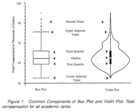
In an age where data visualizations speak louder than reports, choosing the right plot becomes imperative.
Decision-makers crave clear and insightful graphics, ensuring data-driven decisions are based on realities rather than intuitive guesswork. Violin plots and box plots are two visualization champions helping analytical leaders identify hidden patterns and drive innovation. But the question remains: when do you leverage violin plots, and when do box plots take precedence?
As your strategic partner in navigating the complex landscape of data analytics and innovative perspectives, we’re here to guide you through the subtle complexities of these visualization tools, ensuring your data stories resonate powerfully with stakeholders.
Understanding the Difference: Violin Plot vs. Box Plot
At first glance, violin plots and box plots seem similar—both visualizations provide insights about data distribution. Yet, beneath the surface, significant differences distinguish their applicability to various analytical contexts.
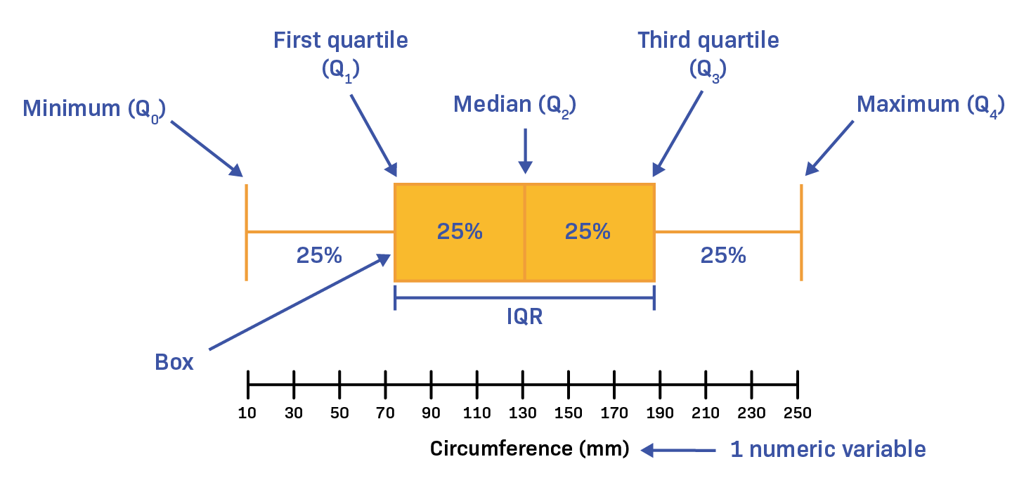
A box plot offers a simple yet powerful representation of essential statistical insights like median, interquartile range, minimum and maximum outliers within the data. Its simplicity fosters quick comprehension and easy communication of data spread, particularly beneficial when stakeholders require immediate clarity.
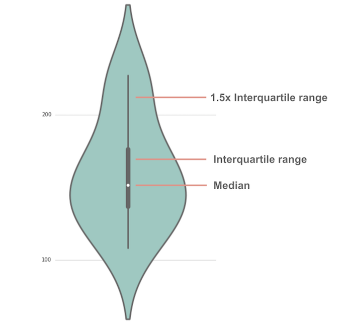
In contrast, a violin plot extends this capability further by combining box plot fundamentals with a kernel density estimation (KDE).
This approach provides a deeper, more nuanced visualization, showcasing the probability density distribution and illuminating the full spectrum of data distribution, including multimodality and density variations. These sophisticated visuals allow decision-makers to understand distributions at a granular level, uncovering hidden trends or patterns that could considerably impact strategic decisions.
This data-centric differentiation makes violin plots powerful in scenarios demanding comprehensive data analysis and deeper interpretive insights. On the other hand, box plots clearly suffice in scenarios focused on rapid interpretation and concise summaries essential for executive presentations. Choosing the right visualization hinges on knowing your data—what insights you need, and how granular stakeholders wish to see the information.
Violin Plots: Best Scenarios for Deeper Distribution Insights
Uncover Hidden Patterns and Multimodal Data Features
Businesses generating substantial amounts of data benefit immensely from visualization techniques that pinpoint subtle variations and hidden insights. Violin plots shine precisely in these contexts by capturing data patterns that box plots might overlook. Kerne density estimation provides additional distribution insights by illuminating multiple peaks or modes within a dataset—a necessity when dealing with multimodal datasets indicating mixed populations or varied behaviors among different subgroups.
Such granularity serves as a necessary precursor before implementing complex analytics strategies like those we outlined in holographic data modeling for multi-perspective analytics. By first understanding nuanced complexities, your predictive and analytical data models become more robust. Imagine a scenario where user behavior exhibits multimodality; a violin plot clarifies user segments more explicitly, adapting strategy and aligning offerings accordingly.
Comprehensive Exploration During Initial Phases of Data Analysis
When performing comprehensive exploratory data analysis (EDA), analysts seek extensive, detailed visualization that fully embraces variability and data diversity. Violin plots enable analysts to see beyond simplistic summaries provided by box plots. Their rich visualizations inform proactive investigation during the early stages of analysis, guiding decisions for subsequent analytical modeling and optimization efforts. Particularly relevant in finely-tuned predictive modeling scenarios, stakeholders appreciate this depth when exploring supply chain variability through approaches detailed in our guidelines on leveraging predictive analytics for enhanced supply chain management. Precise insights into demand volatility and supplier diversity empower decision-makers to anticipate events, foresee roadblocks, and streamline operational strategies.
Box Plots: Optimal for Quick Understanding & Efficient Communication
Simplified Visuals for Executive-Level Reporting
In many organizations, simplified visualizations drive quick, confident executive decision-making. Box plots summarize critical statistical metrics concisely, allowing executives and non-technical stakeholders to grasp fundamental data characteristics fast. Utilizing an easily comprehensible visual ensures adoption and effectiveness in communication across teams and executive leadership.
If you have stakeholders who comment something along lines of “no one looks at your reports,” it could highlight challenges in communication clarity or complexity. Box plots effectively address this issue, providing a visual summary that’s digestible, impactful, and capable of quickly bringing clarity to discussions. Rather than burying leaders in detail-heavy visualizations, the accessible nature of box plots ensures swift insights, supporting prompt strategic action.
Ideal for Quickly Spotting Outliers and Comparing Groups
Another significant benefit of box plots aligns with scenarios demanding quick glance visibility to outliers or performance differences across comparable groups or categories. For instance, segment performance metrics in marketing campaigns, manager KPIs in organizational reviews, or sales results across multiple product categories become immediately identifiable through this simplistic approach.
This straightforward functionality enables quick identification of deviations warranting immediate action. Note that this speed in decision-making can enhance organizational agility, another core benefit when incorporating sophisticated analytics aimed at operational efficiency, similar to innovations discussed in our guide to semantic type recognition for automated data processing. You initiate faster response times, expedited troubleshooting, and strategic pivots, maximizing opportunities and minimizing inefficiencies.
Synergizing Violin and Box Plots for Strategic Advantages
Smart technical strategists also understand the advantages inherent to utilizing violin plots and box plots in tandem, leveraging each visualization to complement the other. For example, analysts venture into violin plots initially when exploring data properties comprehensively, then transition later to box plots when communicating summarized insights to broader audiences.
This approach mirrors methodologies we’ve employed successfully in engagements providing advanced Tableau consulting services, where analytics dashboards balance comprehensive analysis (with violin plots) and easy-to-digest summaries (using box plots).
Carefully choosing visualization strategies based on purpose and audience cultivates deeper appreciation of analytics capabilities throughout an organization. Consider using the combined strength of these plots for situations like performance tuning, predictive analytics refinement, and even advanced data retrieval strategies such as those noted in our insight into enhancing data retrieval with indexing in SQL.
A Visualization Strategy Aligned to Your Data Objectives
Ultimately, the violin plot vs. box plot debate finds merit only in understanding your unique strategic priorities and organizational needs.
For rapid communication, executive dashboards, and immediate insights—box plots remain unbeatable. However, when exploratory investigation and meticulous distribution insights become paramount, violin plots provide robust clarity and deeper analytical footing.
At every visualization journey step, an informed approach steers optimal strategic outcomes. Effective visualization is not merely a formula but a strategy developed through careful contemplation into data complexities, stakeholder requirements, and intended objectives.
Ready to enhance your strategic decision-making through visualization clarity? Consider also the benefits of structured, semantic data integration efforts, aligning perfectly towards your strategic aim—like we’ve outlined in our work with ontology-driven data integration and our strategy of creating clarity via enhancing user experience through clearer policies.
Final Thoughts: Plotting the Road Ahead
Understanding the contextual benefits and differences between violin and box plots ensures your visualization strategy sets your team in the right analytical direction. Choosing the right visualization aligns directly with impactful storytelling, powerful insights, and insightful data discovery—each vital in navigating today’s competitive, data-driven marketplace. As your strategic partner in technology, analytics, and innovation, we’re here to help guide your analytics journey forward toward data excellence and strategic clarity.
Need support integrating these visualizations into your data ecosystem? Let’s connect—your data innovation journey starts here.
Visualizing complex data in recognizable, actionable ways is a hallmark of strategic decision-making. Among data visualization solutions, contour plotting stands out for its ability to clearly translate multi-dimensional continuous variable domains into intuitive visual insights. Businesses and stakeholders today rely increasingly on precise data-driven methods; contour plotting provides an unparalleled blend of clarity and depth. This technique aids analysts and decision-makers in understanding geographical, statistical, or multidimensional variable patterns in relationships otherwise obfuscated by traditional visualization styles. Through careful consideration and strategic incorporation of modern contour plotting techniques, organizations can quickly spot performance trends, monitor variable interactions, and reveal insights critical for informed strategy definition and successful operational execution.
The Crucial Role of Contour Plots in Data Analysis
In analytical practices, contour plots effectively portray continuous variable domains, clearly showing how one variable relates to another across a defined space. These visualizations display data points at equal values, thus helping stakeholders identify performance variations, peak ranges, patterns, or anomalies within their datasets. Unlike bar or line charts that represent individual data points or aggregated measures, contour plots convey dynamic interactions between variables, granting analysts a unique interpretive lens for complex datasets. They become especially critical when handling multivariate domains, as highlighted in our article on embracing data diversity.
Organizations struggling with data overload find contour plotting especially beneficial, as it condenses vast quantities of information into comprehensible visual snapshots. An effective contour plot circumvents the clutter of redundant visualizations, allowing decision-makers to swiftly pin down regions of interest or concern. For example, geographic information systems (GIS) frequently rely upon contour plots to depict elevation or environmental variables, clearly offering immediate context for any analytical observation. In marketing, finance, and operational optimization activities such as supply chain management, contour plots serve as indispensable tools for mapping response surfaces and identifying profitable operational strategies quickly and efficiently.
Identifying Optimal Use Cases for Contour Plotting
Determining the right visual aid for critical analyses is essential—data professionals must choose the right chart type to effectively communicate their insights. Contour plotting shines particularly in scenarios involving continuous or large datasets where relationships between multiple variables must be examined simultaneously. Optimizing manufacturing processes through response surface methodologies, assessing geographical environmental impacts, or evaluating complex computational models—or even understanding customer response functions—are scenarios ideally suited for contour plots.
Moreover, industries utilizing considerable spatial analysis or computational fluid dynamics routinely adopt contour plotting techniques as vital visualization practices. Decision-makers aiming to pinpoint ideal operational parameters use contour plotting to rapidly comprehend significant multi-dimensional results. Financial institutions find value in contour plots for understanding sensitivity and risk scenarios, enabling quick strategic shifts for maximizing returns or reducing market exposure.
Effective Contour Plot Methodologies and Strategies
A solid understanding of contour plot methodologies can significantly enhance an organization’s effectiveness in interpreting continuous variables. Selecting appropriate contour plotting methodologies depends on the dataset characteristics and strategic analytical goals. For continuous domains, common methodologies involve interpolative or function-fitting approaches. Interpolation methods generate smooth surfaces between data points to visualize trends and patterns effectively, whereas regression modeling or function-fitting methods can precisely represent relationships within defined parameters.
Strategically integrating these techniques into analytical workflows enhances the interpretability of visualizations, drawing deeply informative insights far quicker than through purely numeric analyses. Interpolation offers flexibility when datasets are sparse, identifying potential areas of interest or hidden trends, a practice detailed further in our guide on dataset sampling techniques for processing optimization. Meanwhile, regression-based approaches refine those insights by portraying statistically-driven contour lines that clearly illustrate trends and relationships within the dataset, allowing analysts and executives to confidently guide strategic decisions.
Choosing Appropriate Scale and Resolution in Contour Visualizations
Selecting optimal resolution and scaling can significantly influence contour plots’ effectiveness and accuracy. Decision-makers require accurate understanding of shifts within data patterns; therefore, carefully choosing resolution ensures visibility without loss of important nuances. Too fine a resolution might unnecessarily complicate readability without adding strategic value, while a coarse resolution could hide significant information.
Cleverly adjusting scales facilitates quick identification of subtle shifts within data domains. Using logarithmic or asymmetric scaling can highlight relationships in datasets featuring significant range variations, making crucial outliers visibly distinct and informative. This choice makes visual analysis faster and actionable insights more evident. Our comprehensive exploration of big data vs small data strategies highlights the importance of selecting appropriate data scales to achieve meaningful visualizations.
Integration of Contour Plotting into Analytical Pipelines
With analytics increasingly integral to organizational strategy, seamless integration of contour plotting into standard analytical pipelines ensures rapid iteration and exploration of insights. Contour plotting fits naturally within advanced analytics frameworks employing SQL databases, spreadsheet data repositories, and cloud computing environments. Leveraging flexible, declarative data flows, as detailed in our article on moving beyond imperative scripts with declarative data transformations, allows visualization tools to connect with data sources more quickly, enabling users to focus on insights rather than data preparation.
For instance, organizations utilizing SQL Server databases can effectively extract insights from large relational datasets efficiently. Strategically applied database-level preprocessing—including summarizing and organizing through aggregating and grouping data in SQL—simplifies dataflows during visualization development. Our expertise in database management, clearly outlined in our Microsoft SQL Server Consulting Services, demonstrates consistent effectiveness in equipping businesses to seamlessly integrate advanced contour plots into their analytics pipelines.
Minimizing Data Movement and Enhancing Efficiency
Efficiency in contour plotting requires minimizing unnecessary data movements. Organizations increasingly strive for zero-copy data integration approaches to avoid redundant copying and enhance visualization pipeline performance. Using APIs or direct database connectors, this integration reduces latency and resource overhead, enabling faster iterations and more immediate insight generation. By strategically planning pipeline integration points and prioritizing efficiency, decision-makers foster shorter analytical cycles and rapidly accessible visual results, foundational for agile and decisive management practices.
Advancing Organizational Maturity Through Contour Plotting
Effectively adopting contour plotting reflects higher analytical maturity in an organization’s strategic capabilities, as it demonstrates advanced awareness of visualization strategies tailored to complex multi-dimensional datasets. Organizations implementing these techniques effectively often reflect robust data operational maturity. Our DataOps maturity assessment helps decision-makers quickly gauge their current analytical capability and visualize how adopting sophisticated visualizations such as contour plotting positions them at higher stages of analytical maturity.
Contour plotting thus becomes much more than an isolated visualization technique—it supports organizational advancement, strategic decision-making, and informed risk-taking. Strategic use of contour plotting elucidates multidimensional dataset relationships, encouraging organizations to confidently build innovative solutions or address operational inefficiencies directly through visualized insights. With ongoing improvements in software capabilities, contour plotting remains at the forefront of visual innovation, promoting understanding and viable decision-making trajectory.
Continuous variable domains become accessible, actionable, and insightful when visualized effectively—contour plotting ensures this visualization journey remains seamless, insightful, and increasingly sophisticated for progressive organizations.
In today’s data-driven world, effective visualization isn’t merely about presenting information—it’s about telling a compelling story. The correct presentation of data using charts and visualizations is increasingly crucial for clarity, decision-making, and communicating insights effectively. While factors like color schemes and labeling choices are critical, one commonly overlooked, yet fundamentally important aspect, is managing the aspect ratio in chart designs. The aspect ratio—the relationship between the width and height of a visualization—not only influences readability and interpretability, but directly impacts the insights your audience ultimately derives from your data presentations. Just as architects carefully select dimensions to balance aesthetics and functionality in buildings, skilled data visualization professionals strategically choose aspect ratios that facilitate greater clarity and understanding. In this article, we uncover the essential considerations of choosing the right aspect ratios, examine various chart types, and highlight how mastering ratios fits seamlessly into our professional data analytics consulting services and innovations that meet your strategic technology needs.
Why Does Aspect Ratio Matter in Data Visualization?
Aspect ratio considerations might initially seem minor or trivial, yet they significantly alter the audience’s understanding and interpretation of your data. Visual perception relies heavily upon proportional relationships; slight changes in these relationships can drastically alter how insights resonate. Poor aspect ratios can distort your data, lead to misunderstandings regarding values or comparisons, and ultimately harm the decision-making process. For executives and analysts alike, understanding the importance of aspect ratios isn’t just good practice—it’s a crucial principle for ensuring accuracy and reliability in strategic analytics.
The primary reason aspect ratio matters is its direct influence on how data relationships are perceived. For instance, excessively tall and thin line charts can exaggerate minor fluctuations, leading viewers towards overly dramatic interpretations of changes over time. Conversely, overly wide and short visualizations can mask these same shifts, diminishing the perceived significance of crucial patterns or trends. Equally essential is the role of the aspect ratio in user satisfaction; viewers navigating visualizations in interactive dashboards often prefer clear, uncluttered views optimized for their screen resolutions. Engaging, interactive presentations in an efficient real-time analytics architecture depend significantly on skillful aspect ratio selection.
Integrating aspect ratio considerations into the initial visualization design phase empowers analysts to avoid common pitfalls and amplifies the accuracy with which insights are communicated to audiences. Correctly chosen aspect ratios set the foundation for effective visual storytelling and solidify the data integrity at all organizational levels.
Understanding Aspect Ratio: Basic Principles and Best Practices
Keen visualizations require a solid foundation in fundamental aspect ratio principles and proven best practices. The most standard aspect ratios—such as 4:3, 16:9, or the golden ratio (approximately 1.618:1)—have long served as guidelines in graphic design, photography, and visual media. Translating these practices to the realm of data visualization creates visual stability and provides a solid baseline upon which insightful analytics can flourish.
A common best practice regarding aspect ratios is to choose a proportion giving audiences an honest and accurate representation of data relationships. Line graphs demonstrating presentation of temporal developments over time benefit greatly from aspect ratios that allow audiences to intuitively interpret visual slopes and make comparisons efficiently. Selecting width-to-height ratios based on the type of data visualized, such as time-series or categorical comparisons, maximizes audience understanding and cuts through noise in complex datasets. This aligns closely with core principles of responsible data visualization principles, ensuring complexity doesn’t overshadow clarity.
In interactive dashboards, responsive design often demands flexibility regarding aspect ratios. Mobile-optimized analytics must dynamically adjust to maintain visual fidelity across various screen sizes, resolutions, and devices. Dashboard designers must proactively consider these possibilities throughout design phases, carefully optimizing aspect ratio choices from ideation to deployment stages.
Aspect Ratios Across Different Chart Types
Aspect Ratio in Line Charts and Scatter Plots
Line charts and scatter plots strongly depend on a precisely selected aspect ratio. The ratio can notably affect perceived slopes, correlations, and patterns within data. For line charts that represent temporal data, carefully aligning the aspect ratio creates clarity by correctly communicating time-dependent variations. Observing aspect ratio proactively helps executives avoid skewed perspectives or misleading conclusions derived from seemingly small adjustments in width or height proportions.
In scatter plots, aspect ratios significantly impact the perception of correlation between variables. Incorrect or exaggerated aspect ratios can either falsely imply correlations or hide important relationships altogether. Ensuring a balanced aspect ratio helps analysts and business leaders identify genuine relationships quickly, facilitating decisive strategic actions aligned with data-driven insights.
Aspect Ratio in Bar and Column Charts
Bar and column charts, typically designed for categorical comparisons, exhibit a slightly different relationship with aspect ratios. Unlike line or scatter plots where slope and trajectory matter, bar chart aspect ratios must aim for clarity in readability regarding individual categories and values. Optimal ratios emphasize recognizable comparisons without overcrowding or excessive subdivision of screen real estate.
Furthermore, these charts often benefit from leveraging an appropriate width-to-height ratio to maintain visual associations across categories without distortion. Careful tuning enables executives and analysts to derive clear benchmarking insights and efficient knowledge transfer—especially crucial when embedding visualizations within decision support systems, dashboards, or reporting environments. Such practices greatly enhance data-driven storytelling that complements focused analytical projects for sustainable urban planning projects or similarly impactful engagements.
Advanced Applications: Integrating Aspect Ratio and Analytics Pipelines
As businesses move towards complex, interconnected analytics systems and pipelines, visualization becomes an integral part of the analytics delivery framework. Appropriately designed and implemented aspect ratios fit seamlessly into the ecosystem—especially important in architectures like parent-child pipeline hierarchies and visualization frameworks integrated into extraction, transformation, and loading (ETL) data workflows. Consistent aspect ratio implementation becomes pivotal for standardized internal reporting, customer communications, and data-driven strategy formulation.
Additionally, advanced visualization workshops and consultative engagements must emphasize the careful oversight of aspect ratios from conceptualization through final design phases. Aspect ratios implemented correctly proactively mitigate risks associated with misinterpreting analytics results. These careful considerations can effectively minimize data-sharing friction, reduce downstream corrective process steps, and significantly contribute to success in low-latency, high-performance analytical pipelines, such as those detailed extensively in our article on zero-copy integrations: minimizing data movement costs.
Common Mistakes and How to Avoid Them
Many common visualization mistakes trace directly back to fundamental aspect ratio errors. For instance, mismatched ratios negatively impact interpretability, leading executives or stakeholders to misguided decisions. A frequent oversight is scaling visualizations to fit screen space or reporting templates without careful regard for accurate data representation. Strategic data presentations cannot simply chase aesthetics at the expense of precision or clarity.
Charts distorted—or subtly misrepresented—by insufficiently thought-out aspect ratios risk miscommunication or misinterpretation. To avoid misleading visual impressions, rely heavily upon querying data using proven analytics strategies, such as leveraging SQL wildcards (learn more about SQL wildcard patterns here), validating query results to maintain accurate data integrity, and proactively cross-checking thoroughly developed analytics against alternate reporting viewpoints (including appropriate testing and quality assurance processes).
When faced with technical issues in creating or rendering effective visualizations, refer to trusted resources and guides like our recent blog post addressing common tech challenges “Problem Resetting Your PC Windows 10 Safe Mode” to tackle foundational technical barriers proactively and efficiently.
Empower Your Data Analytics with Optimal Visualization Practices
With aspect ratio awareness deeply embedded into your visualization and analytics culture, your organization is better positioned to foster data literacy, analytic clarity, and strategic accuracy. Mastering this often undervalued dimension—and partnering with consultants who understand how to integrate these strategies effectively—is a forward-thinking investment into long-term innovation through analytics.
In today’s rapidly evolving data landscape, the ability to efficiently handle data insertions and updates—known technically as upserts—is crucial for organizations committed to modern analytics, data integrity, and operational excellence. Whether managing customer details, real-time analytics data, or transactional information, a robust upsert strategy ensures consistency and agility. Understanding how upsert implementations differ across various data stores empowers strategic technology leaders to select the optimal platform to sustain data-driven growth and innovation. This blog post provides clarity on common upsert patterns, highlights pertinent considerations, and guides informed decision-makers through the architectural nuances that can shape successful data practices.
What is an Upsert?
An upsert—a combination of “update” and “insert”—is an operation in database management that seamlessly inserts a new record if it does not already exist, or updates it if it does. By merging two critical database operations into one atomic task, upserts simplify application complexity, optimize performance, and ensure data integrity. Understanding the power behind this hybrid command allows technology leaders to implement structured solutions streamlined around efficient data management.
Upsert logic plays a pivotal role across a vast spectrum of applications from real-time analytics dashboards to complex ETL pipelines. Efficient implementation significantly speeds up data synchronization, enhances data accuracy, and simplifies transactional handling. Rather than relying on separate logic for insert-and-update scenarios, businesses can encapsulate complex logic within scalable applications. Leveraging upserts appropriately can unlock productivity gains, ensuring development resources remain available for higher-value activities focused on business goals rather than routine technical intricacies. An optimized upsert strategy streamlines your data architecture and amplifies operational efficiencies.
Upsert Strategies in Relational Databases
Traditional SQL Databases and Upsert Techniques
In the relational database landscape—dominated by SQL-based platforms like PostgreSQL, MySQL, SQL Server, and Oracle—several standardized methodologies have emerged. Platforms usually implement specialized SQL commands such as “INSERT INTO… ON DUPLICATE KEY UPDATE” for MySQL or “INSERT INTO… ON CONFLICT DO UPDATE” in PostgreSQL. SQL Server utilizes the “MERGE” statement to cleverly handle parallel update and insert requirements, whereas Oracle similarly employs its powerful “MERGE INTO” syntax.
Leveraging these built-in relational database mechanisms provides reliable transaction processing, ensures data integrity rules are strictly enforced, and reduces complexity—thus enabling agile data teams to design powerful business logic without complicated boilerplate. Decision-makers adopting SQL-centric data architecture benefit from the simplified yet robust nature of regularized upsert logic, ensuring processes remain streamlined and maintainable.
Additionally, understanding fundamental SQL concepts such as the differences between UNION and UNION ALL can significantly enhance a technology team’s capabilities in structuring intelligent, performance-focused upsert solutions within relational environments.
NoSQL Databases: Understanding and Optimizing Upserts
MongoDB and Document-Based Stores
NoSQL Databases, typified by MongoDB, Cassandra, or Couchbase, favor flexibility, scalability, and agile schema design compared to traditional SQL databases. Among these, MongoDB upserts have gained prominence as a critical operational tool, using commands like “updateOne()”, “updateMany()”, or “findAndModify()” with the upsert:true option to facilitate efficient self-contained updates or inserts.
MongoDB’s efficient handling of native JSON-like document structures supports agile data mapping, enabling rapid development workflows. Development teams often find this dramatically simplifies data ingestion tasks associated with modern applications, real-time analytics, or IoT monitoring scenarios. Moreover, NoSQL upsert capabilities smoothly align with Node.js implementations, where flexible, lightweight data manipulation via MongoDB drivers helps foster streamlined data pipelines. For expert Node.js development guidance, you might explore our specialized Node.js consulting services.
Beyond mere performance gains, NoSQL platforms offer inherent fault tolerance, geographical data replication, and scalability across extensive datasets—key features for organizations focused on innovation. Purposeful upsert implementation in this domain provides an effective way to leverage NoSQL readiness for evolving business requirements and dynamic schema changes.
Cloud Data Warehouses: Optimizing Analytics Workflows
Redshift, BigQuery, and Snowflake Upsert Techniques
Cloud-native data warehouses such as AWS Redshift, Google’s BigQuery, and Snowflake streamline analytical workflows, leveraging massive scalability and distributed computing advantages. Upserting in these platforms often involves distinct replacement or merging approaches through SQL commands or platform-specific functions. For example, BigQuery offers MERGE operations tailored to effortlessly consolidate enormous datasets with impressive efficiency and accuracy.
Leveraging upserts within cloud data warehouses becomes especially beneficial in ELT (Extract, Load, Transform) architecture, which has consistently demonstrated powerful results in real-world analytical applications. Dive deeper into why this matters through our article covering real-use cases where ELT significantly outperformed ETL. Cloud data warehouses function impeccably within ELT workflows due to their capability to manage massive-scale merges and incremental refresh scenarios effectively.
Strategically selecting modern, cloud-native platforms for enterprise analytics, complemented by carefully planned upsert approaches, empowers analytic teams and improves query performance, data freshness, and overall agility. Effective upsert strategies in cloud environments ultimately drive organizational competitiveness and informed decision-making via timely, actionable insights.
Real-Time Upserts in Streaming Platforms
Apache Kafka and Stream Processing Solutions
Modern businesses increasingly depend on capturing and leveraging real-time data to maintain competitive advantages. The burgeoning importance of event-streaming platforms like Apache Kafka, coupled with message processing systems such as Apache Flink, Apache Beam, or Node.js-based frameworks, makes real-time upsert handling critical.
Stream processing solutions allow companies to execute operations that blend incoming data streams with existing data. Apache Kafka’s KTable abstraction, for example, elegantly supports event-sourced logic, ensuring data changes progressively update existing states rather than overwriting entire datasets. This real-time operational transparency notably enhances user experience and maintains privacy integrity—an aspect detailed further in our analysis of data privacy in fintech.
Implementing efficient real-time upserts can translate into meaningful benefits ranging from near-instantaneous financial transaction reconciliations to dynamic personalization in user dashboards. Businesses wielding the power of event-driven patterns combined with intelligent upsert practices drastically improve data immediacy, accuracy, and responsiveness.
Upsert Challenges and Best Practices
Avoiding Pitfalls in Implementation
Implementing an efficient upsert strategy requires understanding common challenges—such as performance bottlenecks, concurrency conflicts, and schema management. One common challenge arises when complex data transformations and pipeline dependencies create cascading impacts across data ingestion—a topic explored further in our article, fixing failing dashboard strategies. Clearly defining update-vs-insert hierarchies, ensuring unique identifier integrity, and handling conflicts predictably with minimal performance impact are key considerations in navigating pitfalls.
Best practices for handling upsert conflicts include careful management of unique constraints, smart indexing strategies, leveraging transactions for consistency, and choosing the appropriate database or data pipeline mechanisms. Businesses will benefit significantly by investing time upfront in understanding how their chosen platform aligns with core application data needs, analyzing real-world use cases, and planning capacity and concurrency limits.
Clearly articulated policies, well-defined procedures, and understanding your analytical goals shaped by informed strategic implementation set positive directions. To further foster consumer trust in accurate data handling, teams can explore our best-practice advice for enhancing user experience through clear privacy policies.
Conclusion: Strategic Upserts Drive Innovation and Efficiency
An effective upsert strategy transforms analytical workflows, optimizes data-driven agility, and provides businesses with significant competitive advantages. Choosing the correct upsert implementation strategy demands assessing your business goals, evaluating workloads realistically, and understanding both relational and NoSQL data nuances.
When implemented strategically, an optimized upsert solution strengthens data pipelines, enables insightful analytics, and powers impactful innovation across your organization. Explore several practical examples through our detailed report: Case studies of successful ETL implementations.