
Visualizing flow data accurately and intuitively is fundamental to making informed decisions across industries such as aerospace, automotive engineering, meteorology, and even financial modeling. Leveraging advanced visualization techniques empowers decision-makers to interpret complex vector fields, translating detailed flow patterns into actionable insights that shape strategy and innovation. Whether analyzing airflow across aerodynamic surfaces or mapping ocean currents for renewable energy initiatives, effective visualization allows professionals to quickly decipher large datasets, identify key trends, and formulate impactful strategies. This article explores powerful and impactful vector field visualization techniques used to represent flow data clearly, aiding stakeholders in turning data-rich environments into precise, strategic decisions.
Why Vector Field Visualization Matters in Data Analysis
Vector field data is abundant in many complex domains from computational fluid dynamics to electromagnetism. This data typically consists of direction and magnitude components at multiple points in space, creating datasets often challenging to visualize clearly. Understanding vector fields is crucial, especially when precision is paramount in product designs, simulation accuracy, or predictive analysis, such as airflow simulations for aircraft or fluid flow analyses in hydraulic systems. Poor visualization practices can lead to misunderstood data, incorrect formulations, and costly design errors.
Effective vector field visualization techniques can elucidate intricate patterns such as vortices, turbulence zones, and critical points in fluid dynamics data, providing engineers and analysts clarity to guide decision-making and strategy development. Furthermore, the ability to visualize data effectively has significant implications beyond engineering; industries leveraging strategic data literacy, from pharmaceutical companies modeling drug dispersion to oceanographers studying intricate marine currents, heavily depend on clear visual communication. Companies investing in expert guidance, such as those specializing in advanced Tableau consulting services, understand the necessity of strategic data visualization. By strategically deploying specialized vector field visualization techniques, organizations ensure comprehensive interpretation, minimize analytics uncertainty, and elevate data-driven innovation.
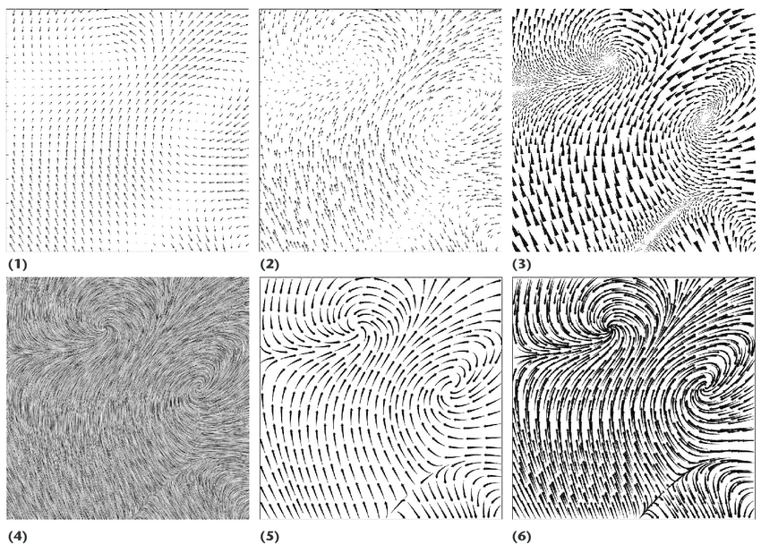
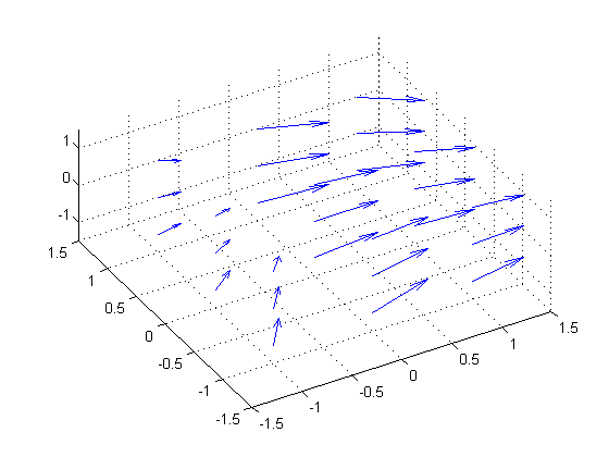
Arrow Glyphs: Direct Visualization of Magnitude and Direction
Arrow-based glyphs represent perhaps the most intuitive and direct method for visualizing vector fields, with each arrow glyph illustrating both the direction and magnitude of vectors at discrete points in space. By positioning arrows onto spatial grids or irregular measurement points, analysts can immediately understand the flow structure, directional trends, and local behaviors within the data. The length of each arrow typically corresponds directly to vector magnitude, providing an efficient visual representation that can quickly highlight areas of interest, such as regions of high flow velocity or vortex formation.
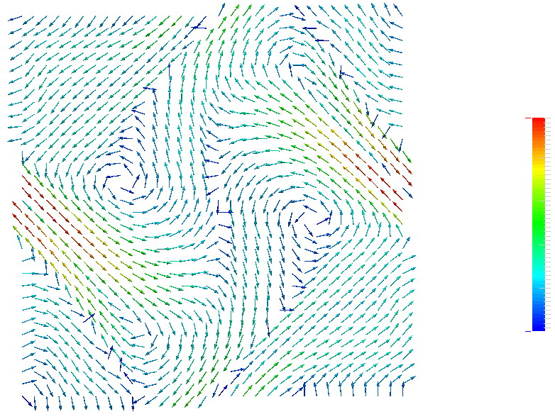
However, relying solely on arrow visualizations does have limitations. Large data fields densely packed with arrow glyphs may suffer from cluttering effects, obscuring subtle or intricate underlying flow structures. Analysts often address this by strategically optimizing arrow glyph density or employing filtering techniques. For further enhancements in handling visual clarity and effective presentation, exploring popular data visualization tools and their unique features can streamline developing clear visual strategies. Techniques such as spatial sampling or selectively displaying arrows only above a certain magnitude threshold maintain essential information visibility without sacrificing clarity. Moreover, organizations transitioning from basic spreadsheet tools to data visualizations will find valuable guidance in articles explaining how to transition from Excel to data warehousing effectively.
Streamlines: Illustrating Flow Patterns Effectively
Streamline visualization techniques overcome many clarity challenges inherent to arrow glyph displays. Streamlines visualize flow data by illustrating the paths that massless particles would follow as they move within the vector field, yielding smooth and continuous curves. These visualizations interpret complex vector data more intuitively, allowing analysts and decision-makers to quickly grasp overall flow structures and current trajectories. This can be particularly valuable in aerodynamic simulations or understanding how liquids disperse in products such as medical aerosol sprays or chemical reactors.
Streamlines excel at showing how fluid flows around objects or how air circulates within complex enclosures, allowing stakeholders to immediately recognize patterns such as recirculation zones, stagnation points, and boundary interactions. When approaching large datasets, selecting intelligent seed placement strategies is vital, as the positioning significantly affects visual clarity. Consulting experts in data visualization can dramatically streamline this complexity. Advanced Tableau consulting services offer specialized assistance to refine streamline visualizations, optimize seed point allocation, and deliver insight-driven visualizations tailored for decision-making contexts.
Contour and Scalar Mappings: Using Color and Texture effectively
Another strategic visualization method involves transforming vector components into scalar fields—such as velocity magnitude or vorticity—to render informative contour or color map visuals.
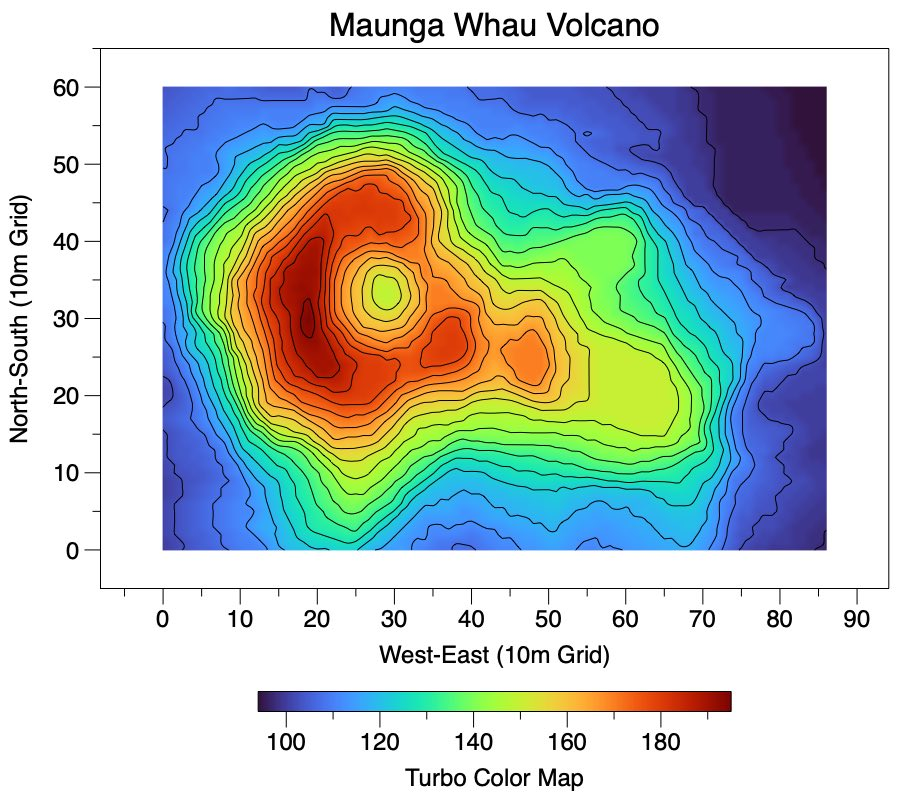
Textures, shading, and gradient-based coloring reveal subtle variability across vector fields, clearly highlighting quantitative information in user-friendly formats. Scalar mappings such as heat maps or contour plots present underlying flow dynamics elegantly, ensuring seamless comprehension amongst technical and non-technical stakeholders alike. Meteorologists leverage similar techniques in mapping wind intensity in weather models; aerodynamicists utilize them to analyze airflow velocity gradients across aerodynamic surfaces.
Choosing optimal scalar transformations demands attentiveness to analytical contexts, as these visualizations are sensitive to data representation decisions. Color scales necessitate thoughtful consideration to avoid misleading perceptual biases; thus, strategic visualization expertise or consulting resources become valuable to ensure the communication of decision-critical insights accurately. For further exploration into comparative effectiveness between visualization techniques and tools, reviewing guides such as the detailed overview described in the comparison of popular data visualization tools can provide organizational clarity.
Animated Vector Field Visualization: Adding the Dimension of Time
Adding animation to vector field visualizations introduces the critically informative dimension of temporal variability, demonstrating how fields evolve dynamically over time.
Animated representations allow decision-makers to comprehend complexities inherent in transient phenomena, such as turbulent flow physics, changes in electromagnetic fields, or growth patterns in cellular flows in biological research. By visualizing time-sequenced data, organizations can effectively analyze flow stability, transient responses, peak flow conditions, as well as forecast or anticipate future conditions, capabilities especially critical for industries dependent on accurate predictive modeling and scenario planning.
While animation provides exceptional value, managing computationally heavy workloads requires careful data infrastructure optimization. Small to mid-sized teams can significantly enhance their visualization output by investing in robust data engineering frameworks—a concept thoroughly discussed in data engineering for small teams, which emphasizes maximized impact with strategic investment in analytics infrastructure. Stakeholders should also consider performance trade-offs displayed in animated visualizations and direct querying of data resources as outlined comprehensively in the analysis of Import vs. Direct Query in Power BI, which serves as a helpful companion resource for strategic analytics tooling decisions.
Data-Driven Innovation: Leveraging Visualization to Uncover Insights
Beyond merely aiding comprehension, effective visualization capabilities stand at the core of data-driven innovation. Visualizations empower teams to explore datasets comprehensively, identify previously hidden structures or patterns, and devise innovative strategies that drive competitive advantages and operational enhancements. Leveraging powerful visualization techniques, from arrow glyph representations to temporal animation, positions analysts and decision-makers alike to derive meaningful insights alongside robust data mining practices.
Detail-oriented analytics teams pairing visualization methods with established data mining techniques form a potent combination, uncovering insight treasures previously inaccessible within complex data environments. Incorporating expert curated techniques for efficiency improvements, such as those illustrated in practical resources like Tableau quick win date buckets, further refines an organization’s analytical agility, translating big-data complexities into compelling visual narratives for clear strategy formulation.
In conclusion, mastering vector field visualization allows companies and decision-makers to fully leverage intricate flow data, transforming complex data challenges into decisively harnessed competitive opportunities. Leveraging professional guidance and strategic visualization expertise positions data-savvy organizations ahead, equipped with clarity, confidence, and innovation-driven momentum.
Thank you for your support, follow DEV3LOPCOM, LLC on LinkedIn and YouTube.


