by tyler garrett | May 25, 2025 | Data Visual
Circular visualization techniques—radar, polar, and radial charts—offer innovative ways to present complex data clearly, intuitively, and compellingly. By moving beyond the limitations of traditional, linear visualizations, these charts provide a richer, more engaging perspective on multidimensional data, allowing decision-makers to quickly capture valuable insights. As a software consulting firm specializing in advanced data analytics and innovation, Dev3lop explores these circular visualization methods to help organizations better leverage their existing data assets. Let’s dive into each of these visualization strategies and explore how they enable agile, informed decisions in today’s data-driven marketplace.
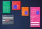
Understanding Radar Charts: Spotting Strengths and Gaps at a Glance
Radar charts, sometimes called spider charts or star charts, excel at visually representing multivariate data where comparisons are crucial. By displaying data across several axes, decision-makers can immediately identify patterns, strengths, and areas needing improvement. Each axis represents a particular quantitative variable, while a polygon’s shape, formed by joining data points across these axes, provides an intuitive snapshot of performance. Radar charts help distill large, complicated datasets into accessible representations that inform strategic priorities and agile decision-making processes.
In a business context, radar charts can greatly enhance performance evaluations, competitiveness analyses, and employee assessment by visualizing key success indicators and facilitating quick comparisons. For instance, project managers may deploy radar charts while optimizing workloads and skill distribution, simplifying informed staffing decisions. Moreover, when dealing with performance metrics from extensive datasets, integrating radar charts with advanced cloud analytics platforms—like those managed in AWS consulting services—can help transform raw data into actionable strategic insights.
Radar charts can be quickly designed using mainstream visualization tools or embedded directly into custom analytics dashboards, simplifying data-driven storytelling and helping communicate complex analytics results. As businesses rapidly shift toward streamlined workflows, adopting clear, effective radar visualizations aligns well with Dev3lop’s vision of enabling analytics-driven efficiencies, something detailed extensively in their article on composable data analytics.
Leveraging Polar Charts: Transforming Complex Relationships Visually
Polar charts, unlike radar charts, display information in a circular layout where each data point is determined by distance from the center and angle. This technique is especially effective at illustrating cyclical patterns, directional data (for example, wind directions or seasonal fluctuations), or periodic datasets, enabling analysts to showcase ongoing trends more distinctly than traditional visualizations.
It’s common to see polar charts used in fields like meteorology, astronomy, and environmental sciences, but their potential extends far into business analytics. An analytics leader can employ polar charts to more effectively assess sales dynamics throughout annual or quarterly business cycles, illuminating internal performance patterns impacted by factors such as customer preferences or seasonal demand. Polar visualizations enhance strategic foresight by making recurrent trends immediately recognizable, leading decision-makers to proactively capitalize on critical opportunities or tackle challenges promptly and efficiently.
Polar charts also excel at helping companies recognize and correct anomalies and mistakes in real-time data streams. For instance, Dev3lop’s detailed exploration of re-windowing strategies demonstrates how correcting data streams improves accuracy and enables precise decision-making. Coupled with real-time technologies covered by Dev3lop, such as stream processing for fraud prevention, polar charts help create resilient and robust analytics architectures ready for current and future market dynamics.
Radial Charts: Communicating Proportions and Part-to-Whole Relationships
Radial charts—like circular bar plots, sunburst charts, or donut charts—emphasize hierarchy, part-to-whole relationships, and proportional composition of various components. Visualizing these relationships across a comprehensive dataset, they effectively communicate structure within layers of data by providing clear, immediate context without overwhelming audiences with numerical details.
For decision-makers, radial charts can substantially elevate understanding and communication of data hierarchy contexts, driving more accurate strategic planning. For instance, an analytics leader employing radial techniques can undilutedly illustrate relative contributions of departments, projects, or revenue streams over time, empowering executives with a crucial perspective for informed prioritization decisions without having to pore over cumbersome spreadsheet analyses.
Companies increasingly incorporate radial charts into flexible analytics implementations, leveraging their adaptability. Data analysts building micro applications—specialized, highly efficient tools optimized for agile business solutions—find that radial visualization techniques seamlessly integrate into compact user interfaces. Equally important, radial charts harmonize with innovative visualization strategies, especially when integrated within sophisticated reports, dashboards, or even embedded analytics components, such as within Dev3lop’s guide on embedding Google Data Studio iframes into custom web applications.
Strategic Use of Circular Visualization Techniques in Business Intelligence
Combining radar, polar, and radial charts strategically in business intelligence practice can significantly enhance data perception and decision-making agility. Circular visualization charts underpin numerous strategic advantages by capturing multi-dimensionality, periodic trends, and hierarchies effectively. With their intuitive comprehension, these techniques empower businesses to respond quickly to dynamic information environments.
When integrated purposefully with robust analytical workflows—particularly those architected via cloud infrastructure such as AWS consulting services—circular visualizations significantly streamline analytical tasks, speeding insights from raw data to business impacts. They can facilitate differing kinds of exploratory or confirmatory analytics efforts, enabling leaders to build stronger communication bridges within cross-functional teams. As Dev3lop emphasizes in their breakdown of analytics working sessions, clear visualizations directly contribute to the effectiveness of analytical collaboration, reducing miscommunication and clarifying strategic intentions.
Furthermore, companies that utilize circular visualization methods alongside best practices, such as those detailed in the insightful Dev3lop article on optimizing Apache Spark jobs, create powerful synergies in data analytics maturity. Circular charts help stakeholders visualize optimized analytic results clearly and rapidly, reinforcing Dev3lop’s commitment to data-driven innovation and continuous improvement.
Best Practices for Building Effective Circular Visualizations
Building effective circular visualizations—whether radar, polar, or radial—means careful attention to best practices. Ensuring accuracy, clarity, and visual attractiveness are crucial for resonating with your audience. High-quality visualizations have strategic advantage, particularly when meaningfully integrated into agile analytics processes to communicate clear, actionable insights.
To maximize effectiveness, always ensure data integrity and consistency when generating circular charts by clearly defining axes labels, titles, scales, and legends. Choosing an optimal number of dimensions is essential to avoid overly complicated or unclear visuals. Also, prioritize simplicity to improve visual communication and intuitive conceptual understanding without oversimplifying underlying data complexity.
Effective color use significantly amplifies chart readability, aiding selection of complementary palettes for target audiences, incorporating accessible design principles, and clarifying meaningful distinctions between various data points clearly and consistently. As Dev3lop details extensively in the guide to visually appealing data visualizations, adhering to best design practices significantly elevates analytical communication performance.
Conclusion: Evolving Visualizations for Agile, Strategic Data Practices
Radar, polar, and radial charts are essential visualization methods for businesses moving beyond linear analytics and embracing holistic views of their data. These innovative circular visualization strategies empower decision-makers, enabling agile and informed responses pivotal to success in a rapidly evolving business landscape. Coupled effectively with sophisticated analytics architectures, actionable best practices, and comprehensive stakeholder engagement, as detailed across many of Dev3lop’s insightful resources, these visualizations can substantially elevate your analytics maturity.
At Dev3lop, we leverage circular visualization techniques to help clients meaningfully transform complex datasets into powerful insights. By continually innovating with new visual analytics techniques and optimizing strategic analytics processes like those explained in AWS-based analytics, we equip enterprises with the tools required for effective digital transformation.
Thank you for your support, follow DEV3LOPCOM, LLC on LinkedIn and YouTube.

by tyler garrett | May 24, 2025 | Data Processing
Imagine your organization’s data moving through its infrastructure, dynamically assessed, categorized, and effortlessly routed exactly where it’s needed most, without human intervention. This isn’t a futuristic ideal but rather the reality of intelligent data routing based on content analysis. Businesses today face increasingly diverse and massive datasets that can swamp traditional data pathways and overwhelm manual processes. By harnessing advanced content analysis algorithms, organizations can automate decision-making around how data is prioritized, stored, and leveraged—dramatically boosting efficiency, accuracy, and insight alignment. Bridging technology innovations with practical business strategies, intelligent data routing solutions empower your teams and stakeholders to make better decisions faster, efficiently unlocking your organization’s full analytics potential.
Understanding Intelligent Data Routing and Its Importance
At its heart, intelligent data routing refers to using machine learning and content analysis techniques to automatically determine the optimal pathway for any given piece of data entering the system. Instead of relying on manual processes or simple static rules, intelligent routing leverages sophisticated algorithms that analyze data characteristics—such as subject matter, format, sensitivity level, and relevance to ongoing business initiatives—to instantly determine the most effective destination.
The importance of intelligent data routing can’t be overstated in today’s rapidly evolving data-driven environment. Organizations generating or ingesting vast amounts of structured and unstructured data struggle to effectively use it to inform strategic decisions. With content-aware routing, companies transition from reactive data management to proactive strategic operations, ensuring relevant data lands in the hands of decision-makers precisely when they need it. Moreover, this methodology significantly reduces manual workload, cuts latency, and enhances data quality by systematically and consistently applying predefined standards and policies.
Forward-thinking technology strategies, coupled with guidance from an experienced perspective like a trusted data warehousing consulting service, help you implement robust intelligent routing capabilities, efficiently aligning data management practices with organizational goals and regulatory compliance.
The Core Mechanics of Content Analysis-Based Routing
To understand intelligent data routing effectively, it’s crucial to grasp the underlying mechanics of content analysis. Content analysis involves automating data interpretation through technologies such as natural language processing (NLP), machine learning classifiers, and advanced metadata extraction. These technologies examine and classify data content based on various criteria that align with business goals, regulations, and analytics applications.
Machine learning algorithms, in particular, play a central role by processing historical datasets to learn which content attributes correspond to specific routing outcomes. For instance, sensitive information like financial data or personally identifiable information (PII) would quickly route through secure, compliant storage channels, while operational transactional data could flow into channels focused on real-time analytical applications. Effective routing based upon this granular content analysis ensures relevance and security, ultimately providing decision-makers precisely curated datasets.
Practically, organizations can leverage tools such as NLP frameworks, sentiment analysis techniques, classification algorithms, and intelligently trained data rules that can automatically assign priorities. Supporting advanced analytics operations, these algorithms deliver accurate, efficient data pathways to predefined storage systems designed specifically for the nature and purpose of identified content. Integrated platforms like Anaconda data science toolkit significantly streamline the deployment and management of these analytical models.
Fundamental Benefits of Implementing Intelligent Data Routing
The advantages of deploying intelligent data routing based on content analysis extend directly into enterprise agility, data accuracy, and business decision-making. Organizations adopting these advanced methodologies immediately benefit from increased operational efficiency. Automating the routing eliminates the manual labor, reduces human error, and accelerates decision-making by enabling instant contextual data availability at the point of decision.
Furthermore, intelligent routing greatly enhances data quality and precision by consistently categorizing and prioritizing datasets based on explicit content criteria, user scenarios, or regulatory requirements. Such meticulous handling simplifies compliance, reduces the risk of breaches, and ensures auditable tracking of sensitive information.
As data-driven companies continually refine their analytics strategies, intelligent routing bridges efficiencies and innovative insights. Enterprise stakeholders experience the enhanced value of their analytics applications, thanks to incisive, high-quality datasets tailored exactly for analysis tasks. Moreover, content-driven routing complements innovations in data visualization strategies—as explained in this article on the role of color in data visualization—by ensuring relevant datasets arrive prepared for rapid interpretation and clear storytelling.
Real-World Cases: Industry Applications of Intelligent Routing
Intelligent data routing has proven significantly beneficial in various industries. In healthcare, intelligent routing streamlines patient record management by categorizing, prioritizing, and channeling sensitive patient data securely and instantly, resulting in improved patient outcomes and enhanced regulatory compliance.
Financial services organizations also significantly benefit by routing sensitive client or market transactional data securely and quickly. Data routed to advanced analytical engines helps rapidly detect anomalies, prevent fraud, and ensure adherence to regulatory guidelines. Furthermore, intelligent content routing can empower data analytics teams in competitive technology hotspots, such as featured in our article exploring Austin’s growing analytics industry.
Logistics companies utilize intelligent data routing effectively to prioritize supply-chain data, ensuring real-time analytics help streamline operations and decision-making processes. In media and marketing sectors, intelligent routing optimizes and enhances personalization and targeted marketing strategies by automatically categorizing and channeling huge volumes of user-generated and social media data to targeted analytics environments specifically designed to harness and maximize customer insights.
Strategic Integration With Legacy Systems and Emerging Innovations
One practical concern for leaders and technology strategists involves intelligently integrating new data routing solutions within legacy software environments. Fortunately, modern intelligent content routing strategies don’t necessarily require replacing longstanding systems outright when organizations can achieve effective results utilizing strategic integration techniques. Complementary strategies such as those discussed in our guide on innovating inside existing legacy systems are critical in achieving successful implementations without disrupting ongoing operations.
Emerging innovations such as hybrid cloud storage and advanced distributed computing infrastructures also enable seamless integration. IT departments can successfully layer intelligent routing onto existing enterprise systems. Whether adopting complementary strategies in tandem with hybrid cloud, containerization, or microservices architectures, intelligent routing aligns perfectly with modern IT patterns, bridging innovative analytics approaches such as column-oriented databases discussed in our article comparing columnar vs document-based storage performance, into traditional environments efficiently and effectively.
Building Stakeholder Trust and Organization-wide Adoption
Successful deployment of intelligent data routing revolves around organizational buy-in and proper adoption by stakeholders across departments. Ensuring executives, analysts, and operational teams understand intelligent routing, its processes, and benefits is essential to effective adoption and maximizing impact. Effective training sessions and consultative approaches using direct expert-to-stakeholder communications strongly encourage trust in automated data processes. We’ve seen great results from structured 1-on-1 expert sessions to improve technology adoption, tailored to organizational technical understanding and strategic requirements.
By clearly communicating potential benefits—greater accuracy, enhanced compliance, reduced latency, and increased strategic agility—organizations build strong support among stakeholders. Intelligent routing isn’t solely a technological upgrade but a cross-organizational cultural transformation emphasizing data as a dynamic organizational resource.
Ultimately, fostering peer and leadership advocates across the organization ensures intelligent content routes become intrinsic organizational processes, deeply enhancing analytics effectiveness, strategic alignment, and decision timeliness.
Conclusion: Prepare Your Business to Leverage Intelligent Data Routing
Intelligent content-based data routing is a transformational opportunity to redefine the efficiency, accuracy, and strategic direction of your organization’s data handling and analytics practices. As enterprises continue navigating increasingly large and varied data environments, adopting intelligent routing strategies stands out as pivotal to maintaining competitive agility, robust data governance, and proactive analytics usage. Partnering with an experienced and specialized analytics consultancy, like detailed in our overview of the advantages of working with a boutique consultancy, positions your business definitively ahead by leveraging advanced data routing capabilities today and into tomorrow.

by tyler garrett | May 24, 2025 | Data Visual
In an era where data fuels strategic decision-making, delivering timely, relevant, and accessible insights to stakeholders is critical. However, relevant analytics are only as good as their accessibility—and user experience matters deeply. With business leaders, executives, and team members accessing critical information via smartphones, tablets, laptops, or large monitor walls, responsive visualization design becomes a non-negotiable imperative. As data strategists and leading-edge software consultants, we’ve seen firsthand how responsive visual design dramatically improves analytics adoption and intuitive decision-making. Building dashboards and interactive analytical visualizations isn’t merely about aesthetics or functionality in silos—it’s about creating unified, cross-device experiences that seamlessly enable insight-driven action. This is the essence of enabling genuinely responsive analytics—designing visual interfaces that tell powerful stories clearly, succinctly, and consistently, regardless of the viewing device.
Understanding the Importance of Responsive Visualization
Organizations today operate in dynamic, fast-moving environments. Executives do not have the luxury of waiting until they’re in front of a desktop monitor to make critical decisions based on analytics—nor do frontline field workers always have the convenience of secure office networks to check essential operational data. Responsive visualization design inherently acknowledges this reality by constraining and molding data-driven insights into meaningful visual outputs that fit perfectly across all types of screens and devices, ensuring accessibility and clarity anywhere.
Our experience with the tech-driven construction industry exemplifies the demand for responsive dashboards. For instance, integrating analytics with platforms through Procore API consulting services proved valuable in enabling field workers on construction sites to swiftly consume analytics through mobile interfaces. Bringing real-time data visualizations to on-the-ground teams requires dashboards optimized for smartphones or tablets, empowering rapid, well-informed decisions without reliance on desktop setups.
Incorporating responsive designs greatly supports adoption by minimizing barriers to insight consumption. As emphasized in our blog post discussing creating executive dashboards for meaningful decisions, a key success factor includes dashboards that instantly adapt to different contexts, workflows, and roles. Responsive visualizations allow executives and employees to instantly understand complex data insights, whether they’re checking a quick report on their mobile phones or analyzing performance metrics at their office desks.
Principles and Best Practices for Responsive Data Visualization
Simplicity in Data Representation
One of the fundamental principles of responsive visualization design is simplicity. Mobile devices inherently have smaller screens, requiring visual elements that communicate clearly and swiftly. Overly complex visualizations may deliver remarkable details on large desktop monitors, but quickly lose readability and usability when viewed on a smartphone device. Therefore, prioritize minimalism and simplicity to ensure the essential information is instantly recognizable and actionable.
Strategically employing visual hierarchy—highlighting critical metrics clearly, placing crucial KPIs at the forefront, and limiting excessive metrics—facilitates quick comprehension. Utilizing best practices such as progressive disclosure, straightforward bar and line charts, and a conservative color palette ensures visualizations remain impactful, ensure clarity, and offer actionable insights, even in constrained spaces.
Adaptive Content and Modular Design
Adapting for mobile devices isn’t merely about shrinking visual elements—it’s about fundamentally re-thinking content from a modular standpoint. Responsive analytics visualizations should break complex dashboards into modular tiles that can reshape flexibly, permitting enhancing content adaptability to various devices and screen orientations. Layers of interaction and data hierarchy emerge intuitively as device size and real-estate increases from smartphone to desktop.
As we’ve outlined previously in our exploration of privacy-preserving analytics with synthetic data, flexibility in viewing data at varying levels of granularity supports both comprehension and secure data handling. Responsive visualization development should similarly allow stakeholders to easily toggle between simple overviews and detailed drill-down scenarios without cognitive overload on smaller screens.
Responsive Visualization Technologies and Tools
Modern visualization tools and platforms now integrate responsiveness inherently, enabling designers and developers to create responsive dashboards efficiently. Solutions such as Tableau, Power BI, and D3.js have robust features facilitating adaptive visualizations without extensive additional coding. Beyond dashboards, building robust APIs and modern data pipelines further ensures analytical data continuously feeds responsive visualizations with accurate and up-to-date information.
Moreover, leveraging responsive visual analytics that integrate with real-time data streaming delivers significant value for rapid business decisions. As discussed in our post highlighting the importance of data streaming in fraud prevention and detection, the fusion of real-time streamed data with responsive visual interface design broadens accessibility to critical insights, eliminating latency in decision making across all devices.
Additionally, advanced monitoring solutions tailored to pipeline drift detection benefit greatly from responsive capabilities, ensuring analytics remain promptly actionable regardless of location or device. Implementing responsive visualization through innovative tooling ensures critical insights get properly presented to decision-makers wherever needed.
Overcoming Responsive Design Challenges
One inherent challenge to responsive visualization and analytics delivery is managing performance while preserving data fidelity across various devices. Smaller devices typically have less processing power, demanding optimized code and streamlined data payloads. Applying best practices like caching, intelligent data sampling, and efficient rendering significantly enhances responsive analytical performance without comprising insight accuracy.
Another critical challenge involves designing information architectures flexible enough for multiple screens while rigorous enough to convey powerful insights without confusion. As noted in our exploration of using causal inference frameworks in business decision support, structured and carefully organized information architectures contribute significantly to robust and insightful analytical experiences. Correctly applying responsive layout grids, dynamic resizing constraints, and employing iterative user testing sessions ensures analytics visuals retain meaning and efficient interaction patterns regardless of the individual end-user’s device.
We also encourage decision-makers and technical strategists adopting responsive designs to proactively learn from user feedback loops. Collaborative sessions conducted in ways similar to our post about 1-on-1 expertise sessions to improve tool adoption offer invaluable insights into user behaviors and unexpected pain points, streamlining iteration and significantly boosting visualization adoption across multiple devices.
Using Responsive Analytics to Impactful Industry-Specific Outcomes
Responsive visualization design becomes particularly impactful in addressing specific industry needs. For instance, cities currently adopting responsive analytics as part of digitally enabled sustainability strategies leverage visualization across multiple connected device categories—from public informational kiosks to smartphone reporting apps and sophisticated command centers. Our collaboration and exploration of improving Austin’s urban sustainability through analytics showcases vividly how responsive data visualization optimizes public policy implementation and community engagement significantly.
Similarly, the healthcare industry strongly benefits from responsive visualizations that accurately and clearly communicate real-time patient monitoring information and health data inputs across medical practitioners’ handheld and desktop devices. The capacity to review data fluidly from wearable devices, tablets, and desktop applications drastically improves responsiveness to medical crises or patient care adjustments.
The critical factor across these varied industries remains straightforward—increase stakeholder access and lower complexity to maximize analytics’ value proposition. Responsive visualization, when executed correctly, becomes a competitive differentiator and a facilitator for innovative analytical breakthroughs across digital transformation journeys.
Conclusion: Building Adaptable, Powerful Analytics Experiences
Responsive visualization design isn’t merely a supplementary feature to modern analytics—it’s a conversation-starting requirement. Effective analytics today demands intelligent responsiveness as stakeholders universally shift toward mobile and multi-device engagements. Organizations harnessing this responsiveness ensure deeper analytic adoption, clearer communication, improved knowledge retention, and ultimately, stronger and more informed decision-making.
At Dev3lop, our expert strategists offer not only technical expertise but also strategic roadmap support for transitioning analytics environments to wholly responsive platforms. Our commitment centers around effectively bridging the gap between data insight and real-world decision-making by enhancing data visualization accessibility, intuitiveness, and actionable outcomes across any device stakeholders leverage.
Through thoughtful, responsive analytics design, your stakeholders effectively engage and intelligently utilize data, laying the foundation for the next tier of digital innovation success.
Thank you for your support, follow DEV3LOPCOM, LLC on LinkedIn and YouTube.

by tyler garrett | May 23, 2025 | Data Processing
In today’s competitive market where data volume and complexity grow exponentially, organizations must leverage advanced technical strategies to maintain efficiency and innovation. As data ecosystems become increasingly intricate, parallel processing emerges as a crucial technique to achieve rapid data analysis and accurate real-time insights. Among several parallel computing patterns, Fan-Out/Fan-In represents a scalable and robust architecture designed to maximize parallelism, reduce latency, and simplify complex processing tasks. Decision-makers tasked with optimizing data pipelines and improving analytical capabilities will find that implementing Fan-Out/Fan-In patterns not only streamlines data processing activities but also enhances operational visibility, significantly driving informed decision-making across multiple industries.
What is Fan-Out/Fan-In, and Why Does It Matter?
Fan-Out/Fan-In is a parallel processing pattern that allows data engineers to break complex data tasks into smaller tasks, execute them simultaneously (Fan-Out), and then aggregate the results back into a unified outcome (Fan-In). Unlike linear or sequential processing, Fan-Out/Fan-In leverages the power of distributed systems to enable concurrent operations. This pattern ensures scalable performance and optimal resource utilization even when processing massive volumes of data—a core capability for enterprises seeking agility and real-time responsiveness.
Implementing Fan-Out/Fan-In is especially critical for businesses addressing modern data demands where timely insights can significantly amplify a competitive advantage. Whether processing streaming data, batch operations, or performing complex analytical computations, the Fan-Out/Fan-In pattern dramatically accelerates performance while maintaining accurate and coherent results.
However, to effectively adopt this parallel processing model, decision-makers need strategic alignment with experienced expertise, such as utilizing our Data Engineering Consulting Services to navigate intricate architecture considerations and optimize outcomes aligned with your organizational objectives.
Practical Applications: Integrating Fan-Out/Fan-In into Data Pipelines
The versatility of Fan-Out/Fan-In allows for effective integration into diverse data scenarios. Typical business applications include real-time analytics, fraud detection, manufacturing analytics, and supply chain optimization. For instance, financial sector companies commonly utilize a Fan-Out architecture to execute simultaneous processing tasks across large transaction volumes, immediately identifying anomalies or fraudulent activities. By leveraging parallelism and subsequently aggregating results through a Fan-In approach, organizations significantly improve detection timeframes and response efficiency.
For example, linking real-time fraud detection strategies efficiently incorporates parallel processing, perfectly illustrated in our blog article Webhooks 101: A Game-Changer for Real-Time Fraud Detection. Furthermore, Fan-Out/Fan-In methodologies are effectively paired with manufacturing and production scenarios, aligning operational output directly with demand forecasts. Discover precise use cases by exploring our insightful piece Streamlining Production Planning: Aligning Manufacturing with Anticipated Demand.
Additionally, Fan-Out/Fan-In principles are easily adopted into analytics-focused workflows. For instance, when enterprises conduct complex analytical functions within a data lakehouse environment, parallel processing via this pattern significantly improves analytical readiness, supporting timely decisions. Understand deeper implementation guidelines by exploring our expertise captured in Data Lakehouse Implementation: Bridging the Gap Between Lakes and Warehouses.
Design Considerations When Applying Fan-Out/Fan-In
Implementing Fan-Out/Fan-In requires thoughtful system architecture design, ensuring robustness, performance efficiency, and optimal resource utilization. The most critical aspect of effectively leveraging this pattern involves carefully analyzing how tasks can be partitioned logically. The goal in Fan-Out processing is to create balanced segmentation of tasks—each performing roughly equal workloads—allowing parallel streams to optimize computational resources and minimize idle times.
System design should also carefully manage data dependencies and synchronization requirements in the Fan-In phase. Successful Fan-In gathers the parallel outputs from the distributed tasks accurately, ensuring integrity and consistency. Strategies to proficiently handle synchronization include using properly configured event-driven architectures, optimized queuing solutions, and sophisticated workflow orchestration tools. To master the principles behind building well-constructed workflows and deliver predictable outcomes, organizations must elevate their technical prowess or partner with experts who understand the nuanced implementations necessary for optimum performance.
Leveraging advanced technologies can further streamline efficiency in parallel pipeline configurations. For instance, intelligently using range filtering can significantly reduce processing overhead by targeting the exact subsets of data required for specialized computations. This ensures data flows seamlessly and efficiently between multiple nodes. For additional insights into structuring more precise selection criteria in parallel tasks, consider our insightful guide on Mastering Range Filtering with the SQL BETWEEN Operator.
Challenges to Anticipate When Adopting Fan-Out/Fan-In Patterns
While Fan-Out/Fan-In provides powerful capabilities for parallel processing, decision-makers must anticipate several technical and operational challenges. One frequent challenge is ensuring workload distribution remains even across processing nodes. If tasks aren’t evenly distributed—whether due to data inconsistency or improperly assessed complexity—processing performance can degrade, negatively impacting the overall advantage provided by parallel execution.
Additionally, the increasing complexity of distributed systems introduces greater overhead in handling errors, managing retries in failed tasks, and ensuring task consistency. The Fan-In stages of data aggregation also add complexity as synchronization overhead must be thoroughly planned and addressed during architectural design phases; failure to manage this appropriately introduces unnecessary latency or discrepancies in data.
Organizations aiming for seamless and efficient parallel implementations should consider utilizing advanced architectural solutions such as ZeroETL, offering promising frameworks toward real-time analysis without excessive complexity. Discover more about this innovative approach by browsing our strategic overview of ZeroETL Architectures – The Future of Real-Time Analytics.
The Importance of Scalability and Flexibility in Parallel Data Processing
Businesses do not benefit from rigid data architectures that fail to scale appropriately. Fan-Out/Fan-In patterns inherently deliver scalability and flexibility—advantageous for achieving growth in rapidly evolving business environments facing fluctuating workloads and increasingly diverse data needs. Scalability, notably attainable in Fan-Out patterns through parallelization, advises future-proofing capabilities, providing organizations essential elasticity during peak data periods or analytical processing surges, without necessitating substantial overhead increases in infrastructure or spend.
Furthermore, Fan-Out/Fan-In patterns mesh seamlessly with advancements in artificial intelligence and machine learning. AI-driven tools integrated within parallel data processing frameworks accelerate analytics and deliver innovative decision-making capabilities. As explored extensively in our article, AI-Powered Tools That Transform Decision-Making in 2025, embracing future technologies within established agile architectures enhances your organization’s analytics landscape, ensuring competitive advantages extend well into upcoming industry innovations.
Decision-makers looking toward robust, highly-scalable solutions can significantly benefit from adopting parallel patterns like Fan-Out/Fan-In, maximizing usage of available data resources strategically, without compromising performance or timeliness.
Summary: Strengthening Data-Driven Decisions with Fan-Out/Fan-In
Regardless of your organizational maturity or industry vertical, implementing Fan-Out/Fan-In methodologies positions your enterprise at a competitive intersection of innovation, agility, and efficiency. By consistently enabling timely, accurate insights and ensuring optimal infrastructure utilization through parallel processing, you gain unprecedented clarity in business environments driven by data.
As specialists in data, analytics, and innovation, we empower organizations to harness the transformative potential of advanced data capabilities effectively. Consider leveraging specialized expertise through our strategic approach to data engineering, analytics optimization, and tailored consulting solutions designed uniquely for your organization’s evolving needs.
Explore practical, industry-specific applications beyond standard solutions with our article on 11 Ideas for Using Data Analytics in Austin, Texas, and discover ways innovation easily becomes actionable when approached strategically.
Invest strategically in your data pipeline architecture. Unlock the full potential of Fan-Out/Fan-In for scalable, responsive, and efficient analytics.

by tyler garrett | May 23, 2025 | Data Visual
In an era where data isn’t only abundant but complex, effective multivariate visualization is crucial to turning complex datasets into understandable insights. Glyph-based visualization techniques have consistently emerged as a sophisticated and powerful approach to tackle this complexity. Significantly more than a simple chart, glyphs offer decision-makers the ability to intuitively perceive multidimensional relationships at a glance. Think of glyphs as compact visual representations where each graphical element—size, shape, color, orientation—is thoughtfully mapped to specific data attributes. For professionals aiming to decode multidimensional relationships quickly and accurately, glyph-based visualizations deliver precision, clarity, and actionable insights. In this article, our data strategy consultants at Dev3lop—a tech firm specialized in data warehousing consulting services—delve deeper into the key glyph-based visualization techniques, exploring leading methodologies, practical applications, and strategic considerations for deploying these solutions successfully.
What Are Glyph-Based Visualizations and Why Do They Matter?
A glyph is fundamentally a symbolic graphic that visually encodes data through multiple attributes such as shape, color, position, or size. Unlike conventional charts, glyph-based visualizations leverage rich multidimensional encoding techniques to simultaneously represent multiple data variables in one visual data representation. In practice, glyphs effectively pack large amounts of information into digestible visual snapshots, significantly enhancing users’ data comprehension capabilities. This powerful method empowers analysts and business stakeholders alike to rapidly discern intricate relationships among multiple variables, thus enabling quicker interpretation and decision-making.
The growing complexity of big data makes glyph-based techniques increasingly valuable. Typical graphical representations like bar charts or scatter plots can quickly spiral out of control as the number of variables rises, leading to cluttered displays and loss of important insights. In contrast, glyph methods naturally optimize space utilization and provide strong visual differentiation between variables, allowing users to navigate and interpret even extremely dense datasets more efficiently.
For businesses looking to dive deeper into complex analytics through advanced methods like multi-modal sensory analytics, glyphs serve as an effective technique, aligning perfectly with modern requirements for intuitive and interactive data representation.
Diving into Prominent Glyph-Based Visualization Techniques
Chernoff Faces: Humanizing Complex Data Patterns
Chernoff faces represent multivariate data through facial features—yes, literally custom-drawn faces! Introduced by Herman Chernoff in 1973, this imaginative technique maps individual data dimensions to facial characteristics like eye width, mouth curvature, and face shape. Each unique face corresponds to a single data sample, enabling analysts to identify correlations, outliers, or clusters instinctively through engaging, humanized representations.
Chernoff faces thrive in psychological and behavioral research contexts, revealing relationships and subtle emotional impressions that numeric or conventional visual forms might fail to communicate directly. While imaginative, decision-makers should use Chernoff faces judiciously due to their subjective nature, ensuring stakeholders don’t interpret emotional cues incorrectly. To create inclusive visualizations that accommodate diverse interpretation patterns, consider adapting accessible data visualization techniques.
Star Glyphs (Radar Charts): Efficiently Visualizing Dimensions
Star glyphs, often called radar or spider charts, represent data values as radial lines equidistantly spaced around central points. Each axis corresponds to a distinct variable, encoding quantitative data values via distance from the center. Data points connect each axis, creating unique star-shaped polygons that facilitate quick visual assessment and comparison.
Star glyphs offer powerful visualizations for performance metrics, comparative analyses, and benchmarking. Businesses can leverage them effectively for illustrating performance scores or assessing product or customer profiles. When integrated into an effective Extract, Transform, Load (ETL) process, data represented by star glyphs becomes part of trusted decision-making cycles, fostering data governance and consistent insights across the organization.
Strategically Implementing Glyphs for Advanced Analytical Insights
Customizing Glyph Attributes: Tailoring Visualizations to Business Needs
Administrators and analysts need to carefully select glyph attributes—such as shape, size, and color—to best reflect their unique business requirements and data characteristics. Strategic selection and thoughtful customization of glyph attributes enable better differentiation, readability, and quicker interpretation of final visual outputs. High-dimensional data landscapes, such as fraud detection scenarios, particularly benefit from this practice, where subtle patterns or anomalies can significantly impact outcomes.
For instance, when bridging glyph visualizations with real-time analytics tools and processes such as webhooks for fraud detection, businesses can dramatically enhance analysts’ capability to immediately spot and respond to abnormal events.
Mapping Multivariate Data to Glyphs Using Relational Logic
Mapping data meticulously and logically is critical to effectively conveying valuable insights with glyphs. Each visual attribute should conveniently reflect varying degrees of differences in significance while ensuring intuitive interpretation. Thus, relational logic in data-to-glyph mappings not only enhances clarity but guarantees visual consistency across datasets.
Careful mapping practices often enhance glyph usage in solutions requiring privacy considerations. Techniques such as homomorphic encryption in privacy-preserving analytics rely heavily on precise data understanding facilitated through accurate visualization practices.
Practical Considerations: Optimizing Glyph-Based Visualizations
Performance Efficiency & Scalability
Selecting the correct visualization technique is just half the journey. Efficient data storage and retrieval practices play an equal—if not greater—role in their real-world relevance. Organizations handling large-scale, high-performance analytics environments must consider how their underlying data infrastructure impacts glyph visualizations. Optimal performance is achieved through thorough database optimization strategies like the insightful steps highlighted in optimizing database performance for analytical queries and insightful assessments such as columnar versus document-based storage performance analysis.
Furthermore, organizations must regularly employ efficient data grouping and aggregation strategies, similar to techniques detailed in our comprehensive guide on aggregating and grouping data in SQL, to ensure meaningful and performant glyph representations.
User-Centric Approach for Visualization Accessibility
It is vital to consider audience comprehension and accessibility when creating glyph-based visualizations. Decision-makers often span different skill levels, backgrounds, and cognitive abilities. Hence, incorporating practices detailed in our article on creating accessible data visualizations for all users ensures that glyph-based approaches remain effective and inclusive across diverse user groups.
Moreover, adopting robust ETL workflows not only improves visualizations but directly contributes to better security, governance, and consistency, as highlighted in our article on 10 examples of ETL in data governance and security roles.
The Future of Glyph-Based Data Visualization Techniques
Given the arrival of newer analytical paradigms such as transductive transfer learning for data classification, glyph-based techniques continue to evolve, offering increasingly intelligent visual insights. Future visualization solutions will intelligently adapt glyph-based techniques to incorporate machine learning and AI frameworks, creating even more intuitive and responsive representation methods.
As specialists in innovative data visualization and analytics, we encourage organizations to continuously explore, innovate, and adopt sophisticated glyphs to deliver highly potent insights into today’s increasingly complex data environments. By doing so, decision-makers arm themselves with powerful tools to navigate complexities, ensuring smart, swift, and successful outcomes.
Ready to leverage cutting-edge advancements to stay ahead of competitors? Explore more about enhancing business intelligence and data analytics capabilities directly with our expert data warehousing consulting services.
Thank you for your support, follow DEV3LOPCOM, LLC on LinkedIn and YouTube.