ET1 helps you extract, transform, and load data in a single user-friendly canvas.
Data automation in a single canvas.
Each node is simple and easy to use in VR/AR headsets.
Welcome to basic training, where we show you the basics so that you’re dangerous. Don’t worry the engine under-the-hood keeps you safe!
If you’re familiar with music equipment, own a phone, or maybe a computer, you’re more than likely familiar with inputs and outputs with audio.
Your phone has a microphone. That’s an input.
Your phone has a speaker. That’s an output.
How those things work, pure magic, but it works and so should your data automation.
ET1 uses outputs, inputs, and a mixture of nodes to help people solve data problems.
Never loop or recycle data (audio analogy)
The DAG Streaming engine also means no ability to loop data/music infinitely, which means you never hurt your ears or your machine!
ET1 is a lot like an audio device and nodes help you change the audio.
Data flows through ET1 through, from output to input.
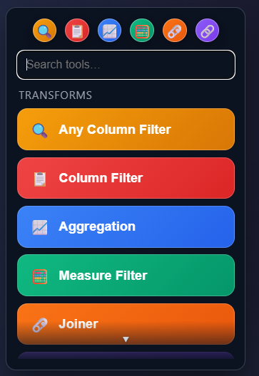
Nodes
Nodes are built to be an easy way to visually solve problems, and not become overwhelming.
ET1 is a lot like a guitar pedal, not overwhelming, limited options, should be able to figure it out by playing with tool.
-tyler garrett
🚀 Getting Started
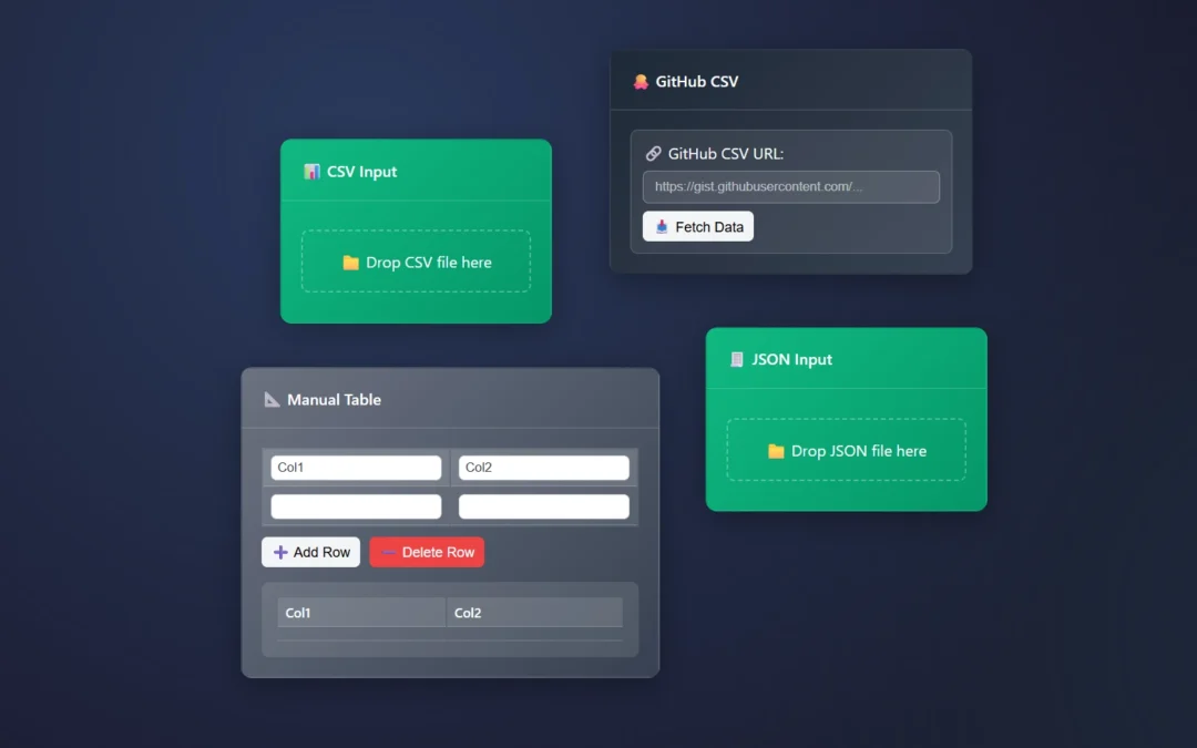
Drag a data source node (CSV, JSON, or Manual Table)
Click the node to configure it
Connect nodes by dragging from output to input circles
Drag to output connect/create
🔍 Core Concepts
Nodes: Each node, tool, or box does one or more things to your data
Connections: Arrows show how data flows. From Output to input
Think of it like audio equipment, that is always ready
Preview: See results instantly under each node
Audio is always on, instantly able to preview
Cell level highlights..!
Hover your mouse over cells to see and understand your data automation tools better.
Highlight a cell, see it highlight across nodes, branches and the canvas.
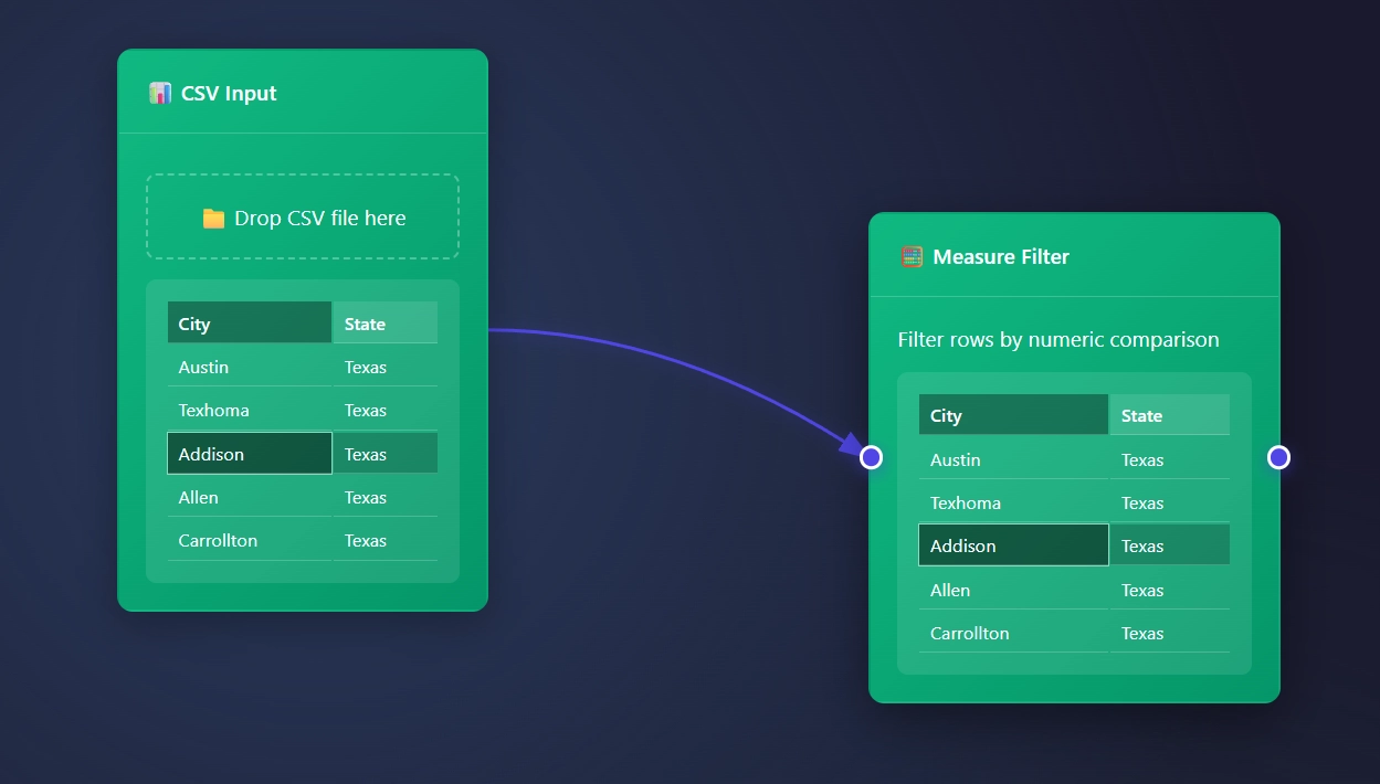
How to start ET1.
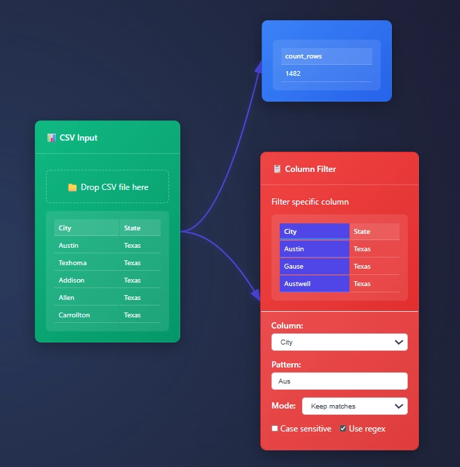
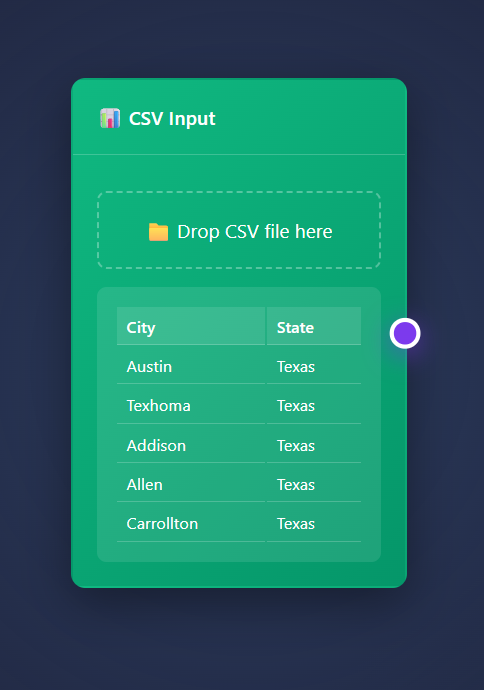
ET1 starts with a CSV Input Node open and available to begin slicing your data.
Csv file looks like file.csv and opens in ET1.
CSV data usually looks like…
City, State
Austin, Texas
Texhoma, Texas
Addison, Texas
Allen, Texas
Carrollton, Texas
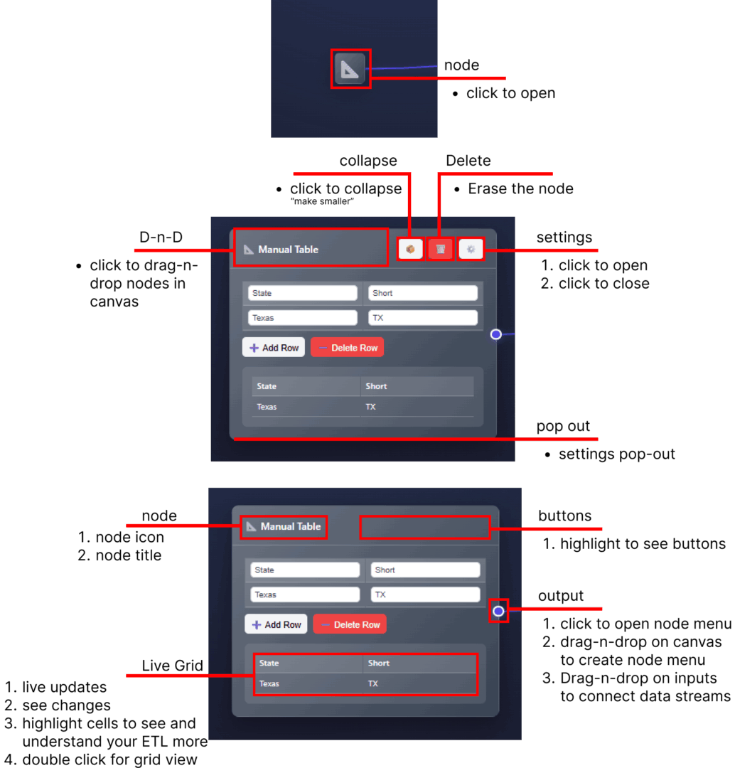
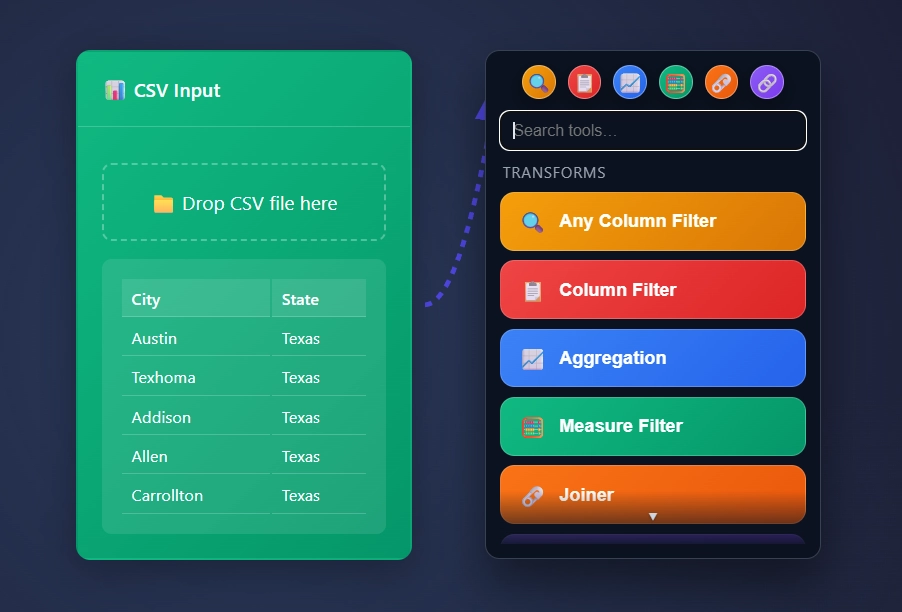
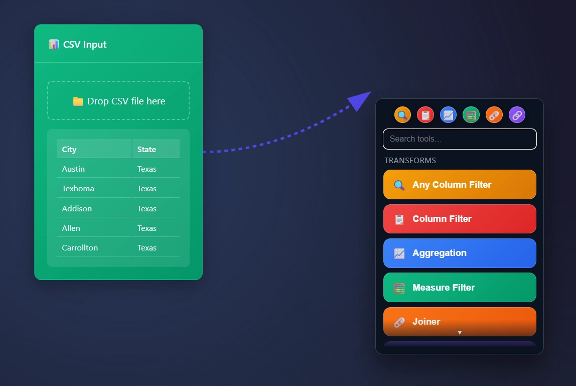
Connecting the dots, creating connectors, drawing connections, the node menu
When highlighting on the right of a node with an output, you will find a circle.
This creates an arrow that can connect to the input of other nodes.
Node Quick Menu
Clicking the circle creates an arrow that points at a scrollable node menu, and automatically places the node directly to the right of your node.
The Quick Menu!
“Drag” the circle by clicking and dragging your mouse to create an arrow…
“Drop” the arrow by letting go of your mouse click into a blank canvas to create a scrollable node menu where you need a node to be placed.
Drag the circle and drop.. not that crazy right!
Save your favorite nodes in the 6 circles in the top. Drag and drop the node/tool into the circle to save your favorite nodes, to make for an easier development lifecycle.
It is undeniable that data can be overwhelming, and those who work with it daily are adept at navigating this complexity. ET1 is designed to assist individuals in managing this chaos, eliminating the constraints associated with outdated software that is over 20 years old.
ET1 is an easy-to-use tool. The intention is to create an ETL solution that empowers everyone to participate and isn’t intimidating.
Many ETL solutions are complex, not refined, and lack non-technical adoption.
Many ETL solutions require lengthy installations, frequent uneventful online searches, community forum posts full of “partners” desperate for clients, driver installs that fail, lengthy setups to gain <X> feature… Then your company must rely this dated technology (20 year old engines) to give them the competitive edge in 2025.
Most ETL software prioritize the database community, consequently hindering overall solution efficiency. Databases primarily focus on columns, data types, and tables, relegating row-level or cell-level data to a position of secondary importance. With our DAG engine, we’re able to treat each row as an important and essential asset to the data solution.
ET1 facilitates repeatable data cleaning within an intuitive environment. It serves as a visual data workbench, empowering users to explore, cleanse, and articulate data solutions with greater efficiency compared to costly “legacy solutions.”
Think of ET1 as a way to easily streamline data management in a user-friendly no-code environment that doesn’t require walls to climb. –Tyler
The vision
With 13 years of experience in drag-and-drop data engineering, data lakes, data warehouses, and dashboards, I have developed ET1 for users of all backgrounds. My intention is for ET1 to be intuitive and user-friendly, evoking the feeling of playing with guitar pedals to create music, rather than a complex, “engineer-only” interface that overwhelms even experienced users. I recognize that not everyone associates data cleaning with the ETL process – extract, transform, load – and I aim to make ET1 accessible and understandable for those unfamiliar with ETL terminology.
To illustrate, envision ET1 as a music platform facilitating the flow of data through inputs and outputs. Each node within ET1 functions similarly to a guitar pedal, each with its own inputs and outputs. These “pedals” are designed to be compact, require minimal configuration, and offer a streamlined, intuitive user experience.
What is ETL? Extract, Transform, Load.
Extract, Pull the data.
Transform, Filter, Sort, Join, Merge, Update, and essentially change the information.
Load, Send the data to a file, database, chart, report, or dashboard.
The Install, Setup, Operating Systems, Requirements?
No install and no setup and any operating system will work.
Unlike all ETL applications, ET1 opens instantly. There are no drivers. Lastly, no interesting implementation.
Do you have a web browser? How else did you get here. That’s the minimum requirement.
Also… With ET1 you can…
Start cleaning and filtering data before KNIME loads.
Begin your ETL journey before you understand the pricing of Alteryx.
Core Functionality
The core functionality of ET1 will change and mutate over a period of time.
Data Input: Supports CSV, JSON, and GitHub data sources
Data Transformation: Various transformation nodes (filters, joins, aggregations, etc.)
Data Output: Export to CSV, JSON, and Excel formats
What’s exciting is it’s easy for us to add new features because we are not a large platform!
ET1 Key Features
Here are a few features about ET1 that make the app exciting.
Node-Based Interface:
Drag-and-drop nodes for different operations
Visual connections between nodes
Real-time data previews, flow data downstream
Node Types:
Input: CSV, JSON, GitHub, Manual Table
Transform: Filter, Join, Union, Pivot, Sort, etc.
Output: CSV, JSON, Excel
Advanced Features:
Branching and versioning of data flows
Node settings and configuration
Collapsible nodes for better organization
Context menus for node operations
Data Processing:
Column operations (rename, filter, normalize)
String operations (concatenation, splitting)
Aggregations and calculations
Data types aren’t very interesting to solve
Data types are for databases
ET1 is not a database, it’s JavaScript
Data is stored in graphs
Data types are boring
UI/UX:
Responsive design, everything just flows downstream
Interactive previews, makes it easy to see what changed
Not scary, eager to avoid the developer style tools
Highlight cells per data grid to visually inspect across canvas
Technical Specs
This application is not mobile friendly, mobility will not be a major focus, with that said, this will requires a computer.
There are no specific computer requirements needed, any machine should work, thanks for giving this an attempt.
The software requires no installation, and no setup.
We currently do not store any information about users, or your data. When we decide to add authorization, we will more than likely use Auth0, we are familiar with Auth0 due to our development with Canopys.
Thank you for learning about ET1.
Jump back to the ET1 Overview to continue learning about how ET1 will help your team save time and money when removing the chaos from your data.
What does the CIA’s “estimation probability” have to do with data visualization and a Reddit poll?
Think of it like this: the CIA, and many government agencies, has teams who dig through research, write up reports, and pass them along to others who make the big calls. A big part of that process is putting numbers behind words, predicting how likely something is to happen, and framing it in plain language. Even the headlines they draft are shaped around those probability calls.
The reddit pole? Just an interested group of data people who decided to re-create this same study.
Did you know the CIA releases documents on a regular basis?
The CIA has a large resource catalog and we will grab from three different sources.
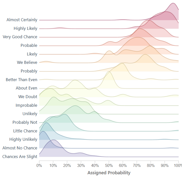
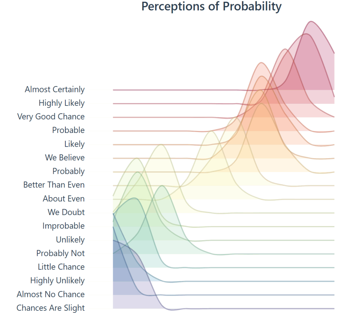
Lets explore the development and history of a ridgeline plot that shows the “Perceptions of Probability,” the curious world of data lovers, migrating data from CSV to JSON, building a visual using D3, dive into the complex history, and more.
Numbers behind the words.
The raw data in our D3 chart came from /r/samplesize responses to the following question: What [probability/number] would you assign to the phrase “[phrase]”?source.
Note: An online community created a data source that resembles the same study the CIA completed, using 23 NATO officials, more on this below. Below you will see images created to resemble the original study, and the background of the data.
Within the CIA, correlations are noticed – studied – quantified and then later released publicly.
In the 1950’s, the CIA noticed something happening internally and created a study.
Before writing this article I did not realize how much content the CIA has released. Like the studies in intelligence, fascinating information here.
Our goal is research the history behind ‘Perceptions of Probability,’ find & optimize the data using ETL, and improve on the solution to ensure it’s interactive, and re-usable. The vision is we will be using an interactive framework like d3, which means JavaScript, html, and CSS.
For research, we will keep everything surface level, and link to more information for further discovery.
The CIA studied and quantified their efforts, and we will be doing the same in this journey.
Adding Features to the Perceptions of Probability Visual
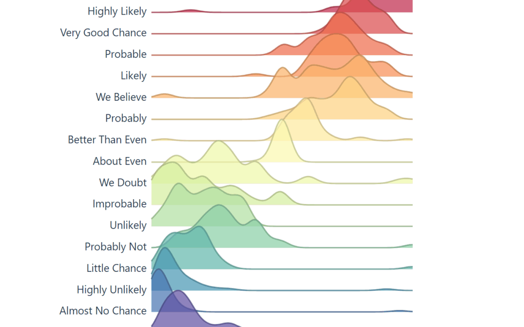
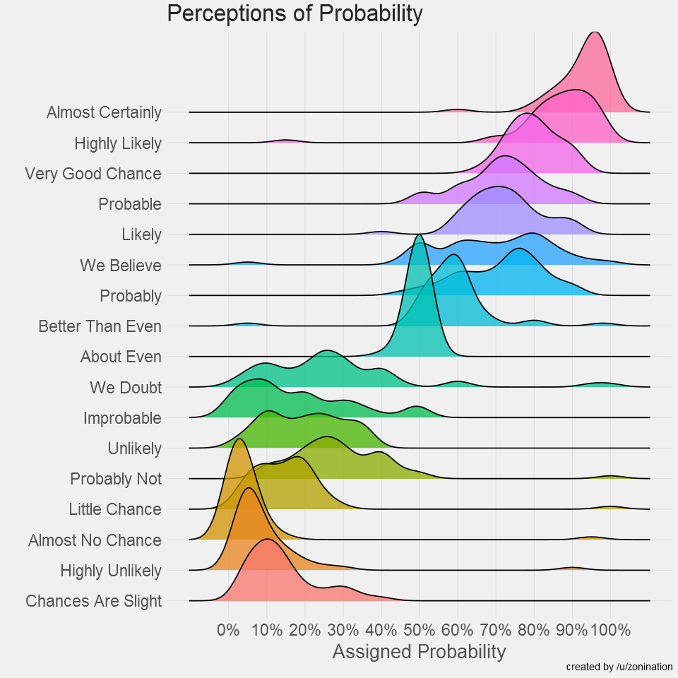
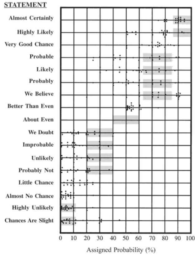
Today, the visual below is the muse (created by a user on reddit) and we are grateful they have this information available to play with on their github. They did the hard part, getting visibility on this visual and gathering the data points.
This viz made the Longlist for the 2015 Kantar Information is Beautiful Awards *
When you learn about the Perceptions of Probability, you’ll see it’s often a screenshot because the system behind the scenes creates images (ggjoy package). Alternatively that’s the usual medium online, sharing content that is static.
A screenshot isn’t dynamic, it’s static and it’s offline, we can’t interact with a screenshot, unless we recreate the screenshot, which would require the ability to understand R, install R, and run R.
This is limiting to average users, and we wonder, is it possible to remove this barrier?
If we looked at this amazing visualization as a solution we can improve and make more adoptable, how would we optimize?
What if it could run online and be interactive?
To modernize, we must optimize how end users interact with the tool; in this case a visualization, and we do our best to remove the current ‘offline’ limitation. Giving this a json data source also modernizes it.
The R code to create the Assigned probability solution above;
#Plot probability data
ggplot(probly,aes(variable,value))+
  geom_boxplot(aes(fill=variable),alpha=.5)+
  geom_jitter(aes(color=variable),size=3,alpha=.2)+
  scale_y_continuous(breaks=seq(0,1,.1), labels=scales::percent)+
  guides(fill=FALSE,color=FALSE)+
  labs(title="Perceptions of Probability",
       x="Phrase",
       y="Assigned Probability",
       caption="created by /u/zonination")+
  coord_flip()+
  z_theme()
ggsave("plot1.png", height=8, width=8, dpi=120, type="cairo-png")
The code is used to manage the data, give it a jitter, and ultimately create a png file.
In our engineering of this solution, we want to create something that loads instantly, easy to use again, and resembles ridgelines from this famous assigned probability study. If we do this, it would enable future problem solvers another tool to solve, and then we are only 1 step away (10-30 lines of code) from making this solution accept a new data file.
The History on Estimative Probability
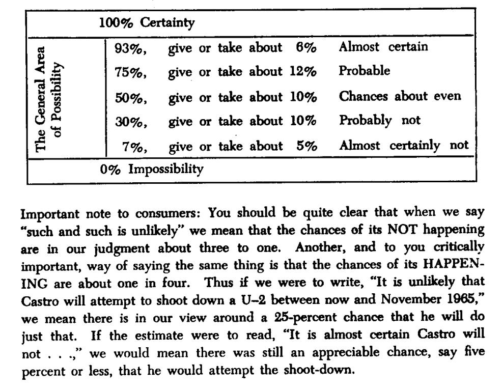
Sherman Kent’s declassified paper Words of Estimative Probability (released May 4, 2012) highlights an incident in estimation reports, “Probability of an Invasion of Yugoslavia in 1951.” A writeup on this was given to policy makers and their assumptions on what they read was a lower value than they had intended.
How long had this been going on? How often are policy makers and analysts not seeing the same understanding of a given situation? How often does this impact us negatively? Many questions come to mind.
There was possibly not enough emphasis on the text, or there was no such scoring system in place to explain the seriousness of a an attack. Even with the report suggesting there was a serious urgency, nothing happened. After some days past, in a conversation someone asked “what did you mean by “Serious Possibility?” What odds did you have in mind?
Sherman Kent, the first director of CIA’s Office of National Estimates, was one of the first to recognize problems of communication caused by imprecise statements of uncertainty. Unfortunately, several decades after Kent was first jolted by how policymakers interpreted the term “serious possibility” in a national estimate, this miscommunication between analysts and policymakers, and between analysts, is still a common occurrence.
Through his studies he created the following chart, which is later used in another visualization, and it enables a viewer to see how this study is similar to the study created here. Used in a scatter plot below this screenshot.
What is Estimation Probability?
Words of estimative probability are terms used by intelligence analysts in the production of analytic reports to convey the likelihood of a future event occurring.
Outside of the intelligence world, human behavior is expected to be somewhat similar, which says a lot about headlines in todays news and content aggregators. One can assume journalists live by these numbers.
Text has the nature to be ambiguous.
When text is ambiguous, I like to lean on data visualization.
To further the research, “23 NATO military officers accustomed to reading intelligence reports [gathered]. They were given a number of sentences such as: “It is highly unlikely that..” All the sentences were the same except that the verbal expressions of probability changed. The officers were asked what percentage probability they would attribute to each statement if they read it in an intelligence report. Each dot in the table represents one officer’s probability assignment.” This quote is from the Psychology of Intelligence Analysis.pdf, Richards J. Heuer, Jr.
The above chart was then overlayed on this scatter plot, of the 23 NATO officers assigning values to the text. Essentially estimating likely hood an event will occur.
Survey score of 23 NATO officers who has a responsibility to read this kind of text. They scored the text based on likely hood the situation/event would take place (Page 155 * )
Modernizing the Perceptions of Probability
Over time people see data and want to create art. My artwork will be creating a tool that can be shared online, interactive, and open the door to a different audience.
Based on empirical observations in data visualization consulting engagement, you can expect getting access to data to take more time, and for the data to be dirty. Luckily this data was readily available and only required some formatting.
The data was found here on github, which is a good sample for what we are trying to create. The current state of the data is not prepared yet to create a D3 chart. This ridgeline plot chart will require JSON.
Lets convert CSV to JSON using the following python:
import pandas as pd
import json
from io import StringIO

csv_data = """Almost Certainly,Highly Likely,Very Good Chance,Probable,Likely,Probably,We Believe,Better Than Even,About Even,We Doubt,Improbable,Unlikely,Probably Not,Little Chance,Almost No Chance,Highly Unlikely,Chances Are Slight
95,80,85,75,66,75,66,55,50,40,20,30,15,20,5,25,25
95,75,75,51,75,51,51,51,50,20,49,25,49,5,5,10,5
95,85,85,70,75,70,80,60,50,30,10,25,25,20,1,5,15
95,85,85,70,75,70,80,60,50,30,10,25,25,20,1,5,15
98,95,80,70,70,75,65,60,50,10,50,5,20,5,1,2,10
95,99,85,90,75,75,80,65,50,7,15,8,15,5,1,3,20
85,95,65,80,40,45,80,60,45,45,35,20,40,20,10,20,30

"""  # paste your full CSV here

# Load CSV
df = pd.read_csv(StringIO(csv_data))

# Melt to long format
df_long = df.melt(var_name="name", value_name="y")
df_long["x"] = df_long.groupby("name").cumcount() * 10  # create x from row index

# Group by category for D3
output = []
for name, group in df_long.groupby("name"):
    values = group[["x", "y"]].to_dict(orient="records")
    output.append({"name": name, "values": values})

# Save JSON
with open("joyplot_data.json", "w") as f:
    json.dump(output, f, indent=2)

print("✅ Data prepared for joyplot and saved to joyplot_data.json")
With data clean, we are a few steps closer to building a visual.
Using code from a ridgeline plot, I created this density generator for the ridgeline to show density. This enables us to look at dense data, and plot it across the axis.
// Improved KDE-based density generator for joyplots
function createDensityData(ridge) {
    // Extract the raw probability values for this phrase
    const values = ridge.values.map(d => d.y);

    // Define x-scale (probability axis: 0–100)
    const x = d3.scaleLinear().domain([0, 100]).ticks(100);

    // Bandwidth controls the "smoothness" of the density
    const bandwidth = 4.5;

    // Gaussian kernel function
    function kernel(u) {
        return Math.exp(-1 * u * u) / Math.sqrt(2 * Math.PI);
    }

    // Kernel density estimator
    function kde(kernel, X, sample, bandwidth) {
        return X.map(x => {
            let sum = 0;
            for (let i = 0; i < sample.length; i++) {
                sum += kernel((x - sample[i]) / bandwidth);
            }
            return { x: x, y: sum / (sample.length * bandwidth) };
        });
    }

    return kde(kernel, x, values, bandwidth);
}
This ridgeline now closely resembles the initial CIA tooling rebuilt by the github user.
We have successfully created a way to create density, ridgelines, and in a space that can be fully interactive.
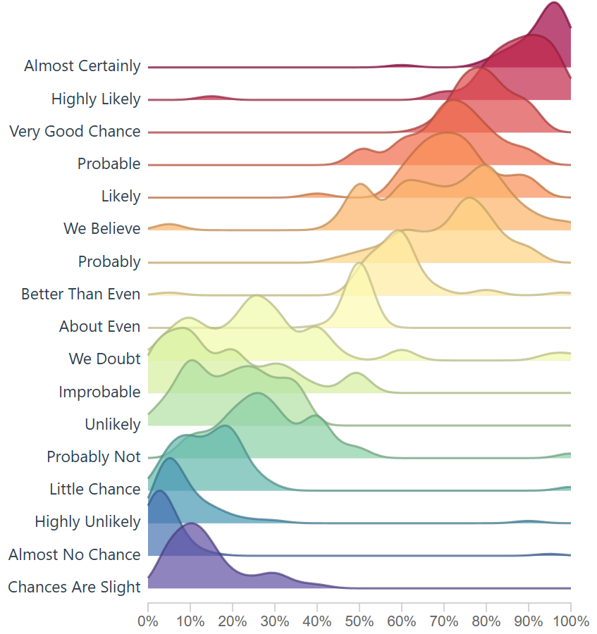
Transparency is a setting so here’s the lower setting.Here’s a different transparency setting: .attr(‘fill-opacity’, 0.7)
Not every attempt was a success: here’s an index based version. Code below. This method simply creates a bell-shape around the most dense area, which does enable a ridgeline plot.
// Create proper density data from the probability assignments
function createDensityData(ridge) {
// The data represents probability assignments, we need to create a density distribution
// around the mean probability value for each phrase

// Calculate mean probability for this phrase
const meanProb = d3.mean(ridge.values, d => d.y);
const stdDev = 15; // Reasonable standard deviation for probability perceptions

// Generate density curve points
// Density Generation Resolution
const densityPoints = [];
for (let x = 10; x <= 100; x += 10) {
// Normal distribution density
const density = Math.exp(-3 * Math.pow((x - meanProb) / stdDev, 2));
densityPoints.push({ x: x, y: density });
}

return densityPoints;
 }
There’s a bit of fun you can have with the smoothing of the curve on the area and line. However I opted for the first approach listed above because it gave more granularity and allowed the chart to sync up more with the R version.
This density bell shape curve producer could be nice for digging into the weeds and cutting out potential density around the sides, in my opinion it didn’t tell the full story, but wanted to report back as this extra area where we adjust the curve was fun to toy with and even breaking the visual was pleasant.
Imagine unlocking a granular understanding of your users—not just what pages they visit, but the organic, session-based journey each person takes across your digital landscape. At Dev3lop, we view sessionization as the strategic foundation to truly actionable clickstream analytics. While it may seem just a way to group user actions, effective sessionization is transformative. It empowers data teams to move beyond raw log analysis to meaningful behavioral segmentation, personalized experiences, and ultimately, deeper business insights. In this article, we demystify sessionization, explore why it’s vital for decision-makers, and outline tactical approaches for modern event-driven data pipelines.
What Is Sessionization, and Why Does It Matter?
Sessionization is the process of grouping sequences of user events into discrete “sessions” based on logical rules—most commonly, activity within a time window or the presence of session identifiers. Without sessionization, clickstream data is simply a long, unordered list of page views, clicks, or other events. By assigning context and boundaries to user behavior, organizations unlock a new dimension of analytics: time-based engagement, conversion funnels, and cross-platform journeys become visible and measurable.
For data strategists and business leaders, sessionization elevates analytics efforts in ways that manual reporting never could. It is the bedrock of everything from accurate personalization algorithms to robust inventory and demand analysis seen in inventory optimization visualization. If you’re seeking to break free from repetitive manual data tasks and harness automated behavioral reporting, mastering sessionization is non-negotiable. As we progress deeper into real-time architectures and omnichannel analytics, this foundational process becomes essential to resilient, decision-driven data operations. For a broader strategy shift, see why data warehouses are critical for breaking free from manual reporting loops.
Challenges in Sessionizing Event Streams at Scale
In today’s digital environment, data pipelines process millions of events every minute—often in real time and across distributed systems. Sessionizing this constantly flowing clickstream data presents hurdles that can’t be solved with batch processes alone. Key difficulties include identifying unique users across devices, ensuring that session boundaries make sense (especially with mobile or multi-touch journeys), and handling late-arriving or out-of-order events. Integrating with downstream systems, evolving your schema as new event types appear (schema evolution handling), and balancing processing cost versus real-time needs compound the complexity.
Yet, innovation here is not optional. Organizations must adapt to streaming-first architectures and shift their talent toward proactive monitoring, anomaly detection, and behavioral analytics. As highlighted in batch is comfortable, but stream is coming for your job, the future belongs to those executing fast, robust sessionization directly in their event pipelines. By consulting with experts that specialize in data engineering consulting, teams can transform these challenges into competitive advantages, unleashing smarter, faster data products.
Building Reliable Sessionization Pipelines: Best Practices and Innovations
Effective sessionization starts with a well-designed streaming or batch pipeline. Leading teams implement robust user identification, set dynamic session timeout rules, and build in handling for ambiguous events (e.g., logins, background tabs). Leveraging solutions such as event stream processors, cloud data warehouses, and flexible ETL frameworks is crucial for scalability.
Version control and release management become particularly important as data definitions and session logic evolve. For managers and architects, investing in modern DevOps for pipelines—as outlined in pipeline version control and release management—makes undocumented changes or regressions far less likely. And with more organizations routing authentication data (see how to send Auth0 data to Google BigQuery using Node.js), there’s greater potential to enrich sessions with identity and behavioral context.
Finally, modern sessionization pipelines unlock the storytelling potential buried within clickstream data. By integrating session output into scrollytelling narrative visualization tools, organizations present actionable narratives to executives, marketers, and product teams—inspiring data-driven decision-making at every level.
Conclusion: Elevate Your Business with Advanced Sessionization
Sessionization in clickstream event processing is far more than a technical checkbox. For forward-thinking teams, it’s the lever that shifts analytics from descriptive to prescriptive, enabling everything from real-time personalization to holistic customer journey mapping. By understanding and addressing the nuanced challenges of event stream sessionization—in both process and pipeline architecture—your organization can stay ahead of the innovation curve.
Our consultants at Dev3lop thrive at the intersection of data engineering and business strategy. Whether you’re just beginning to centralize your clickstream events or ready to build interactive, session-driven data products, our experience with scalable, robust analytics pipelines ensures your success. Let’s turn millions of raw events into a narrative your whole business can act on.