ET1’s DAG Streaming System
Familiar with graphs? How about DAGs? This is not a paradigm shift, but think of DAG as a cool way for tiny team in Austin/Dallas Texas to build an Extract Transform and Load software! Think of “DAG” like rules, which enable data processing unlike software like Alteryx, Knime, and other ETL software.
ET1 is like a guitar pedal, always on, always flowing downstream
Like a guitar pedal, there’s an input and output. Sometimes it’s just an output. Then you have your input only tools. Very much like our ETL software ET1. How the guitar pedal is “always on” and just flows, that’s the goal. You can see the first iteration of the dag engine on github. -Founder, Tyler Garrett
The DAG engine gives this small team of 1 developer the ability to create an ETL software with rules that are meaningful, substantial compared to the competition, and enables futuristic value additions.
What is a graph?
From a data perspective, a graph is a non-linear data structure used to model and store information where the relationships between individual data points are as important as the data itself. Natively a graph engine would treat data as a first class citizen, enabling real-time data processing and the ability to only compute what needs to be computed.
Unlike tables in a relational database, which store data in a fixed, row-and-column format, a graph is a flexible, interconnected network of entities and their relationships. With ET1, we fix together this graph engine so that it looks and feels like a regular ETL software, enabling a lot of cool functionality and features that regular ETL software is unable to offer.
We don’t mean to appear as we are reinventing the wheel but rather adding a different style to the typical nodes or tools you have come to learn and love.
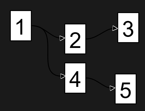
No looping… Acyclic. Stop recycling the same rows…
Focusing solely on the detrimental effects of loops is insufficient. While infinite loops can undoubtedly disrupt systems and lead to financial losses, a more significant concern is the unnecessary recycling of data, a practice prevalent in many software applications. Why is it necessary to repeatedly query data when it is not needed? Many tools, including Tableau, Power BI, Alteryx, and Knime, inherently recycle data rows. This necessitates re-querying 100% of each table during both development and production phases, resulting in frequent downtime, managing downtime due to backfills, the constant need for backfilling, increased system strain, and a continual escalating cost. Where has the concept of incremental data loading gone?
We unblock the ability to stream data incrementally to avoid unnecessary backfilling by using this DAG system!
This is one of many reasons we feel ET1 is powerful data engineering solution.
DAGs used in the wild?
We leverage the same principles employed by other well-regarded Directed Acyclic Graph (DAG) tools, such as Apache Spark, Apache Airflow, Apache Beam, Kubeflow Pipelines, MLflow, TensorFlow, Dagster, Prefect, Argo Workflows, Google Cloud Composer, and Azure Data Factory, among others.
We created our own custom DAG engine using JavaScript, and this enables us to flow data downstream in a web app. Data steaming in a no-code ETL software, without a setup or install, feels like a big win for any ETL software.
ET1 is by law is a acyclic
Meaning not forming part of a cycle. However many ETL style tools, both in visualization and ETL, still remain with the same engine as 20 years ago. Many things have changed in 20 years. Like the ability to avoid recycling data natively.
In the data world, acyclic means no looping is possible, and from a row perspective, this is powerful because you’re always incrementally loading downstream.
This application is unable to loop back on itself. A safe behavior to avoid novice mistakes that can instantly cost a lot of money in the wrong hands.
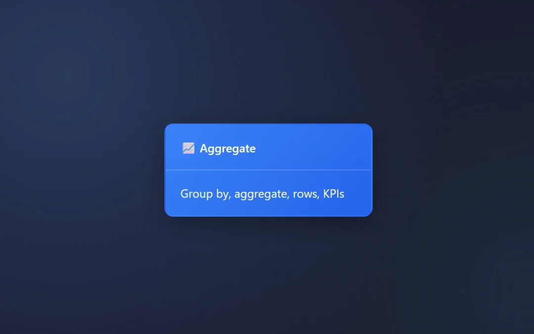
The DAG engine, consider it a beneficial rule for an ETL software that cares about rows, most ETL software cares about columns + tables, rows become second class citizens because in database land – columns and tables are king.
These classic ETL tools constantly recycle, most allow looping, and naturally this will push more work on your systems and increase costs.
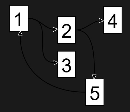
This is one of many reasons we feel the DAG engine is important, and in this diagram, 2 goes to 5 then back to 1. This isn’t possible in ET1 in the UX, and also not possible per row. This enables incremental row level refreshing. Saving time when engineering solutions, and making tweaks doesn’t cause considerable downtime ever again!
Looping still confusing as a negative? Imagine an application that could easily loop on itself, like a delay pedal that can feedback on itself, this would infinitely get louder and could destroy your ears or speakers… And from a data perspective, looping on yourself could spell a disaster for your computer, other computers, your network, your API bills, and much more… Loops would be a negative because it would allow people to break their computer and attached machines..
DAG is predictable and a great engine to use for flowing data downstream with rules, better feature sets, and enables easier visual feedback to teach end users…
DAG Explained per ET1 offering
Bronze ET1
This DAG system runs client-side and can process insane amounts of data 20-50million rows, and limited to the JavaScript Heap. This means around 4 gig of ram is the max per TAB. This is the same on chrome, firefox, etc.
Silver ET1.1
This DAG system runs client-side, the ability to run server-side, and the processing power is identical to Bronze ET1, however this product has storage and two step authentication to keep your data private.
How is this different than other ETL Engines?
Other ETL engines are not based on a DAG.
In other software, you’re familiar with making a change and having to reprocess every row. Consider our JavaScript DAG system the ability to avoid that digital bore. Sitting around waiting.
This matches our “cloud” backend which is serverless and only keeps track of the delta between “production” and “development” instances of your data! Only the delta is tracked.
This DAG system in ET1 lets me create unique user experiences, like processing only the data that is filtered, only the delta, and never reprocessing anything unnecessarily. -Founder, Tyler Garrett
Core Concept: No Play Button, Data Flows, DAG Guides, Ready?
The DAG (Directed Acyclic Graph) system is like a digital assembly line for your data, where each node is a workstation that processes data and passes it along. This changes how data is computed.
Instead of maxing out a few nodes because you’re querying all the data at once before starting a new node, each piece of your data is treated like a first class citizen in ET1.
Here’s how it works:
Is this data ready?
Yes or no?
When you go climbing, you are always talking to your partner, are they “Ready or not.” Is the person keeping you safe ready for you to fall? Are you ready? The person keeping you safe should always be ready. ET1 is always ready, so data is always flowing.
Being “always ready” is the key, DAG the bumpers to fall within, and our guide. It creates things like streaming, processing only what’s necessary, and branching off big ideas is simplistic.
Key Components
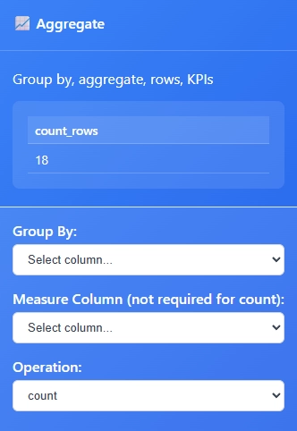
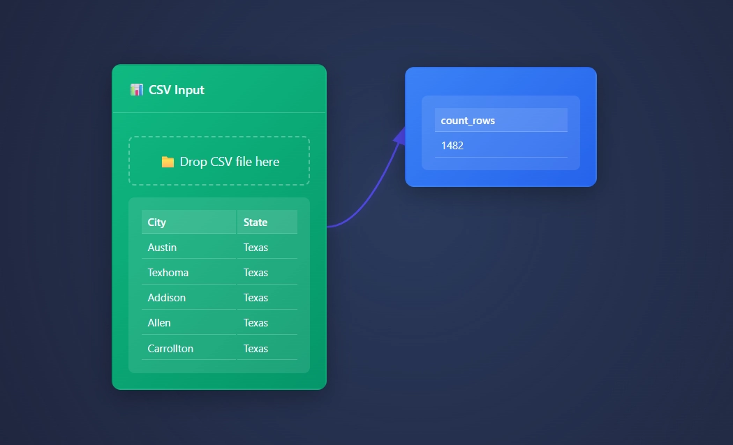
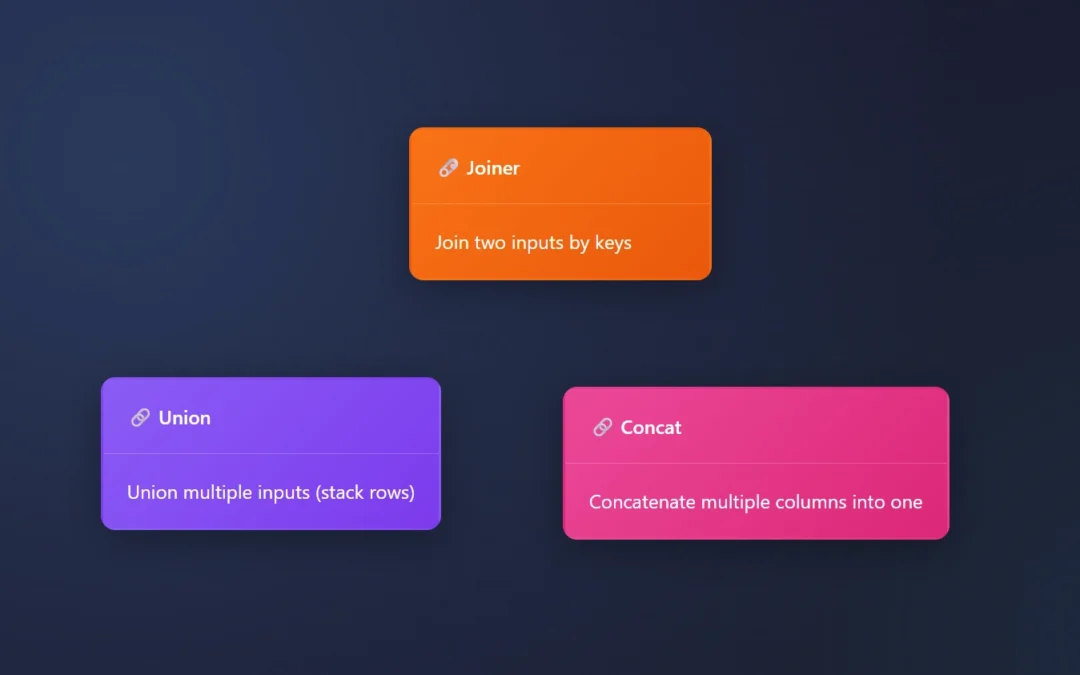
- Nodes – Individual processing units (like filters, joins, calculations)
- Edges – Connections showing data flow between nodes
- Data Streams – The actual data flowing through the system
How It Works
Automatic Updates
- Change a node? The system only recalculates what’s needed downstream
- No manual refreshing – updates happen in real-time
Smart Processing
- Only processes changed data paths
- Alteryx and Knime users tired of data processing unnecessarily will be excited about this feature
- Avoids redundant calculations
- The DAG engine lets you only calculate what changes, decreasing your compute and time spent creating solutions
Visual Flow
- See your data transform step by step
- Easy to spot where changes are needed
- Intuitive drag-and-drop interface
Why ET1 is Better
- No More Waiting: Only recalculates what’s necessary
- Never get stuck waiting on data to re-run because you made a change, only calculate what matters, graph enables the ability to calculate one thing at a time
- Most products have to re-calculate the entire table before it’s ready to move forward
- Mistake-Proof: Can’t create circular references, very helpful
- Users are unable to make big mistakes like spamming their API in an infinite loop
- No one will be able to increase their cloud costs because they made an easy mistake
- Exploration has no penalties, crafting a sense of trust in non-technical users
- Decrease stress and network strains by avoiding infinite loops
- Visual Debugging: See exactly where data changes happen, a visual teacher
- Created to help people visually understand their data processes
- Highlight to quickly see and understand the data automation
- Scalable: Handles simple to complex workflows with ease
Think of it like a factory conveyor belt system – each station (node) does its job and passes the product (data) to the next station, with the system automatically managing the flow and only processing what’s needed.
Competitive analysis
Instead of constantly recycling the same rows over and over, ET1 enables anyone the ability to only compute rows that need to be updated VS re-running each table unnecessarily.
This is the tools for problem solving like KNIME, Alteryx, Tableau, Power BI, and most BI Platforms.
In most software; If your pipeline changes, you have to run 100% of the records.
ET1 defeats this with this engine.
The DAG engine introduces what we feel is great foundation for a powerful ETL tools that can scale in the future.
We believe only the data that matters should flow down stream, DAG natively supports that by design. So using this DAG engine, we are able to only flow what matters, and make problem solving feel modern.
Future outlooks
We are not married to this engine but believe it’s very beneficial thus far. Our goal is not become fixated on the engine but rather what features it can offer.
Graph means it’s easy for us to scale up to cloud or server off loading situations in the future and that’s the easy piece.
Knowing that DAG systems are the backbone of many major big data appliances, know we are thinking bigger, big picture, and next steps too.
If you have a use case that isn’t possible on your current machine, let us know.
Return to ET1 Overview to learn more.