Renaming columns in ET1 is straightforward and intuitive. You can also move the position of your columns by bumping the column left or right. Last, but not least, the ability to remove the column from the table.
Column Renamer in ET1 is the place to manage your columns header name, the position of the column, and removing columns from your data stream.
Using Column Renamer
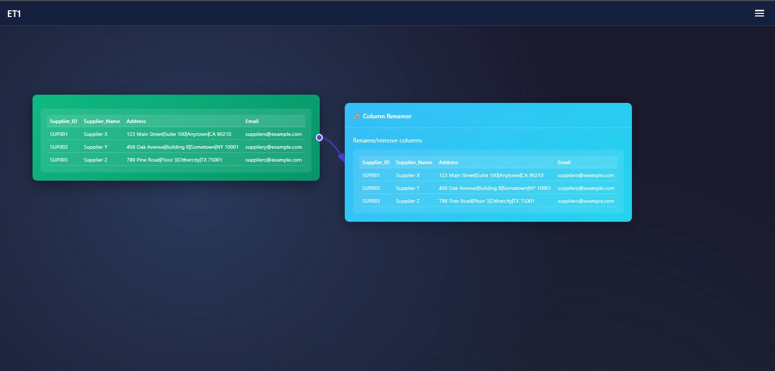
Connect data downstream to the Column Renamer
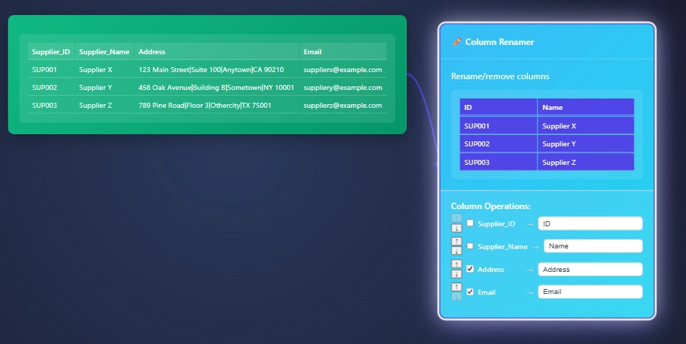
Manage your table in the Column Renamer
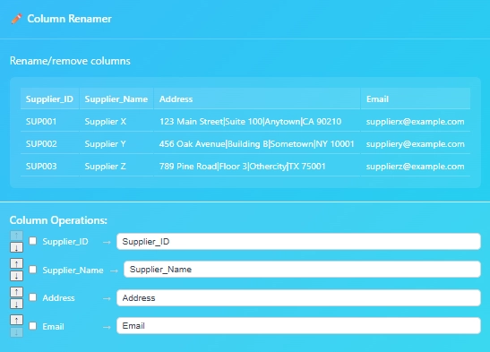
Open the settings by hovering over the node and clicking the settings button.
The checkbox: Removes columns
The arrows bumps the column left or right
Rename the column
In our use case, we want to remove address and email as it’s not relevant for our end goal. We simply check the box to remove the column. Next, we rename the column Supplier_ID to ID, and Supplier_Name to just Name. Done!
Thanks for learning more about ET1 and know if you have any questions… Please contact us.
On your magic quest to join data? We call it the Joiner node.
A simple joining solution that helps people join data at a row level.
In ET1, Joiner is focused on “keeping it simple” and will aim to automatically infers your joins.
ET1 assumes.
Inferring a join means it assumes you prepared the data prior. Like, Id = Id..
Without preparing the data stream prior, the assumptions may fail. Use this to your power, and save time by letting ET1’s Joiner Node assume the correct column for you.
Hint; make it easier by preparing your column headers before using the Joiner Node by using the Column Renamer Node. This will help you save time while using ET1.
If your headers are clean this will automatically infer keys for you. What that means is it will try to find a join, without your help. However you may need to help it with doing the right thing if headers do not equal headers.
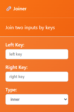
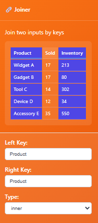
Connect table1, this will be the table on the “left” and we call it the left key
Connect table1, this will be the table on the “right” and we call it the right key
Pick type inner join or left* join
Right join is possible by swapping which table you connect to the Joiner node first. This order of operation is considered, and by adjusting what connects to this node first – you’re able to right join. You’re simple using the left join and the understanding of what you just read.
Type: The style of join. Today, we only have inner and left join.
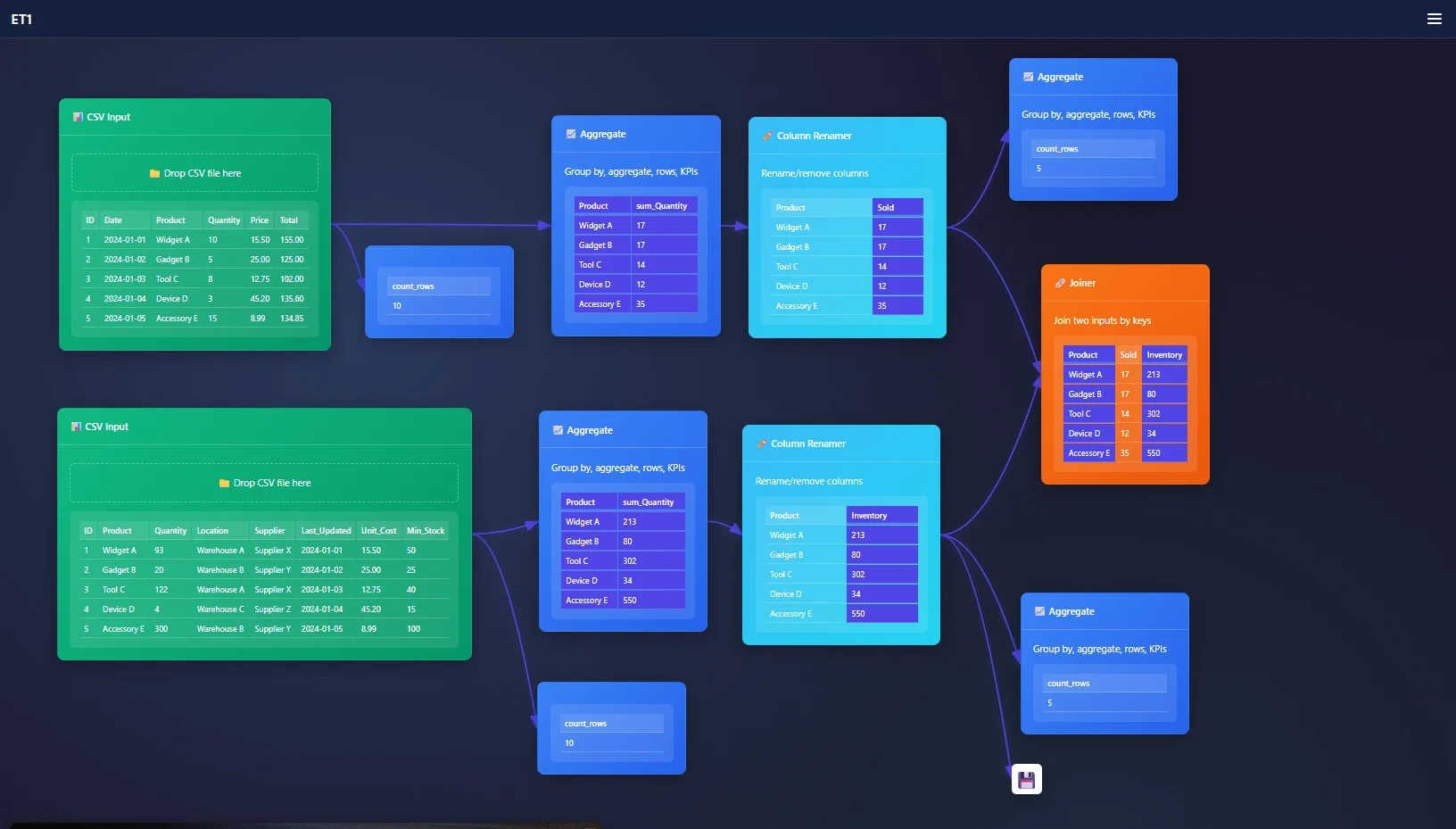
The Joiner Node is the tool for joining data at a row-level, it removes complexities when joining data, and these row-level relationships are likely the ‘key’ we need to use the ET1’s Joiner Node.
Goal, join our data to see if we need more inventory.
Problem, the data is broken into many different tables.
Use case: Purchase data and inventory data can be joined, lets break it down.
While analyzing this request, I found the data has duplicate entries on the column Product. Product has a relationship between tables. However we need the tables to be grouped, or we will be creating a many-to-many join.
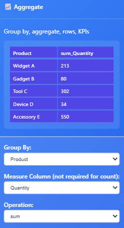
Here’s how our Inventory data will look after we group by Quantity, and rename our header to Inventory.
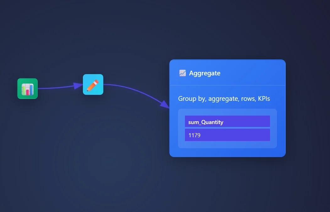
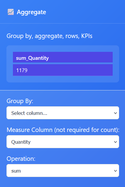
To create a KPI, you need to choose the column and how to aggregate.
Setting up your KPIs in ET1
Open an Aggregate Node, stream data into this node, and open the settings.
We need to create a Sum of Quantity.
We need to swap the measure column to Quantity and the operation to sum!
Recap: The Aggregation Node operation is set to sum and the measure column is set to quantity and this creates a single KPI value for the column quantity.