Circular visualization techniques—radar, polar, and radial charts—offer innovative ways to present complex data clearly, intuitively, and compellingly. By moving beyond the limitations of traditional, linear visualizations, these charts provide a richer, more engaging perspective on multidimensional data, allowing decision-makers to quickly capture valuable insights. As a software consulting firm specializing in advanced data analytics and innovation, Dev3lop explores these circular visualization methods to help organizations better leverage their existing data assets. Let’s dive into each of these visualization strategies and explore how they enable agile, informed decisions in today’s data-driven marketplace.
Understanding Radar Charts: Spotting Strengths and Gaps at a Glance
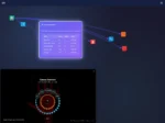
Radar charts, sometimes called spider charts or star charts, excel at visually representing multivariate data where comparisons are crucial. By displaying data across several axes, decision-makers can immediately identify patterns, strengths, and areas needing improvement. Each axis represents a particular quantitative variable, while a polygon’s shape, formed by joining data points across these axes, provides an intuitive snapshot of performance. Radar charts help distill large, complicated datasets into accessible representations that inform strategic priorities and agile decision-making processes.
In a business context, radar charts can greatly enhance performance evaluations, competitiveness analyses, and employee assessment by visualizing key success indicators and facilitating quick comparisons. For instance, project managers may deploy radar charts while optimizing workloads and skill distribution, simplifying informed staffing decisions. Moreover, when dealing with performance metrics from extensive datasets, integrating radar charts with advanced cloud analytics platforms—like those managed in AWS consulting services—can help transform raw data into actionable strategic insights.
Radar charts can be quickly designed using mainstream visualization tools or embedded directly into custom analytics dashboards, simplifying data-driven storytelling and helping communicate complex analytics results. As businesses rapidly shift toward streamlined workflows, adopting clear, effective radar visualizations aligns well with Dev3lop’s vision of enabling analytics-driven efficiencies, something detailed extensively in their article on composable data analytics.
Leveraging Polar Charts: Transforming Complex Relationships Visually
Polar charts, unlike radar charts, display information in a circular layout where each data point is determined by distance from the center and angle. This technique is especially effective at illustrating cyclical patterns, directional data (for example, wind directions or seasonal fluctuations), or periodic datasets, enabling analysts to showcase ongoing trends more distinctly than traditional visualizations.
It’s common to see polar charts used in fields like meteorology, astronomy, and environmental sciences, but their potential extends far into business analytics. An analytics leader can employ polar charts to more effectively assess sales dynamics throughout annual or quarterly business cycles, illuminating internal performance patterns impacted by factors such as customer preferences or seasonal demand. Polar visualizations enhance strategic foresight by making recurrent trends immediately recognizable, leading decision-makers to proactively capitalize on critical opportunities or tackle challenges promptly and efficiently.
Polar charts also excel at helping companies recognize and correct anomalies and mistakes in real-time data streams. For instance, Dev3lop’s detailed exploration of re-windowing strategies demonstrates how correcting data streams improves accuracy and enables precise decision-making. Coupled with real-time technologies covered by Dev3lop, such as stream processing for fraud prevention, polar charts help create resilient and robust analytics architectures ready for current and future market dynamics.
Radial Charts: Communicating Proportions and Part-to-Whole Relationships
Radial charts—like circular bar plots, sunburst charts, or donut charts—emphasize hierarchy, part-to-whole relationships, and proportional composition of various components. Visualizing these relationships across a comprehensive dataset, they effectively communicate structure within layers of data by providing clear, immediate context without overwhelming audiences with numerical details.
For decision-makers, radial charts can substantially elevate understanding and communication of data hierarchy contexts, driving more accurate strategic planning. For instance, an analytics leader employing radial techniques can undilutedly illustrate relative contributions of departments, projects, or revenue streams over time, empowering executives with a crucial perspective for informed prioritization decisions without having to pore over cumbersome spreadsheet analyses.
Companies increasingly incorporate radial charts into flexible analytics implementations, leveraging their adaptability. Data analysts building micro applications—specialized, highly efficient tools optimized for agile business solutions—find that radial visualization techniques seamlessly integrate into compact user interfaces. Equally important, radial charts harmonize with innovative visualization strategies, especially when integrated within sophisticated reports, dashboards, or even embedded analytics components, such as within Dev3lop’s guide on embedding Google Data Studio iframes into custom web applications.
Strategic Use of Circular Visualization Techniques in Business Intelligence
Combining radar, polar, and radial charts strategically in business intelligence practice can significantly enhance data perception and decision-making agility. Circular visualization charts underpin numerous strategic advantages by capturing multi-dimensionality, periodic trends, and hierarchies effectively. With their intuitive comprehension, these techniques empower businesses to respond quickly to dynamic information environments.
When integrated purposefully with robust analytical workflows—particularly those architected via cloud infrastructure such as AWS consulting services—circular visualizations significantly streamline analytical tasks, speeding insights from raw data to business impacts. They can facilitate differing kinds of exploratory or confirmatory analytics efforts, enabling leaders to build stronger communication bridges within cross-functional teams. As Dev3lop emphasizes in their breakdown of analytics working sessions, clear visualizations directly contribute to the effectiveness of analytical collaboration, reducing miscommunication and clarifying strategic intentions.
Furthermore, companies that utilize circular visualization methods alongside best practices, such as those detailed in the insightful Dev3lop article on optimizing Apache Spark jobs, create powerful synergies in data analytics maturity. Circular charts help stakeholders visualize optimized analytic results clearly and rapidly, reinforcing Dev3lop’s commitment to data-driven innovation and continuous improvement.
Best Practices for Building Effective Circular Visualizations
Building effective circular visualizations—whether radar, polar, or radial—means careful attention to best practices. Ensuring accuracy, clarity, and visual attractiveness are crucial for resonating with your audience. High-quality visualizations have strategic advantage, particularly when meaningfully integrated into agile analytics processes to communicate clear, actionable insights.
To maximize effectiveness, always ensure data integrity and consistency when generating circular charts by clearly defining axes labels, titles, scales, and legends. Choosing an optimal number of dimensions is essential to avoid overly complicated or unclear visuals. Also, prioritize simplicity to improve visual communication and intuitive conceptual understanding without oversimplifying underlying data complexity.
Effective color use significantly amplifies chart readability, aiding selection of complementary palettes for target audiences, incorporating accessible design principles, and clarifying meaningful distinctions between various data points clearly and consistently. As Dev3lop details extensively in the guide to visually appealing data visualizations, adhering to best design practices significantly elevates analytical communication performance.
Conclusion: Evolving Visualizations for Agile, Strategic Data Practices
Radar, polar, and radial charts are essential visualization methods for businesses moving beyond linear analytics and embracing holistic views of their data. These innovative circular visualization strategies empower decision-makers, enabling agile and informed responses pivotal to success in a rapidly evolving business landscape. Coupled effectively with sophisticated analytics architectures, actionable best practices, and comprehensive stakeholder engagement, as detailed across many of Dev3lop’s insightful resources, these visualizations can substantially elevate your analytics maturity.
At Dev3lop, we leverage circular visualization techniques to help clients meaningfully transform complex datasets into powerful insights. By continually innovating with new visual analytics techniques and optimizing strategic analytics processes like those explained in AWS-based analytics, we equip enterprises with the tools required for effective digital transformation.
Thank you for your support, follow DEV3LOPCOM, LLC on LinkedIn and YouTube.


