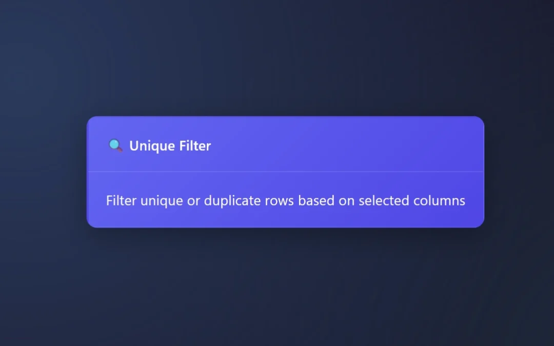
The Unique Filter Node or Unique Tool finds unique values per row in your data pipelines, or allows people to quickly review duplicates only.
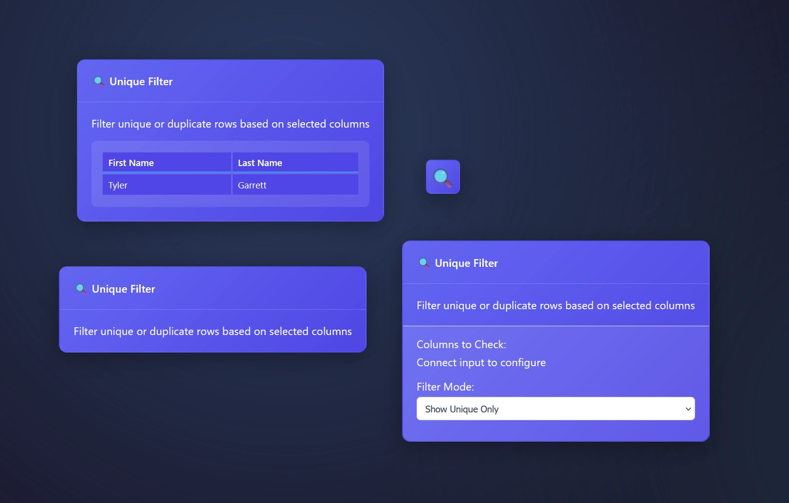
Plus, you can select what column(s) to find unique values within. This enables people to easily understand what is inside of a column.
Duplicate rows happen, The Unique Filter node manages these rows for you automatically.
Whether you’re eager to only look at unique rows or drilling into the duplicates, ET1’s Unique Filter Node is the data engineering tool for your unique or duplicated needs.
Unique Filter Node: Filter mode explained
The Unique Tool or Unique Filter Node
Show unique only – this setting means you will stream only the unique values through the pipeline
You may want to run this across all pipelines as a way to verify
This is an easy way to create look up tables
Build a tool to understand what is inside of a column
Show duplicate only – will stream duplicates only and remove the unique values found
Drill into duplicates only, great for deep dives and researchers
Helpful for auditing pipelines, does your pipeline have duplicates?
Using the Unique Filter Node in ET1
Drag and drop your data pipeline arrow connection to the input of the Unique Filter to begin immediately reporting on unique rows only.
Open the settings for more granular options.
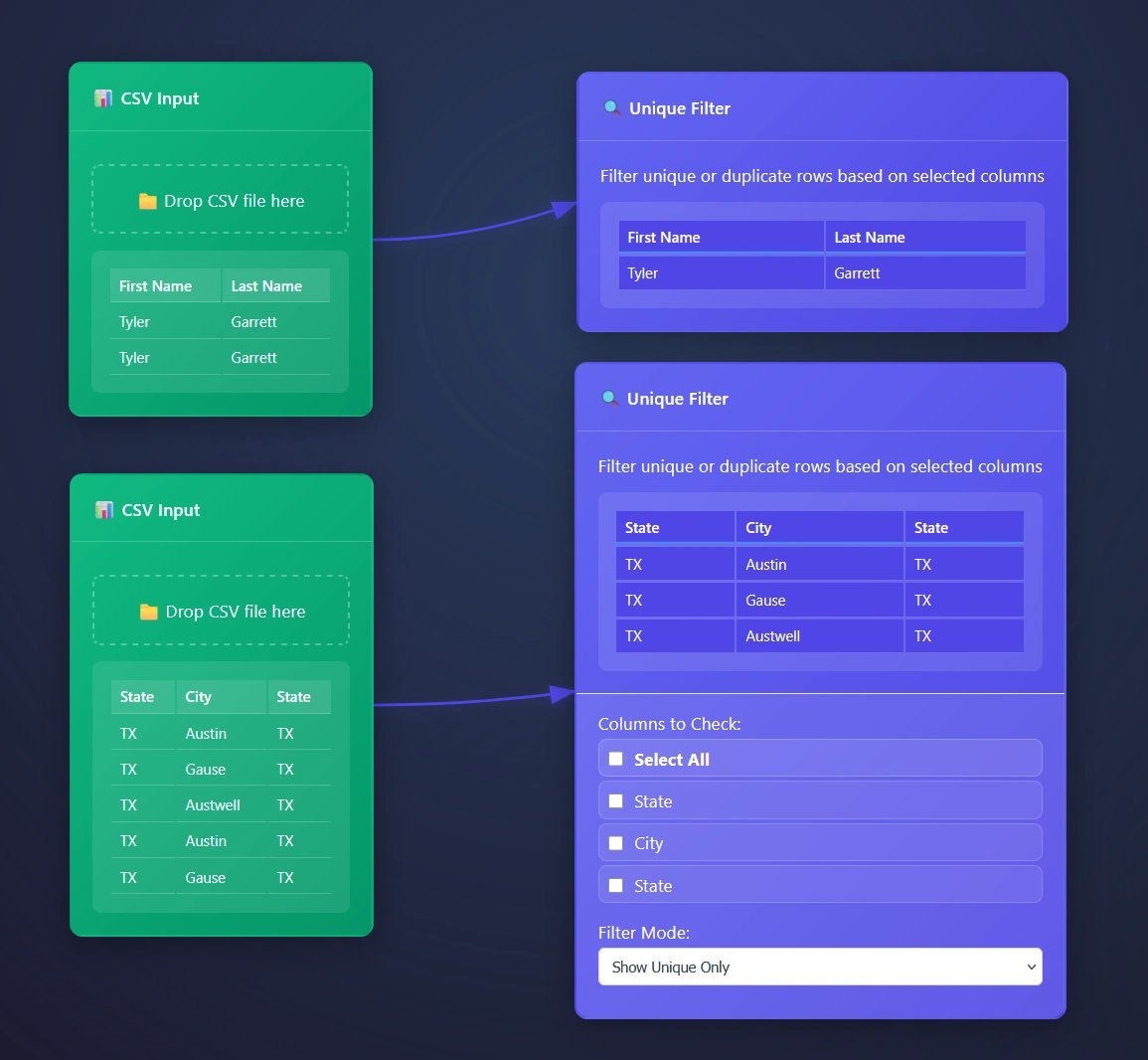
ET1’s Unique Filter Node automatically removes duplicate rows based on selected columns, however we automatically infer you are eager to use all columns and start there. Opening the settings for more options will offer a cool way to group data.
Creating look up tables with Unique Filter Node
Auditing your column? How about the values inside of each column? This is a great tool for understanding what is possible in your data pipeline.
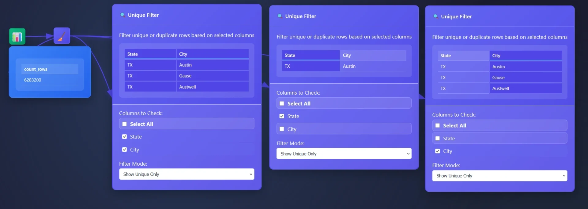
In this example, a dataset comprising 6 million transactions is provided through an email you never wish you looked at, and the objective is to identify the originating cities. While an aggregation tool could be utilized (where you are able to use group by), however the Unique Tool offers a more effective approach for grouping data in these circumstances.
The Unique Tool facilitates a comprehensive understanding of individual column content. A common strategy involves removing unnecessary columns and employing the Unique Filter Node to extract the distinct values within the remaining table, thereby enabling the surfacing of valuable insights.
ET1 is designed to facilitate straightforward data filtering and transformation processes. It is helpful to consider data analysis as a communicative exchange with the dataset.
Technical specs on the Unique Tool’s Data Processing
JavaScript that filters data rows for uniqueness or duplication based on specified columns.
It processes tabular data in a browser-based ETL pipeline, determining which rows are unique or duplicate by constructing composite keys from selected column values. The behavior depends on the filterMode configuration: when set to 'unique', it retains only the first occurrence of each key; when set to 'duplicates', it excludes first occurrences and keeps only subsequent repeats.
Composite keys use a rare delimiter ('␟'): The character U+241F (Symbol for Unit Separator) is used to join column values into a single key string. This prevents collisions that could occur with common delimiters like commas or pipes, especially when column values themselves contain such characters.
Robust handling of missing or invalid configurations: If node.columns is not an array or contains invalid column names, the function defaults to using all available headers, ensuring that filtering still occurs meaningfully instead of failing silently or throwing errors.
Two-pass algorithm ensures correctness: The first pass counts all key occurrences, which could be used for analytics (though currently unused); the second pass performs the actual filtering. This structure allows future enhancements, such as filtering by occurrence count thresholds.
Familiar with graphs? How about DAGs? This is not a paradigm shift, but think of DAG as a cool way for tiny team in Austin/Dallas Texas to build an Extract Transform and Load software!
Like a guitar pedal, there’s an input and output. Sometimes it’s just an output. Then you have your input only tools. Very much like our ETL software ET1.
The DAG engine gives this small team the ability to create an ETL software with rules and futuristic features.
We leverage the same principles employed by other well-regarded Directed Acyclic Graph (DAG) tools, such as Apache Spark, Apache Airflow, Apache Beam, Kubeflow Pipelines, MLflow, TensorFlow, Dagster, Prefect, Argo Workflows, Google Cloud Composer, and Azure Data Factory, among others.
We created our own custom DAG engine using JavaScript, and this enables us to flow data downstream in a web app. Data steaming in a no-code ETL software, without a setup or install, feels like a big win for any ETL software.
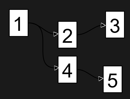
In simple terms, Acyclic means not looping, this diagram/graph shows no loops.
What is a graph?
From a data perspective, a graph is a non-linear data structure used to model and store information where the relationships between individual data points are as important as the data itself. Natively a graph engine would treat data as a first class citizen, enabling real-time data processing and the ability to only compute what needs to be computed.
Unlike tables in a relational database, which store data in a fixed, row-and-column format, a graph is a flexible, interconnected network of entities and their relationships. With ET1, we fix together this graph engine so that it looks and feels like a regular ETL software, enabling a lot of cool functionality and features that regular ETL software is unable to offer.
We don’t mean to appear as we are reinventing the wheel but rather adding a different style to the typical nodes or tools you have come to learn and love.
No looping… Acyclic. Stop recycling the same rows…
Focusing solely on the detrimental effects of loops is insufficient. While infinite loops can undoubtedly disrupt systems and lead to financial losses, a more significant concern is the unnecessary recycling of data, a practice prevalent in many software applications. Why is it necessary to repeatedly query data when it is not needed? Many tools, including Tableau, Power BI, Alteryx, and Knime, inherently recycle data rows. This necessitates re-querying 100% of each table during both development and production phases, resulting in frequent downtime, managing downtime due to backfills, the constant need for backfilling, increased system strain, and a continual escalating cost. Where has the concept of incremental data loading gone?
We unblock the ability to stream data incrementally to avoid unnecessary backfilling by using this DAG system!
This is one of many reasons we feel ET1 is powerful data engineering solution.
ET1 is by law is a acyclic
Meaning not forming part of a cycle. However many ETL style tools, both in visualization and ETL, still remain with the same engine as 20 years ago. Many things have changed in 20 years. Like the ability to avoid recycling data natively.
In the data world, acyclic means no looping is possible, and from a row perspective, this is powerful because you’re always incrementally loading downstream.
This application is unable to loop back on itself. A safe behavior to avoid novice mistakes that can instantly cost a lot of money in the wrong hands.
The DAG engine, consider it a beneficial rule for an ETL software that cares about rows, most ETL software cares about columns + tables, rows become second class citizens because in database land – columns and tables are king.
These classic ETL tools constantly recycle, most allow looping, and naturally this will push more work on your systems and increase costs.
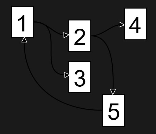
This is one of many reasons we feel the DAG engine is important, and in this diagram, 2 goes to 5 then back to 1. This isn’t possible in ET1 in the UX, and also not possible per row. This enables incremental row level refreshing. Saving time when engineering solutions, and making tweaks doesn’t cause considerable downtime ever again!
This diagram is not possible due to the rule base in the engine and not a DAG, due to the loop.
Looping still confusing as a negative? Imagine an application that could easily loop on itself, like a delay pedal that can feedback on itself, this would infinitely get louder and could destroy your ears or speakers… And from a data perspective, looping on yourself could spell a disaster for your computer, other computers, your network, your API bills, and much more… Loops would be a negative because it would allow people to break their computer and attached machines..
DAG is predictable and a great engine to use for flowing data downstream with rules, better feature sets, and enables easier visual feedback to teach end users…
Core Concept: No Play Button, Data Flows, DAG Guides, Ready?
The DAG (Directed Acyclic Graph) system is like a digital assembly line for your data, where each node is a workstation that processes data and passes it along. This changes how data is computed.
Instead of maxing out a few nodes because you’re querying all the data at once before starting a new node, each piece of your data is treated like a first class citizen in ET1.
Here’s how it works:
Is this data ready?
Yes or no?
When you go climbing, you are always talking to your partner, are they “Ready or not.” Is the person keeping you safe ready for you to fall? Are you ready? The person keeping you safe should always be ready. ET1 is always ready, so data is always flowing.
Being “always ready” is the key, DAG the bumpers to fall within, and our guide. It creates things like streaming, processing only what’s necessary, and branching off big ideas is simplistic.
Key Components
Nodes – Individual processing units (like filters, joins, calculations)
Edges – Connections showing data flow between nodes
Data Streams – The actual data flowing through the system
How It Works
Automatic Updates
Change a node? The system only recalculates what’s needed downstream
No manual refreshing – updates happen in real-time
Smart Processing
Only processes changed data paths
Alteryx and Knime users tired of data processing unnecessarily will be excited about this feature
Avoids redundant calculations
The DAG engine lets you only calculate what changes, decreasing your compute and time spent creating solutions
Visual Flow
See your data transform step by step
Easy to spot where changes are needed
Intuitive drag-and-drop interface
Why ET1 is Better
No More Waiting: Only recalculates what’s necessary
Never get stuck waiting on data to re-run because you made a change, only calculate what matters, graph enables the ability to calculate one thing at a time
Most products have to re-calculate the entire table before it’s ready to move forward
Mistake-Proof: Can’t create circular references, very helpful
Users are unable to make big mistakes like spamming their API in an infinite loop
No one will be able to increase their cloud costs because they made an easy mistake
Exploration has no penalties, crafting a sense of trust in non-technical users
Decrease stress and network strains by avoiding infinite loops
Visual Debugging: See exactly where data changes happen, a visual teacher
Created to help people visually understand their data processes
Highlight to quickly see and understand the data automation
Scalable: Handles simple to complex workflows with ease
Think of it like a factory conveyor belt system – each station (node) does its job and passes the product (data) to the next station, with the system automatically managing the flow and only processing what’s needed.
Competitive analysis
Instead of constantly recycling the same rows over and over, ET1 enables anyone the ability to only compute rows that need to be updated VS re-running each table unnecessarily.
This is the tools for problem solving like KNIME, Alteryx, Tableau, Power BI, and most BI Platforms.
In most software; If your pipeline changes, you have to run 100% of the records.
ET1 defeats this with this engine.
The DAG engine introduces what we feel is great foundation for a powerful ETL tools that can scale in the future.
We believe only the data that matters should flow down stream, DAG natively supports that by design. So using this DAG engine, we are able to only flow what matters, and make problem solving feel modern.
Future outlooks
We are not married to this engine but believe it’s very beneficial thus far. Our goal is not become fixated on the engine but rather what features it can offer.
Graph means it’s easy for us to scale up to cloud or server off loading situations in the future and that’s the easy piece.
Knowing that DAG systems are the backbone of many major big data appliances, know we are thinking bigger, big picture, and next steps too.
If you have a use case that isn’t possible on your current machine, let us know.
In today’s fast-paced, digitally connected world, businesses operate across multiple channels, from websites and social media to point-of-sale systems, mobile apps, and customer support platforms. This complexity has given rise to omnichannel customer interactions and journeys, making it more crucial than ever for companies to have crystal-clear visibility into their data landscape. Omnichannel customer analytics, particularly unified journey visualization, offers unprecedented insight into customer interactions and experiences across channels, empowering strategic decision-making and accelerating growth. By visualizing your customer’s journey across every touchpoint in real-time, businesses are able to uncover trends, predict needs, and respond proactively, creating tailored, personalized experiences and fueling customer loyalty and satisfaction. In this article, we’ll delve deeper into omnichannel customer analytics, discussing how a unified approach to integrated data frameworks enhances journey visualization and can boost your technology capabilities, unlock innovation, and drive lasting competitive advantage.
Why Omnichannel Analytics Matters in Modern Business
Businesses today engage customers on various digital platforms, physical stores, chatbots, email campaigns, and countless other touchpoints. Customers themselves are more informed, connected, and empowered—with expectations of personalized, immediate responses and seamless transitions across interactions. Catering to evolving customer needs requires businesses to break down internal data silos and leverage omnichannel analytics. By unifying data from social media interactions, website browsing habits, transactional information, call center communications, and even IoT-connected devices, organizations gain a comprehensive view of customer experience dynamics.
This capability is crucial—not just for understanding historical patterns, but for proactively predicting future behaviors and preferences. Advanced customer analytics that incorporate interactive approximate queries can rapidly surface hidden trends and empower quicker decision-making. Equipped with a holistic data perspective, businesses become agile at adapting strategies, enhancing engagements, improving products or services, and ultimately driving increased revenue and customer lifetime value. Omnichannel analytics isn’t just a business advantage—it has grown into a foundational requirement for marketplace survival, competitive differentiation, and long-term brand leadership.
The Strategic Advantages of Unified Journey Visualization
A unified journey visualization is a powerful extension of omnichannel analytics that integrates customer data sources into visually intuitive interfaces. This methodology consolidates cross-channel communication threads to map customer engagements end-to-end. Through advanced graphical platforms or dashboards, decision-makers can instantly highlight friction points, understand engagement patterns, and reveal inefficiencies or hidden opportunities—all from a single visualization pane. Real-time visualizations of customer journey analytics enable collaboration among marketing, sales, customer support, product management, and operational stakeholders, ensuring alignment and unified strategic objectives.
Businesses that leverage unified journey visualization gain definitive advantages. Firstly, they can more efficiently identify high-value customer segments across their journey, personalizing each interaction and maximizing lifetime value. Customer-churn prevention also becomes easier as early warning indicators across multiple channels become more visible. Additionally, this approach becomes instrumental for optimizing upselling and cross-selling strategies. When teams quickly detect engagement signals, decision-makers rapidly implement targeted campaigns, prices adjustments, or relevant product recommendations, heightening customer satisfaction and sales.
The unified analytics landscape also enhances accuracy, speed, and reliability in the decision-making process. Automated notifications leveraging advanced alert systems for analytics pipelines keep stakeholders informed proactively, ensuring fast pivoting and fluid customer interactions. Visualizing journey analytics unifies teams around common goals, positively influencing organizational culture and promoting customer-centric thinking.
Key Components of Unified Customer Journey Visualization
Successfully developing unified journey visualization platforms demands several critical components working harmoniously. First and foremost is data engineering effectiveness. To build a unified picture of customer interactions, teams must adeptly gather, cleanse, and prepare vast volumes of data from disparate systems. Effective data engineering expertise ensures smooth data pipelines, robust data integration, and minimal downtime. High-quality data remains the foundation and prerequisite to effective visualization and analytics.
Another essential component is metadata management. Visualizing journeys accurately depends on effective metadata capture and exposure, allowing for consistent views and easy navigation. Metadata enriches core business data assets and facilitates better searching, sorting, analyzing, or cross-referencing customer interactions. Moreover, interactive analytics experiences become streamlined when metadata management is well-designed, allowing decision-makers across business units effortless exploration of journey insights.
Further enhancements involve leveraging advanced analytics tools and technologies like AI and Machine Learning to model and predict customer behaviors proactively. Automated visualizations that highlight anticipated actions or predict customer needs can dramatically enhance response times and personalize experiences.
Implementing Unified Visualization: Approaches and Best Practices
Embarking on omnichannel unified visualizations requires thoughtful considerations to ensure smooth implementations. Firstly, businesses should approach analytics transformation in incremental stages rather than a single massive initiative. Incremental changes utilizing proven techniques like progressive pipeline rollout via feature flags ensure seamless transitions while minimizing disruptions. Embracing an agile methodology to iterate quickly, receive stakeholder feedback, and promptly adjust ensures effective integration.
A strong data governance practice also remains critical. Clearly defined data ownership, security frameworks, and data privacy compliance procedures protect customer information and reinforce trustworthy analytics environments. Governance practices facilitate informed, secure decision-making without sacrificing agility or innovation.
Standardization and democratization are important related practices. Standardized visual frameworks across dashboards or interfaces ensure internal consistency, compelling storytelling, and teamwide ease-of-use. Democratized access, proper data education, and user-friendly visualization tools empower cross-functional employees to explore insights on-demand, driving engagement and encouraging data-driven cultures.
Additionally, integration of non-traditional data sources significantly fortifies unified journey visualizations. Innovative data approaches—such as integrating social media data streams (for example, sending Twitter engagement data into Google BigQuery)—offer rich brand engagement insights beyond conventional channels, creating a fuller customer journey picture.
Future-Proofing Your Analytics Strategy with Omnichannel Visualization
Technology, analytics, and data-driven decisions progress rapidly, making future-proofing strategies essential. Omnichannel analytics and unified journey visualizations must continually evolve, embracing innovative technologies and new data sources. Organizations should actively invest in robust product roadmaps and cloud-enabled platforms to flexibly scale analytics capabilities.
Forward-focused companies should anticipate the future needs of their visualization platforms, maximally leveraging automation, AI, and real-time analytics to strengthen predictive customer understanding. Embracing platforms that support experimentation, flexible analytics querying, and integration of emerging data sources ensures adaptability and resilience. Innovative features—including intelligent metadata management, automated data extraction methods, or even novel AI-driven capabilities like removing branding markers from digital image assets using Python—indicate how AI-supported enhancements continually spark new visualization potentials.
Ultimately, ensuring that data infrastructures, automated processes, and visualization environments sustain innovation agility remains crucial for competitive advantage. Continuous iteration combined with forward-looking strategic investments ensures analytics evolve parallel to customer expectations and business requirements. Companies committed to staying relevant and customer-centric should continuously refine visualization tools and analytical processes, remaining proactive and future-ready.
Conclusion: Embracing Omnichannel Analytics for Powerful Results
Unified journey visualization drives unrivaled clarity into customer experiences, equipping strategic decision-makers with powerful analytics at their fingertips. As customer channels diversify, unifying digital and physical experiences while utilizing robust integrated analytics platforms becomes essential. Stakeholders must invest in building effective data engineering architectures, leveraging metadata management, and committing to continuous innovation to maintain customer satisfaction, competitive positioning, and growth.
With omnichannel customer analytics visualization as a catalyst, your organization can strengthen customer relationships, effectively anticipate challenges, and dynamically seize market opportunities. Taking a holistic and unified approach to customer journey analytics clearly differentiates innovative businesses prepared to lead and dominate market spaces tomorrow.
In today’s rapidly evolving digital landscape, enterprises face complex questions that traditional data systems can’t effectively answer. Understanding relationships between various elements of your data isn’t just helpful—it’s essential. Enter graph database visualization. This dynamic technology allows businesses not only to store but to clearly see connections between datasets, uncover hidden insights, and drive innovation. Imagine being able to visually map intricate customer journeys, supplier dependencies, or operational networks effortlessly. Graph visuals deliver this clarity, empowering decision-makers to recognize trends, assess risks, and capitalize on opportunities faster. By harnessing relationship mapping at scale, enterprise leaders transform raw data into actionable intelligence, providing a strategic advantage in an increasingly competitive market.
The Rising Importance of Graph Databases for Enterprise Data Strategies
Graph databases have emerged as a crucial tool in the enterprise data strategist’s toolkit, surpassing traditional relational databases when it comes to capturing and exploring multifaceted relationships. Unlike conventional relational databases that store data in tables with rigid, predefined schemas, graph databases offer flexibility through structures consisting of nodes, relationships, and properties. This structure inherently focuses on relational connectivity, making it ideal for complex relationship discovery—the kind commonly encountered in enterprise-scale data.
For many enterprises, this transition has become increasingly necessary. As described in our article covering Business Capability to Data Asset Mapping Registry, mapping assets to core business competencies is foundational. Graph technologies build upon this concept by visually mapping not only business capabilities but also the intricate interdependencies that exist across enterprise datasets, integrations, stakeholders, and digital resources.
From detecting fraud in financial transactions, managing large-scale logistics networks, or mapping digital transformation roadmaps, graph databases provide unparalleled insights into complex enterprise problems. Empowered by these insights, decision-makers gain a significant strategic advantage over competitors relying exclusively on legacy databases for analytics and reporting.
Visualizing Complex Relationships: Making Big Data Intuitively Accessible
At enterprise scale, data complexity can become overwhelming—even for seasoned data analysts. Graph visualization technology bridges the gap between raw data and actionable insights by employing clear, visually engaging models. Data visualization tools like Tableau, as detailed extensively in our insights piece, Tableau Desktop and Tableau Data Extract BI Software, help turn detailed data into interactive visual analytics. Graph database visualizations amplify these abilities further by explicitly mapping relationships and dependencies.
With simplified, user-friendly visualizations, stakeholders across varying proficiency levels can intuitively understand complex relationships without technical training. Analysts, decision-makers, and executives can visually pinpoint critical themes and business-link relationships amongst customers, suppliers, products, and market data. Effective visualization democratizes data-driven decisions across business units and promotes proactive rather than reactive decision-making.
Date dependencies, integration complexities, and nuanced business rules can indeed become overwhelming; visual graph caching transforms this complexity into easy-to-understand global views. To streamline user experiences further, transparent data sharing policies as addressed in our article about Building Trust with Users through Transparent Data Sharing, ensure enterprise-wide accessibility and usability, fostering a data culture centered on trust and collaboration.
Enterprise-level Challenges Solved by Graph Database Visualization
Graph visualization directly addresses many unique enterprise-level challenges that traditional tools struggle with. Such challenges include real-time fraud detection, operational resilience planning, regulatory compliance tracking, and complex supply chain mapping. Financial institutions, for example, utilize graph-shaped queries to detect suspicious transaction patterns rapidly—something extremely cumbersome when queried via traditional methods. Similarly, visualizing extensive supply chains can pinpoint disruptions or risks before they escalate.
Visualizing relationships can reduce redundancy and expose vulnerabilities. Our piece on achieving cost-effective data movements using Zero-Copy Integrations: Minimizing Data Movement Costs exemplifies the kind of optimization possible at enterprise scale by leveraging graph models. Graph database insights also dramatically improve data lineage transparency, helping businesses quickly understand and comply with changing regulatory environments.
Moreover, complex business rules or evolving organizational frameworks frequently contribute to disconnected data silos. Graph visualizations aid enterprises in integrating disparate systems and overcoming silos by clearly illustrating the logical relationships across applications and databases, paving the way for cohesive data strategies.
The Role of Cloud Computing and Ephemeral Environments in Graph Visualization
Robust cloud computing platforms have fueled the ability to perform large-scale graph database computations, offering innovative solutions like ephemeral computing to handle bursts of intense analytic workloads. Choosing the appropriate cloud infrastructure is critical—a decision we explain further in our GCP Consulting Services. Cloud-based environments significantly simplify deploying highly complex representations, enhancing scalability and making graph database visualizations achievable enterprise-wide.
The agility offered by ephemeral environments—an ideal solution we previously discussed in the context of Ephemeral Computing for Burst Analytics Workloads—allows businesses to adapt seamlessly to fluctuating analytic demands without over-investing in persistent infrastructure. Graph-based computations often require powerful processing for short durations; cloud providers respond efficiently to these fluctuating demand patterns, delivering cost-effective performance.
Enterprise data architects and CIOs now have platforms capable of scaling effortlessly. Investing strategically in graph visualizations interoperable with cloud-based services empowers intelligent and responsive decision-making, ensuring that technical capabilities remain agile, performant, and resilient in the face of growth and changing organizational needs.
Critical Considerations When Adopting a Graph Database Visualization Solution
Although graph database visualization provides transformative benefits, the transition also necessitates thoughtful consideration before choosing solutions. As we emphasize with clients in our foundational guide, The Questions We Ask Clients Before Writing a Single Line of Code, achieving alignment between tool choices and business objectives remains essential.
Key considerations include evaluating the complexity of desired analyses, scalability requirements, integration compatibility, security provisions, and user accessibility levels across an organization. Security mechanisms—such as effective Dynamic Data Masking for Role-Based Data Access—must be robust to protect sensitive relationships, personal data, or proprietary corporate strategies from unauthorized access.
Another strategic decision revolves around ETL (extract-transform-load) processes and solutions. Selecting ETL tools influences how easily data can flow into these graph databases, ensuring maximum accuracy and integrity when data is visually mapped. Enterprises should thoroughly assess various solutions by reviewing our insights on both How to Choose the Right ETL Tool for Your Business and the practical Comparison of Open-source and Commercial ETL Solutions.
Implementation and Strategic Adoption: Leveraging Visual Insight for Innovative Advantage
To drive smart adoption, enterprises should approach graph database visualization as a foundational piece of their broader enterprise data strategy. Building a robust framework requires iterative versioning and intelligent deployment strategies, ideas we cover comprehensively in our guide on Enterprise Data Model Versioning and Deployment. A step-wise approach enables iterative refinement of graph integrity, visualization quality, and analytics capability based on user feedback and evolving needs.
Ultimately, the enterprise benefits from coherent combination—data governance, high-quality visualizations, accessible analytics, and cloud-enabled computational power—that fuels innovation. Enterprises leveraging graph visualization successfully uncover hidden efficiencies, deliver competitive differentiation, and convert complex, multi-dimensional datasets into strategic insights that drive real-time business agility.
Graph Database Visualization scales seamlessly in today’s enterprise environment, allowing businesses not only to represent their data clearly and intuitively but to power sophisticated decision-making processes and strategies. The differentiating factor lies in leveraging relationship mapping strategically and purposefully. With the right visual insight, enterprises gain powerful competitive advantages, enabling smarter decisions that align closely with core strategic objectives.
In today’s fast-paced digital environment, enterprises no longer have the luxury of relying solely on nightly batch processing. Executives increasingly demand real-time insights—driving agile decisions measured in moments rather than days. When we talk about streaming data, Delta Lake and incremental tables emerge as game-changing solutions. They allow organizations to effectively harness change data streaming, improving their data warehousing flexibility, data quality, performance, and ultimately empowering a savvy approach to analytics. As data strategists specializing in advanced data analytics and innovative solutions, we frequently advocate Delta Lake to our clients. Through understanding incremental tables and streaming data, businesses can realize exceptional real-time analytics capabilities that are increasingly essential in competitive markets.
Why Incremental Tables Are the Backbone of Real-Time Analytics
Traditional batch processing architectures often struggle under the demands of modern real-time data flows. Dependency on overnight ETL processes has become a bottleneck, preventing timely strategic decisions. Incremental tables circumvent these challenges by recording only the latest changes—including insertions, updates, or deletions—to your data sets. This minimalistic yet potent method enhances performance, reduces overhead, and unlocks real-time analytics capabilities, essential for decision-makers tasked with managing increasingly complex data streams.
Incremental tables supported by platforms like Delta Lake provide scalable solutions to this common challenge. By continuously tracking changes rather than maintaining bulky historical snapshots, organizations cut time to insight significantly. Delta Lake brings together the ease of use of traditional data warehousing with the power of incremental streaming—leveraging delta logs to keep track of data versioning. This approach benefits businesses by greatly improving query performance and allowing more agile analytics practices, ensuring accelerated decision-making to enhance market responsiveness. Whether implementing data strategies for startups or large corporations, adopting incremental tables paves the groundwork for real-time data consumption—transforming operational agility.
As organizations embrace true real-time analytics enabled by incremental tables, they naturally strengthen their competitive positioning. We consistently observe companies stepping into powerful, event-driven analytics environments—taking immediate action based on fresh, trustworthy data in a timely manner.
Understanding Streaming Change Data Capture (CDC)
Change Data Capture or CDC lies at the heart of incremental table methodologies. CDC involves capturing database changes at their source as they happen in real-time—this includes inserts, updates, and deletes—then streaming those changes securely to downstream data destinations. Integrating CDC with Delta Lake elevates incremental data pipelines into truly responsive, high-performing data-driven organizations that demand quick, confident adjustments.
CDC integration helps enterprises move away from the traditional static snapshots and move toward incremental updates of data analytics repositories. Platforms like Delta Lake allow real-time ingestion of CDC data feeds, maintaining accurate, granular records without repetitive batch rebuilds. Companies leveraging CDC-streaming strategies immediately elevate their data governance and quality because incremental, event-driven processing inherently promotes better accuracy and data quality controls.
Within a well-governed data environment—like the federated governance solutions explored in our post Federated Data Governance Implementation Across Business Units—CDC’s potency in generating clean, relevant, and recent information fuels superior analytics and decisioning processes. By focusing on incremental change streaming, organizations accelerate feedback loops, enhance operational responsiveness, and achieve finer-grained control over information quality and timeliness. This enables executive teams to act smarter, make proactive and data-driven decisions faster.
The Power of Delta Lake in Incremental Data Processing
Delta Lake uniquely combines transactional reliability procedures with scalable incremental ingestion of streaming data—an invaluable technology for today’s analytics-driven organizations. Built atop open-source technologies like Apache Spark, Delta Lake is purpose-built to support incremental updates efficiently and accurately. It pairs rapid streaming capabilities with transactional integrity, enabling businesses to ingest and query incremental changes swiftly and seamlessly.
Delta Lake addresses common data warehousing pain points by minimizing downtime and dramatically increasing performance with incremental updating. Incremental tables in Delta Lake use log tracking mechanisms (delta logs) that clearly indicate data changes from the previous state. This clarity means analysts can query the freshest data reliable—mitigating time-consuming indexing issues discussed in our post Enhancing Data Retrieval With Indexing in SQL. With fewer heavy batch processes, analytics operations become inherently stable, agile, and highly automated, dramatically cutting back data latency timeframes.
On-the-fly schema evolution capabilities also grant security and flexibility. Organizations profiting from Delta Lake’s incremental processing capabilities can easily integrate advanced technical innovations without sacrificing performance standards or data accuracy, ensuring strategic continuity and minimal disruptions to business operations.
Implementing Incremental Tables: Practical Considerations for Success
Implementing incremental table strategies demands comprehensive technical expertise and structured planning. Successfully operationalizing streaming CDC using Delta Lake means proactively managing schema changes, security implications, and data modeling complexity to minimize friction across data initiatives. Thoughtful implementation involves rigorous planning and thorough testing to ensure successful, secure, and compliant deployments.
Incremental tables require optimal integration with database resources, frequently necessitating advanced SQL understanding. Companies can benefit greatly from mastering key SQL concepts, like those highlighted in our article Filtering Data with Precision Using SQL’s WHERE Clause. Streamlining increment-based retrieval processes helps optimize the database workload and provides robust data analytics integration. Furthermore, proper implementation supports strong compliance-related processes. Integrating incremental processes in conjunction with governance workflows can efficiently automate privacy controls—part of a strategy explored further in our blog on Privacy Impact Assessment Automation Framework.
Thorough implementation also means addressing critical points of flexibility early in your architecture—for example, recursive data processing approaches discussed in Recursive Data Processing for Hierarchical Structures. Creating flexible, scalable architectures enables enterprises to comfortably adapt incremental processing methods while managing data hierarchies effectively, positioning them to quickly scale future analytics ambitions.
The Broader Impact: Enhancing Data Agility Across Your Organization
With incremental tables and Delta Lake, organizations substantially enhance their ability to react quickly to evolving conditions, driving measurable business agility. Decision-makers benefit immensely from the increased responsiveness these technologies provide—ability to recognize emerging trends immediately, act proactively, and meet strategic objectives with data-informed precision.
Leveraging incremental tables encourages business units across your organization to embrace data-driven decision-making. Empowering analysts and data scientists with timely, accurate incremental data streams means they can experiment more daringly, adjust faster, and deliver insights that resonate in real-world effectiveness. In industries increasingly characterized by volatility, this agility represents critical competitive advantage.
We’ve experienced firsthand through collaborations such as our partnership outlined in The Role of the University of Texas at Austin in Training the Next Generation of Data Analysts, how equipping teams with strong incremental data pipeline expertise creates lasting impacts. As your organization leverages incremental tables, employee analytics capabilities naturally mature, fueling innovation across the enterprise and sustainably embedding a data-driven culture.
Conclusion: The Strategic Advantage of Incremental Tables with Delta Lake
Incremental tables and streaming CDC using Delta Lake create powerful opportunities for enterprises seeking agile, responsive, and reliable data infrastructures. Incremental approaches improve efficiency, accelerate generation of insights, enhance data quality, and ultimately drive significant competitive advantage. Successfully deploying incremental solutions requires careful planning, in-depth expertise, robust governance frameworks, and strong data engineering skills.
At Dev3lop, we recognize that implementing these solutions ultimately means crafting powerful technical strategies aligned precisely to organizational goals. Incremental tables position your enterprise for sustained analytical maturity—delivering impactful business outcomes for today’s competitive landscape and into the foreseeable future.