What does the CIA’s “estimation probability” have to do with data visualization and a Reddit poll?
Think of it like this: the CIA, and many government agencies, has teams who dig through research, write up reports, and pass them along to others who make the big calls. A big part of that process is putting numbers behind words, predicting how likely something is to happen, and framing it in plain language. Even the headlines they draft are shaped around those probability calls.
The reddit pole? Just an interested group of data people who decided to re-create this same study.
Did you know the CIA releases documents on a regular basis?
The CIA has a large resource catalog and we will grab from three different sources.
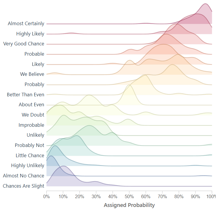
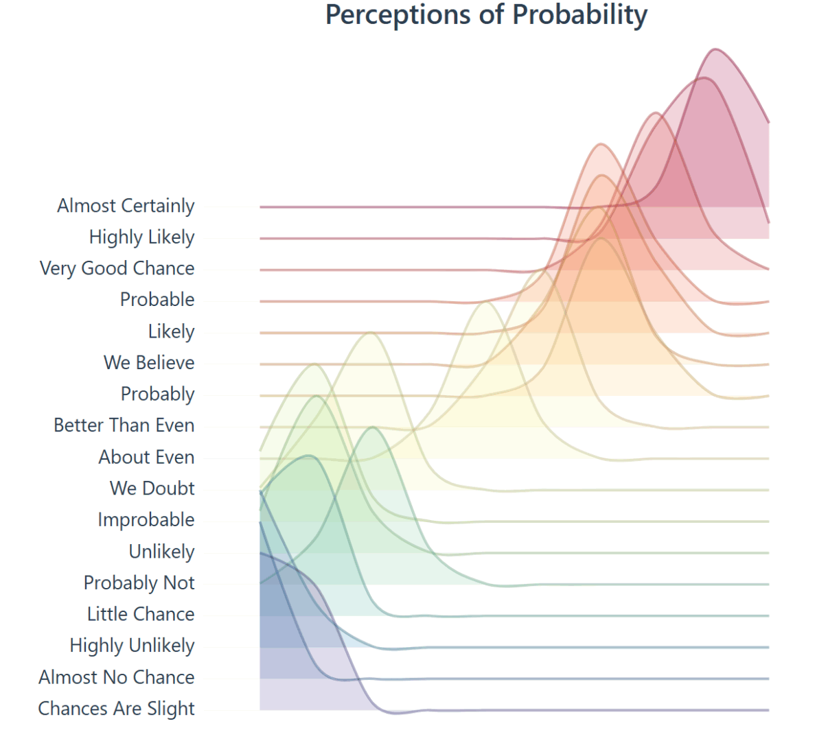
Lets explore the development and history of a ridgeline plot that shows the “Perceptions of Probability,” the curious world of data lovers, migrating data from CSV to JSON, building a visual using D3, dive into the complex history, and more.
Numbers behind the words.
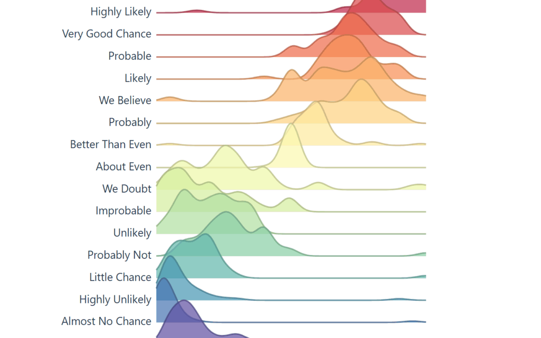
The raw data in our D3 chart came from /r/samplesize responses to the following question: What [probability/number] would you assign to the phrase “[phrase]”?source.
Note: An online community created a data source that resembles the same study the CIA completed, using 23 NATO officials, more on this below. Below you will see images created to resemble the original study, and the background of the data.
Within the CIA, correlations are noticed – studied – quantified and then later released publicly.
In the 1950’s, the CIA noticed something happening internally and created a study.
Before writing this article I did not realize how much content the CIA has released. Like the studies in intelligence, fascinating information here.
Our goal is research the history behind ‘Perceptions of Probability,’ find & optimize the data using ETL, and improve on the solution to ensure it’s interactive, and re-usable. The vision is we will be using an interactive framework like d3, which means JavaScript, html, and CSS.
For research, we will keep everything surface level, and link to more information for further discovery.
The CIA studied and quantified their efforts, and we will be doing the same in this journey.
Adding Features to the Perceptions of Probability Visual
Today, the visual below is the muse (created by a user on reddit) and we are grateful they have this information available to play with on their github. They did the hard part, getting visibility on this visual and gathering the data points.
This viz made the Longlist for the 2015 Kantar Information is Beautiful Awards *
When you learn about the Perceptions of Probability, you’ll see it’s often a screenshot because the system behind the scenes creates images (ggjoy package). Alternatively that’s the usual medium online, sharing content that is static.
A screenshot isn’t dynamic, it’s static and it’s offline, we can’t interact with a screenshot, unless we recreate the screenshot, which would require the ability to understand R, install R, and run R.
This is limiting to average users, and we wonder, is it possible to remove this barrier?
If we looked at this amazing visualization as a solution we can improve and make more adoptable, how would we optimize?
What if it could run online and be interactive?
To modernize, we must optimize how end users interact with the tool; in this case a visualization, and we do our best to remove the current ‘offline’ limitation. Giving this a json data source also modernizes it.
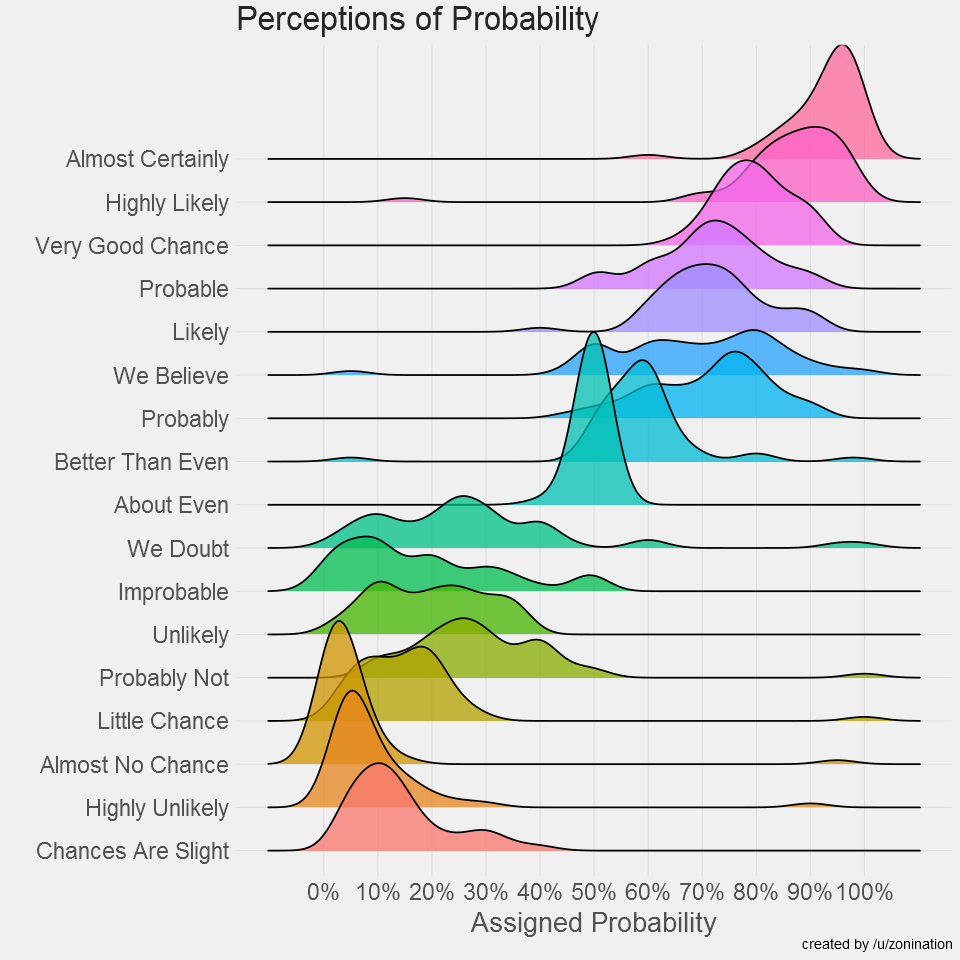
The R code to create the Assigned probability solution above;
#Plot probability data
ggplot(probly,aes(variable,value))+
  geom_boxplot(aes(fill=variable),alpha=.5)+
  geom_jitter(aes(color=variable),size=3,alpha=.2)+
  scale_y_continuous(breaks=seq(0,1,.1), labels=scales::percent)+
  guides(fill=FALSE,color=FALSE)+
  labs(title="Perceptions of Probability",
       x="Phrase",
       y="Assigned Probability",
       caption="created by /u/zonination")+
  coord_flip()+
  z_theme()
ggsave("plot1.png", height=8, width=8, dpi=120, type="cairo-png")
The code is used to manage the data, give it a jitter, and ultimately create a png file.
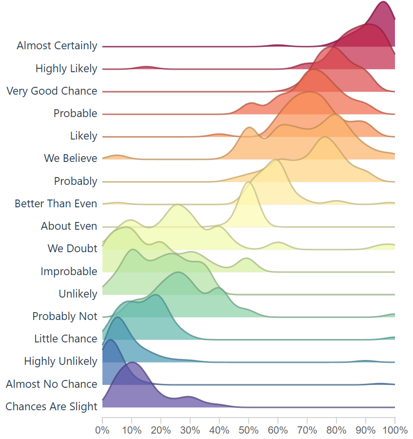
In our engineering of this solution, we want to create something that loads instantly, easy to use again, and resembles ridgelines from this famous assigned probability study. If we do this, it would enable future problem solvers another tool to solve, and then we are only 1 step away (10-30 lines of code) from making this solution accept a new data file.
The History on Estimative Probability
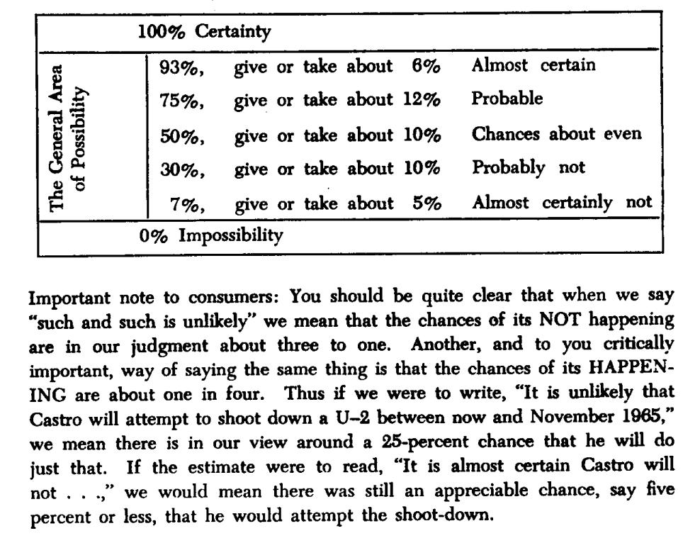
Sherman Kent’s declassified paper Words of Estimative Probability (released May 4, 2012) highlights an incident in estimation reports, “Probability of an Invasion of Yugoslavia in 1951.” A writeup on this was given to policy makers and their assumptions on what they read was a lower value than they had intended.
How long had this been going on? How often are policy makers and analysts not seeing the same understanding of a given situation? How often does this impact us negatively? Many questions come to mind.
There was possibly not enough emphasis on the text, or there was no such scoring system in place to explain the seriousness of a an attack. Even with the report suggesting there was a serious urgency, nothing happened. After some days past, in a conversation someone asked “what did you mean by “Serious Possibility?” What odds did you have in mind?
Sherman Kent, the first director of CIA’s Office of National Estimates, was one of the first to recognize problems of communication caused by imprecise statements of uncertainty. Unfortunately, several decades after Kent was first jolted by how policymakers interpreted the term “serious possibility” in a national estimate, this miscommunication between analysts and policymakers, and between analysts, is still a common occurrence.
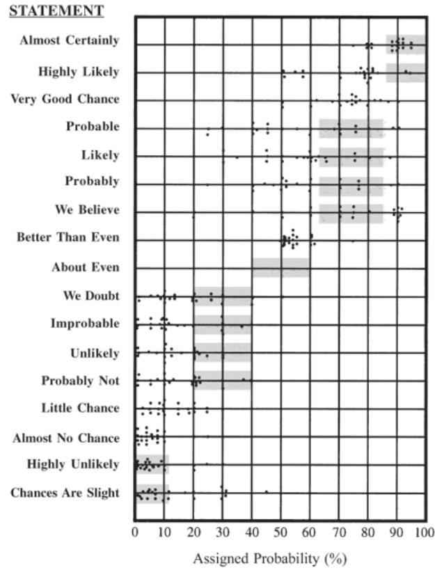
Through his studies he created the following chart, which is later used in another visualization, and it enables a viewer to see how this study is similar to the study created here. Used in a scatter plot below this screenshot.
What is Estimation Probability?
Words of estimative probability are terms used by intelligence analysts in the production of analytic reports to convey the likelihood of a future event occurring.
Outside of the intelligence world, human behavior is expected to be somewhat similar, which says a lot about headlines in todays news and content aggregators. One can assume journalists live by these numbers.
Text has the nature to be ambiguous.
When text is ambiguous, I like to lean on data visualization.
To further the research, “23 NATO military officers accustomed to reading intelligence reports [gathered]. They were given a number of sentences such as: “It is highly unlikely that..” All the sentences were the same except that the verbal expressions of probability changed. The officers were asked what percentage probability they would attribute to each statement if they read it in an intelligence report. Each dot in the table represents one officer’s probability assignment.” This quote is from the Psychology of Intelligence Analysis.pdf, Richards J. Heuer, Jr.
The above chart was then overlayed on this scatter plot, of the 23 NATO officers assigning values to the text. Essentially estimating likely hood an event will occur.
Survey score of 23 NATO officers who has a responsibility to read this kind of text. They scored the text based on likely hood the situation/event would take place (Page 155 * )
Modernizing the Perceptions of Probability
Over time people see data and want to create art. My artwork will be creating a tool that can be shared online, interactive, and open the door to a different audience.
Based on empirical observations in data visualization consulting engagement, you can expect getting access to data to take more time, and for the data to be dirty. Luckily this data was readily available and only required some formatting.
The data was found here on github, which is a good sample for what we are trying to create. The current state of the data is not prepared yet to create a D3 chart. This ridgeline plot chart will require JSON.
Lets convert CSV to JSON using the following python:
import pandas as pd
import json
from io import StringIO

csv_data = """Almost Certainly,Highly Likely,Very Good Chance,Probable,Likely,Probably,We Believe,Better Than Even,About Even,We Doubt,Improbable,Unlikely,Probably Not,Little Chance,Almost No Chance,Highly Unlikely,Chances Are Slight
95,80,85,75,66,75,66,55,50,40,20,30,15,20,5,25,25
95,75,75,51,75,51,51,51,50,20,49,25,49,5,5,10,5
95,85,85,70,75,70,80,60,50,30,10,25,25,20,1,5,15
95,85,85,70,75,70,80,60,50,30,10,25,25,20,1,5,15
98,95,80,70,70,75,65,60,50,10,50,5,20,5,1,2,10
95,99,85,90,75,75,80,65,50,7,15,8,15,5,1,3,20
85,95,65,80,40,45,80,60,45,45,35,20,40,20,10,20,30

"""  # paste your full CSV here

# Load CSV
df = pd.read_csv(StringIO(csv_data))

# Melt to long format
df_long = df.melt(var_name="name", value_name="y")
df_long["x"] = df_long.groupby("name").cumcount() * 10  # create x from row index

# Group by category for D3
output = []
for name, group in df_long.groupby("name"):
    values = group[["x", "y"]].to_dict(orient="records")
    output.append({"name": name, "values": values})

# Save JSON
with open("joyplot_data.json", "w") as f:
    json.dump(output, f, indent=2)

print("✅ Data prepared for joyplot and saved to joyplot_data.json")
With data clean, we are a few steps closer to building a visual.
Using code from a ridgeline plot, I created this density generator for the ridgeline to show density. This enables us to look at dense data, and plot it across the axis.
// Improved KDE-based density generator for joyplots
function createDensityData(ridge) {
    // Extract the raw probability values for this phrase
    const values = ridge.values.map(d => d.y);

    // Define x-scale (probability axis: 0–100)
    const x = d3.scaleLinear().domain([0, 100]).ticks(100);

    // Bandwidth controls the "smoothness" of the density
    const bandwidth = 4.5;

    // Gaussian kernel function
    function kernel(u) {
        return Math.exp(-1 * u * u) / Math.sqrt(2 * Math.PI);
    }

    // Kernel density estimator
    function kde(kernel, X, sample, bandwidth) {
        return X.map(x => {
            let sum = 0;
            for (let i = 0; i < sample.length; i++) {
                sum += kernel((x - sample[i]) / bandwidth);
            }
            return { x: x, y: sum / (sample.length * bandwidth) };
        });
    }

    return kde(kernel, x, values, bandwidth);
}
This ridgeline now closely resembles the initial CIA tooling rebuilt by the github user.
We have successfully created a way to create density, ridgelines, and in a space that can be fully interactive.
Transparency is a setting so here’s the lower setting.Here’s a different transparency setting: .attr(‘fill-opacity’, 0.7)
Not every attempt was a success: here’s an index based version. Code below. This method simply creates a bell-shape around the most dense area, which does enable a ridgeline plot.
// Create proper density data from the probability assignments
function createDensityData(ridge) {
// The data represents probability assignments, we need to create a density distribution
// around the mean probability value for each phrase

// Calculate mean probability for this phrase
const meanProb = d3.mean(ridge.values, d => d.y);
const stdDev = 15; // Reasonable standard deviation for probability perceptions

// Generate density curve points
// Density Generation Resolution
const densityPoints = [];
for (let x = 10; x <= 100; x += 10) {
// Normal distribution density
const density = Math.exp(-3 * Math.pow((x - meanProb) / stdDev, 2));
densityPoints.push({ x: x, y: density });
}

return densityPoints;
 }
There’s a bit of fun you can have with the smoothing of the curve on the area and line. However I opted for the first approach listed above because it gave more granularity and allowed the chart to sync up more with the R version.
This density bell shape curve producer could be nice for digging into the weeds and cutting out potential density around the sides, in my opinion it didn’t tell the full story, but wanted to report back as this extra area where we adjust the curve was fun to toy with and even breaking the visual was pleasant.
YIn today’s rapidly evolving era of artificial intelligence, businesses evolve at the pace their data flows. Machine learning (ML) models unlock unprecedented opportunities for innovation and growth. Yet their black-box nature often leaves executives and stakeholders grappling with uncertainty and doubt. How can organizations navigate these turbulent waters and establish a clear, confident line of sight into complex ML systems? The answer lies in leveraging advanced visualization strategies engineered specifically to demystify model inner workings, enhance interpretability, and foster a culture of trust through clear data communication.
The Importance of ML Model Interpretability in Business Decision Making
Data-centric decision-making structures have emerged as an integral determinant of corporate success. However, many proprietary machine learning algorithms can feel opaque, delivering predictions without insight into the processes behind them. This opacity frequently leads to hesitation among stakeholders and hampers business agility. Prioritizing ML model interpretability is now vital—an interpreter between human decision-makers and automated processes. Advanced visualization techniques empower decision-makers, highlighting key variables, model sensitivities, and areas for improvement.
Consider fields where choices have significant stakes—finance, medical diagnostics, or supply chain optimization—where understanding model behaviors provides a strategic advantage. A clear visualization uncovers otherwise hidden connections or influences that directly impact business metrics. Visualization-driven interpretability heightens trust across technical and non-technical roles, facilitating stakeholder alignment and collaborative data literate decision making. Our experience assisting clients through every step of powerful visual interpretations consistently demonstrates measurable benefits in contextually comprehending model outputs. For businesses seeking analytical precision in database interactions, integrating insights into analytics workflows via MySQL consulting services can establish robust data foundations that naturally complement interpretability efforts.
Popular Methods and Techniques in Visualization for Model Interpretability
Interpretability visualizations come in multiple shapes, each tailored to specific use cases or model structures. Familiarity with leading techniques allows decision-makers and analysts to leverage visual assets effectively. Some of the most widely implemented visualization techniques include partial dependence plots, SHAP values, LIME explanations, feature importance graphs, and honestly-crafted decision trees.
Partial dependence plots offer intuitive views into model decisions related to particular predictor variables, while SHAP and LIME visualizations quantify each feature’s impact on individual predictions, creating visual stories behind results. Feature importance charts provide strategic insights into model relevancy hierarchies, assisting stakeholders prioritizing feature development or remediation strategies. Decision trees and their visualized variants elucidate decision-making logic, especially valuable when outlining scenarios clearly during executive briefings.
Incorporating these visual strategies into your analytics stack optimizes decision-making clarity. Notably, businesses dealing with complex SQL-driven analyses can amplify their interpretative oversight by integrating visualization with advanced filtering like that demonstrated in our guide to mastering the SQL BETWEEN operator.
The leap towards interactive analytics goes beyond static plots, embracing dynamic interfaces where stakeholders explore predictions in real-time. Interactive visualizations offer the ability to interact seamlessly with complex data flows, extract context-relevant details, explore alternative input scenarios, and immediately see changes reflected visually. Complex datasets often produce cognitive load—learn our recommendations for simplifying these complexities by designing for cognitive load in data displays.
Sophisticated visualization tools allow interactive visual navigation—sliders, drill-downs, hover detail panels—enabling professionals to interrogate data more intuitively. This innovation drives transparency, enabling real-time stakeholder alignment and informed tactical responses in an era where competitive advantage stems from rapid interpretative agility.
Bridging the Gap: Visualization-Driven Communication Between Data Teams and Executives
Data communication remains central to ensuring interpretability efforts reach the stakeholders who need clarity the most—executives and leadership teams. Visualization promotes understanding and narrative-building between analytics teams and business decision-makers. Given executives’ busy schedules and strategic priorities, concise yet insightful visualizations help data scientists effectively articulate model accuracy, strengths, weaknesses, and impact.
Strategically, visualization acts as a powerful language, crystalizing abstract modeling concepts into scenarios executives comfortably manage. For example, visual scenario modeling of ETL vs ELT data workflows provides clarity and aligns strategies—we offer examples illustrating why companies choose ELT in our blog detailing the real-world cases where ELT outperforms ETL. At its core, effective visualization-driven communication fortifies trust and facilitates better-informed strategic actions, making complex data insights universally approachable and actionable.
The Role of Data Governance and Visualization-Driven Model Auditing
Effective data governance policies underpin data visualizations and model interpretability, ensuring legitimacy, transparency, and end-to-end trust within organizations. Poor governance can result in fragmented views across an organization, creating dangerous data silos which undermine decision making—learn quickly by reviewing our comprehensive guide to identifying data silos holding your business back. Data governance sets the foundation for consistent methodologies, streamlined insights, and optimized, traceable visualizations critical for ML interpretability.
Visualization-driven auditing actively engages governance practices, allowing stakeholders regular assessments on model drift, deprecated features, and underlying data quality issues. Advanced visualizations timely reveal problems to prevent inaccurate assumptions and strengthen cross-team communication to quickly enact necessary corrections. Learn how stakeholders gain transparent views into high-impact changes by proactively detecting data field deprecation signals and notifications through visually oriented methodologies.
Language-Aware Visualizations: Ensuring Global Communication
In international organizations, language handling in data visualization can significantly impact ML interpretability. Visualization tooling should also support linguistic inclusivity, accurately representing regional context variations. Our article exploring custom collators for language-aware data processing outlines effective global localization and natural language analytics techniques designed explicitly for global business demands. Language-aware strategies promote global trust and clarity, enhancing visual communication efforts beyond linguistic barriers.
Practical Implementation: Integrating Visualization Tools into Business Analytics Workflows
Savvy organizations invest in visual analytic environments to guarantee sustained analytics-driven advantage. Modern ML frameworks readily accommodate powerful third-party visualization tools that seamlessly integrate into large-scale analytics workflows. Tools such as Tableau, Power BI, and custom-built Python or R visualization stacks give ample choice. Clear documentation, workflow integration, and a well-organized data pipeline make visualization a seamless and impactful step rather than a complication.
Stakeholders commonly face challenges incorporating advanced visualizations into legacy or standalone analytical workflows. Evaluating when to implement proprietary visualization mechanisms—like embedding a customized sparkline for performance tracking—is critical. Reference our comprehensive approach to creating insightful sparkline charts in Tableau Desktop effectively, adding quick, compact visual indicators to analytical presentations. Optimized development practices enable interpretability without burdening existing pipelines, balancing innovation with integration.
Looking Forward: Innovation and the Future of ML Visualization-Driven Interpretability
The role of advanced visualization in ML interpretability is expanding quickly, driven by rapid innovation, improving computational hardware, and increased visualization literacy in organizations. Robust, AI-driven tooling makes sophisticated visuals increasingly accessible to analysts, and executive stakeholders can interpret dynamic visualizations even as data and complexity increase exponentially.
Future innovators should focus on streamlining visualization workflows, utilizing augmented and virtual reality solutions, quantum computing visualization integrations, and real-time dashboards powered by automated ML interpretability models. Staying ahead of these trends positions organizations to maintain agile, trusted, interpretative ownership of modeling processes and proactively navigates challenges inherent in increasingly complex data realities.
By continuing to adopt advanced visualization techniques, organizations prepare themselves to approach ML investments strategically—demonstrating confidently to stakeholders that models enhance human understanding rather than obscure it.
Imagine analyzing massive data landscapes with just the power of your voice, commanding advanced analytical processes to deliver insights instantly, intuitively, and seamlessly. Voice-activated data exploration is no longer a futuristic fantasy—it’s rapidly becoming the new standard for data analytics. As organizations race toward digital maturity, adopting hands-free analytics empowers users, fosters accessibility, and significantly improves workflow efficiency. This powerful convergence of natural language processing (NLP) technologies and data analytics tools reshapes how professionals interact with information. As businesses aspire to make data-driven decisions faster and smarter, embracing voice-controlled data exploration unlocks agility, reduces operational friction, and transforms traditionally tedious analytics tasks into effortless conversations. Welcome to the era of conversational analytics, where innovation speaks louder than ever, empowering you to ask, analyze, and act faster than previously possible.
The Rising Need for Voice-Activated Analytics
The explosive growth of data volume and complexity has created a pressing urgency for innovative analytical methods that streamline data access and interpretation. Modern enterprises regularly engage with extensive data lakes, cloud databases, and diverse data warehouse architectures that demand speed, accuracy, and productivity. Yet, the traditional analytic methods often involve repetitive mouse clicks, endless manual queries, or complex scripting—methods incompatible with the speed of business today. Enter voice-activated analytics solutions, a fresh technological approach leveraging conversational AI and NLP to simplify data interactions dramatically.
The shift toward conversational analytics resonates with current market trends, driven by increased digital accessibility and a generational embrace of voice-enabled technologies. Millennials and Gen Z, already comfortable using virtual assistants for tasks, naturally expect seamless interactions with data systems at work. Moreover, businesses increasingly prioritize accessibility, aiming to democratize data use across skill levels and roles, thereby improving operational agility across the organization.
Implementing advanced Tableau consulting services combined with conversational analytics capabilities can propel organizations toward success. The ease of just speaking your queries empowers everyone from executives to frontline staff with accessible, actionable insights—consistently reducing barriers to data intelligence and boosting user confidence and engagement.
Technologies Powering Voice-Driven Data Exploration
Voice-activated analytics relies heavily on several core technological components. Natural language processing (NLP), a subset of artificial intelligence (AI), is paramount for making sense of spoken command inputs. NLP algorithms decipher spoken queries and translate speech patterns into structured queries that can interact seamlessly with traditional data pipelines or contemporary data frameworks.
Moreover, voice-driven analytics integrates closely with advanced data engineering practices and architectures. Organizations transitioning from traditional ETL processes may substantially enhance performance and accessibility by integrating conversational interfaces. Embracing modern methodologies, including components described in modern data engineering practices, opens up new opportunities for businesses seeking dynamic, real-time interactions with datasets. The backbone of any successful conversational analytics initiative lies firmly within robust, optimized data infrastructures like query mesh optimization and routing techniques, a fundamental strategy for ensuring responsive, reliable experiences at scale.
With backend infrastructures streamlined, organizations operate interactive, voice-driven environments capable of providing consistent speed and accurate responses. Such architectures allow stakeholders to effortlessly query limited or extensive data volumes. Thus, using voice commands to perform rapid tasks, such as quickly retrieving results through optimized database commands like SELECT TOP statements in SQL, saves many hours of manual searching, enabling teams to spend more of their precious time making strategic business decisions.
The Benefits of Hands-Free Analytics for Enterprises
Introducing conversational analytics to organizations generates extensive operational, strategic, and competitive advantages. First and foremost, enhanced accessibility and ease of use enable non-technical users to work effectively in complex analytical frameworks. Executives can bypass administrative bottlenecks, analysts can rapidly prototype data queries, and customer-facing personnel can leverage advanced analytics without coding or intensive training. Consequently, voice-activated analytics dramatically expands organizational data literacy and encourages wider analytical participation.
Furthermore, hands-free interaction facilitates improved productivity. Without the hindrances of intricate manual processes, teams solve problems more dynamically, revealing previously hidden operational efficiencies. From sustainability improvements within local urban environments to optimizing data-driven decision-making, organizations equipped with voice interaction capabilities effortlessly leverage data analytics to drive sustainability and other strategic initiatives—unlocking innovation potential company-wide.
Adopting voice-enabled analytics also reduces repetitive strain and digital fatigue among workers, mitigating traditional workplace drawbacks. The potential for smoother workflow fostered by minimal tool engagement ultimately contributes to higher employee satisfaction, positive organizational culture, and better retention rates. It’s fair to say voice-activated analytics can quickly move from novelty into outright necessity, equipping companies to respond swiftly to market changes and competitive pressures.
Navigating Challenges: Data Privacy, Ethics, and Regulatory Compliance
Despite the significant upsides, introducing new technology always involves risks and unique challenges—particularly related to data security, privacy, and regulatory compliance. Voice recognition inherently generates vast quantities of speech data, potentially involving sensitive personal insights or strategically important business information. Thus, businesses leveraging this technology must carefully implement rigorous security protocols and safeguarding measures to protect their data assets and their employees’ voices from unauthorized exploitation.
Additionally, as businesses explore voice-activated analytics, it’s imperative to stay ahead of privacy standards and ethical practices. Understanding evolving data ethics is crucial, given growing regulatory scrutiny across industries worldwide. Organizations must proactively assess and adhere to compliance measures regarding data protection, retention, bias management, transparency, and consent. Deliberate strategies like keeping abreast of future data regulations and privacy standards mitigate substantial risks associated with voice-driven technologies.
Furthermore, practical implementations require robust processes for data validation and risk prevention. Comprehensive security strategies must include protocols around appropriate data archiving approaches, and implementing robust data deletion verification and certification processes can help safeguard against unintended data exposure or compliance issues. Maintaining best practices in data management ultimately helps organizations confidently leverage voice-activated analytics without encountering unforeseen complications.
Preparing Your Organization for Voice-Activated Analytics
While technology-driven initiatives like voice-activated analytics may sound inherently futuristic, businesses can prepare today for seamless future adoption. First, executives should identify gaps in current data engineering strategies and actively pivot toward a skill-building environment. Guiding talent development, training, and reskilling opportunities toward data engineering skills ensures a robust professional pipeline ready to handle forthcoming data-driven conversational interfaces. Businesses should focus intentionally on building a data engineering career path, enhancing team readiness at every level.
Additionally, companies should proactively transition their legacy data architectures from cumbersome, script-dependent systems toward modern, efficient, and maintainable designs. Adopting declarative methodologies such as declarative data transformations can make data infrastructures vastly more adaptable to new technologies, like voice-activated analytics, enabling smoother integration and reduced downtime.
Voice-activated analytics isn’t merely the future—it’s the now. Organizations positioned wisely for hands-free exploration of information can differentiate themselves by enhancing fast decision-making, widening data literacy, and fortifying competitive advantage. The success of conversational analytics initiatives depends on strategic investments and technical foresight. Partnering with experts like Dev3lop ensures your business leverages data-driven, voice-enabled innovation effectively and confidently.
Imagine standing on a bustling factory floor, peering through your AR goggles and instantly seeing vital production data floating seamlessly next to each machine. Glancing at a warehouse aisle, you effortlessly access real-time inventory status hovering right alongside stacked pallets, directing immediate actions and streamlining operations. Augmented reality dashboards are no longer science fiction—they’ve rapidly emerged as a powerful tool for transforming transparency, collaboration, and decision-making across manufacturing, supply chain, energy, logistics, and field service sectors. They present a compelling vision: seamlessly merging digital insight into real-world perspectives to significantly enhance operational efficiency, situational awareness, and strategic responsiveness. Today, forward-thinking organizations are embracing augmented reality as a key component of their digital transformation journey, combining advanced analytics, intuitive visualization, and strategic innovation to unlock groundbreaking advantages. Let’s explore the exciting landscape of AR-enabled data dashboards—why they’re valuable, how they’re utilized, and the ambitious possibilities they’re creating across industries.
What are Augmented Reality Dashboards and Why Do They Matter?
Augmented reality dashboards are a cutting-edge approach to data visualization that projects analytical insights directly into the real-world environments where decisions are made. Unlike traditional dashboards displayed on desktops or mobile devices, AR dashboards overlay crucial context-aware information onto physical objects and surroundings. Utilizing advanced lenses, smart glasses, tablets, or other AR-enabled devices, users can visualize operational performance statistics, sensor readings, KPIs, resource allocation statuses, and even predictive analytics within their immediate context. This fusion of data and physical spaces dramatically reduces cognitive load and allows operators, technicians, and decision-makers to instantly comprehend complex scenarios and respond with greater speed and confidence.
The transformative potential lies in the immediacy and relevance offered by AR overlays. Operators no longer need to cross-reference screens—they can directly perceive information aligned in real-time with their field view, significantly streamlining workflows. Such capabilities not only make operations safer and more productive but also pave the way for proactive decision-making, optimal resource utilization, and enhanced collaboration across teams. For instance, a maintenance technician can wear AR glasses to visualize historical maintenance logs and predictive alerts right beside a physical asset, swiftly identifying and addressing potential breakdowns before they occur. Consequently, businesses adopting these innovations are well-positioned to secure a powerful competitive advantage: the ability to make smarter, informed decisions right in the moment.
Revolutionizing Operational Efficiency with Context-Specific Analytics
Today’s operational landscapes involve increasing complexity—diverse physical assets, logistics intricacies, and sophisticated workflows that require rapid situational awareness to manage effectively. AR dashboards play a crucial role in this context, delivering data precisely where it’s needed the most. By embedding analytics insights directly onto physical spaces, businesses gain advanced capabilities in resource allocation and production planning efficiency. Employees can intuitively perceive which machines are running optimally, which inventories need replenishment, and where production bottlenecks may occur—helping teams proactively orchestrate smoother operations and minimize unnecessary downtime.
Furthermore, AR-driven visualizations simplify interpreting complex data, allowing users across various skill levels to harness the full power of analytics. Managers and technicians alike benefit from seeing contextualized KPIs and operational alerts naturally superimposed within their immediate environment. For example, warehouses equipped with AR dashboards allow forklift operators to immediately visualize optimal travel paths and real-time inventory stock levels overlaid on pallet locations, accelerating order completion times and improving accuracy. Similarly, by applying self-healing data pipelines with circuit breaker patterns, organizations can ensure continuous, reliable data feeds into their AR environments, supporting robust, uninterrupted decision-making.
AR Dashboards Powered by Cutting-Edge Data Integration and Engineering
The effective implementation of augmented reality dashboards into operational contexts depends heavily upon advanced data management practices and mature integration capabilities. This is where sophisticated data engineering consulting becomes indispensable. AR dashboards must seamlessly integrate data from various sources—IoT sensors, enterprise databases, remote field devices, analytics platforms—to deliver reliable, timely context-specific visuals. Quality data integration ensures seamless, cohesive experiences for AR users, facilitating confident, accurate decision-making.
Leveraging innovative methodologies like data contract-driven development, organizations align data deliverables carefully across business and technical stakeholders. Moreover, strategically architecting data pipelines with human-in-the-loop design patterns ensures that AR dashboards include validated, verified information—keeping crucial operational insights consistent and trustworthy. In essence, sophisticated data engineering ensures AR solutions serve decision-makers dedicated to optimizing operations rather than becoming an additional burden on resources. The seamless connection between physical reality, digital insights, and responsive operational actions is fundamental to realizing the full promise of augmented reality dashboards in business environments.
Enhancing Strategic Decision-Making with Immersive Data Visualization
AR dashboards not only impact daily operations but empower strategic decision-making through innovative visualization methods. For instance, Non-Euclidean visualization techniques within augmented reality environments allow leaders to intuitively understand complex network dependencies and constraints. By physically walking through a manufacturing line with AR overlays highlighting dependencies and bottlenecks, executives can grasp abstract concepts in tangible ways, supporting quicker, more insightful strategic choices.
Likewise, utilizing AR to visualize market trend analysis can enhance demand forecasting accuracy by overlaying detailed trend insights directly into retail spaces or product stocking areas. AR dashboards translating sophisticated analytic reports into intuitive visual narratives—capitalizing on concepts like market trend analysis for demand forecasting—enable decision-makers to rapidly internalize key insights, bridging data literacy gaps among interdisciplinary leadership teams.
The convergence of advanced visualization approaches, including narrative visualization techniques for data storytelling, further enhances strategic communications. Augmented reality dashboards allow analysts and strategists to present compelling data-driven narratives directly within real-world contexts, making information genuinely impactful and memorable to stakeholders.
AR Dashboards in the Real World: Practical Industry Applications
Industries are swiftly embracing AR dashboard solutions into their digital transformation roadmaps. Manufacturing enterprises have dramatically improved productivity with operations teams visualizing machine health analytics directly on equipment. In logistics, AR dashboard overlays support warehouse workers by providing precise visual guidance, navigation aids, and immediate inventory visibility, enhancing efficiency and accuracy.
Field services companies integrate AR dashboards to instantly display maintenance data, failure risks, and historical records, dramatically reducing repair turnaround times. Similarly, energy, construction, and resource-based industries effectively deploy AR-driven visual controls, ensuring safe, efficient working conditions by providing immediate visibility into hazardous situations, pipeline statuses, or structural integrity.
Companies actively investing in digitally-enabled experiences, as discussed in depth upon the launch of our revised website (see announcement here), gain considerable competitive positioning through innovation-led differentiators. Wherever accurate, timely information is crucial to operational performance, AR dashboards represent a transformative, forward-looking solution that integrates intelligence and action seamlessly into everyday business workflows.
Future Vision & Strategic Recommendations for Adopting AR Dashboards
Now is the time for leaders across sectors to strategically evaluate how augmented reality dashboards can optimize their operational workflows, improve decision-making, and accelerate purposeful innovation. Start by clearly identifying specific business processes and workflows that would benefit from immediate, context-specific data overlays—areas of complexity where real-time insights are crucial for efficiency gains.
From here, engaging the right expertise in data analytics and engineering consulting helps ensure reliable, accurate, and actionable AR solutions. Investing in foundational practices like robust data engineering strategies and trusted data integrations will empower your AR dashboard platforms—and your teams—to succeed. By thoughtfully adopting augmented reality dashboards, organizations position themselves to proactively shape their operational future, driving sustained growth through technology-driven competitive advantages.
Imagine visualizing the invisible, tracing the paths of transactions that ripple across global networks instantly and securely. Blockchain transaction visualization unlocks this capability, transforming abstract data flows into clear, navigable visual stories. Decision-makers today face an urgent need to understand blockchain activity to capture value, enhance regulatory compliance, and make strategic decisions confidently. By effectively mapping distributed ledger transactions, businesses can gain unprecedented transparency into their operations and enjoy richer analytic insights—turning cryptic ledger entries into vibrant opportunities for innovation.
Understanding Blockchain Transactions: Insights Beyond the Ledger
Blockchain technology, known for its decentralized and tamper-resistant properties, carries tremendous potential for transparency. Each blockchain transaction is a cryptographically secure event stored permanently across multiple distributed nodes, building an immutable ledger. Yet the inherent complexity of transactions and the vast scale of ledger data present substantial challenges when extracting meaningful insights rapidly. Here, visualization emerges as an essential approach to simplify and clarify blockchain insights for strategic understanding.
By leveraging effective visualization techniques, stakeholders can examine intricate transaction relationships, pinpoint high-value exchanges, and uncover patterns indicative of market behaviors or fraudulent activities. When decision-makers grasp the flow of resources through intuitive visual interfaces, it elevates their strategic decision-making ability exponentially. Using innovative analytical tools and methodologies specifically designed for blockchain, businesses can quickly transform distributed ledger complexity into actionable intelligence, thus generating concrete business value from distributed insights.
At Dev3lop, our expertise in Node.js consulting services helps integrate robust visualization systems seamlessly into cutting-edge blockchain analytics workflows, enhancing the speed and precision of strategic decision-making across your organization.
Choosing the Right Visualization Techniques for Blockchain Data
Not every visualization approach works effectively for blockchain data. Optimal visualization demands understanding the specific nature and purpose of the data you’re analyzing. Transaction maps, heat maps, Sankey diagrams, network graphs, and even contour plot visuals—like the ones we’ve explained in our blog on contour plotting techniques for continuous variable domains—offer tremendous analytical power. Network graphs illustrate complex relationships among addresses, wallets, and smart contracts, allowing analysts to recognize influential nodes and assess transactional risk accurately.
Sankey diagrams, in particular, can visualize resource movements across crypto platforms clearly, allowing stakeholders to instantly grasp inflows and outflows at multiple addresses or distinguish between factors influencing wallet activities. Heat maps enable stakeholders to detect areas of high blockchain usage frequency, easily identifying geographic or temporal transaction trends. Creating the right visualization structure demands strategic thought: are stakeholders most interested in confirming transaction authenticity, systematic fraud detection, monitoring compliance adherence, or understanding market dynamics?
The strategic alignment with visualization type and analytics goal becomes pivotal. For organizations managing constrained data resources, our blog post about prioritizing analytics projects with limited budgets provides valuable strategic guidance to ensure investments align powerfully with organizational outcomes.
Enhancing Fraud Detection and Security through Visual Analytics
Security and fraud prevention rank as top priorities for blockchain users, particularly for enterprises integrating distributed ledger technology into critical business processes. Transaction visualization significantly strengthens the effectiveness of security measures. Identifying suspicious transactions quickly and easily through visual analysis reduces organizational risk and saves resources otherwise dedicated to manual investigative processes. Patterns and outliers revealed via visualization highlight transactions with unusual transfer volumes or repeated activity from suspicious sources clearly.
Furthermore, visual analytics tools powered by Node.js solutions can be implemented for tracking blockchain events in real-time, supported by platforms well-suited for processing large data streams. Adopting effective processing window strategies for streaming analytics, as described in our published insights, positions analytics teams to detect fraudulent irregularities rapidly in live transactional datasets.
Visualization also aids regulatory compliance by enabling comprehensive chain-of-custody insights into funds traveling across dispersed networks. Enterprises can track compliance adherence visually and share transparent reports instantly, dramatically improving trust and accountability across complex digital ecosystems.
Real-time blockchain monitoring represents the future of strategic blockchain visualization within analytics frameworks. Decision-makers require immediate accuracy and clarity when evaluating distributed ledger activities, and advanced visualization methods make this possible. Real-time dashboards employing sophisticated data querying frameworks, like utilizing efficient SQL operators we detailed in efficient filtering of multiple values using the SQL IN operator, equip analysts with live transaction feeds represented visually. Instantaneous visualization helps businesses react quickly to dynamic market shifts or regulatory requirements.
Enabling real-time monitoring demands powerful, reliable infrastructure and streamlined data movement: as we’ve previously demonstrated by helping businesses send Sage API data to Google BigQuery, robust integration services provide stable platforms for scalable blockchain analytics. Engineers adept at big data analytics and cloud environments, outlined further in our article on hiring engineers focused on improving your data environment, bolster your analytics strategy by constructing streamlined analytics pipelines that instantly bring blockchain insights from decentralized nodes to decision-maker dashboards.
Navigating Global Complexity: Visualization at Scale
Blockchain systems inherently span multiple global locations, creating complexities inherent to distributed operations, transaction timing, and location-specific analytics needs. Decision-makers managing cross-border blockchain applications encounter issues in comparing and analyzing transaction timestamps consistently—a challenge we covered extensively in our post about handling time zones in global data processing.
Effective blockchain visualization reconciles these global complexities by offering intuitive visual representations, synchronizing time zones dynamically, and presenting coherent perspectives no matter how wide-ranging or globally dispersed the data may be. Platforms capable of intelligently aggregating data from geographically decentralized blockchain nodes enhance reliability, speed, and clarity, thereby minimizing confusion across global teams.
Seamless integration between visual analytics and global blockchain systems ensures businesses stay competitive in international arenas, confidently interpret cross-border ledger activities, and leverage blockchain data effectively in their strategic decision-making processes.
Leveraging Blockchain Visualization for Competitive Advantage
With sophisticated blockchain transaction visualization in place, organizations achieve unprecedented strategic clarity and operational insight—unlocking significant competitive advantages across marketplaces. Visualizing your distributed ledger data enhances forecasting accuracy, identifies customer segments clearly, and reveals new business opportunities. We’ve detailed similar strategies previously in our article illustrating how market basket analysis helps identify complementary products.
Visualization also serves as a powerful communication tool internally. Translating blockchain data into visually comprehensible insights, even non-technical executives quickly grasp previously obscure ledger trends. This boosts organizational agility, expedites data-driven responses, and helps organizations position themselves expertly for market leadership.
Strategic decision-making fueled by clear blockchain data visualizations drives lasting innovation, operational efficiency, and robust competitive performance. Leaders who embrace blockchain transaction visualization pledge their organization toward greater transparency, sustained innovation, and unwavering growth potential in an increasingly blockchain-centric economy.
From strategy definition through visualization execution at Dev3lop, our expertise bridges the gap between industry-defining analytics insight and blockchain’s transformative power, ensuring your organization leads confidently through a digitally decentralized future.
Predicting future trends has long captivated human imagination—from ancient astronomers mapping celestial paths to today’s financial experts forecasting markets. Yet, while accurate time series forecasting is critical, communicating these predictions comprehensively through visualization is equally essential. Businesses drowning in data often lack clarity, preventing decision-makers from turning insights into strategic actions. As we collectively harness the power of forecasted analytics, turning intricate data sets into understandable, visually engaging presentations becomes a strategic advantage. Here, we explore why effective visualization matters for time series forecasting and share best practices for transforming complex predictions into visually compelling and actionable insights.
Why Visualization Matters in Time Series Forecasting
Time series forecasting isn’t merely about generating predictive algorithms. It’s equally important that these forecasted insights are digestible, actionable, and comprehensible by stakeholders across all organization layers. Without effective visualization, even the most sophisticated predictive models remain inaccessible, weakening their strategic impact. Great visualizations allow for quicker, more intuitive interpretation of complex predictions. They uncover hidden patterns, expose potential risks, and vividly illustrate trends that might otherwise remain unnoticed. Leaders don’t have the luxury of sifting through raw numeric outcomes—they need insights fast, confidently, and clearly.
Visualization significantly enhances data storytelling capabilities. It helps bridge gaps between technical experts who develop models and stakeholders responsible for strategic decisions, fostering open dialogue and ensuring alignment. Additionally, robust visualization supports transparency and accountability, an increasingly vital aspect amidst growing debates about the finance industry’s reliance on data.
Moreover, intuitive visualization scenarios empower teams across all departments to participate actively in analytics-driven decisions. Turning complex predictions into visuals not only democratizes data-driven decision-making but ensures that critical insights don’t remain hidden or misunderstood.
Essentials of Effective Time Series Visualization
Crafting visualizations for forecasting involves more than plotting data points and trend lines. Effective time series visualization demands strategic thinking, clear storytelling, and a nuanced understanding of visual encoding principles. One foundational aspect of effective visualization involves selecting the right visual encoding channels. According to principles we’ve outlined previously in our analysis of visual encoding channels effectiveness hierarchy, visuals must precisely convey the intended data relationships and trends clearly and intuitively.
Another critical element involves highlighting uncertainty clearly and transparently. Uncertainty visualization helps stakeholders understand the forecast’s confidence levels and buffer their strategic decisions accordingly. Techniques like shaded regions, confidence intervals, or uncertainty cones add nuance without overwhelming the viewer. An effective visualization strategy doesn’t shy away from uncertainty; it communicates it explicitly, bridging analytical reality with leadership expectations.
Likewise, temporal context is crucial. Clearly identifying major events or changes within your forecast timeline boosts comprehension and explanatory power. Strategic annotation and well-tailored labeling provide visual context that enriches the viewer’s experience, reducing ambiguity and enhancing clarity—especially important across competitive sectors with large volumes of interwoven data sets.
Static visualizations have historically been the norm; however, today’s leaders demand more dynamic data representation. Interactive visualization moves beyond mere static images, permitting users to explore data actively, hover for additional details, zoom into specific predictions, or filter by relevant dimensions. Applying advanced filtering techniques, such as those we’ve explored thoroughly in our guide on effectively leveraging the SQL BETWEEN operator, further improves your visualization’s accessibility and ease of use.
Implementing interactive visualizations is beneficial for teams needing layers of insights from the same data source. Interactive visuals encourage exploration, discovery, and active intellectual engagement, unlike passive viewing experiences. Real-time data manipulation also assists decision-makers in generating personalized actionable insights, significantly improving overall analytical coherence across the entire organization.
Furthermore, interactivity promotes transparency and openness, allowing analysts to illustrate precisely how different assumptions or parameters influence forecasts. This level of openness enriches corporate discussions and decision-making processes, making your forecasting efforts understandable and strategic. Interactive dashboards empower executives with the versatility normally afforded only to technical experts and data analysts, democratizing analytics use and fueling better decisions.
Innovative Visualization Approaches to Boost Time-Series Comprehension
Visualization innovations increasingly push the boundaries of perception, comprehension, and predictability mastery. Embracing powerful next-gen methods like semantic embeddings elevates visualizations so that they’re meaningful and aligned with business narratives. In our recent exploration of semantic embeddings for business intelligence, we’ve learned that employing semantic relationships can revolutionize how executives perceive and understand predictive visuals.
Another exciting visualization innovation involves geo-temporal visualizations, such as cartograms that transform spatial projections to vividly represent prediction impacts geographically. As demonstrated in our article outlining cartogram implementations for geospatial data distortion, reshaping map visualizations makes geospatial forecasts clearer, richer, and immensely impactful across territories and markets.
Additionally, leveraging differentiable data structures, a cutting-edge analytics concept we’ve addressed in depth in our recent examination of ML-enhanced analytics, supports the flexibility and adaptability of advanced visualization techniques. Innovations like these don’t just simplify data—they strategically ensure the right insight reaches the right stakeholder precisely at the decision-making moment.
Aligning Your Visualizations with Technical Data Management Frameworks
Powerful forecasting visualizations must align harmoniously with robust metadata management practices and business glossaries. Visualization strategies unsupported by effective data governance and metadata management often lead to confusion, inefficiency, or misinterpretation. Developing visualizations demands understanding the technical undercurrent beneath prediction data points—elements extensively covered in our comprehensive overview of technical metadata management.
Moreover, integrating forecasting visualizations seamlessly with existing business glossary standards is equally beneficial. Aligning technical and business metadata leads to enhanced enterprise-wide understanding, enabling organizational alignment toward strategic business objectives. To achieve such alignment, businesses typically rely on best practices around business glossary integration with technical metadata, cultivating a coherent and powerful forecasting visualization experience.
Maintaining alignment between visualizations and technical metadata isn’t purely technical—it’s also fundamentally strategic. It reassures stakeholders your visualizations accurately and meaningfully portray validated analytical insights, raising organizational confidence, reliability, and ultimately, strategic efficiency. Aligning these data management strategies with your forecasting visualizations will elevate your business insights into actionable intelligence that resonates across audiences.
AI and Automated Visualization Strategies—Optimizing For the Future
Artificial intelligence (AI) techniques have revolutionized forecasting visualization by automating visual generation, identifying essential predictive insights, and surfacing hidden correlational patterns effectively. Embedding AI across visualization creation workflows proves substantially beneficial, significantly minimizing manual labor dedicated to plot adjustments, adjustments often requiring considerable manual interventions previously. In fact, exploring these advancements aligns seamlessly with the insights provided in our exploration of the impact of AI on data engineering workflows.
Automated systems intelligently suggest best visualization elements appropriate for forecast data—coloring decisions, forecasting intervals, clear pattern highlights—speeding dashboard deployment massively. By leveraging AI-driven visualization strategies, businesses reduce guessing or repetitive tasks, redirecting valuable human talent toward strategic problems requiring creativity, ingenuity, and expert judgment.
AI-enhanced visualizations also respond dynamically as new data flows in. These timely visuals enable companies to quickly respond to market shifts and make agile strategic decisions confidently. Growing AI integration, coupled with innovative approaches to visual construction, ensures that the continually evolving analytical aspects of forecasting visualizations remain strategically relevant—solidifying strategic advantages and enabling organizations to stay ahead in an increasingly expedited business environment.
Conclusion—Clarifying the Future through Forecast Visualization
Transforming time series forecasting into powerful visualizations empowers businesses immeasurably—enhancing strategic clarity and ensuring analytic efforts directly generate actionable insights. At our consultancy, we consistently integrate innovative visualization strategies with robust analytics methodologies, delivering tangible value seamlessly. Consider exploring our advanced analytics consulting services to appreciate the actualization possibilities visualization brings.