In today’s data-driven world, it’s essential for businesses to swiftly leverage information as data continues to stream in rapidly and relentlessly. Streaming analytics is not merely an advantage but a fundamental aspect of staying agile and competitive. However, to efficiently harness data streams for actionable insights, companies require robust strategies around processing windows—time boundaries that determine how incoming data is aggregated and interpreted in real-time.
As market volatility increases and consumer expectations rise, implementing effective windowing strategies becomes paramount. At Dev3lop, our extensive experience with data analytics and streaming technologies helps businesses precisely manage incoming data, ensuring they capitalize on timely, accurate insights. Let’s delve deeper into mastering processing window strategies—for overcoming obstacles associated with high-velocity data streams and unlocking the full potential of your analytics infrastructure.
Understanding Processing Windows in Streaming Analytics
Streaming analytics involves analyzing real-time data continuously to detect opportunities or anomalies as they happen.
A critical concept within streaming analytics is the processing window—a defined interval or time frame within which data is grouped, aggregated, and processed. Processing windows allow businesses to identify patterns, trends, and events in rapidly flowing streams, enabling effective and timely responses. Unlike traditional batch processes, streaming analytics demand accurate time-bound segmentation of data to ensure freshness and relevancy.
There are several common types of processing windows utilized in streaming analytics: tumbling, sliding, session, and event-time windows. Understanding each window type ensures efficient querying, aggregation, and monitoring processes, ultimately optimizing business outcomes. In an era where maximizing profitability through optimized inventory and real-time operational decisions hinge primarily on rapid yet accurate data processing, choosing the right window type is mission-critical. Leveraging precise processing windows enhances situational awareness, supports advanced predictive modeling, and enables dynamic actions driven by real-time intelligence.
Tumbling windows are a straightforward and commonly utilized strategy for separating streaming data into consecutive, non-overlapping intervals of equal duration. Imagine a scenario where a retail chain uses historical transactional data to quickly aggregate sales volumes every five minutes. Tumbling windows ensure that each five-minute interval contains a unique dataset without crossing boundaries—useful for simplified analytics scenarios focused heavily on trend analysis carried out on fixed timeframes.
Implementing tumbling windows is especially beneficial when working within environments that require predictable and easily-interpretable analytics. For instance, inventory demand forecasting, resource allocation decisions, and regular KPIs updates fit comfortably within neatly delineated intervals. Proper utilization of tumbling windows also contributes substantially toward efficient storage space utilization, simplifying infrastructure requirements. Because data processed within tumbling windows does not overlap, query efficiency improves and analytical tasks are clearer and more cost-effective.
However, fixed intervals can be limiting if an organization requires real-time responsiveness and the ability to capture events or behaviors that could span different intervals. In such scenarios, evaluating alternative processing windows strategies becomes paramount.
Sliding Windows: Flexible Overlapping Frames for Enhanced Insights
Sliding windows are progressive, overlapping intervals allowing data to be continuously aggregated and analyzed, updating results frequently as new events flow into the streaming pipeline. A financial institution might use sliding windows within fraud detection scenarios—analyzing transactions in the last hour continuously updated every five minutes—to pinpoint suspicious patterns occurring over an extended period, and promptly trigger necessary interventions.
This flexibility offered by sliding windows allows businesses to respond more rapidly to changing conditions, identifying anomalies promptly and capitalizing on emerging trends as soon as they arise. Implementing sliding windows can substantially improve operational response times and decision-making agility—a critical competitive advantage in a world increasingly dominated by data-driven initiatives and aggressive business analytics.
Sliding windows provide dynamic snapshots of data that are invaluable when tracking customer behavior patterns, monitoring resource utilization in cloud environments, or optimizing inventory decisions. Strategic window management can drastically enhance your capabilities in innovating within existing legacy systems, efficiently adapting your applications to respond proactively without costly system replacements.
Session Windows: Intelligent Event-driven Periods for Customized Analysis
Session windows offer a powerful and insightful solution: dynamically grouping event streams based on defined periods of activity—or inactivity—to measure user engagement, response effectiveness, or operational efficiency. Unlike fixed tumbling or sliding windows, session windows flexibly accommodate varying session lengths determined by real events, such as a web user activity or IoT device communications.
Consider an e-commerce platform aiming to gain deeper insights into individual customer satisfaction by tracking personalized user browsing sessions. This platform might benefit greatly from building event-triggered session windows unique to each visitor. Similarly, applications measuring system downtime or determining customer demand cycles can capitalize on dynamic, activity-centric windows to generate accurate and actionable insights.
By identifying vital activity periods, session windows enable organizations to drive targeted intervention or personalized user experiences, fostering improved customer loyalty and substantial productivity gains. A correctly implemented session window strategy complements overall analytics initiatives that empower you to unlock even deeper analytical applications, such as those explored in our piece, “11 Ideas for Using Data Analytics in Austin Texas.” Thus, getting session windows right means capturing layers of hidden insights that other strategies fail to reveal.
Event-Time vs. Processing-Time Windows: An Accurate Understanding of When Data Matters
When streaming data arrives out-of-order or delayed, differentiating between event-time windows (based on the time events actually occurred) and processing-time windows (time when events arrive at the analytics platform) becomes critical. Although processing-time windows deliver simpler real-time analytics, they fail to account for out-of-order event processing, a frequent occurrence in distributed applications and IoT networks.
On the other hand, event-time windows ensure more accurate analytics by incorporating original timestamps, making them indispensable for precise calculations of retention metrics, session durations, or sensor data processing scenarios. However, managing event-time windows can introduce complexities—highlighting the importance of advanced data engineering skills and thoughtful strategic planning when building analytics platforms.
At Dev3lop, our experienced team provides sophisticated data engineering consulting services to help businesses handle these complexities effectively. We assess organizational goals and technology constraints to implement optimal windowing solutions that guarantee accurate analytics, maintaining your organization’s competitive edge.
Choosing the Right Windowing Strategy to Optimize Analytics for Your Business
When creating streaming analytics frameworks, leveraging the suitable processing window strategy makes all the difference. Selecting an appropriate windowing method largely depends on your business objectives, industry type, and specific analytics use-cases. For instance, an inventory optimization system might benefit from precise tumbling or sliding windows, whereas personalized customer experiences or user engagement might require flexible session windows.
Combining robust data engineering expertise with strategic windowing decisions provides tremendous advantages—accurate, actionable insights, minimized latency in analytics responses, and streamlined operational processes that bring measurable business growth. In the increasingly complex landscape of real-time analytics systems, we’ve seen the right strategies transform business models and customer experiences significantly.
At Dev3lop, we specialize in delivering these transformative outcomes. From overcoming operating system challenges like solving a problem resetting your PC Windows 10 safe mode during analytics support, to developing advanced software automation capabilities such as those outlined in our recent release “Canopys task scheduler,” we ensure strategic intelligence and practical implementations converge. Embrace effective windowing strategies now to empower your business well into the future.
In the modern digital economy, interpreting complex data trends isn’t just desirable—it’s mandatory. Executives and data practitioners alike seek intuitive visual solutions to extract powerful insights efficiently from vast temporal data sets. Enter streamgraphs, an innovative data visualization technique transforming the clarity and depth with which temporal flow data can be represented and understood. With their organic shape, vibrant color schemes, and fluid depiction of shifting magnitudes, streamgraphs excel where traditional graphs stall, illustrating complex data movement over time with elegance and clarity. From digital marketing analytics to real-time supply chain observations and beyond, the adaptability and visual immediacy of streamgraphs make them an increasingly impactful choice for business strategists who thrive in data-rich environments. Within this article, we provide insights into the core concepts behind streamgraphs, best practices for implementation, and how your organization can leverage them strategically to unlock more informed and insightful decision-making.
Understanding Streamgraphs: A Higher Level of Temporal Clarity
A streamgraph is fundamentally a type of stacked area graph designed specifically for visualizing data flows over time. Unlike traditional line graphs or simple bar charts, streamgraphs organically represent layered data, smoothly showing each data stream’s relative contribution and how it evolves dynamically. Their flowing structure allows decision-makers to rapidly identify trends, periodic fluctuations, and anomalous behaviors more intuitively than traditional visualizations.
At the core of a streamgraph’s advantage is the ability to visualize multiple related variables simultaneously over long-term temporal horizons, enhancing stakeholder engagement. Appropriately used, streamgraphs reveal hidden patterns across complex historical datasets, facilitating sharper analytics-focused decision-making. Companies analyzing market share evolution, fluctuating resource usage, or variable cost distributions stand to gain tremendously by adopting streamgraphs within their analytical toolkits.
Data engineering teams, familiar with backend platforms, must ensure robust data processing and clean data streams to support visualizations like streamgraphs effectively. Proficient data engineering consulting services are crucial when preparing datasets to optimize these visuals. Thus, savvy companies invest in underlying data infrastructure and flow optimizations, enabling analytical flexibility for management teams seeking powerful temporal insights swiftly and accurately.
Technical Components and Design Considerations Behind Streamgraphs
Creating effective streamgraphs involves several key considerations and technical steps. First, organizations should carefully define time series granularity to identify temporal increments that drive maximum value—be it daily, weekly, or monthly. This granularity choice should align with both strategic objectives and technical capabilities, making balanced decisions crucial from the outset.
Another critical component involves optimizing data querying and indexing methods to ensure real-time or near real-time visual interactions. By leveraging optimized indexing strategies, technical teams can significantly speed up data retrieval operations, making streamgraph updates both seamless and streamlined. Understanding effective database indexing strategies can greatly enhance data visualization performance; our detailed guide on enhancing retrieval with indexing in SQL is an excellent resource for teams looking to develop this competency.
Aesthetic considerations should not be overlooked either. Selecting colors that differentiate clearly between multiple data streams helps enhance readability. Optimal visual design leverages gradient shading, gentle smoothing, and intuitive color schemas that resonate with visual best practices. Additionally, the responsiveness and interactivity of your streamgraph application matter, allowing teams to drill down into specifics effortlessly, fully leveraging these visuals’ narrative power.
Real-World Application Scenarios of Streamgraphs
The adaptability and versatility of streamgraphs have made them indispensable across multiple industries, notably e-commerce, financial management, and supply chain sectors. For supply chain executives and logistics management professionals aiming to understand fluctuating demand patterns swiftly, streamgraphs illuminate inventory and resource utilization trends across multiple warehouses, providing granular insights visually accessible at a glance. Our previous article on leveraging predictive analytics for supply chain illustrates more deeply how these insights might integrate strategically.
Financial analysts can visualize expenditures and revenue streams simultaneously, providing clarity to stakeholders on financial flows in real-time. Likewise, streamgraphs stand as powerful analytical companions in predictive maintenance scenarios. Data engineers, analysts, or business managers interested in reducing downtime and boosting operational productivity should consider integrating temporal visualization capabilities alongside analytics tools—as explained in our guide to predicting the future of maintenance through data analysis.
In practice, streamgraphs have also figured prominently in multi-tenant environments—managers of shared infrastructures leverage the stacked nature of streamgraphs to grasp instantly which entity consumes specific resources, enabling informed strategies to allocate more efficiently. To understand more about managing resources effectively, see our article discussing multi-tenant resource allocation strategies in shared environments.
Implementing Streamgraphs Strategically Within Your Tech Stack
Integrating streamgraphs successfully requires careful consideration of your technical architecture and data processing capabilities. Companies aiming for strategic and competitive advantages through advanced visualizations should evaluate their data warehousing solutions and analytical infrastructure critically. Adopting a robust cloud data warehouse is foundational to achieving smooth data visualization: our strategic comparison of leading platforms—detailed in our cloud data warehousing comparison—helps decision-makers select the most suitable platform to support high-quality, real-time streamgraphs.
Further developments like ZeroETL architectures significantly streamline visualizations’ real-time aspects, reducing points of failure and processing times. Additionally, developing architectures explicitly designed for scalability is critical to robust streamgraph implementations. Our exploration into architecting for scale in data engineering emphasizes the importance of scalable design practices to support ongoing growth and maintain visualization responsiveness even as data volumes swell exponentially.
By integrating streamgraphs strategically, organizations can realize fully the potential insights hidden in temporal data flows and optimize decision-making. Technical diligence and thoughtful integration within the analytics stack ensure that streamgraphs provide clear visibility, actionable trends, and distinct strategic advantages across all analytics-driven functions.
Optimization and Measurement for Maximum Business Impact
No analytic visualization tool is complete without continuous optimization and validation against tangible business results. Streamgraphs, much like other advanced data visualization techniques, greatly benefit from experimentation and A/B testing approaches. By leveraging principles discussed in our optimization and A/B testing guide, organizations can iteratively refine visual representations for clarity, ease of use, and maximum information transfer.
Additionally, setting measurable KPIs helps quantify streamgraphs’ value to end-users. Metrics such as decision-making speed improvements, reductions in analytical reporting timelines, or increased accuracy in predictive modeling can all demonstrate streamgraphs’ impact. Incorporating user feedback directly into iterative development cycles will further refine visualization use and ensure alignment with evolving organizational objectives.
Ultimately, optimizing streamgraphs for maximum business impact requires building cohesive collaboration between business stakeholders, analysts, and data engineers. Achieving strategic alignment around visualization goals and ensuring robust data engineering backing bolsters the entire analytics capability of your organization—unlocking insights, enhancing transparency, and fueling critical business advantages.
Conclusion: Driving Innovation Through Streamgraph Visualization
Leaders who harness the power of streamgraphs leverage innovative visualization tactics that convey complex data with remarkable ease and immediacy. Thoughtful adoption and implementation grants executives, senior management, analysts, and technical teams the capability to rapidly detect emerging trends, identify operational anomalies, and streamline their decision-making.
Innovation in visualization is fundamentally intertwined with foundational data infrastructure and analytics practices. Adopting streamgraphs is evidently beneficial to business leaders who invest strategically in data processing, visualization design, and technical architectures. Ensuring alignment between analytics innovation strategies and ongoing infrastructure enhancements helps firms remain agile, insightful, and strategically ahead of data-informed competition.
At Dev3lop, our commitment to innovation flows through every service—from expert data engineering consultations to optimized visualization deployments. Embrace streamgraphs today, and transform your temporal flow visualization into a strategic advantage.
In the data-centric world of scientific visualization, clarity isn’t just important—it can mean the difference between impactful discoveries and misleading conclusions. Colors guide the eye and mind inherently, making perception-based color mapping an indispensable tool for analysts, scientists, and researchers who need precise interpretation of complex data. If you’ve ever found yourself wondering why certain visualizations immediately resonate and others fall flat, the principles of color perception are likely at play. Let’s explore how adopting a strategic, scientifically-grounded approach to color mapping can transform your data visualizations into powerful storytelling devices that lead directly to better decision-making.
Understanding Human Perception and Its Role in Color Mapping
At the core of perception-based color mapping is an understanding of how human beings interpret colors. When we view visualizations, our eyes distinguish varying intensities and hues, triggering cognitive reactions that direct focus, influence interpretation, and impact our understanding. For instance, specific hues are instinctively associated with natural elements—such as blue with water or coolness, red with heat or urgency—while intensity gradients dictate perceived data magnitude, clarity, and hierarchy of information. Misalignment between these perceptual cues and your intended message can cause confusion or misleading impressions.
Employing perception-based mapping means intentionally leveraging cognitive science to ensure accuracy and clarity in data visualization design. By using color schemes that align closely with natural human heuristics, we enhance readability, comprehension, and decision-making ability. Recognizing these fundamentals lays a robust foundation for analysts, scientists, and corporate executives who depend heavily on efficient decision-making tools for accuracy and speed.
Additionally, adopting perception-based principles complements broader visualization best practices. As detailed in our article on the importance of data visualization in data science, carefully crafted visualizations not only streamline analysis but also significantly enhance the communication and practical usability of your datasets, which ultimately leads to stronger business outcomes.
Choosing the Right Color Mapping Strategy
Designing effective color maps is a strategic exercise that hinges on multiple key factors. Begin by determining your specific visualization objective clearly: Are you mapping discrete categories, continuous data ranges, or diverging patterns? Understanding these objectives helps you select from sequential, diverging, or categorical color schemes accordingly.
Sequential schemes, consisting of gradual tonal shifts between two endpoints, are best suited for data with natural ordering or magnitude relationships (e.g., population density, temperature). In contrast, categorical color mappings highlight distinct and unrelated groups and must employ colors deemed sufficiently different to minimize confusion. Lastly, diverging color maps illustrate deviation around a midpoint and are valuable for data sets characterized by critical neutral or baseline values, like profit analysis or performance monitoring relative to benchmarks.
Like choosing between open-source and commercial ETL tools—explained thoroughly in our article comparing open-source and commercial ETL solutions—the right color mapping approach depends heavily upon aligning your visualizations closely to your business context and objectives. Thoughtful selection ensures accuracy, clear interpretation, and actionable insights for stakeholders, dramatically improving the quality and effectiveness of business communication.
Avoiding Common Pitfalls in Color Mapping
Even with well-defined objectives, pitfalls commonly emerge in designing perception-based color mappings. Too frequently, data visualizations fail due to improper color usage—such as inconsistent palettes, confusing schemes, overly vibrant colors causing visual fatigue, or inadequately distinguishable colors obscuring critical differences.
Additionally, excessive decoration or clutter in visual designs severely hampers effectiveness and readability. We strongly recommend reviewing our guidelines to avoid unnecessary chart elements and decorations. When selecting colors and constructing your palettes, simplicity and consistency enhance the clarity and immediate comprehensibility of your data storytelling.
An equally important pitfall to avoid concerns accessibility. Color choices should consider colorblind users and be perceivable universally, accounting for variability in color vision among your audience. Test your color mappings with various accessibility tools and ensure visualizations deliver meaningful insights to everyone equally, reflecting professionalism and inclusivity in your communication strategy.
Integrating Perception-Based Color Mapping in Data Visualization Tools
Effectively implementing these perception-based principles requires strategic tool usage and integration within your organization’s data visualization workflow. Leading analytics platforms like Power BI, Tableau, and Python-based visualization tools such as Matplotlib offer nuanced controls over color scale selections, customizable gradients, and accessibility-focused options designed specifically to implement perception-based mapping best practices.
For example, leveraging Power BI’s robust capabilities—highlighted in our comprehensive guide comparing import vs. direct query Power BI connections—can elevate your visual analytics substantially. Utilizing color decisions powered by psychological and cognitive research considerations brings visualization accuracy, clarity, and interpretability to new heights and directly supports informed decision-making.
Integrating color mapping through advanced analytical tools also requires careful management of access controls and data security measures. Ensuring appropriate data governance strategies like privilege management become crucial as visualizations become more detailed and widely shared. Our article focused on managing access control in SQL reinforces the importance of strict yet flexible control mechanisms for visualization security within data tools.
The Strategic Value of Perception-Based Color Mapping for Decision-Makers
When implemented strategically at the organizational level, perception-based color mapping transcends mere data presentation; it becomes a powerful decision-making asset. Clearly visualized data significantly reduces the cognitive load required to interpret complex analytics, accelerating insight extraction and enhancing informed judgment calls.
Perception-driven colors eliminate ambiguity and enhance decision accuracy by intuitively guiding viewer attention to underlying patterns, anomalies, or emerging trends communicated clearly through visualization. Thus, executives and decision-makers can interpret complex scenarios swiftly, understand business metrics effectively, and react promptly to evolving market conditions or internal performance indicators.
Moreover, training internal teams on effective color mapping techniques can strengthen intra-organizational communication, increase analytical literacy, and foster better collaborative data exploration methodologies. This proactive capacity building is particularly critical in clearly understanding workforce roles, which our article examining differences between data engineers and data analysts emphasizes as central to optimized analytics workflows in organizations.
Expert Support in Realizing Your Data Visualization Vision
Building robust scientific data visualizations with intentional color deployment is crucial in modern analytics-driven markets. Yet, not all internal teams are equally positioned to leverage these practices fully without guidance. Collaborating with experienced experts, especially through specialized support like our team at Dev3lop, provides organizations access to deep expertise in data analytics innovation, visualization best practices, and perception-based color mapping principles.
Our specialized team offering PostgreSQL consulting services fully integrates strategic visualization principles into broader analytics technology infrastructure planning. Leveraging professional consulting empowers your team’s ability to transform raw data into intuitively presented analytics insights, significantly enhancing both your organization’s internal analytics culture and stakeholder-facing competitive advantage.
With strategic consulting from Dev3lop LLC, you ensure your visualization strategy aligns better with cutting-edge cognitive psychological insights and powerful analytical technologies available today. Ultimately, perception-based color mapping can lead your organization’s storytelling from ordinary graphs to extraordinary insights crucial for shaping industry leadership.
Ready to elevate your approach? Let’s visualize your data effectively—together.
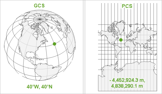
Navigating geographical data visualization successfully requires more than just an eye-catching map. Selecting the appropriate geographic coordinate system forms the backbone that supports accurate representation of spatial relationships, efficient data interaction, and clear analytic insights. Businesses relying on geospatial analyses for making critical decisions must ensure that their visualizations not only display geographic information accurately but also facilitate seamless integration with other analytical capabilities like modern data analytics tools and technologies. Taking an informed approach to coordinate system selection can mean the difference between insightful, actionable visualizations and misleading representations that drive suboptimal decisions. In this article, we’ll dive deeply into guiding principles, practical considerations, and strategic insights on selecting geographic coordinate systems for impactful map visualizations, empowering decision-makers and analytics teams to optimize their spatial data capabilities confidently.
Understanding Geographic Coordinate Systems and Projections
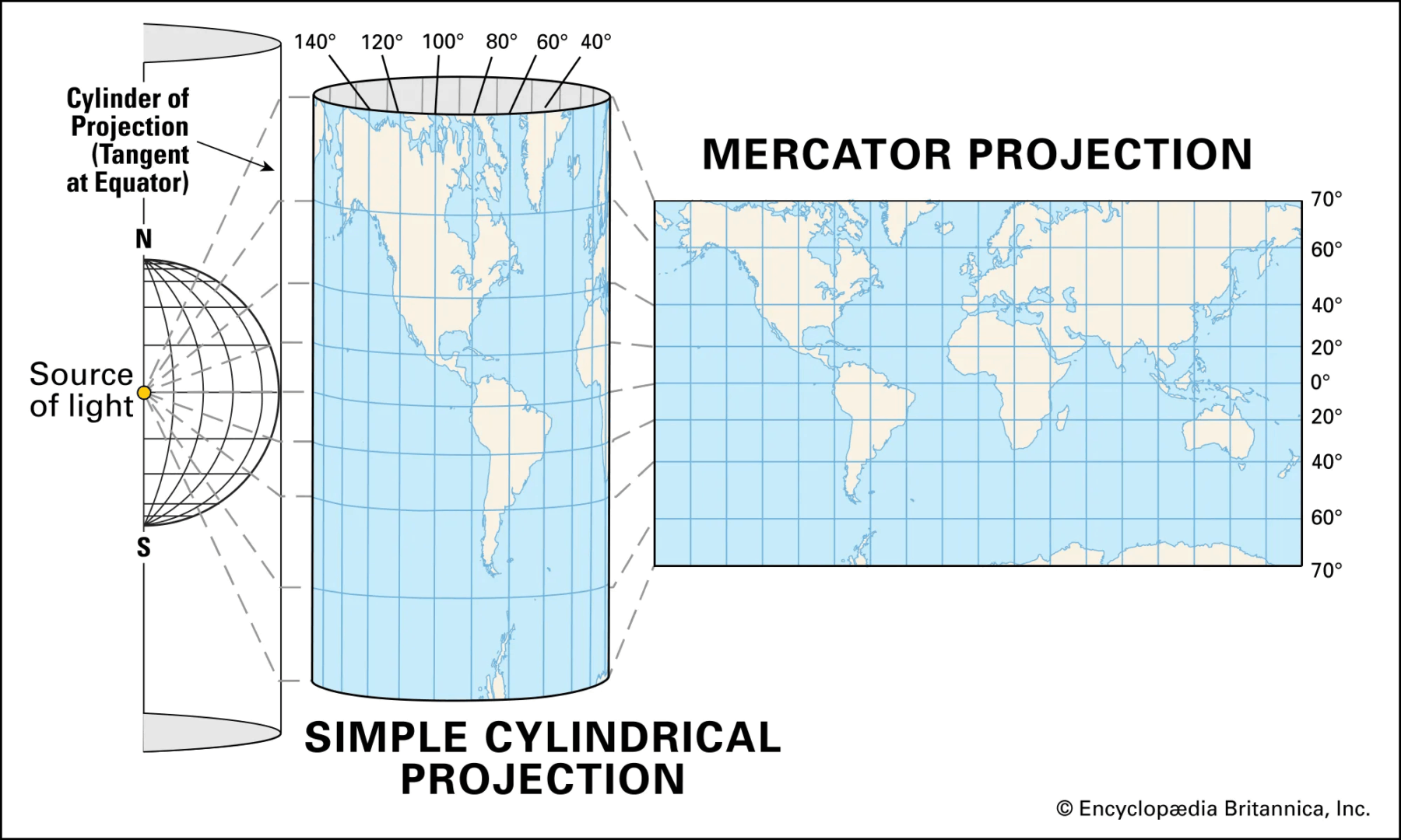
At their most basic, geographic coordinate systems (GCS) define locations by latitude and longitude, enabling location pinpointing anywhere on Earth. Yet, raw latitude and longitude numbers don’t directly translate well into two-dimensional maps suitable for human consumption. Hence, we introduce map projections, which convert the earth’s spherical coordinates into planar coordinates. Selecting an unsuitable projection can distort distances, directions, areas, and shapes, ultimately risking the accuracy of your analysis and its conclusions.
For example, the Mercator projection, often employed in many web-based visualization tools, significantly enlarges objects closer to the poles and misrepresents true sizes and distances. While suitable for navigation, it can incorrectly inform decisions where accurate representation of size and proportion is critical. Conversely, choosing equal-area projections like Mollweide ensures faithfully represented surface areas but distorts shapes, demanding thoughtful consideration when visuals impact business analyses and decisions.
Understanding how these coordinate systems and projections work at a fundamental level empowers your analytics teams, ensuring accuracy in map-based assessments and enabling stakeholders to make better-informed decisions. Whether visualizing sales performance, market penetration, or logistics supply chains, understanding these foundational elements contributes significantly towards precision and strategic effectiveness.
Factors Influencing Geographic Coordinate System Selection
When deciding on a coordinate system or projection, several key factors warrant serious consideration to maximize your visualization’s effectiveness and accuracy. Primarily, analytics teams should evaluate their visualization objectives first: is your primary aim navigational accuracy, shape accuracy, or accurate depiction of area? Each objective leads you towards selecting a different coordinate system.
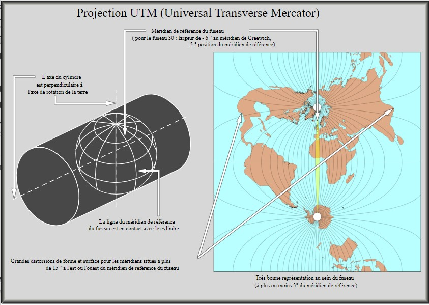
Next, consider geographic extent: is your visual focused on a local region, national scale, global scope, or perhaps spanning multiple continents? Local analyses benefit from localized projections, such as State Plane or UTM (Universal Transverse Mercator), preserving distance and local accuracy with minimal distortion. Conversely, global or multi-country visualizations require broader projections, potentially leveraging equal-area options to represent large geographic areas clearly and uniformly.
Performance and interactivity are also critical. Organizations serious about visual analytics often focus on optimizing loading times and responsiveness, as discussed in our guide on Performance Tuning for Data Visualization Dashboards. Your coordinate system’s complexity and alignment with visualization tools can significantly influence the scale and speed of data processing required. Thus, consider leveraging established data warehousing solutions, as detailed in our data warehousing consulting services, to better manage and streamline spatial data interaction.
By carefully weighing your specific objectives, geographic context, and technical usability, your selections will become more strategic and impactful, delivering meaningful insights to stakeholders quickly.
Impacts of Coordinate System Selection on Data Visualization Quality
Choosing a geographic coordinate system directly impacts visualization effectiveness and trustworthiness. An incorrect projection or unsuitable coordinate system can distort relative values, spatial relationships, and shapes. Inaccurate representation directly impacts interpretations, analyses, strategic decisions, and business outcomes. Eliminating unnecessary confusion caused by distorted views aids live analytics and executive teams alike, enabling straightforward interpretation, collaboration, and quicker actions.
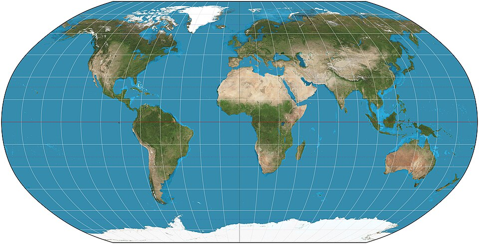
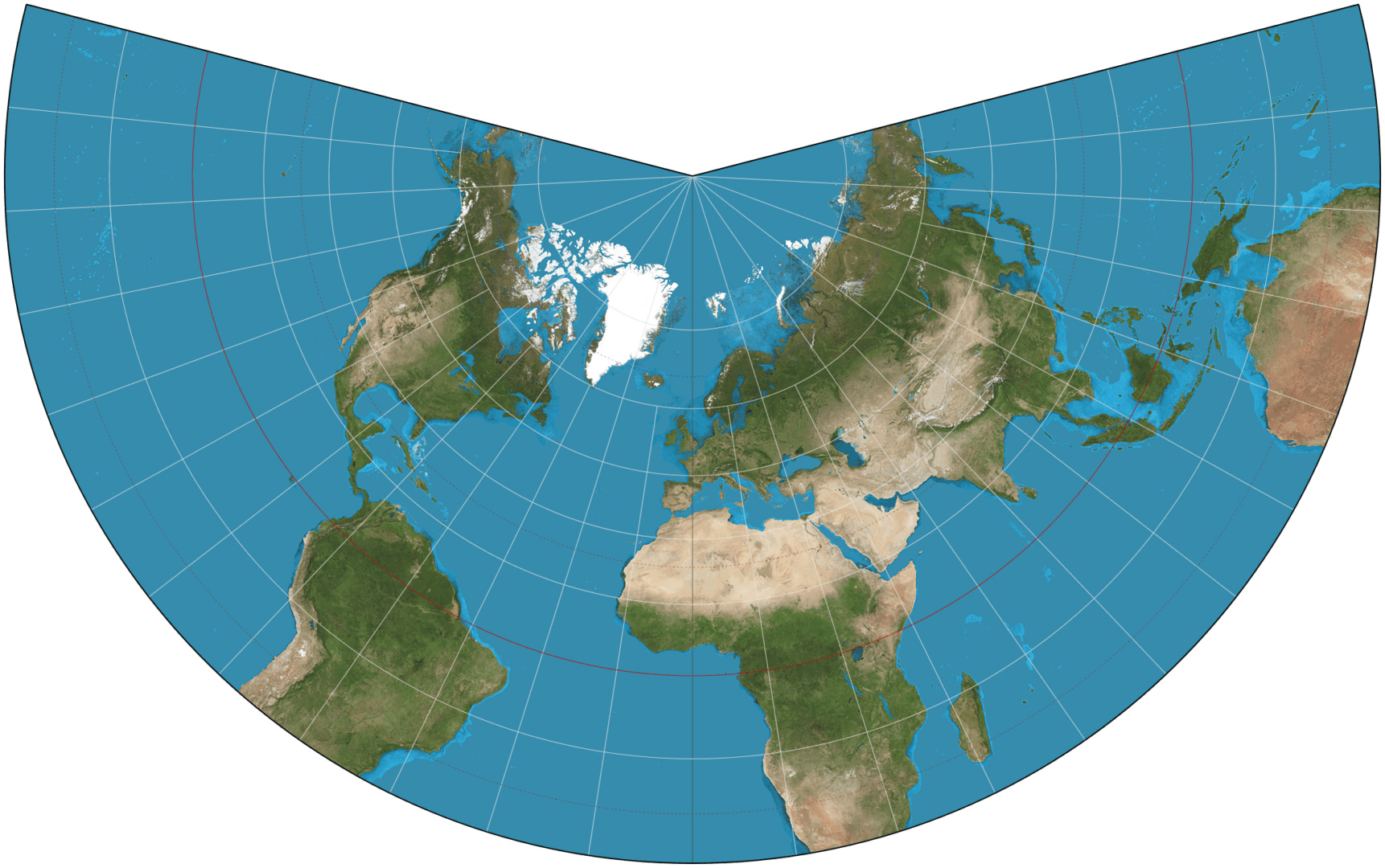
Robinson
For example, in visualizing international markets or global distributions, choosing projections like equal-area Robinson or Eckert IV greatly reduces the perceived distortion. Conversely, national analytics focusing heavily on logistics and routes benefit substantially from conformal projections (such as Lambert Conformal Conic), as these correctly preserve angles and shapes necessary to accurately trace routes and understand spatial logistics efficiently.
Eckert IV
Correctly viewing spatial data also supports advanced analytical opportunities—from effective clustering insights to deeper data science modeling usage. Real-time analytics and machine learning model accuracy depend heavily on feeding models high-quality, accurately represented geospatial data—making coordinate system selection foundational for advanced analytics, accurate predictive modeling, and consistent decision-making.
By aligning your visual analysis tools properly with the optimum coordinate system, organizations reduce ambiguity, improve data-driven efficiencies, and confidently support strategic and operational decisions with strong, convincing visualizations.
Practical Examples of Choosing the Right Coordinate System
Understanding these theoretical principles becomes stronger when contextualized within real-world applications. Suppose you’re leading data analysis in logistics, measuring delivery routes across Texas. Leveraging local scale projections such as State Plane Texas Central will ensure minimal distortion in distances and measurements, supporting exact geographic data interpretation, regulatory compliance, and precise route optimization.
Alternatively, businesses analyzing climate-impacting activities globally will benefit significantly from employing equal-area map projections, such as Peters or Mollweide, helping accurately visualize environmental impact data, distribute resources fairly, and make informed global strategic decisions.
Meanwhile, organizations prioritizing navigation-like use-cases, such as real-time fleet tracking visualizations or drone delivery routing, generally prefer conformal projections like Mercator or Lambert Conformal Conic. These systems preserve angles and allow for accurate representation of bearings, significantly increasing the precision of operational capabilities and the accuracy of real-time decision-making activities across analytics teams.
Lambert Conformal Conic
Effective practicality mandates adequate knowledge sharing, team alignment, and clear understanding of use-cases and tool capabilities. For organizations aiming to establish lasting consistency in spatial visualizations, employing data-contract-driven development frameworks enhances team alignment and communication about coordinate selection rationale, increasing strategic confidence across stakeholders.
Advanced Considerations: Integration and Data Pipelines
Today’s data-driven environments demand not just insightful map visualizations but seamless integration into broader data ecosystems. Coordinate systems and geospatial data should integrate easily within ETL pipelines, data warehousing solutions, and BI visualization tools. Observing the right golden signals for data pipelines is vital to maintaining the quality, efficiency, and accuracy of geographic data.
In advanced pipeline scenarios, such as integrating spatial data into automated machine learning models, the role of clearly defined and consistently applied geospatial standards becomes especially crucial. Modeling complexity and subtle predictive nuances become more manageable when consistent coordinate system choices underpin all combined data sets. As data products evolve—be it predictive delivery time models, regionally optimized marketing strategies, or market segmentation tools—coordination between spatial visualization requirements and predictive modeling necessities must be clearly defined.
In complex analytics operations, specialized consultants can greatly improve company capabilities. Organizations can benefit from engaging with expert partners who understand the intricate intersection between grassroots or enterprise-style consultancies, geospatial analytics best practices, and broader strategic analytics. By selecting experienced consultants, organizations enhance their opportunities for success, improve geospatial visualization capabilities, and ensure optimal alignment with broader organizational data strategies.
The Future of Geographic Coordinate Systems in Visualization
Looking forward, businesses face evolving demands and technological innovations—ranging from spatial analysis on real-time streaming data to advances in natural language querying of spatial data, such as explored in Natural Language Processing (NLP) applications. The future promises increasingly dynamic interactions with spatial data and map visualization capabilities.
Emerging trends point toward increased personalization, real-time responsiveness, and widespread machine learning integration—all of which depend heavily on the foundational accuracy and performance of geographic coordinate systems. Analytics platforms capable of dynamically adjusting coordinate systems based on query complexity, geographic context, or analytical objectives will grow in importance. Thus, staying informed about these developments and ensuring that your organization’s spatial visualization infrastructure remains flexible and adaptable strategically positions your analytics capabilities for future competitiveness and success.
By building strong expertise and aligning teams around deliberate geographic coordinate system selection, organizations enable robust spatial analytics, agile responsiveness to business requirements, and a solid framework for innovation readiness moving forward.
There’s a lot of data visualizations in the world of reporting.
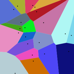
Among the innovative data visualization methods emerging in recent years, Voronoi treemaps stand out as a powerful means to intuitively display hierarchical information.
The Voronoi diagram is named after mathematician Georgy Voronoy.
Built upon the mathematical elegance of Voronoi diagrams, these treemaps offer a visually compelling and effective way to represent multi-dimensional structures. Decisions driven by clear visuals translate into quicker insights, reduced decision fatigue, improved resource allocation, and stronger strategic alignment. As a result, organizations equipped with sophisticated visual analytic practices like Voronoi treemaps set themselves ahead in innovation, efficiency, and effectiveness.
What is a Voronoi Treemap?
A Voronoi treemap is an advanced visualization technique grounded in Voronoi diagrams, partitioning space into distinct cells around a set of predefined points or seeds. This method generates polygonal, rather than rectangular, shapes to represent data categories, allowing them to be visually characterized by size (such as market share, revenue figures, or proportional engagement). Unlike traditional rectangle-based treemaps, Voronoi treemaps adapt the visual complexity naturally, enabling more intuitive visual cues due to polygonal shapes. This makes indexing hierarchical levels both easy and aesthetically pleasing.
Leveraging Voronoi treemaps can dramatically improve data-driven decisions for businesses—from visualizing sales territories and understanding customer segmentation, to highlighting product demand patterns. For example, accurately modeling consumer demand patterns can enhance predictive analytics efforts, as discussed in our article on precise forecasting and demand prediction. Furthermore, organizations working with big data or complex analytics workloads could strategically integrate Voronoi structures into dynamic dashboards hosted on scalable cloud solutions. If you’re considering how best to deploy analytical models at scale and ensure your technology stack aligns with visual analytics ambitions, explore our AWS consulting services.
Is Voronoi Treemap difficult for me to setup?
The Voronoi Treemap does appear to be an advanced visualization, however from a creation perspective it’s a few lines of python. Here’s just a preview of what it may be for you to create your own Voronoi Treemap.
You’ll need — pip install voronoi-treemap matplotlib.
import numpy as np
import matplotlib.pyplot as plt
from voronoi_treemap import voronoi_map, Polygon

# Define weights (these could be anything, like revenue, population, etc.)
weights = [5, 15, 10, 30, 40]

# Create bounding polygon (a unit square)
bounding_polygon = Polygon([[0, 0], [1, 0], [1, 1], [0, 1]])

# Generate random initial sites
sites = np.random.rand(len(weights), 2)

# Generate Voronoi treemap
result = voronoi_map(weights, bounding_polygon, sites, max_iter=100)

# Plot the treemap
fig, ax = plt.subplots()
for region in result.polygons:
    coords = np.array(region.polygon)
    ax.fill(coords[:, 0], coords[:, 1], alpha=0.6)

ax.set_aspect('equal')
ax.set_title('Simple Voronoi Treemap')
plt.axis('off')
plt.show()
Advantages of Using Voronoi Treemaps for Hierarchical Data
Enhanced Visual Clarity and Informativeness
In complex hierarchical datasets, clarity in visualization is paramount. The polygonal segmentation approach of Voronoi treemaps naturally reduces visual clutter, enhancing readability compared to traditional rectangular treemaps or nested pie-charts. Each polygon’s size clearly represents data magnitude, while adjacency and similarity between polygons illustrate hierarchical relationships effectively.
Additionally, Voronoi treemaps excel at communicating context and patterns that are difficult to discern when merely viewing tables or basic charts. For instance, conventional visualization methods such as simple bar or line graphs may not sufficiently represent hierarchical dependencies and complexities. If you’re new to creating visualizations and are currently relying on these approaches, consider deepening your understanding through our tutorial for creating basic bar charts or line graphs. From there, transitioning to Voronoi visualizations can significantly enhance the sophistication and effectiveness of your insights.
Flexibility in Spatial Organization and Customization
Voronoi treemaps are also highly customizable, allowing data engineers and visual analysts to effectively communicate complex scenarios. Their flexible polygon-based organization leads to better utilization of space, vital for responsive digital platforms and dashboards. Unlike fixed-grid visualizations, Voronoi treemaps dynamically adapt to the dataset’s specific hierarchical structure, reducing the unused space and better engaging the viewer.
Moreover, the flexibility inherent in Voronoi diagrams supports continuous enhancement and customization based on user feedback and iterative development cycles. If your current data project management strategy isn’t supporting iterative improvements, our strategic insights in this article related to data team synergy and project management can significantly transform the way your teams coordinate to deliver visualizations like Voronoi treemaps.
Practical Applications of Voronoi Treemaps Across Industries
Retail and Consumer Analytics
In retail analytics contexts, Voronoi treemaps provide an exceptional way of mapping and visualizing product hierarchies, product line performances, and customer segmentation. By quickly discerning visually large segments amid smaller ones, decision-makers obtain immediate visibility into high-performing categories and areas needing optimization. Retail chains looking to fine-tune inventory management, optimize store shelving, and predict demand could achieve considerable efficiencies by visualizing dependencies through this method.
Such visualization effectively supports accurate enterprise-level demand forecasting. Our dedicated blog on accurate demand prediction outlines further compelling reasons and methodologies for integrating sophisticated hierarchical visual techniques for precise forecasts and timely replenishment strategies.
Technology and Infrastructure Management
Tech and infrastructure-focused organizations frequently encounter complex hierarchical models such as multi-tier networking components, cloud infrastructure usage, and database schema dependencies. Voronoi treemaps offer an elegant approach to visualizing data warehouses and schemas, vastly simplifying otherwise complicated architectures. Data engineers coding in SQL may find Voronoi visuals particularly useful for understanding nested hierarchies. Familiarizing oneself with SQL hierarchical models can be significantly improved through our comprehensive article on the difference between UNION and UNION ALL in SQL, enhancing your capacity to visualize and query complex hierarchical databases accurately.
Implementing Voronoi Treemaps in Your Organization
Assess Your Data Readiness and Architecture
Successfully adopting an advanced visualization methodology like Voronoi treemaps requires a robust data foundation and suitable architecture. Data readiness assessments should evaluate the completeness, accuracy, granularity, and structure of the hierarchical data. Organizations that fail to properly assess these areas might experience compatibility issues and insufficient data quality, resulting in inaccurate visualizations. Understanding the scalability and architectural strategies behind your data visualization solutions is essential, as we’ve outlined comprehensively in our blog discussing why data engineers may face architectural scaling difficulties.
In contexts of high-volume data, cloud-based strategies such as leveraging Amazon Web Services (AWS) can substantially streamline implementation efforts, reduce latency, and increase query responsiveness, delivering real-time insights via complex visualizations. For practical assistance in assessing technical readiness and implementing advanced visual analytics, explore our AWS consulting services designed to help companies successfully adopt innovative data visualization practices.
Selecting the Right Tools and Techniques (ETL vs ELT)
Choosing between Extract-Transform-Load (ETL) and Extract-Load-Transform (ELT) methodologies significantly influences your success in harnessing Voronoi treemaps effectively. ETL processes data first, then loads the cleansed and prepared data into your visualization tools. Alternatively, ELT processes transform raw data after ingestion, allowing analytic flexibility in cloud environments. If you’re uncertain which strategy aligns best with your visualization goals, our detailed comparison of ETL vs ELT approaches provides helpful insights.
Best Practices and Strategic Considerations for Voronoi Treemaps
Realizing the full potential of Voronoi treemaps demands strategic considerations that align closely with business needs, processes, and scalability objectives. Organizations should approach Voronoi treemaps implementation with a structured project plan, clear stakeholder alignment, and pre-visualization considerations to boost ROI, user acceptance, and reporting efficacy. Properly eliciting visualization requirements and understanding user needs upfront—mirroring our recommended practice in asking the right exploratory questions—can prevent misalignments later. You can explore these essential questions further in our detailed guide on questions we ask clients before writing a single line of code.
Furthermore, continued innovation in visualization tools driven by data experts fosters long-term, sustainable visual practices critical for business agility. Organizations adopting strategic visual approaches become innovators instead of followers, effectively turning data into a robust strategic advantage.
Empower your business today by leveraging visual innovations like Voronoi treemaps: the future of complex hierarchical data visualization.