What does the CIA’s “estimation probability” have to do with data visualization and a Reddit poll?
Think of it like this: the CIA, and many government agencies, has teams who dig through research, write up reports, and pass them along to others who make the big calls. A big part of that process is putting numbers behind words, predicting how likely something is to happen, and framing it in plain language. Even the headlines they draft are shaped around those probability calls.
The reddit pole? Just an interested group of data people who decided to re-create this same study.
Did you know the CIA releases documents on a regular basis?
The CIA has a large resource catalog and we will grab from three different sources.
Lets explore the development and history of a ridgeline plot that shows the “Perceptions of Probability,” the curious world of data lovers, migrating data from CSV to JSON, building a visual using D3, dive into the complex history, and more.
Numbers behind the words.
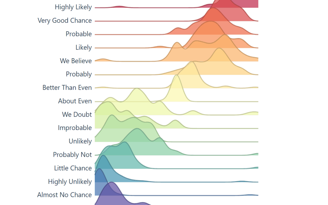
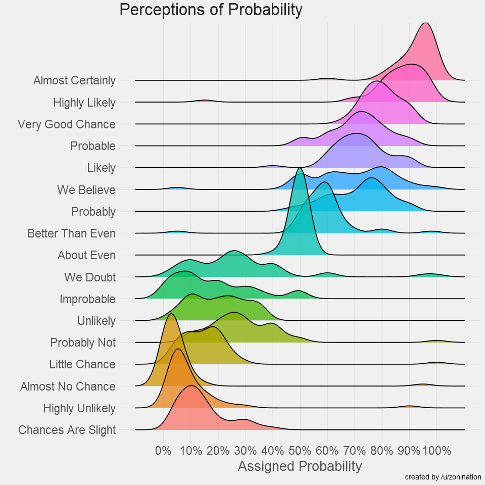
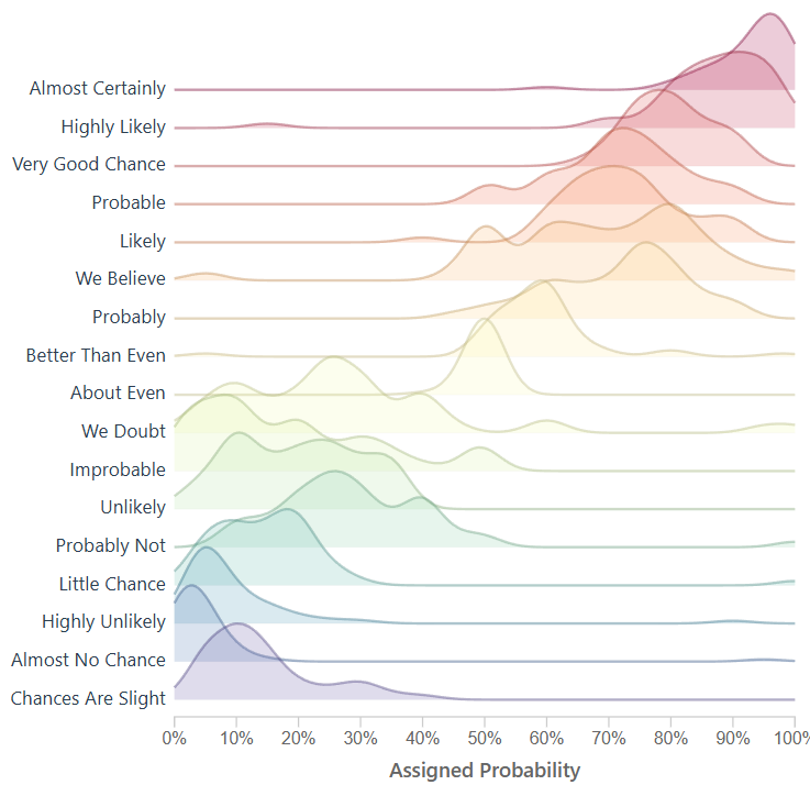
The raw data in our D3 chart came from /r/samplesize responses to the following question: What [probability/number] would you assign to the phrase “[phrase]”?source.
Note: An online community created a data source that resembles the same study the CIA completed, using 23 NATO officials, more on this below. Below you will see images created to resemble the original study, and the background of the data.
Within the CIA, correlations are noticed – studied – quantified and then later released publicly.
In the 1950’s, the CIA noticed something happening internally and created a study.
Before writing this article I did not realize how much content the CIA has released. Like the studies in intelligence, fascinating information here.
Our goal is research the history behind ‘Perceptions of Probability,’ find & optimize the data using ETL, and improve on the solution to ensure it’s interactive, and re-usable. The vision is we will be using an interactive framework like d3, which means JavaScript, html, and CSS.
For research, we will keep everything surface level, and link to more information for further discovery.
The CIA studied and quantified their efforts, and we will be doing the same in this journey.
Adding Features to the Perceptions of Probability Visual
Today, the visual below is the muse (created by a user on reddit) and we are grateful they have this information available to play with on their github. They did the hard part, getting visibility on this visual and gathering the data points.
This viz made the Longlist for the 2015 Kantar Information is Beautiful Awards *
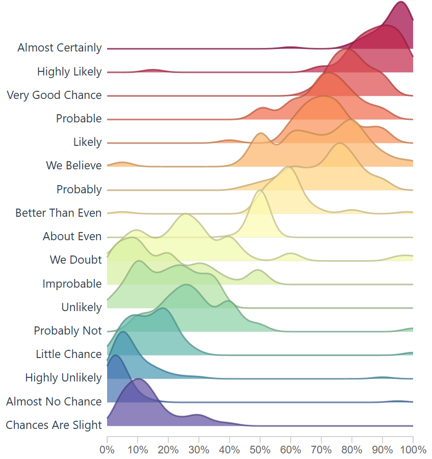
When you learn about the Perceptions of Probability, you’ll see it’s often a screenshot because the system behind the scenes creates images (ggjoy package). Alternatively that’s the usual medium online, sharing content that is static.
A screenshot isn’t dynamic, it’s static and it’s offline, we can’t interact with a screenshot, unless we recreate the screenshot, which would require the ability to understand R, install R, and run R.
This is limiting to average users, and we wonder, is it possible to remove this barrier?
If we looked at this amazing visualization as a solution we can improve and make more adoptable, how would we optimize?
What if it could run online and be interactive?
To modernize, we must optimize how end users interact with the tool; in this case a visualization, and we do our best to remove the current ‘offline’ limitation. Giving this a json data source also modernizes it.
The R code to create the Assigned probability solution above;
#Plot probability data
ggplot(probly,aes(variable,value))+
  geom_boxplot(aes(fill=variable),alpha=.5)+
  geom_jitter(aes(color=variable),size=3,alpha=.2)+
  scale_y_continuous(breaks=seq(0,1,.1), labels=scales::percent)+
  guides(fill=FALSE,color=FALSE)+
  labs(title="Perceptions of Probability",
       x="Phrase",
       y="Assigned Probability",
       caption="created by /u/zonination")+
  coord_flip()+
  z_theme()
ggsave("plot1.png", height=8, width=8, dpi=120, type="cairo-png")
The code is used to manage the data, give it a jitter, and ultimately create a png file.
In our engineering of this solution, we want to create something that loads instantly, easy to use again, and resembles ridgelines from this famous assigned probability study. If we do this, it would enable future problem solvers another tool to solve, and then we are only 1 step away (10-30 lines of code) from making this solution accept a new data file.
The History on Estimative Probability
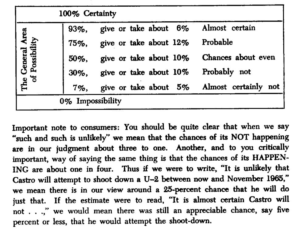
Sherman Kent’s declassified paper Words of Estimative Probability (released May 4, 2012) highlights an incident in estimation reports, “Probability of an Invasion of Yugoslavia in 1951.” A writeup on this was given to policy makers and their assumptions on what they read was a lower value than they had intended.
How long had this been going on? How often are policy makers and analysts not seeing the same understanding of a given situation? How often does this impact us negatively? Many questions come to mind.
There was possibly not enough emphasis on the text, or there was no such scoring system in place to explain the seriousness of a an attack. Even with the report suggesting there was a serious urgency, nothing happened. After some days past, in a conversation someone asked “what did you mean by “Serious Possibility?” What odds did you have in mind?
Sherman Kent, the first director of CIA’s Office of National Estimates, was one of the first to recognize problems of communication caused by imprecise statements of uncertainty. Unfortunately, several decades after Kent was first jolted by how policymakers interpreted the term “serious possibility” in a national estimate, this miscommunication between analysts and policymakers, and between analysts, is still a common occurrence.
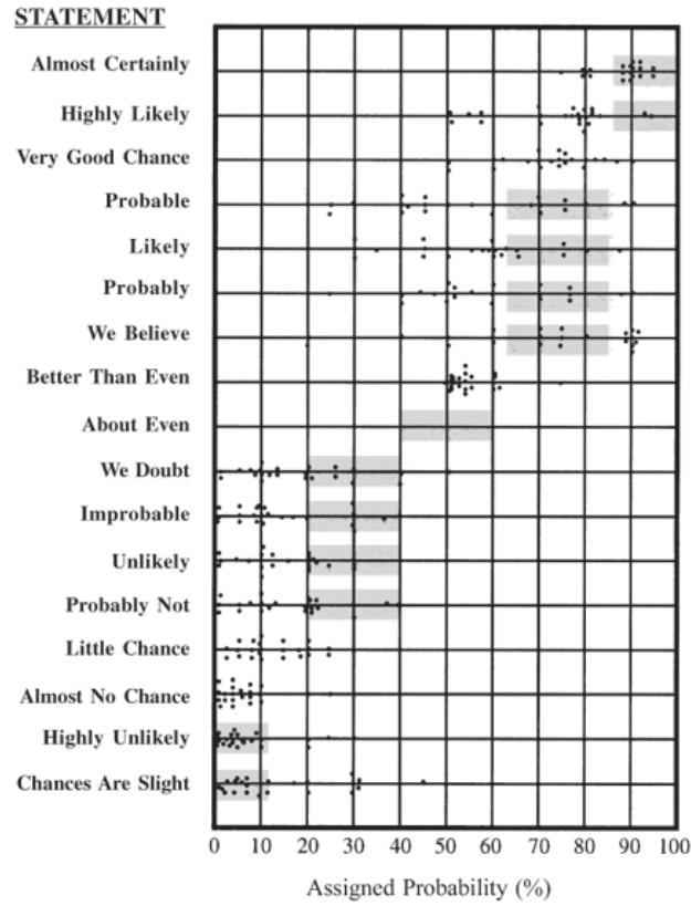
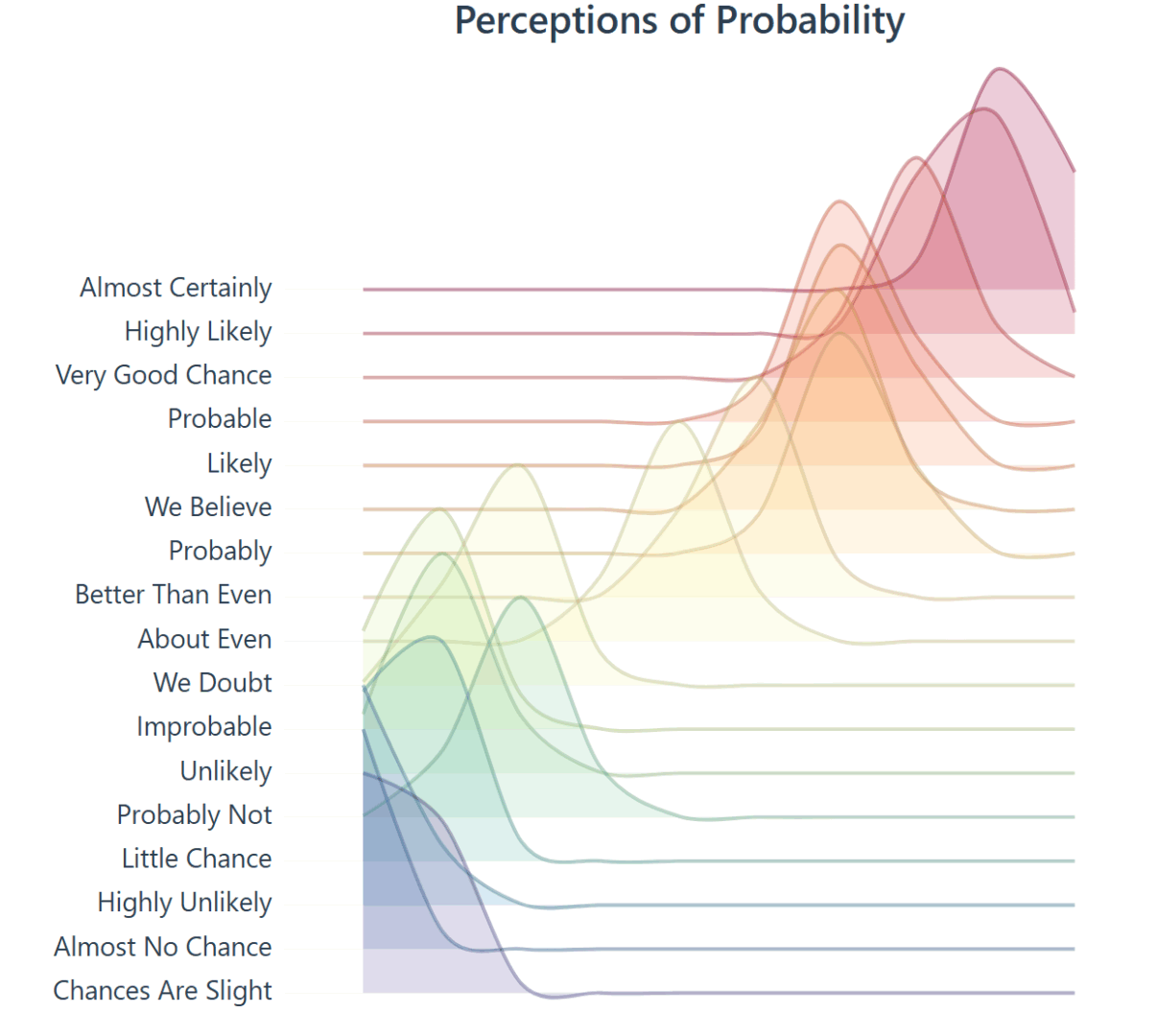
Through his studies he created the following chart, which is later used in another visualization, and it enables a viewer to see how this study is similar to the study created here. Used in a scatter plot below this screenshot.
What is Estimation Probability?
Words of estimative probability are terms used by intelligence analysts in the production of analytic reports to convey the likelihood of a future event occurring.
Outside of the intelligence world, human behavior is expected to be somewhat similar, which says a lot about headlines in todays news and content aggregators. One can assume journalists live by these numbers.
Text has the nature to be ambiguous.
When text is ambiguous, I like to lean on data visualization.
To further the research, “23 NATO military officers accustomed to reading intelligence reports [gathered]. They were given a number of sentences such as: “It is highly unlikely that..” All the sentences were the same except that the verbal expressions of probability changed. The officers were asked what percentage probability they would attribute to each statement if they read it in an intelligence report. Each dot in the table represents one officer’s probability assignment.” This quote is from the Psychology of Intelligence Analysis.pdf, Richards J. Heuer, Jr.
The above chart was then overlayed on this scatter plot, of the 23 NATO officers assigning values to the text. Essentially estimating likely hood an event will occur.
Survey score of 23 NATO officers who has a responsibility to read this kind of text. They scored the text based on likely hood the situation/event would take place (Page 155 * )
Modernizing the Perceptions of Probability
Over time people see data and want to create art. My artwork will be creating a tool that can be shared online, interactive, and open the door to a different audience.
Based on empirical observations in data visualization consulting engagement, you can expect getting access to data to take more time, and for the data to be dirty. Luckily this data was readily available and only required some formatting.
The data was found here on github, which is a good sample for what we are trying to create. The current state of the data is not prepared yet to create a D3 chart. This ridgeline plot chart will require JSON.
Lets convert CSV to JSON using the following python:
import pandas as pd
import json
from io import StringIO

csv_data = """Almost Certainly,Highly Likely,Very Good Chance,Probable,Likely,Probably,We Believe,Better Than Even,About Even,We Doubt,Improbable,Unlikely,Probably Not,Little Chance,Almost No Chance,Highly Unlikely,Chances Are Slight
95,80,85,75,66,75,66,55,50,40,20,30,15,20,5,25,25
95,75,75,51,75,51,51,51,50,20,49,25,49,5,5,10,5
95,85,85,70,75,70,80,60,50,30,10,25,25,20,1,5,15
95,85,85,70,75,70,80,60,50,30,10,25,25,20,1,5,15
98,95,80,70,70,75,65,60,50,10,50,5,20,5,1,2,10
95,99,85,90,75,75,80,65,50,7,15,8,15,5,1,3,20
85,95,65,80,40,45,80,60,45,45,35,20,40,20,10,20,30

"""  # paste your full CSV here

# Load CSV
df = pd.read_csv(StringIO(csv_data))

# Melt to long format
df_long = df.melt(var_name="name", value_name="y")
df_long["x"] = df_long.groupby("name").cumcount() * 10  # create x from row index

# Group by category for D3
output = []
for name, group in df_long.groupby("name"):
    values = group[["x", "y"]].to_dict(orient="records")
    output.append({"name": name, "values": values})

# Save JSON
with open("joyplot_data.json", "w") as f:
    json.dump(output, f, indent=2)

print("✅ Data prepared for joyplot and saved to joyplot_data.json")
With data clean, we are a few steps closer to building a visual.
Using code from a ridgeline plot, I created this density generator for the ridgeline to show density. This enables us to look at dense data, and plot it across the axis.
// Improved KDE-based density generator for joyplots
function createDensityData(ridge) {
    // Extract the raw probability values for this phrase
    const values = ridge.values.map(d => d.y);

    // Define x-scale (probability axis: 0–100)
    const x = d3.scaleLinear().domain([0, 100]).ticks(100);

    // Bandwidth controls the "smoothness" of the density
    const bandwidth = 4.5;

    // Gaussian kernel function
    function kernel(u) {
        return Math.exp(-1 * u * u) / Math.sqrt(2 * Math.PI);
    }

    // Kernel density estimator
    function kde(kernel, X, sample, bandwidth) {
        return X.map(x => {
            let sum = 0;
            for (let i = 0; i < sample.length; i++) {
                sum += kernel((x - sample[i]) / bandwidth);
            }
            return { x: x, y: sum / (sample.length * bandwidth) };
        });
    }

    return kde(kernel, x, values, bandwidth);
}
This ridgeline now closely resembles the initial CIA tooling rebuilt by the github user.
We have successfully created a way to create density, ridgelines, and in a space that can be fully interactive.
Transparency is a setting so here’s the lower setting.Here’s a different transparency setting: .attr(‘fill-opacity’, 0.7)
Not every attempt was a success: here’s an index based version. Code below. This method simply creates a bell-shape around the most dense area, which does enable a ridgeline plot.
// Create proper density data from the probability assignments
function createDensityData(ridge) {
// The data represents probability assignments, we need to create a density distribution
// around the mean probability value for each phrase

// Calculate mean probability for this phrase
const meanProb = d3.mean(ridge.values, d => d.y);
const stdDev = 15; // Reasonable standard deviation for probability perceptions

// Generate density curve points
// Density Generation Resolution
const densityPoints = [];
for (let x = 10; x <= 100; x += 10) {
// Normal distribution density
const density = Math.exp(-3 * Math.pow((x - meanProb) / stdDev, 2));
densityPoints.push({ x: x, y: density });
}

return densityPoints;
 }
There’s a bit of fun you can have with the smoothing of the curve on the area and line. However I opted for the first approach listed above because it gave more granularity and allowed the chart to sync up more with the R version.
This density bell shape curve producer could be nice for digging into the weeds and cutting out potential density around the sides, in my opinion it didn’t tell the full story, but wanted to report back as this extra area where we adjust the curve was fun to toy with and even breaking the visual was pleasant.
Imagine navigating through a complex web of relationships, effortlessly seeing hidden patterns emerge. Social Network Analysis (SNA) and its powerful visualization techniques allow decision-makers to decode these interconnected relationships quickly and effectively. Whether you’re tackling business analytics, healthcare optimization, or technology development, community detection methods within social networks offer invaluable insights. At our software consulting LLC, we specialize in leveraging data, analytics, and innovation to help our clients navigate uncertainty, capitalize on untapped opportunities, and strategize effectively. Let’s delve deep into community detection visualization and how leveraging the right visualization tools can radically transform your analytics capabilities.
Understanding Social Network Analysis and Community Detection
Social Network Analysis (SNA) is more than just mapping connections—it involves a systematic approach for studying relationships between actors, such as people, organizations, or digital entities. The goal is to uncover the underlying structure, dynamics, and potential within these vast interconnected systems. One key aspect within SNA is community detection—the process of identifying distinct groups or clusters where actors are strongly interconnected or share similar characteristics. These communities provide invaluable insights into behavior patterns, influence, communication flows, and potential areas for innovation.
Community detection isn’t just limited to academic research; it has robust practical applications far beyond academia. Businesses utilize it to segment customers accurately, predict market trends, and optimize collaboration internally or externally. For instance, in healthcare, effective visualization of communities can enhance patient care outcomes significantly, as explained in our detailed analysis on how data analytics is transforming the healthcare industry. The insights derived from these community structures help decision-makers craft targeted strategies and innovative solutions tailored specifically to each identified community.
Popular Methods for Community Detection
When performing community detection analysis, the methods you choose directly impact the visualization output and the overall efficacy of your analytical results. The main categories include modularity-based, hierarchical clustering, label propagation, and graph partitioning. Modularity-based techniques, such as the Louvain algorithm and Leiden method, are incredibly popular due to their ability to detect communities at scale quickly and accurately, making them ideal for large-scale social networks or business datasets.
Hierarchical clustering offers an alternative approach by organizing nodes into nested clusters based on defined similarity metrics. This hierarchical organization can provide granular insights, enabling analysts to zoom in or out based on strategic requirements. On the other hand, label propagation techniques utilize iterative processes to spread community labels based on neighbors, lending simplicity and scalability for dynamic networks requiring responsive adaptations. Understanding how your data scientists and analysts leverage these methods aligns with our approach to innovation and technological flexibility, as we discuss extensively in our article on why hourly software consulting is the future of adaptive, scalable innovation.
Why Visualization Matters: Making Communities Intuitive
Visualizing detected communities is where the value of Social Network Analysis truly shines. Even the most precise community detection method falls flat if decision-makers can’t intuitively interpret or act upon the results. Visualization transforms complex data into an actionable format by activating our brain’s preattentive visual processing skills, facilitating rapid understanding and better-informed decision-making.
Effective visualizations align closely with human cognition principles and advanced visualization best practices to rapidly spotlight meaningful relationships or clusters. This empowerment directly leads to strategic decisions—such as refining marketing campaigns, optimizing customer segmentation, enhancing operational efficiency, or identifying innovation opportunities previously hidden in dense datasets. Knowing the essentials of visual perception can radically increase the effectiveness of your analytical dashboards and reporting.
Top Community Detection Visualization Methods and Tools
Force-Directed Graph Layouts
Force-directed layouts remain fundamentally popular because they effectively represent clusters visually through node attraction (connections) and repulsion (non-connections). Platforms like Gephi and Cytoscape use variations of this visualization approach to offer dynamic, intuitive views of community structures. This type of graph visualization is immensely helpful when dealing with exploratory data analysis where unknown relationships and clusters need quick discovery capabilities.
Heat Maps and Adjacency Matrices
When compactness and clarity matter most, heat maps and adjacency matrices offer compelling advantages. These visual methods highlight densities and connections efficiently by mapping values to colors, significantly improving readability for decision-makers who prefer concise snapshots of data interactions. This structured approach complements advanced data engineering approaches such as embracing Node.js for scalable data pipeline engineering, giving granular yet comprehensible insights at scale.
Dendrograms and Hierarchical Trees
The hierarchical approach to community detection lends itself naturally to dendrograms (tree-like diagrams). Dendrogram visuals demonstrate clusters of entities organized by proximity or similarity. Decision-makers receive intuitive access to granular or macro-level information by simply moving up or down the tree hierarchy, allowing efficient strategic decisions tailored to business needs. Often, advanced data strategies like creating and managing effective data catalogs significantly enhance the accuracy and interpretability of insights obtained through hierarchical visualization methods.
Optimizing Data Performance with Visualization
Clear insights require optimal data accessibility and computational efficiency—areas that directly benefit from innovative optimization methods. One such technique, known as projection pushdown optimization in data access patterns, enhances data retrieval efficiency, significantly streamlining visualizations of large networks, and making your Social Network Analysis substantially quicker and more effective.
Real-time and responsive visualizations help businesses stay adaptable in volatile markets or rapidly evolving social landscapes. Moreover, these optimized visualization processes not only save time but enable analysts to experiment freely, develop hypotheses quickly, and carry out interactive visual analyses. Companies implementing optimized data visualization strategies maximize their analytical agility, making data-driven decisions effortlessly.
Leveraging Best-in-Class Visualization Tools
To make your community detection analytics truly transformative, pairing them with industry-leading visualization software is essential. Our analysis finds solutions outlined in our guide on the top 5 data visualization tools for 2025. Advanced data visualization tools like Tableau enable analysts to visually navigate through communities with interaction and drill-down capability, ensuring decision-makers gain clarity, depth, and actionable insights quickly. Engaging advanced Tableau consulting services ensures your organization leverages expertise for enhanced analytical and strategic outcomes.
Visualization tools significantly contribute flexibility and scalability, facilitating better decision-making capabilities, intuitive understanding, and rapid insights—key elements that modern businesses demand from their analytics investments. Being deliberate about visualization choice gives strategic advantages regarding speed, performance, accuracy, and depth of insights.
Closing Thoughts: The Strategic Advantage of Community Visualization
Community detection visualization in Social Network Analysis transcends mere data exploration—it serves as a powerful decision-making tool that delivers actionable insights. The ability to visualize community structures enables analysts and strategists to anticipate trends, effectively allocate resources, fine-tune communication strategies, and accelerate innovation. A strategic approach to visual community detection allows businesses to move beyond guesswork to objective, data-driven actions.
At our software consulting LLC, we see firsthand how such actionable insights can reshape industries, empower businesses, and drive significant growth. By mastering visualization tools and methodologies, organizations equip themselves to respond optimally during uncertainty, transforming raw data into strategic clarity. Partnering effectively with technological experts reinforces innovation and adaptability in your analytics journey, positioning you ahead in the rapidly evolving digital landscape.
Let meaningful, intuitive visualizations be your competitive differentiator in navigating complexity and driving innovation forward.
Managing complex data systems requires a robust mechanism not only for current operations but to restore historical states quickly and elegantly. Businesses consistently demand reliability in data management, analytics accuracy, and seamless innovation adoption. One integral software solution that makes state preservation and recovery manageable and efficient is known as the Memento Pattern. As trusted technical strategists specializing in data, analytics, and innovation, we emphasize the strategic advantage of leveraging well-established design patterns to enhance your software’s resilience and maintainability. Let’s delve deeper into how using the Memento pattern can safeguard your digital assets, accelerate troubleshooting processes, and amplify your business agility.
Understanding The Basics: What Is the Memento Pattern?
The Memento pattern, a behavioral software design approach categorized by the renowned “Gang of Four,” provides a mechanism to capture and externalize an object’s internal state without violating encapsulation. This pattern allows restoring the state later, making it particularly useful in scenarios involving undo operations, audit trails, or stateful workflows. Imagine taking reliable snapshots of your software objects’ states at critical points in service flows. Whenever needed—be it due to error recovery, user-initiated undo, or precise auditing—you have the flexibility to revert precisely to a previous state, ensuring operational continuity and data fidelity.
In the data analytics and data pipelines space where we at Dev3lop continually guide and advise our clients, state management proves vital. Accurate implementation of the Memento pattern acts as an insurance policy against unexpected errors or unintended changes, thereby increasing both uptime and robust data integrity—cornerstones behind successful analytics programs and transformations. Consider scenarios such as data cleansing processes or complex data transformation journeys, where reverting a processing pipeline step quickly ensures continual business delivery. The inventive use of patterns like these readily complements advanced techniques such as workflow-integrated data quality validation gates ensuring system accuracy remains continually assured.
Core Components of the Memento Pattern
Three distinct actors power the elegant architecture of the Memento pattern: the Originator, the Memento, and the Caretaker. The Originator creates snapshots of its own state, encapsulating these snapshots into a structured object known as the Memento. The Originator later can restore its state using the previously created Memento instances. Safeguarded from direct state manipulation or exposure, this design naturally aligns with principles of encapsulation—a necessary foundation toward scalable software architecture.
The Caretaker serves as a gatekeeper and manager of the Originator’s snapshots. It stores the Memento objects securely and transparently without ever directly accessing or editing their internal content—a critical trait that maintains integrity. From a decision-making perspective, this means your data governance remains strong, and you can easily align your architecture to satisfy data retention policies and technical implementation guidelines, ensuring compliance and robust audit-readiness.
Structurally, this pattern thus empowers architects, innovation champions, and data-driven organizations to maintain high-quality data transactions and transformation workflows. Integrating the Memento pattern strategically equips your systems architecture with tools to swiftly manage historical data states, complementing enterprise innovation workflows with prudence and precision.
Practical Advantages in Data-Intensive Scenarios
In complex enterprise environments dealing with extensive data workflows, analytics-driven decisions rely heavily upon accurate historical state management. For scenarios such as accurate demand prediction models where past data states must be replayed or reverted efficiently for scenario simulations, the Memento pattern provides ideal practical benefits.
By using Memento snapshots, analytics solutions can quickly pinpoint previously validated states to reproduce results accurately—critically essential in highly regulated sectors. Parallelly, when handling extensive data consistency checks or API versioning as discussed in our article on data catalog API design for programmatic metadata access, incorporating Memento facilitates precise version control and transparent system restorability.
This elegant mechanism performing automatic state recovery aligns harmoniously with data transformation best practices such as functional programming paradigms in transformation logic. Having a reliable historical rollback encourages confident iterative development, allowing data science teams and engineers to experiment robustly, validate models on historical sets, and rapidly restore consistent states whenever unforeseen data anomalies are encountered.
Memento Pattern’s Role Within Modern AI and ML Pipelines
Artificial intelligence and machine learning increasingly dominate today’s data innovation landscape, significantly altering how businesses address data complexity. Our article examining AI and ML’s revolutionary impact on the data industry underscores a crucial theme—efficient data management. As machine learning pipelines become complex entwined systems with numerous stateful operations, the value of snapshots for restorations significantly multiplies.
The Memento pattern shines in machine learning processes, particularly when maintaining reliable checkpoints within data pipelines, experiments, and model-training stages. Using snapshots strategically to manage model-training states can significantly help protect organization investments in costly datasets or computational efforts. Not only does this decrease resource waste, but it fortifies disaster recovery provisions during iterative experimentation and agile analytics exploration.
Alongside advanced analytics scenarios, such as employing HyperLogLog counters for cardinality estimation in near-real-time data ingestions, Memento enhances experimental confidence. Decision-makers relying upon cutting-edge machine learning models continuously integrate stateful pipeline checkpoints, safeguarding data scientists’ efforts and eliminating losses from incidental mishaps.
Memento In Action: A PostgreSQL Case Study
Consider real-world data management scenarios involving sophisticated databases like PostgreSQL. In demanding environments, companies often rely on PostgreSQL’s powerful transactional features combined with advanced analytical capabilities. A thoughtfully implemented Memento Pattern integration increases database value by simplifying rollback management automation and ensuring seamless state restoration when unexpected incidents or operational errors occur.
Database administrators or analysts could invoke tailored Memento-pattern implementations on data sets performing analytics-intensive transformations. Such an approach helps complement modern data system transformations—adding a layer of safety during schema migrations, bulk data updates, or minute business rule adjustments that demand quick rollbacks.
Effectively integrating Memento with PostgreSQL state management not only streamlines transaction-level checkpointing but also complements existing database architectures with advanced techniques, supporting integrity, auditing precision, and speedily maintaining resiliency when addressing unforeseen data issues or application-level malfunctions.
Storytelling and Communication: You and Your Memento Snapshots
At Dev3lop, part of our holistic approach includes effectively communicating data-driven insights. In our comprehensive guide on data storytelling, we explain the critical role historical comparability and consistent snapshots play when creating visual storytelling narratives. Utilizing the Memento Pattern provides researchers, engineers, and business analysts interactive means for narrative storytelling—restoring specific workflow states to compare scenarios visually and address stakeholder questions accurately and succinctly.
By readily restoring historical snapshots aligned precisely to prior data visualization snapshots or reporting dimensions, the Memento pattern empowers analysts to build rich narratives anchored consistently in trustworthy historical contexts. This consistency profoundly elevates strategic data storytelling, enabling decision-makers to rapidly comprehend scenarios, confidently make iterative changes, and clearly communicate transformations and results across teams.
Unlocking Your Potential Through Strategic Memento Implementation
Embracing the Memento pattern expands your technical arsenal to manage business-critical states explicitly, safeguard your data-intensive processes, and cultivate innovation agility. Empower your strategic data initiatives by leveraging trusted architectural paradigms intelligently, allowing you to focus confidently on core business operations—ushering in an era of sustainable growth and reliable digital scalability.
Dev3lop remains dedicated to guiding businesses strategically through complex challenges in data management, analytics, AI, and storytelling—driven by informed innovation. The Memento pattern and other robust design approaches serve as powerful tools to control data risk and unlock strategic growth initiatives confidently.
In an age dominated by radical digital innovation, safeguarding your organization’s critical data has become more crucial than ever. Data integrity forms the bedrock of reliable analytics, strategic planning, and competitive advantage in a marketplace that demands swift, accurate decisions. Just as forensic experts rely on fingerprints to define unique identities, data engineers and technical strategists similarly depend on digital “fingerprints”—checksums and algorithms—to ensure their data remains untampered, complete, and consistently reliable. Given today’s complex digital landscape—from transformative virtual worlds explored in Metaverse Analytics and Virtual World Data Visualization Platforms to complex integrations demanding robust data pipeline circuit breaker patterns—securing data integrity through well-executed checksums and validation mechanisms has evolved into a fundamental best practice many decision-makers need to grasp fully. Let’s dive deeper and decode how these digital fingerprints can empower your data strategies, safeguard analytics insights, and supercharge innovation across your organization.
Understanding Checksums and Digital Fingerprinting
The concept of data fingerprints or checksums is rooted deeply in cryptographic methodologies and data structure verification principles. Essentially, a checksum is a compact representation generated from a block of data—serving as a distinctive, mathematically derived digital fingerprint. Think of it like a digital DNA—unique, precise, and capable of revealing even subtle changes in data content. When verifying the consistency of data sets or files, recalculating the checksum allows engineers and analysts to detect data corruption, storage issues, or unauthorized modifications.
Commonly used checksum algorithms—such as MD5, SHA-1, and SHA-256—not only reduce complex information into manageable verification strings but also introduce layers of verification enabling greater transparency and trustworthiness within analytic workflows. For instance, in handling large datasets obtained from complex databases like those enhanced by specialized Microsoft SQL Server Consulting Services, applying checksums helps significantly improve the credibility and reliability of downstream analytics and reporting.
Moreover, digital fingerprints and checksums have applications that extend beyond just data files. They also prove invaluable in verifying software packages, digital content distribution, and real-time data transformations. Given their versatility, checksums offer a low-overhead yet profoundly powerful technique that forms a crucial line of defense and integrity validation within today’s increasingly digital-dependent organizations.
The Crucial Role of Fingerprints in Safeguarding Analytical Processes
Reliable analytics doesn’t occur in isolation; rather, it rests heavily on both accurate data and consistent data handling mechanisms. Just one incorrect entry or corrupted data file can ripple devastatingly through the entire analytics ecosystem, delivering erroneous insights and resulting in misguided business decisions. By implementing checksum validation early in your analytical processes—especially within complex ETL or ELT operations—teams can confidently detect and prevent cascading errors or inaccuracies.
Checksum approaches are particularly beneficial when coupled with advanced data pipeline design principles described effectively in our guide on Schema Evolution Handling in Data Pipeline Development. With rigorous digital fingerprinting, your pipeline and analytical infrastructure can readily identify and flag inconsistencies or unexpected changes before propagating these problematic elements downstream.
Furthermore, checksum validations serve as excellent integration points within automated analytic environments like your organization’s internal Tableau platform, complemented by automated functionalities such as Tableau Server automated dashboard images. By including checksum checks at informative checkpoints and prior to visualization rendering processes, decision-makers can always trust dashboard insights to be precise, verified, and actionable. Ultimately, digital fingerprints don’t just protect against data corruption—they actively support superior strategic outcomes through assured analytic accuracy.
Best Practices for Implementing Checksums in Data Strategy
Successful checksum implementation begins by thoroughly embedding digital fingerprinting into everyday data management and engineering practices. First, clearly define when and where checksum verifications occur within your data pipeline. Strategic points typically involve ingestion stages, following transformations, or directly before critical analytics workflows. Adopting flexible and repetitive checksum validations offers continuous vigilance, reinforcing data accountability throughout analytical processes.
Second, partner checksums with robust data element documentation using practices like those explained within our dedicated guide for Data Element Cross Reference Registry Implementation. Building transparent data element registries bolsters checksum efficacy by providing structured insights into expected data conditions, facilitating proactive troubleshooting when checksum mismatches emerge.
Third, ensure consistency of checksum approaches across teams, databases, and pipelines. Diverse processing environments demand standardization in algorithms selected, checksum calculation methodologies, and subsequent validation rules. Uniform standards not only streamline operational governance around checksum practices but also dismantle data silos, promoting accessible visibility and transparency throughout your data ecosystem.
By embedding firm digital fingerprint practices deeply into data strategy—from data contracts and data sharing agreements (detailed in our informative Data Sharing Agreements Technical Implementation Guide) to robust data integrity verification—you’re effectively protecting your organization’s most significant informational assets, promoting operational confidence, and accelerating analytical productivity.
Addressing Complex Data Environments Using Checksums
As technology environments become increasingly diverse and complex—evolving toward expansive cloud infrastructures, multi-tier virtualization, and holistic digital platforms embedded across physical and virtual spaces—the demand for nuanced data integrity checks becomes pivotal. Ensuring trustworthiness at every juncture helps sustain smooth operations, fosters innovation opportunities, and reinforces customer value across virtual and real-world interactions and analytical reporting.
This complexity underscores the essential role of rigorous checksum validation strategies in highly reusable frameworks such as our powerful methodology established in the Visualization Heuristic Evaluation Framework. Seamless verification processes enhance end-user experience by ensuring every visual element remains consistently accurate, trustworthy, and insightful.
Furthermore, digital fingerprinting also supports disaster recovery and fault tolerance practices in big data environments. Adopting checksum-validated backups and replication processes ensures recoverability and traceability, defending environments increasingly reliant on continuous availability strategies. Coupled with practices such as circuit breaker implementations, covered comprehensively in Data Pipeline Circuit Breaker Pattern Implementation, checksum methodologies ensure stable operational resilience during anomalies and environmental disruptions.
The Future of Data Integrity: Innovation Meets Integrity Assurance
Looking forward, advancing technologies—from blockchain ecosystems to AI-driven automated governance—continue to elevate checksum methods’ importance to new heights. Coupled with advanced anomaly detection algorithms, continuous verification mechanisms, and real-time fingerprint auditing techniques, tomorrow’s data validation landscape promises visionary transformations. Innovation-driven organizations increasingly embrace checksums not merely as a tactical data troubleshooting measure but rather as a holistic proactive strategy encompassing risk mitigation, reliable analytics processes, customer transparency, and long-term resilience.
This evolution resonates particularly in emerging analytical practices related to the metaverse, virtual analytics, and integrated data-intensive platforms—explained effectively in our guide on Metaverse Analytics Virtual World Data Visualization Platforms. As digital spaces become deeper engrained within organizational structure, mastering checksum methodologies will prove critical to fortifying analytical infrastructures and delivering trustworthy insights that fuel genuinely innovative growth and informed organizational decision-making.
Consolidating checksum and digital fingerprint capabilities as a company-wide cultural imperative will enable your teams to confidently embrace further innovation. Ultimately, prioritizing data integrity through checksum practices deeply contributes to operational agility, analytical confidence, and strategic digital transformation.
Final Thoughts: Checksums, Confidence, and Your Data Integrity Strategy
Implementing robust checksum and digital fingerprinting practices lies at the heart of secure, innovative, and high-performance organizational analytics. By deliberately embedding checksum principles across your entire data ecosystem—from pipelines to advanced analytics and real-time visualizations—you elevate your organization’s integrity standard, strategic confidence, and analytical accuracy to significantly higher levels. As organizational data needs grow and evolve, maintaining data integrity becomes less an optional checkpoint and more a strategic necessity.
Establish your digital fingerprint strategy thoughtfully, partner it effectively with advanced analytics methodologies, pipeline resilience best practices, and strategic innovation insights available through our strategic guides and consulting services. Fingerprints, checksums, and proven integrity validations will empower your analytic-driven organization confidently toward sustainable digital transformation and innovative breakthroughs.
Tags: Checksums, Data Integrity, Data Checks, Digital Fingerprinting, Data Pipelines, Analytics Strategy
The concept of running software applications on a single instance—commonly known in technology circles as a “singleton”—can seem both straightforward and deceptively appealing. At first glance, using a singleton might sound like an efficient way to streamline your services, eliminate redundancy, and ensure clear-cut communication channels. After all, there should only ever be one master copy, right? But before you confidently press forward with a singleton approach across your tech infrastructure, it’s wise to cautiously evaluate when, why, and how single-instance services align (or clash) with your broader strategy for growth, resilience, innovation, and scalability. This blog dives decisively into the practicalities of singleton services, exploring cases when a single instance is exactly what’s needed and, crucially, when you’ll definitely want to steer clear.
Singleton Services Explained: A Strategic Overview
A singleton service simply refers to an software component designed explicitly so that only one instance exists during runtime. Ever opened an application and noticed it ensures that multiple instances don’t launch simultaneously? You’ve encountered a singleton pattern in action. Singleton services enforce this “one-of-a-kind” instance rule through carefully coded logic, often proving valuable when managing centralized resources or configuration controls—particularly in areas like logging, caching, or authentication.
From a strategic standpoint, singletons help technical leaders simplify the management of critical resources. They typically guarantee thread-safety and consistency, avoiding conflicts or inconsistencies. Moreover, singletons often provide a performance edge: fewer instances mean less overhead, memory usage, and complexity—especially beneficial when working closely with tactical data analytics and business intelligence solutions. At Dev3lop, our extensive experience implementing advanced analytics solutions, such as our comprehensive Power BI consulting services, underscores the key role singleton services can play in strategic technical decision-making.
Despite the significant benefits, whenever considering singleton implementation, savvy software strategists need to approach solutions cautiously and evaluate potential drawbacks. Singleton architecture introduces limitations in scalability, creates dependencies that impede modular testing, and might lead your developers into tricky scenarios managing application lifecycle across distributed environments.
The Power and Possibilities of Singleton Implementations
Singleton implementations have legitimate strategic applications that can substantially advance an organization’s capability to manage vital and limited resources collectively. In scenarios involving centralized logging systems—a crucial component for efficient monitoring and alerting—single instances limit complexity across distributed application environments. Services designed to communicate across multiple microservices architectures or pipelines may rely on singleton-based notification frameworks; for example, sophisticated notification systems for pipeline status and alerts require consistency, reliability, and clear communication mechanisms.
Singleton patterns also align well with tokenization and other security frameworks, especially where centralized control over cryptographic and token handling processes is required. For instance, an intelligent approach to payload tokenization techniques for secure data processing would significantly benefit from controlled singleton services to minimize security risks associated with managing cryptographic keys and sensitive tokens. Ensuring one authoritative token manager simplifies operations, reduces error points, provides clarity, and maintains tight security.
Likewise, analytics systems requiring consistent management of current states, configuration data, or session information benefit greatly from singleton architectures. Our team’s innovations and strategic expertise in the analytics space have resulted in optimized, high-performance singleton-driven solutions—not just to eliminate redundancy, but also to centralize critical information securely and efficiently.
Potential Pitfalls of Singleton Service Usage
While singleton services present compelling operational advantages, they also come with a handful of critical drawbacks that forward-looking leaders must evaluate. Singleton designs are inherently challenging to scale horizontally, making it potentially counterproductive in distributed, cloud-based infrastructures demanding auto-scaling and rapid elasticity. Singleton services can become single points of failure; with only one instance performing crucial tasks, disruptions like crashes or outages have disproportionately negative impacts.
Another key concern is dependency management and testing complexity. Singleton services occasionally make unit-testing cumbersome, introducing dependencies that require complex solutions like mocking singleton classes. If your architecture or requirement involves rigorous and independent unit testing, singleton services might complicate rather than simplify your development and deployment process.
Ironically, singletons can give birth to unintended scalability bottlenecks—often within big data technology solutions—where parallelizable tasks are integral to performance and efficiency. Handling streaming data analytics or hyperdimensional computing methodologies (explore more on hyperdimensional computing) can significantly suffer when stuck in a singleton design. You risk critical slowdowns when your architecture depends on managed concurrency. In such cases, enforcing singularity becomes an obstacle to throughput rather than a help.
Evaluating Singleton Suitability: Key Considerations for Tech Leaders
Software strategists should adopt a methodical approach, proactively assessing whether singleton services align correctly with broader organizational objectives. Decision-makers must thoroughly understand data resource requirements, anticipated workflows, and long-term scalability objectives. For instance, a singleton authentication service or centralized logging solution might make firm strategic sense due to straightforward scalability and limited concurrency requirements. However, demanding analytics-oriented or concurrent processes operating across complex virtual environments may require multi-instance containerized architectures.
A good practice involves evaluating singleton suitability based on real-world historical analytics consumption data combined with projected business growth expectations. Such diligent analysis will reveal clearly that singleton design can have a rightful and strategic place within your technological solutions. Regular monitoring of singleton performance metrics is crucial, relying upon targeted analytics and dashboards carefully developed by experienced business intelligence consultants—for instance, through strategic Power BI deployments tailored specifically for your infrastructure monitoring and evaluation needs.
Additionally, technology leaders pursuing cutting-edge innovations will want to carefully navigate singleton service complexities, especially in scenarios involving novel data visualization methods in the metaverse analytics landscape. Organizations that foresee leveraging virtual worlds’ data visualization capabilities require distributed or decentralized capabilities rather than a singleton solution, ensuring future scalability in dynamic environments.
Real-Life Singleton Usage Scenarios: Making Sense of Complexity
To provide deeper strategic insight, consider scenarios in modern industry contexts. For example, imagine developing a connection layer that securely sends LinkedIn analytics data to Google BigQuery (as explained in this technical guide). Singleton design offers a robust mechanism for centralized management of key connectors, reducing data redundancy, complexities, and simplifying data pipelines.
Conversely, consider more distributed analytical applications such as hyperdimensional computing or machine learning pipelines, ingesting and processing large data streams. Here the “singleton-as-performance-bottleneck” scenario reigns supreme, calling for decentralized or multi-instance patterns. With large-scale data pipelines, singleton structures may simply restrict analytical breakthroughs, excellence, and practical incorporation of innovative concepts necessary to maintain competitive advantage.
If in doubt, it’s always wise for strategic leaders to revisit technical fundamentals; understanding core data concepts thoroughly can guide decision-making around critical questions like whether a singleton truly adds value or inadvertently limits your capabilities.
Singleton or Multi-instance? A Strategic Decision for Your Future
Singleton services undoubtedly occupy a nuanced strategic position within modern software environments. These services have clear applications but come with well-defined pitfalls that tech strategy leaders ignore at their peril. Evaluating singleton viability means balancing benefits like streamlined, centralized resource management with potential risks, particularly regarding scalability, redundancy, resilience, and flexibility.
As analytical and innovation-focused consultants specializing in data-driven technology solutions, we frequently work closely with organizations to look carefully “under the hood” of their software ecosystems, providing strategic guidance and offering practical frameworks around advanced data and analytics services. We invite you to leverage our expertise, strategic insights, and innovative capabilities—whether through our robust Power BI deployments or advanced analytics solutions—to truly harness technology that strategically complements your organization’s goals.
Singleton might be plenty, or maybe it’s not. Your tech strategy deserves to be clear, informed, and intentionally aligned with where your organization is headed.