Have you ever faced difficulty visualizing your data clearly because multiple data points overlap, obscuring important insights? When datasets become dense, traditional graphical representations often conceal the full story, leaving business leaders and analysts unable to drive clear decisions. The solution is jitter—a simple yet powerful technique that intelligently shifts data points slightly from their original positions, increasing visibility and interpretability. Implementing jitter empowers data analysts and decision-makers alike, enhancing the clarity of your visual storytelling. As a software consulting firm deeply committed to data, analytics, and innovation, we understand how critical precise data visualization can be in unlocking actionable insights. In this blog, we dive deeply into jitter implementation, exploring its importance, best practices, and strategic integration within your analytical workflows.
Understanding the Overlapping Data Challenge
In the world of data analytics, clarity is synonymous with actionable information. However, overlapping data points are commonplace, particularly in densely populated visualizations. Clustering hinders readability, significantly diminishing the value of an otherwise insightful visual analysis. Overlapping data obscures density, distribution, and distinct data clusters that decision-makers frequently depend on for strategic choices. To tackle this challenge, analytical teams must adopt smart visualization strategies that differentiate points clearly enough to reveal hidden trends and patterns.
Think about databases like Amazon Redshift that efficiently store and manage massive quantities of data. Proper visualization that demonstrates clear distinctions within overlapping points becomes critical for extracting full value from powerful services. Organizations leveraging platforms like Redshift benefit immensely from insightful visualizations that complement robust data storage solutions. For those unfamiliar with advanced database management, check out how our Amazon Redshift consulting services elevate analytical capacities strategically.
Resolving overlapping points through jittering means analysts no longer infer incorrectly or miss critical details concealed within clusters. For large-scale visualizations, it translates directly to improved data-driven decision making, empowering stakeholders with visual confidence.
Introducing Jitter: A Simple Yet Powerful Visualization Strategy
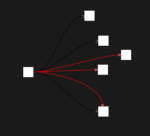
Jitter represents a simple, elegant, and highly effective visualization strategy to overcome the overlap issue. It works by adding small, random variations in the positioning of overlapping data points. As a result, jitter subtly disperses visually stacked points to reveal hidden density, trends, and distributions, all while maintaining the general correctness of your graph. Such strategic adjustments enhance accuracy in interpreting data visuals, making jitter an essential technique toolchest for data-driven organizations.
This controlled randomization helps analysts discern important nuances that would otherwise remain hidden. At a fundamental level, jitter offers an intuitive mechanism to observe variation, ensuring graphical presentations of data remain informative, engaging, and valuable to business stakeholders. Strategically integrating jitter within your visualizations offers a pivotal step toward enabling data-driven decision-making by presenting information clearer and concisely.
Jittering supports visual clarity without introducing bias. Rather, it enriches transparency by ensuring data points remain auditable and traceable to exact origins. Analysts trust jittered data because small positional variations do not significantly distort analytical outcomes; instead, jitter presents the intended picture accurately while eliminating misleading graphical congestion.
Best Practices for Jitter Implementation
Implementing jitter requires careful consideration of parameters. When embedding jitter into visualizations, randomness must be subtle yet sufficient, retaining accurate interpretation. Too much jitter introduces misleading visual dispersion; too little fails to effectively resolve overlaps. Adopting industry-proven best practices can help ensure jitter enhances rather than detracts visual accuracy.
When choosing jitter magnitude, consider your data scale and the density distribution of data points. Smaller increments typically maintain data integrity and readability. Avoid overly aggressive jitter to prevent misinterpretations. Strategic jittering often involves slight vertical or horizontal adjustment, depending on your visualization type (scatter plots, box plots, categorical plots). Each visualization option necessitates specific considerations for optimal usage of jittering.
Additionally, complement jitter with proper visualization considerations like color choices and schema selection. Learn more about how purposeful color selection makes jitter even more impactful in our article: the role of color in data visualization. Pairing jitter with thoughtful visual decisions ensures maximum clarity and effectiveness across analytical dashboards.
Applications of Jitter Across Industries and Analytical Methods
Jitter has widespread applications across countless industries and analytical scenarios. For instance, financial firms employ jitter visualization in scatterplot distributions of market analytics to reveal hidden correlations and outliers. Healthcare organizations adopt jitter in patient data visualizations to identify sensitive and otherwise hidden variations among patient population groups. Marketing analytics teams leverage jitter to identify subtle patterns in demographic data or sentiment analysis results, enhancing insights from advanced analytical methods.
Data teams increasingly integrate jitter into their toolkits alongside other analytical advancements. For example, combining jitter visualizations alongside sentiment analysis powered by Python and NLTK enables more precise digital media marketing strategies. Likewise, leveraging jitter helps visualize complex relationships and informs data-driven decision-making around customer engagement, user behavior, or complex transactional data.
Integrating jitter is also beneficial in enhancing clarity when visualizing data transformations in dynamic pipelines or analyzing complex logical SQL operator analytics—as detailed extensively in our guide on harnessing the power of logical operators in SQL. Robust visual clarity enabled by jitter supports transparency and accuracy across agile analytical workflows, empowering technical strategists as more reliable decision-makers.
Incorporating Jitter into Advanced Data Solution Architectures
As organizations embrace advanced feature store architectures or implement complex machine learning (ML) operations, jitter plays a role within broader analytical frameworks. Feature stores and ML pipelines must guarantee interpretability and transparency of data representations, making jitter an essential consideration. As discussed in our recent article on feature store architectures, jitter helps present features visibly and comparatively, enhancing the explainability of high-dimensional datasets in ML research and product deployments.
Jitter facilitates better comprehension in analytical frameworks where bidirectional data synchronization patterns emerge across different data systems. When dealing with synchronized data feeds coming from multiple emerging data platforms (like MongoDB Atlas explained in our recent guide MongoDB Atlas Signup), jitter visualizations further inform data synchronization analyses and integrations effectively. Visual clarity enabled by jitter aids engineers and decision-makers, proactively revealing subtler patterns in distributed systems.
Moreover, increasingly popular dynamic scheduling frameworks such as our proprietary scheduling software Canopys—see our announcement around this innovative technology here: software Canopys task scheduler—benefit significantly from jitter implementation, facilitating clarity in visual analytics generated by scheduled repeatable jobs and dynamic workflows. Organizational agility paired with visual accuracy and communicative clarity creates exceptional competitive advantage.
Conclusion and Strategic Next Steps: Optimizing Your Jitter Visualization Strategy
Far beyond a mere graphical adjustment, jitter redefines the way analysts visualize overlapping datasets by dramatically improving clarity, readability, and ultimately, decision accuracy. Successful implementation of jitter involves understanding best practices around jitter magnitude, positional variance, and interaction with other visualization considerations.
Enabling your organization with jitter augmentation positions you strategically to improve your data-driven decision-making capabilities. Leveraging jitter alongside other analytical best practices ensures cleaner, more insightful visualizations across your analytical infrastructure—from databases to cloud tools, and from pipelines to visual frontends.
If you’re ready to heighten the effectiveness and accuracy of your visual analytics, our team at Dev3lop offers comprehensive support to implement jitter across projects, from visualization best practices to advanced dynamic pipeline generation strategies. With jitter enhancing clarity, your organization can fully harness data-driven decision-making potential and lead innovation in analytical excellence.
Tags: Jitter Visualization, Data Visualization Techniques, Analytics Strategy, Data Clarity, Data-Driven Decisions, Visualization Best Practices
Thank you for your support, follow DEV3LOPCOM, LLC on LinkedIn and YouTube.


