Uncomplicate Data
ET1, for humans who hate complex
No ET phone home.
About ET1
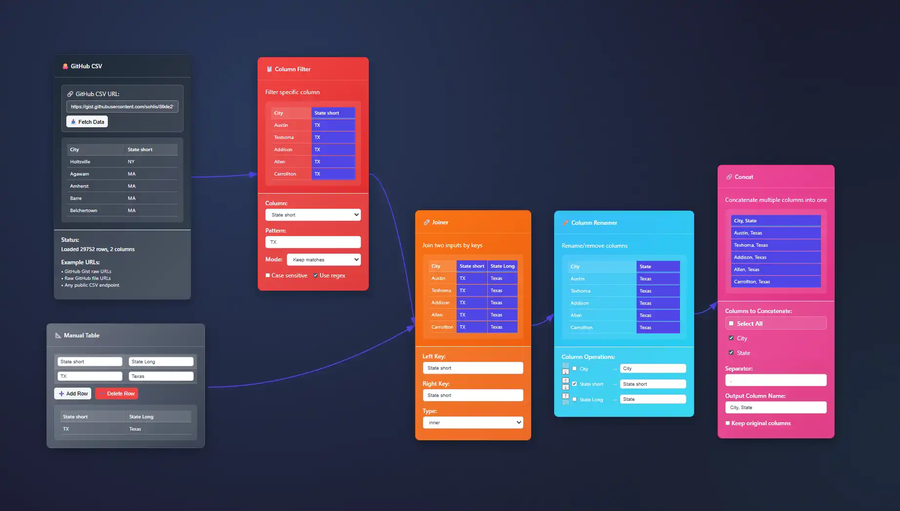
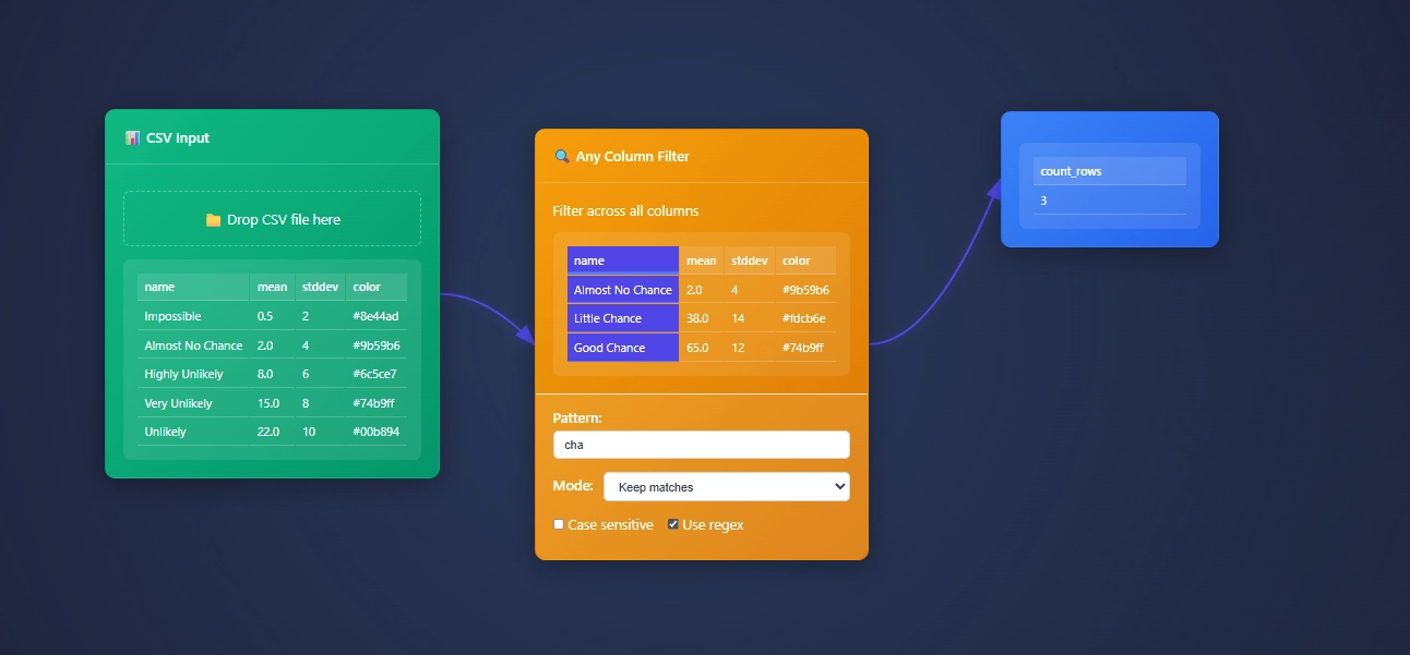
ET1 is a visual data workbench that lets you explore, clean, and explain data in-memory. Built for non-technical humans, (but developer friendly) who want to wrangle data, without complexity.


Create
Hands-on ETL

Training Documentation
Use the training material to help you understand more about ET1 and how it helps solve data wrangling problems.

ET1 Basic Training
If you need help getting started, begin here.

ET1 Video Training
Learn the basics, the features, and more.
Future Insight
We see the future being focused on adoption, training, and creating Easy Tools for anyone. We are building an emerging technology while also maintaining a creative user experience that is inviting and friendly for all ages.
Inspiration
We are inspired by software, video games, and Sci-Fi movies like The Matrix, Minority Report and Ironman. ET1 is created to be “some-what” similar to other legendary software like Alteryx Desktop, and KNIME Analytics Platform.
Join beta.
Why do you want to access beta?
Visualization Accessibility Guidelines and Implementation
In the age of data-driven decisions, sophisticated visualizations form the backbone of strategic thinking. Yet, how effective are visual analytics if they fail to include everyone? Accessibility in data visualization isn't simply an optional feature—it's a...
Composite Pattern Visualization for Multi-Metric Analysis
The realm of data analytics is an ever-evolving landscape where bold strategies, innovative tools, and visionary implementations converge to transform raw, complex datasets into visually compelling narratives. Today's decision-makers wrestle with unprecedented data...
Streamgraphs for Temporal Flow Visualization
In the modern digital economy, interpreting complex data trends isn't just desirable—it's mandatory. Executives and data practitioners alike seek intuitive visual solutions to extract powerful insights efficiently from vast temporal data sets. Enter streamgraphs, an...
Perception-Based Color Mapping in Scientific Visualization
In the data-centric world of scientific visualization, clarity isn't just important—it can mean the difference between impactful discoveries and misleading conclusions. Colors guide the eye and mind inherently, making perception-based color mapping an indispensable...
Geographic Coordinate Systems Selection for Map Visualizations
Navigating geographical data visualization successfully requires more than just an eye-catching map. Selecting the appropriate geographic coordinate system forms the backbone that supports accurate representation of spatial relationships, efficient data interaction,...
Density Contour Visualization for Multivariate Distribution
In our data-driven world, understanding the characteristics of complex datasets is critical to driving impactful business decisions. Capturing insights from multivariate distributions efficiently often requires intuitive and powerful visual tools that reveal...
Vector Field Visualization Techniques for Flow Data
Visualizing flow data accurately and intuitively is fundamental to making informed decisions across industries such as aerospace, automotive engineering, meteorology, and even financial modeling. Leveraging advanced visualization techniques empowers decision-makers to...
Color Channel Separation for Multidimensional Encoding
Imagine being able to untangle and decode hidden insights buried deep within your organization's vast data volumes. Picture harnessing color—the vivid language our eyes fluently understand—as a powerful key to unlocking multidimensional analytics. Welcome to the...
Projection Pushdown Optimization in Data Access Patterns
In the fast-paced world of data analytics, decision-makers face an ever-growing challenge: extracting actionable insights quickly and efficiently from expanding datasets. As data volumes balloon, traditional query methods can swiftly strain system resources, degrade...


