Uncomplicate Data
ET1, for humans who hate complex
No ET phone home.
About ET1
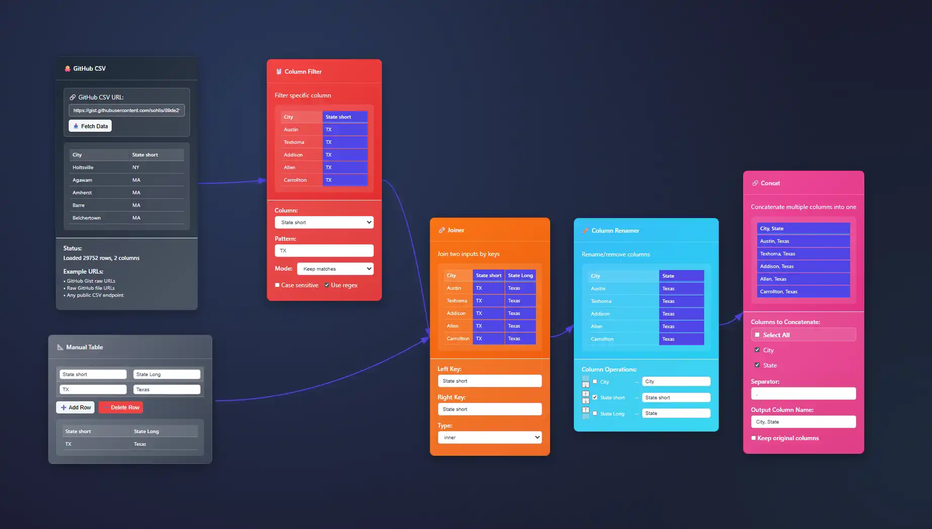
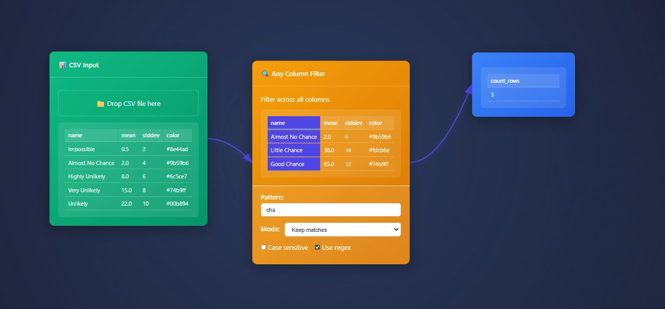
ET1 is a visual data workbench that lets you explore, clean, and explain data in-memory. Built for non-technical humans, (but developer friendly) who want to wrangle data, without complexity.


Create
Hands-on ETL

Training Documentation
Use the training material to help you understand more about ET1 and how it helps solve data wrangling problems.

ET1 Basic Training
If you need help getting started, begin here.

ET1 Video Training
Learn the basics, the features, and more.
Future Insight
We see the future being focused on adoption, training, and creating Easy Tools for anyone. We are building an emerging technology while also maintaining a creative user experience that is inviting and friendly for all ages.
Inspiration
We are inspired by software, video games, and Sci-Fi movies like The Matrix, Minority Report and Ironman. ET1 is created to be “some-what” similar to other legendary software like Alteryx Desktop, and KNIME Analytics Platform.
Join beta.
Why do you want to access beta?
Violin Plot Implementation for Distribution Visualization
Understanding complex data can seem daunting without the appropriate tools. Decision-makers and analysts alike strive to visualize data effectively, gaining meticulous insights into data distribution and patterns. Violin plots emerge as a robust solution in...
Event Droplines for Temporal Sequence Visualization
Imagine being at the command center of a bustling city, where every movement, interaction, and event creates ripples impacting the broader ecosystem. To effectively anticipate outcomes and coordinate responses, you need sophisticated visualization tools that clearly...
Progressive Disclosure in Complex Visualization Interfaces
Consider standing before a vast ocean of data charts, tables, and interactive dashboards—each packed with vital insights, yet dauntingly complex, and overwhelming to navigate. Decision-makers and end-users often face such predicaments when interacting with...
Word Clouds: Design Techniques Beyond Random Layout
The word cloud, a beloved yet often overlooked tool in data visualization, captures our imagination effortlessly. However, for many organizations, word clouds rarely evolve beyond a colorful jumble of randomly scattered keywords. At the intersection of analytics,...
Visual Comparison Techniques for Before/After Analysis
Picture this scenario: your organization recently implemented significant operational changes, launched a new web redesign, or introduced advanced AI capabilities. How do you confidently articulate the resulting improvements and justify continued investments in...
Interactive Tour Design for New Visualization Users
In today's data-driven world, visually compelling and intuitive visualizations aren't just beneficial—they're essential. However, creating beautiful dashboards or analytics reports is futile if your audience—the end-users—cannot derive value from them. That's why...
Implementing Zoom-to-Details in Multi-Resolution Visualizations
In today's rapidly evolving data landscape, business leaders are challenged with translating large, complex data sets into actionable insights—quickly and effectively. Implementing zoom-to-details functionality within multi-resolution visualizations provides...
Building Self-Service Analytics Platforms
The landscape of business intelligence has rapidly shifted toward enabling users to take control of data insights independently. Gone are the days when requests for data took weeks to traverse bureaucratic approval processes only to deliver outdated information....
Time-Travel Queries: Historical Data Access Implementation
Imagine having the ability to step back through the evolution of your data, pinpoint exact moments of change, and analyze insights in historical context. Time-travel queries provide this dynamic capability, enabling organizations to unlock a deeper level of analysis...


