Uncomplicate Data
ET1, for humans who hate complex
No ET phone home.
About ET1
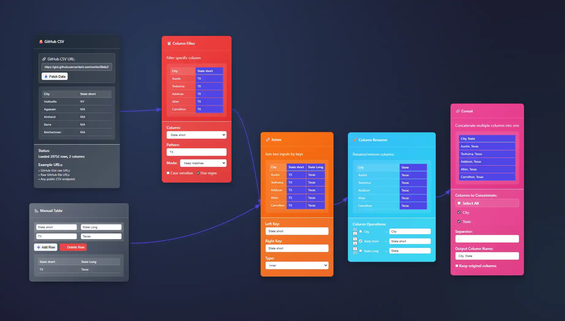
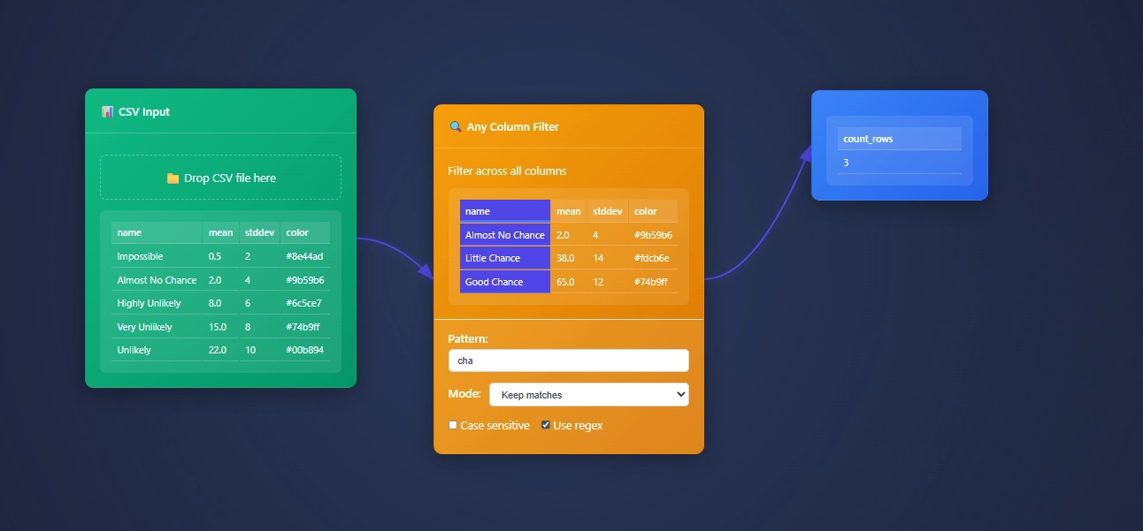
ET1 is a visual data workbench that lets you explore, clean, and explain data in-memory. Built for non-technical humans, (but developer friendly) who want to wrangle data, without complexity.


Create
Hands-on ETL

Training Documentation
Use the training material to help you understand more about ET1 and how it helps solve data wrangling problems.

ET1 Basic Training
If you need help getting started, begin here.

ET1 Video Training
Learn the basics, the features, and more.
Future Insight
We see the future being focused on adoption, training, and creating Easy Tools for anyone. We are building an emerging technology while also maintaining a creative user experience that is inviting and friendly for all ages.
Inspiration
We are inspired by software, video games, and Sci-Fi movies like The Matrix, Minority Report and Ironman. ET1 is created to be “some-what” similar to other legendary software like Alteryx Desktop, and KNIME Analytics Platform.
Join beta.
Why do you want to access beta?
Implementing Animated Transitions for State Changes in Dashboards
In today's data-driven landscape, dashboards serve as essential tools for businesses aiming to extract actionable insights swiftly. Interactive dashboards with animated transitions can elevate your data storytelling efforts, enabling users to grasp complex information...
Small Multiple Design Patterns for Comparative Analysis
In business analytics and data visualization, simplicity and clarity often drive the most influential insights. Leaders aiming to capture strategic opportunities and enhance decision-making are continually challenged to distill complex datasets into easily digestible...
Scrollytelling Implementation for Data Narrative Visualization
Imagine a tool that transforms mundane datasets into compelling visual stories, captivating your audience from start to finish. Enter "scrollytelling"—the artful combination of scrolling and storytelling to enhance data-driven narratives. As businesses grow...
Information Hierarchy in Dashboard Layout Design
Imagine navigating a densely populated urban landscape without street signs, traffic lights, or directional cues—complete chaos, right? The same challenge exists in the design and presentation of business analytics dashboards. Strategically structuring visual...
Self-Explaining Visualizations with Embedded Context
Imagine reading a compelling story told entirely through visuals—no misunderstandings, no questions, just clarity and insight at a glance. In today's fast-paced, data-driven environment, decision-makers don't have the luxury of deciphering complex charts and vague...
Bundling Techniques for Edge Reduction in Network Visualizations
In today's data-driven world, effectively visualizing complex network data becomes a strategic imperative for businesses looking to innovate and maintain competitive advantages. The challenge arises when networks, rich in relationships and interactions, span thousands...
Text Integration in Data Visualization: Beyond Labels and Titles
Imagine being in a boardroom where complex data sets are presented through visuals brimming with insightful details and promising outcomes. The graphics are visually engaging, yet something critical is missing—explanatory, strategic text that contextualizes the data,...
Effective Data Documentation Strategies
In today's fast-paced digital landscape, data is as valuable as gold—guiding critical decisions, driving innovation, and shaping strategies that impact the bottom line. Yet, without proper documentation, even the most insightful datasets can become a labyrinth of...
Vector Embedding Pipeline Design for Semantic Search Applications
In a world driven by ever-growing digital interactions and increasingly sophisticated user expectations, ensuring that information retrieval aligns precisely with user intent has never been more critical. Semantic search, powered by vector embedding pipelines,...


