Uncomplicate Data
ET1, for humans who hate complex
No ET phone home.
About ET1
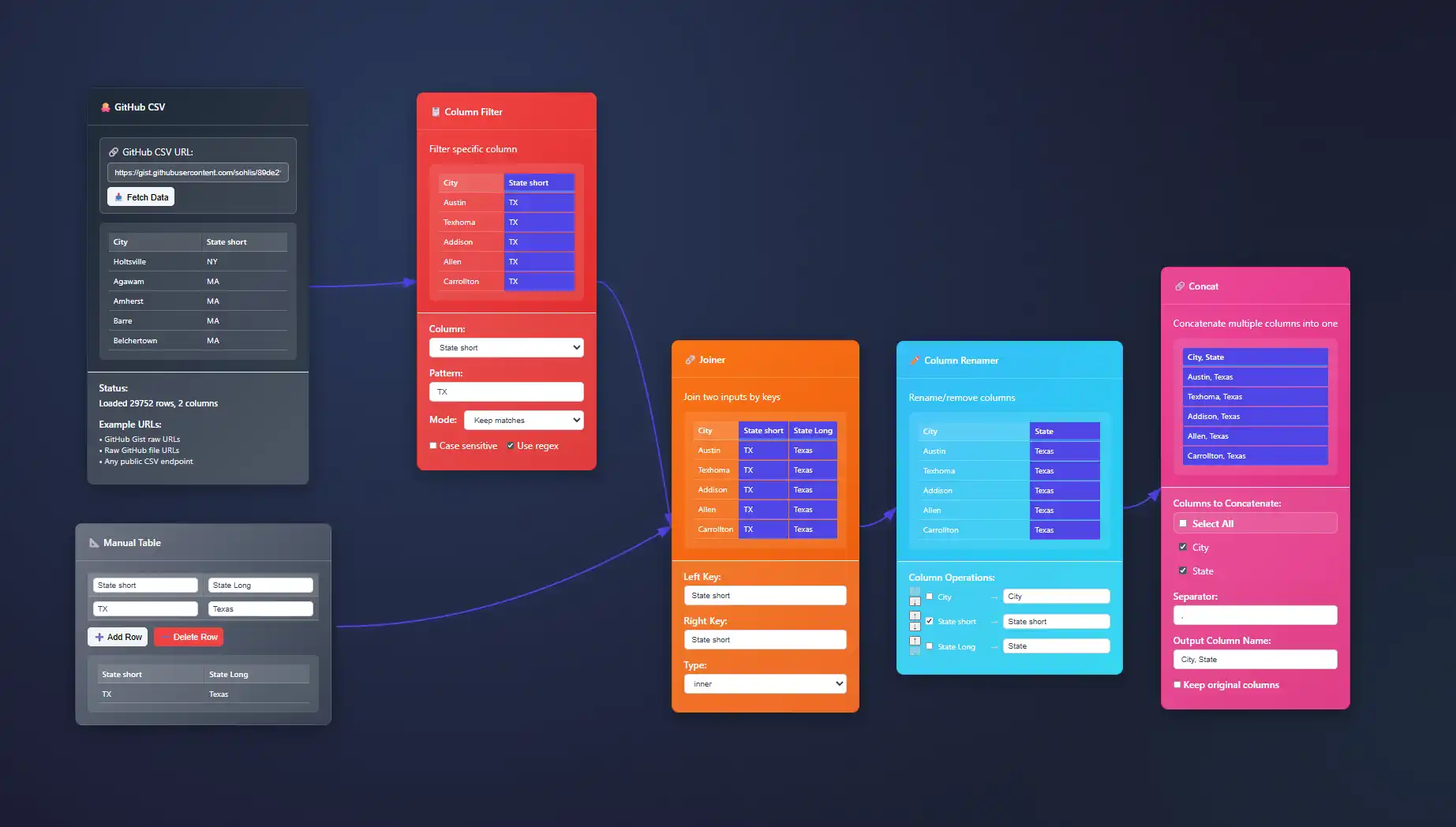
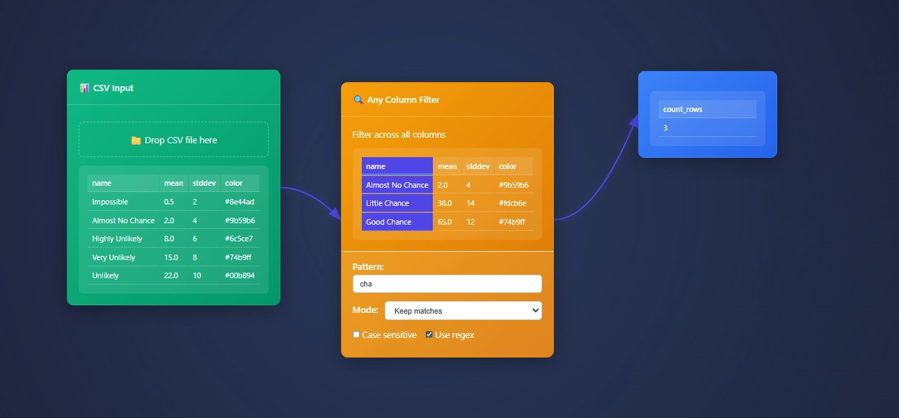
ET1 is a visual data workbench that lets you explore, clean, and explain data in-memory. Built for non-technical humans, (but developer friendly) who want to wrangle data, without complexity.


Create
Hands-on ETL

Training Documentation
Use the training material to help you understand more about ET1 and how it helps solve data wrangling problems.

ET1 Basic Training
If you need help getting started, begin here.

ET1 Video Training
Learn the basics, the features, and more.
Future Insight
We see the future being focused on adoption, training, and creating Easy Tools for anyone. We are building an emerging technology while also maintaining a creative user experience that is inviting and friendly for all ages.
Inspiration
We are inspired by software, video games, and Sci-Fi movies like The Matrix, Minority Report and Ironman. ET1 is created to be “some-what” similar to other legendary software like Alteryx Desktop, and KNIME Analytics Platform.
Join beta.
Why do you want to access beta?
Glyph-Based Multivariate Data Visualization Techniques
In an era where data isn't only abundant but complex, effective multivariate visualization is crucial to turning complex datasets into understandable insights. Glyph-based visualization techniques have consistently emerged as a sophisticated and powerful approach to...
Visual Diagnostics for Regression Model Evaluation
In the age of advanced analytics and machine learning, regression models have become indispensable tools guiding business leaders toward smarter, data-driven decisions. Yet, even the most sophisticated models require rigorous scrutiny and ongoing evaluation to ensure...
Audio Augmentation of Data Visualizations for Accessibility
Imagine unlocking deeper insights from your organization's data, providing clarity and inclusion beyond traditional visualizations. Whether you're a business leader looking to enhance accessibility, a developer exploring innovative data presentation methods, or...
Cartogram Implementation for Geospatial Data Distortion
Maps have transcended their original intent, evolving from simple navigation tools to dynamic visualizations that communicate powerful stories about data, efficiency, and market potential. Today, decision-makers require more than geographically accurate maps; they...
Implementing Drill-Down Navigation in Hierarchical Visualizations
In a world inundated with massive data volumes, understanding complex relationships and uncovering insights requires effective yet intuitive visualization tools. Enter drill-down navigation—a powerful technique that empowers decision-makers to explore vast,...
Heat Maps vs. Hex Bins for Density Visualization
In today's competitive analytical landscape, understanding the density and distribution of your data is not just a visual benefit—it's a genuine strategic advantage. Visualizations like heat maps and hex bin plots allow decision-makers to immediately glean insights...
Information Scent in Interactive Data Exploration
In today's dynamic business environment, data consumption has become a mission-critical component of strategic decision-making. Yet, decision-makers consistently struggle to access the insights they most urgently need—often due to cumbersome data navigation and...
Embedding Statistical Context in Data Visualizations
In today's data-driven marketplace, merely visualizing data is no longer good enough. Decision-makers are increasingly demanding actionable insights and clarity. Leveraging statistical context within your visualizations is key to not just interpreting data, but also...
Visual Analytics for Outlier Detection and Exploration
In today's data-driven era, detecting anomalies and outliers isn't merely a statistical exercise—it's a strategic imperative. Organizations lose valuable opportunities and revenue by ignoring underlying data anomalies. Visual analytics provides an intuitive way to...


