Uncomplicate Data
ET1, for humans who hate complex
No ET phone home.
About ET1
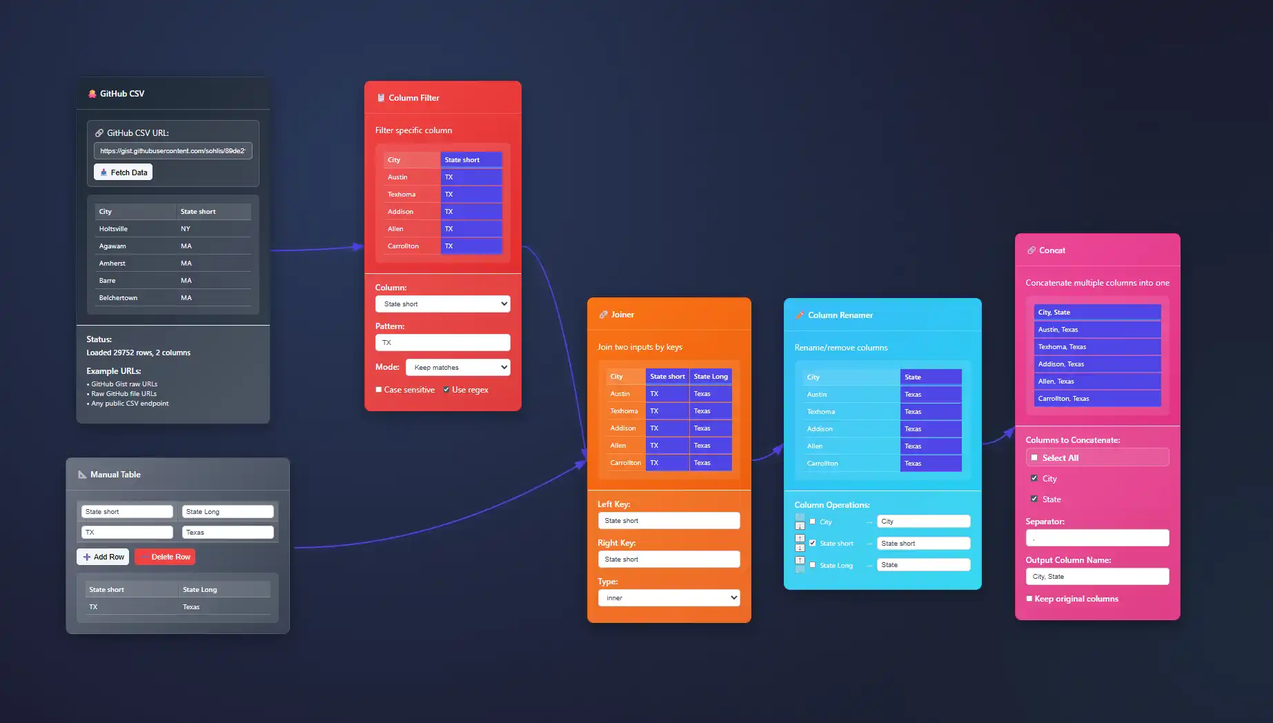
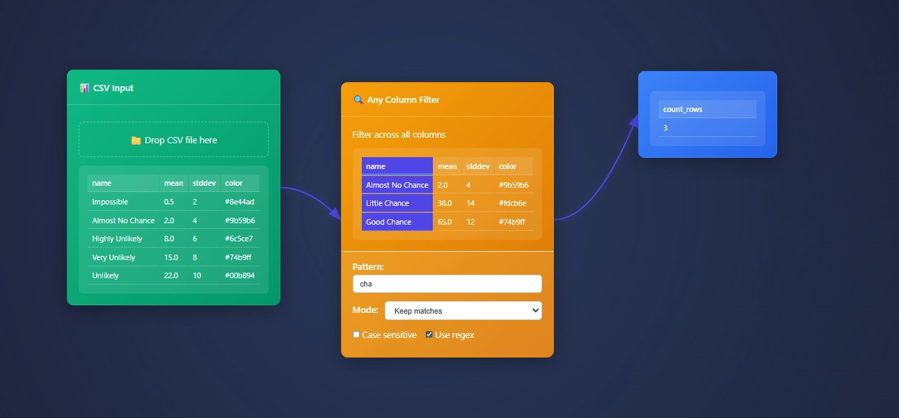
ET1 is a visual data workbench that lets you explore, clean, and explain data in-memory. Built for non-technical humans, (but developer friendly) who want to wrangle data, without complexity.


Create
Hands-on ETL

Training Documentation
Use the training material to help you understand more about ET1 and how it helps solve data wrangling problems.

ET1 Basic Training
If you need help getting started, begin here.

ET1 Video Training
Learn the basics, the features, and more.
Future Insight
We see the future being focused on adoption, training, and creating Easy Tools for anyone. We are building an emerging technology while also maintaining a creative user experience that is inviting and friendly for all ages.
Inspiration
We are inspired by software, video games, and Sci-Fi movies like The Matrix, Minority Report and Ironman. ET1 is created to be “some-what” similar to other legendary software like Alteryx Desktop, and KNIME Analytics Platform.
Join beta.
Why do you want to access beta?
Interactive Crossfiltering Implementation for Multi-Chart Dashboards
In an era marked by data ubiquity and real-time analytics, decision-makers require dynamic dashboard solutions that transcend static visualizations. Static dashboards provide insights, but truly innovative businesses require interactive solutions that enable...
Motion Visualization for Time-Series Pattern Detection
In today's data-driven decision-making landscape, recognizing patterns quickly can mean the difference between seizing an opportunity and missing out entirely. While traditional static visualizations have served as reliable tools, they often fall short when detecting...
Designing Accessible Visualizations for Screen Readers
In today's digital-driven world, visualizations are often the cornerstone of decision-making, providing clarity, impact, and insights that drive business strategies. Yet, these visualizations are underutilized if they remain inaccessible to those relying upon...
Circular Visualization Techniques: Radar, Polar, and Radial Charts
Circular visualization techniques—radar, polar, and radial charts—offer innovative ways to present complex data clearly, intuitively, and compellingly. By moving beyond the limitations of traditional, linear visualizations, these charts provide a richer, more engaging...
Visual Binning Strategies for Continuous Data Variables
In the contemporary world of analytics, making sense of continuous data variables can be overwhelming without the right approach. Continuous data variables can reveal hidden trends, unlock unprecedented competitive advantages, and maximize return on your investment in...
Data Mesh vs. Data Lake: Understanding Modern Data Architectures
In the digital age, organizations are constantly navigating the evolving landscape of data management architectures—striving to extract maximum business value from increasingly large and complex data sets. Two buzzing concepts in contemporary data strategy discussions...
Probabilistic Data Structures for Stream Processing Approximation
In today's rapidly innovating technology environment, businesses deal with mountains of streaming data arriving at lightning-fast velocities. Traditional approaches to data processing often stumble when confronted with high-throughput data streams, leading to...
Cross-Datacenter Pipeline Topology Design
As enterprises grow and data proliferates across global boundaries, ensuring the efficient operation of data pipelines across data centers is no longer just smart—it's essential. Carefully crafting a cross-datacenter pipeline topology allows businesses to minimize...
Recursive Data Processing for Hierarchical Structures
In today's data-rich environment, businesses face increasingly layered and complex information structures. From organizational charts and nested product categories to geographic hierarchies and data flows, hierarchical data lies at the heart of informed strategic...


