Uncomplicate Data
ET1, for humans who hate complex
No ET phone home.
About ET1
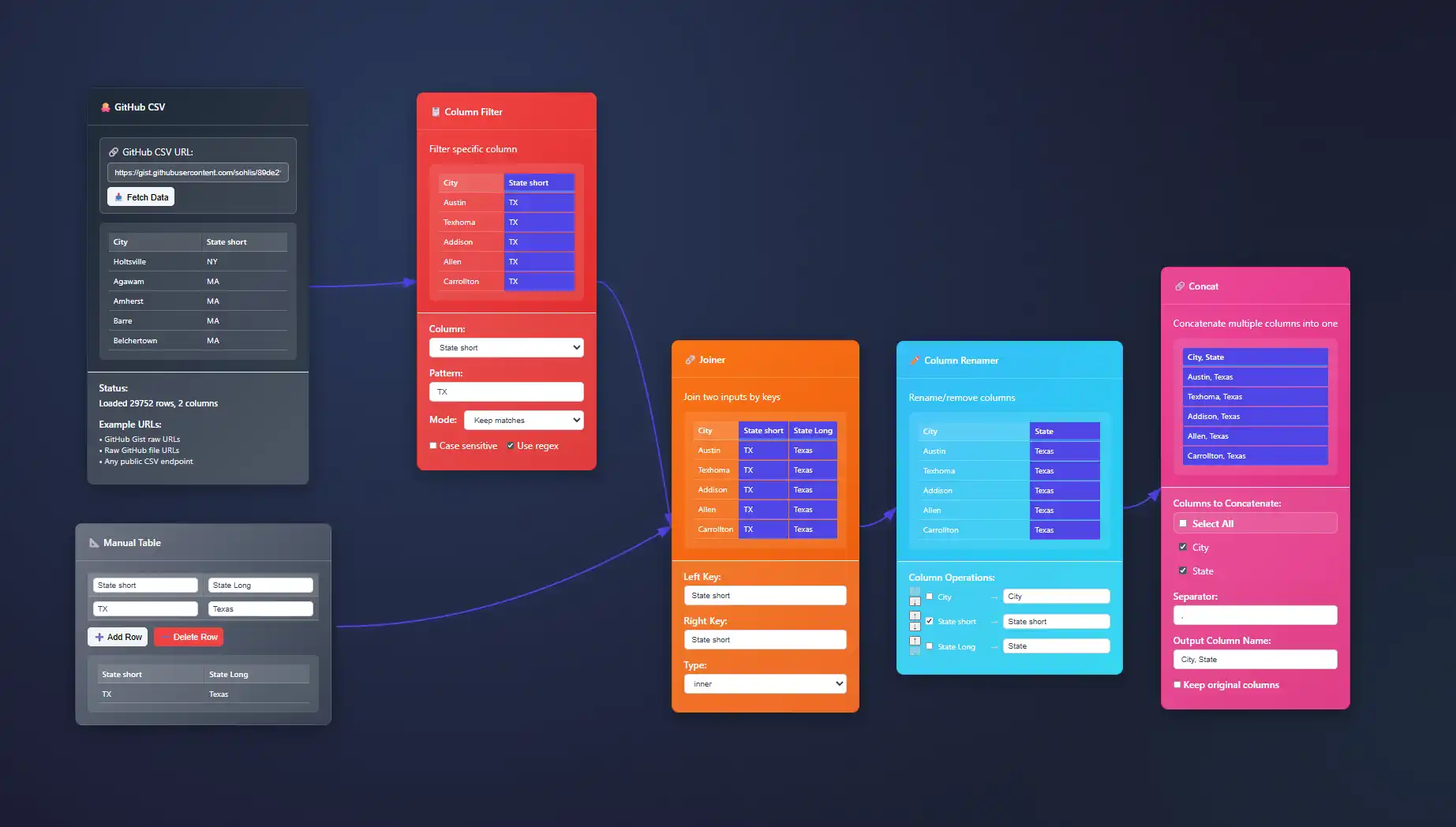
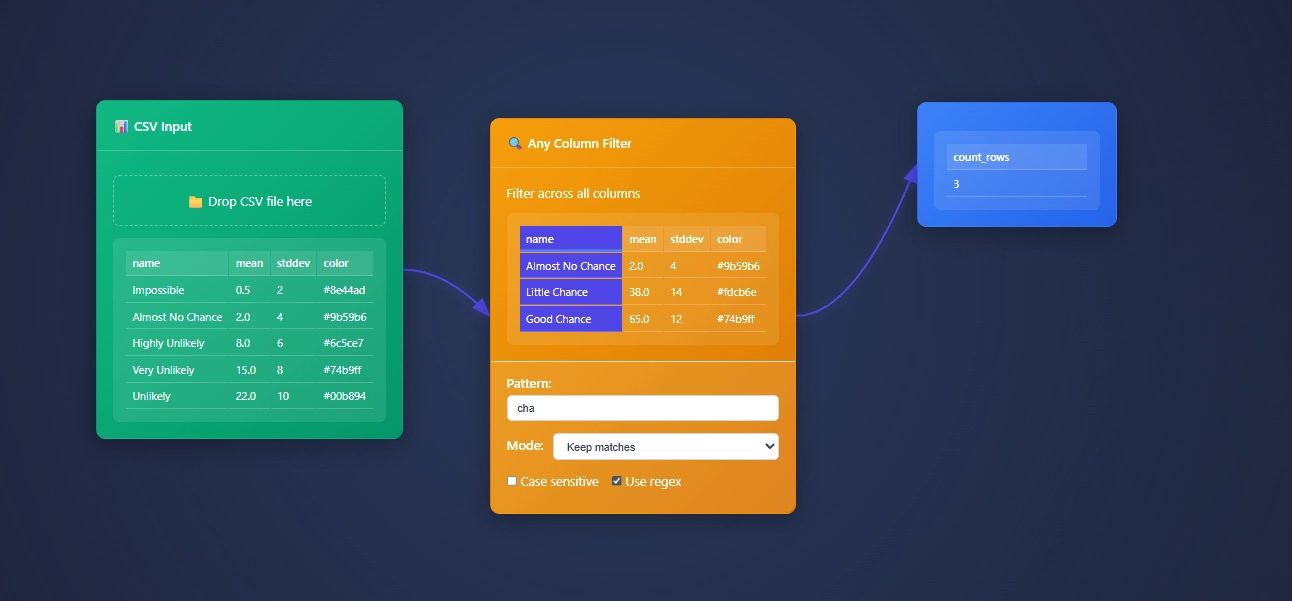
ET1 is a visual data workbench that lets you explore, clean, and explain data in-memory. Built for non-technical humans, (but developer friendly) who want to wrangle data, without complexity.


Create
Hands-on ETL

Training Documentation
Use the training material to help you understand more about ET1 and how it helps solve data wrangling problems.

ET1 Basic Training
If you need help getting started, begin here.

ET1 Video Training
Learn the basics, the features, and more.
Future Insight
We see the future being focused on adoption, training, and creating Easy Tools for anyone. We are building an emerging technology while also maintaining a creative user experience that is inviting and friendly for all ages.
Inspiration
We are inspired by software, video games, and Sci-Fi movies like The Matrix, Minority Report and Ironman. ET1 is created to be “some-what” similar to other legendary software like Alteryx Desktop, and KNIME Analytics Platform.
Join beta.
Why do you want to access beta?
Violin Plots vs. Box Plots: When to Use Each Visualization
In an age where data visualizations speak louder than reports, choosing the right plot becomes imperative. Decision-makers crave clear and insightful graphics, ensuring data-driven decisions are based on realities rather than intuitive guesswork. Violin plots and box...
Annotations and References in Explanatory Visualizations
In the realm of complex business decisions, clarity is power. Data visualizations serve as essential tools, turning complicated data streams into understandable information. Yet, without appropriate annotations and references, even the most visually compelling...
Force-Directed Graph Layout Algorithms for Network Data
Understanding complex network structures can dramatically transform how organizations uncover insights, optimize decision-making, and innovate their business strategies. Force-directed graph layout algorithms have emerged as a cornerstone for effectively visualizing...
Contour Plotting Techniques for Continuous Variable Domains
Visualizing complex data in recognizable, actionable ways is a hallmark of strategic decision-making. Among data visualization solutions, contour plotting stands out for its ability to clearly translate multi-dimensional continuous variable domains into intuitive...
SVG vs. Canvas vs. WebGL: Rendering Choice for Data Visualization
When it comes to turning raw data into actionable insights, selecting the right visualization technology can make or break your strategy. Choosing between SVG, Canvas, and WebGL isn't just a technical decision—it's a strategic one. Each rendering choice impacts...
Zoom and Pan Implementation in Interactive Visualizations
As business intelligence and data analytics continue to evolve, interactive visualizations have become indispensable tools for understanding complex datasets efficiently. Leaders and decision-makers not only require visual clarity but also interactivity that allows...
Visual Encoding Channels: Effectiveness Hierarchy and Selection
Imagine stepping into the cockpit of a high-performance plane. The clear layout and intuitive displays help the pilot instantly grasp critical information, react swiftly, and navigate confidently through complexity. Similarly, in data visualization, visual encoding...
Visualizing Uncertainty: Techniques for Representing Data Confidence
In an era where decision-making increasingly hinges upon data-driven insights, clearly communicating uncertainty is essential. Without effectively visualizing uncertainty, stakeholders can make costly choices based on misleading confidence. Every piece of data carries...
Aspect Ratio Considerations in Chart Design
In today's data-driven world, effective visualization isn't merely about presenting information—it's about telling a compelling story. The correct presentation of data using charts and visualizations is increasingly crucial for clarity, decision-making, and...


