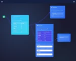
Understanding and mastering the intricacies of data pipelines is now a vital cornerstone for any organization striving to maximize its analytics and innovation journey. Modern data pipelines, however, have grown increasingly complex, forming large dependency networks that can quickly become difficult to track, manage, or optimize without strategic visualizations. The key to effective pipeline management lies deeply rooted in clear, coherent visualization techniques—allowing stakeholders and engineers alike to intuitively grasp complex interactions and dependencies, enhance productivity, and swiftly pinpoint bottlenecks or inefficiencies. In this comprehensive guide, we’ll explore practical visualization strategies decision-makers and data architects can leverage to illuminate their complex data pipelines clearly and efficiently.
The Importance of Visualization in Complex Data Pipelines
As businesses continue to integrate advanced analytics, artificial intelligence, and machine learning into their daily operations, the complexity and interconnectedness of their data ecosystems scale exponentially. A well-structured visual representation of your data pipeline’s dependency graph plays a vital role in clearly communicating system architecture, troubleshooting problems efficiently, and proactively maintaining data trustworthiness and accuracy. By utilizing effective visualization techniques, your technical team is provided with the clarity and transparency needed to enable rapid decision-making as well as pinpoint data anomalies or opportunities for performance optimization.
Moreover, visualization acts as a common, universally understood form of communication among technical developers, business analysts, and stakeholders—improving collaboration and facilitating constructive, productive dialogues about complex data flows and dependencies. Without well-designed visual aids, it is challenging and time-consuming to establish alignment, iron out misunderstandings, and transform data strategies into actions capable of driving real revenue growth. Businesses mastering data pipeline visuals are better positioned in boosting sales and revenue growth by being more responsive and informed during strategic decision-making.
Therefore, a robust visualization strategy keeps your data engineering team one step ahead of data issues, ensures system transparency, and remarkably accelerates both root cause analysis and system optimization processes. In the rapidly evolving data landscape, visualization excellence correlates directly with competitive advantage.
Key Techniques for Visualizing Data Pipeline Dependency Graphs
Directed Acyclic Graphs (DAGs): Clear Mapping of Pipelines
A Directed Acyclic Graph (DAG) is arguably the most critical and prevalent representation model employed by data engineers today. DAGs convey relationships within data workflows as they clearly define the sequence of transformations, interdependencies, and stages without allowing circular dependencies—ensuring smooth, repeatable execution. Popular workflow orchestrators such as Apache Airflow and Prefect heavily employ DAGs to demonstrate task dependencies explicitly, making them intuitive for engineers to decipher quickly and reliably.
The visual nature of DAGs is particularly beneficial in identifying bottlenecks, delays, or redundant processing tasks. It also streamlines troubleshooting by giving developers the ability to visualize and navigate complex dependencies efficiently. Moreover, DAG visualizations aid strategic forecasting of resource allocation, such as computational and storage resources, vital to practicing proactive inventory management and forecasting—a crucial aspect for modern enterprises aiming to consistently meet customer demands with precision.
Implementing DAG-based representations systematically across your pipelines ensures a unified approach to communicating data workflows effectively, significantly enhancing your team’s operational agility, scalability, and responsiveness.
Interactive Sankey Diagrams for Data Flow Visualization
While DAGs are exceptional for quickly identifying task dependencies, those seeking a broader, comprehensive view of data movement across systems may find Sankey diagrams indispensable. Sankey diagrams visually depict quantitative flows—showing where data originates, splits, merges, and eventually gets consumed or stored within different stages of the data pipeline. This form of visualization efficiently reveals bottlenecks, data drift, or unwanted duplications while simultaneously highlighting opportunities for optimizing data storage, processing, and operations.
A properly implemented Sankey diagram dynamically reflects actual data volumes passed between tasks or system components and thus allows stakeholders to quickly assess resource allocations and utilization rates. By clearly exposing inefficiencies and highlighting optimal opportunities for pipeline improvement, businesses are better equipped at rapidly adapting their data infrastructure, ultimately becoming more efficient in their analytics strategies.
Furthermore, interactive visualizations are commonly embedded within dashboards and reports, giving teams leadership-level insights necessary to support strategic and informed decision-making. When crafting visualizations embedded into reports or dashboards, organizations must remember the importance of choosing chart types that effectively communicate their message, ensuring clarity and impactful storytelling.
Leveraging Dimensional Modeling and Domain-Driven Design Principles in Visualization Strategy
Effective data pipeline visualization methods are incomplete without considering efficient data design philosophies. Adopting structured approaches, like dimensional modeling or the domain-driven design of bounded contexts, makes developing visualizations clearer and far more straightforward. These strategies guide architects and developers towards a well-defined data framework, reducing ambiguity and facilitating meaningful visuals that clearly convey purpose, interactions, and data structures.
Dimensional modeling, for instance, emphasizes simplicity, clarity, and ease of queryability by structuring data into fact and dimension tables—laying a clear foundation for organizations looking to visualize and understand complex data interactions easily. Likewise, domain-driven design organizes data infrastructure into bounded, logically separate contexts, allowing visualization techniques to intuitively reflect business domains clearly, consistently, and intuitively. Taking inspiration from such practices reduces visualization complexity significantly, ensuring tailored visualizations that resonate distinctly with business users’ domain expertise and their decision-making needs.
Ultimately, these design philosophies not only set the groundwork for coherent and impactful dependency graphs but also directly support scalable, repeatable, and maintainable analytics. This approach is remarkably helpful in establishing robust visual metadata collection methodologies used to effectively measure data health and consistency, exemplified in practices such as enhancing metadata collection using Tableau dashboards.
Integrating Automation and Advanced Visualization Tools
Multiplying complexity across data pipelines necessitates the strategic use of automation and advanced visualization tooling to ensure sustainable tracking and performance measurement. Contemporary strategy dictates utilizing frameworks and tools like Grafana, Tableau Server, or Power BI, each offering role-specific, actionable insights into data pipeline workflows and dependencies. These tools provide strong support for automated alerts, notifications, and real-time visualizations—enabling proactive interventions to mitigate potential system failures and ensuring data integrity.
Moreover, visualization automation allows teams to rapidly assess pipeline impacts and dependencies when introducing new transformations, tables, or systems modifications, significantly easing project lifecycles with heightened transparency and predictability. Combined with powerful data manipulation techniques, like SQL’s efficient INSERT INTO operations, automated visualization updates ensure smooth onboarding of new data processes or integrations seamlessly entertained into live systems.
By embedding automation and employing best-in-class visualization tools, organizations unlock agility and scalability previously unachievable with manual approaches to visual management. These techniques truly transform how businesses manage data complexity across growing organizational demands, thereby maintaining a competitive advantage in innovation-driven markets.
Visualize to Optimize: From Data Chaos to Clarity
A clear visualization approach brings organization-wide transparency, simplifies complex system architectures, and ensures efficient, performance-focused management. Effective pipeline visualizations create streamlined decision-making processes, optimize resource allocation, enhance real-time issue identification, and enable robust data governance. Through adopting robust visualization techniques, strategic data modeling philosophies, and automation tools proven to enhance decision speed and accuracy, your business moves confidently from data chaos into clarity, efficiency, and strategic innovation.
Ready to transform your data pipeline visualization strategy? Partner with our experienced team and unlock the real power of your organization’s data today.


