Imagine your hybrid data workloads as a symphony orchestra—each instrument valuable on its own, but truly transformative only when harmonized by the conductor. In the music of modern analytics, your data strategy serves as the conductor, managing diverse data sources, formats, and flows. Yet, today’s decision-makers grapple with data sprawls across multiple environments, from cloud platforms and on-premises warehouses to SaaS applications and more. Enter data fabric visualization, the conductor’s baton that stitches hybrid workloads into cohesive, insightful symphonies. In this article, we’ll explore how data fabric visualization strengthens data connectivity across heterogeneous environments, offering clear pathways for businesses to orchestrate insights seamlessly, accurately, and reliably.
A Visionary Approach: Understanding Data Fabrics
A data fabric stands as a strategic architectural concept aimed at simplifying data management complexities that inevitably arise in hybrid or multi-cloud environments. In short, the data fabric approach unifies disparate data sources and makes them accessible via a unified and consistent data management framework. At the heart of a data fabric lies automation, integration capabilities, metadata management, governance, and semantic enrichment—key ingredients that empower businesses to turn raw data into actionable insights.
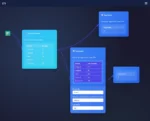
But simply setting up a data fabric isn’t the endgame; visualizing these complex, interconnected data pipelines brings true clarity and power. Effective visualization allows stakeholders not only to see precisely where data resides and how it moves, but also to unlock strategic value in their data assets. By stitching the data fabric with visual clarity, stakeholders across the organization—from business executives to technical teams—can confidently navigate and understand data flows, ensuring that crucial business decisions are based on accurate, timely insights.
Without visualization, even the strongest data fabrics risk becoming opaque silos that obscure rather than illuminate. Indeed, organizations that neglect visualization may suffer increased confusion, slower response times, and limited agility. By embracing visualization, however, businesses reduce operational friction, increase stakeholder confidence, and gain strategic clarity on their data journeys. In short, robust data fabric visualization becomes the bridge that seamlessly connects technical capability to strategic business outcomes.
The Power of Visualization in Managing Hybrid Workloads
“Seeing is believing” could not ring truer in the realm of data management and analytics. Complex hybrid workloads, which might span thousands of distinct sources ranging from cloud services to legacy systems, require robust visualization capabilities to ensure clarity and coherence. Indeed, a well-designed visualization approach can transform daunting data landscapes into clear, understandable interactive visual aids grounding decision-makers with confidence.
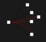
One powerful example comes from parallel sets for categorical data flow visualization, which provides a dynamic means to trace connections across disparate datasets seamlessly. Techniques like parallel sets offer intuitively visual depictions of categorical data, enabling stakeholders to quickly grasp how data moves across business domains and identify bottlenecks or anomalies.
Similarly, revolutionary methods like holographic data modeling for multi-perspective analytics strengthen capabilities even further. These advanced visualization methodologies facilitate viewing multidimensional data from numerous perspectives. Stakeholders can immerse themselves in the data fabric and slice through millions of rows and data sources from unique angles, fostering deeper analytical insights. Combined with a strong data fabric infrastructure, businesses gain an unparalleled competitive edge, consolidating diverse workloads into an intuitive blueprint of understanding.
Ensuring Data Consistency: The Importance of Idempotency and Visualization
While visualization excels at highlighting the connections across your data fabric architecture, ensuring accuracy and consistency behind these visuals is critical. This is where the principle and practice of idempotent data transformations become tremendously important. By implementing idempotent operations, your data engineers can execute and re-execute transformations without ever corrupting or compromising data integrity.
Why visualize data processes without first guaranteeing trusted data outcomes? By embedding idempotency within your data fabric architecture, you’re able to reliably handle retries, manage failures better, and streamline continuous integration processes. This robust foundation of confidence, in conjunction with visualization, empowers your stakeholders to optimize hybrid workload performance more efficiently and identify potential issues at a glance.
Additionally, visuals illustrating data integrity checkpoints and idempotent logic help internal teams better understand complex data workflows. With a clear visualization of idempotent checkpoints and error handling, even non-technical leadership can easily grasp how their hybrid workloads prevent inaccuracies, avoid redundancies, and maintain clean data hygiene over time. This transparency fosters increased trust in your data fabric architecture, driving stronger organizational buy-in and ultimately delivering transformative business results.
Harnessing API Integration with the Data Fabric Visualization
Integrating Applications Program Interfaces (APIs) into hybrid workloads can significantly elevate the efficacy of a data fabric across distributed systems. APIs enable connections between previously disconnected data sources and allow your visualization layer to accurately reflect real-time source systems. If APIs intimidate or confuse your team, an extensive resource guide such as our comprehensive API guide for everyone delivers step-by-step instructions that make complex connections easy.
Leveraging APIs within your data fabric architecture enriches your visualization effectiveness. Real-time updates from various API sources, whether internal databases, cloud providers, or third-party SaaS solutions, reflect accurate, timely intelligence across visual dashboards. For instance, your sales team could have APIs configured to visualize critical CRM data alongside supplier and inventory data. Likewise, internal operational teams, empowered with API-driven visual insights, can identify bottlenecks promptly and optimize processes accordingly.
Moreover, a carefully managed API strategy helps ensure heightened security and governance throughout your data workflows. APIs set clear boundaries for internal and external data flows, incorporating proper access controls and authentication mechanisms. With APIs strategically visualized and documented, leaders have holistic transparency—helping them swiftly make informed business decisions with increased trust and agility.
Navigating Common Data Visualization Challenges with Proven Techniques
Despite advantages, attempts to visualize hybrid workloads frequently encounter hurdles. Whether it’s limitations like data size constraints—such as those explained in “connecting to Google Sheets exceeding 10 MB“—or challenges in performance optimization, selecting proper visualization strategies is crucial. Being aware of common pitfalls such as visualization clutter, poor readability, and data scalability limitations enables effective preemptive planning.
Your organization’s visualization approach should integrate best practices explained in “the importance of data visualization in data science“. Emphasis on clarity, simplicity, and focusing on relevant KPIs makes visuals easily interpretable for leaders across all departments. Implementing advanced filtering criteria, optimized visuals, and tightly linked navigational structures are just a few proven methods that can tackle complex environments seamlessly while maintaining optimal user experience.
Working alongside experienced data visualization and analytics consultants can further accelerate overcoming challenges and ensure successful project outcomes. Experts equipped with deep knowledge and best practices can smoothly navigate complex visualization requirements, clarify ambiguity, and ensure impactful, user-friendly designs. Experienced data consultants, such as the experts available through Dev3lop’s trusted MySQL consulting services, consistently help enterprises reach visualization excellence and drive results-oriented analytics programs.
Final Thoughts: Seamlessly Stitching Your Data Fabric Visualization
In today’s data-driven business world, data fabric visualization is no longer optional; it’s foundational to driving strategic advantage. By proactively visualizing hybrid workloads, embracing advanced analytics and modeling techniques, and applying best practices to API integration and idempotency, your organization can unlock deeper accuracy, agility, and confidence from its data fabric architecture.
Like an orchestra’s conductor commanding refinement and clarity, your visualization efforts orchestrate complex, diversified data processes. This produces powerful data storytelling that clearly communicates nuanced insights, enabling your stakeholders to engage effectively with analytics at every turn. Ready to conduct your enterprise’s analytics symphony? Now’s the time to stitch those hybrid workloads into the cohesive visualization tapestry driving extraordinary organizational effectiveness.
Thank you for your support, follow DEV3LOPCOM, LLC on LinkedIn and YouTube.


