
In an age where data visualizations speak louder than reports, choosing the right plot becomes imperative.
Decision-makers crave clear and insightful graphics, ensuring data-driven decisions are based on realities rather than intuitive guesswork. Violin plots and box plots are two visualization champions helping analytical leaders identify hidden patterns and drive innovation. But the question remains: when do you leverage violin plots, and when do box plots take precedence?
As your strategic partner in navigating the complex landscape of data analytics and innovative perspectives, we’re here to guide you through the subtle complexities of these visualization tools, ensuring your data stories resonate powerfully with stakeholders.
Understanding the Difference: Violin Plot vs. Box Plot
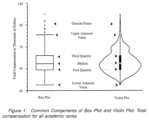
At first glance, violin plots and box plots seem similar—both visualizations provide insights about data distribution. Yet, beneath the surface, significant differences distinguish their applicability to various analytical contexts.
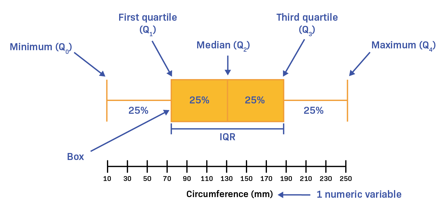
A box plot offers a simple yet powerful representation of essential statistical insights like median, interquartile range, minimum and maximum outliers within the data. Its simplicity fosters quick comprehension and easy communication of data spread, particularly beneficial when stakeholders require immediate clarity.
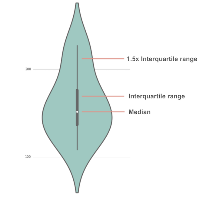
In contrast, a violin plot extends this capability further by combining box plot fundamentals with a kernel density estimation (KDE).
This approach provides a deeper, more nuanced visualization, showcasing the probability density distribution and illuminating the full spectrum of data distribution, including multimodality and density variations. These sophisticated visuals allow decision-makers to understand distributions at a granular level, uncovering hidden trends or patterns that could considerably impact strategic decisions.
This data-centric differentiation makes violin plots powerful in scenarios demanding comprehensive data analysis and deeper interpretive insights. On the other hand, box plots clearly suffice in scenarios focused on rapid interpretation and concise summaries essential for executive presentations. Choosing the right visualization hinges on knowing your data—what insights you need, and how granular stakeholders wish to see the information.
Violin Plots: Best Scenarios for Deeper Distribution Insights
Uncover Hidden Patterns and Multimodal Data Features
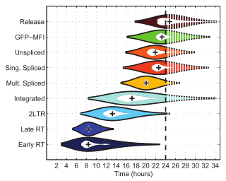
Businesses generating substantial amounts of data benefit immensely from visualization techniques that pinpoint subtle variations and hidden insights. Violin plots shine precisely in these contexts by capturing data patterns that box plots might overlook. Kerne density estimation provides additional distribution insights by illuminating multiple peaks or modes within a dataset—a necessity when dealing with multimodal datasets indicating mixed populations or varied behaviors among different subgroups.
Such granularity serves as a necessary precursor before implementing complex analytics strategies like those we outlined in holographic data modeling for multi-perspective analytics. By first understanding nuanced complexities, your predictive and analytical data models become more robust. Imagine a scenario where user behavior exhibits multimodality; a violin plot clarifies user segments more explicitly, adapting strategy and aligning offerings accordingly.
Comprehensive Exploration During Initial Phases of Data Analysis
When performing comprehensive exploratory data analysis (EDA), analysts seek extensive, detailed visualization that fully embraces variability and data diversity. Violin plots enable analysts to see beyond simplistic summaries provided by box plots. Their rich visualizations inform proactive investigation during the early stages of analysis, guiding decisions for subsequent analytical modeling and optimization efforts. Particularly relevant in finely-tuned predictive modeling scenarios, stakeholders appreciate this depth when exploring supply chain variability through approaches detailed in our guidelines on leveraging predictive analytics for enhanced supply chain management. Precise insights into demand volatility and supplier diversity empower decision-makers to anticipate events, foresee roadblocks, and streamline operational strategies.
Box Plots: Optimal for Quick Understanding & Efficient Communication
Simplified Visuals for Executive-Level Reporting
In many organizations, simplified visualizations drive quick, confident executive decision-making. Box plots summarize critical statistical metrics concisely, allowing executives and non-technical stakeholders to grasp fundamental data characteristics fast. Utilizing an easily comprehensible visual ensures adoption and effectiveness in communication across teams and executive leadership.
If you have stakeholders who comment something along lines of “no one looks at your reports,” it could highlight challenges in communication clarity or complexity. Box plots effectively address this issue, providing a visual summary that’s digestible, impactful, and capable of quickly bringing clarity to discussions. Rather than burying leaders in detail-heavy visualizations, the accessible nature of box plots ensures swift insights, supporting prompt strategic action.
Ideal for Quickly Spotting Outliers and Comparing Groups
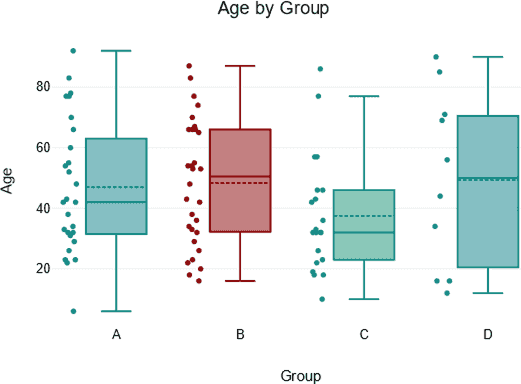
Another significant benefit of box plots aligns with scenarios demanding quick glance visibility to outliers or performance differences across comparable groups or categories. For instance, segment performance metrics in marketing campaigns, manager KPIs in organizational reviews, or sales results across multiple product categories become immediately identifiable through this simplistic approach.
This straightforward functionality enables quick identification of deviations warranting immediate action. Note that this speed in decision-making can enhance organizational agility, another core benefit when incorporating sophisticated analytics aimed at operational efficiency, similar to innovations discussed in our guide to semantic type recognition for automated data processing. You initiate faster response times, expedited troubleshooting, and strategic pivots, maximizing opportunities and minimizing inefficiencies.
Synergizing Violin and Box Plots for Strategic Advantages
Smart technical strategists also understand the advantages inherent to utilizing violin plots and box plots in tandem, leveraging each visualization to complement the other. For example, analysts venture into violin plots initially when exploring data properties comprehensively, then transition later to box plots when communicating summarized insights to broader audiences.
This approach mirrors methodologies we’ve employed successfully in engagements providing advanced Tableau consulting services, where analytics dashboards balance comprehensive analysis (with violin plots) and easy-to-digest summaries (using box plots).
Carefully choosing visualization strategies based on purpose and audience cultivates deeper appreciation of analytics capabilities throughout an organization. Consider using the combined strength of these plots for situations like performance tuning, predictive analytics refinement, and even advanced data retrieval strategies such as those noted in our insight into enhancing data retrieval with indexing in SQL.
A Visualization Strategy Aligned to Your Data Objectives
Ultimately, the violin plot vs. box plot debate finds merit only in understanding your unique strategic priorities and organizational needs.
For rapid communication, executive dashboards, and immediate insights—box plots remain unbeatable. However, when exploratory investigation and meticulous distribution insights become paramount, violin plots provide robust clarity and deeper analytical footing.
At every visualization journey step, an informed approach steers optimal strategic outcomes. Effective visualization is not merely a formula but a strategy developed through careful contemplation into data complexities, stakeholder requirements, and intended objectives.
Ready to enhance your strategic decision-making through visualization clarity? Consider also the benefits of structured, semantic data integration efforts, aligning perfectly towards your strategic aim—like we’ve outlined in our work with ontology-driven data integration and our strategy of creating clarity via enhancing user experience through clearer policies.
Final Thoughts: Plotting the Road Ahead
Understanding the contextual benefits and differences between violin and box plots ensures your visualization strategy sets your team in the right analytical direction. Choosing the right visualization aligns directly with impactful storytelling, powerful insights, and insightful data discovery—each vital in navigating today’s competitive, data-driven marketplace. As your strategic partner in technology, analytics, and innovation, we’re here to help guide your analytics journey forward toward data excellence and strategic clarity.
Need support integrating these visualizations into your data ecosystem? Let’s connect—your data innovation journey starts here.
Thank you for your support, follow DEV3LOPCOM, LLC on LinkedIn and YouTube.


