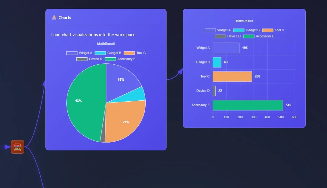
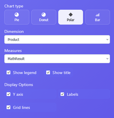
In ET1.1 Neon you can now pipeline your data to Charts.
Pie Chart
Donut Chart
Polar Chart
Bar Chart
This covers an array of classic data visualizations and the same highlighting functionally flows through from data grid to charts. Making it the first ETL software that can show you up and downstream what is happening by mousing over and highlighting in the software.
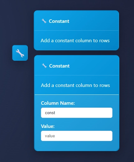
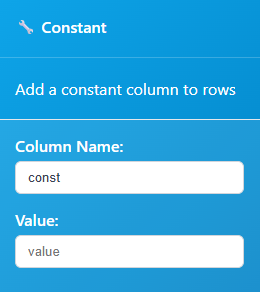
These data visualizations are “single measure” and “single dimensions” charts.
Charts Node will automatically infer a good dimension and measure based on what you’re sending to the node. Also, manual selections are good for directing the tool the right direction.
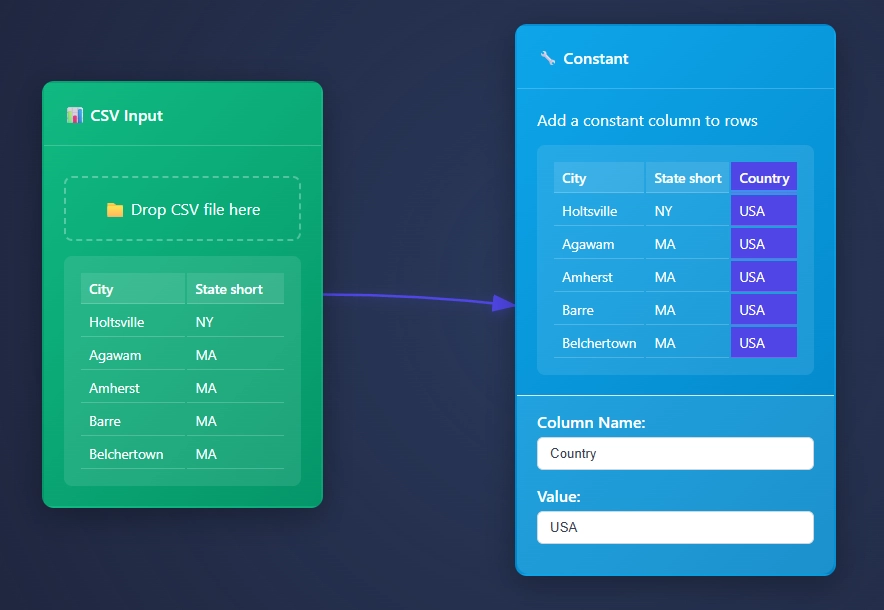
Data can continue to pass through the charts.
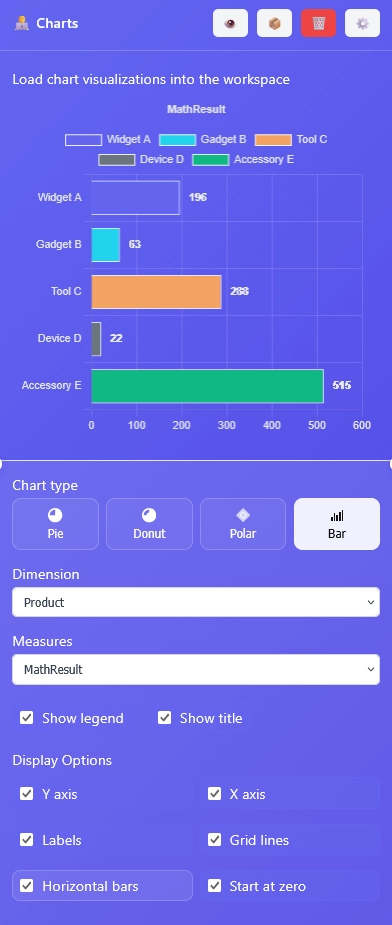
Charts Node: Bar Chart
Creating a bar chart in ET1.1 is possible and has the most settings currently. However in the spirit keeping everything very simple and user friendly for the future of AR/VR users, we want to reduce whatever settings possible and each Chart Type selection will hide “features” related to that chart type, which we are going to term “display options” for the foreseeable future.
Here’s the bar chart features aka Display Options:
Y axis
X axis
Labels
Grid Lines
Horizontal Bars
Start at zero
Display options are change as Chart Types change.
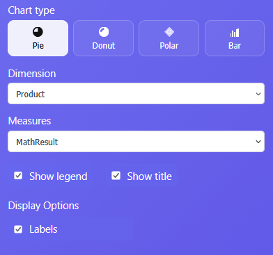
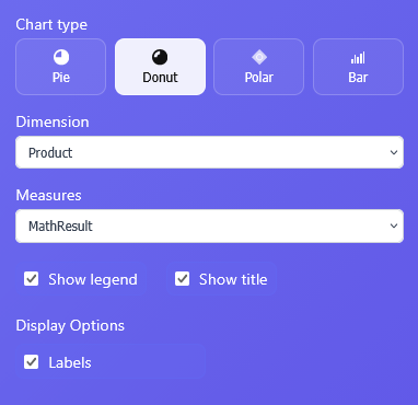
Pie Charts and Donut Charts in ET1 Charts Node
Pie charts and donut chart are similar.
Polar Chart in ET1 Charts Node
Seeking a no-code way to create chartjs Polar charts? Look no further, we built that app here!
Also, learn about how we are the first ETL/Visualization company to deploy Google Ai Edge technology in ET1.1, so that you can use your fingers/hand to solve problems, which turns this into a multiplayer solution!
The Neon Output Node depends on serverless postgresql backend to ensure your data tooling thrives with cool features. Like unblocking postgresql’s upsert – built in an easy user experience.
This Node syncs with your Data Lake, enabling users to gain data from any data in their Data Lake, from any workflow, and begin building their solutions from here.
To avoid spilling all the pop corn here (which is a lot for intro paragraph), will start now.. but before we do…
Next blog; will be about our first implementation of data visualizations in ET1.1 Neon!
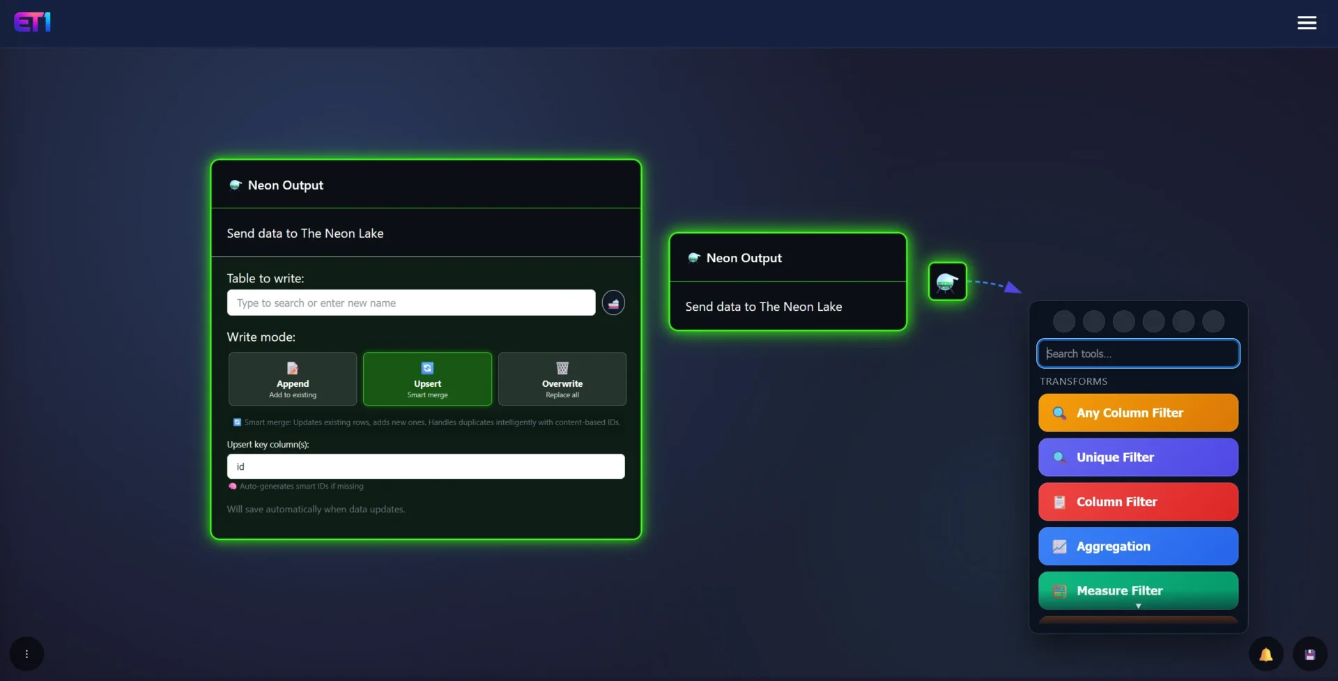
How to use Neon Output Node
The Neon Output Node is in the ET1.1 Neon edition. Contact us for demo.
Note: We have a limit of 19 free spots available for testing. Happy to have you join beta.
The Neon Output Node UX
The User Experience is unique, and kicks off the future of how we build our UX. With these simple buttons packaging a bit under hood. To make life easier. The Neon Output Node Write modes all interact with the “Notification Center” which elaborate more on how Append, Upsert and Overwrite work.
Table to write: TYPE THE TABLE NAME or search for existing table
Ship emoticon: “ship it” or in other words send it to the database immediately
ET1.1 automatically sends data when you save and shipping isn’t required
Append: add data to existing Table
Upsert: add data like postgresql upsert
Overwrite: replace entire table
Upsert key column is only relevant on upsert
The Neon Output Warning…
Warning: The Neon Output Node is designed for ease of use but has the potential to cause damage, “sh1t i deleted everything” kind of vibes that should be considered, and only 1 click away. Good once you understand, bad if you’re not careful.
It’s intended for those aspiring to become proficient database users, and understand the ramifications of such a click. Well, to achieve said mastery, it’s essential to have a thorough understanding of the tooling we all must rely on.
ET1.1 is designed to aid in understanding how to troubleshoot database issues. As in the real world of databases, always test your actions as if they were critical. Use sample data for learning, never use production or client data until you are fully prepared.
Table to write
Type the name of the table you want to create, or wildcard search for the table that is already created.
If the table already exists, what buttons you have selected, like “upsert” and “overwrite” may be destructive behavior given the level of automation happening, be advised you will want to test before using these tools to ensure you’re gaining the results you’re expecting.
By finding an existing table, the value is you can create many workflows and write all of them to the same table, or started from the same table using the Neon Input Node.
Append
Append will push data to the bottom of the table, repeatedly, making it ideal for logging data in situations where you want to retain all information indefinitely, such as monitoring dynamic data like weather.
This creates a unique primary key. The update and create timestamps will be identical.
The end of this url, you’re expected to first know about Primary Keys, Database implementations, and the ability to thread information through this upsert automatically as data happens. Something we do for clients in our data engineering consulting services and this style of solving has felt rather blocked, until ET1.1 – so we hope this is exciting for people interested in data pipelining with a user friendly Upsert solution.
Upsert intelligently removes dupes, creates unique primary key, inserts data and updates data.
How it creates a primary key in the upsert
The creation of the primary key maybe impactful for your data flow so develop accordingly or benefit from the abilities.. The PK built by checking for a unique key first, if it can’t find one, it has to create one to fully function.
If it can’t find a unique key it will automatically create a unique key based on the concat() of all the data at a row level. This can be both helpful and intuitive for moving towards migrating flat files to single source of truth, and not beneficial depending on your use case, so think about your use case.
You can also set the primary key to avoid the intelligent processing.
Overwrite
Erases the data in the table and starts over.
There’s not undo buttons, the data is gone forever, you’re committing this action on a database!
We are not keeping copies of your old data that is overwritten.
This can be considered a very destructive button but used correctly, there’s a high chance this is the button you need. Otherwise upsert is set to default because there’s a higher chance you will want to avoid deletion and merely “update” that row.
Please, if you’re trying to keep the data in the table, don’t click this button, please consider what you’re clicking here.
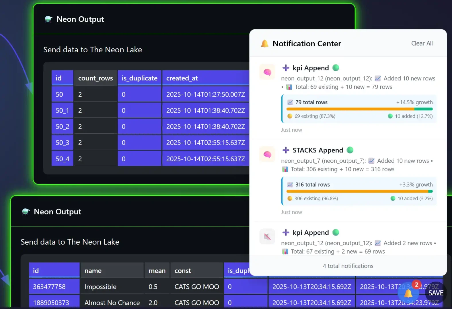
Notification center
When interacting with Neon Output for the first time it’s good to get acquainted with it first.
So, we created a logging system for the Neon Output Nodes.
In screenshot below, you can see what happens if we append data to tables in the Neon Lake.
Each variation has its own method and way of explaining what just happened, we recommend testing in this area with fake data, store the data in a replicated Table.
Also, learn about how we are the first ETL/Visualization company to deploy Google Ai Edge technology in ET1.1, so that you can use your fingers/hand to solve problems, which turns this into a multiplayer solution!
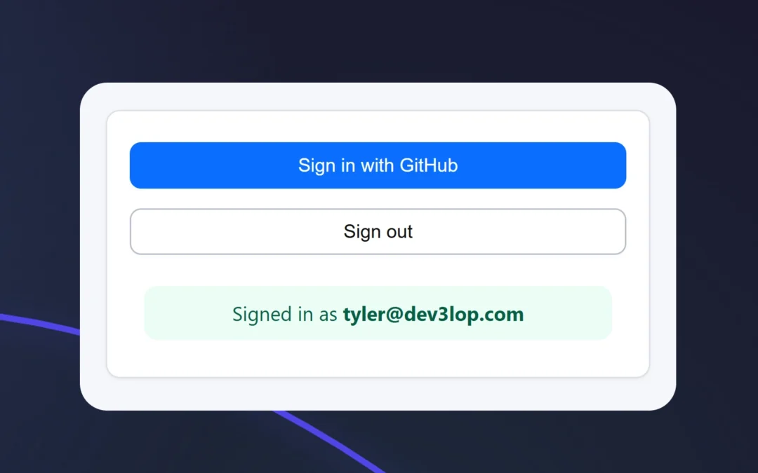
We are excited to announce the GitHub OAuth Login page is now active in ET1.1 (Neon).
Picture a world where your most sensitive data files and database tables are protected with the same robust security protocols and layers you’d expect from a leading, Fortune 500 corporation.
Without having to setup data security; login, authorization, storage, persistence, managing login information and keeping data compliance people happy.
In ET1.1, we encourage end users to begin translating important data to solutions that can become a single source of truth around their team, organization, or across the sea.
Authorization isn’t just a checkbox on our to-do list
Authorization, it’s our top priority, and that’s why we went with GitHub’s OAuth!
Our commitment with developing solutions is to cultivate and maintain an exceptionally secure environment, safeguarding both our users and the valuable data they entrust to us.
With this completed we are actively seeking people to participate in beta testing.
ET1 is using Auth2 through GitHub, providing two-factor authentication to end-users of ET1.
FYI; Using dozens of SaaS products during analytics consulting engagements is our skill, building open source solutions from scratch is our specialty, and…
At DEV3LOPCOM, LLC, we have a decade+ of experience beta-testing and deploying numerous authentication tools in advanced production settings (enterprise and GOV). With this solution, I have developed a unique perspective on streamlined login/security and optimized our ET1’s login process.
ps… If you need assistance with Auth2 in your software, let me know
– Tyler Garrett, Founder tyler@dev3lop.com..
About Authorization
Software authorization is the process of determining what an authenticated user is permitted to do within a software system, such as accessing specific files, performing actions, or using certain features. It is crucial for ensuring security by preventing unauthorized access to sensitive data and functionality, and for maintaining operational control by managing user permissions, tracking usage, and enabling personalized user experiences that enhance customer satisfaction and loyalty.
About GitHubs OAuth (Auth2)
We did not create auth2, rather we are utilizing auth2! Think of Auth2 like a way to keep your sensitive information safe and secure, we don’t store your password.
This helps you login fast, seamlessly, if you’re already logged into GitHub in another tab – it’s a 1 click login – and this process keeps your solution/data safe.
What is Auth2?
Auth2 is a protective layer we use to help use generate data security per user.
Auth2 is an industry standard when it comes to managing data privacy and security.
People are going to want to add their data into ET1, different kinds of data, and we are working hard to ensure this is not only possible but also the safest it can be. We will not need to recreate the wheel, but instead utilize vetted systems. This enables us to offer hippa compliant storage, soc2 compliant storage, and way more… Without over complicating the UX.
With ET1, we are going a similar direction as our cronjob software Canopys Task Scheduler, and using different under hood tech. Excited to share, founder of dev3lop, Tyler Garrett, created the entire authorization flow. The Login to ET1 with GitHub Authentication is now live for beta testing!
Setting up 2 way auth is VIA GitHub is easier than you think so here’s a link to GitHub Auth Documentation and more importantly it unlocks Google emails. Plus, we like the idea of advocating for a software we love to use.
If you don’t have a GitHub account, please create one
If you have a github account, login
We only request your ’email’, we don’t save your password.
Github Auth and User Data Explained
Here’s a simple, privacy‑first explainer of the users table, plus a short technical brief of “GitHub Auth” for the curious.
Users table (what each column means) Source:
database-schema.sql → table users
id (UUID)
A random unique tag the system gives you when you first show up.
It’s not your email or username.
Think of it like a sticker on a package so it can be tracked without opening it. 🔒
external_id (text)
A number/string that represents you from GitHub.
It’s how the system knows “the same person” across sessions without storing a password here.
Marked unique, so there’s only one of you. ✅
email (text, optional)
Used for “who’s signed in” display or contact. ✉️
created_at (timestamp)
When your record was first created.
Like a “birthday” for your account in this system. 🗓️
updated_at (timestamp)
When anything about your record last changed.
Auto‑updated so there’s an honest trail. 🕒
Why this is privacy‑friendly
Minimal data: just an internal id, a GitHub id, and optionally an email.
No passwords stored here. Authentication happens through GitHub, so this table isn’t a vault of secrets.
Clear timestamps help you audit “when did this get created/updated?”
Short technical brief: GitHub Direct (for the nerds)
Flow: Browser requests GitHub OAuth → user consents at GitHub → GitHub redirects back with a code → the backend exchanges code for tokens → identity is read (e.g., user id, email) → app creates/updates users using external_id as the stable key.
Why we use “Direct” conversations with GitHub? It talks straight to GitHub’s OAuth endpoints, avoiding extra middle SaaS style layers that can fail, require passwords, and become a single point of failure.
Data model: external_id is the anchor. Email is optional data that may change; external_id won’t.
Security posture: No passwords stored locally. Use HTTPS, strict redirect URIs, and least scopes (often user:email). Tokens should be short‑lived and stored server‑side with care.
To keep your account secure, you must authenticate before you can access certain resources. When you authenticate, you supply or confirm credentials that are unique to you to prove that you are exactly who you declare to be.*
TL;DR tech stuff
You get a private internal id, a “GitHub id”
so the system recognizes you, and an email.
No password stored here, that would not be safe!
GitHub Auth = clean OAuth (Auth2) with GitHub as the identity source.
Plus GitHub includes a simple Google Login which is very secure and our preference.
Our history with authorization
Previous software we released, Canopys Task Scheduler, a desktop task schedule for both windows and mac, was a good demonstration of our knowledge with desktop development, creating executable files, and authorization embedded into an electronjs desktop only application. Building native web applications on desktop, using Auth0s authorization, a local SQLite database, not an easy task, however with NodeJS and electronjs we think life is much easier.
Learn more about ET1, contact us for any questions, demo, and access to beta.
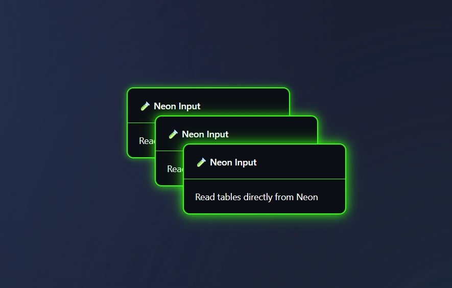
The Neon Input Node is our first managed database access node, and an intuitive approach to giving people access to a serverless PostgreSQL which users are able to manage in Neon Lake.
Data here is safe, and protected by 0Auth (Two way authentication).
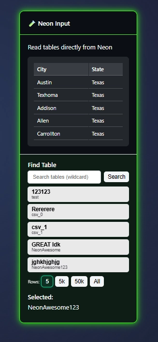
As you use ET1.1 csv files, json, and manual tables, this data will automatically flow to the Neon Lake. Making it available, immediately, in the Neon Input Node.
Think of the Neon Input Node as a way to collaborate easier across data development, and a way to begin bringing together flat files lost in the organization – in one node.
The Neon Input lets you access the Neon Lake from any Workflow.
Neon Input Node, enables teams to work together on the same source of truth and helps you to work across workflows with the same data source.
ET1 Neon Input Node requirements
ET1 Neon Input Node is not available in the Bronze Edition of ET1.