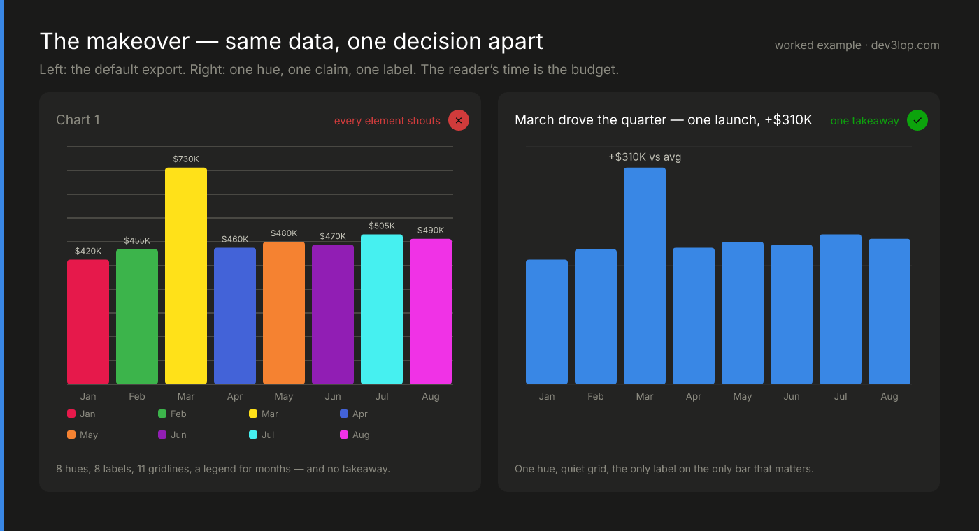
Same data, one decision apart
A lot of good design work looks like this image: very little added, most of the noise removed. On the left is the chart as it often ships: a different hue for every month, a value on every bar, eleven heavy gridlines, and a legend for the months. On the right, one decision has been made (March is the story), so March gets the only label and the title states the claim.
Design rules, applied
Three dashboard templates we designed and published with sample data, plus one component from our own ETL tool. The templates share one palette and one set of status rules, the same kind of rules we write into a client's style guide. Each card names the rule it applies.
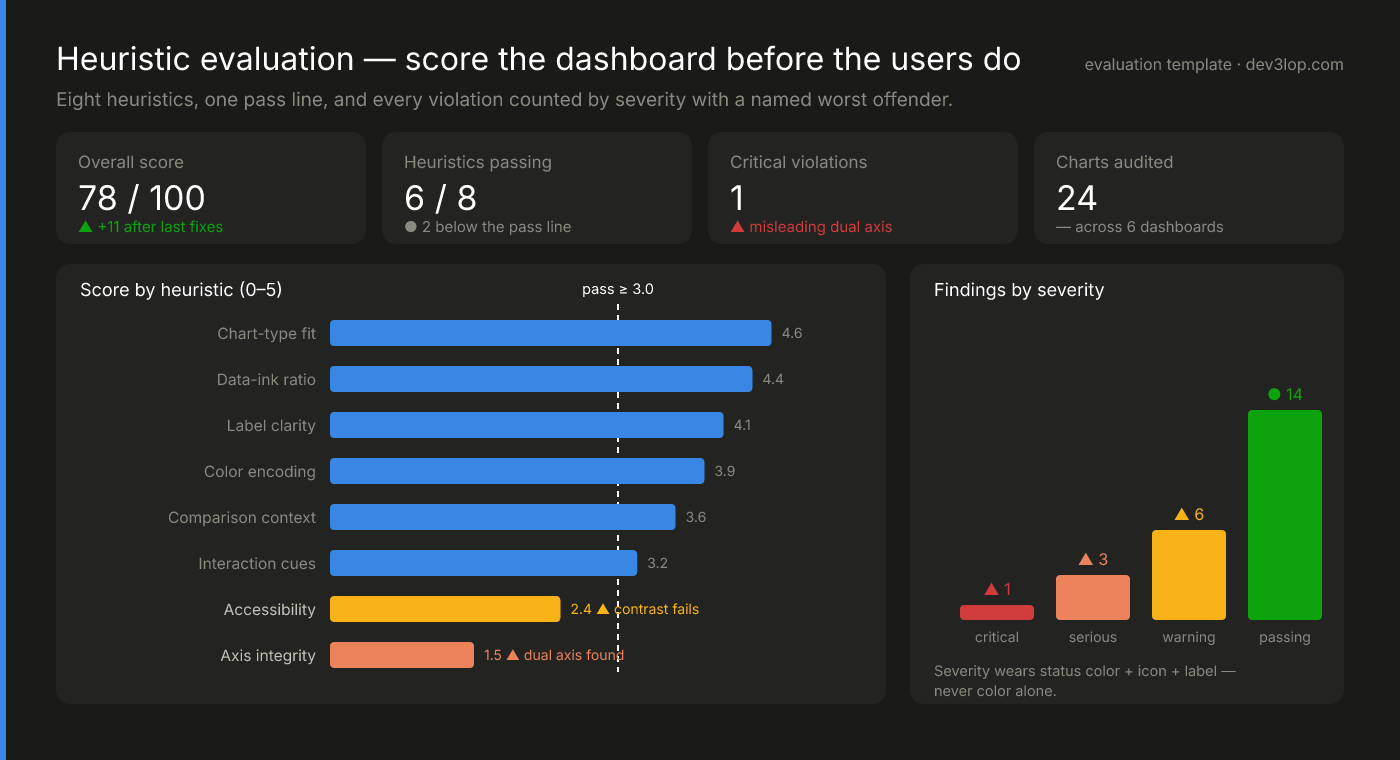
Score the dashboard before the users do
Eight heuristics, from chart-type fit and label clarity to accessibility and axis integrity, each scored 0 to 5 against a dashed pass line. The two that fall short are named at the bar (a contrast failure and a dual axis), and findings are counted by severity with a color, an icon, and a label. It turns "I don't like this dashboard" into a ranked fix list a team can repeat without us.
See the scoring framework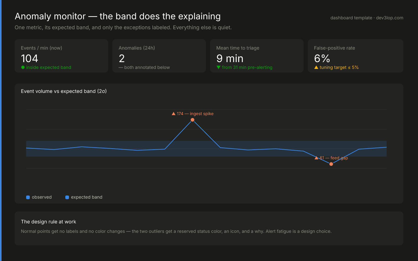
Only the exceptions get color
One metric, its expected band, and silence everywhere else. Normal points get no labels and no color change. The two real outliers get a reserved status color, an icon, a value, and a reason. The tile row scores the detector itself, time to triage and false-positive rate, because on-call stops trusting a monitor that cries wolf. Alert fatigue is decided when the screen is drawn.
See the monitor template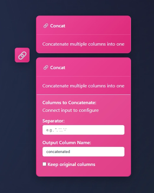
One node, three states
Internal tools get the same treatment as dashboards. In ET1, our visual ETL tool, the Concat node appears three ways: an icon on the canvas, a collapsed card with its name and purpose, and an expanded form for its settings. Before any data is wired in, the column picker says "Connect input to configure" instead of showing an empty list.
See the node in ET1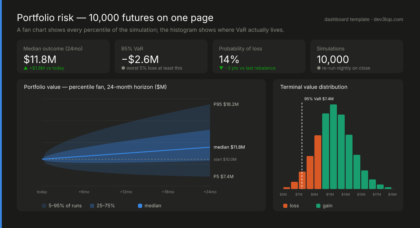
A forecast that shows its risk
A single forecast number hides the part leadership most needs to see. This layout draws the simulation as percentile bands in one hue, with the median as a line and P95, median, and P5 labeled at the edge, beside a histogram that shows where value at risk sits, in a fixed loss-and-gain color pair.
See the risk templateOur design services.
Hover any tile to learn more about how we can help.
Data App & Internal Tool UI
Flows · Forms · States
HoverData App & Internal Tool UI
Interfaces for the forms, queues, and pipeline builders your team uses all day, with empty, loading, and error states designed in.
Design Systems & Style Guides
Tokens · Components · Chart rules
HoverDesign Systems & Style Guides
Color, type, spacing, and chart rules defined once, then shipped as CSS variables, a Power BI theme, or a Tableau palette and template.
Dashboard & Report UX
Layout · Hierarchy · Flow
HoverDashboard & Report UX
Screens organized around the decision, not the data model. The number someone came for sits where the eye lands first.
Accessible Color & Type
Contrast · Color-blind safe
HoverAccessible Color & Type
Palettes checked for contrast and color-blind separation, status that never relies on color alone, and type that holds up on a phone.
Design Reviews
Heuristics · Severity · Fixes
HoverDesign Reviews
A scored review of your dashboards or app against clear heuristics, every finding ranked by severity and paired with a fix.
Web Design for Technical Companies
Product pages · Docs · Sites
HoverWeb Design for Technical Companies
Product and marketing pages that explain an API or a data platform in specifics, designed with the build and search in view.
Design is the part of a data product people touch
DEV3LOPCOM, LLC is a data engineering and analytics consultancy in Austin, Texas, and a lot of the “data problems” we get called about turn out to be design problems. The numbers are right and the pipeline runs on time, but nobody can find the number they came for, status colors mean different things on different screens, and the internal tool loses to a spreadsheet export.
Because we also build the data underneath, we design against real data shapes, like the empty state, the sixty-character product name, and the month with triple the usual volume, before those surprises reach production.
Design work we’ve shipped
We design as engineers: a design has to survive implementation, so we design what can be built and then build it. Our founder is a former Tableau Software Professional Services consultant, and we are 100% onshore.
- Our own products. ET1, our visual ETL tool, puts pipelines on a drag-and-drop canvas where every node previews its own output. For Canopys, our task scheduler, we designed a drag-and-drop DAG builder so teams can lay out workflows without writing YAML.
- A client’s brand, applied at scale. Applying a client’s style guide takes the same discipline as writing one. For Buxton, we worked with their design and product teams on more than 100 Tableau workbooks matched pixel-to-pixel to their existing brand guidelines on desktop and mobile.
- A branded server. At GoPro, we edited Tableau Server’s HTML and CSS directly, an unsupported change, to give the team a branded server experience.
- Executive dashboards. At ExxonMobil, we tightened metric definitions and narrative flow on executive dashboards for the CTO, the CIO, and their direct reports.
- Reusable templates. At Lever, configurable Tableau templates replaced hours of manual SQL work for every new client.
Status wears a color, an icon, and a label, never color alone. The dashboard templates above draw their series colors from one categorical palette that passed an automated validator, including separation under common forms of color blindness. For background, see our post on colorblind-friendly palettes.
Where design ends and our other services begin
Design covers the product around the charts: layout, navigation, interaction, and the system that keeps it all consistent. For chart-level work inside a BI tool, such as chart selection, visualization best practices, and team training, see our data visualization consulting. When a design needs to become a working application or site, our web development services practice builds it, so the handoff from mockup to code stays inside one company.
How an engagement runs
Review. We start with what exists and who uses it: which decisions each screen supports, and which screens people avoid. You get a question inventory and, for existing work, a scorecard against a fixed set of heuristics with every finding ranked by severity, like the one above.
Design. Wireframes on your real data first, then high-fidelity screens, annotated for the people who build them. Each decision gets written down with its reason, so the next person to touch the screen knows why the grid is quiet or why only one bar is labeled.
Systematize. Whatever repeats becomes a token, a component, or a chart rule, collected into a style guide in the form your tools accept: CSS variables for web apps, a theme file for Power BI, a color palette and a formatted starter workbook for Tableau.
Build or hand off. We build it in Tableau or Power BI for reporting and through our web development practice for applications and sites. Or your developers get specs that cover the empty, loading, error, and overflow states.
Problems we fix
- Every new screen is a one-off. No shared components or tokens, so each team rebuilds the table, the filter bar, and the status badge, and no two match.
- The internal tool people work around. Every field on one screen, no empty or error states, and a CSV export that quietly becomes the real workflow.
- Designs engineers can’t build. Mockups with no states, no spacing rules, and no plan for long labels or missing data. Real data always overflows the mockup.
- A marketing site that could belong to anyone. Stock imagery and copy that never says what the product actually does.
Start with your most-used screen
Send us the dashboard, internal tool, or page your team opens most, or the one they avoid. We will look at it against the heuristics we publish, tell you what we would fix first, and tell you honestly whether you need a designer at all. Contact us to get started.