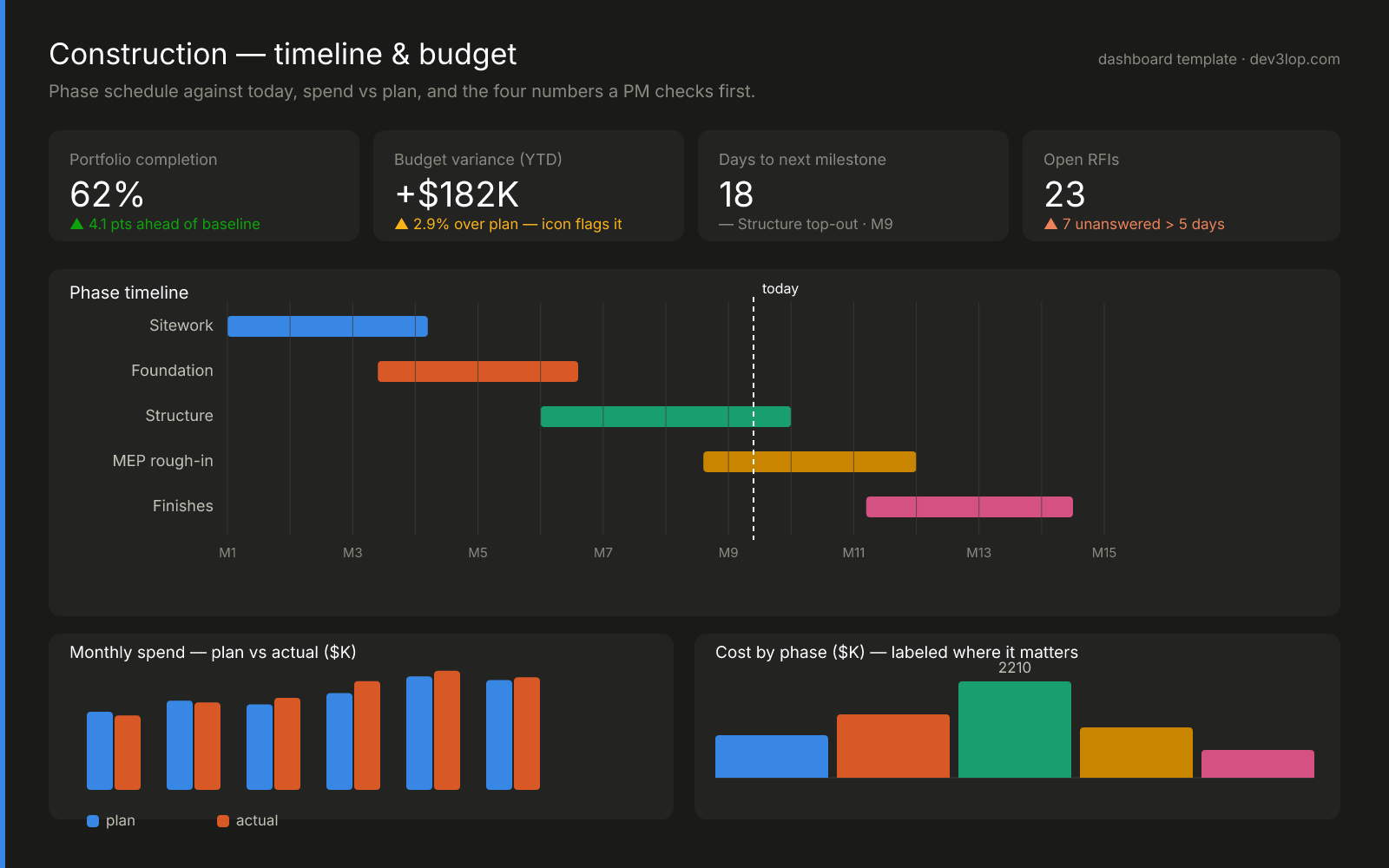
Work you can inspect, not just read about
This construction dashboard is one of our published templates — KPI tiles with status icons and labels, a phase Gantt cut by a hard “today” line, plan-vs-actual pairing, and exactly one labeled bar. Every color passed a six-check accessibility validator, including color-blindness separation, before it shipped. We publish the whole design and teach it chart by chart, because dashboards you can audit are the only kind worth buying.
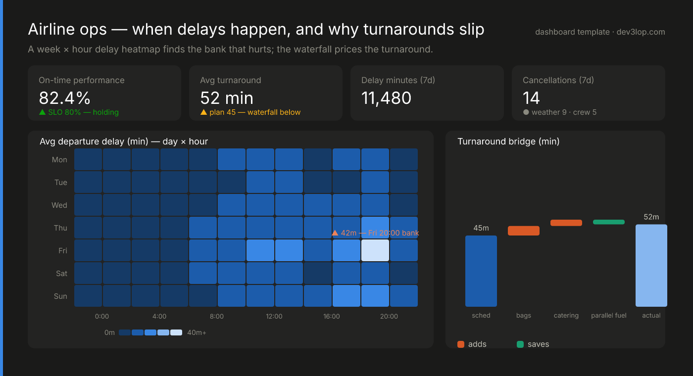
Heatmaps that find the Friday bank
A week-by-hour delay matrix makes the painful departure bank jump out of 84 cells, and a turnaround waterfall prices exactly where the 45-minute plan becomes 52 real minutes. Sequential color done properly: one hue, monotonic lightness, a labeled scale.
See the airline template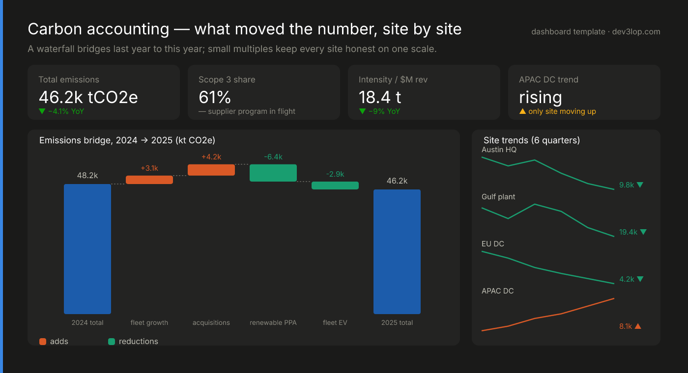
Waterfalls that explain the delta
An emissions bridge shows exactly what moved the annual number — growth, acquisitions, renewables, electrification — and small multiples keep every site honest on one shared scale. The only site trending the wrong way is the only one that gets a warning color.
See the carbon template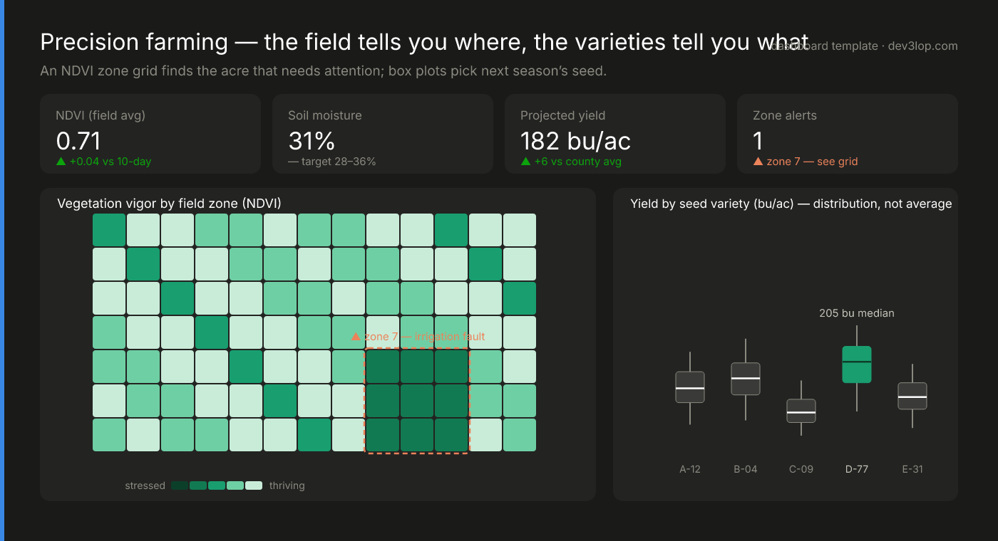
Spatial grids and honest distributions
A field-zone grid turns an irrigation fault into a visible hole in the field, and box plots pick next season's seed by distribution, not average — the winning variety's worst quartile beats most competitors' medians, which is the actual purchasing argument.
See the farming template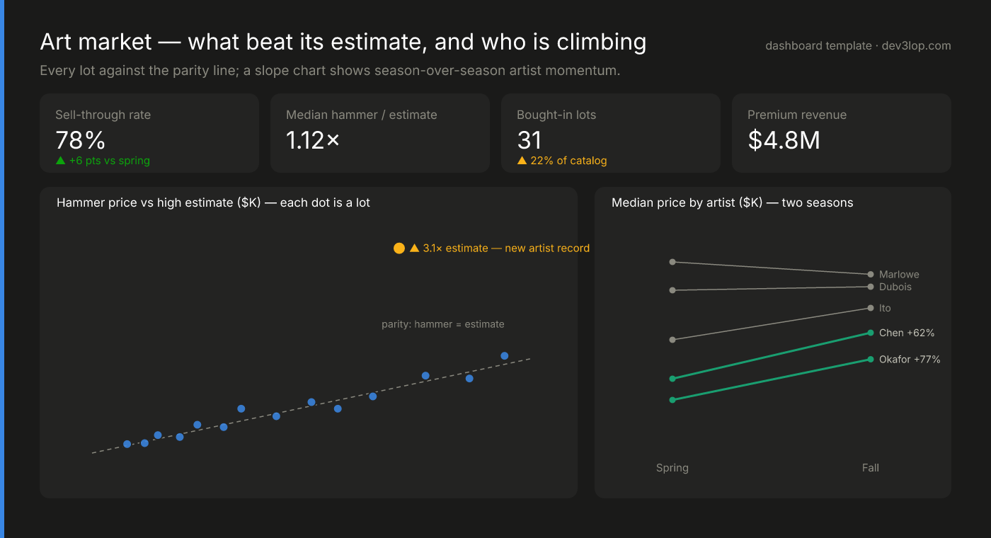
Parity scatters and slope charts
Every lot placed against a parity line makes the market's verdict geometric — and a slope chart turns five artists' season-over-season momentum into something you read faster than any table. Both patterns transfer to any predicted-vs-actual pair you track.
See the art market template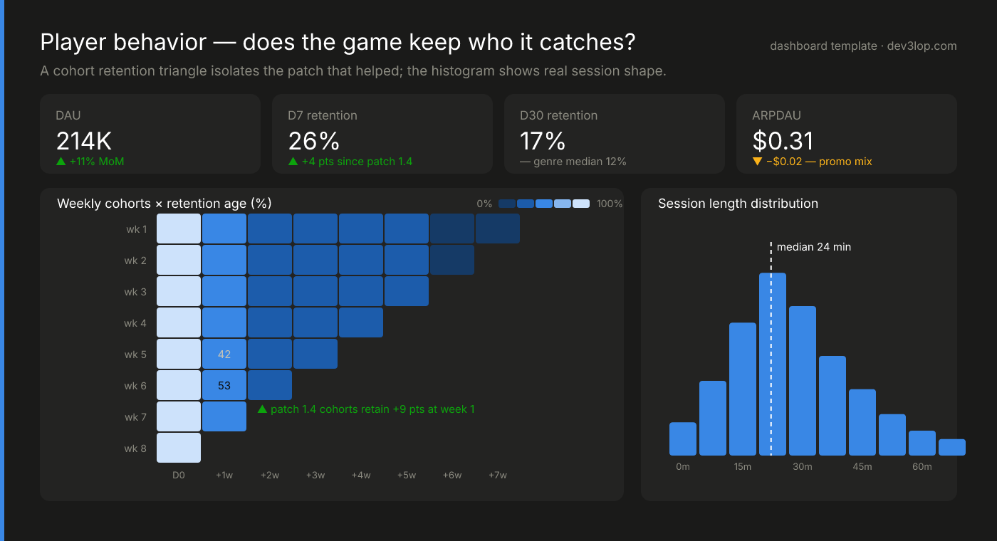
Cohort triangles that catch what averages hide
The retention triangle is the most information-dense chart in games analytics: read it diagonally and the patch that lifted week-one retention nine points appears — invisible in the topline, because old cohorts drag the average. That's why cohorts exist.
See the gaming templateOver a Decade of Visualization Excellence
DEV3LOP provides top-tier data visualization consulting services. Whether you’re interested in deeper data insights or trend analysis, we’re excited to help you communicate your data story effectively.
Trusted by Leading Organizations
Enterprise clients include Deloitte, Nielsen, GoPro, Boston Scientific, ExxonMobil, Kroger, GoodWill, WellCare, PepsiCo, and OnCor.
Government and nonprofit work spans Florida Department of Revenue, Alabama Medicaid, the FBI, Florida Surplus Lines, and Florida Medicare.
Education sector projects include Ministry of Higher Education, Ryerson University, Minneapolis Public Schools, Education Corp. of America, and University of Texas.
Boutique Expertise, Enterprise Results
DEV3LOP is a boutique data visualization consulting company based in Austin, Texas. When you work with us, you get direct access to our most skilled visualization engineers.
We’re passionate about teaching others about emerging technologies and helping organizations develop a strong foundation of visual analytics. We offer remote and on-site consulting, including gap analysis, project management, staff augmentation, and custom end-to-end visualization solutions.
What Good Visualization Work Looks Like
A dashboard is not a place to display data; it is a place to answer questions. Our design process starts by writing down the questions a viewer brings to the screen, then choosing the fewest marks that answer them. That means bar charts over gauges, direct labels over legends, and a visual hierarchy that puts the number someone came for at the top left, not behind three filters.
The craft came from enterprise practice. Our founder is a former Tableau Software Professional Services consultant, and the standards we apply were forged on projects where thousands of people used the output daily — like the streaming occupancy dashboards we built for ExxonMobil, covering more than 80 campuses, where a confusing chart meant a facilities decision made on bad information.
Common Problems We Fix
- The dashboard nobody opens. Usually a design problem, not a data problem: too many charts, no clear question answered. We interview the audience and rebuild around what they actually decide with it.
- Charts that mislead. Truncated axes, dual axes with mismatched scales, part-to-whole charts of non-exclusive categories. We audit for honesty as well as polish.
- Slow render times. Visualization performance is often a data-shape problem. We restructure sources so views draw in milliseconds — the same tuning discipline behind the Tableau Server high-availability work we did for GoPro.
- Inconsistent styles across teams. We build style guides and reusable templates so a chart from finance looks like it came from the same organization as a chart from operations. For a design system that also covers apps and internal tools, see our design services.
Tools and Adjacent Services
We design in Tableau, Power BI, Looker Studio, and D3.js for fully custom work. Because we are a data engineering consultancy underneath, we also fix the layer most visualization projects trip over: the model feeding the charts. When the underlying data is shaped correctly, the visualization work gets faster, cheaper, and easier to maintain. That end-to-end scope is how we handled reporting at scale for clients like Nielsen, where the datasets behind the visuals ran to trillions of records.
Get Started
Achieve faster access to experienced data visualization consultants. We’re ready to collaborate, sign NDAs, and learn about your goals. Send us your most-used dashboard and we will give you an honest read on what is working and what is costing you adoption. Schedule a discovery call today.