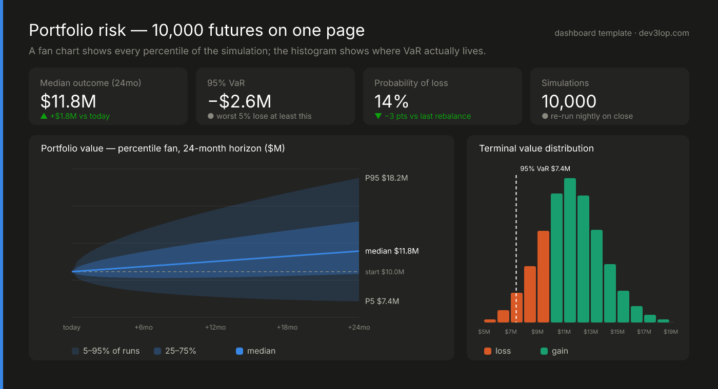
A Monte Carlo simulation answers the only honest version of “what will happen?” — it runs the future ten thousand times and hands you the whole distribution. The problem has never been the math; it’s that a distribution is a terrible thing to put in an executive’s inbox. Monte Carlo simulation visualization is the craft of turning those ten thousand runs into charts a decision-maker can act on in one glance: a fan of percentile paths instead of a single forecast line, a histogram that shows exactly where Value at Risk lives, and a sensitivity view that names the assumption doing the damage. In this article we build that dashboard piece by piece — the layout we would start a financial risk dashboard from — then break each chart out as a standalone starting place, and close with the same math pointed at a different question entirely: the kanban Monte Carlo forecasting chart that replaces “when will it be done?” guesswork with a commit date you can defend.
The template: 10,000 futures on one page
The hero image above is the layout, and every element earns its position. The four tiles answer the pre-coffee questions: the median outcome (what we expect), the 95% VaR (what the worst 5% of futures cost), the probability of loss, and the run count — because a simulation’s credibility starts with “how many futures did you actually check?” The fan chart is the centerpiece: portfolio value over 24 months drawn as percentile bands in one hue, where darker means more probable — the 25–75% band inside the 5–95% band, the median as a line, and a dashed reference at the starting value so loss is a place on the chart, not a footnote. The histogram on the right shows where all those paths actually land, split at breakeven, with the VaR marker cutting through it.
The data bill is smaller than the output suggests: a starting value, a list of simulated end-state values (one number per run), and the percentile series over time (five columns: P5, P25, P50, P75, P95 per period). Any simulation engine — Python, R, a pricing library, even a spreadsheet add-in — already produces this. The dashboard’s job is to not summarize it down to one number again.
Monte Carlo simulation visualization, chart by chart
You don’t need the whole dashboard on day one. Each chart below stands alone: take the one that matches this week’s question, wire your simulation’s output into it, and ship it.
The fan chart — a forecast that admits uncertainty
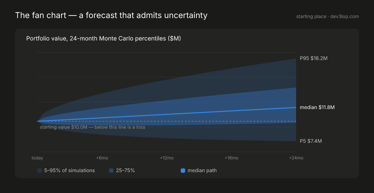
What it answers: the range question — “where could we be in two years, and how wide is could?” A single forecast line is a promise nobody can keep; the fan is the honest version. Data you need: percentiles per period — P5, P25, P50, P75, P95. Five columns, one row per month. Make it yours: keep it one hue. The bands are the same variable at different probabilities, so this is sequential color — opacity carries density. The moment bands get their own hues, readers hunt for a legend that shouldn’t need to exist. And draw the starting-value line: below it is a loss, and that single dashed rule turns an abstract chart into a risk chart.
The outcome histogram — where VaR actually lives
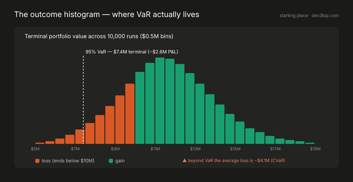
What it answers: what “95% VaR of −$2.6M” means. VaR quoted as a number gets nodded at; VaR drawn as a line through a histogram — with the 5% tail visibly to its left — gets understood. Data you need: one column: terminal value per run. Bin it; count it. Make it yours: color here is polarity, not decoration — a fixed loss/gain pair split at breakeven, with a legend. Annotate the tail average (CVaR) beside the VaR line, because the average loss beyond VaR is the number risk committees actually argue about. If your runs land in heavy skew, resist the urge to trim the axis; the ugly tail is the finding.
The tornado chart — which assumption moves the answer
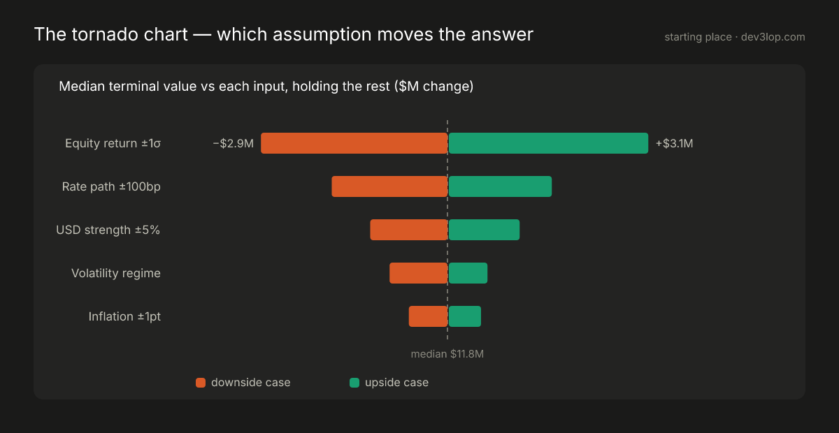
What it answers: the meeting-after question — “fine, but what drives it?” Re-run the simulation flexing one input at a time and the tornado ranks your assumptions by how hard they swing the median. Data you need: three columns — input name, downside result, upside result. One row per assumption. Make it yours: sort by total span, always — an unsorted tornado is just bars. Label only the top pair; the shape carries the rest. This chart doubles as your model-governance exhibit: it’s the visual answer to “which of these assumptions deserve better data?” — and when correlated inputs make single-flex analysis misleading, that’s your cue to graduate toward richer multidimensional views like quaternion-based visualization.
The kanban Monte Carlo simulation chart, explained
The same math that prices portfolio risk forecasts software delivery — and the kanban version might be the most immediately useful Monte Carlo simulation chart in existence, because its only input is data every team already has.
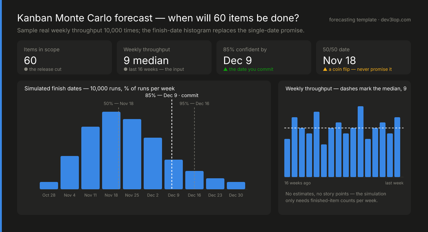
Here’s the whole method. Count finished items per week — no estimates, no story points, just throughput. To forecast “when will these 60 items be done?”, sample randomly from your own recent weeks over and over: draw a week, subtract its throughput from 60, repeat until the backlog hits zero, record the finish date. Do that 10,000 times and you get the histogram above — a kanban Monte Carlo forecasting chart where each bar is the share of simulated futures finishing that week.
The dashed percentile lines are the entire management conversation. The 50% line is a coin flip — the date optimists accidentally promise. The 85% line is the commit date: in 8,500 of 10,000 futures you’re done by then. The gap between those two lines is your delivery risk, drawn to scale. When a stakeholder asks for the earlier date, you’re no longer negotiating feelings; you’re pointing at the 35% of histogram sitting between the two lines and asking which of those futures they’d like to pretend don’t exist.
Data you need: two columns — week, items finished. Genuinely nothing else; the throughput run chart on the right of the example is the input, shown so the forecast can be audited at a glance. Make it yours: re-run nightly as new weeks land, and only sample from weeks that resemble the future (same team size, no holiday freezes). The forecast is only as honest as the history you let it draw from.
The plumbing that keeps a simulation honest
A Monte Carlo dashboard fails quietly when its inputs drift, and no chart above will warn you. The engineering underneath is where trust is manufactured. Simulated scenarios only match reality when the input distributions are fit on clean, well-shaped history — which is why data skew detection and handling in distributed processing matters more here than in most analytics work: skew you didn’t model is risk you didn’t price. Market and position data arriving as deeply nested API payloads needs deliberate flattening before it feeds a simulation, and inputs drawn from many systems need enterprise-wide data type standardization so “return,” “exposure,” and “date” mean one thing across every run.
Two more pieces earn their keep at scale. For near-real-time risk monitoring, probabilistic data structures like HyperLogLog and Count-Min Sketch let the pipeline summarize massive streams cheaply so the dashboard can re-simulate on fresh data instead of yesterday’s close. And because a risk model everyone can poke at is a risk model people trust, run the whole thing inside a governed data-sharing sandbox architecture where analysts, traders, and compliance can stress the same simulation without stepping on production — the collaboration is what turns a chart into an institution.
Implementing your Monte Carlo dashboard
Sequence the build like this. First, define what you’re simulating and why — the variables, correlations, and probability distributions come from the decision you’re trying to support, not the other way around. Second, size the compute honestly: 10,000 runs nightly across a real portfolio is a batch workload with spiky needs, which is exactly the shape cloud infrastructure handles well — our AWS consulting engagements typically stand this layer up before any chart gets drawn. Third, put the visualization where your audience already lives: every chart in this article ports directly to Tableau or Power BI (if you’re starting fresh, here’s our quick guide to installing Tableau Desktop), and the percentile-band + histogram + tornado trio needs no exotic chart types. Finally, close the loop — publish the run count and refresh date on the dashboard itself, gather where readers misread it, and iterate. A simulation nobody re-checks is a very expensive random number generator.
If you want this built against your own book — plumbing, simulation layer, and the dashboards above — that’s the first few weeks of a data visualization consulting engagement with us, and the kanban version takes an afternoon once throughput data exists.
Monte Carlo visualization FAQ
What charts are used to visualize a Monte Carlo simulation? Three do most of the work: a fan chart (percentile bands over time) for the range of paths, a histogram of outcomes for the distribution and VaR, and a tornado chart for input sensitivity. Dashboards add KPI tiles for the median, VaR, probability of loss, and run count.
How many simulation runs do you need? Enough that the percentiles you report stop moving — 10,000 is a practical default for portfolio-level dashboards; tail-focused work (CVaR, 99th percentiles) benefits from 100,000+. Always print the run count on the dashboard.
What is a kanban Monte Carlo chart? A forecasting chart that samples a team’s real weekly throughput thousands of times to build a histogram of possible finish dates, read through percentile lines — commonly the 85th percentile as the commit date. It requires only finished-item counts per week, no estimates.
Thank you for your support, follow DEV3LOPCOM, LLC on LinkedIn and YouTube.