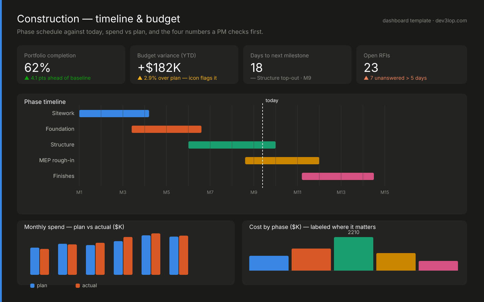
In the ever-evolving landscape of the construction industry, project managers and executives face mounting pressures to optimize project timelines and budget utilization. The challenges are compounded by increased project complexities, vast data sources, and tight deadlines. Fortunately, advanced analytics powered by intuitive business intelligence tools now revolutionize how construction enterprises track projects. Leveraging robust analytics methods like interactive dashboards, organizations transition from manually intensive check-ins toward actionable insights delivered through powerful visualizations. In this insightful exploration, we demonstrate how construction project analytics through timeline and budget visualization empower your organization to proactively identify bottlenecks, streamline resource allocation, and achieve strategic clarity to hit milestones with precision and accuracy.
The template: one page from groundbreak to closeout
This is the layout we reach for on construction engagements, and every element earns its position. The four tiles answer the questions a PM asks before coffee — how far along, how far over, how long to the next milestone, and what’s stuck — with status icons and labels, never color alone. The phase Gantt runs against a hard “today” line so schedule slip is visible geometry, not a footnote. Below it, plan-vs-actual spend pairs each month (the 2px gap between bars is deliberate — touching bars read as one shape), and the cost-by-phase chart labels only the number that matters. Steal the structure; the sections that follow explain the data plumbing that keeps it honest.
Your starting places, chart by chart
You don’t need the whole dashboard on day one — and you don’t need a BI platform to begin. Each piece below stands alone: take the one that matches this week’s headache, wire your columns into it, and ship it. The rest can wait.
The KPI tile row
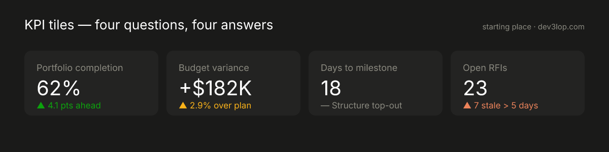
What it answers: the four questions your PM gets asked before 8am, without opening a single report. Data you need: one number per tile, plus the comparison that gives it meaning (plan, baseline, or threshold). That’s it — a tile with no comparison is trivia. Make it yours: swap our four questions for the four your standup actually asks. The discipline is the count: four tiles force a ranking; twelve tiles are a dodge.
The phase timeline against today
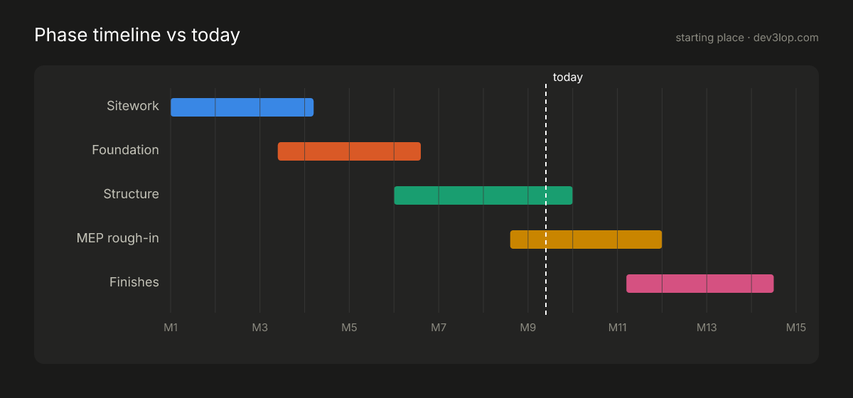
What it answers: where every phase stands relative to right now — slip becomes visible geometry instead of a paragraph in a status email. Data you need: three columns — phase name, start date, end date. A spreadsheet has this today. Make it yours: the dashed “today” line is the whole trick, and it works for anything with phases: permitting, hiring pipelines, product launches. Add a second faint bar per phase for the baseline plan when you’re ready to show slip explicitly.
Plan vs actual, paired
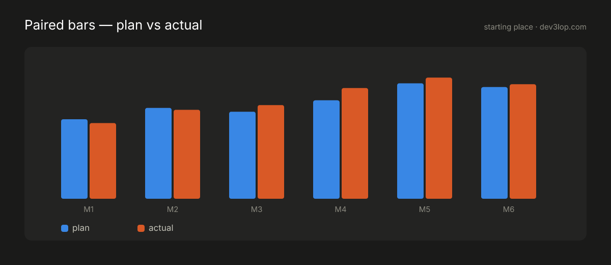
What it answers: whether the money is tracking the story — month by month, not as one year-end surprise. Data you need: period, planned amount, actual amount. Three columns again. Make it yours: this pairing pattern is the workhorse of accountability charts — swap dollars for labor hours, tonnage, or inspection counts. Keep the two colors fixed (plan is always the same hue everywhere it appears) and let the gap between pairs do the separating.
A worked example: the mid-rise that was quietly six weeks late
Theory doesn’t teach; stories in data do. So here’s a composite of engagements we’ve actually run — a 14-month mid-rise, told through the same three charts from the template above, in the order the truth came out.
Act 1 — the status meeting said “fine”
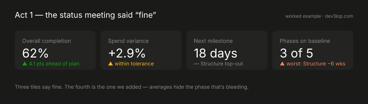
Overall completion: ahead of plan. Spend: within tolerance. That’s what the Monday meeting heard for six straight weeks, and nobody was lying — averages were. Sitework finished early, which mathematically canceled Structure quietly falling behind. The fix wasn’t a better meeting; it was the fourth tile: phases on baseline, 3 of 5, worst offender named. The teaching point transfers to any industry: every aggregate KPI needs its worst-case companion, because an average is where problems go to hide.
Act 2 — the Gantt told on it
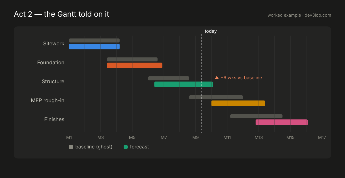
One chart change turned suspicion into geometry: ghost bars. Each phase keeps its original baseline as a muted gray bar behind the live forecast — so Structure’s six weeks aren’t a sentence in a status email, they’re a visible gap, and the cascade into MEP and Finishes isn’t a debate, it’s right there. This is what “interactive timeline transparency” actually means in practice (and what cross-filtering across a multi-chart dashboard makes drillable): not prettier bars — the plan and the truth on the same row, per phase.
Act 3 — the money confirmed it, late
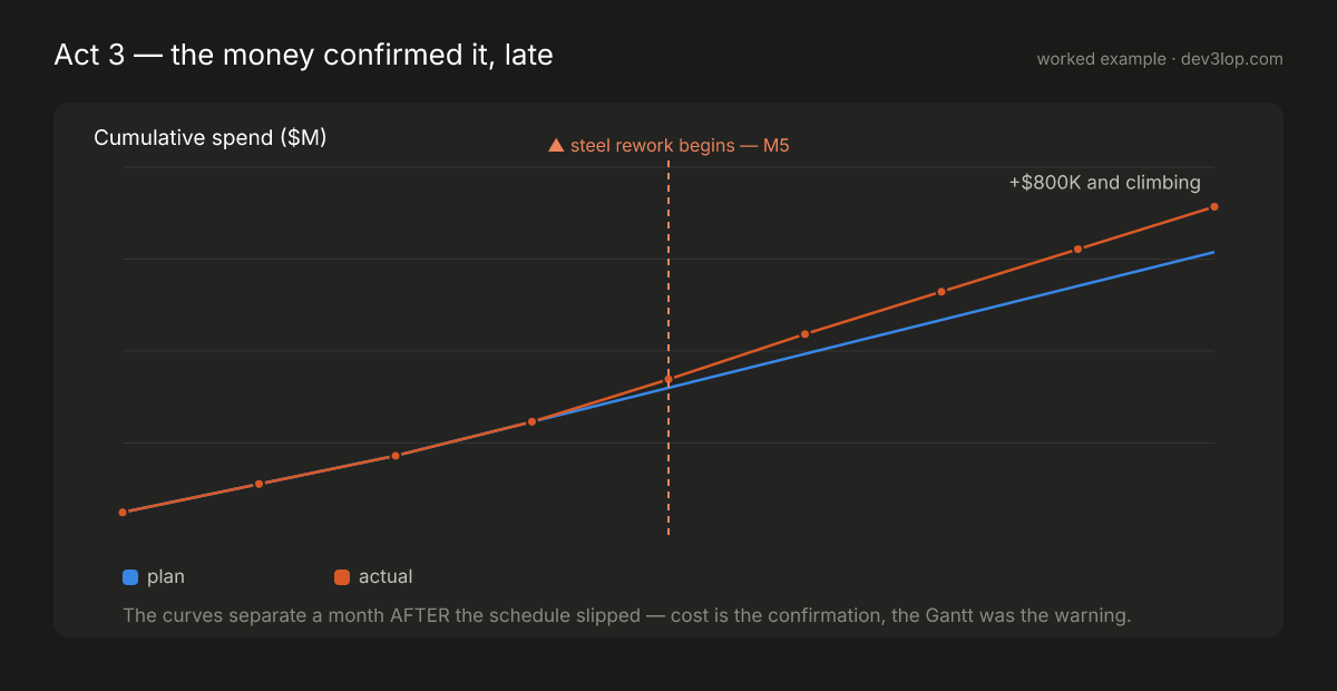
The budget chart everyone watched did eventually show the problem — a month after the Gantt already had. Cumulative plan and actual ran together until the steel rework began, then split, and by month nine the gap was +$800K and compounding. That ordering is the lesson: schedule is the leading indicator; cost is the confirmation. Teams that only watch spend variance are reading yesterday’s news at next month’s prices.
Act 4 — the decision (the part dashboards exist for)
With the slip visible and priced, the call took one meeting: re-sequence a package of MEP rough-in into the Structure gap, pull two inspections forward, and reset the milestone with the owner before it was missed — trading a $40K resequencing cost against the $800K trajectory. No chart made that decision. The charts made it makeable a month earlier, which was worth roughly the difference.
The plumbing that makes the story tellable
None of the above works on screenshots of spreadsheets. The tiles, ghosts, and cost curves stayed truthful because the data underneath was centralized and consistently defined: schedules, invoices, and timesheets flowing into a warehouse rather than departmental silos, with phase and cost-code definitions governed by a canonical data model so “Structure” means one thing on every chart. That’s the unglamorous 80% of the work — and the reason the charts get to be simple.
If you want this working against your own projects — the worked example above is roughly what our Power BI consulting engagements build in the first few weeks, plumbing included. Start with one phase, one ghost bar, and one honest tile.
Thank you for your support, follow DEV3LOPCOM, LLC on LinkedIn and YouTube.