Creating effective and visually appealing data visualizations involves several key steps:
Understand the purpose of your visualization and the audience it is intended for.
Collect and clean your data, ensuring that it is accurate and complete.
Use design elements, such as color, labeling, and layout, to make the visualization easy to understand and interpret.
Test and refine your visualization, seeking feedback from others and making changes as needed to improve its effectiveness and visual appeal.
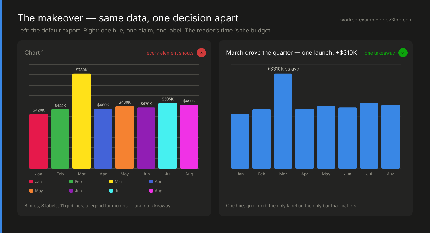
The makeover: the whole checklist, in one before/after
The hero image is every step above applied to a single chart, drawn from the same eight numbers. The “before” is what most tools export by default: eight hues doing the job of zero, a value stamped on every bar, gridlines heavy enough to read as data, and a legend explaining colors that never needed to exist — a chart where every element shouts and nothing gets heard. The “after” makes one decision: March is the story. So March gets the only label, the title becomes the claim (“March drove the quarter”), the grid recedes to three faint lines, and one hue carries the whole series. Nothing was added to make it better — nearly everything was removed. That’s the discipline the checklist is really teaching: a chart improves by subtraction until the takeaway is the only thing left.
By following these steps and considering the specific needs and goals of your visualization, you can create data visualizations that are both effective at communicating information and visually appealing to your audience. Additionally, many data visualization tools offer a range of features and options that can help you create more effective and visually appealing visualizations, such as advanced chart types, annotations, and interactivity. By using these tools and features, you can create visualizations that are both informative and engaging.
Data visualization plays an important role in data science and machine learning, as it allows data scientists and other professionals to explore, analyze, and communicate complex data and insights. If you need a data visualization consultant who is able speak to these teams, you may consider using our team, or encouraging your data visualization guru to study data science on free/paid bootcamp websites.
By creating visualizations of data, data scientists can identify patterns, trends, and anomalies that would be difficult to detect using other methods, and can communicate their findings to others in a clear and concise way.
There are many different chart types and techniques that data scientists can use to create data visualizations, including bar charts, line graphs, scatter plots, heatmaps, and maps. These chart types can be used to visualize different types of data, such as numerical data, categorical data, and spatial data, and can help data scientists and other professionals to understand and make decisions based on their data.
In addition to traditional data visualization techniques, data scientists can also use more advanced techniques, such as data mining, machine learning, and natural language processing, to create more sophisticated and interactive visualizations. For example, data mining algorithms can be used to identify hidden patterns and trends in large datasets, while machine learning algorithms can be used to create predictive models and interactive visualizations that allow users to explore and interact with the data.
Overall, the role of data visualization in data science and machine learning is to provide a powerful and effective way to explore, analyze, and communicate complex data and insights, enabling data scientists and other professionals to make more informed and accurate decisions.
Related reading: a comparison of popular data visualization tools, how to choose the right ETL tool, and an overview of visualization types and when to use each.